MATD > Belgium & The Netherlands

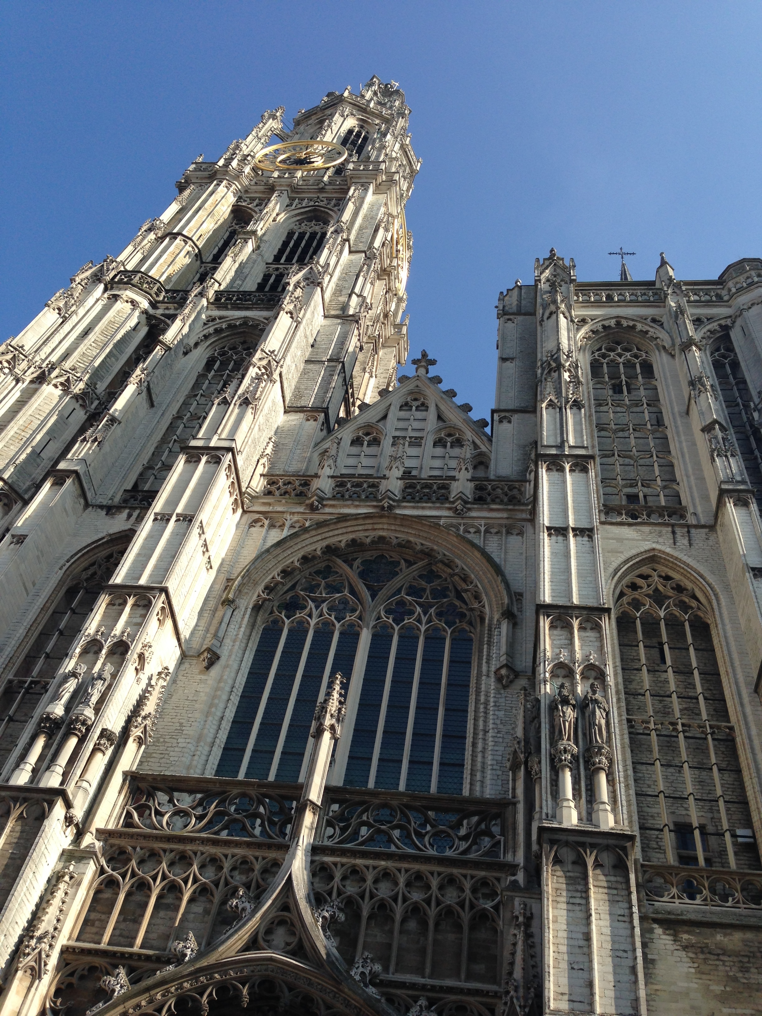
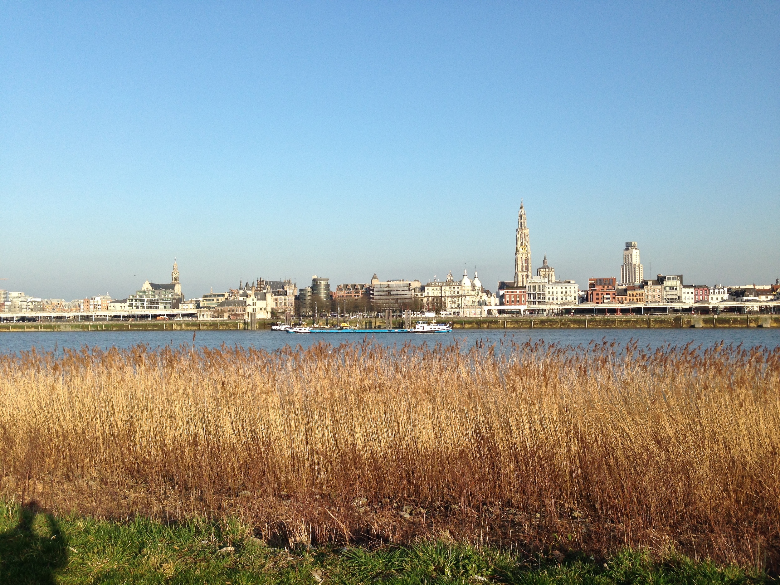
I recently got back from Belgium and the Netherlands. If you dont wanna read the rest of this article I'll sum it up quick: It was awesome. Scroll down for images taken in a hurry.  

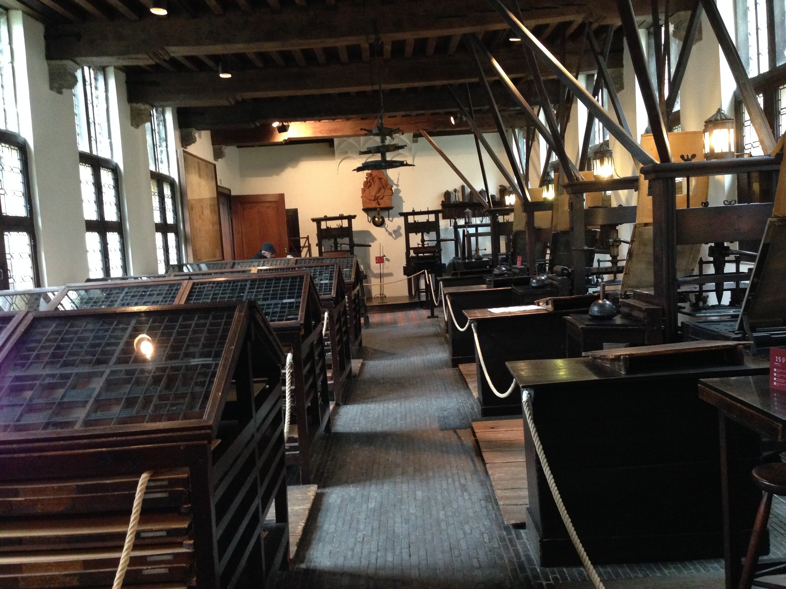
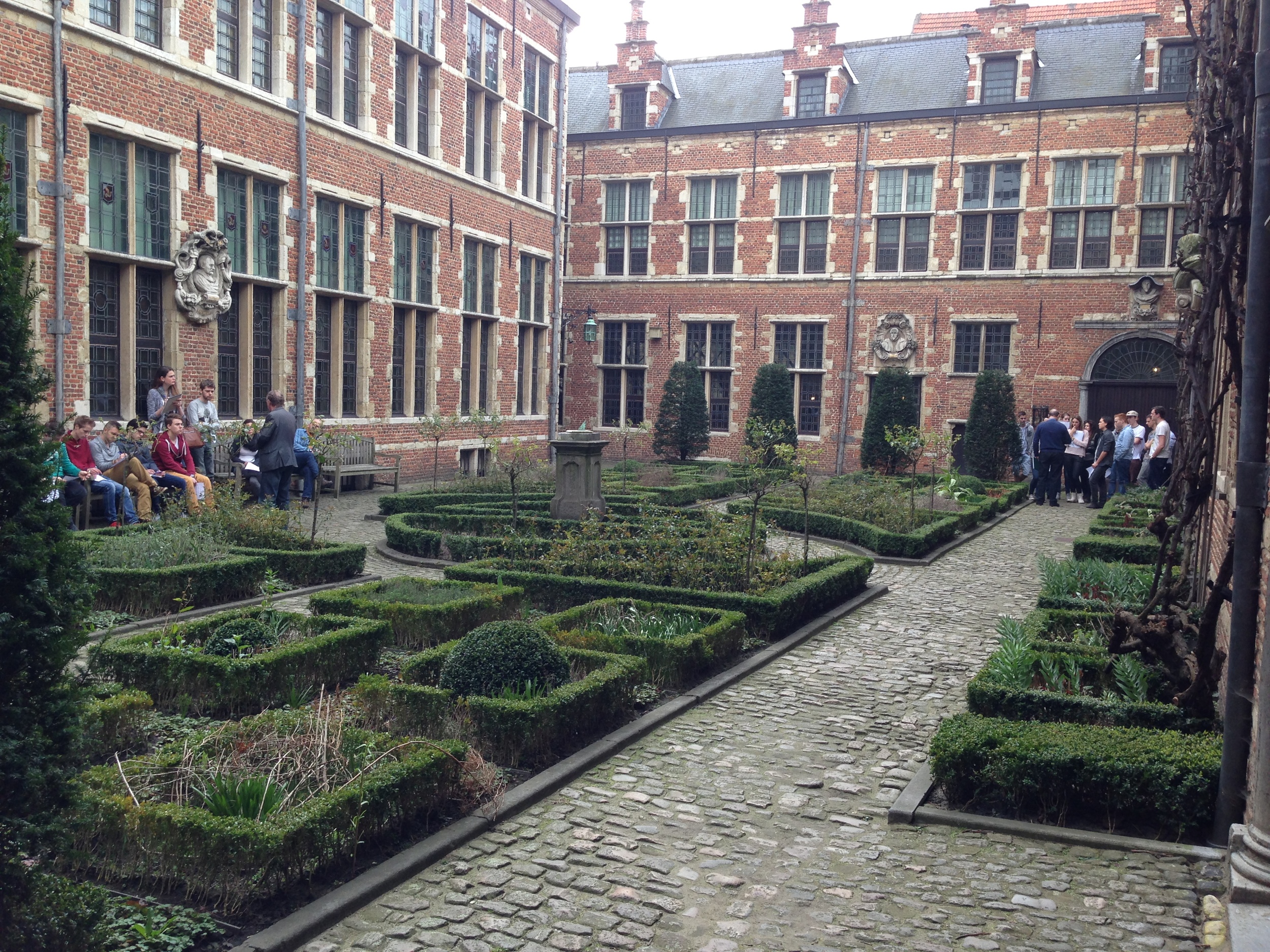
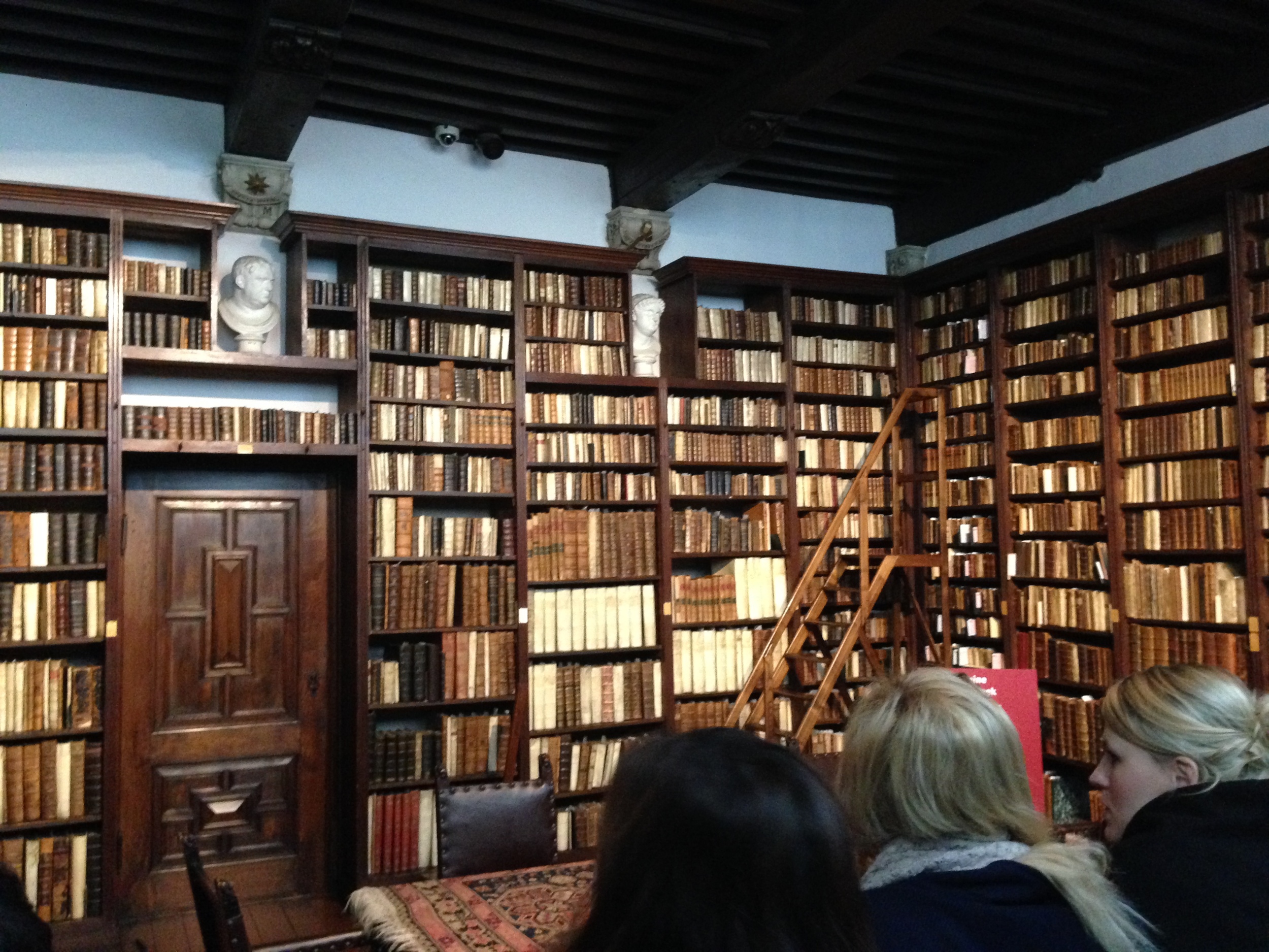
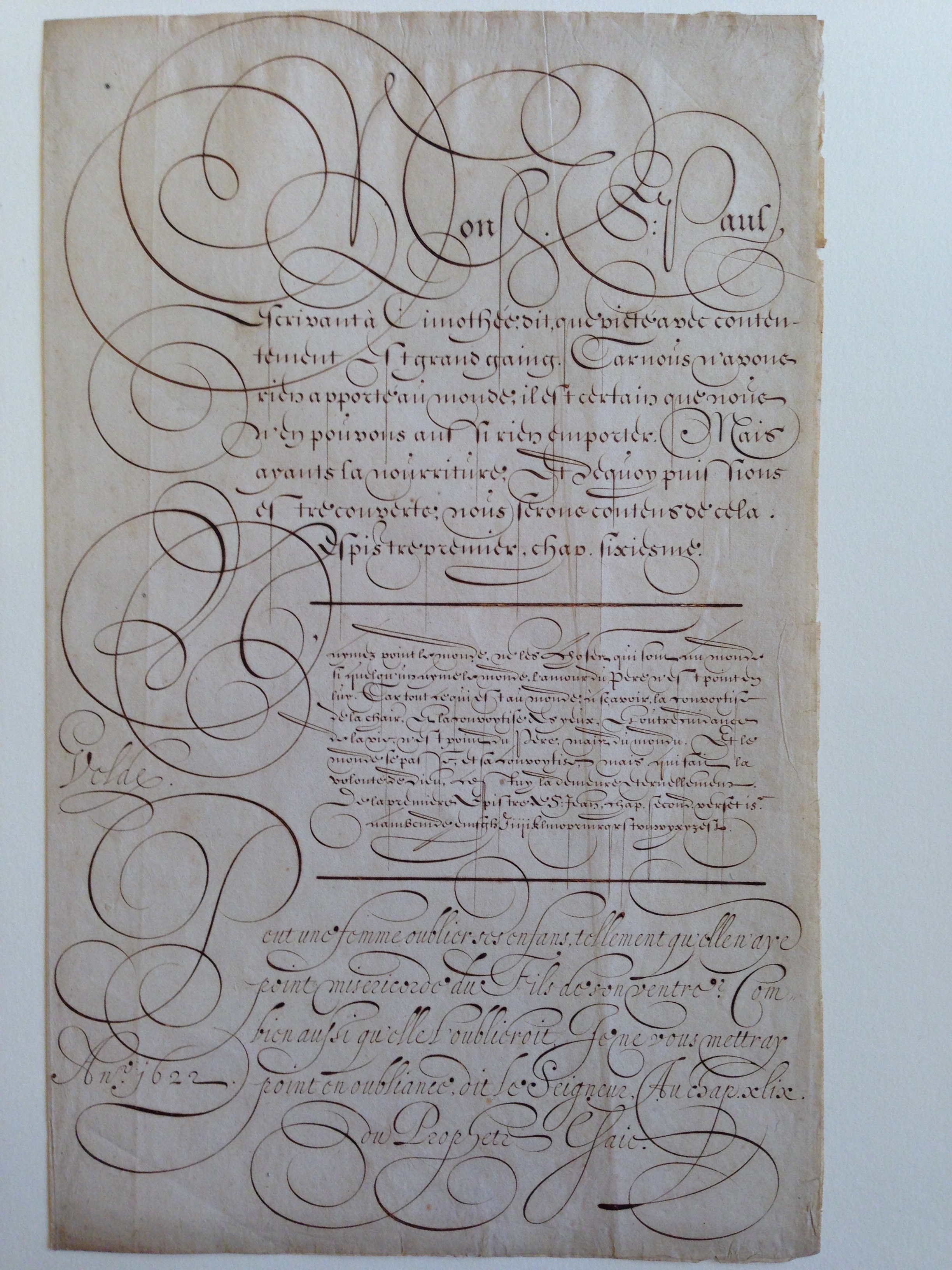
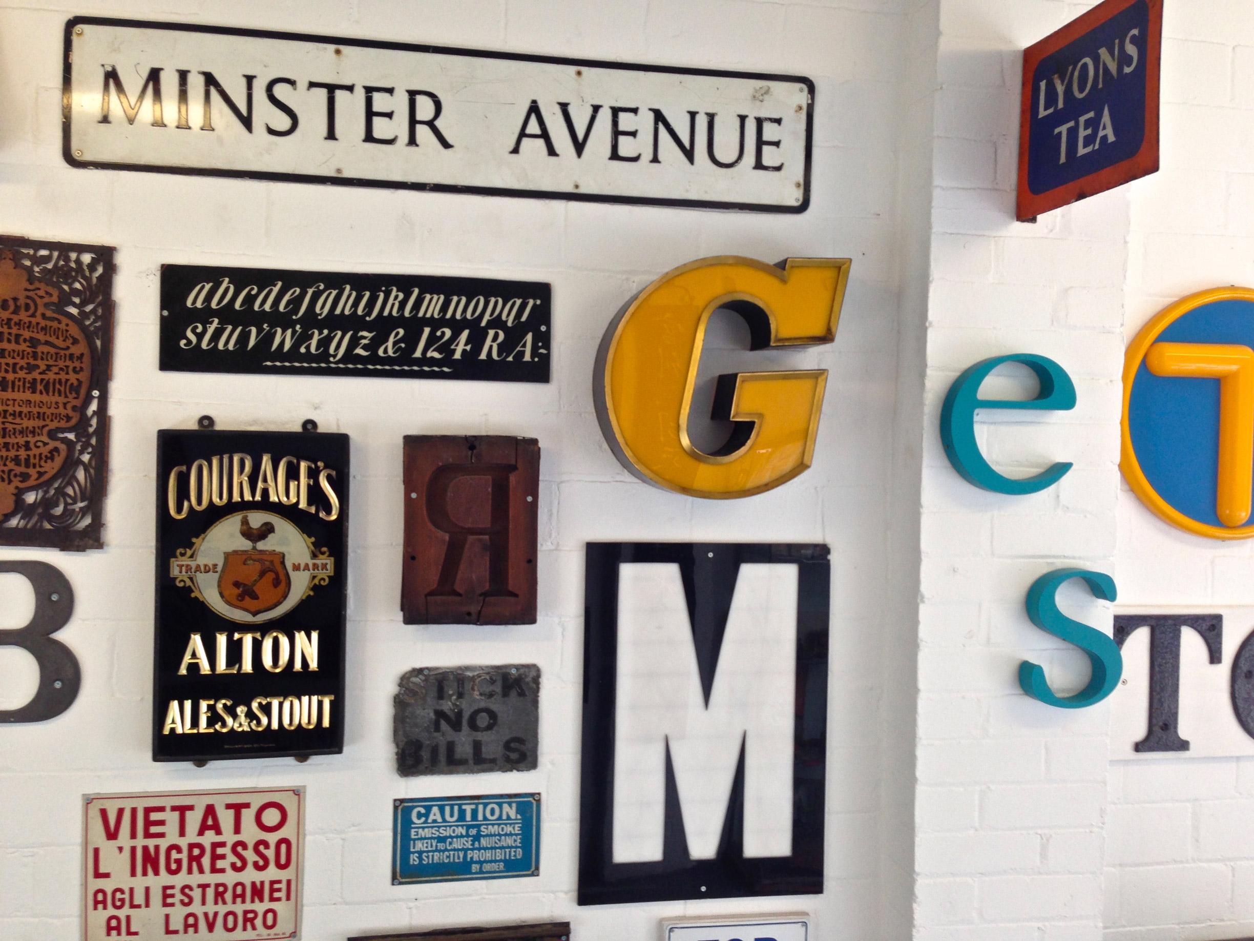
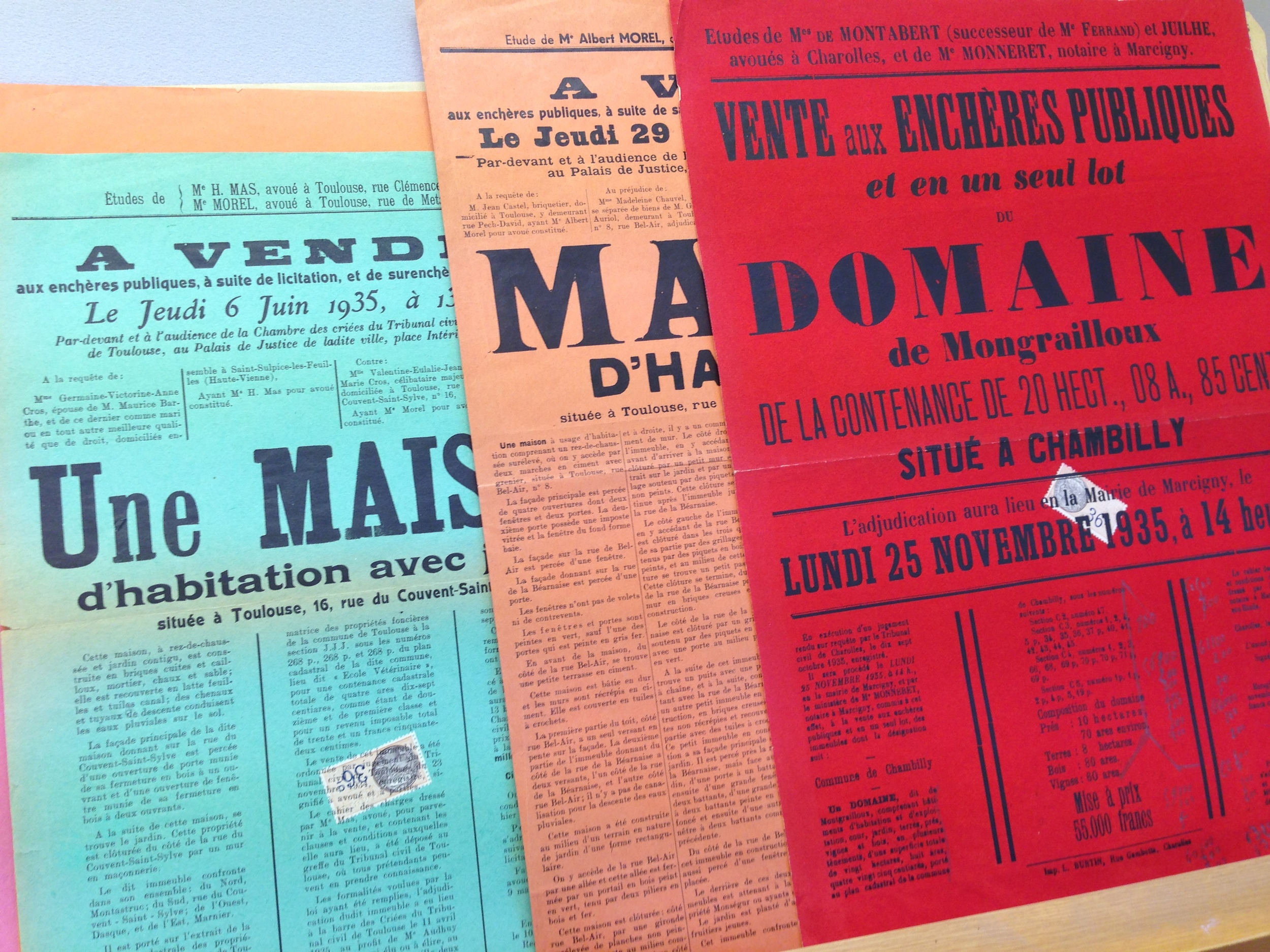
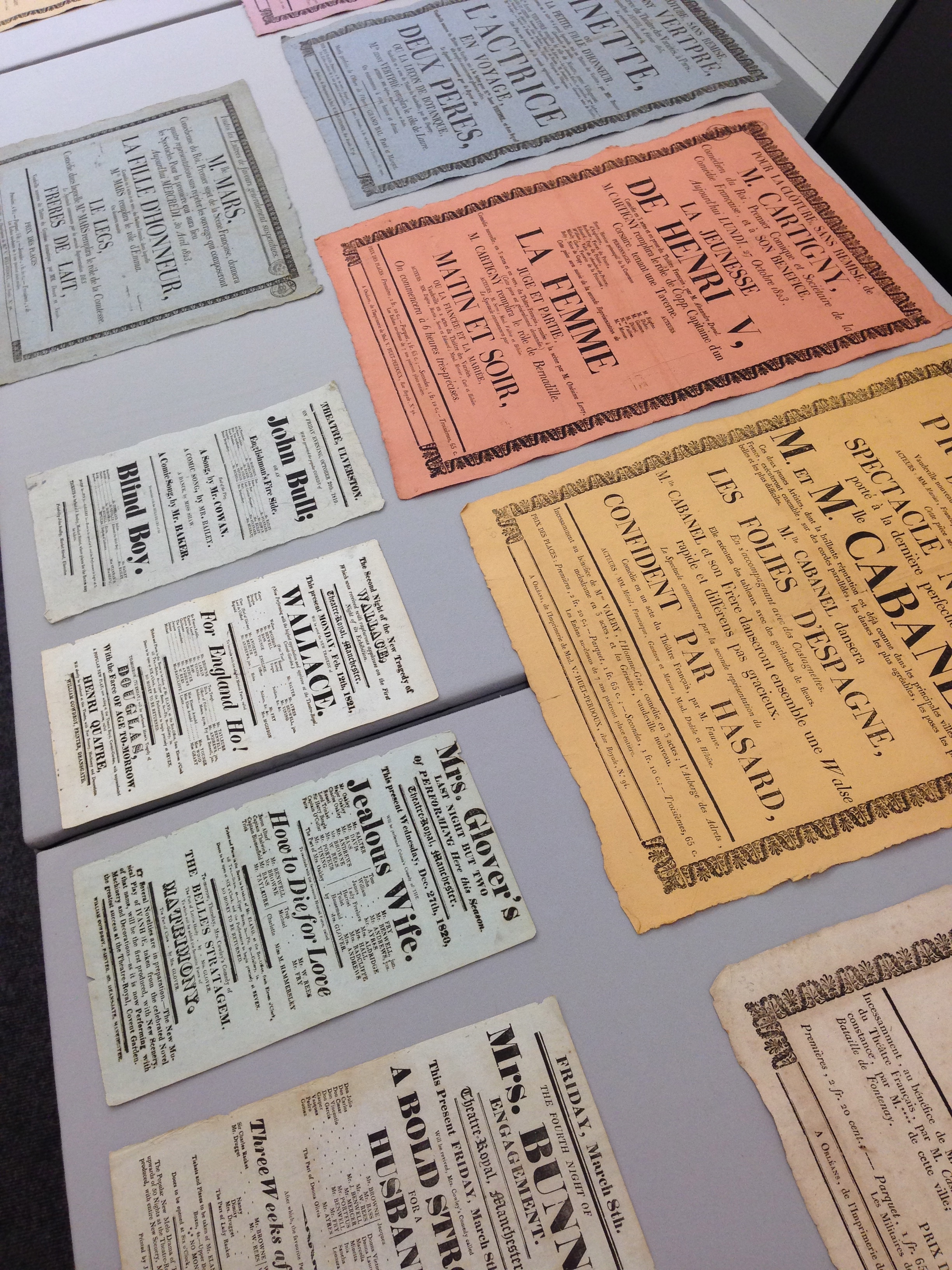
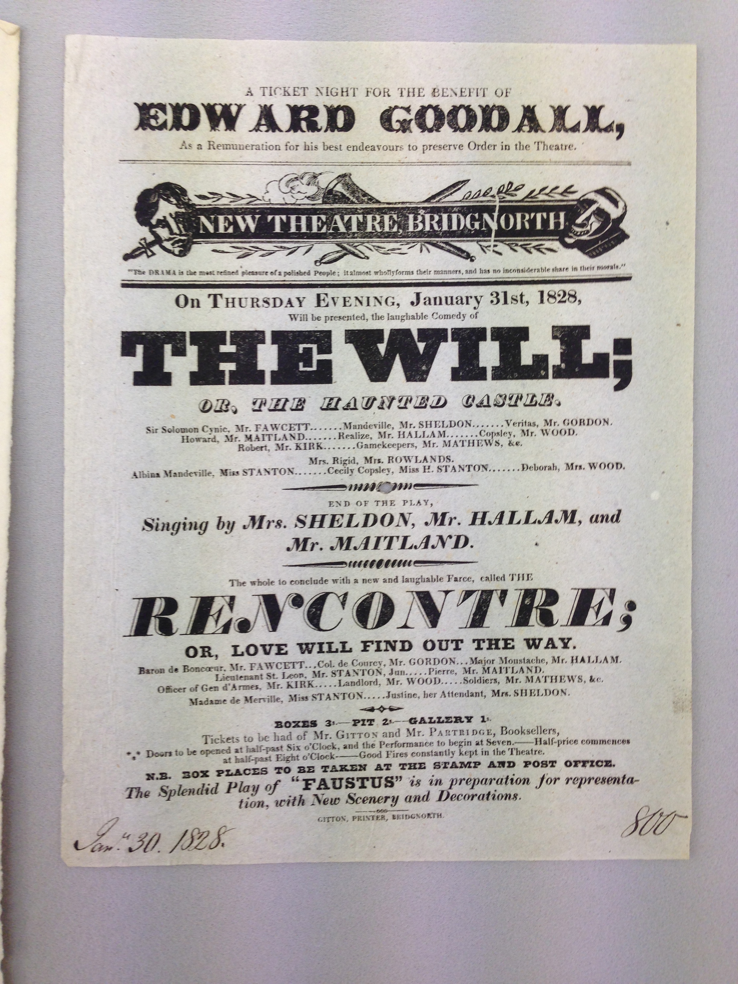
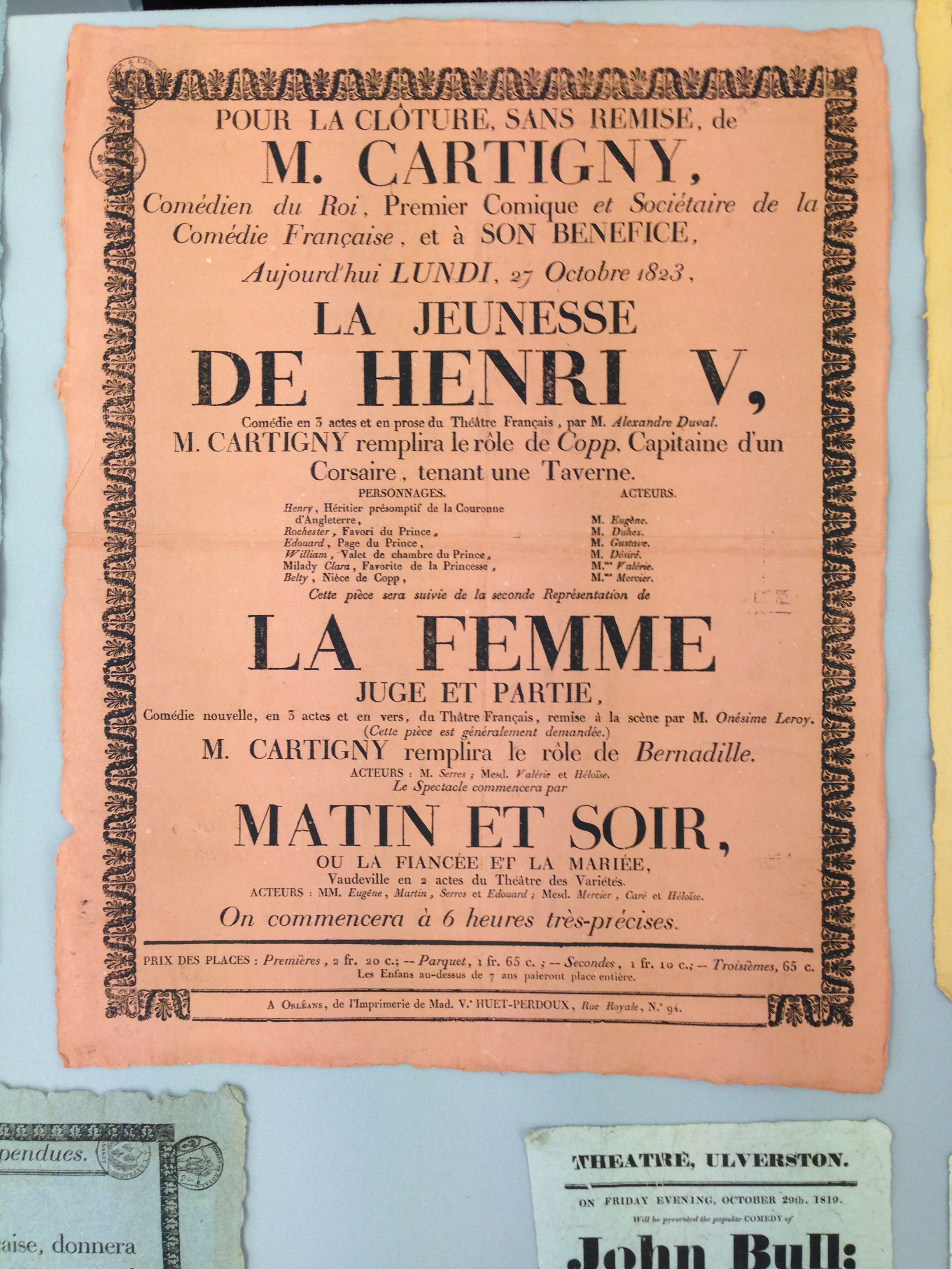
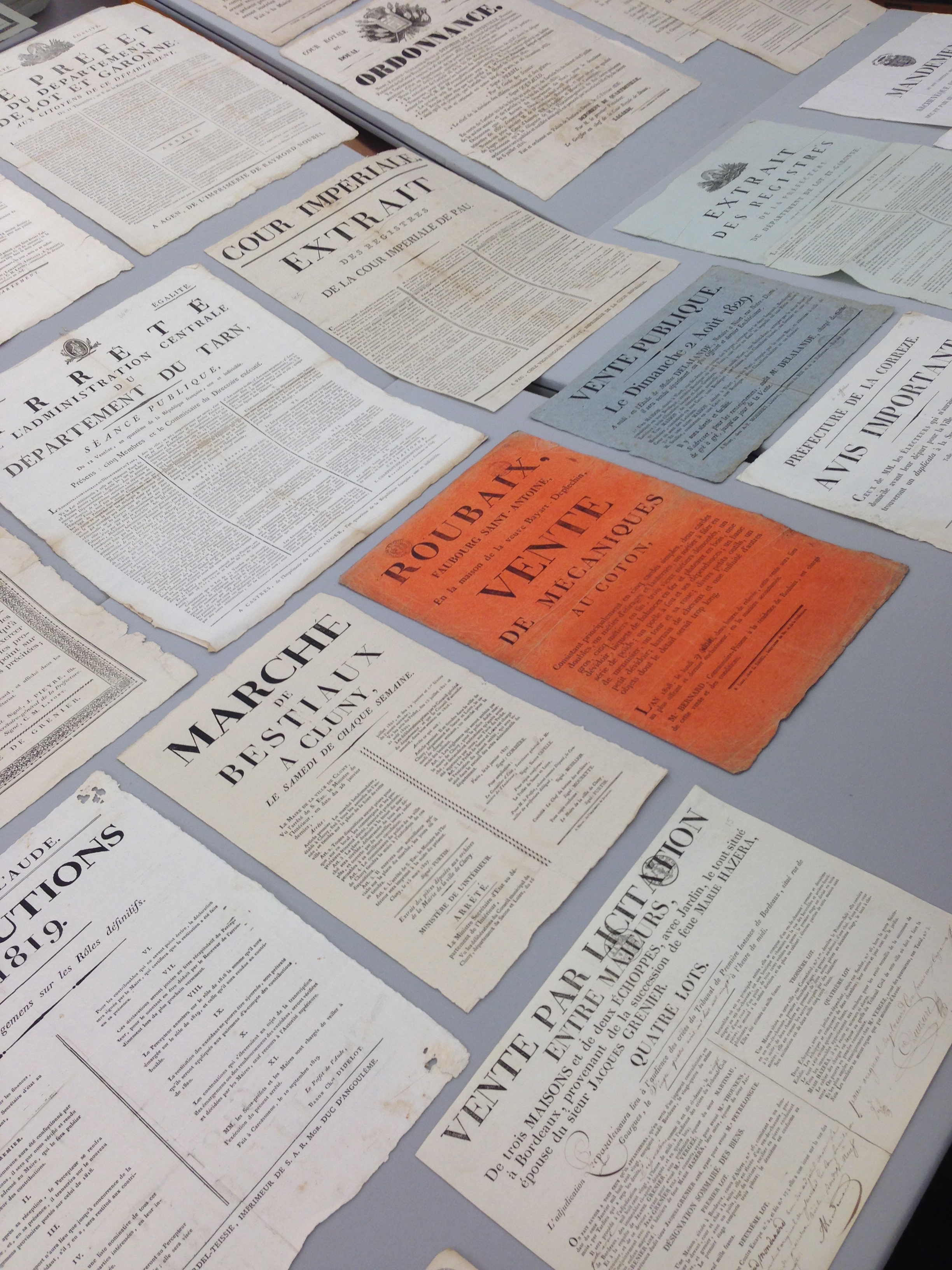
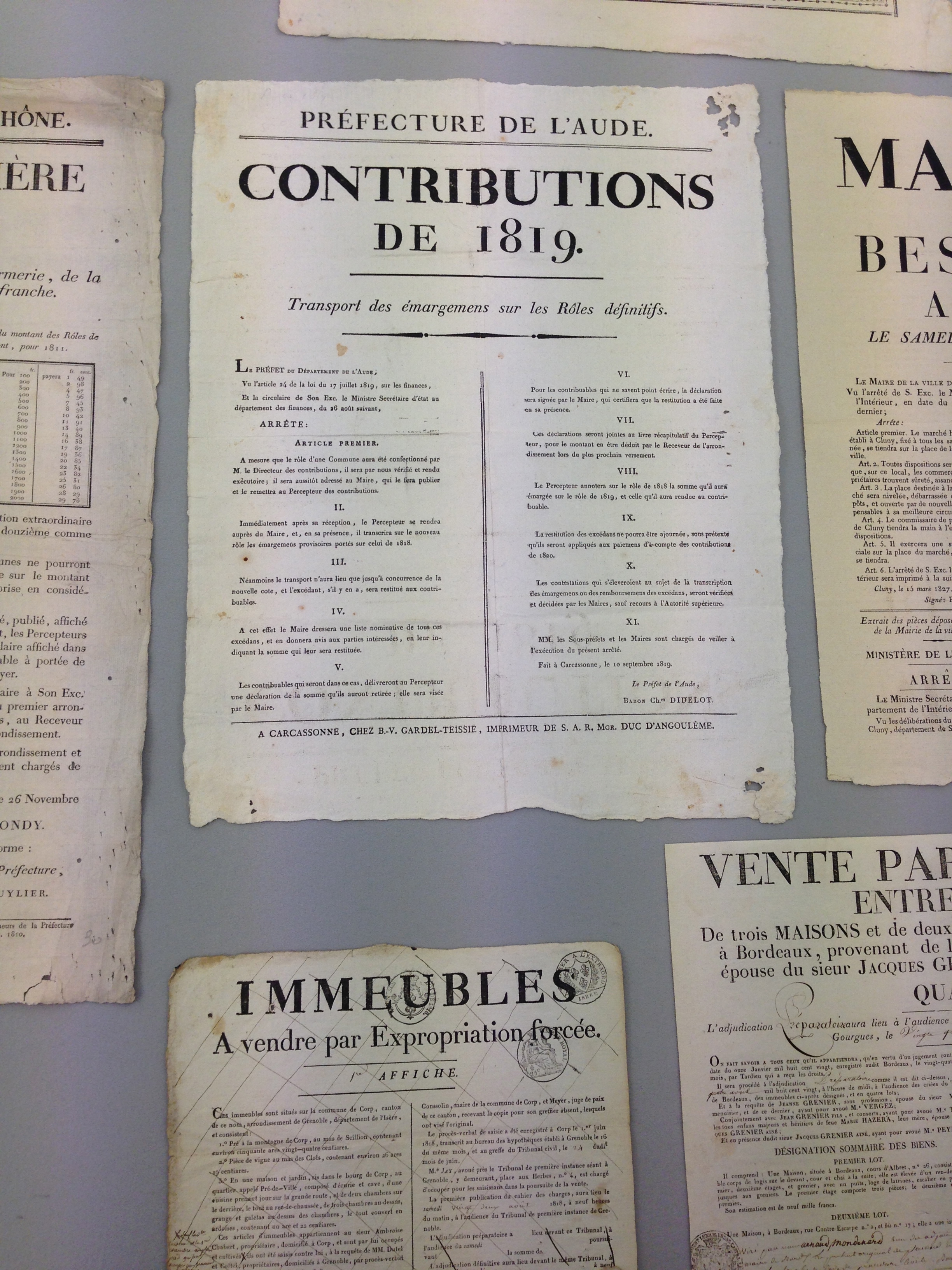
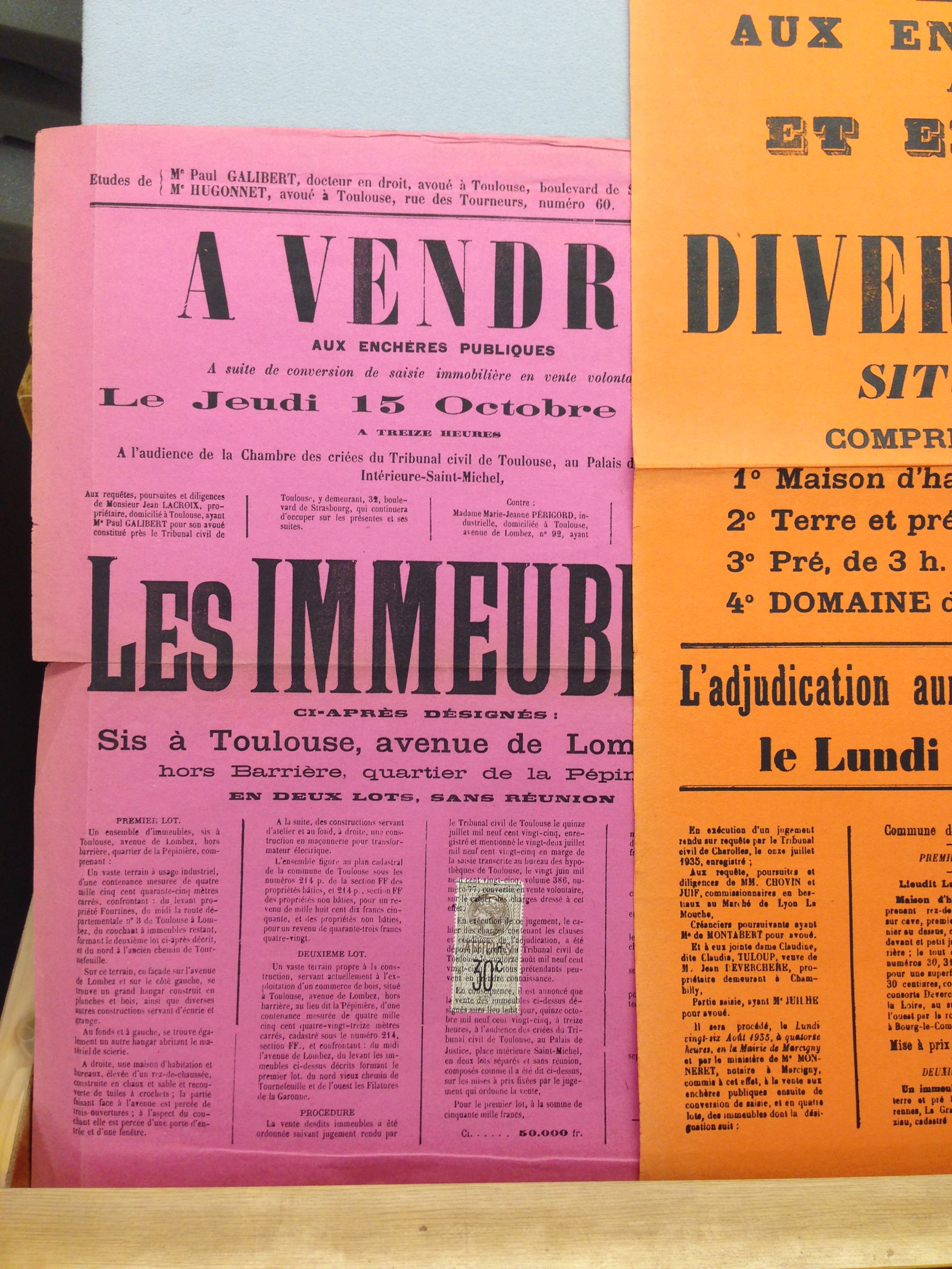
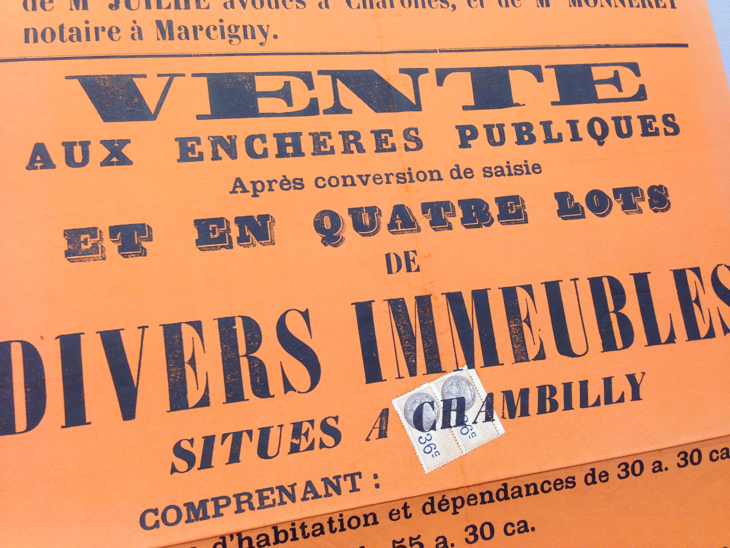
Our first stop was to Antwerp where we visited the Plantin-Moretus Museum. We viewed and studied some seriously old books and manuscripts. The sheer amount of books, manuscripts, bibles, presses, tools, and type was absolutely stunning. After an hour in this place your head starts to spin. But it's amazing that there even exists a museum on the history of type and the printers that used it 500 years ago. 

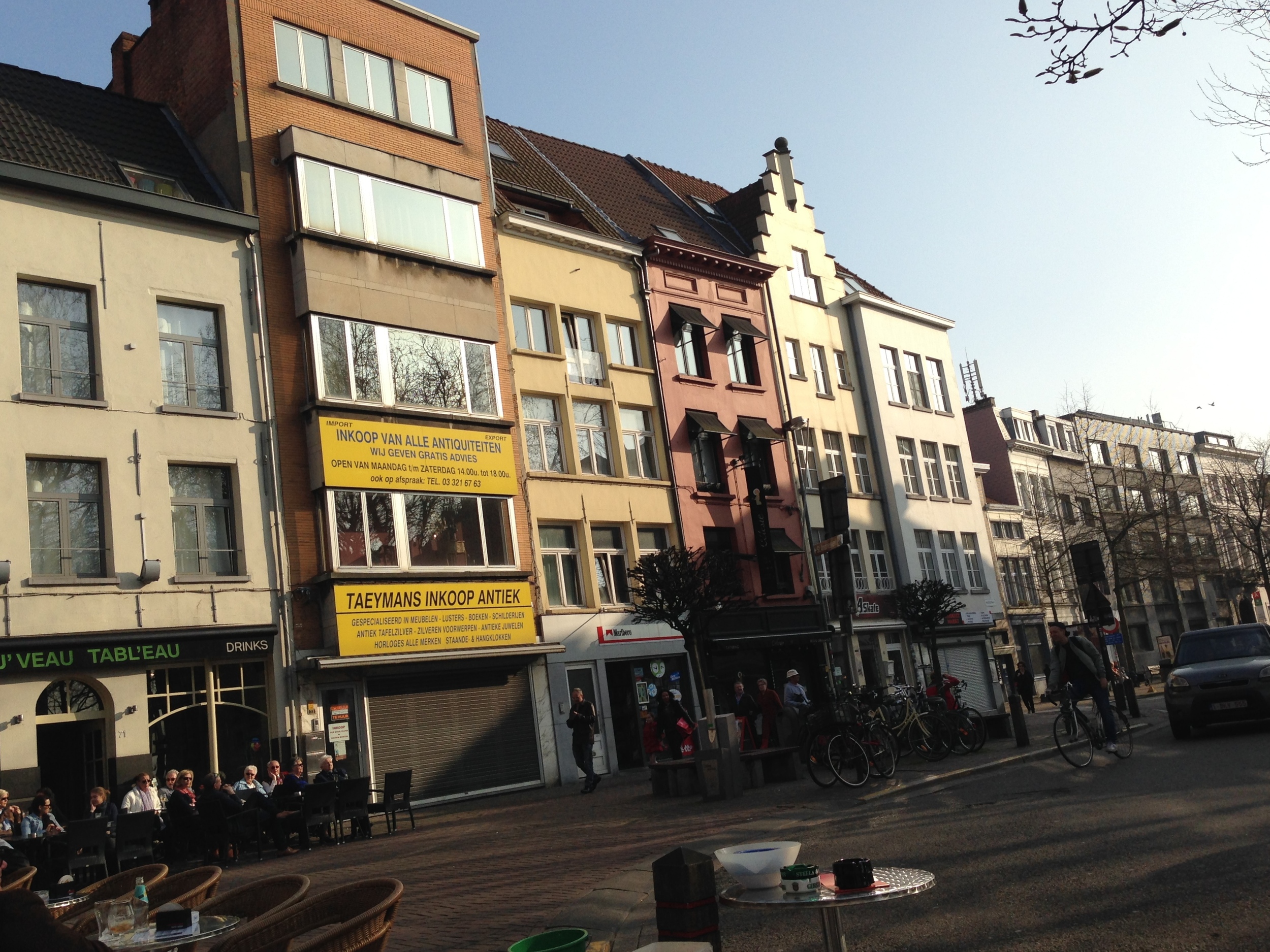
While in Antwerp I also ate more food than the average human being should in 2 days. Brunch at beautiful outdoor cafes, Belgium fries and waffles, Ethiopian all-you-can-eat, fantastic coffees and teas, and the Trappist brews proved how amazing Belgium cuisine is. I don't know if I have eaten that well since I came to Europe. If you've never been to Antwerp go. Even if its just for the cafes and waffles, you won't regret it.

We left for Amsterdam midweek and immediately headed to the Special Collections at the University of Amsterdam. Another place with an unbelievable collection of antiques and rare books that you can hardly believe still exist. The entire list of items we saw can be found here. Gerard Unger was giving us an excellent presentation on the items retrieved from the archives there. He is a great speaker and a refined expert in this field, especially when it comes to Dutch type & graphic design. After that, Gerard led us to an Artists Club where I devoured half a chicken with potatoes and gravy. We had nice conversation and most likely a heated typographic debate. 

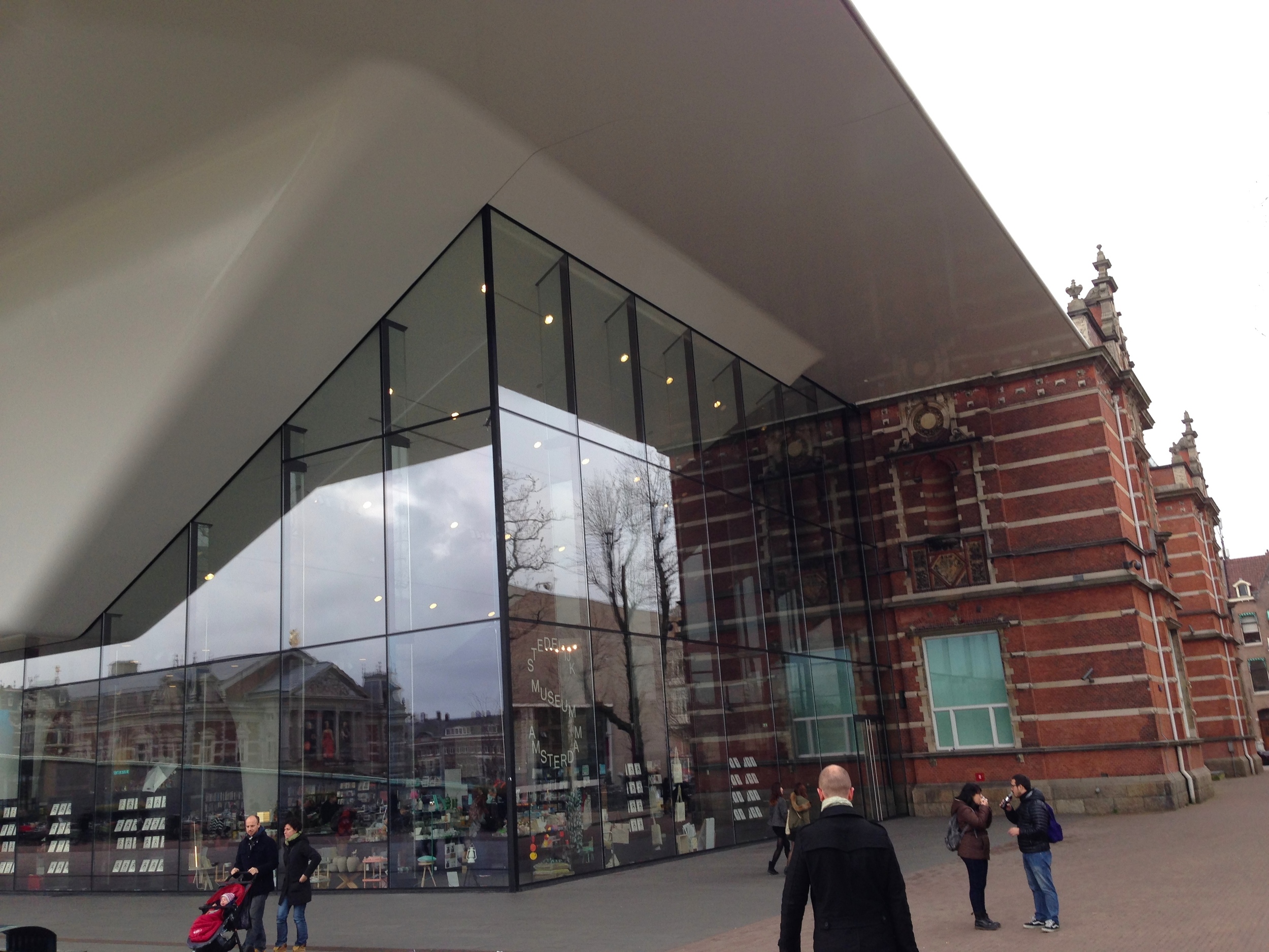
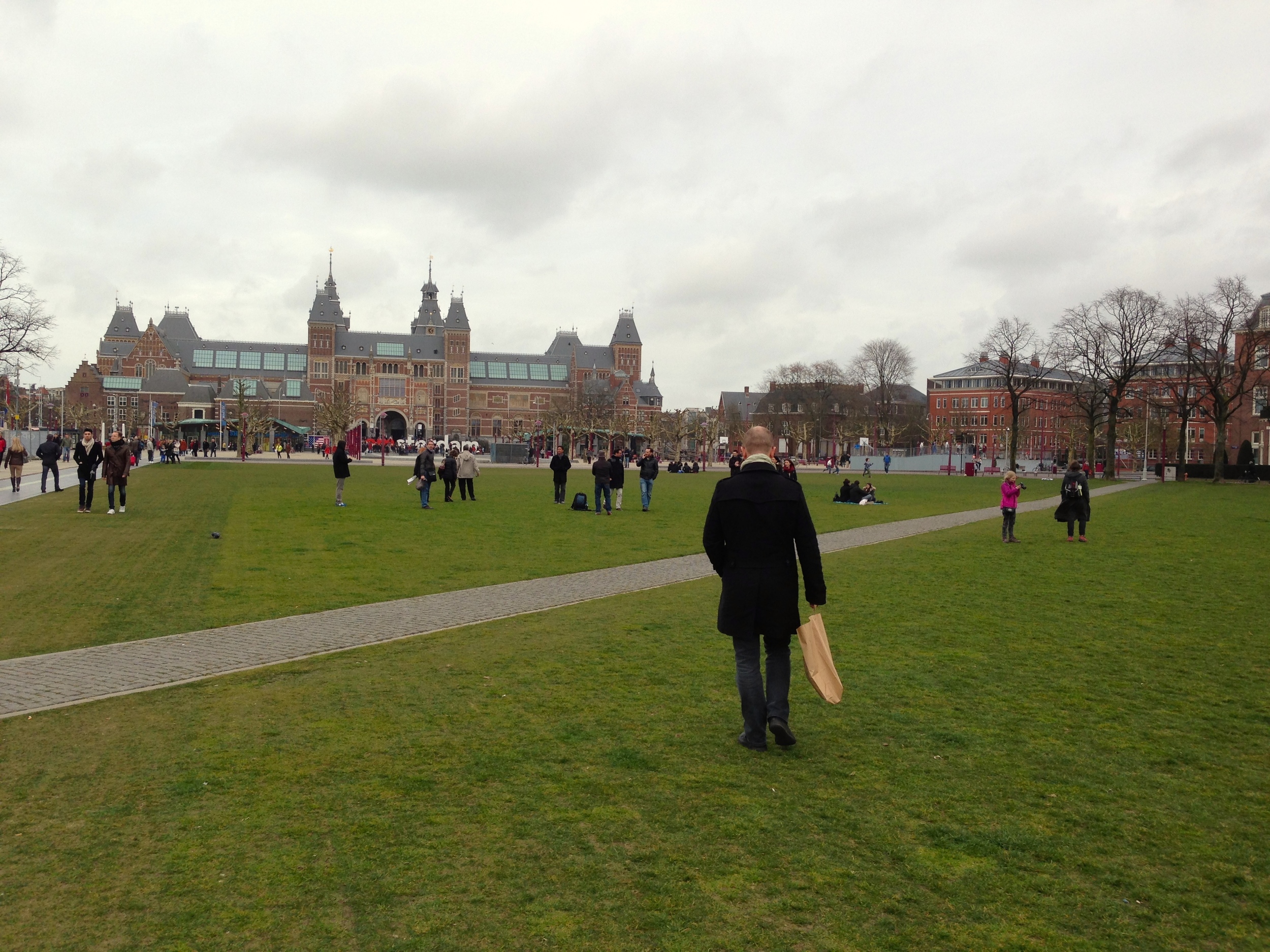
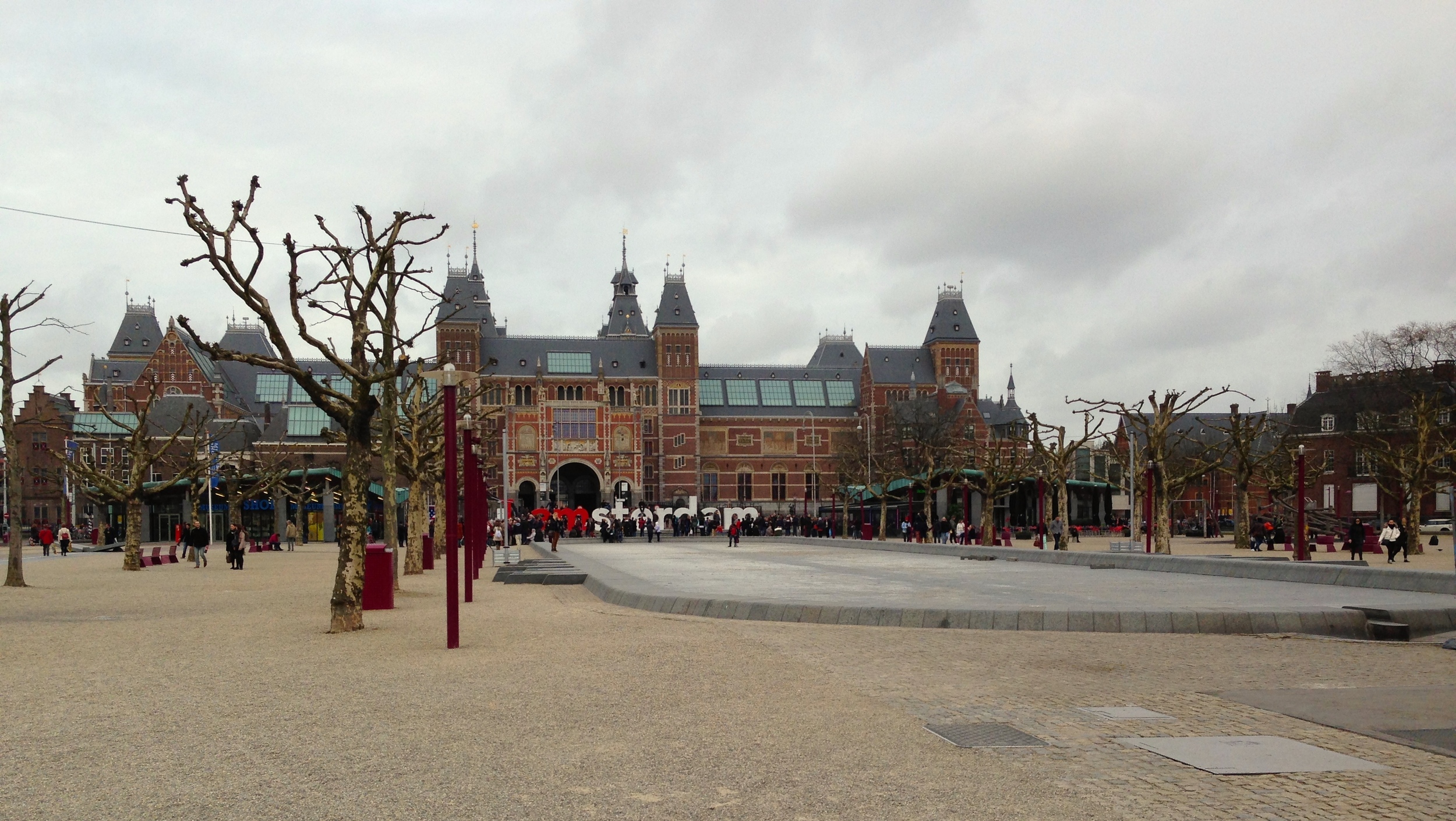
The next few days were spent exploring Amsterdam museums, libraries, and bookshops (oh, and pubs as well). We took a day trip to Haarlem where we visited the Enschede Museum. Later we went to Unger's favorite diner in Amsterdam. I had a smoked eel broodje. Yup, you read that right – smoked eel. Your'e all posers until you eat something as disgusting and slimy as an eel (it was actually like, crazy delicious). After that we went to the Rijksmuseum which houses many amazing works by Rembrant, Monet, van de Velde, Breitner, Vermeer, van Dijck, van Gogh, and many others.

The next day we travelled to Den Haag (The Hague) and went to the The Meermanno Museum . After looking at some of the worlds most beautifully designed books, we headed to the KABK to eat lunch and meet up with the type design students. They gave us a seriously impressive presentation and schooled us in Foosball. In the great dutch tradition, they gave us an ice cold Heineken as well so we would all stop talking about type and start chatting about something more normal, like beer. After realising how terrible I was at foosball (even though I love soccer), Riccardo (italian colleague & friend) and I were invited to Gerard Unger's house for dinner. He prepared an absolutely amazing meal for us and then showed us some of his favourite Italian and Tex Avery comedies! What a cool dude. 

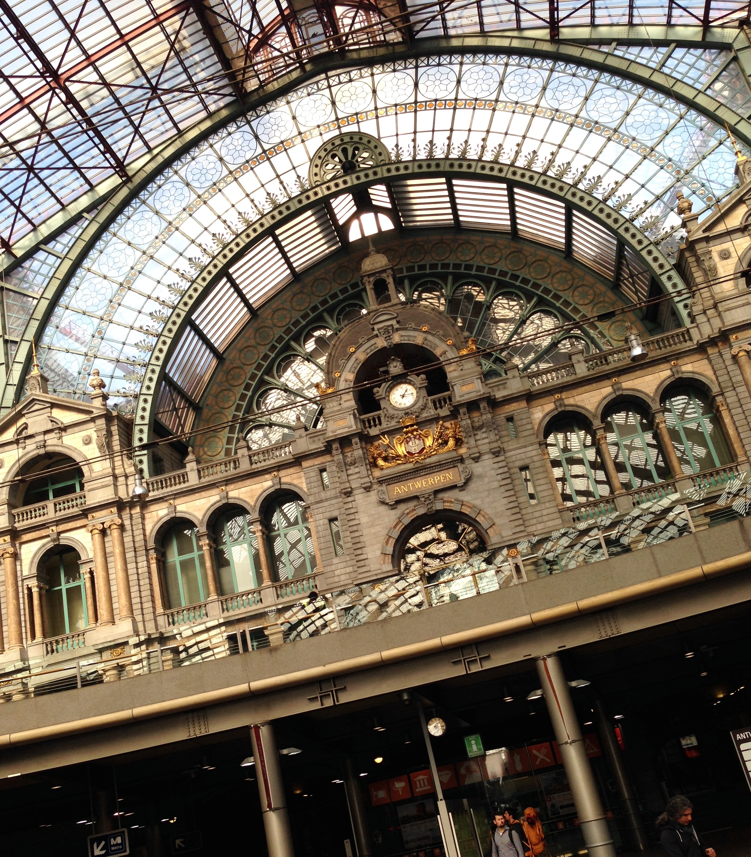
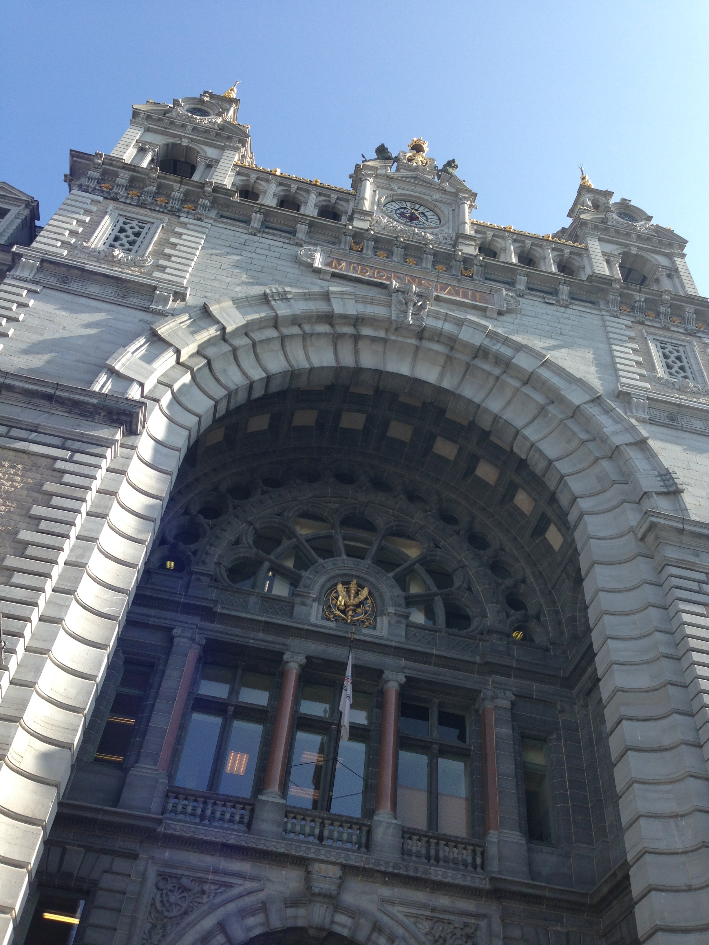
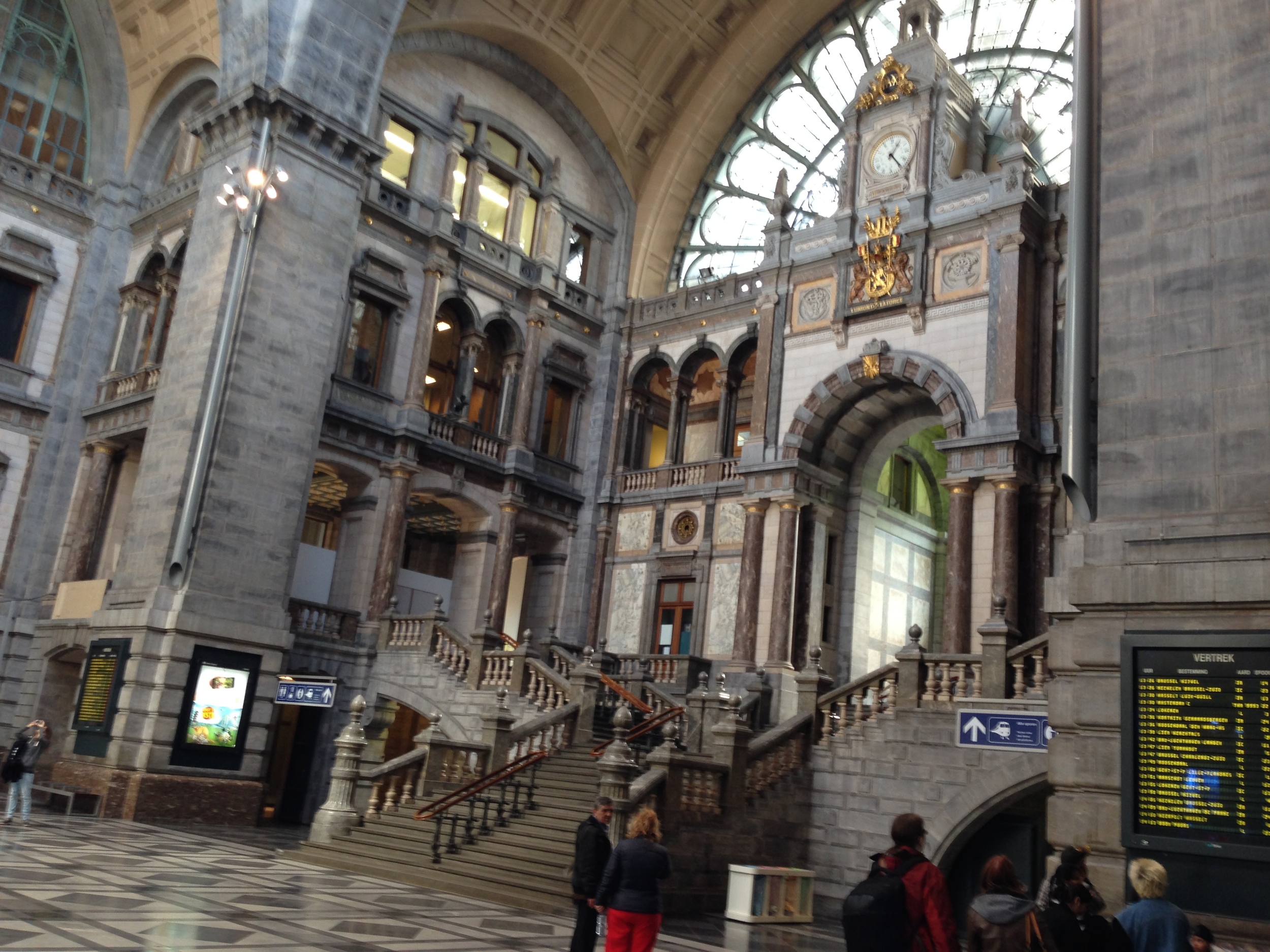
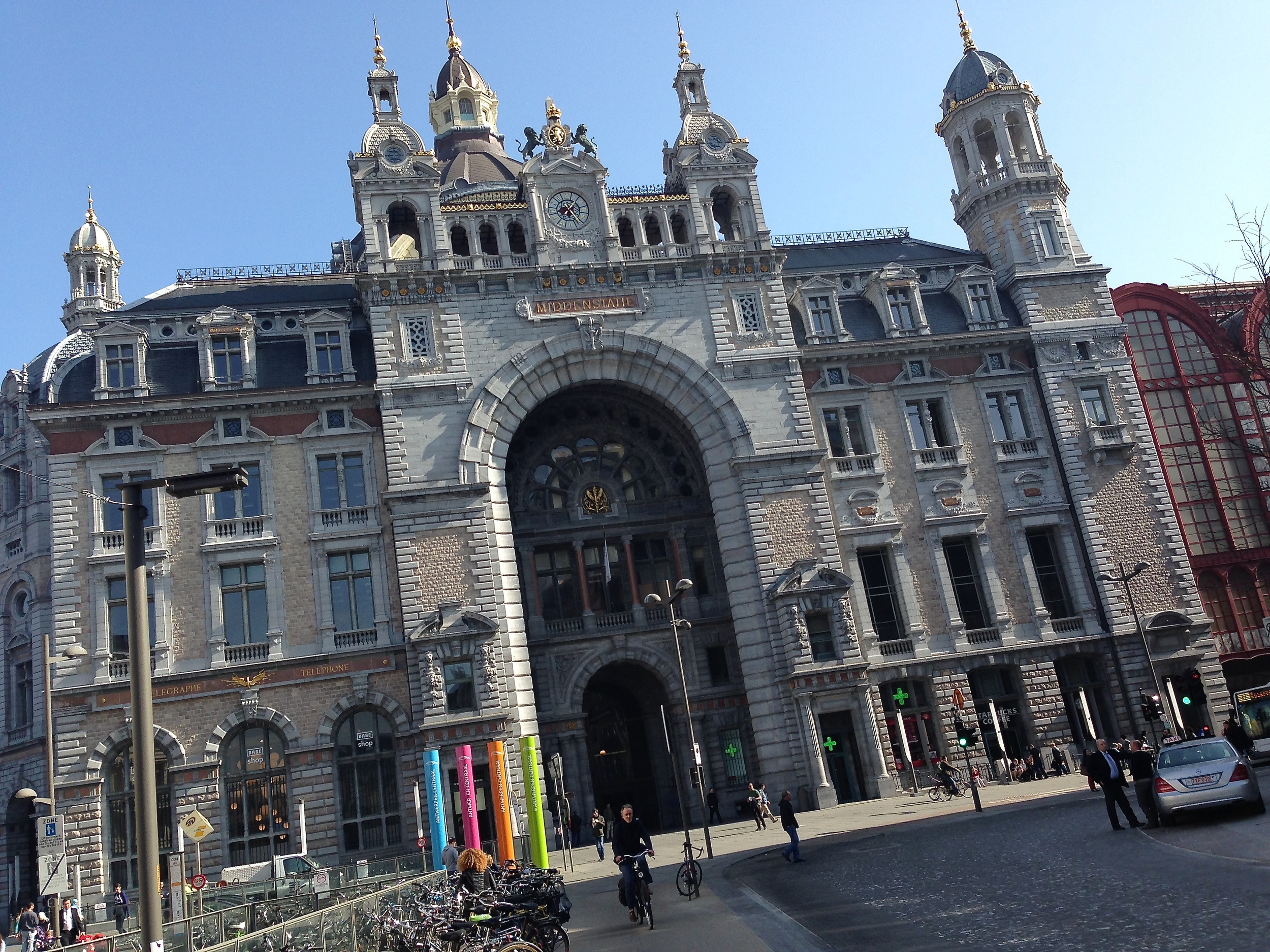
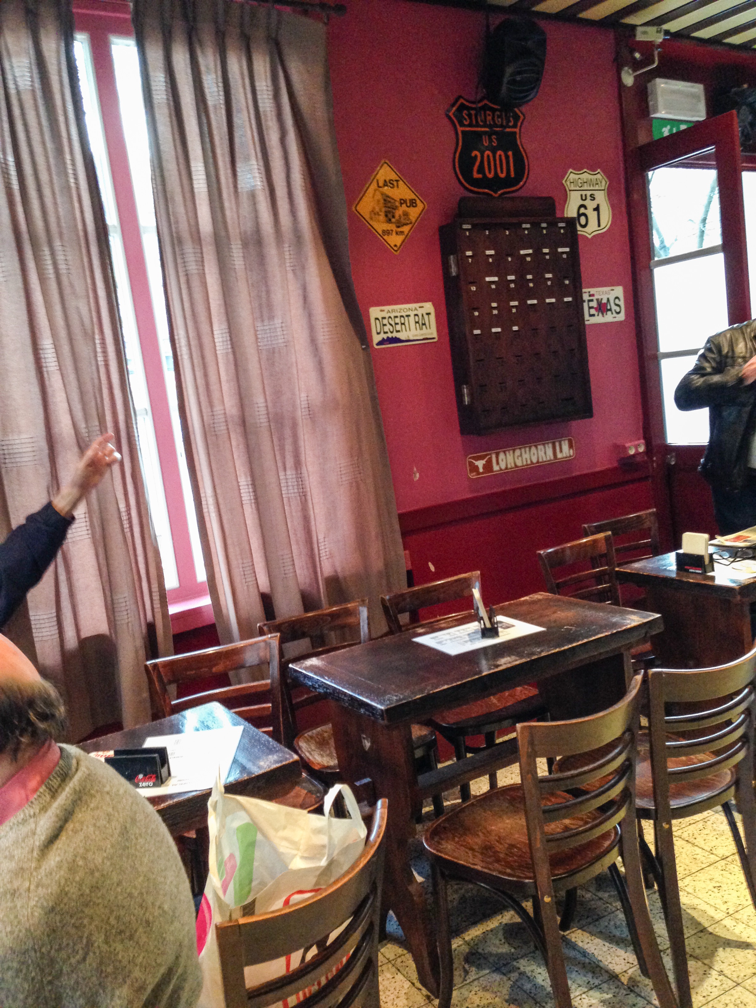
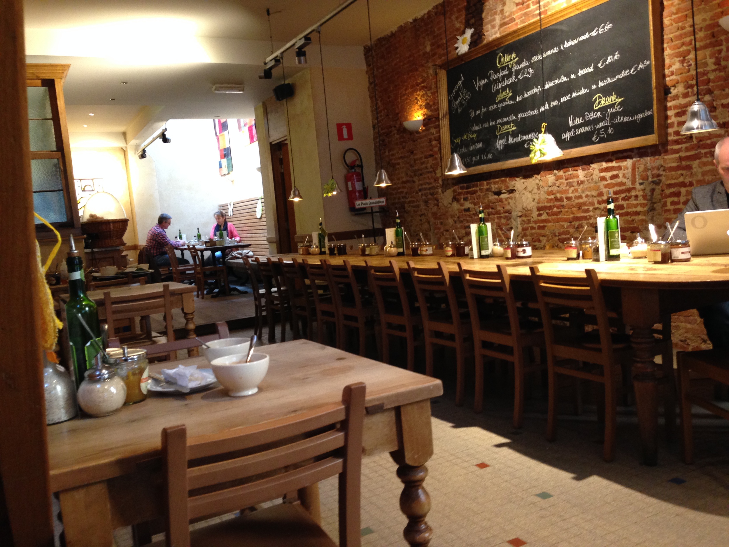
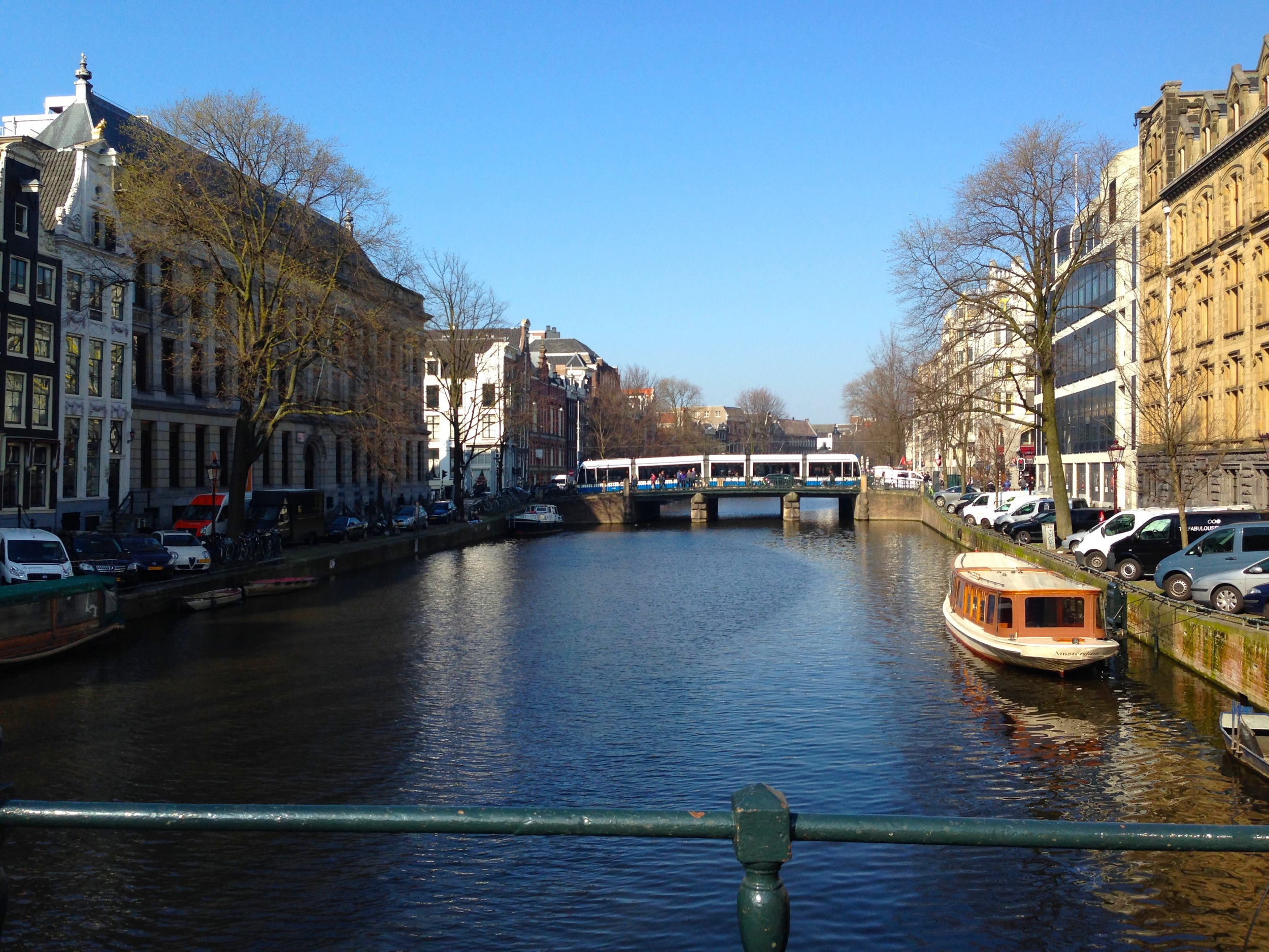
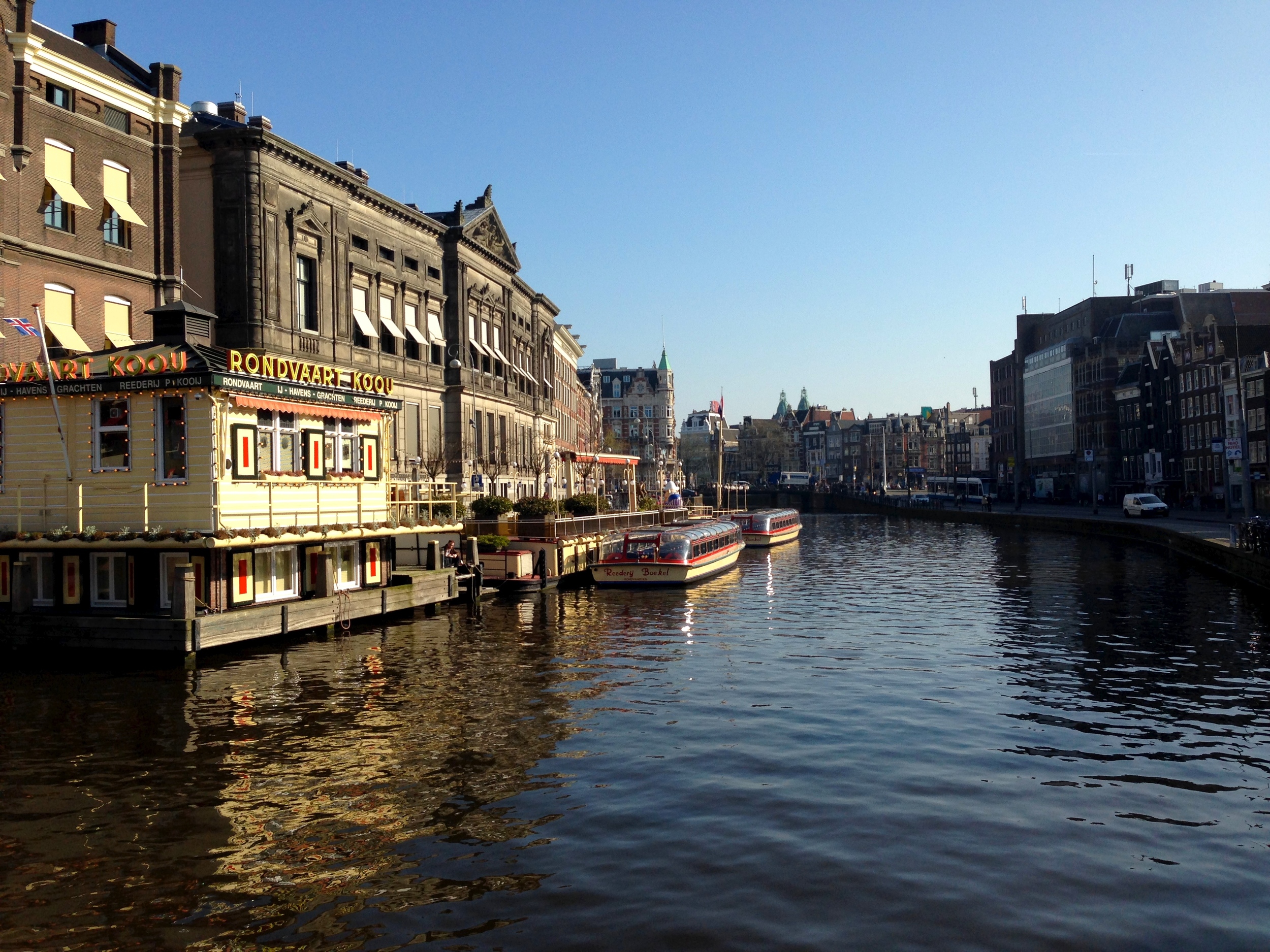
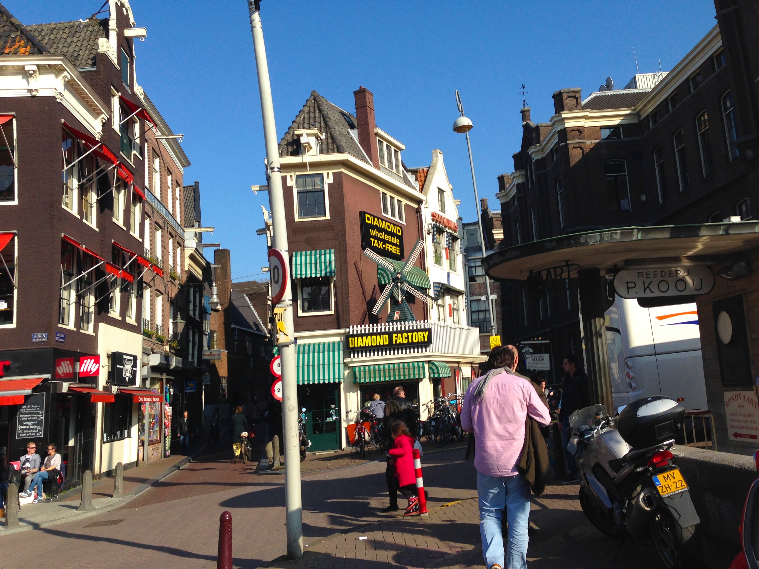
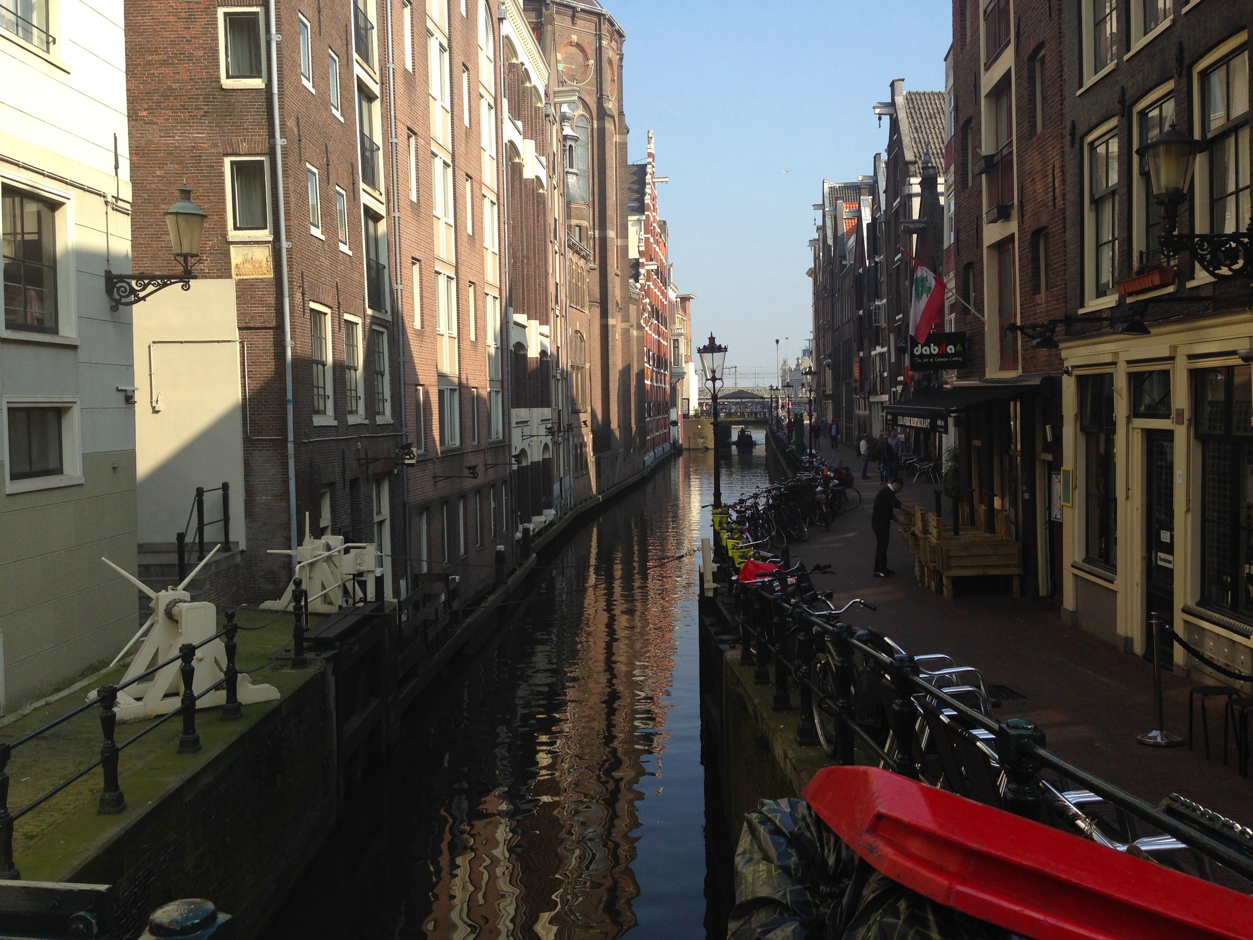
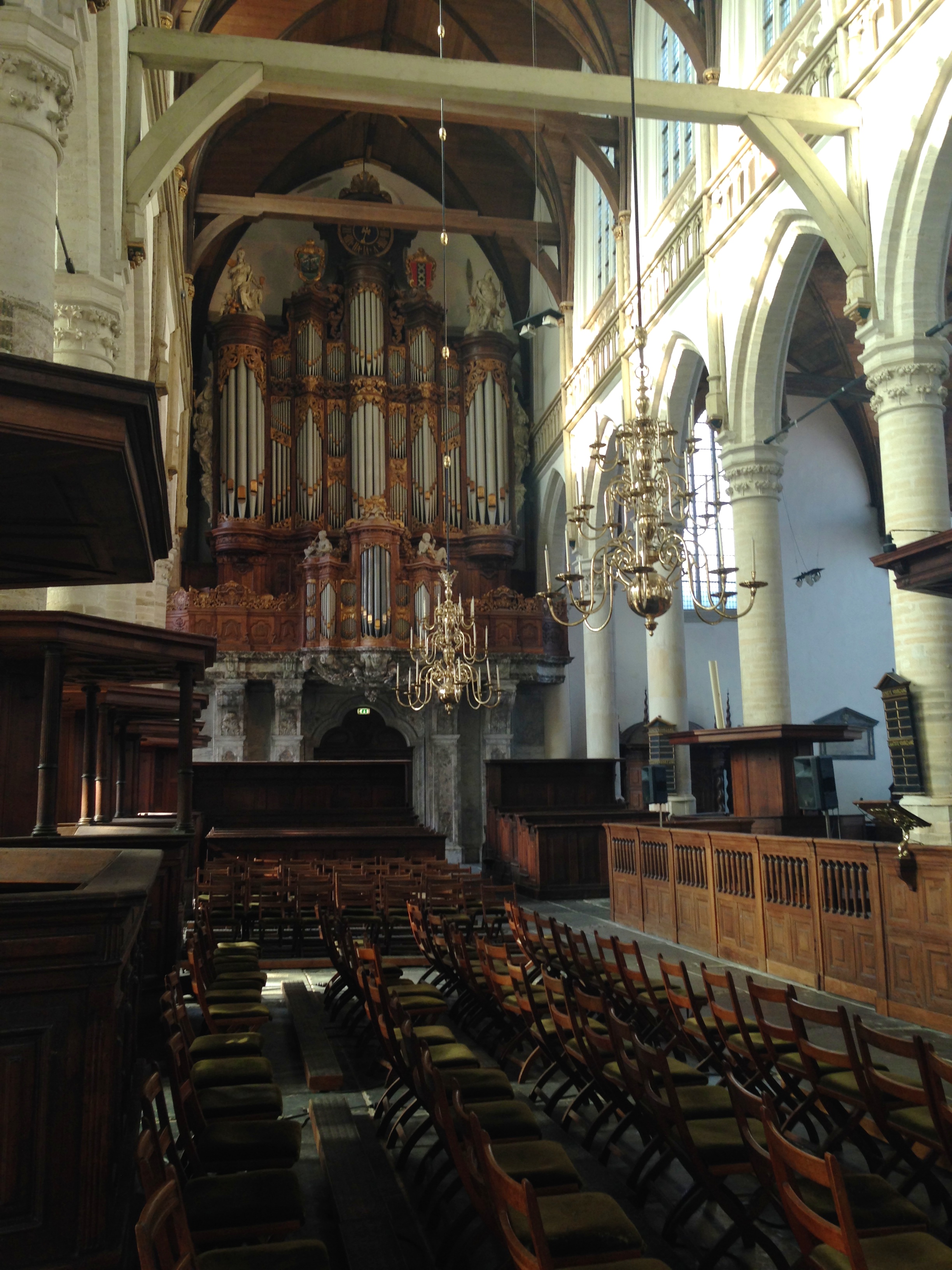
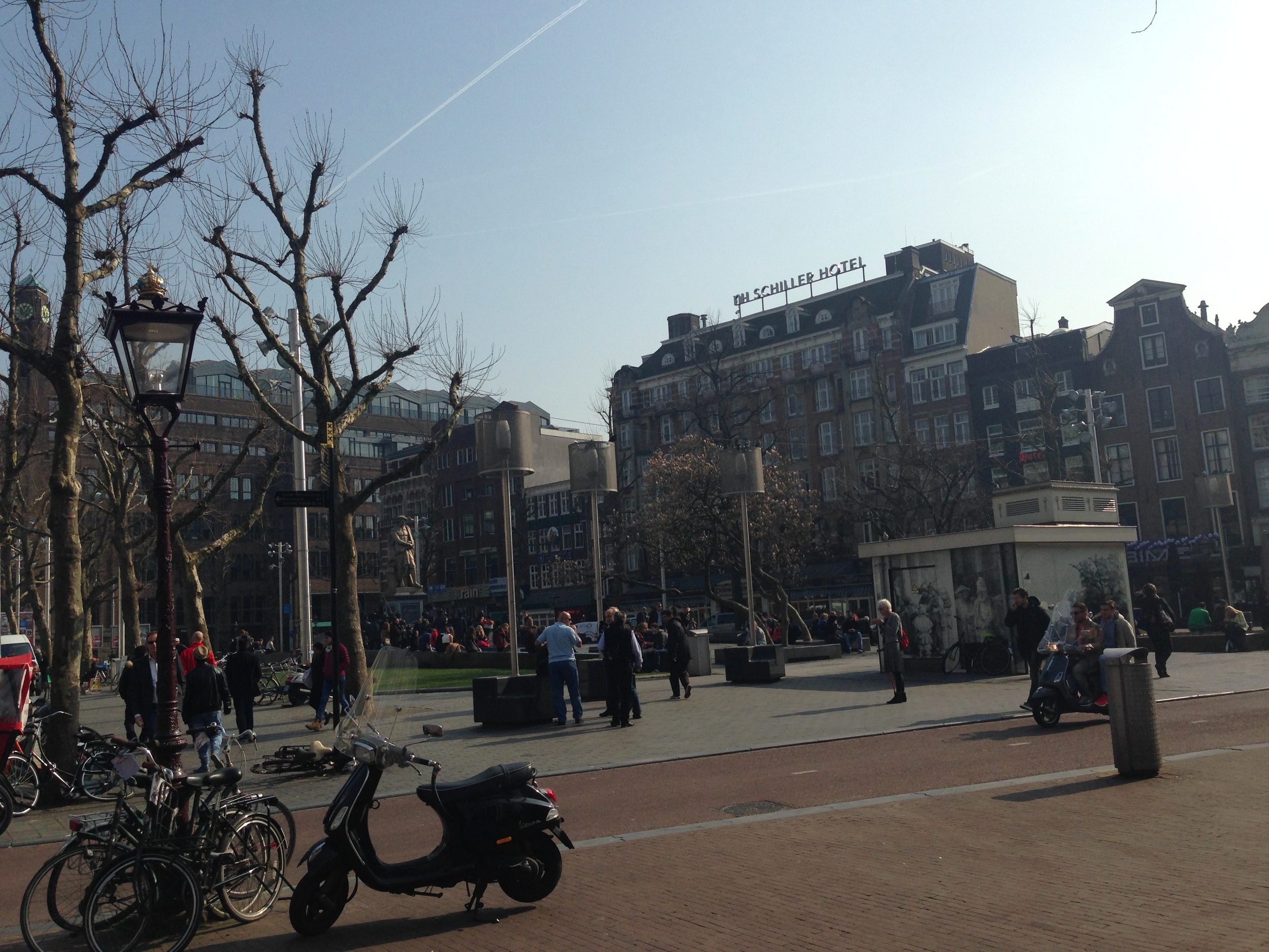
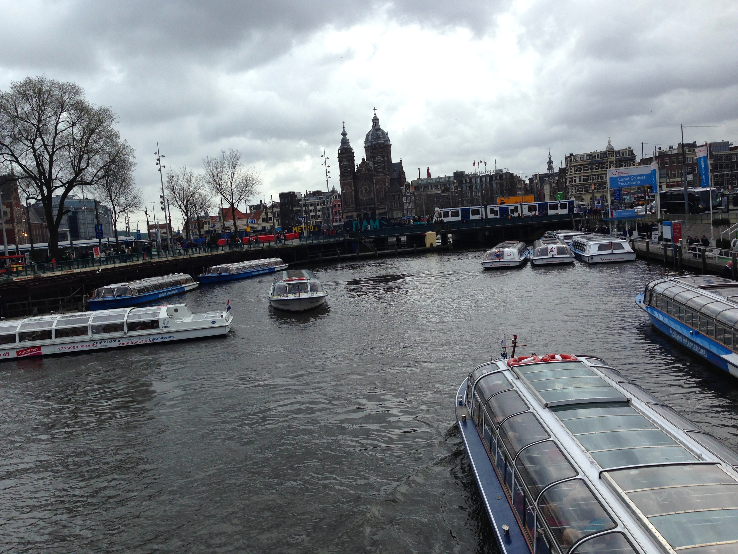
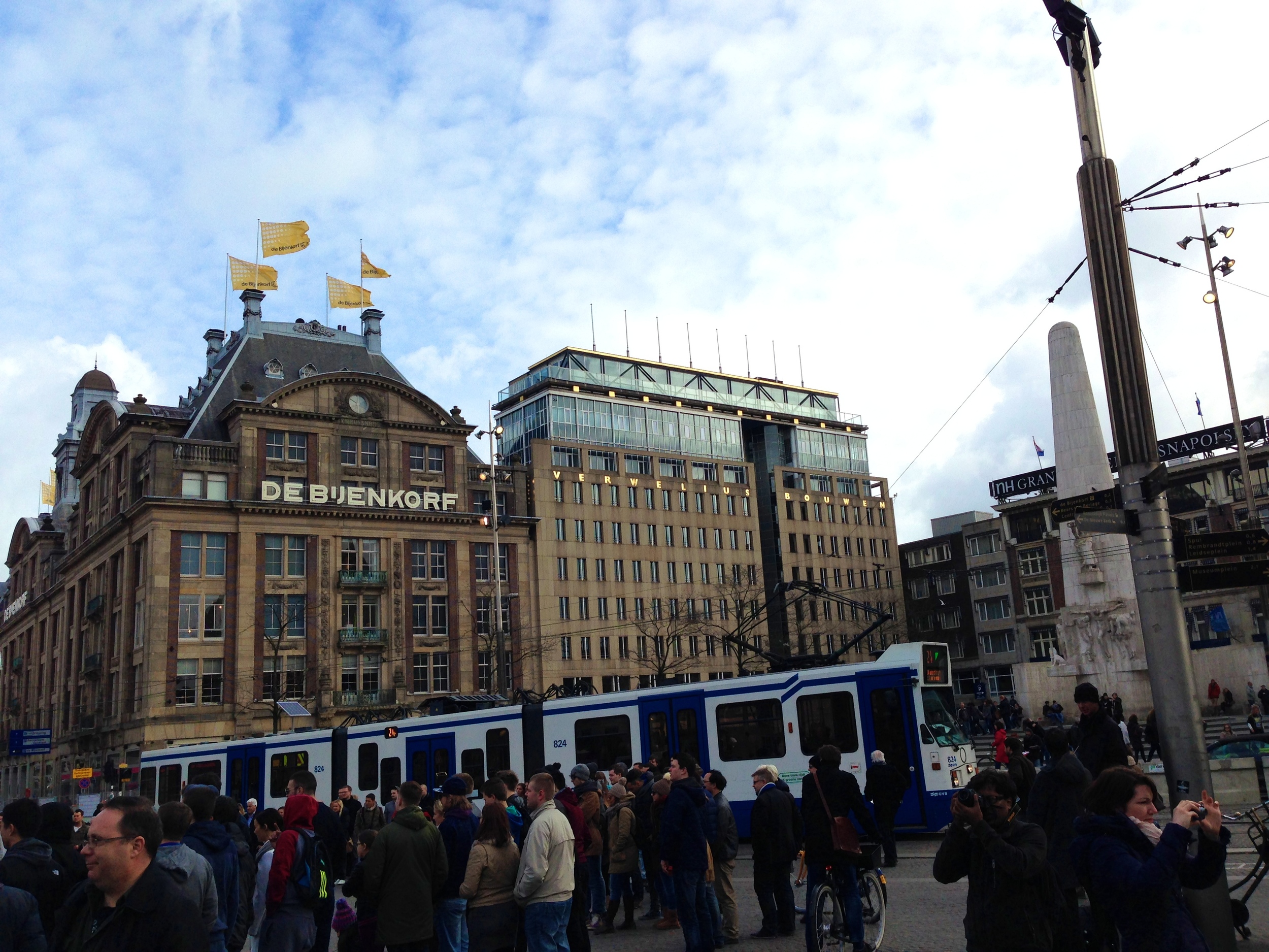
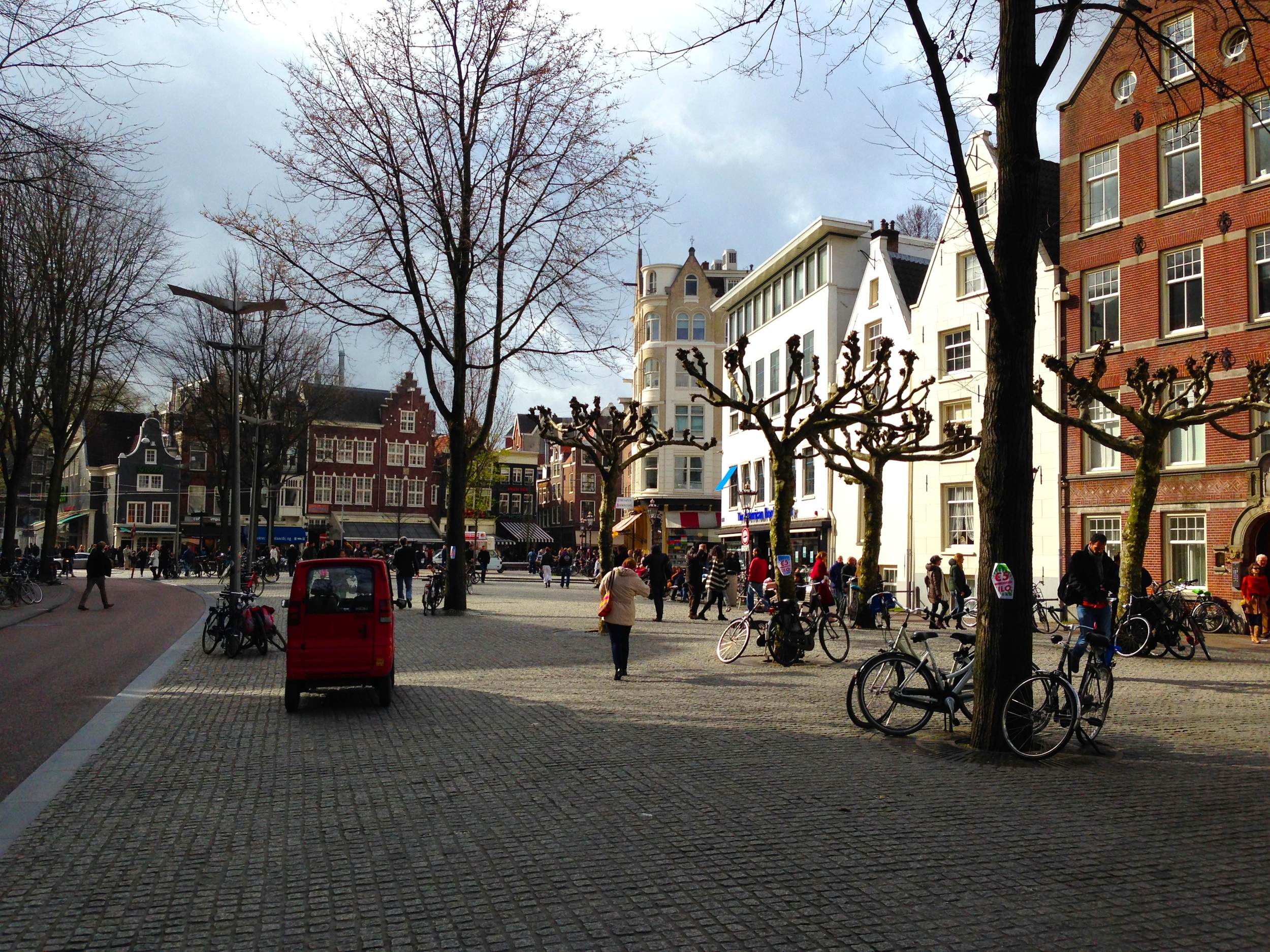
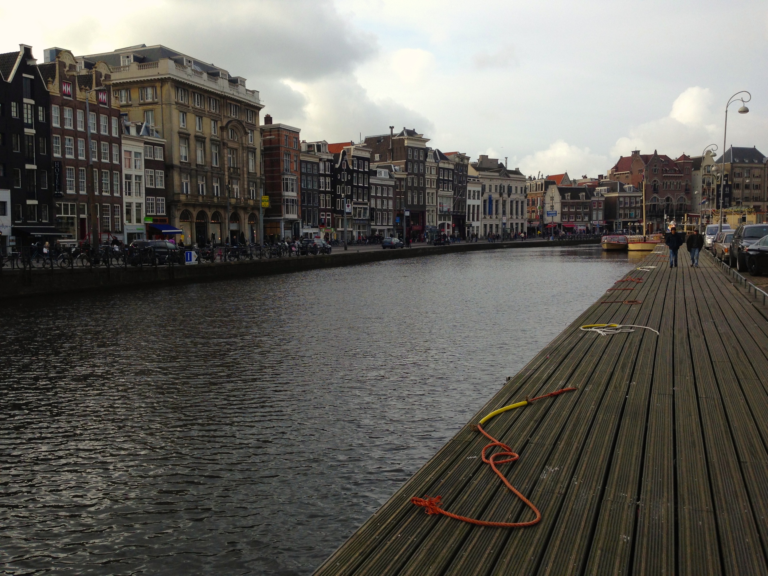
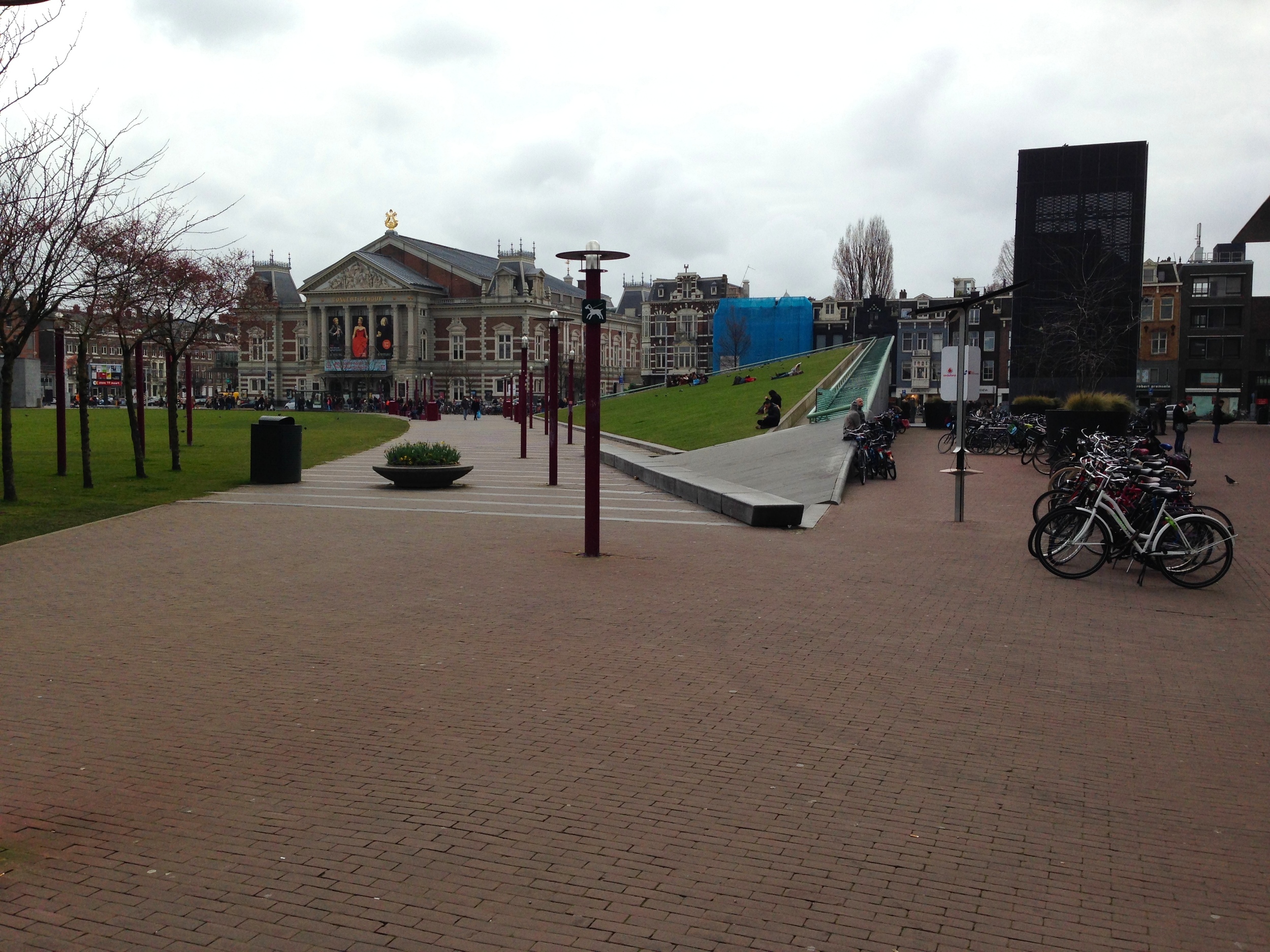
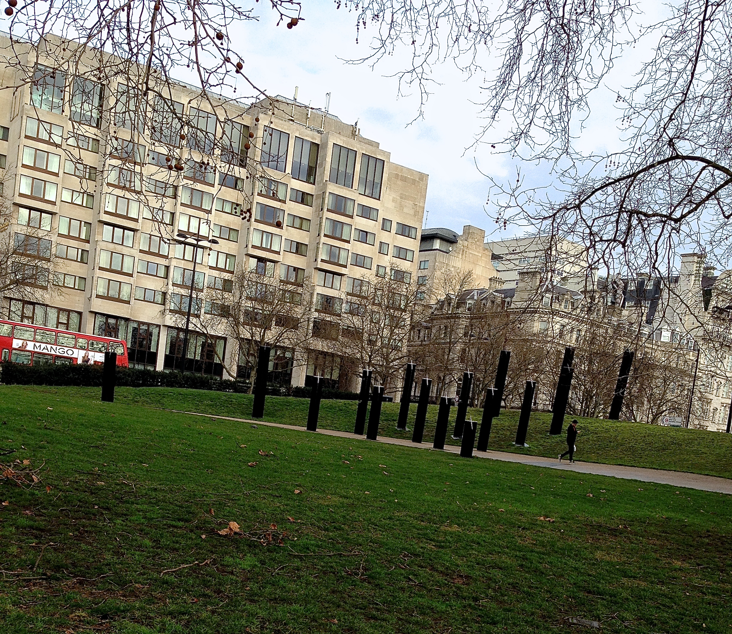
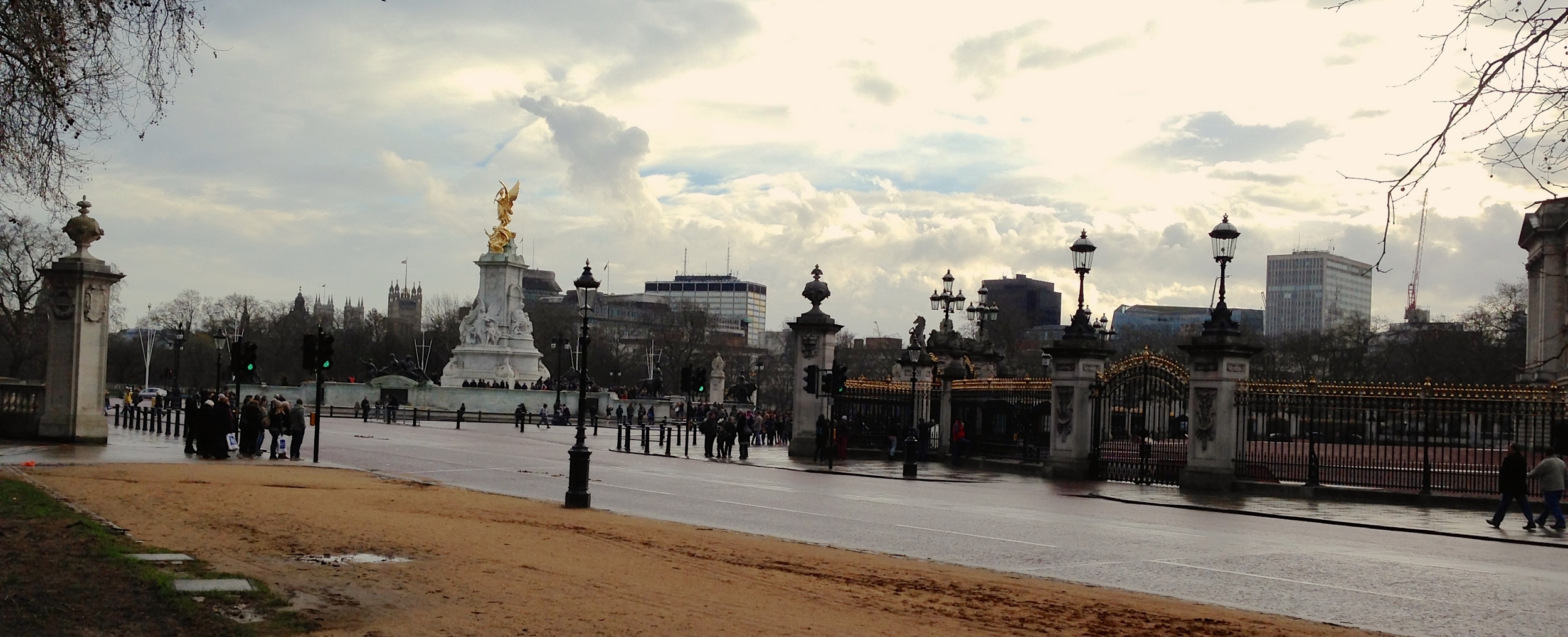
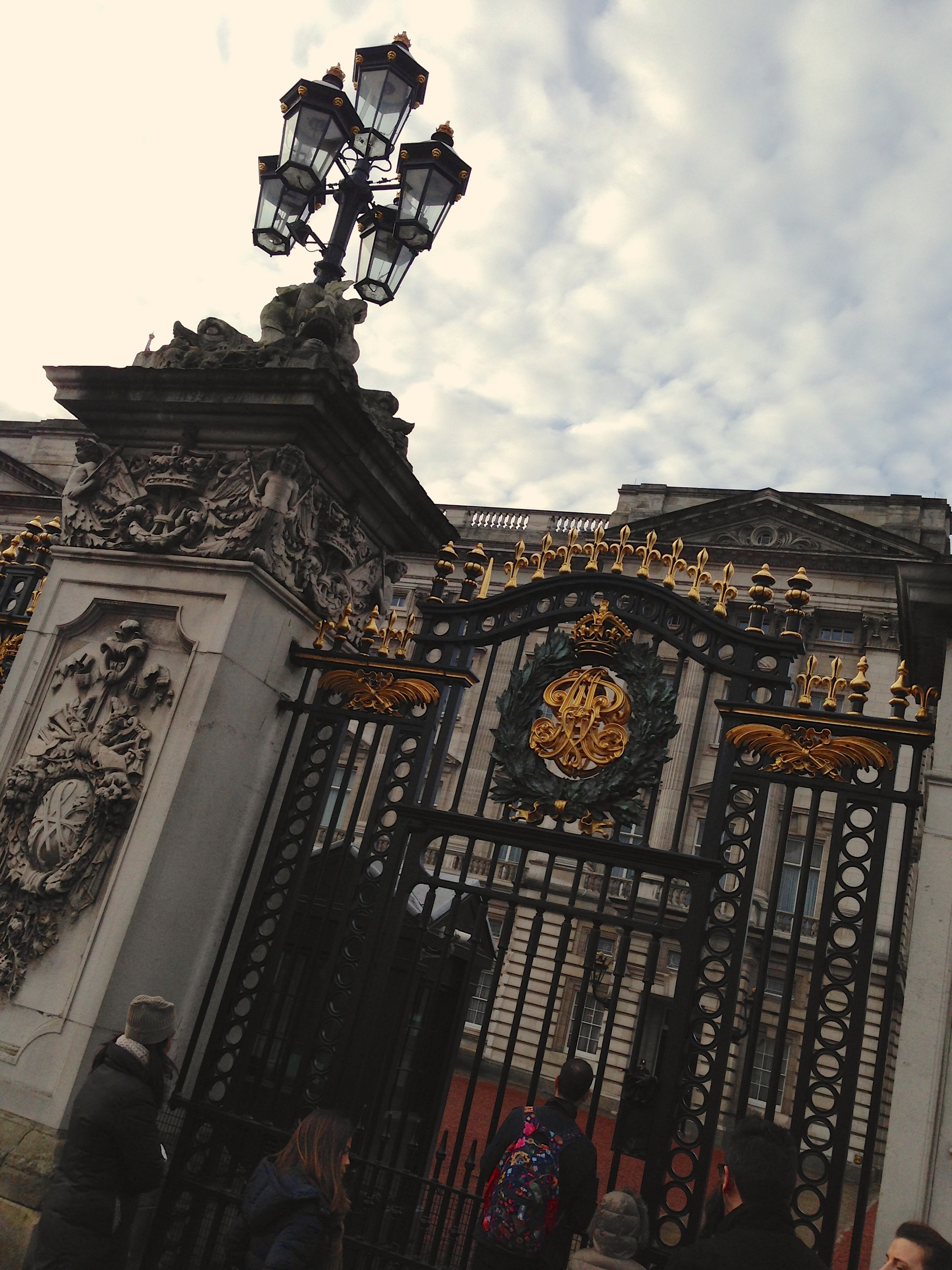
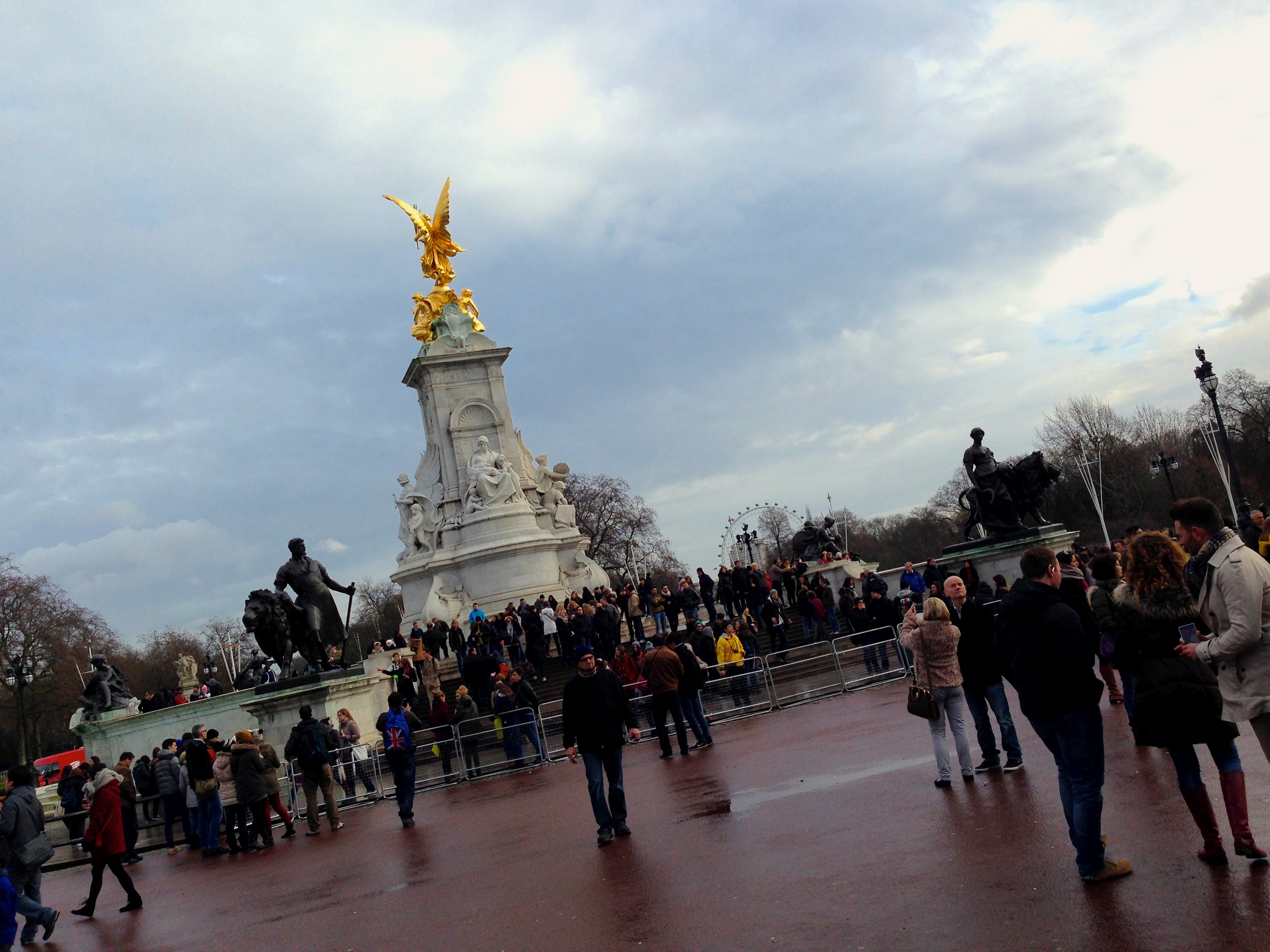
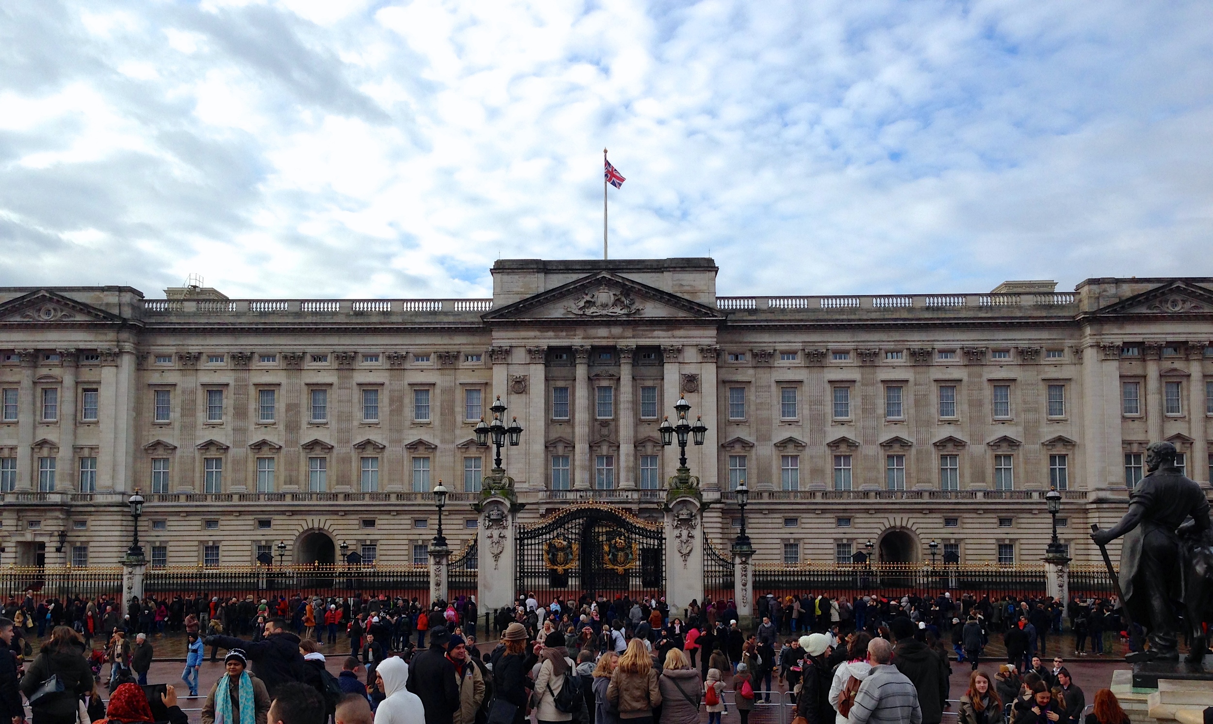
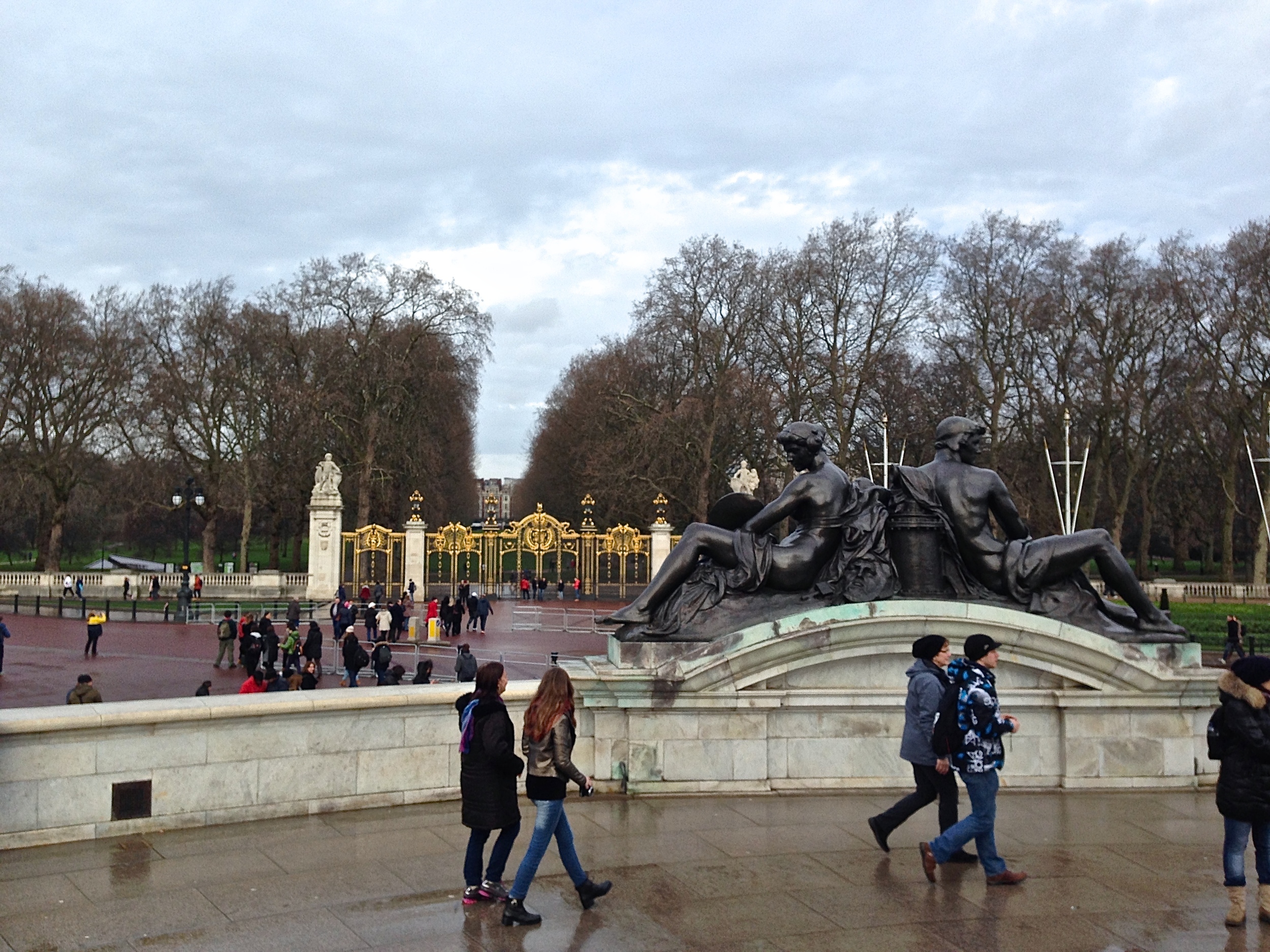
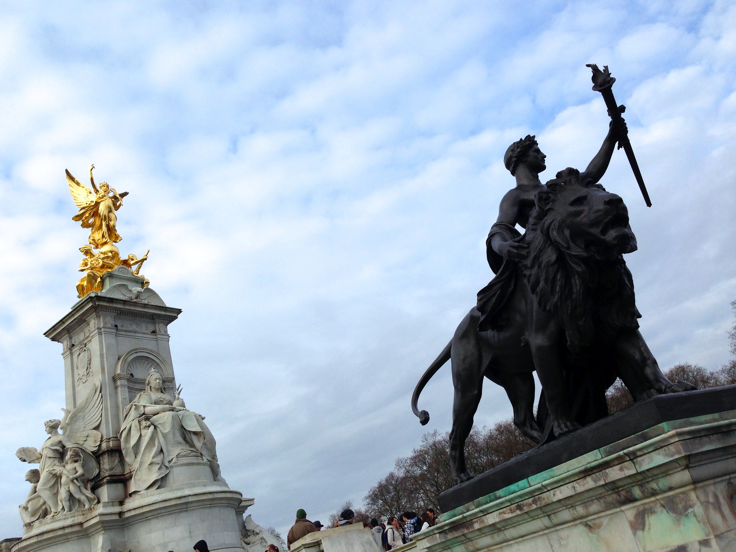
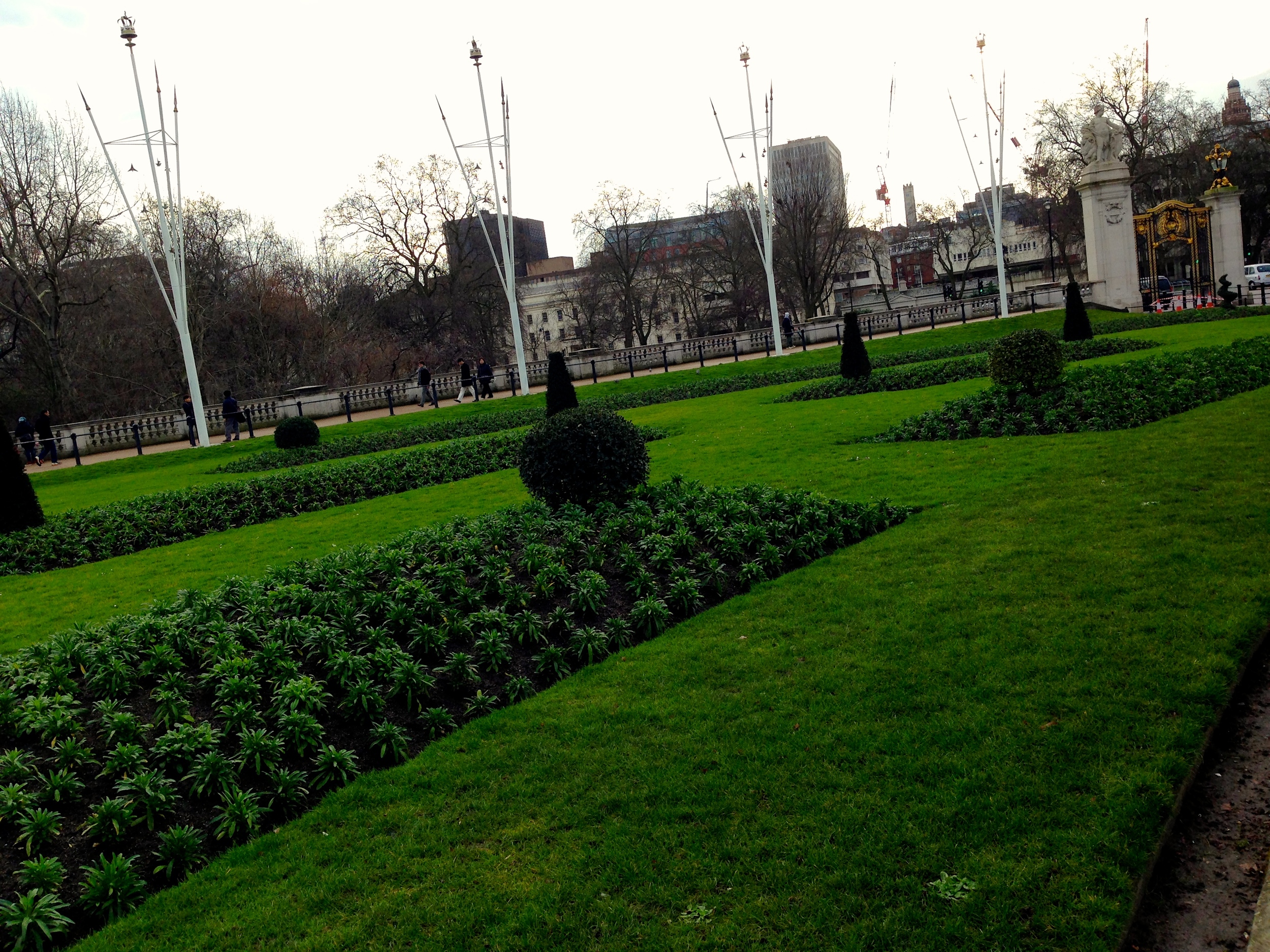
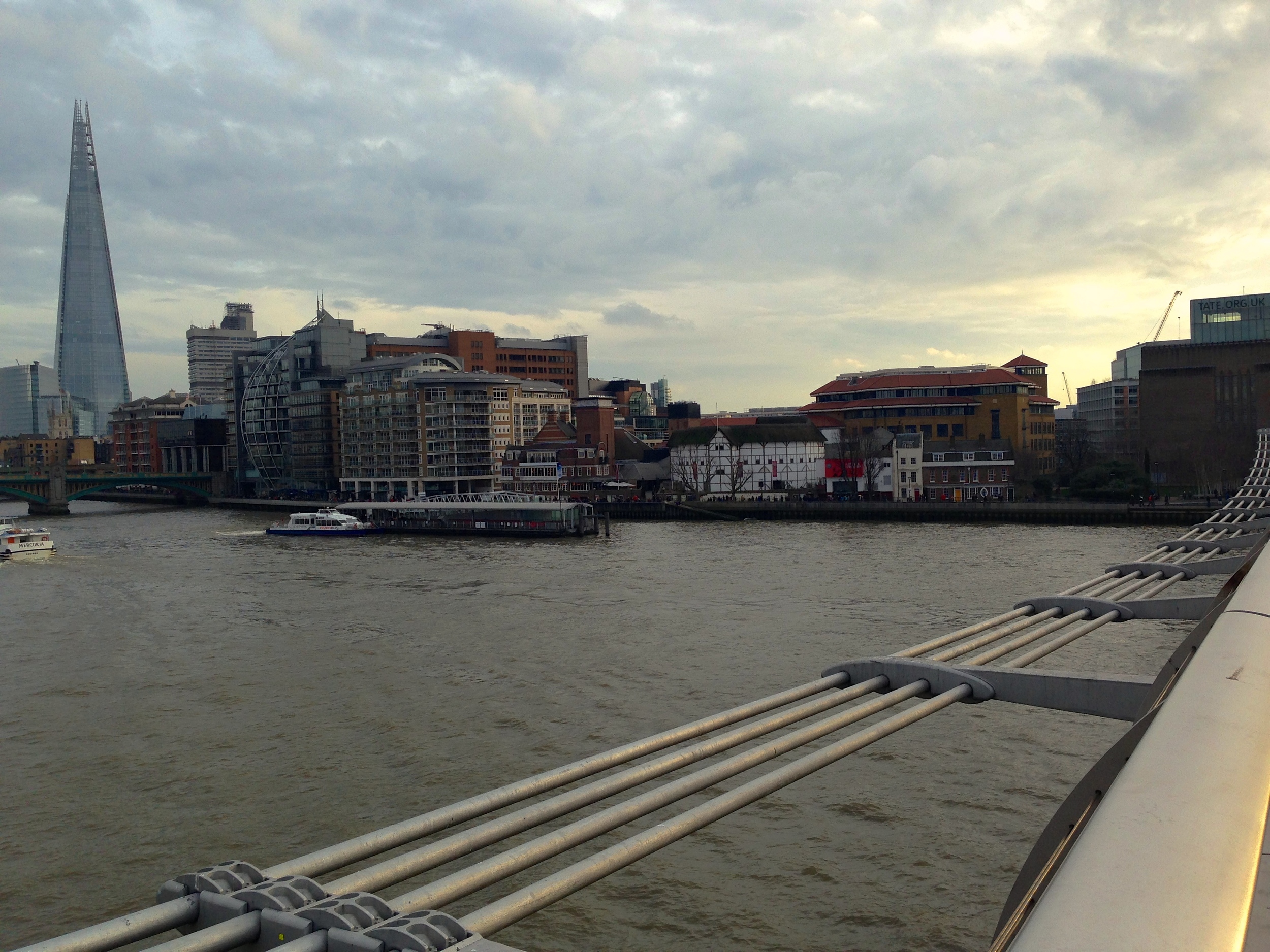
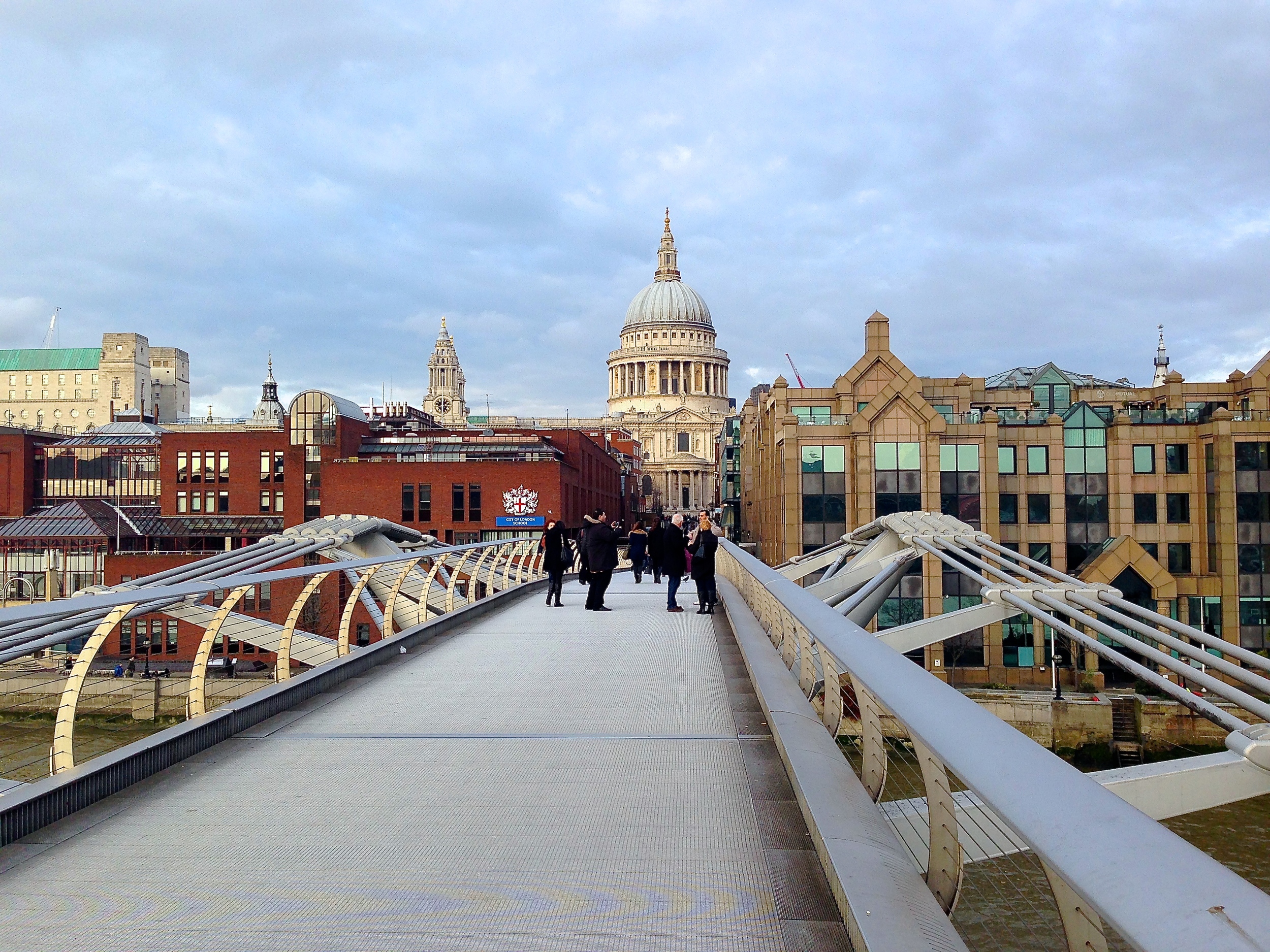
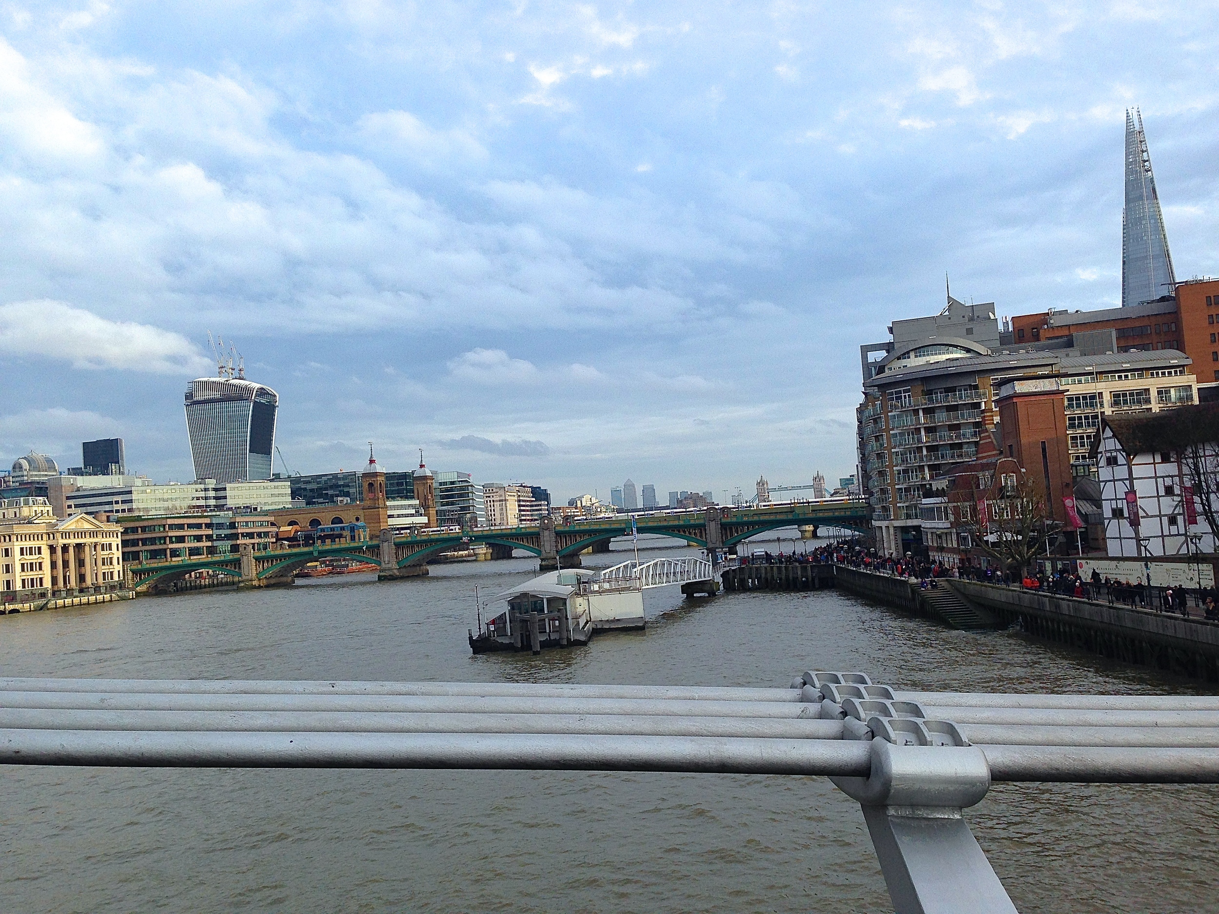
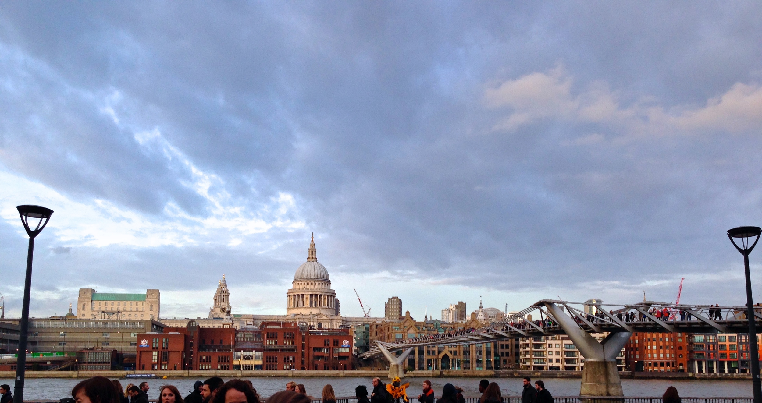
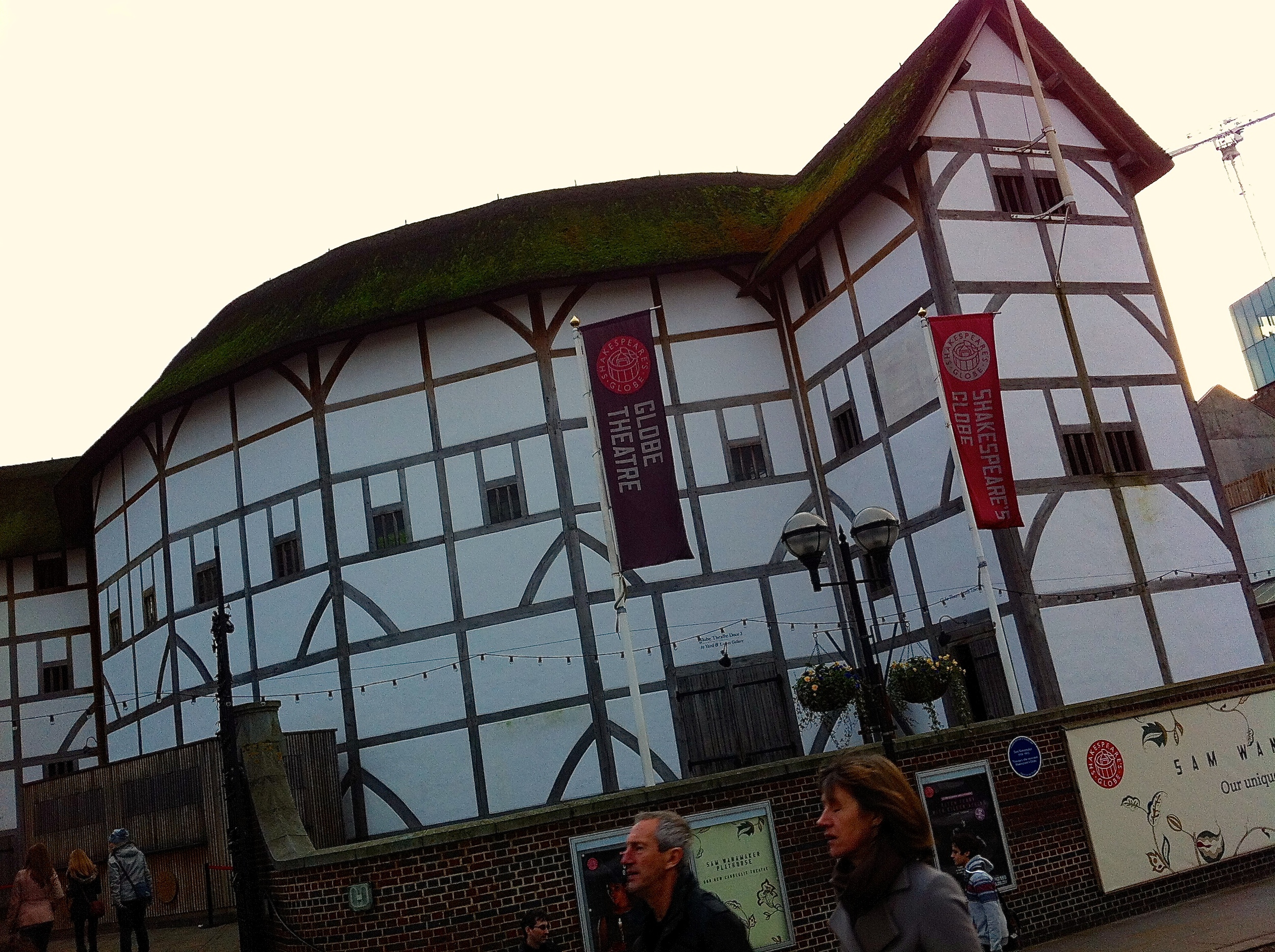
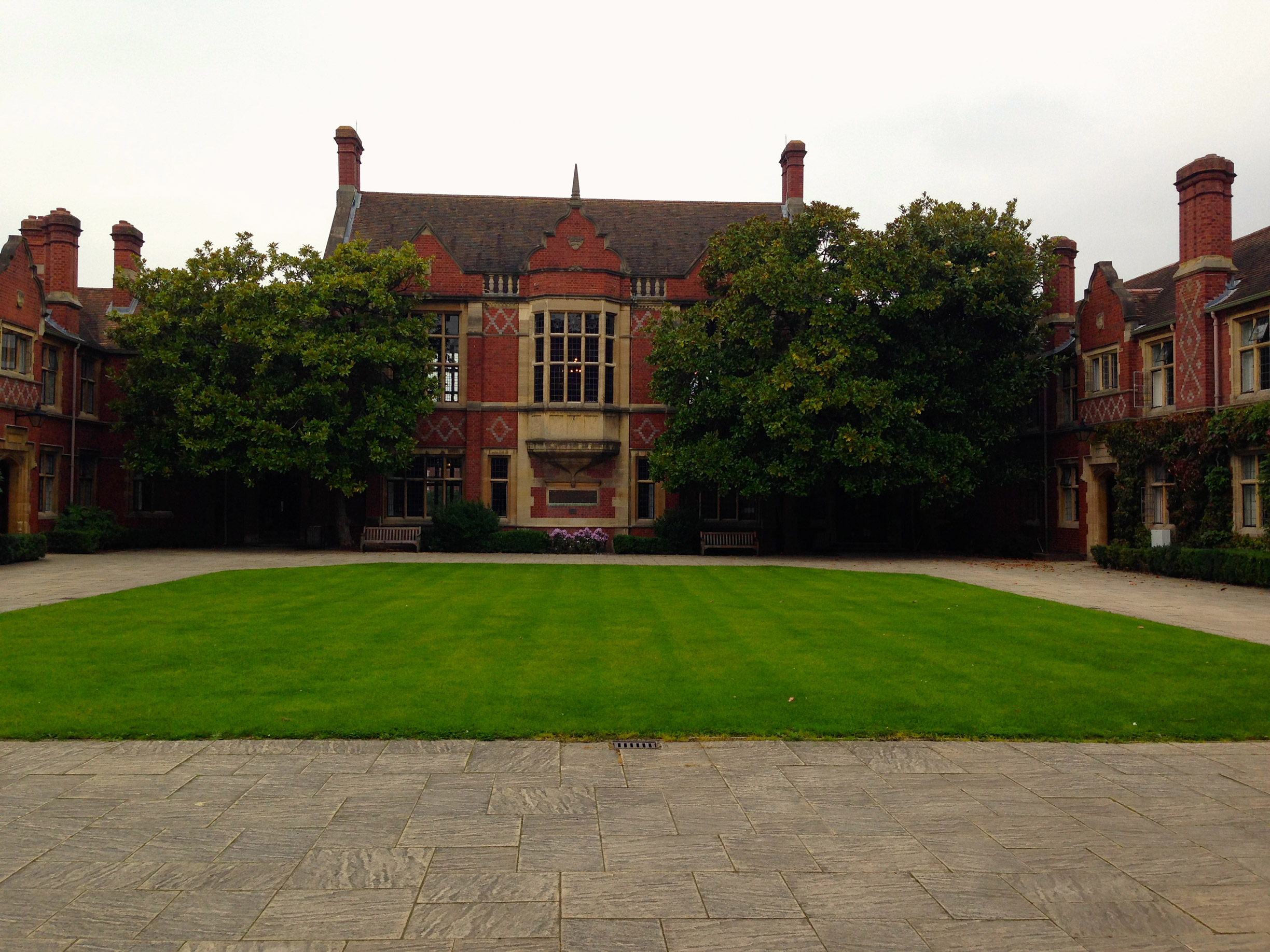
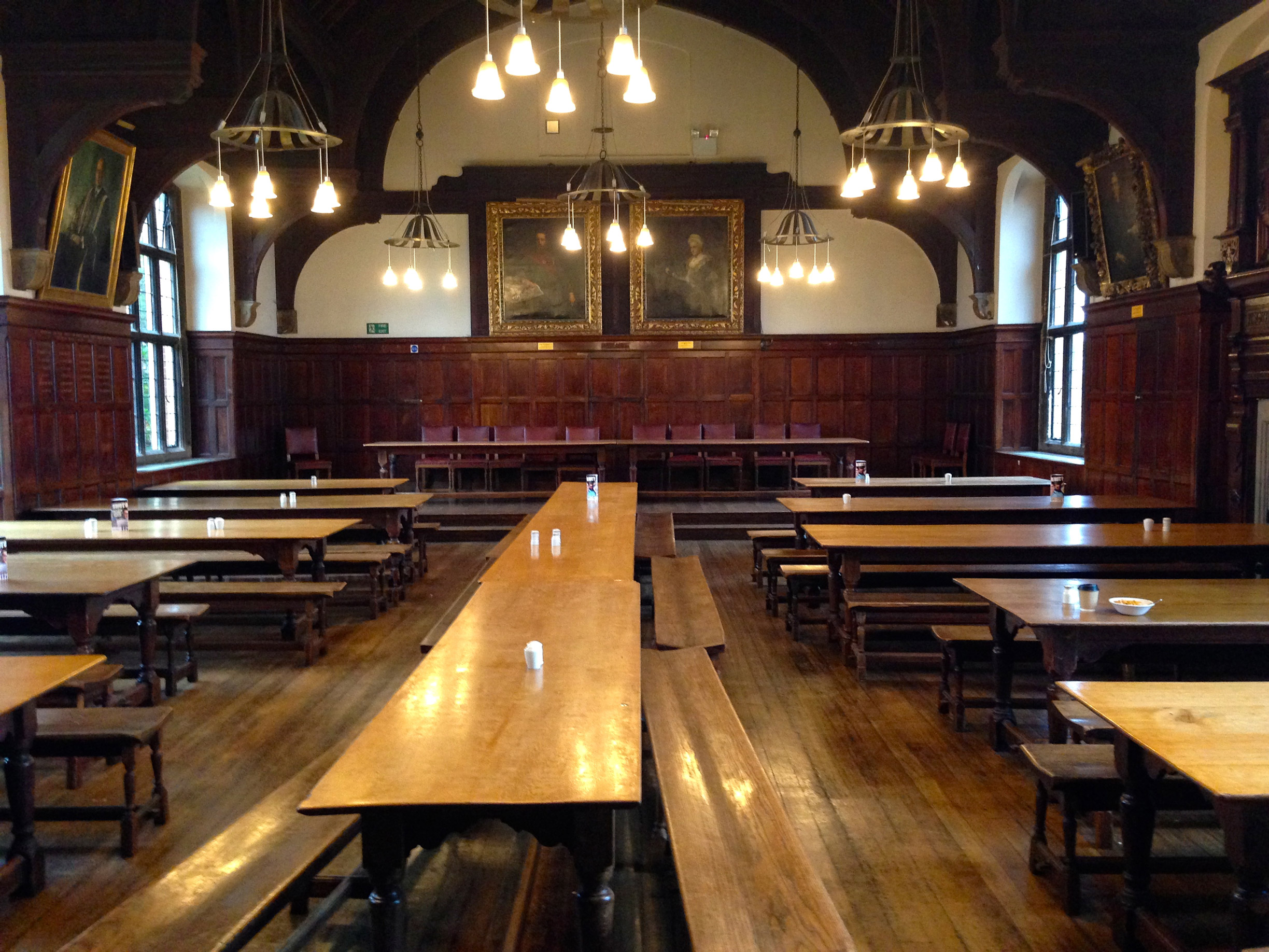
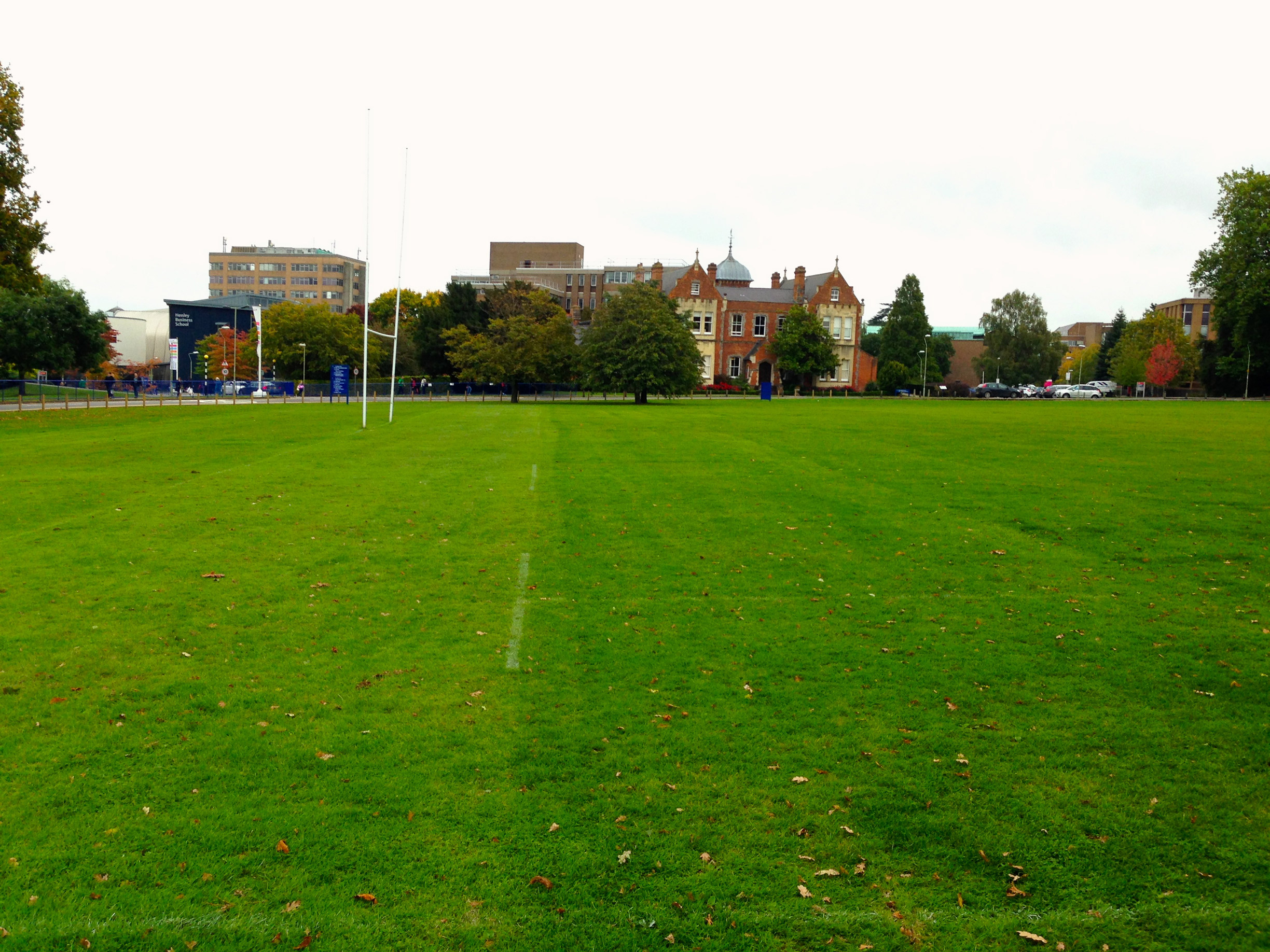
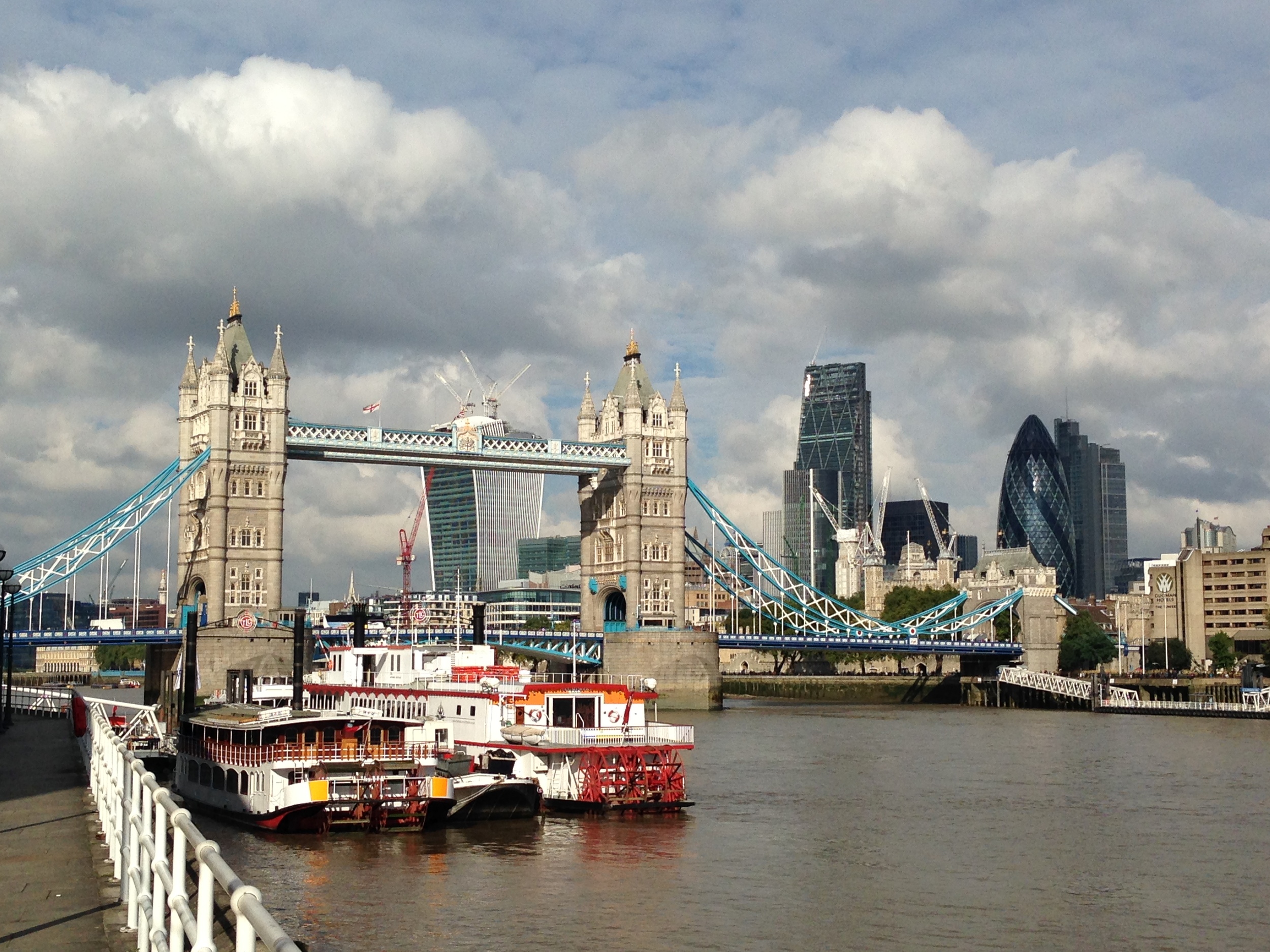
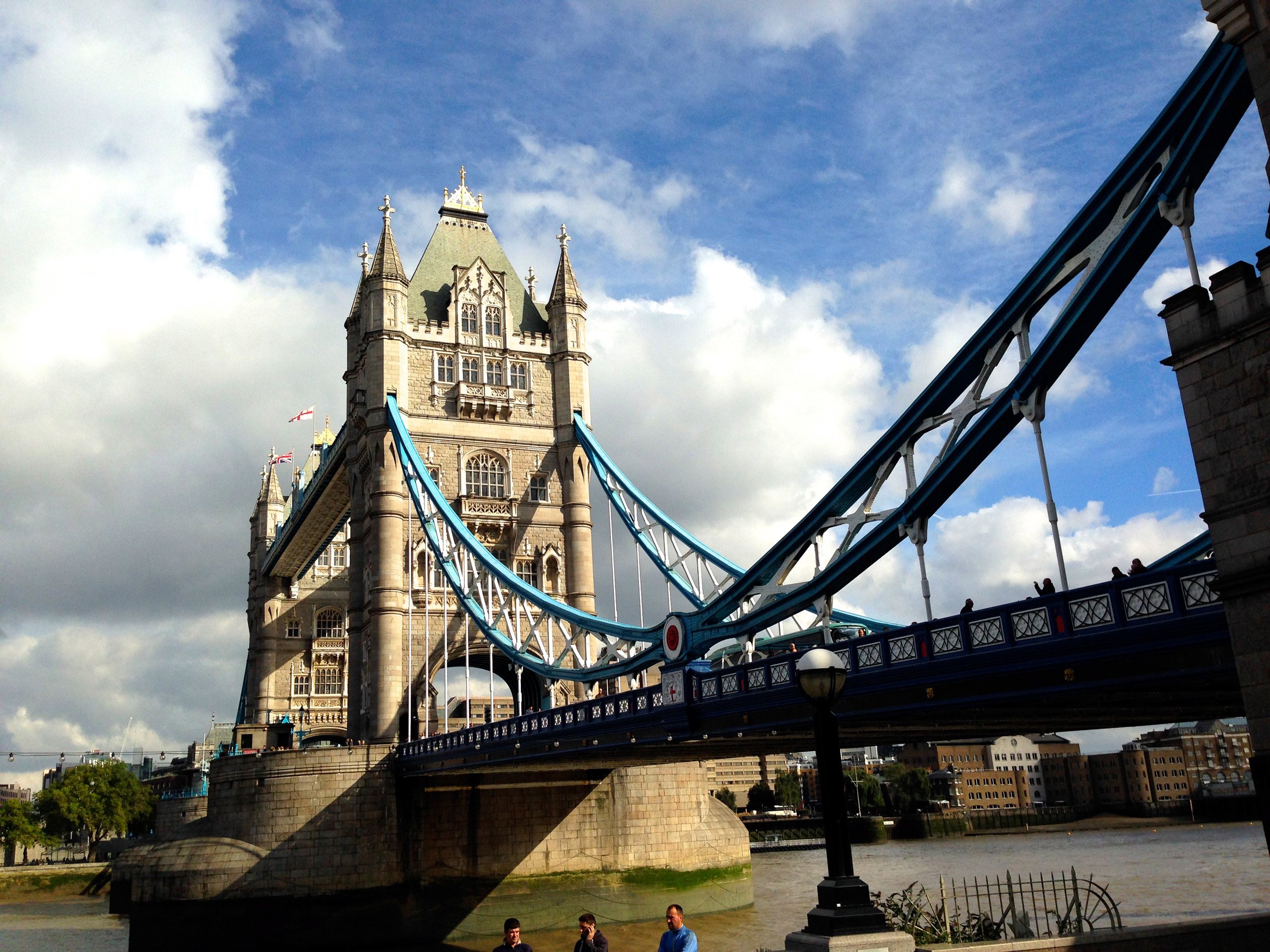
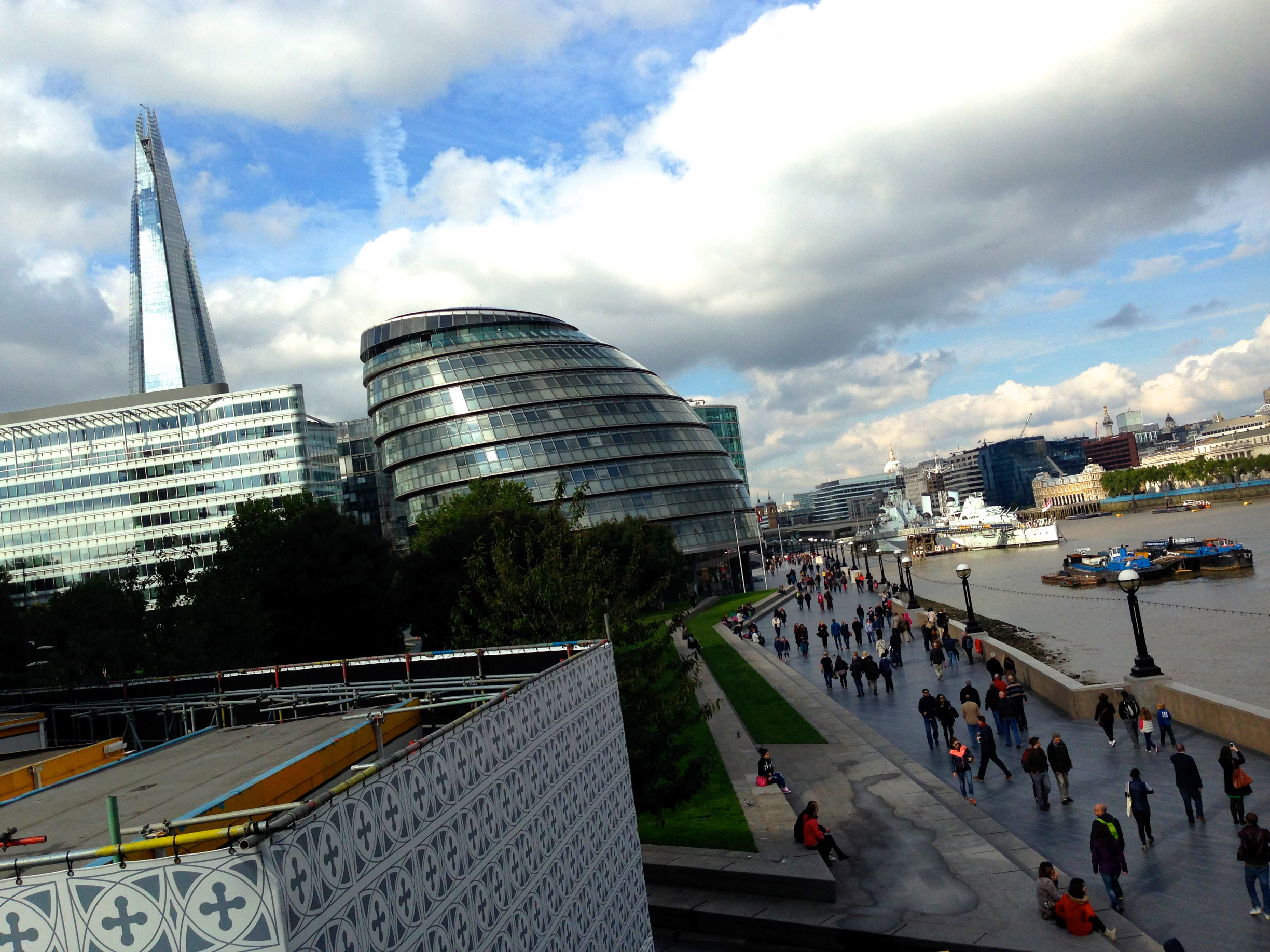
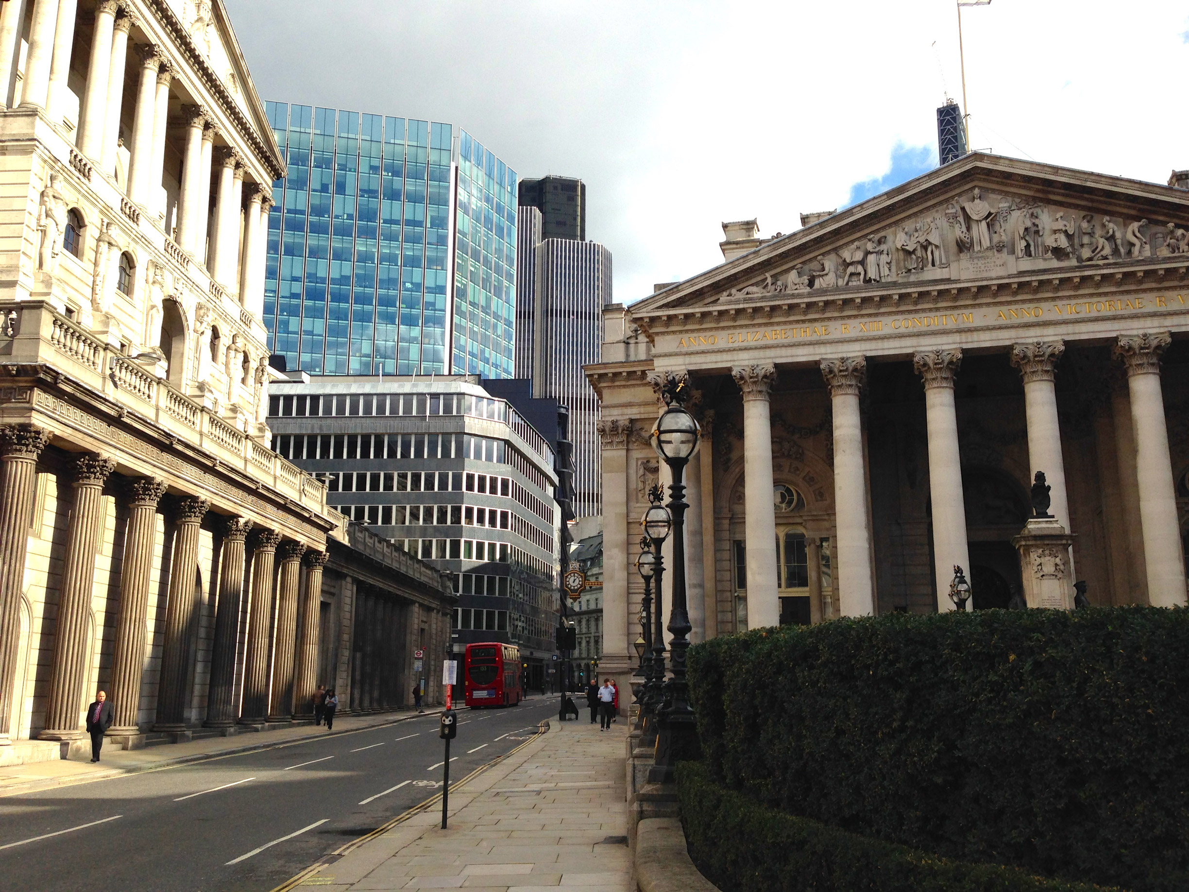
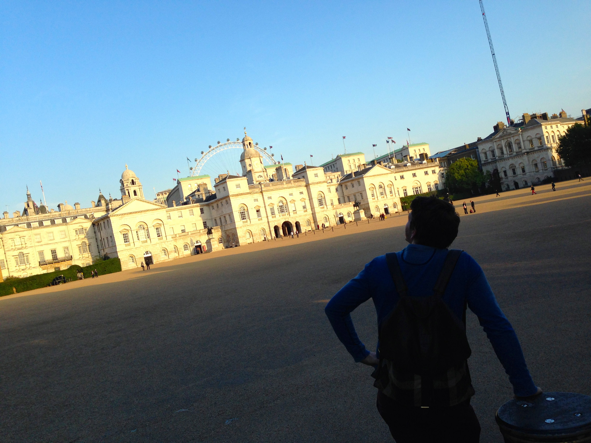
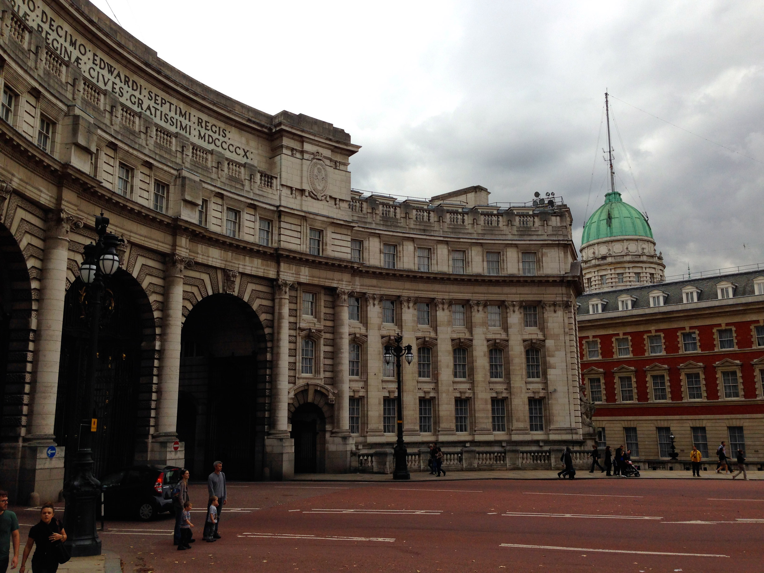
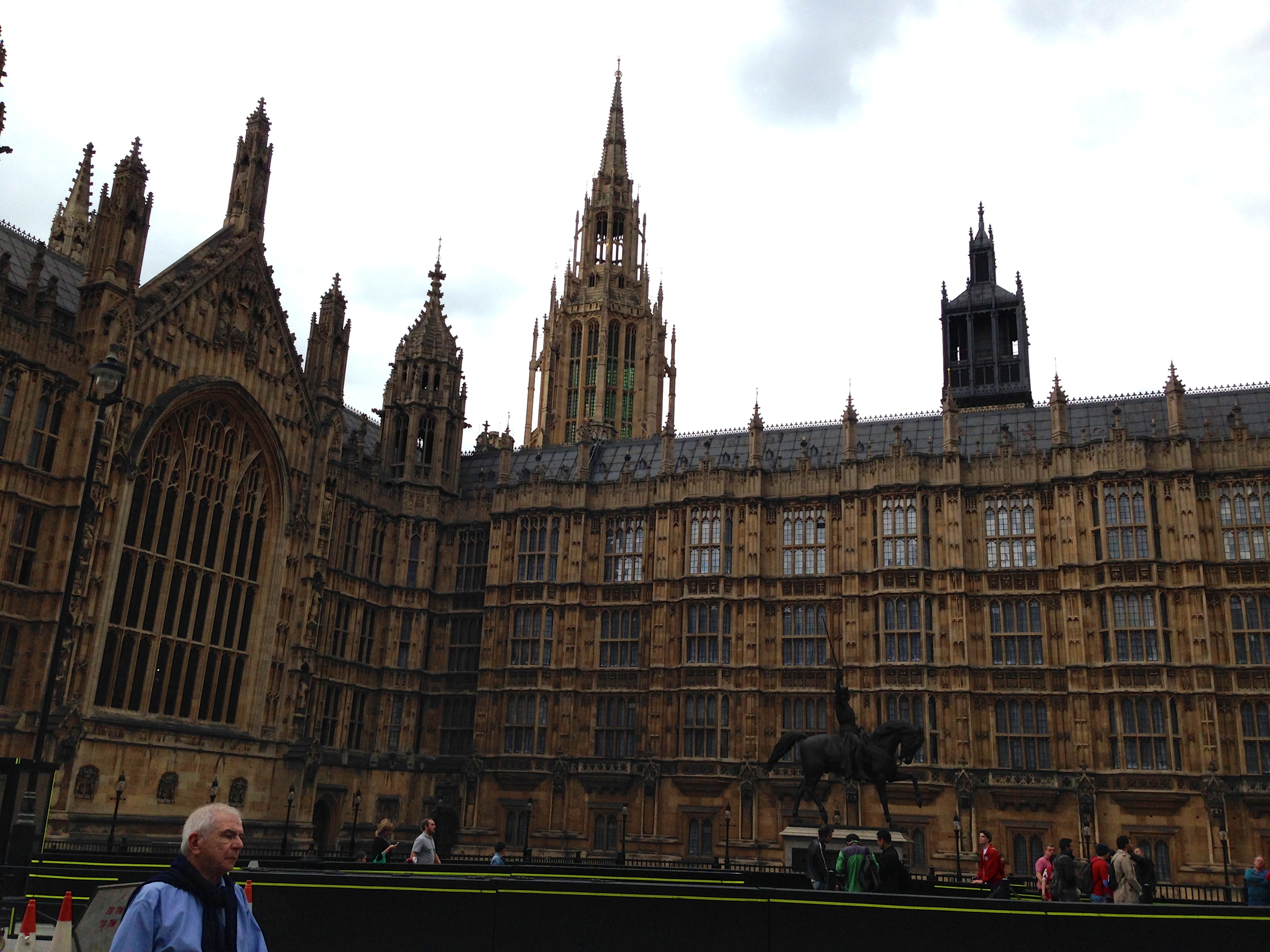
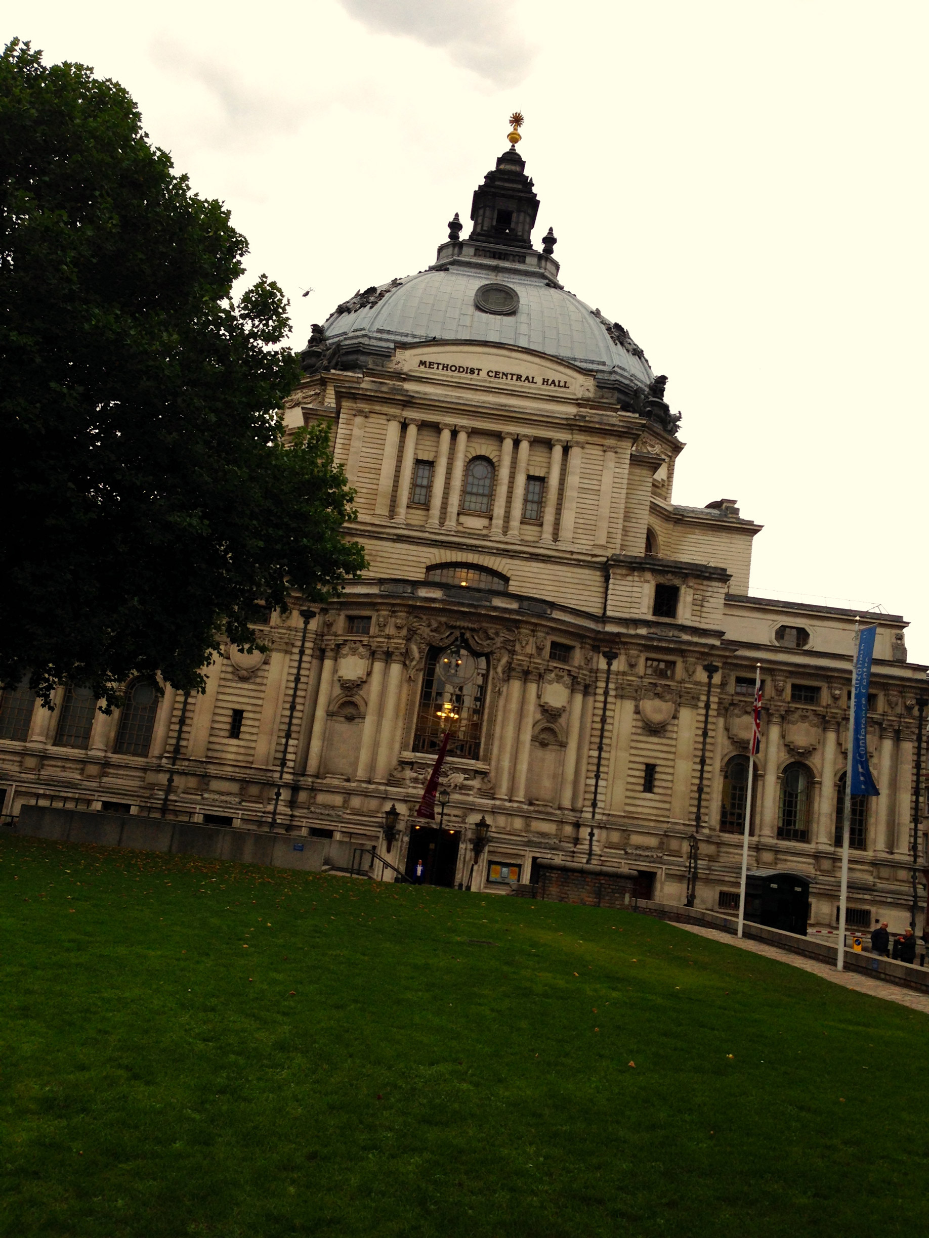
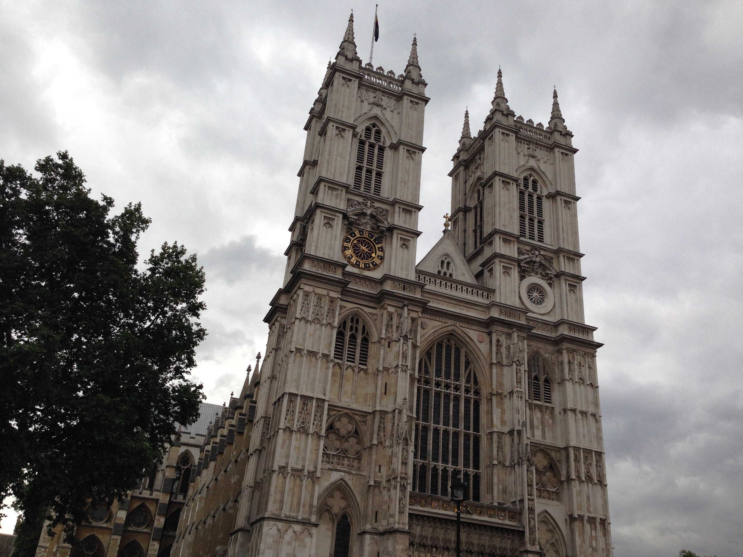
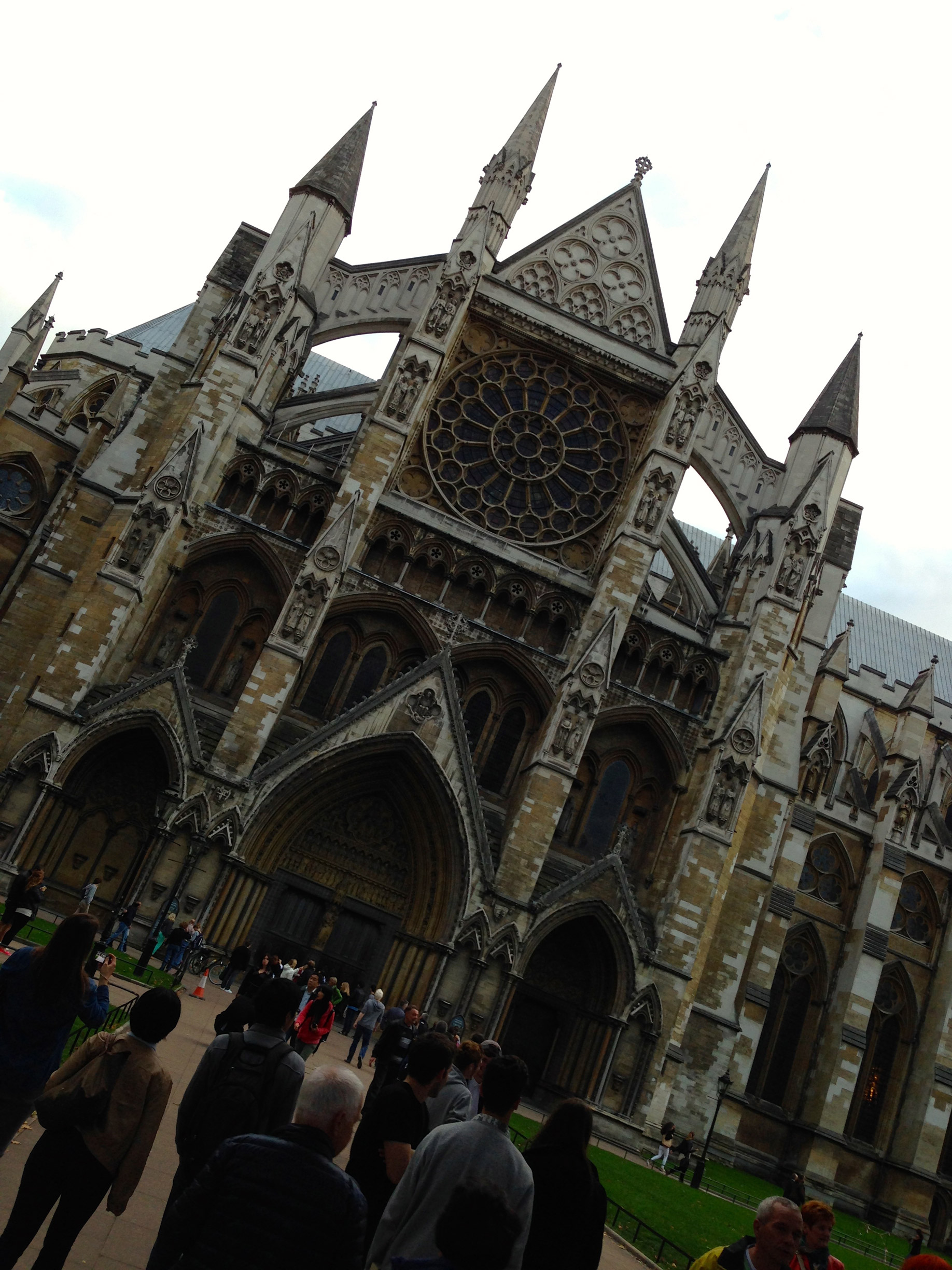
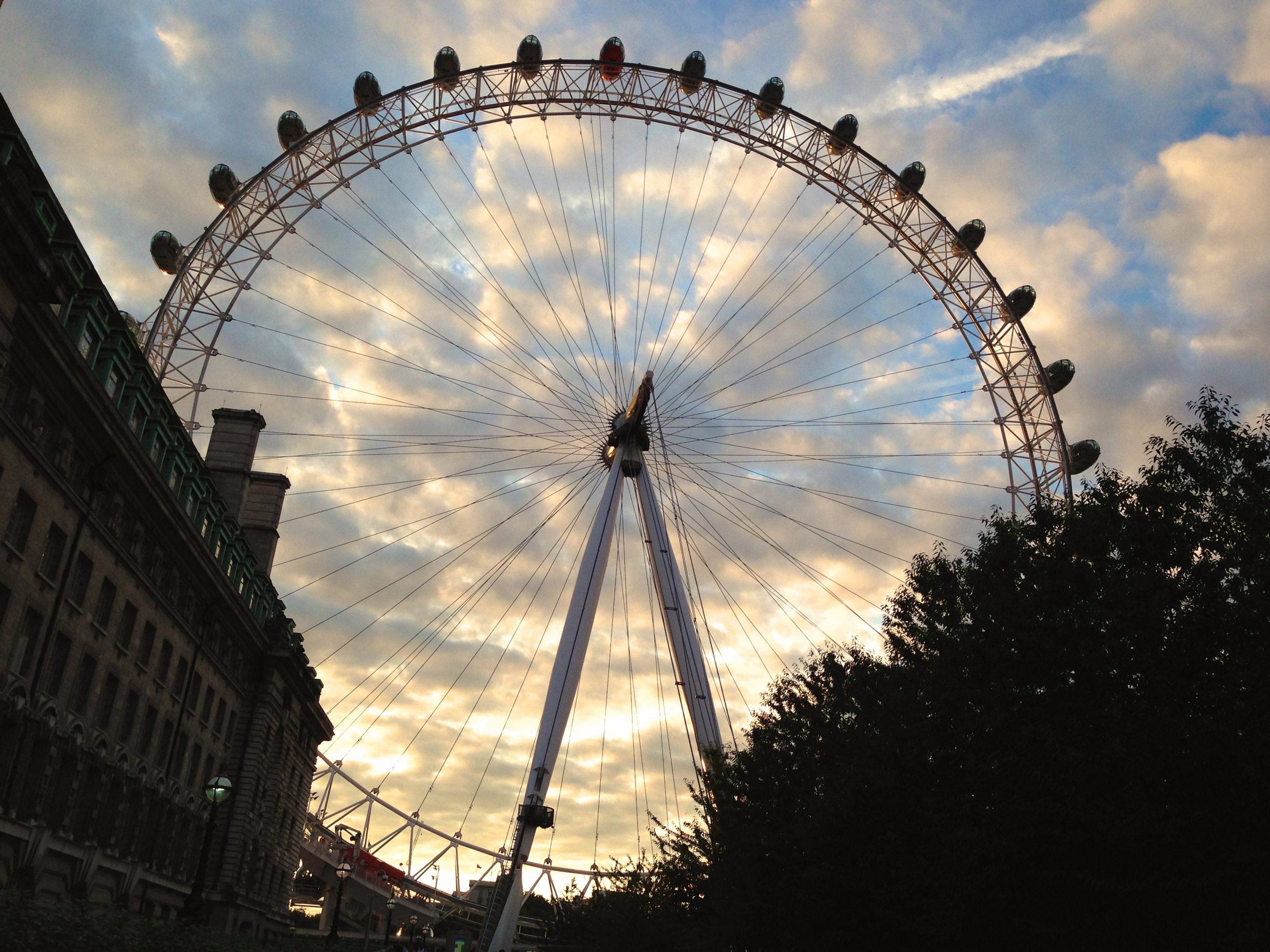
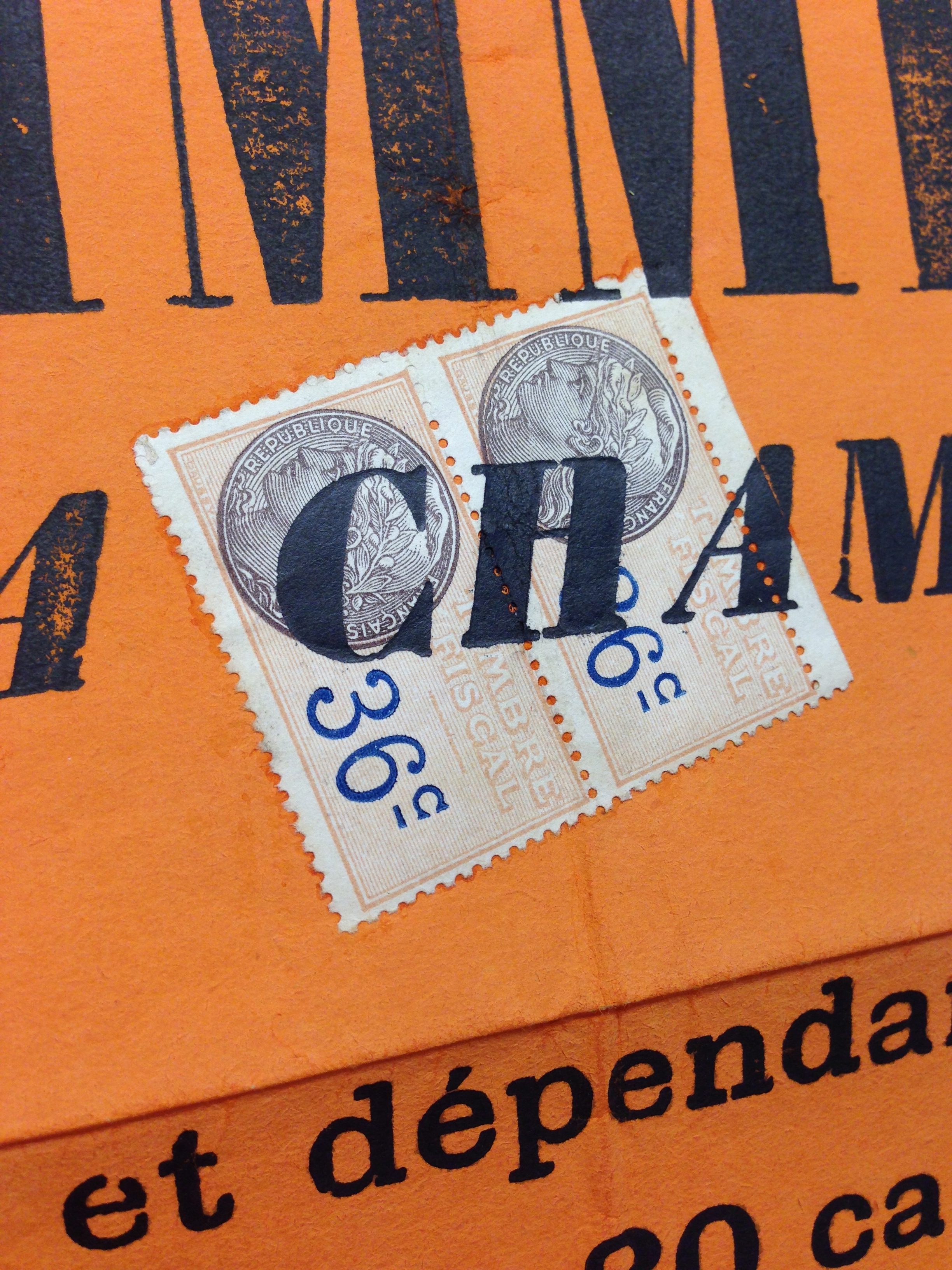
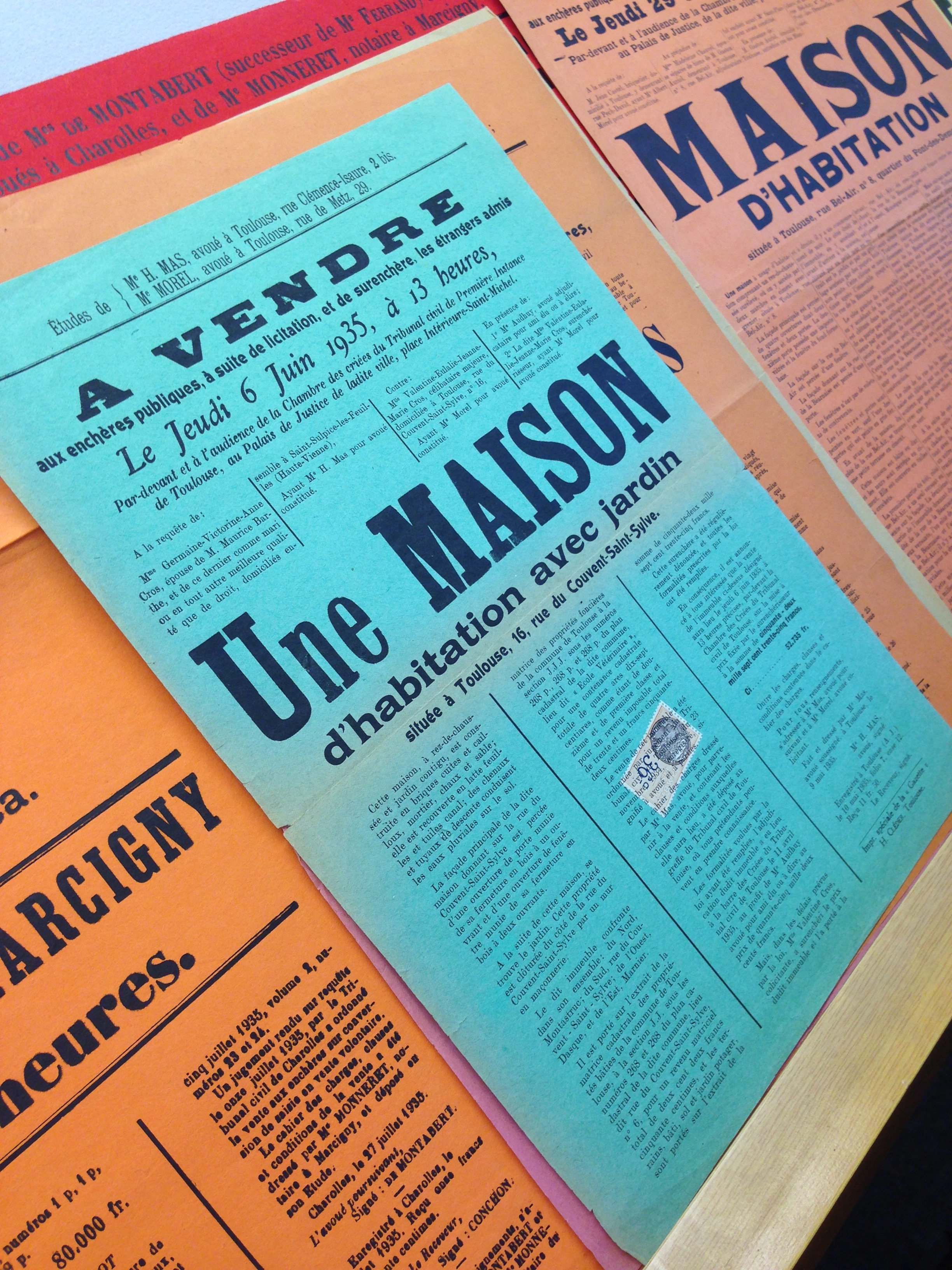
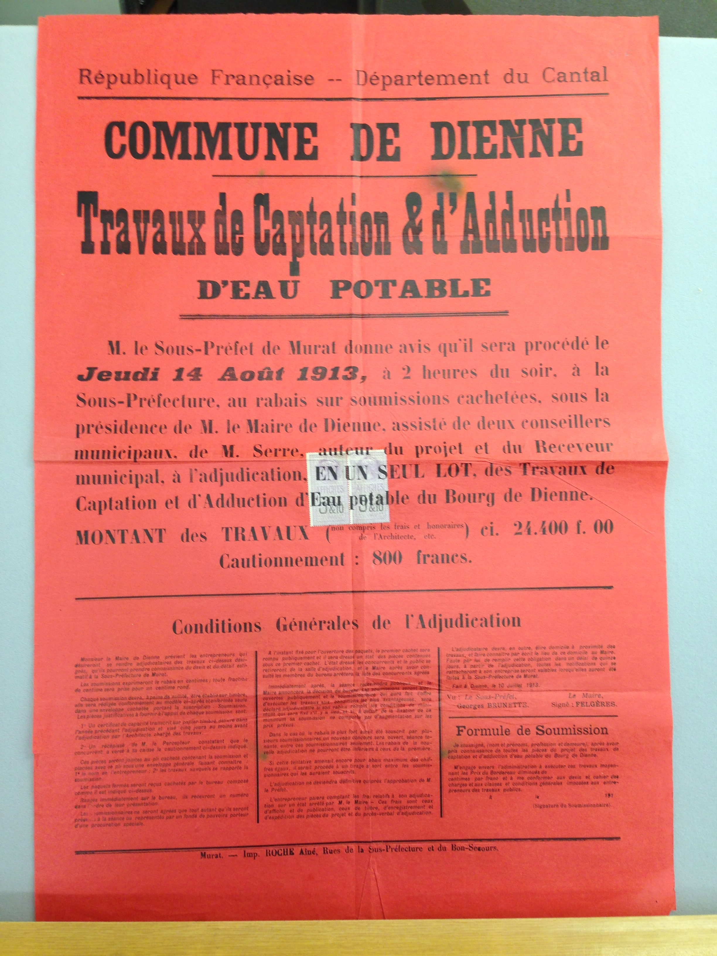
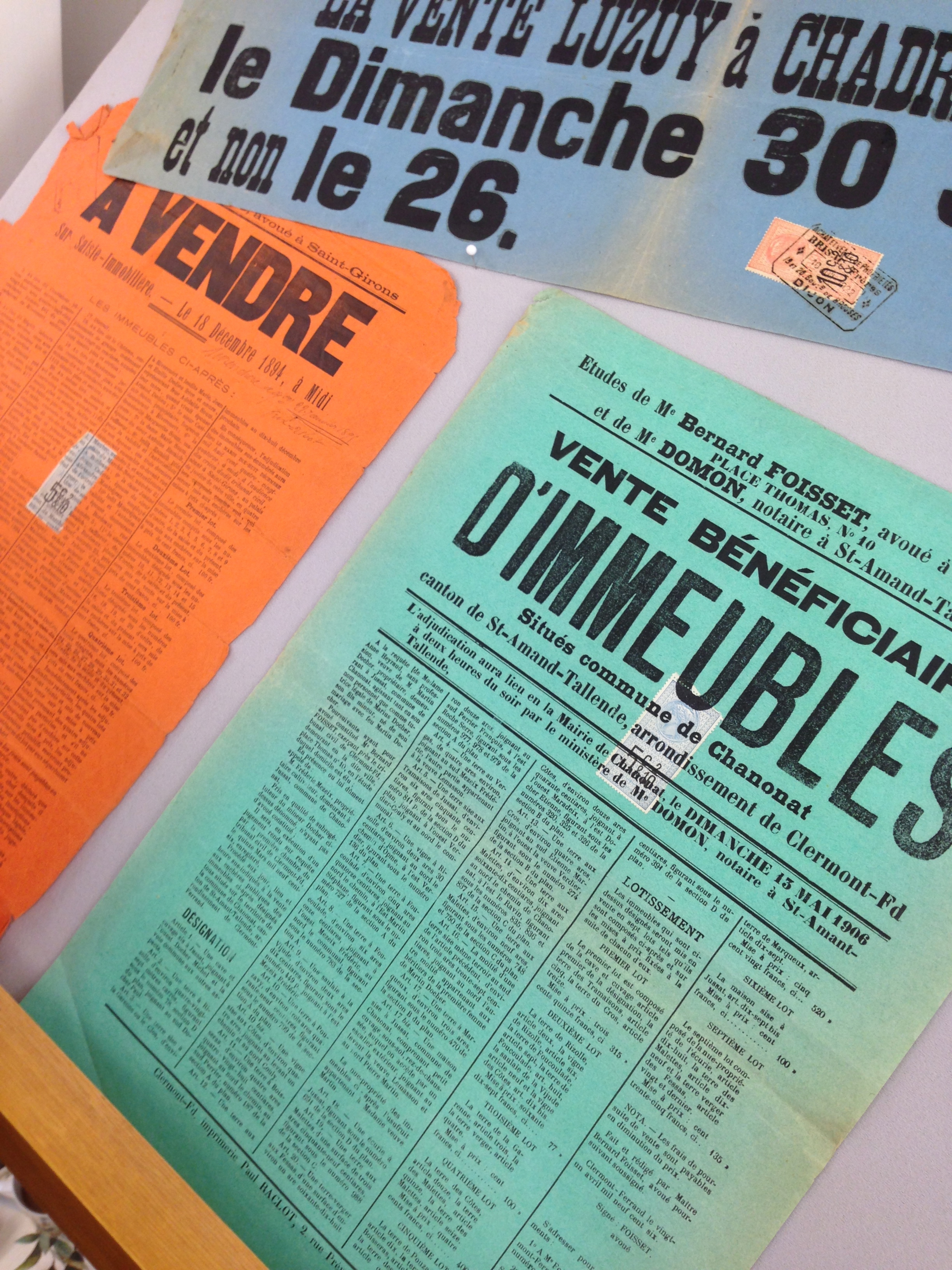
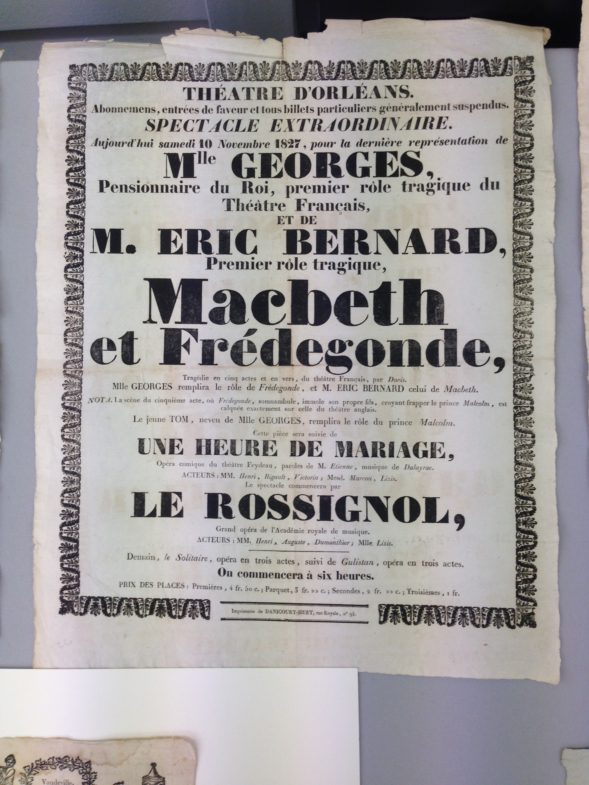
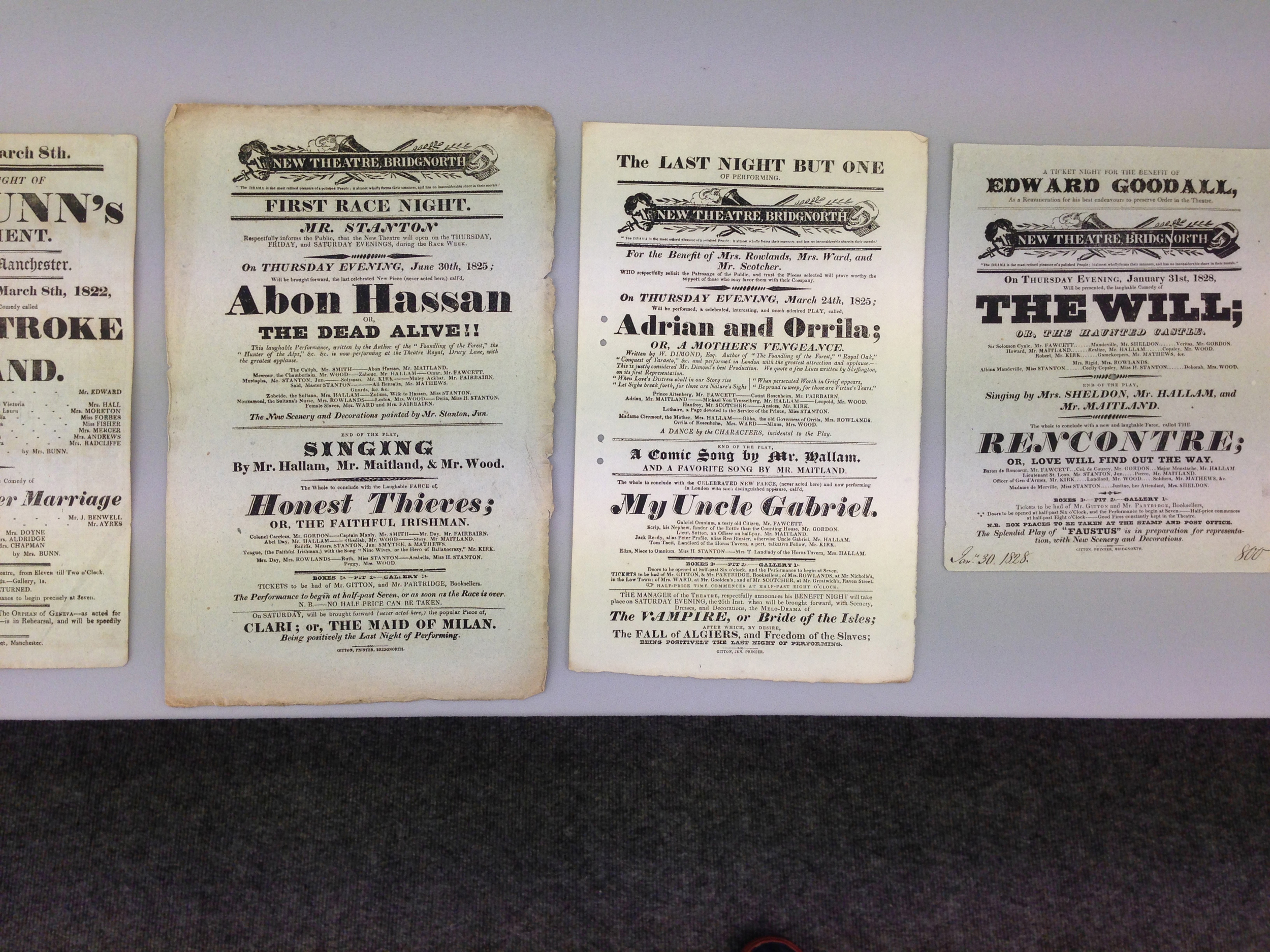
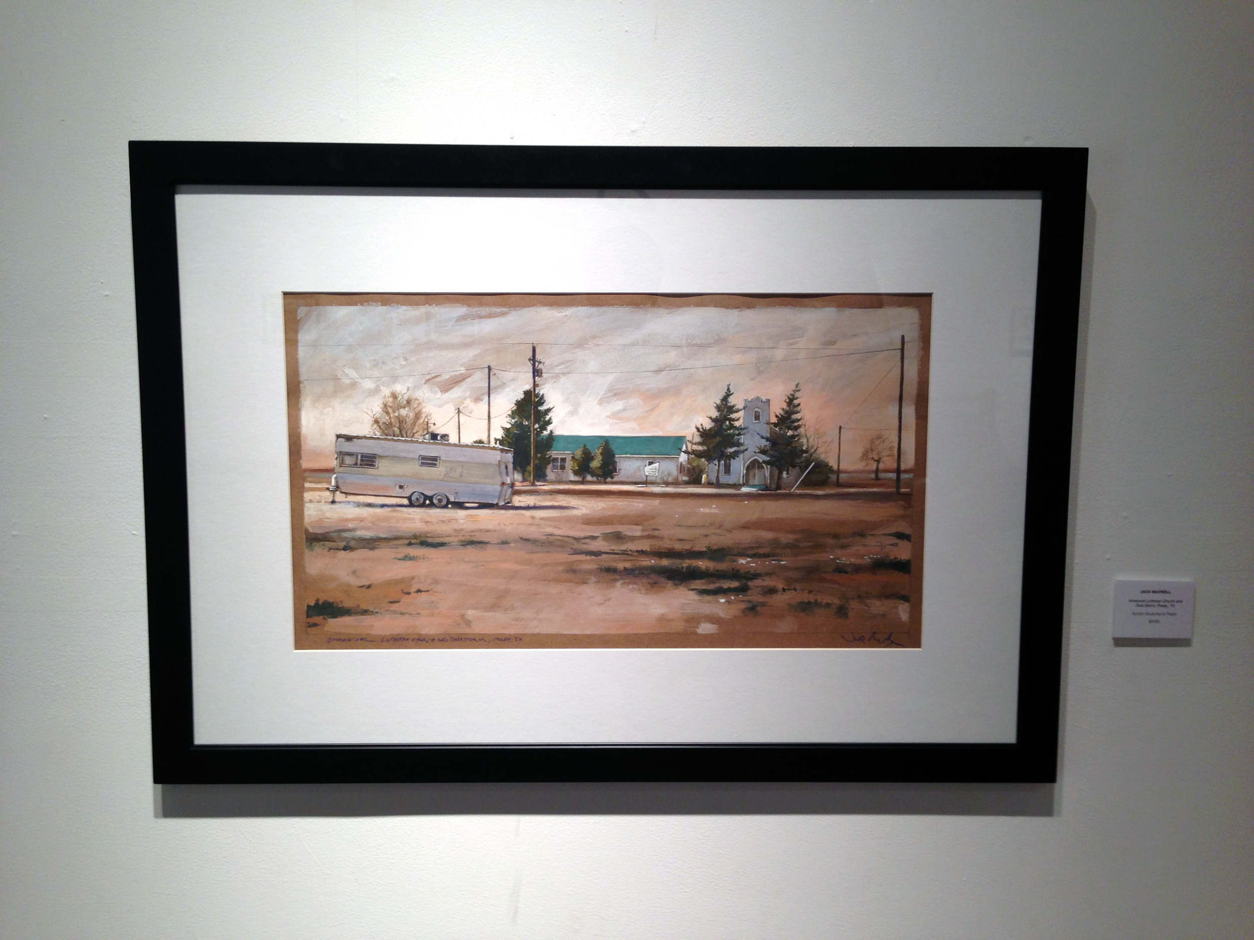
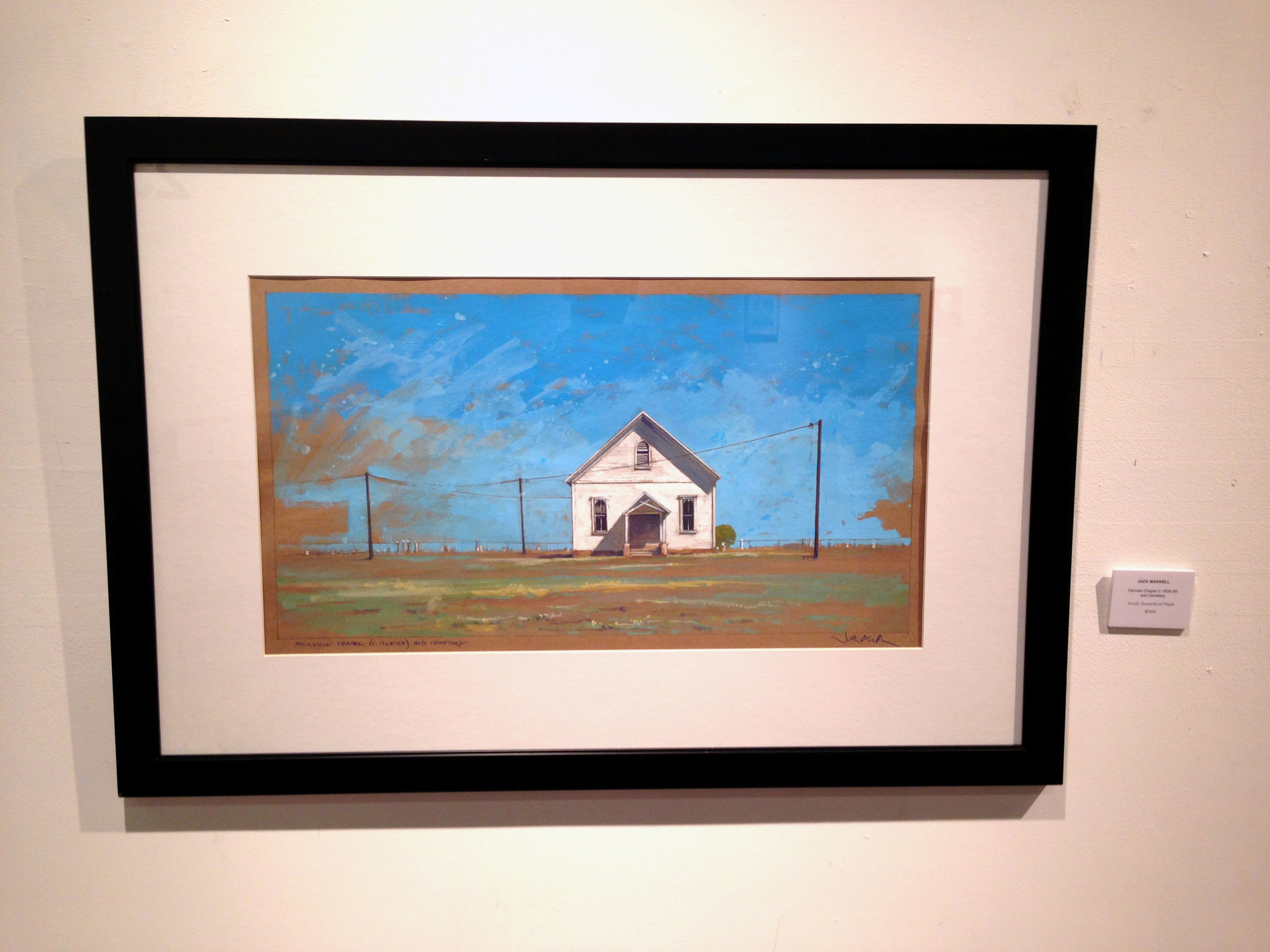
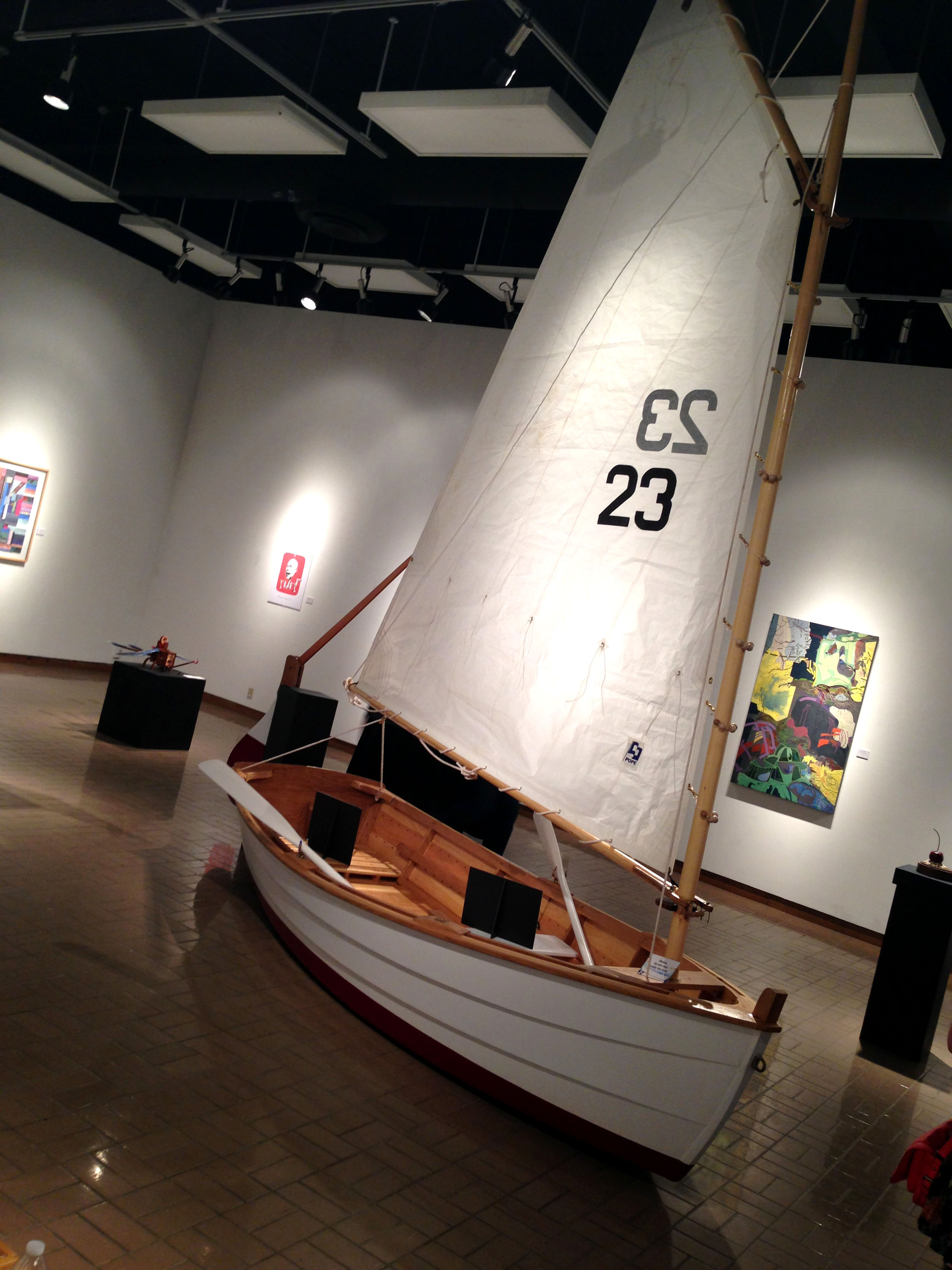
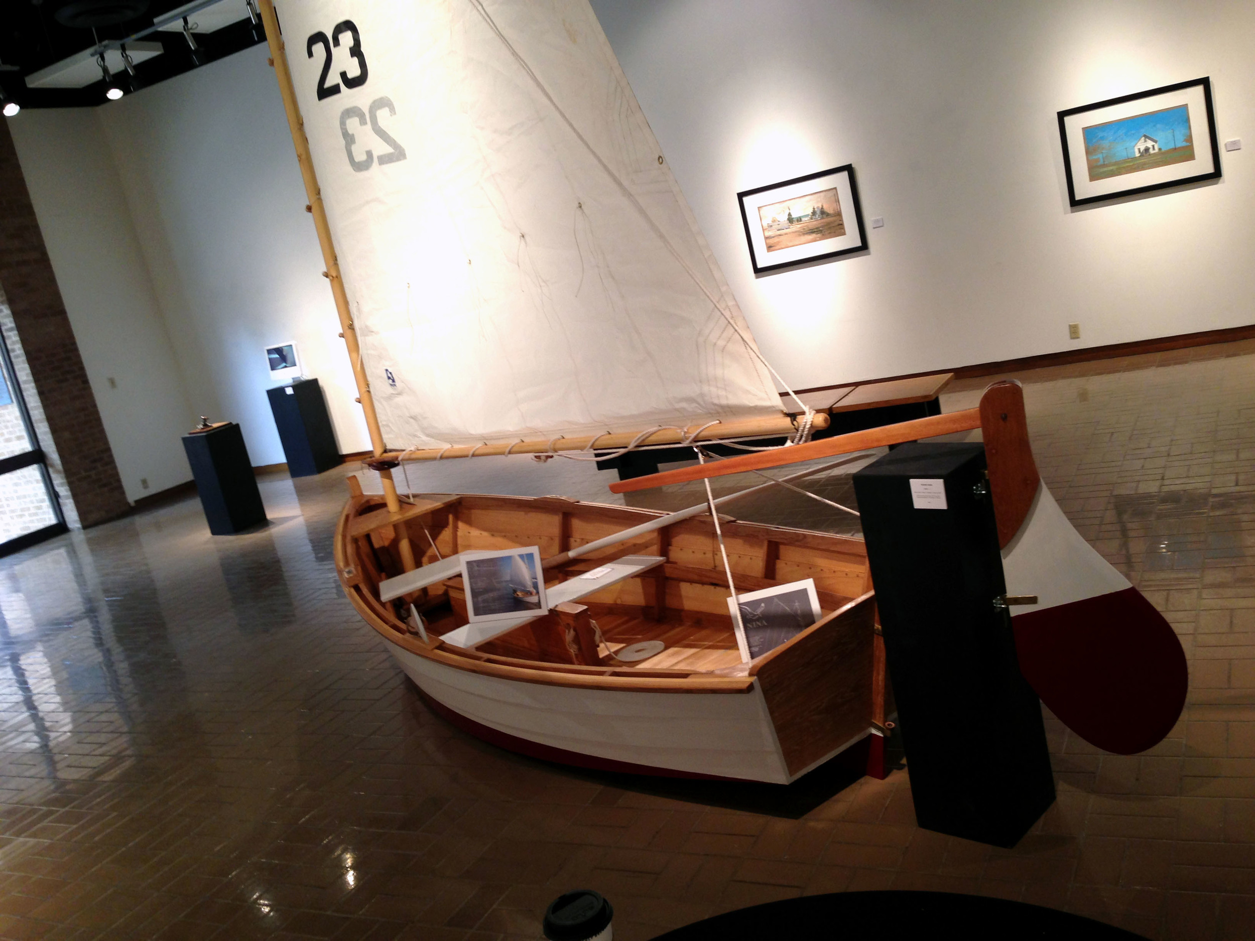
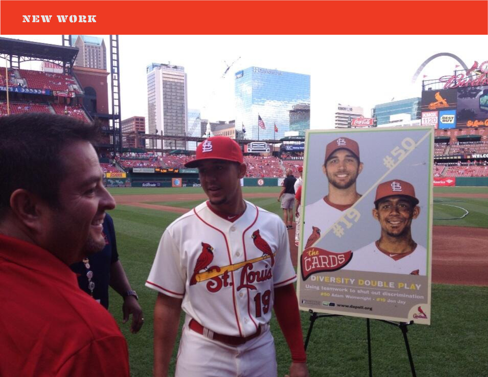
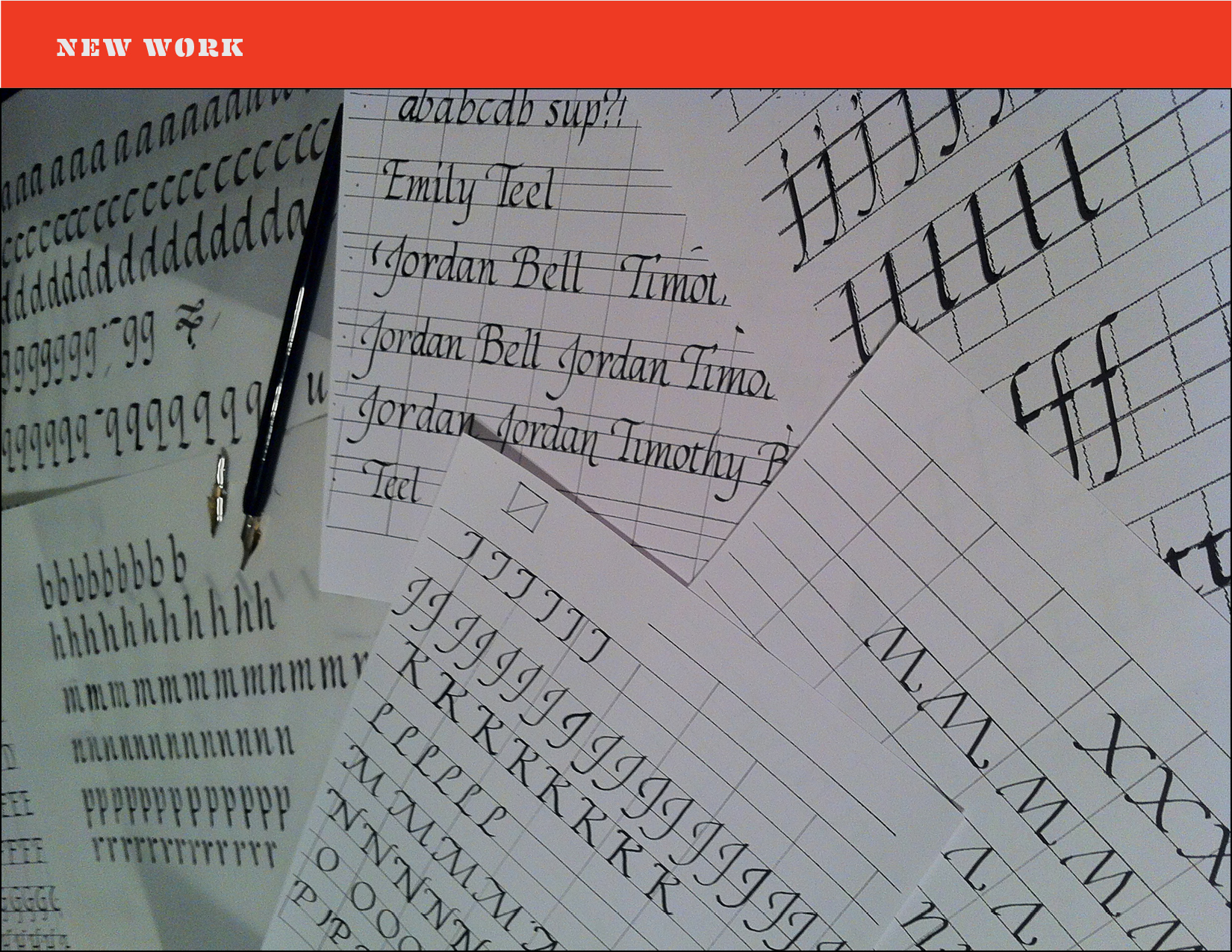
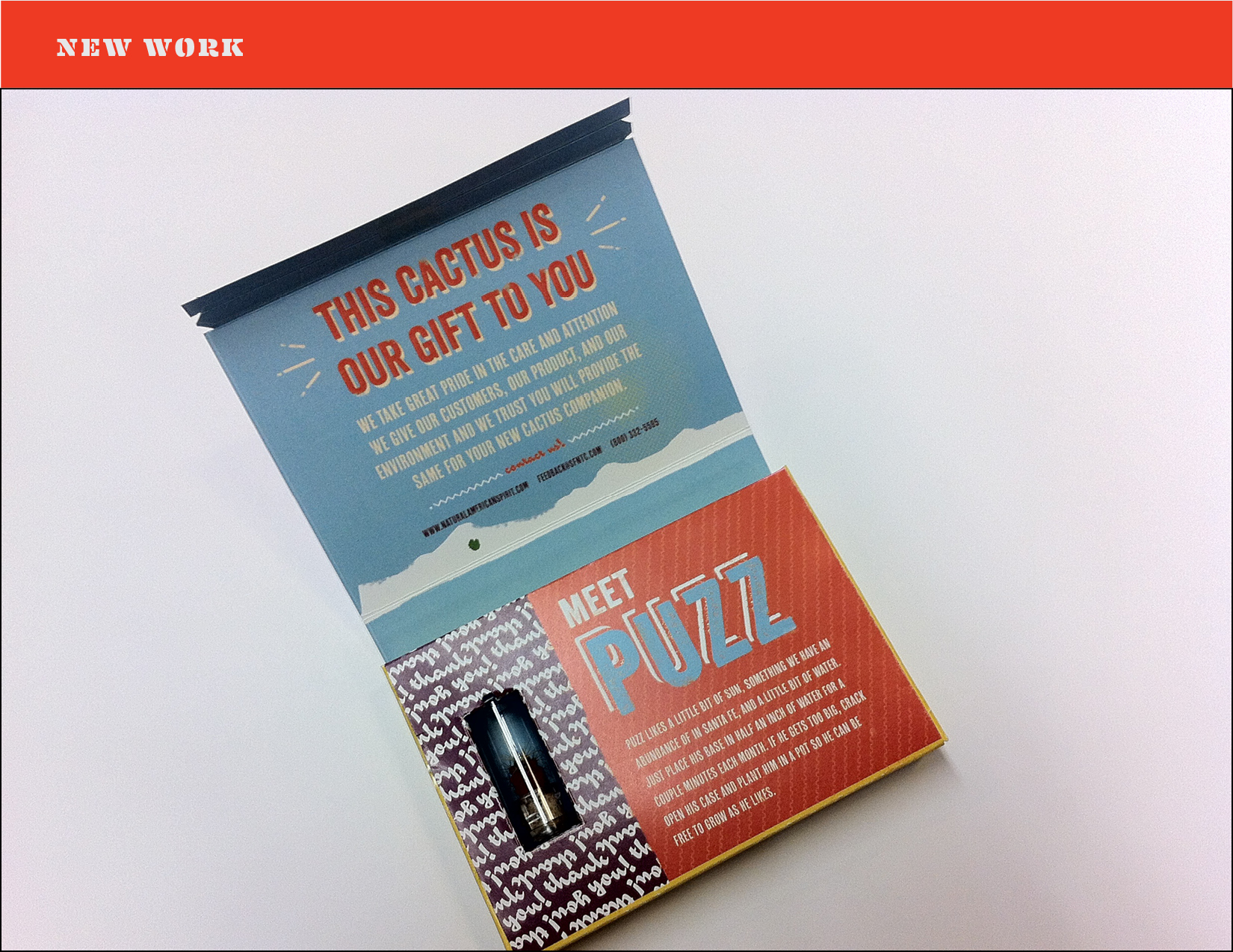
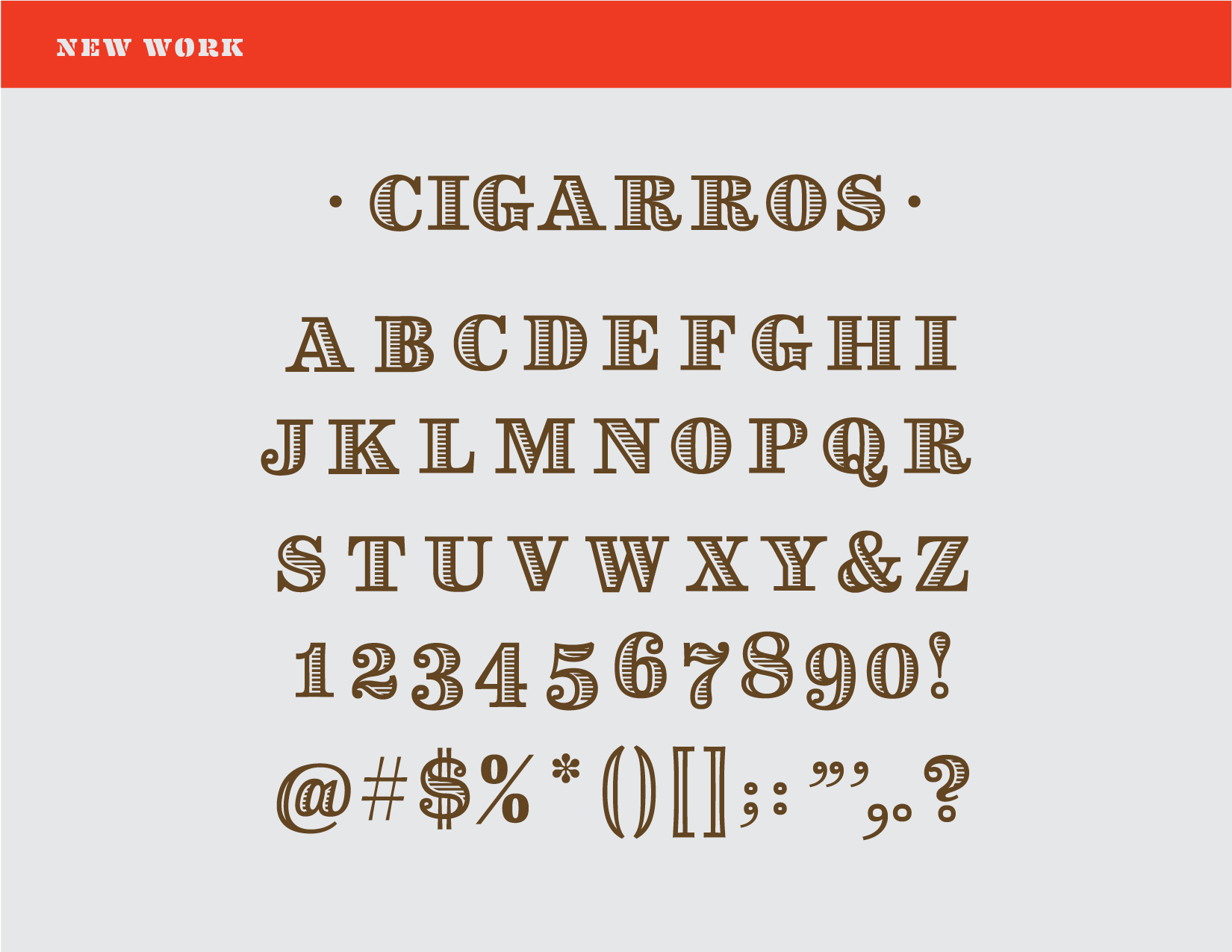
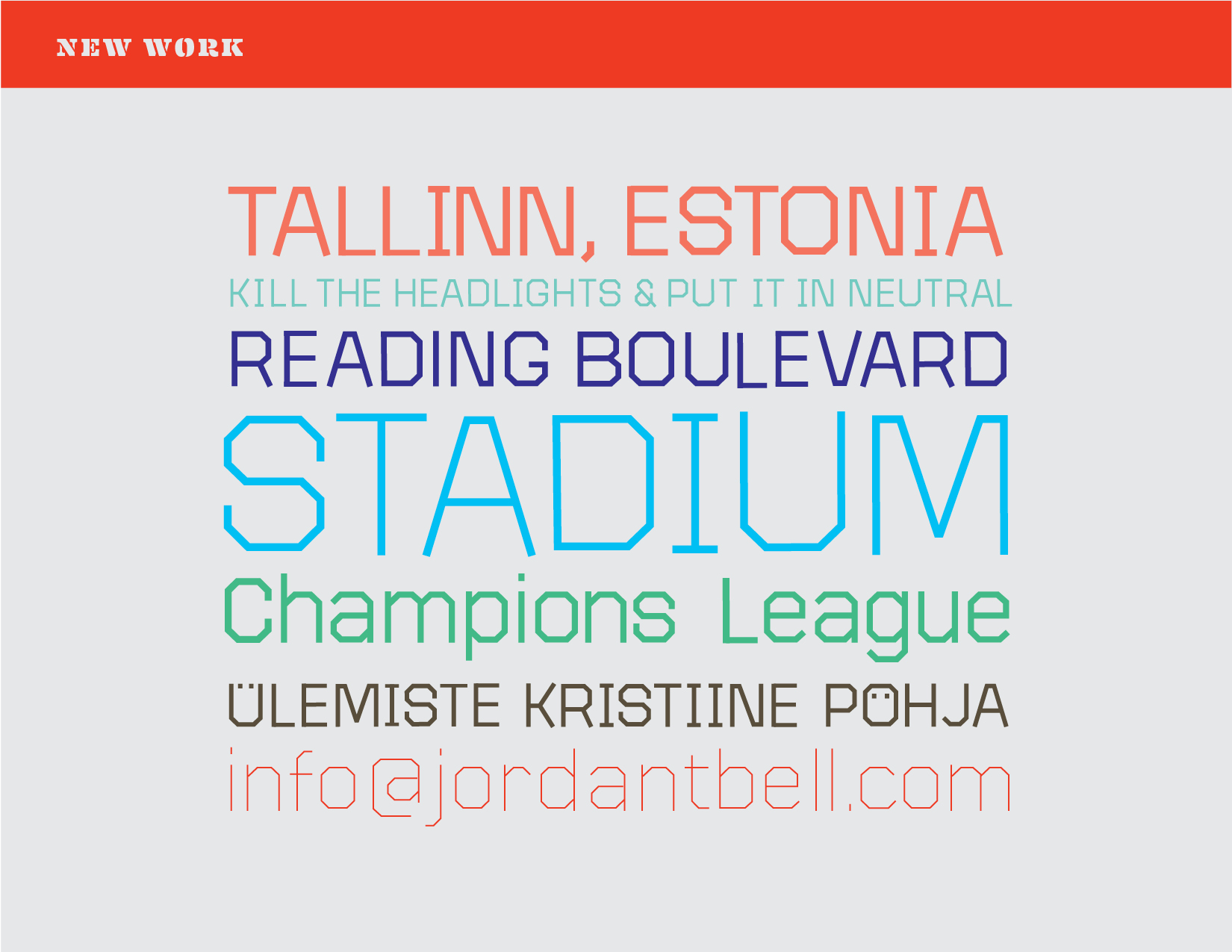
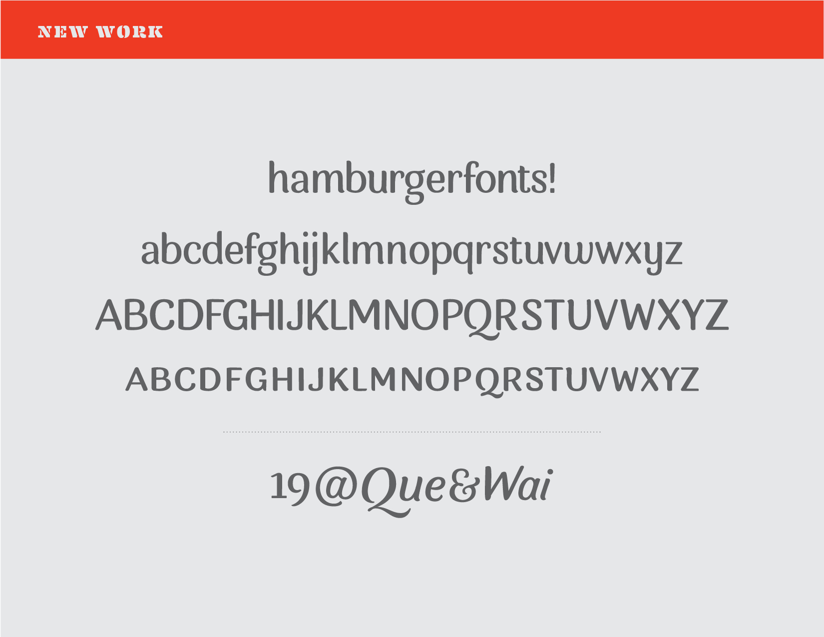
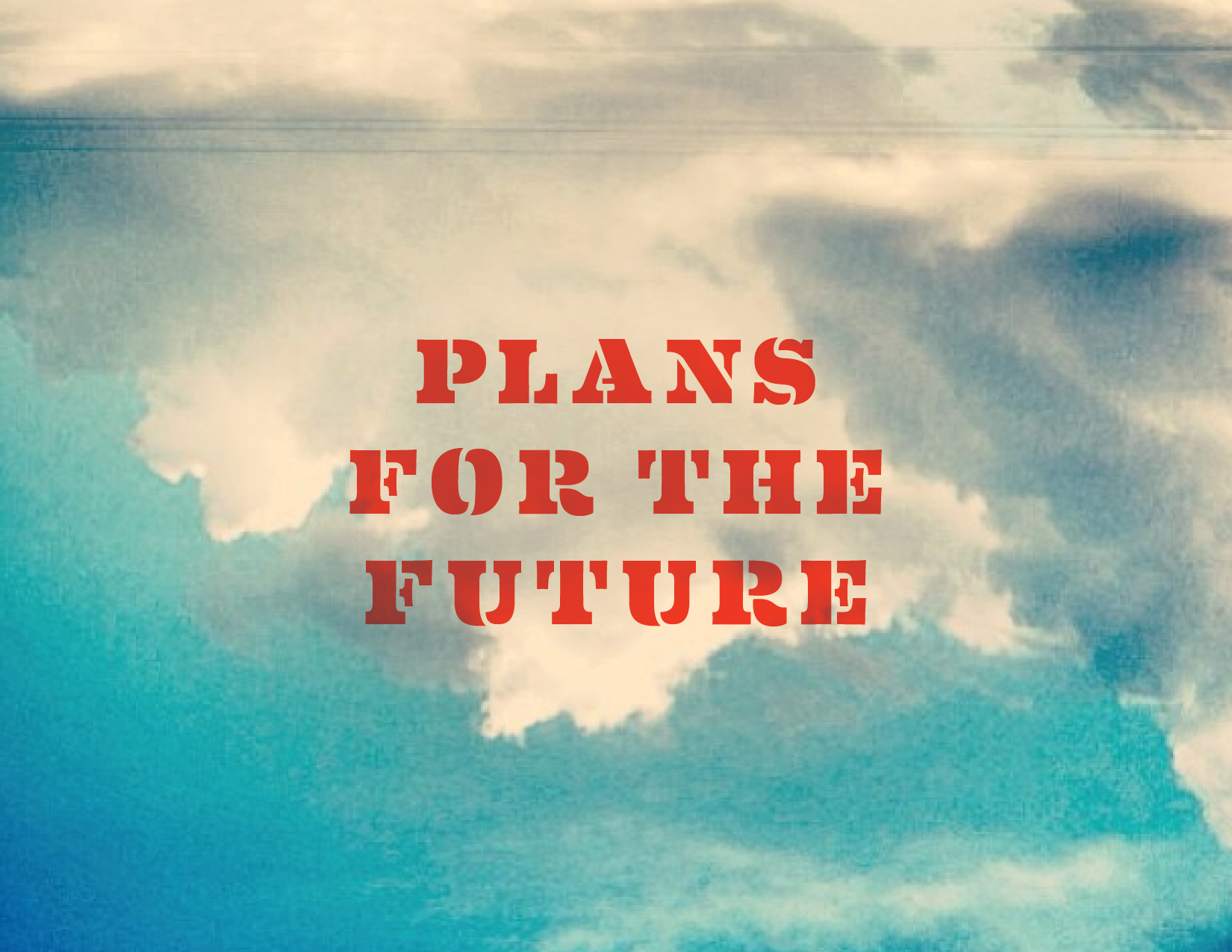
Anyways, since I have now bored you with all the details, here are some crappy photos taken with my iPhone while walking around. Enjoy!

Design, Travel, and TV

If I haven't been busy designing multiple typefaces and rewriting my dissertation proposal I've been hiding out in my flat watching House of Cards or True Detective (amazing stuff, really). The past couple of months have seen my typefaces and designs completely evolve. Hopefully that evolution is for the better. There is so much 'behind the scenes work' when all you want to change is, for example, a curve on the shoulder of the "n" or how the descenders look. When you modify one little thing you have to do it to all the glyphs over 3 masters (Thin, Regular, and Fat) and to the italics (which also have 3 masters)! But the design is in the details, so changing tiny things have made big differences. All that to say, I am enjoying my designs and my education (and also that True Detective... wow).

We recently had a week of design with Gerard Unger and a Adobe FDK (Font Development Kit) workshop with Frank Grießhammer from @kioskfonts. Both sessions and designers gave me really great feedback and also strengthened my ideas on the direction and use of my project. 

I only have one more week of class until our Spring Break – which is an amazing five weeks long. But before then, I have to send in a revised disertation proposal and I also have to present my project for the final critique of the semester. During the break, I will be visiting Dublin and maybe some of the Irish countryside. This past week though, I have been in Antwerp, Amsterdam and The Hague visiting museums of art and typography, eating delicious food, and hanging out with some really cool kids. More on that in the next post though. Hope you enjoy the designs below!


London in January

I had a very stressful week after returning to the UK. I have 2 proposals due, a presentation paper, and a seminar all in the same week. On top of that, I have three typeface projects and a few freelance jobs keeping me busy. This is a good problem though. I am glad I have awesome projects and great clients! However, I like to go out and explore as well :] I caught up on all of this a few days ago and decided to take a day off and wander around London. I hadn't been to the south bank much, so I decided to head there after getting off the tube.

These are by no means "good" photographs. I just walk around and point my phone at things I think are cool and click a button. Hope you enjoy a few of them though! Some things I saw in London: The Wellington Arch, Buckingham Palace, St. James Park, Trafalgar Square, The National Gallery, The Thames, St. Paul's Cathedral, The Millennium Bridge, Tate Modern, The Shard, Southwark Cathedral, Borough Market and many more awesome places. I have seen most of these things before, but its always nice to visit again! P.s. The first two images are actually form Reading town centre! 

Progress!

We are now approaching the end of the first term here at Reading University MATD and I (would like to think) have made progress on my practical work! While I have been developing my typefaces, I had been working on other projects as well. You can see some of these designs in the "Featured" tab above.

For the first of my typeface projects I have created a friendly, versatile serif family that will be accompanied by extreme weights (thin and FAT) that can be used for editorial or general use. This project will probably be my main focus throughout the year, since it will have many weights and styles. I also believe this typeface has the most potential of the bunch because I do not know many on the market that are similar. I drew inspiration from humanistic imperfections in writing, and the aesthetic qualities of brush lettering. You can see this typeface in the first 3 examples at the bottom of this article.

But even before I drew my first "a" of that typeface, I started creating an "italic" that wasn't even first thought of as an italic. I drew this font first as brush lettering for a project at Cisneros Design. I looked at it one day and thought to myself, "hmm, that could be neat as a typeface!" So, in reality, it is a italic with no regular. I thought about adding a regular to it, but maybe it's more of a lone wolf and can get along just fine by itself! Some thought I was crazy at first, but this idea of creating an italic before the regular is quite fun and will hopefully lead to even more exciting discoveries. You can see this font in the fourth string of text below.

I also was roaming around the intertron (yes, technical term) one day and stumbled across an old type specimen by the Ludlow Typograph Company in Chicago that dates back to 1958. However, inside the specimen there are typefaces that were punched and cut in the 1920s. A few of these designs caught my eye with their brilliant, unique, vintage feel and I wondered if anyone had made digital drawings of them. After perusing around some nerdy typography sites, I found nothing. So, I decided to start digitising revivals of my own! Obviously though, my drawings are not direct revivals, but merely inspired revivals. Not only have I been able to learn more about this company and the designs, but I have also enjoyed every minute (or countless hours) of reviving the type. This project is no where near complete, but I plan on working on it when I have some spare time. This font is shown on the last line below.

Hopefully something in these typefaces will catch your eye. These are works in progress, but feedback and critique are greatly appreciated. Enjoy.

TypefacesSoFar.png

Type Design vs Hand Lettering


My former classmate, and good friend, Megan Teel recently asked me whether she should pursue a intensive study on hand lettering or type design. I started answering the question but soon realized it’s a more complex issue. I wanted to share my thoughts on the subject below.


First of all, I believe both of these subjects are noble and difficult forms of design. I also would like to think I have experience in both since I did much hand lettering in college and am now studying type design at Reading University. But to answer which one a designer should choose to pursue is difficult for many reasons.

My answer depends largely on what you qualify as “hand-lettering”. It is such an ambiguous word. Hand lettering can mean drawing grungy lettering with a pencil or ballpoint pen (like what I did in college lol) or creating custom made, high quality, digitally drawn logos. The former of these two styles is a fad. I think many designers will say the same. People really dig the hand-made, quick, rustic aesthetic currently, but companies and clients are always going to want what is vogue at the moment. You can see this in the clients that I have worked for in the past. Many just want what is cool and trendy, pay me quick, then they are on their way to the next job. It’s business, we have to embrace that. But that’s why we must not only single ourselves out as a one-trick pony. We should strive to create great timeless design that can be attractive to many different clients because of our critical eye for detail and typography.

However, my guess is custom lettering will never go away. Many designers (me included) and firms do custom lettering. It has been a profession for hundreds of years. Since way before the first digital font, before Gutenberg created moveable types for his press, and even before the scribes “hand lettered” one bible for years, people have been creating lettering.

All of this leads to the next option – Creating type design. Custom type in many ways is hand lettering that can function as “type” for a specific reason or client. Creating “functional” typefaces is an even more difficult task though than just creating a few letters or words for a brand. I think putting restraints on yourself to develop something that actually has to work as type for many different mediums and people instead of just creating lettering for an aesthetic choice is respectable, but not better. Both have their merits. Learning new programs on the computer can never really harm you either. Getting a feel for Glyphs, Robofont, or any other design software for that matter, will only broaden your perception on what lettering, type, and typography is.

Learning about the history of typography and creating type design will push the designer to create more beautiful letterforms through the ability to notice details in the design. This will help any designer to have a greater knowledge of letters and the reasons why they are made, thus helping the designer create beautiful designs and solutions for a whole slew of media. This knowledge and practice of typography could be manifested in hand lettered posters, logos, web type, packaging, custom typefaces for a company, ornamental monograms, or just the ability to distinguish good fonts from bad.

Also of course you have to think about your own perspective. Why do you want to design type or lettering? What are the ends to this incredibly complex means? Do you want to create calligraphy for wedding cards, or a branding for your favourite local eatery, or a workhorse text face for a scientific magazine? There are so many different fields and branches of lettering/type design that it is hard to answer the initial question: which direction to choose, hand lettering or type design. A knowledge about the design and history of letterforms and graphic design will undoubtedly lead the designer to better typographic solutions whichever path they choose.

This is the same question I was asking myself while I was in college. I ended up with the thought that leaning about the history of type and graphic design and practicing drawing everyday will help me create beautiful typography and design no matter what medium or client. And that’s why I am here at Reading University studying Type Design and Typography!

My advice is this. Get out a sketchbook and start drawing crazy letters with all sorts of weird pens and pencils. Maybe you’ll enjoy it. I know it’s my favorite thing to do.


Travels around London and Reading

Being three weeks into my adventure I decided it was probably time to put up a post about my travels into London and around Reading so far. I have been to London now three times and will probably go back this soon for a lecture on Frederick Warde at St. Brides Library on Fleet street. 

My three adventures to London were all extremely fun and in a way, very normal. London is such an inviting city that you almost don't feel like you are in a major capital of the world. It's full of such beautiful old buildings and parks that you sometimes forget you are in a modern metropolis packed with 18 million people! Then you get on the tube and all that goes away. However, I have been really impressed by the tube. most trains arrive ever 2-3 minutes, all the cars and stations are really modern and clean, and there are cushioned seats (!!!). I have gone to see Westminster, The Eye, Picadilly Circus, Covent Garden, comedy shows in Islington, shopping on High Street Kensington, Tower Bridge, St. Paul's Cathedral, and that one big clock thing you all have heard of I'm sure.

In general though, I love going into London either for a day trip to hear a lecture, or for a longer stay to see all the sights. It is an amazing city so do yourself a favor and come visit. 

Below are some select images from Reading first, then London picks up when you see Tower Bridge (obvs!). Big props to Nick Abrams and his lovely girlfriend Beth for hanging out and being tourists together.

First Day of Grad School, Michael Twyman, and 19th Century Posters

Today was officially my first day of graduate study here at Reading University. The previous week I have been preparing for my classes by eating lots of delicious food, watching Doctor Who and frequently traveling to London (there will be another post on my first week in the UK later.) But unlike my first week, today was actually educational and was spent in the classroom listening to Michael Twyman talk about his giant collection of 19th century posters.

Michael Twyman established the Graphic Communication & Typography program that I am now apart of here at Reading University in 1974. It was the first of its kind in the entire world. He is well known for his writings on the theory of graphic language and his epic collections of printed design. He retired from full time teaching in 1998 but still continues to gives lectures to us post-graduate students once a week. 

Every Monday Professor Twyman brings a small portion of his huge private collection and gives a talk pertaining to what he has brought in. Depending on the topic he will bring posters, books, pamphlets, advertisements, magazines, or various other kinds of ephemera. Today Professor Twyman brought in French letterpress posters from the 19th century for us to "ohhh" and "ahhh" at. All the posters were beautiful and preserved very well. Many of the posters are administrative documents or play bills. Others are advertisements, for sale signs, or even proclamations from the king.

Enjoy the images, but let's first thank Michael Twyman and the other brilliant people who archive and collect past works. If it was not for them, we wouldn't even have the chance to see these amazing designs.


2013 ACU Biennial Faculty Exhibition

I was lucky enough to be taught by some of the best artists and designers in all the land. While visiting Abilene this week I heard that the Biennial Faculty Exhibition was opening on the 13th. The show was amazing. So much great work was showcased. It was evident to me that the faculty are not only gifted artists, but are also constantly looking to improve and create just as much as the students are.

The works explored almost every form of art and design. There were whimsical illustrations, beautiful typography, laser-engraved posters, black & white photography, typographical paintings, kinetic sculptures, gouache landscapes, beautiful jewelry, and even a hand-built sailboat! Unfortunately I wasn't able to take photos of everything, but I really wanted to share and promote the work of my former professors. Have a look! Sorry the photos are not as epic as the work is.


Resources

I decided to start a list of reading material after a student asked me what books on type/typography I have been reading lately or which books were most influential to me as a type design student. Of course this is not a complete list, but it is a list full of articles, magazines, books and blogs that have inspired me. If you have any suggestions, please add them in a comment below. Hope you enjoy!


Books

Simon Garfield, Just My Type. Avery, 2010

Ellen Lupton, Thinking With Type. Princeton, 2010

Steven Heller & Louise Fili, Scripts: Elegant Lettering from Design's Golden Age. Thames & Hudson, 2012

Steven Heller & Talarico Lita, Typography Sketchbooks. Thames & Hudson, 2012

Steven Heller & Philip B Meggs (eds), Texts on Type: Critical Writings on Typography. Allworth Press, 2001

Rob Roy Kelly, American Wood Type: 1828–1900. Da Capo, 1977

Robert Bringhurst, The Elements of Typographic Style. Hartley & Marks, 3rd Edition, 2004

Walter Tracey, Letters of Credit. David R Godine, 1987

Gerard Unger, Theory of Type Design. nai010, 2018

Hyphen Press

Robin Kinross, Modern Typography. 2nd Edition. 2005

Gerritt Noordzij, The Stroke: Theory of Writing of the Pen. 2005

Fred Smeijers, Counterpunch: Making Type in the Sixteenth Century; Designing Typefaces Now. 1996
 

Magazines

Typography Papers (Distributed through Hyphen but the site is down currently)

Eye Magazine and also the Blog – Type Tuesdays is also great

Codex Magazine


Blogs

John Boardley’s I Love Typography. Definitely read the Type History Series, including The First Roman Fonts, and pay more attention to the designer interviews; start with Seb Lester’s.

Stephen Coles’ Typographica. Great collection of type reviews and articles. Read anything that sounds interesting to you. It's all good!

C.A.S.T Foundry’s Medium. High quality writing here from Riccardo Olocco and company. Definitely read his interview with Gerrard Unger

Peter Bil’ak and Johanna Bil’ak-Balusíková’s Typotheque

James Edmonson’s blog at Oh no Type Co. The “Process” and “Teaching” tabs have some real gems in there.

First Talk - Information Graphics Class at ACU

Recently I was asked by my former professor Ryan Feerer to give a talk to his information graphics class at my Alma Mater – ACU. I was hesitant at first to accept, but what was there to lose (besides making a fool of myself). I took Ryan up on it as long as he would take blame if the talk sucked. He asked me to speak on working and living in Santa Fe, current projects I'm designing, and what my plans are for the future. I decided to put up the slides from that talk below. Of course they don't make much sense without the talking included, but they are divided into the 3 main speaking points – What Up (working and living in Santa Fe), Current Projects, and Plans For The Future (Reading University MATD). Maybe you can follow the progression and talk without the words ;)

I thoroughly enjoyed speaking to the class and was surprised at how many great questions they had at the end. A few questions were along the lines of: "How would you suggest to prepare for a job like what you had at Cisneros Design?" or "What do you wish you had learned or studied more of while you were in school at ACU?". Another student asked me about the books or magazines I'm reading currently to prepare for Reading and my future in design. An open discussion on these resources will be covered in my next post.  


Slides from the presentation