We turned in our type specimen and the “Reflection on Practice” last Tuesday. It was incredible to see all of my classmates work and to see how far we had come. It’s also crazy to think that an entire year worth of practical design work could be displayed inside a 20 page booklet! However, all of the specimens look amazing and I’m jealous of every single one. I’ve been really impressed by all of my classmates work throughout the entire year. When you’re surrounded by great designers who produce stellar work it really inspires you to up your game. I have felt like I have grown a lot here not only as a designer, but as a student as well. I was just telling the head of our department, Gerry Leonidas, about how I have learned so much more than I thought possible. All the brilliant professors, workshops, guest lecturers, trips to museums, libraries, and various countries have made this year incredibly successful and even fun. It’s been very difficult at times, but in the end (of the practical work portion), I think it was an amazing experience and worth every penny. Now all we have to do is write an epic dissertation! Mine will be on the creation and localization of the American Gothics (or Grotesques if you wish). More on this later though.
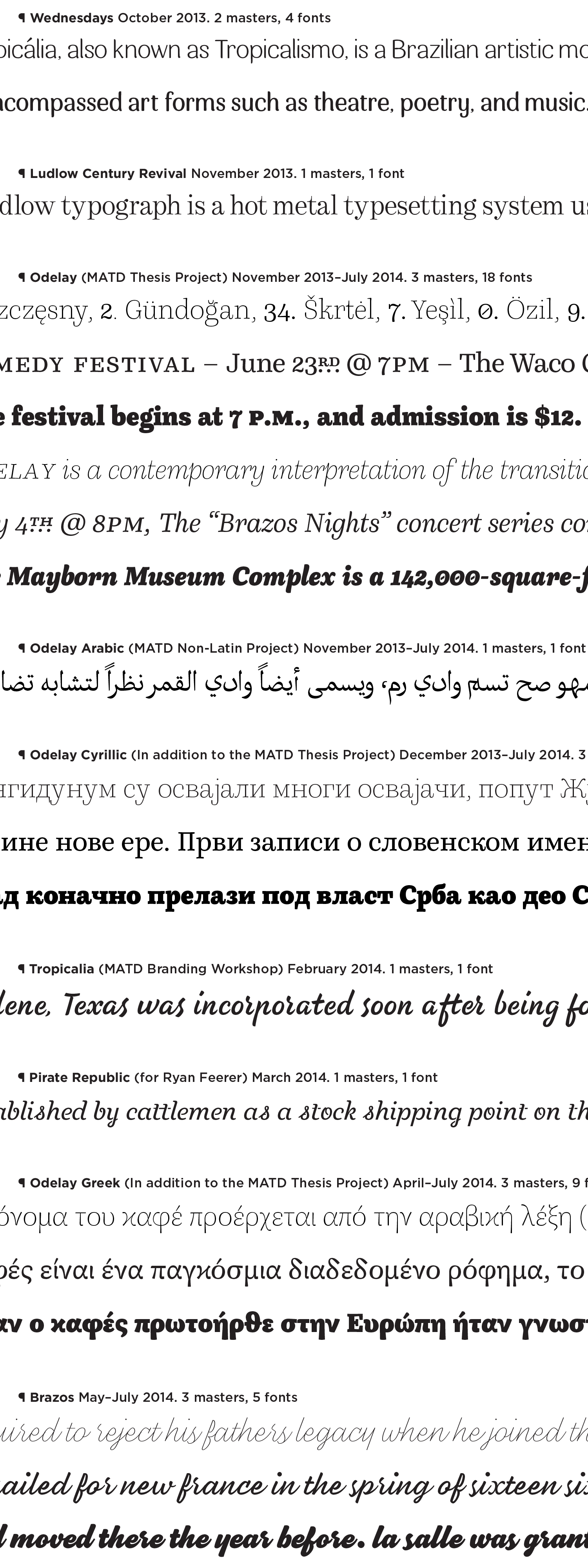
Like I said above, it’s kinda crazy to cram a year of practical design work into one booklet. Our specimen also only showed our ‘thesis project’, but we created a lot typefaces and lettering over the course of the program. So, I quickly typeset a few random lines below in all the ‘masters’ I designed over this past year in order from oldest, to latest. And as I looked back on the absolute rubbish I created a year ago, I smiled. I quickly realized that I have progressed as a designer just by looking at a timeline of faces I have drawn in the short span of 9 months. Below is the list of typefaces I created from October 2013 through July 2014. I’m not too ashamed of any of them, however, many are still works-in-progress. Hope you enjoy one or two!
* Squarespace does a bit of compression that I dunno how to turn off so be sure to right click the image and ‘open in new tab’. This should make it a bit better; might still look terrible though :P *

