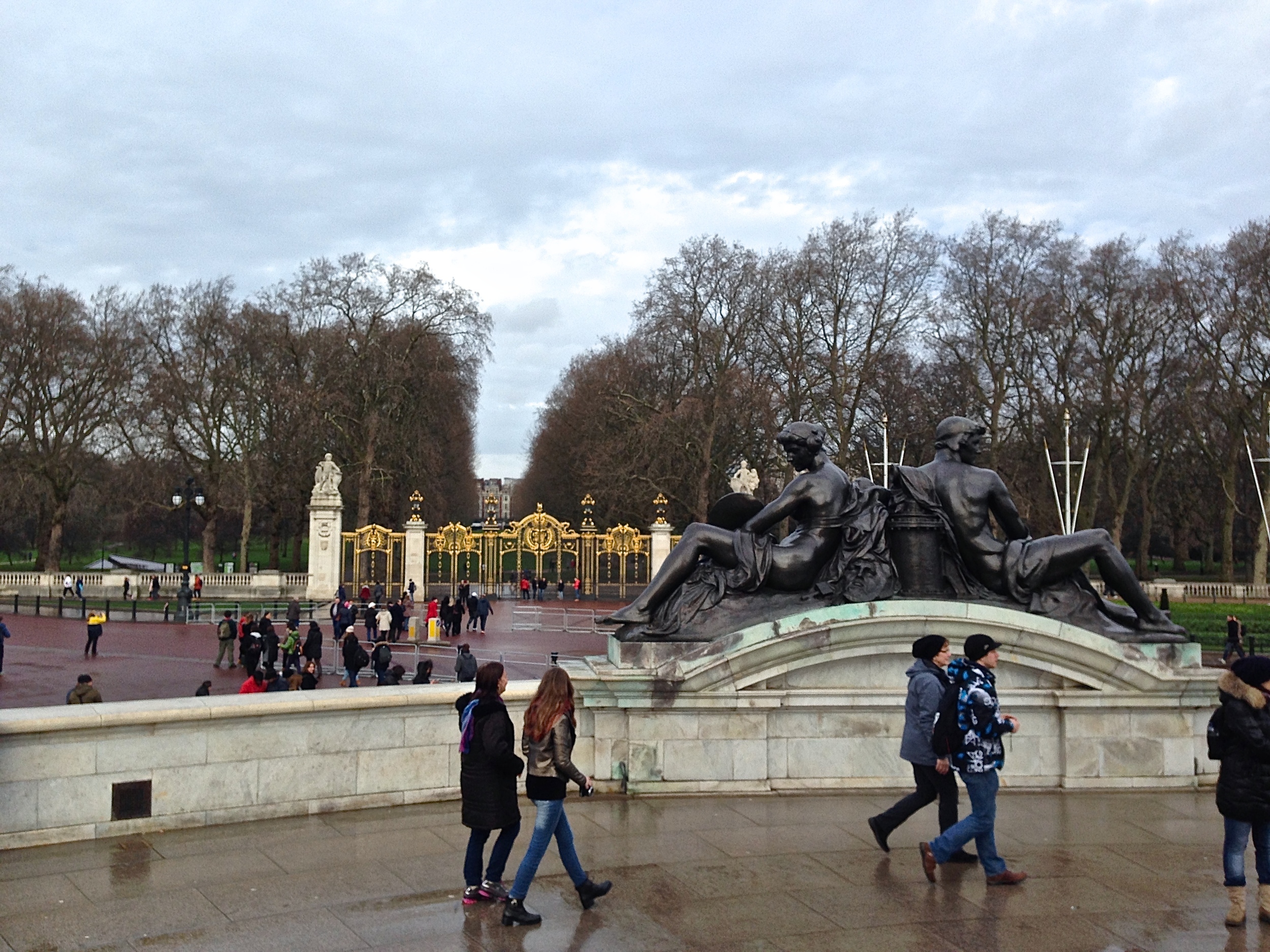
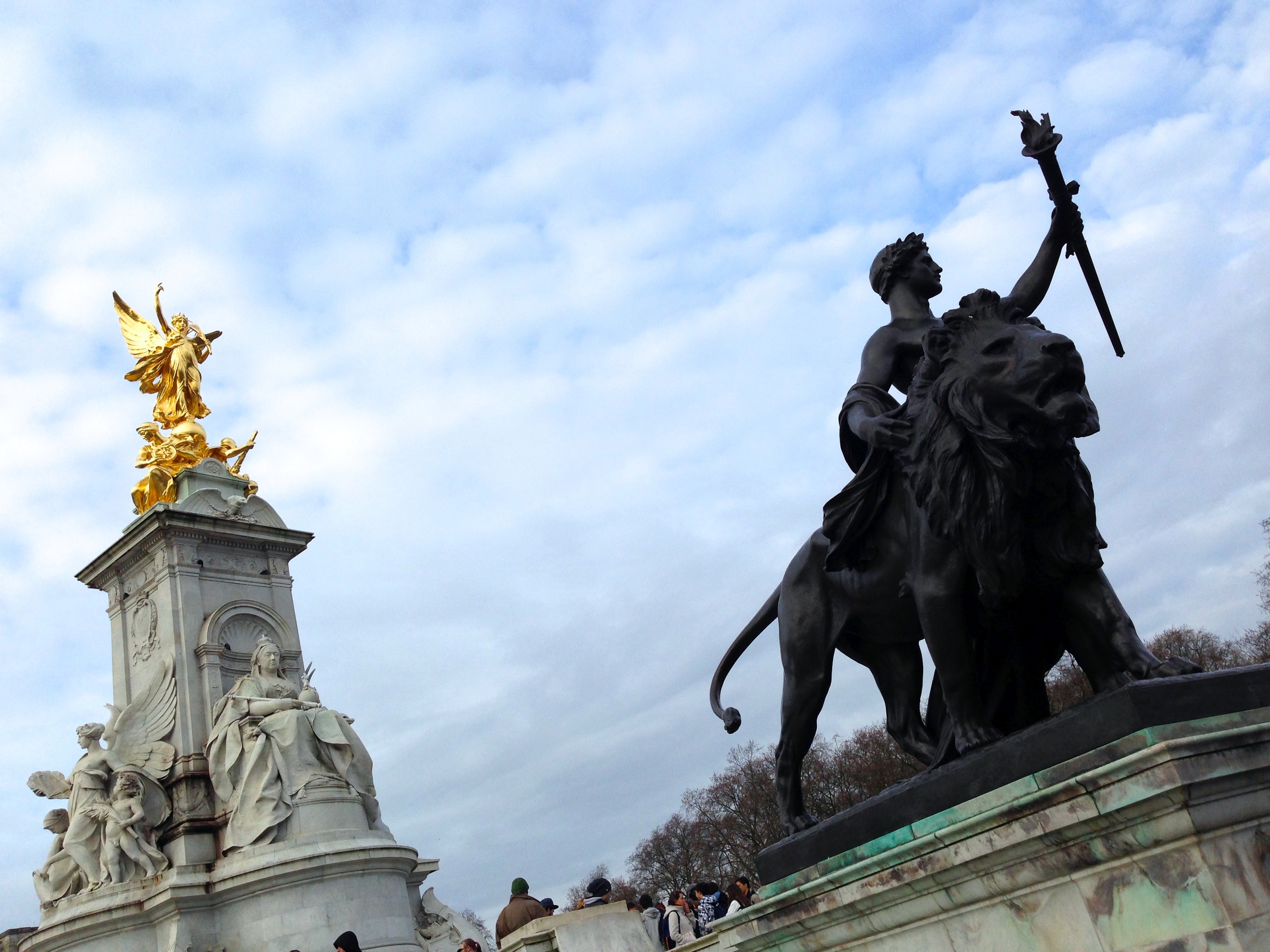
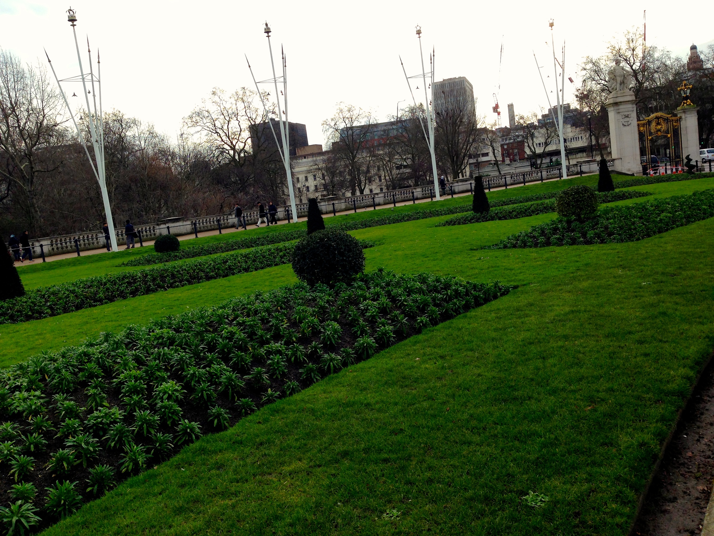
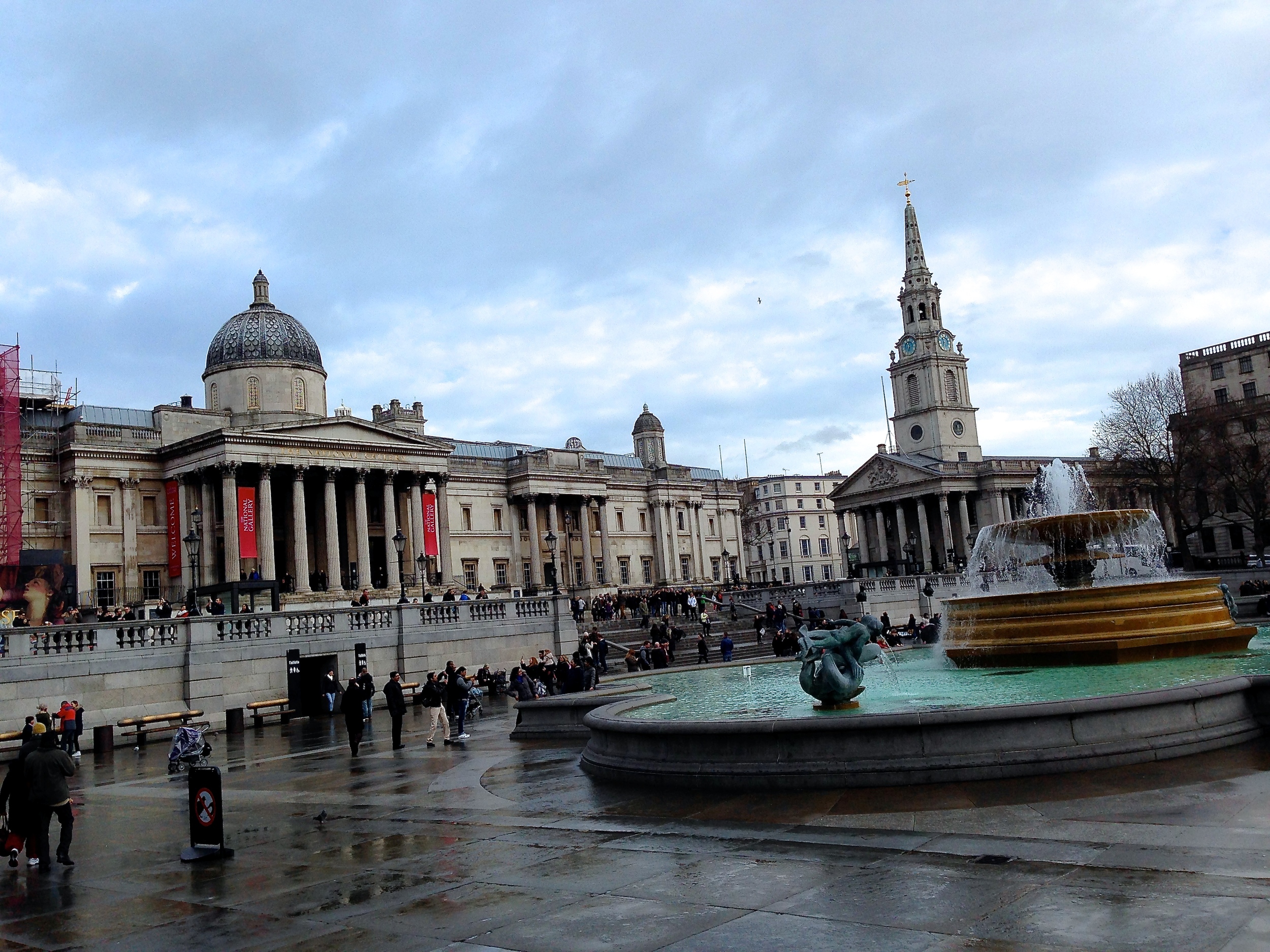
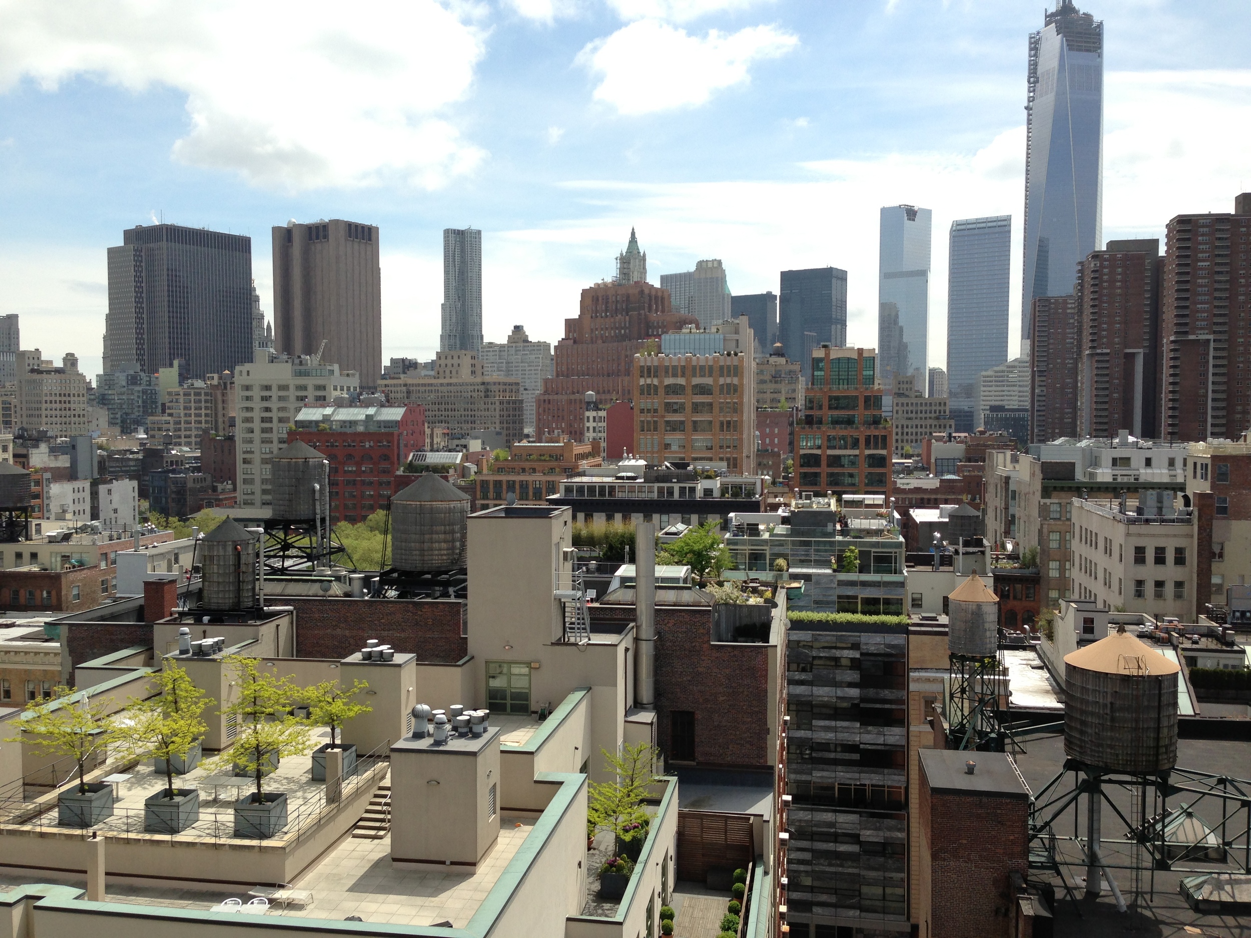
London in January

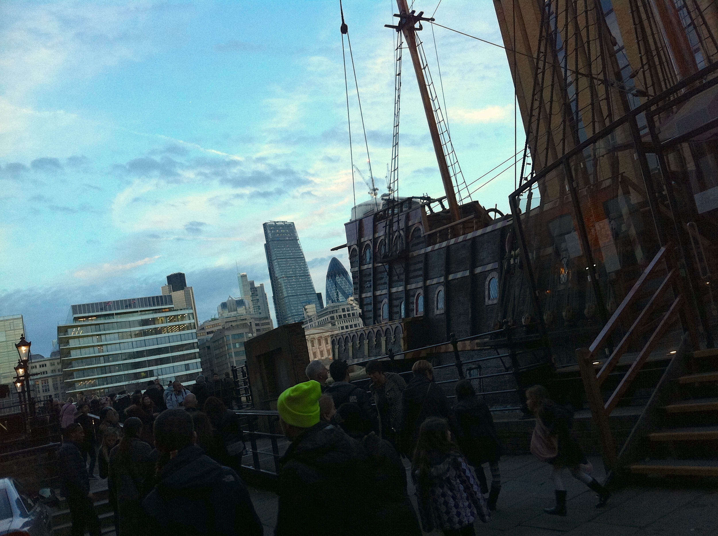
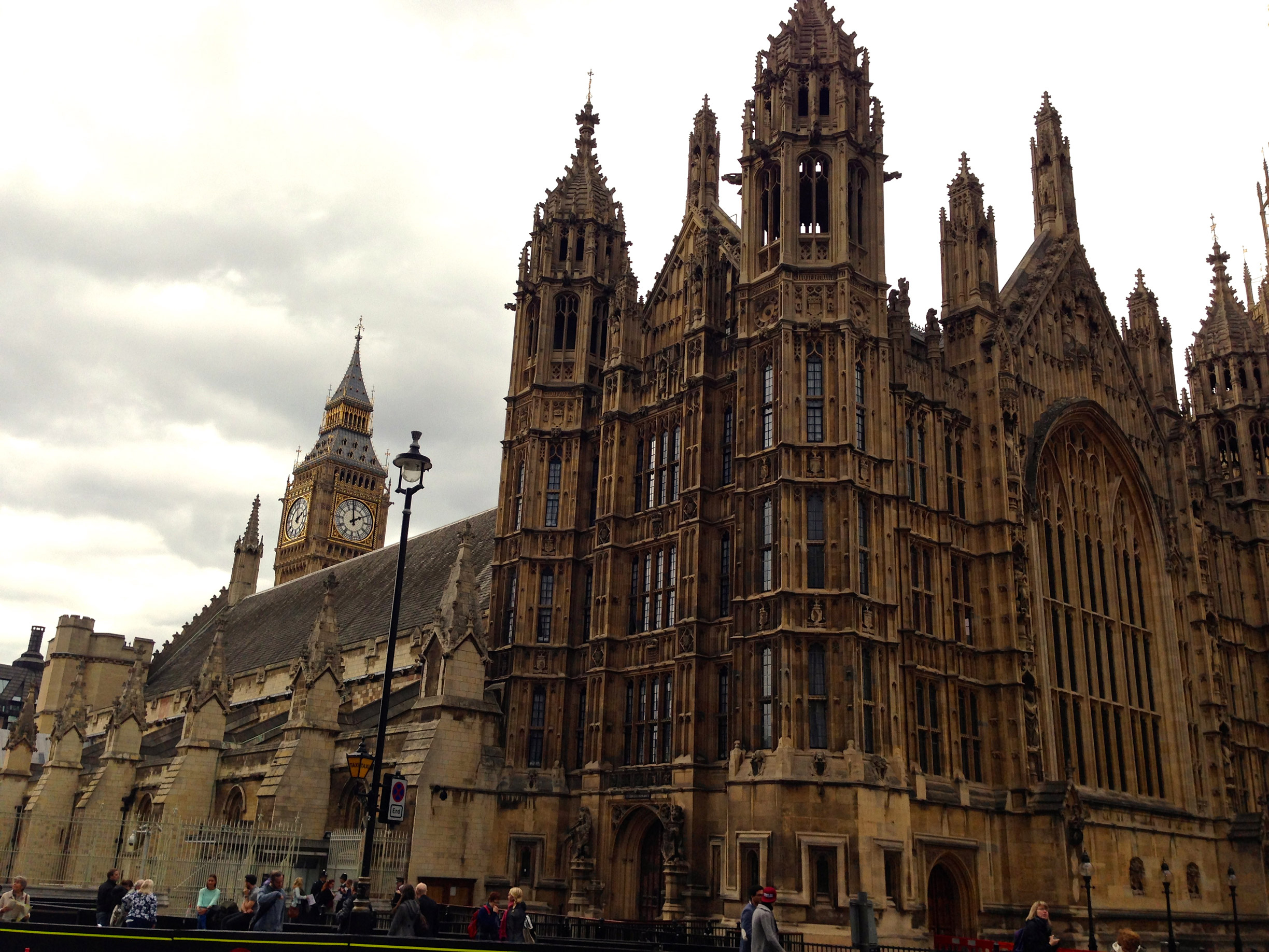
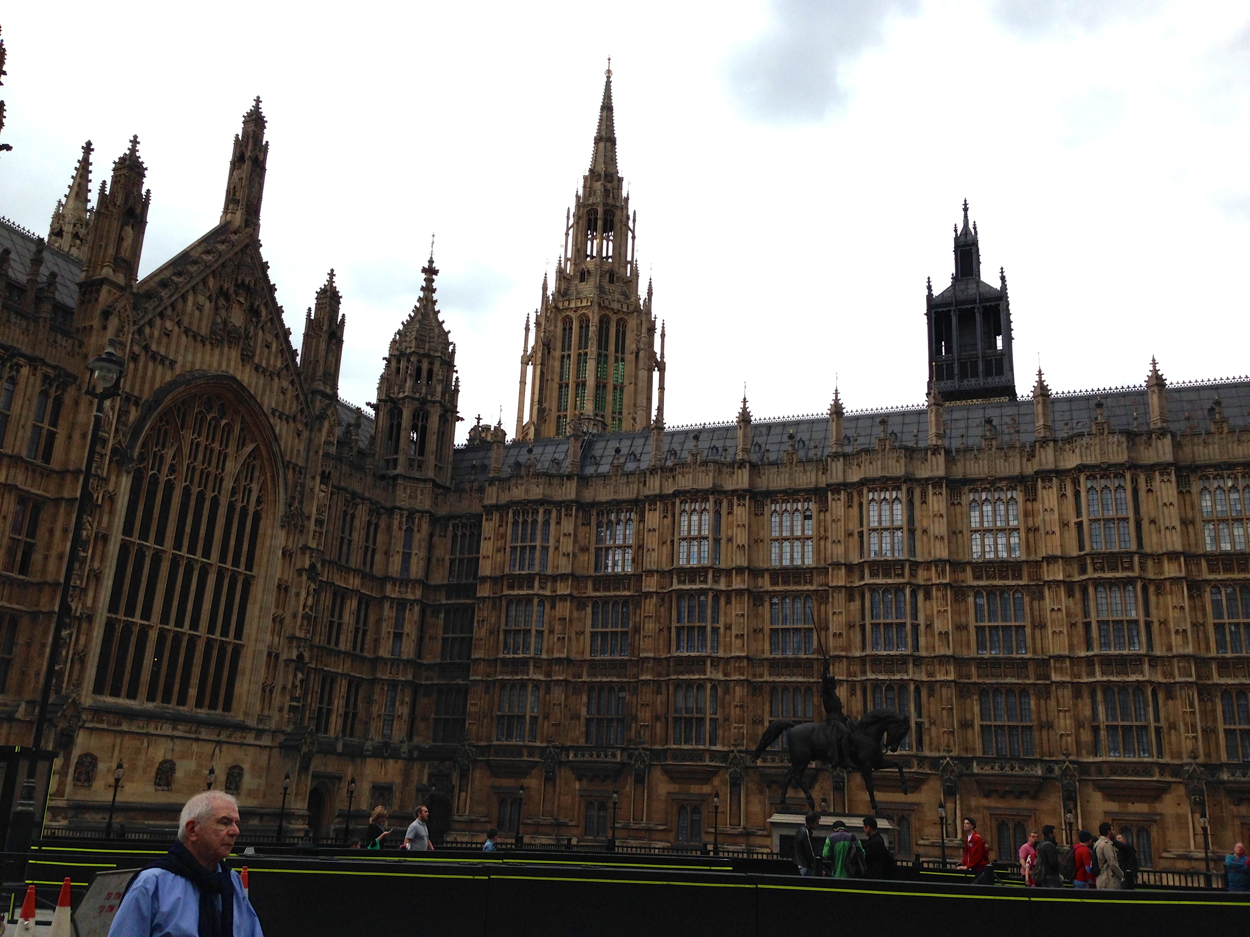
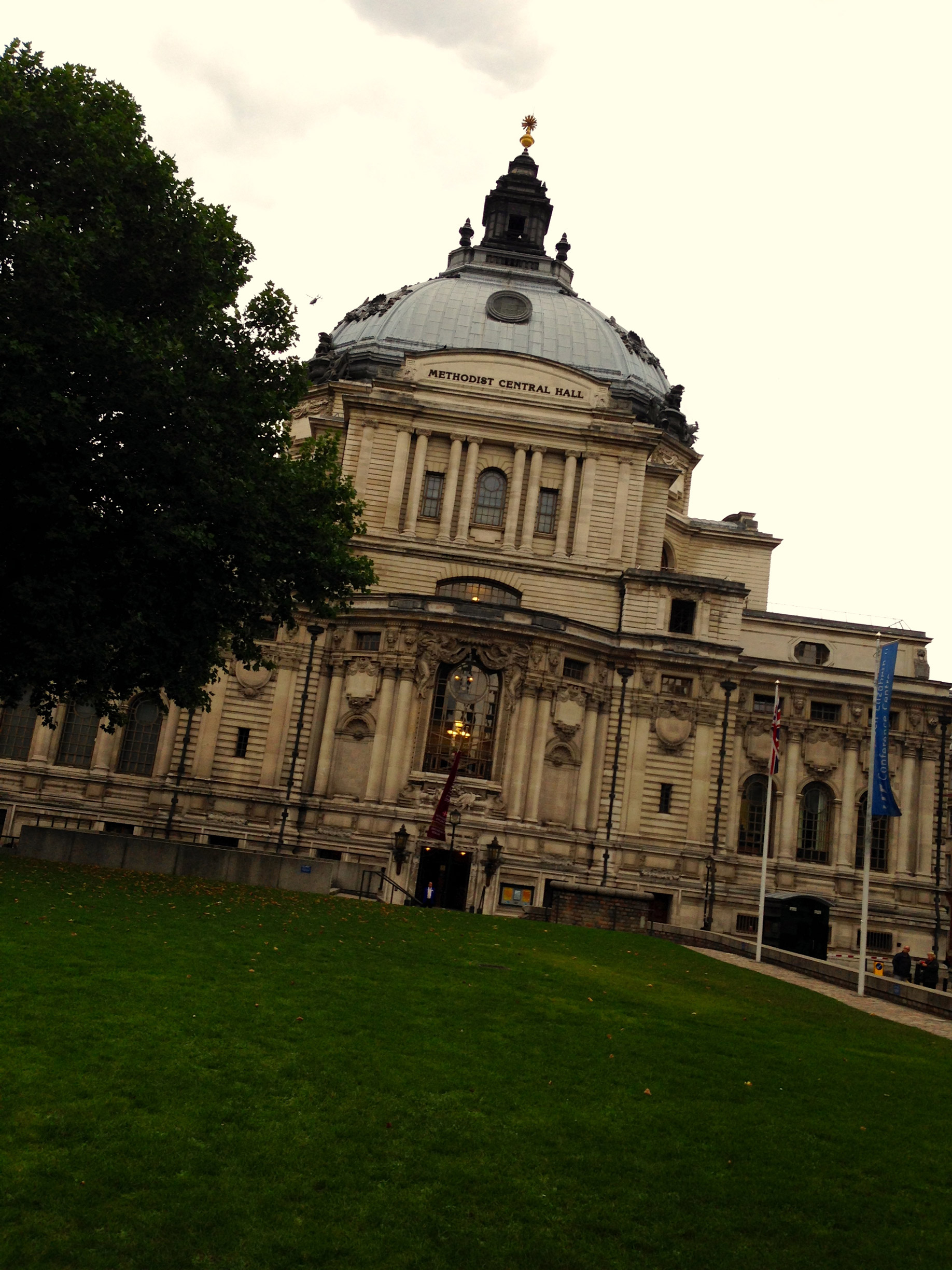
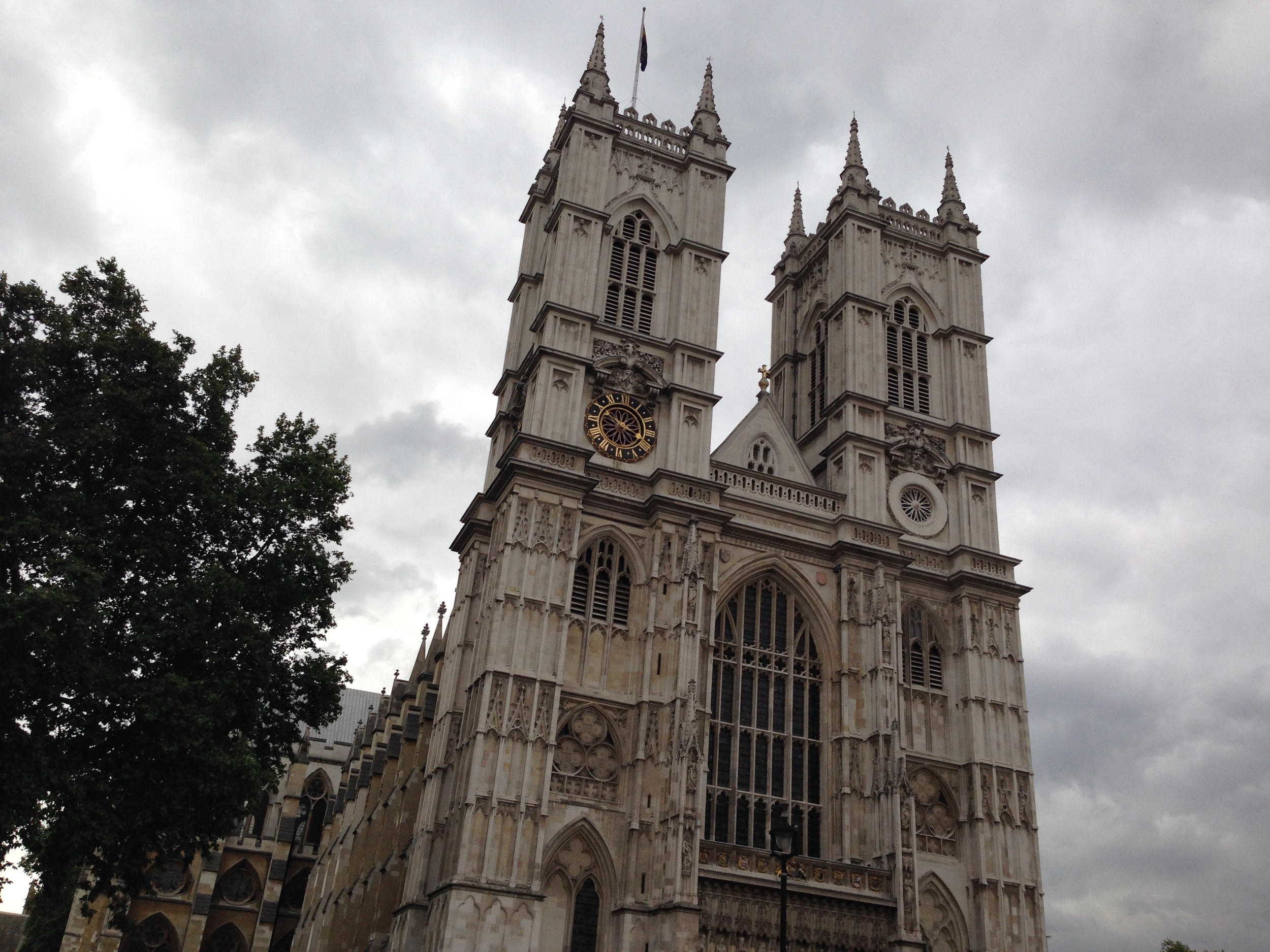
I had a very stressful week after returning to the UK. I have 2 proposals due, a presentation paper, and a seminar all in the same week. On top of that, I have three typeface projects and a few freelance jobs keeping me busy. This is a good problem though. I am glad I have awesome projects and great clients! However, I like to go out and explore as well :] I caught up on all of this a few days ago and decided to take a day off and wander around London. I hadn't been to the south bank much, so I decided to head there after getting off the tube.

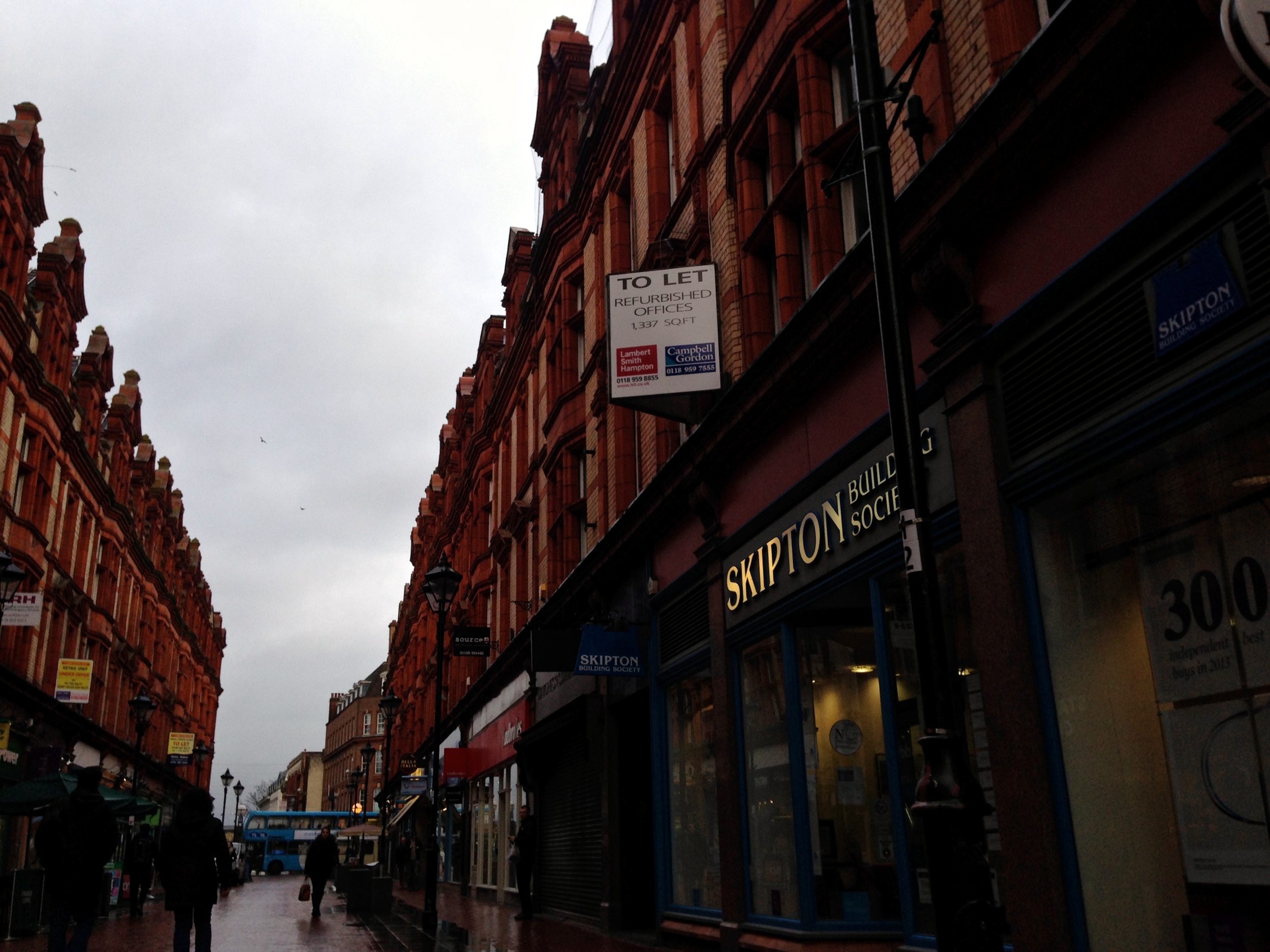
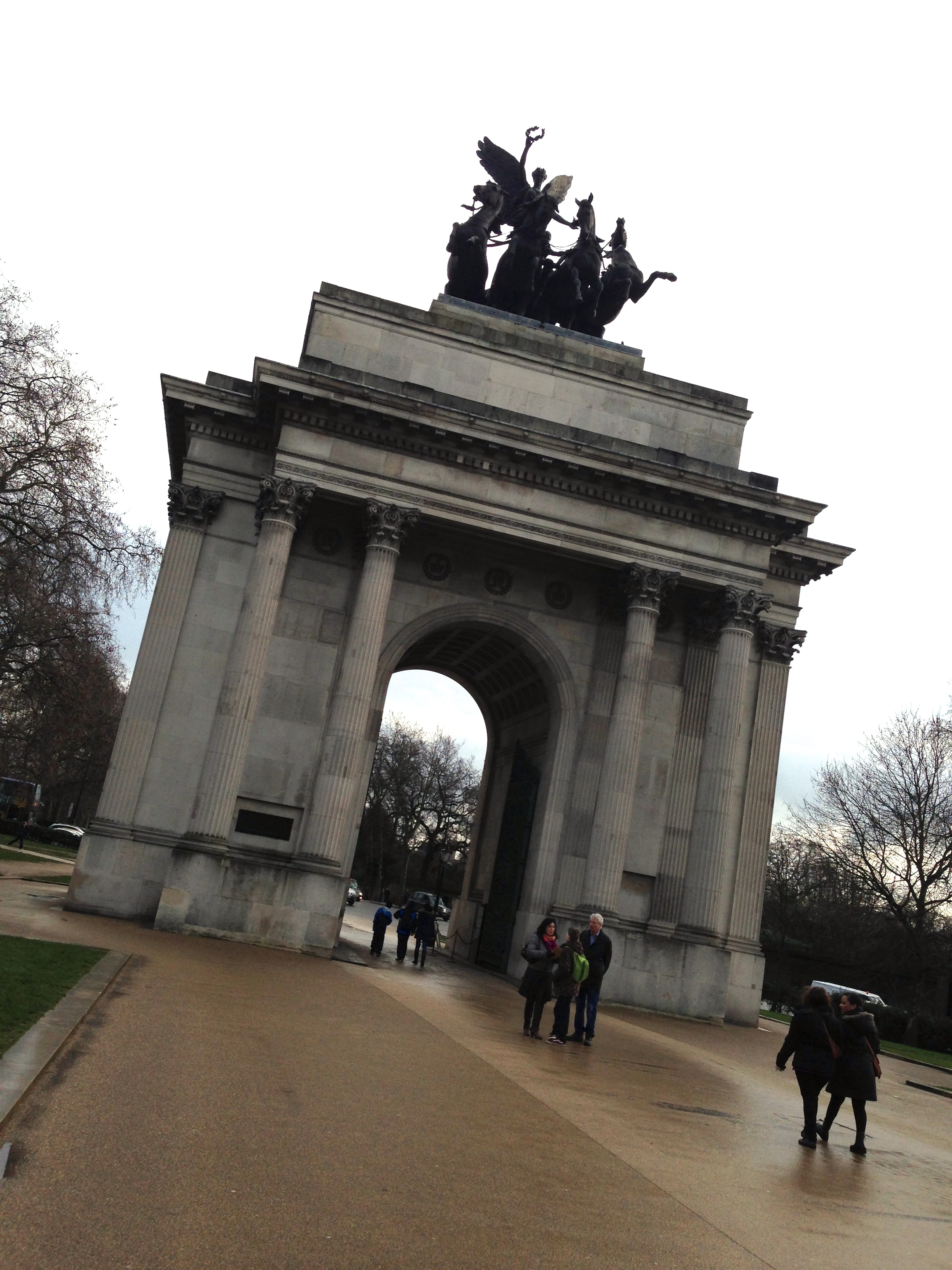
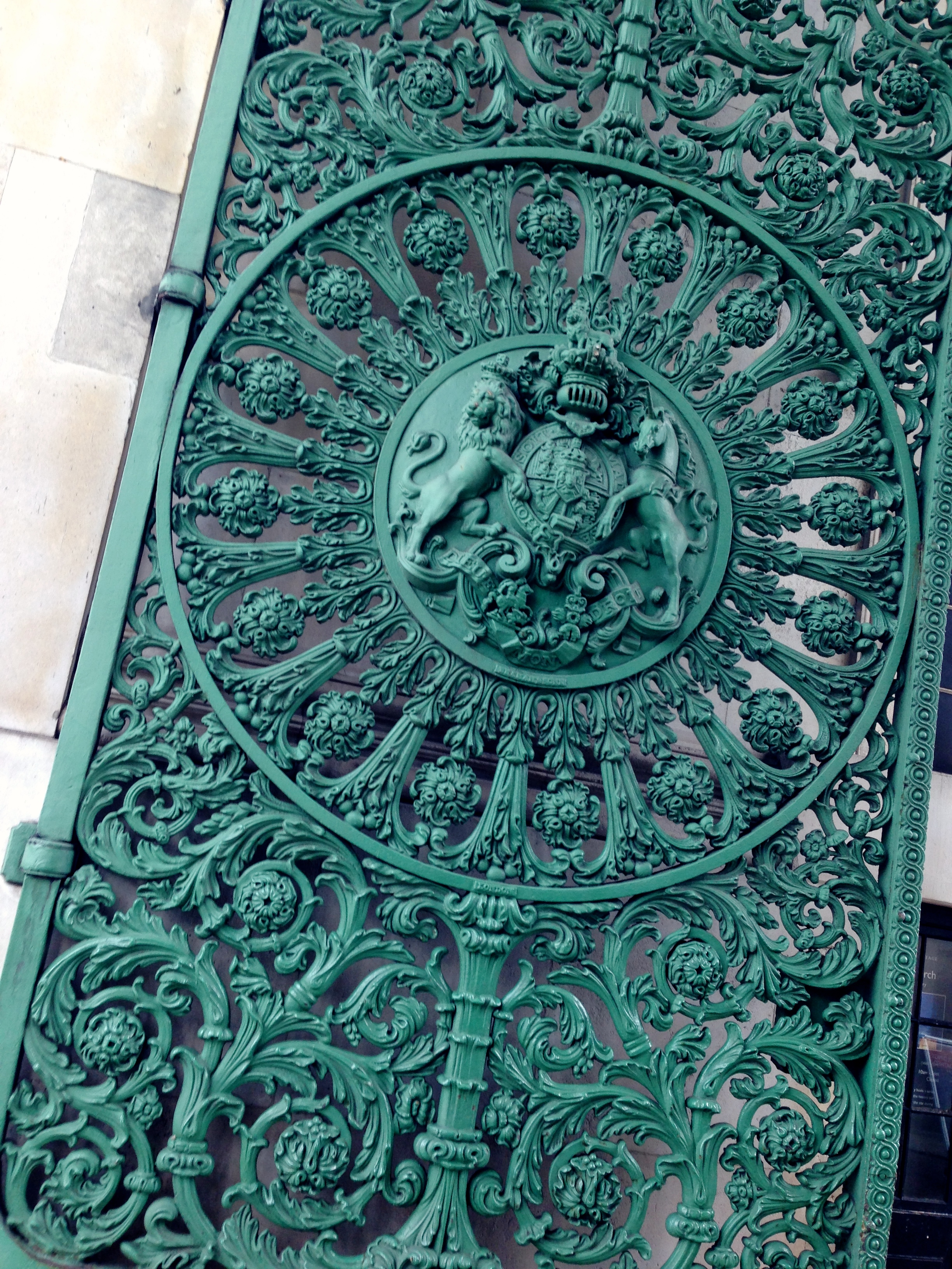
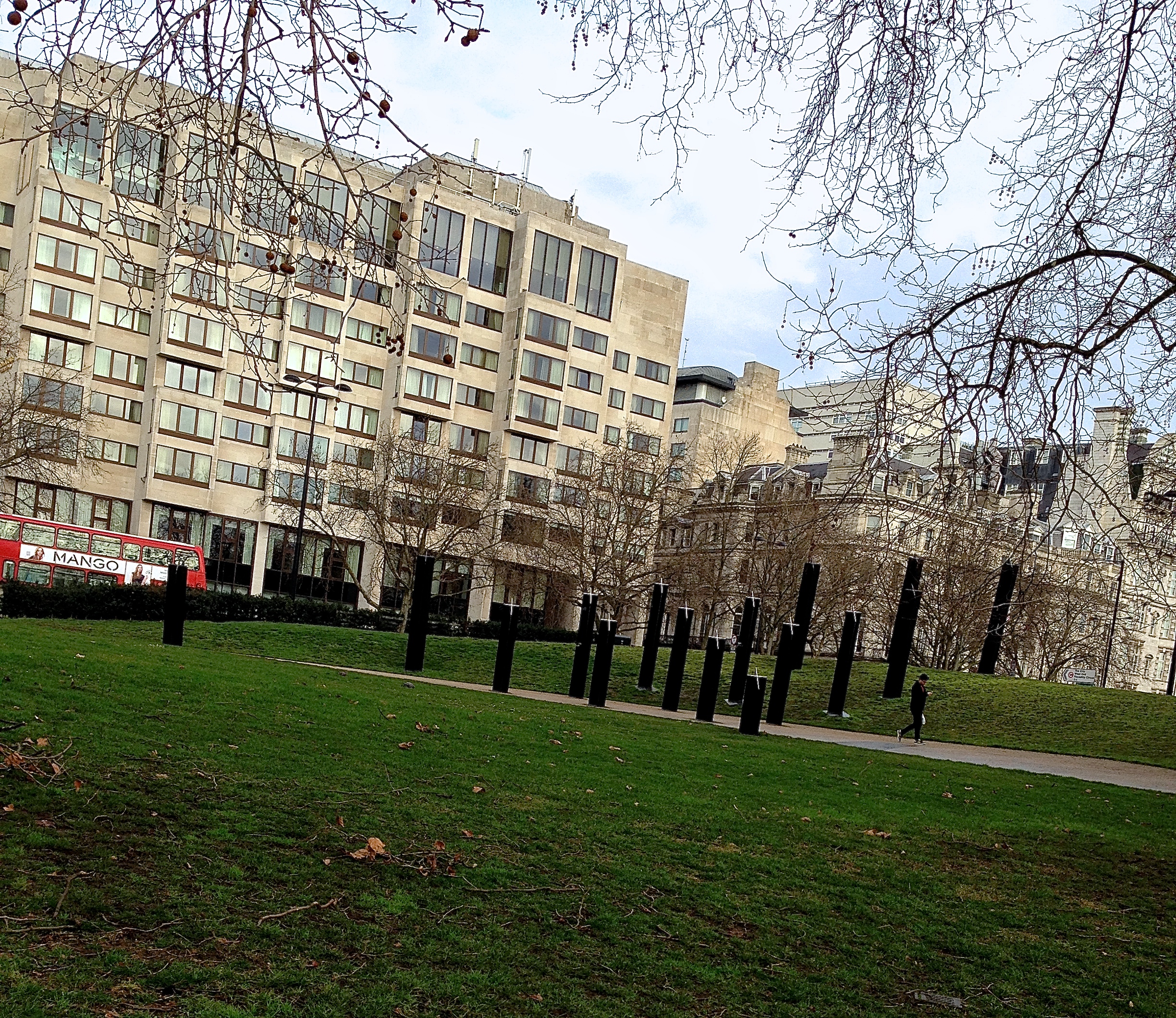
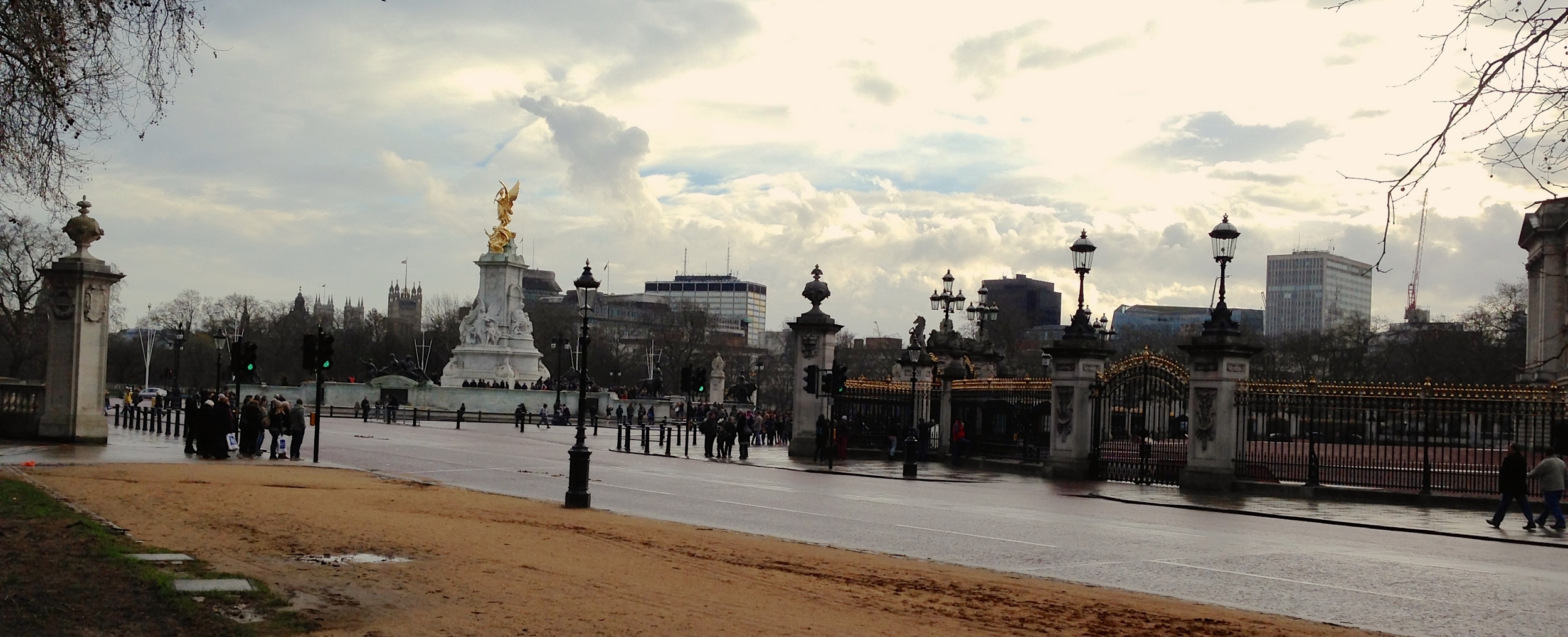
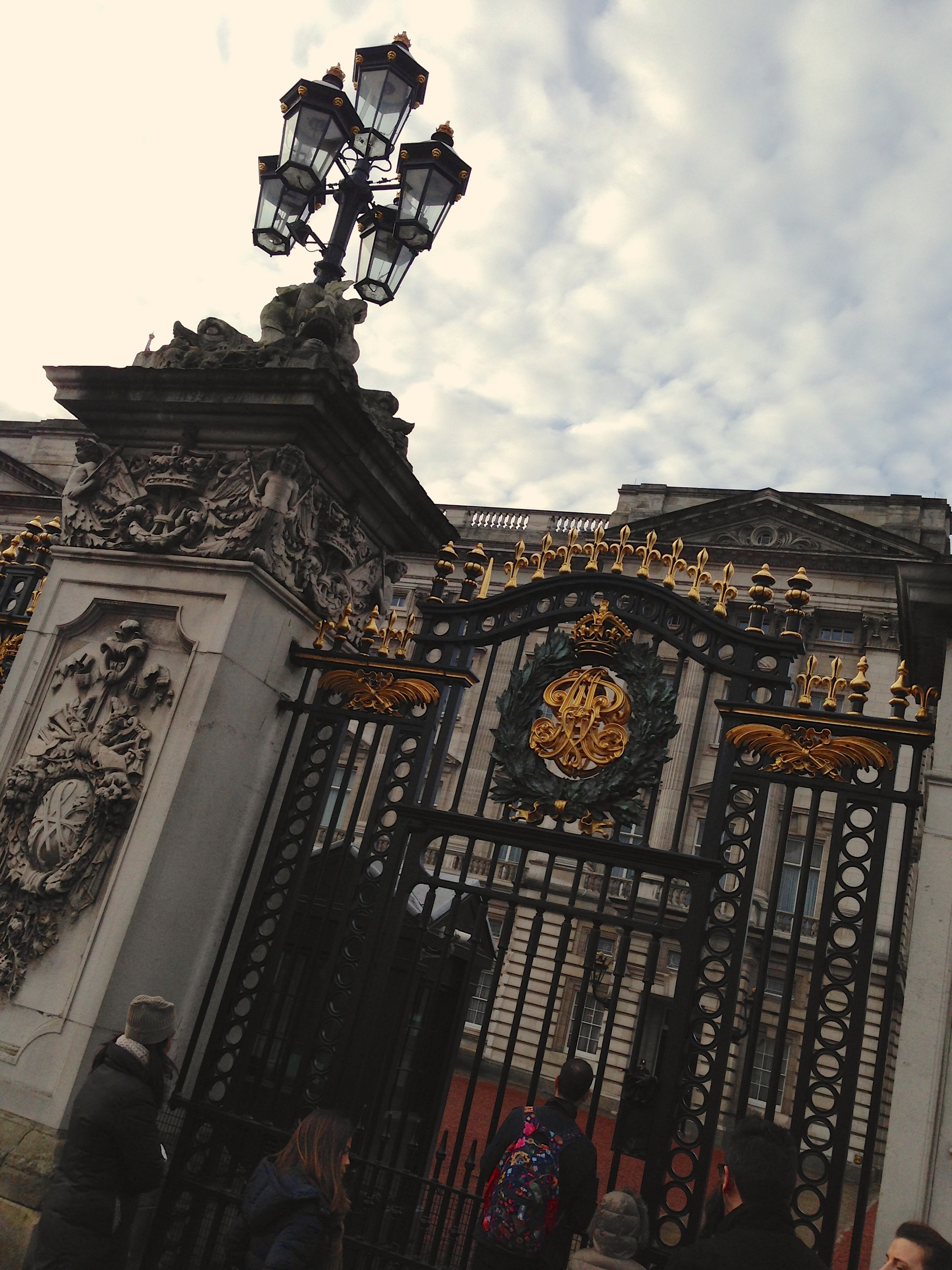
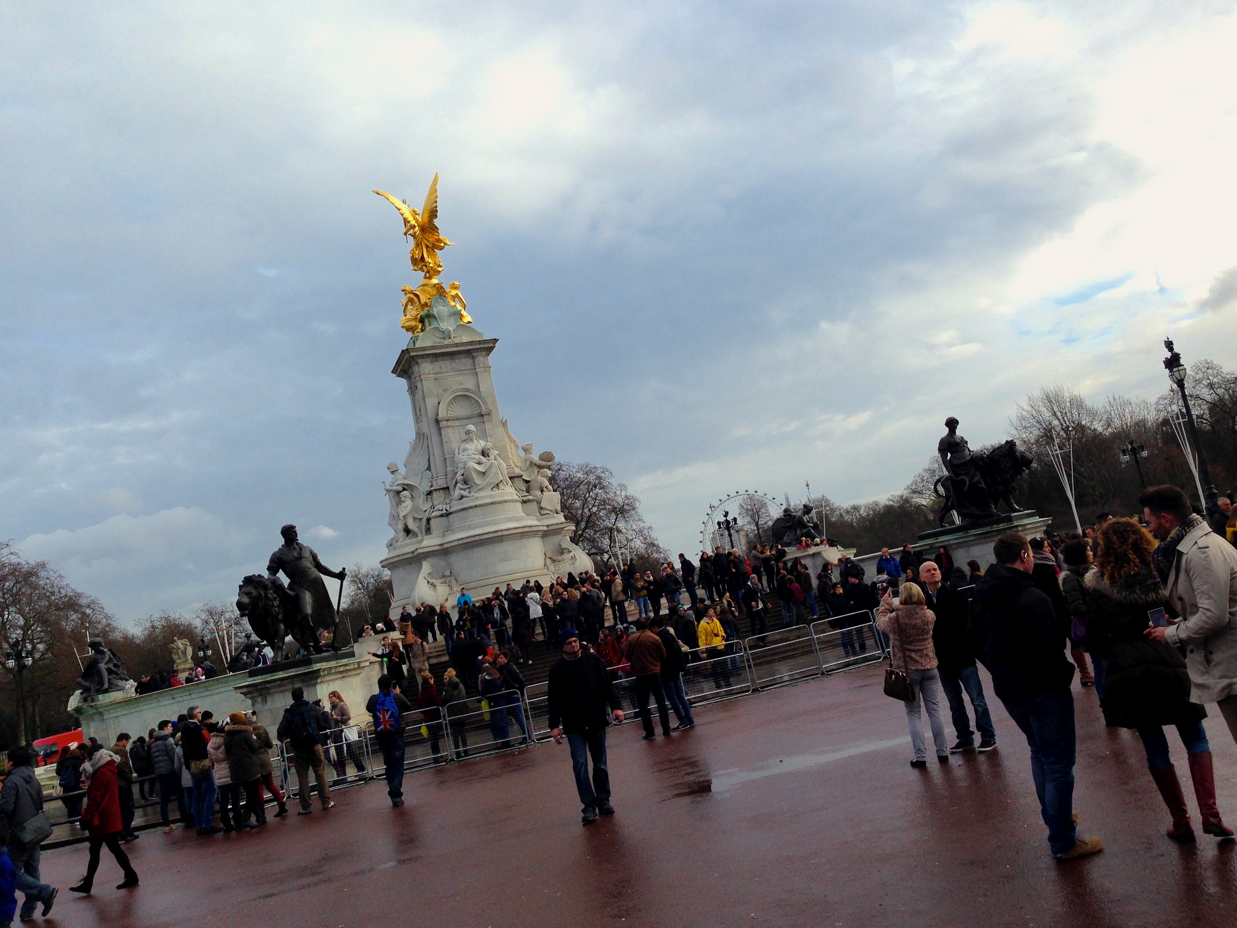
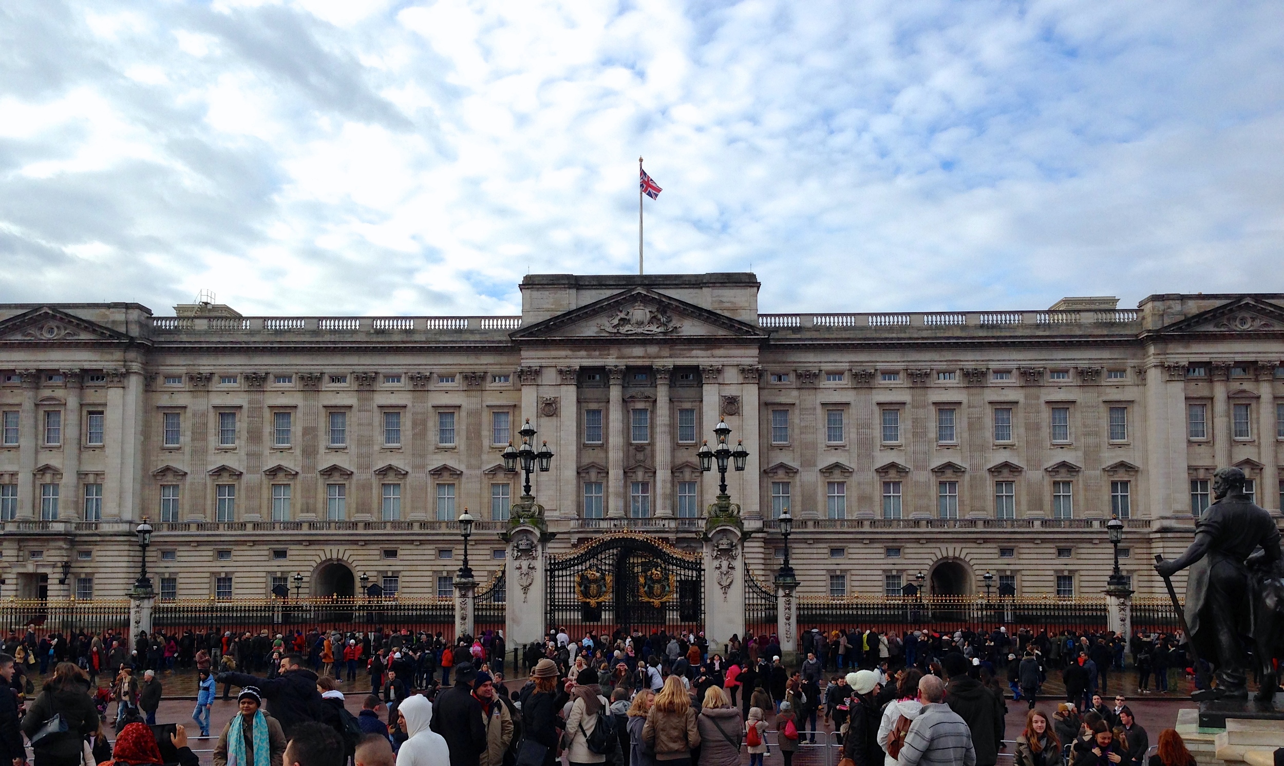
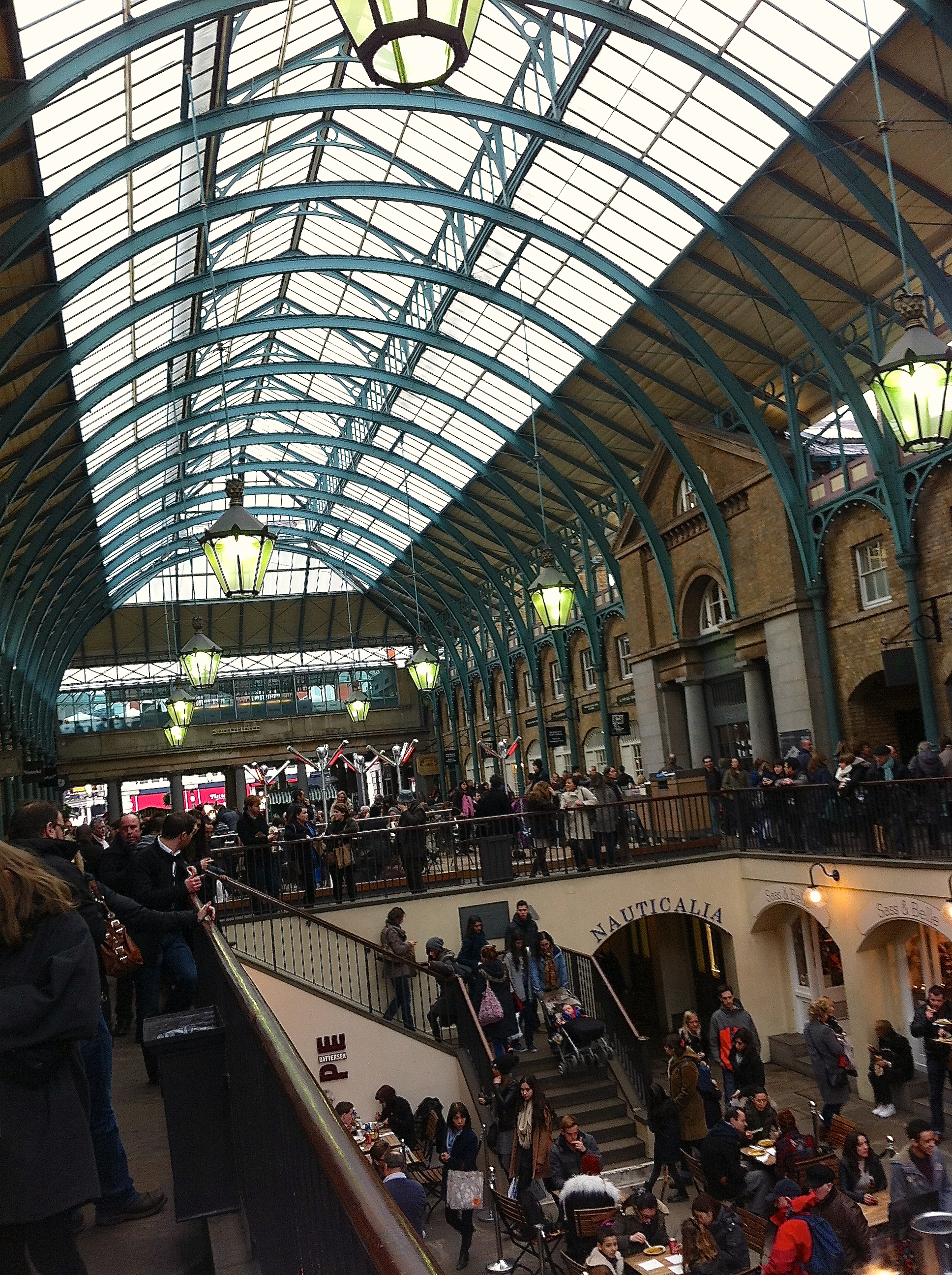
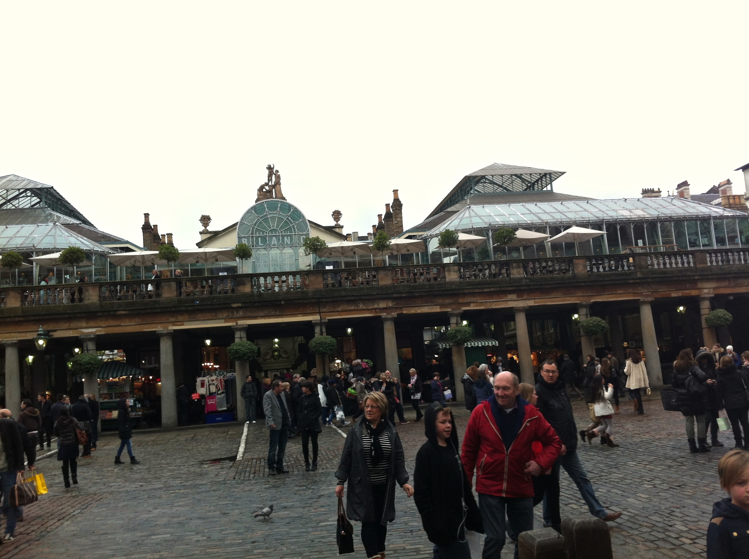
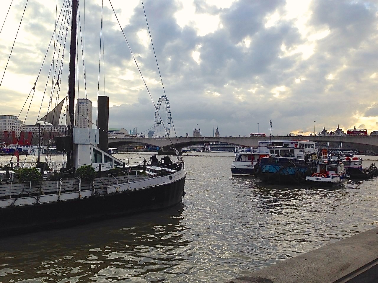
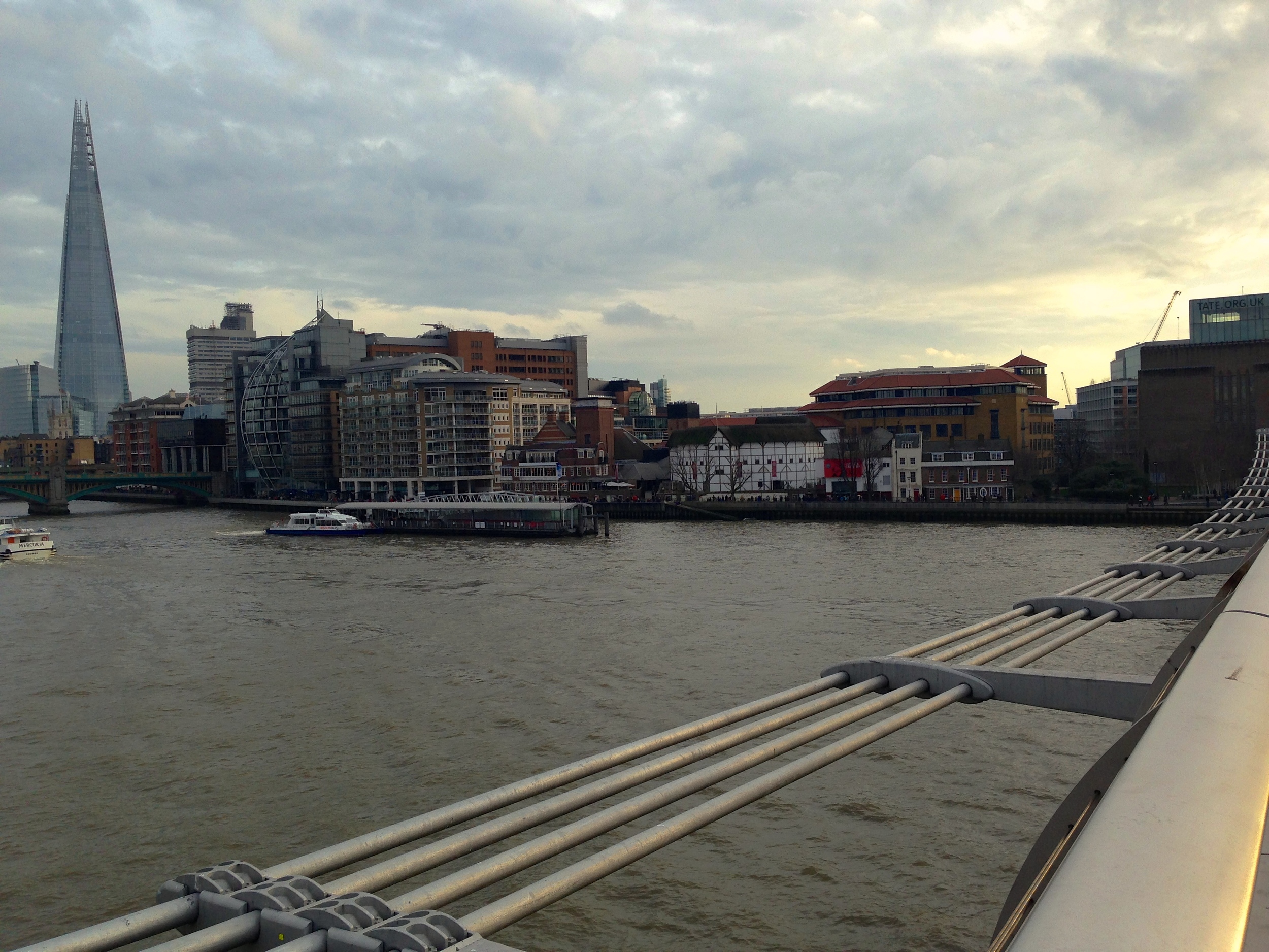
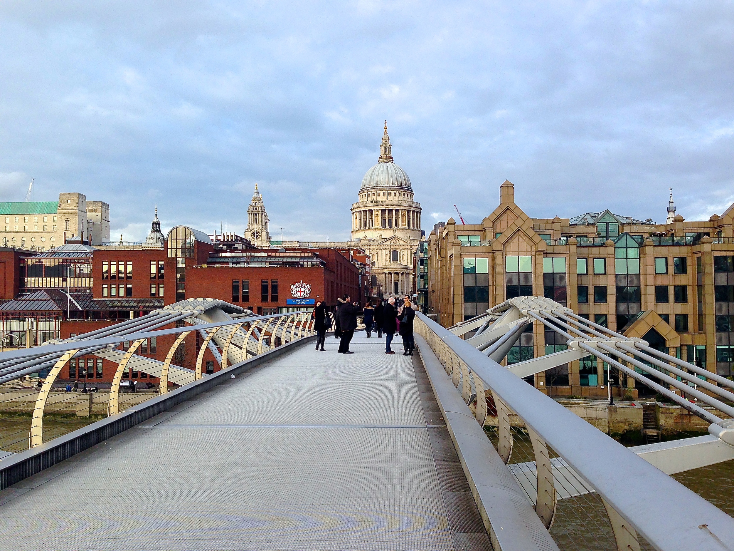
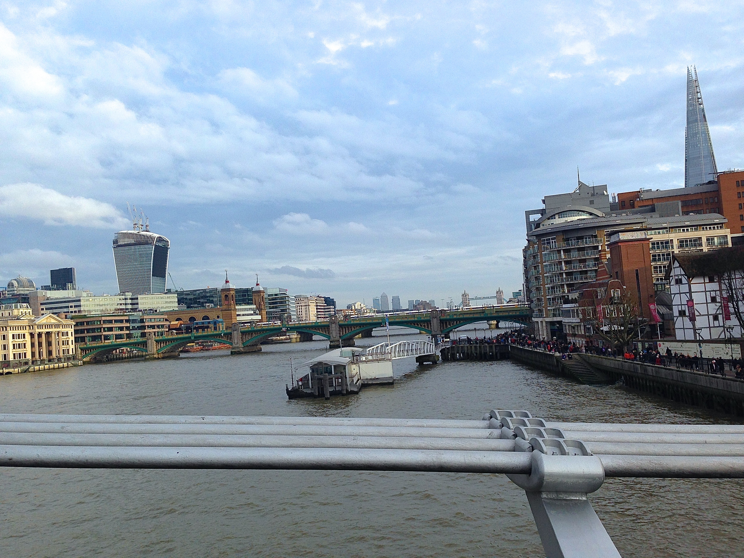
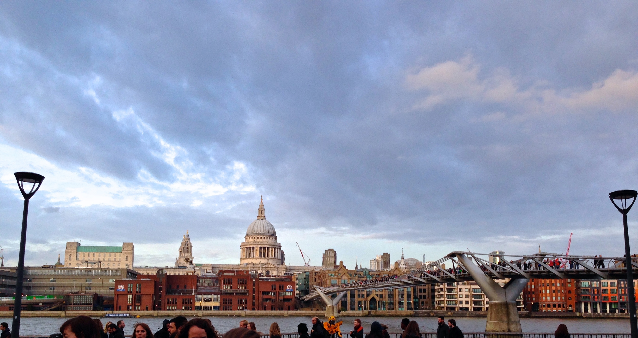
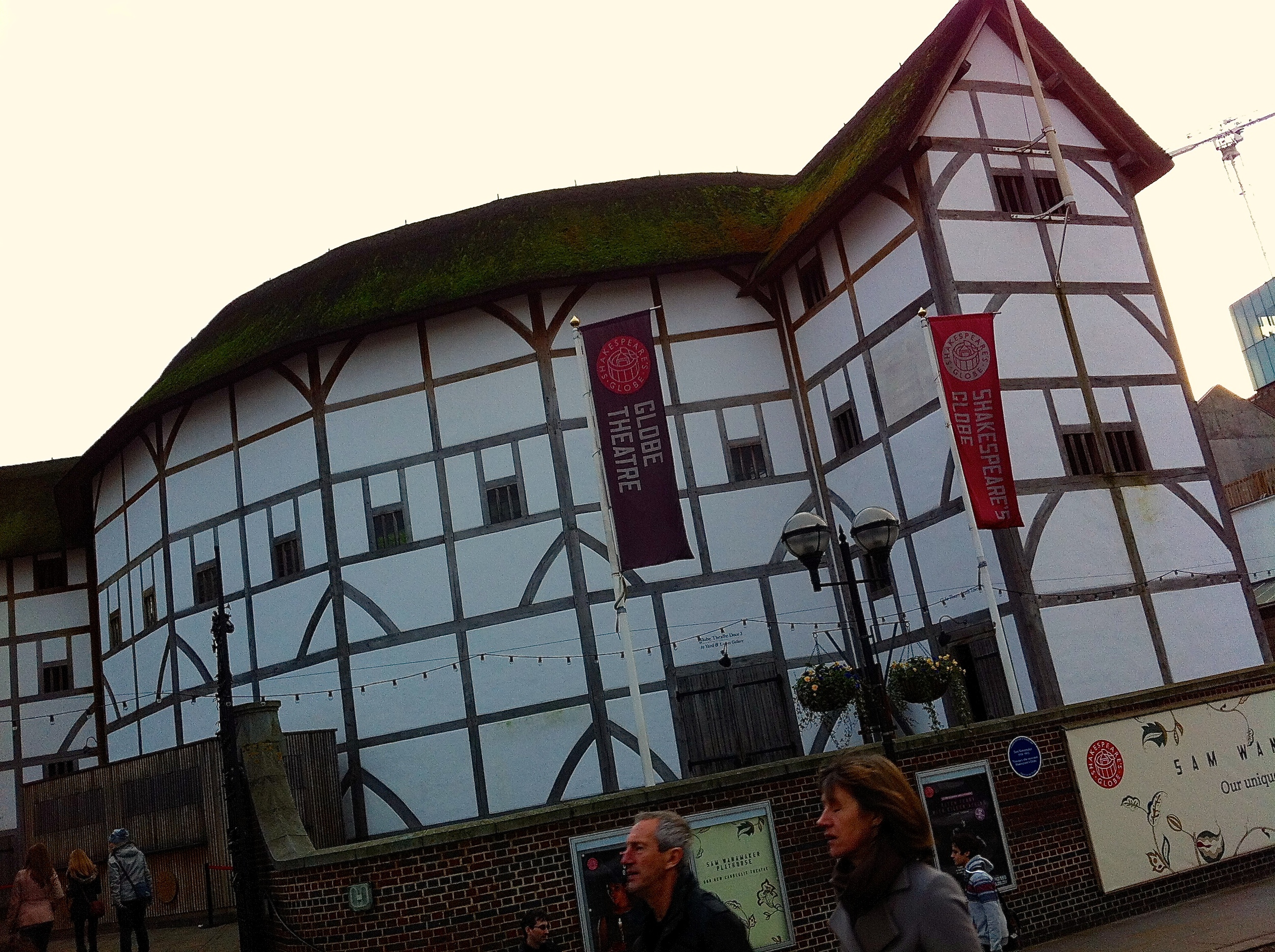
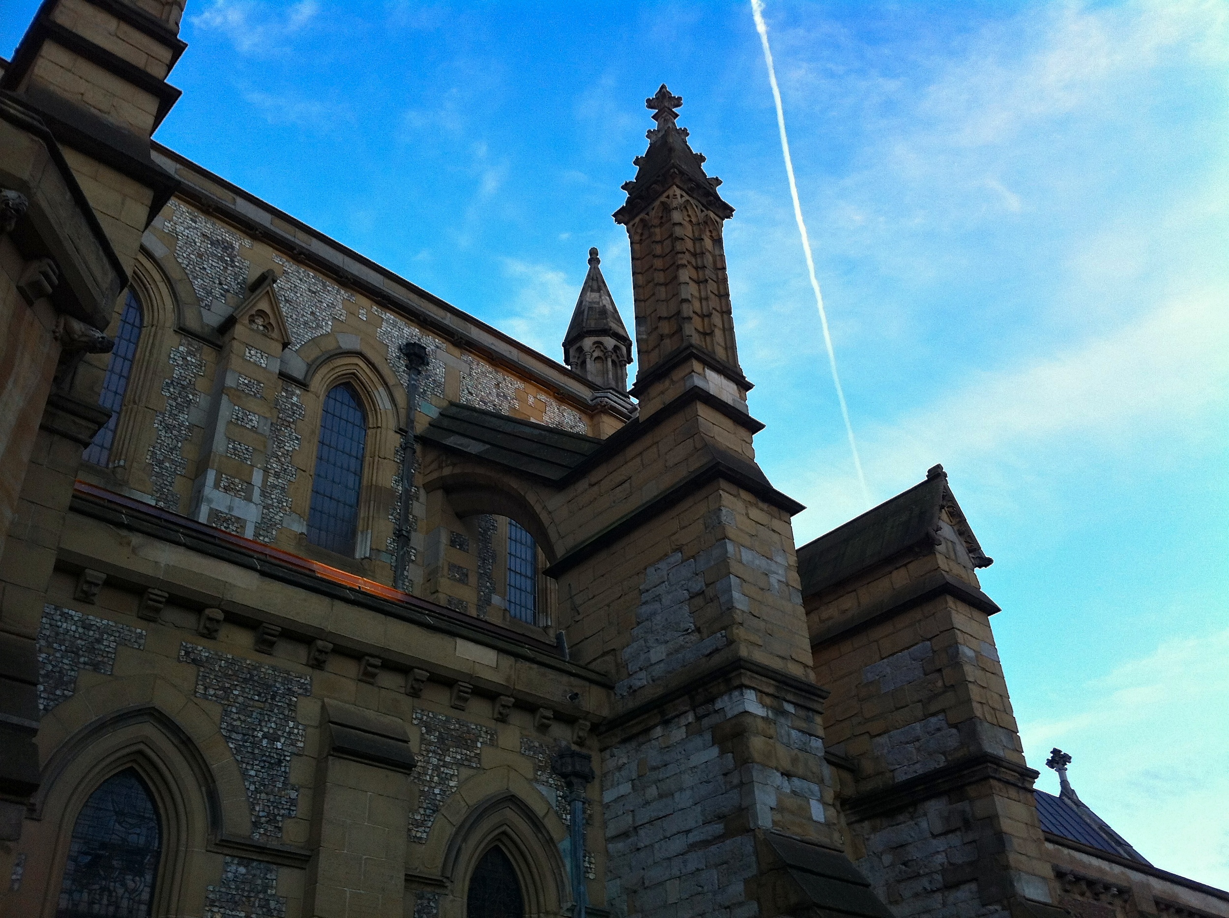
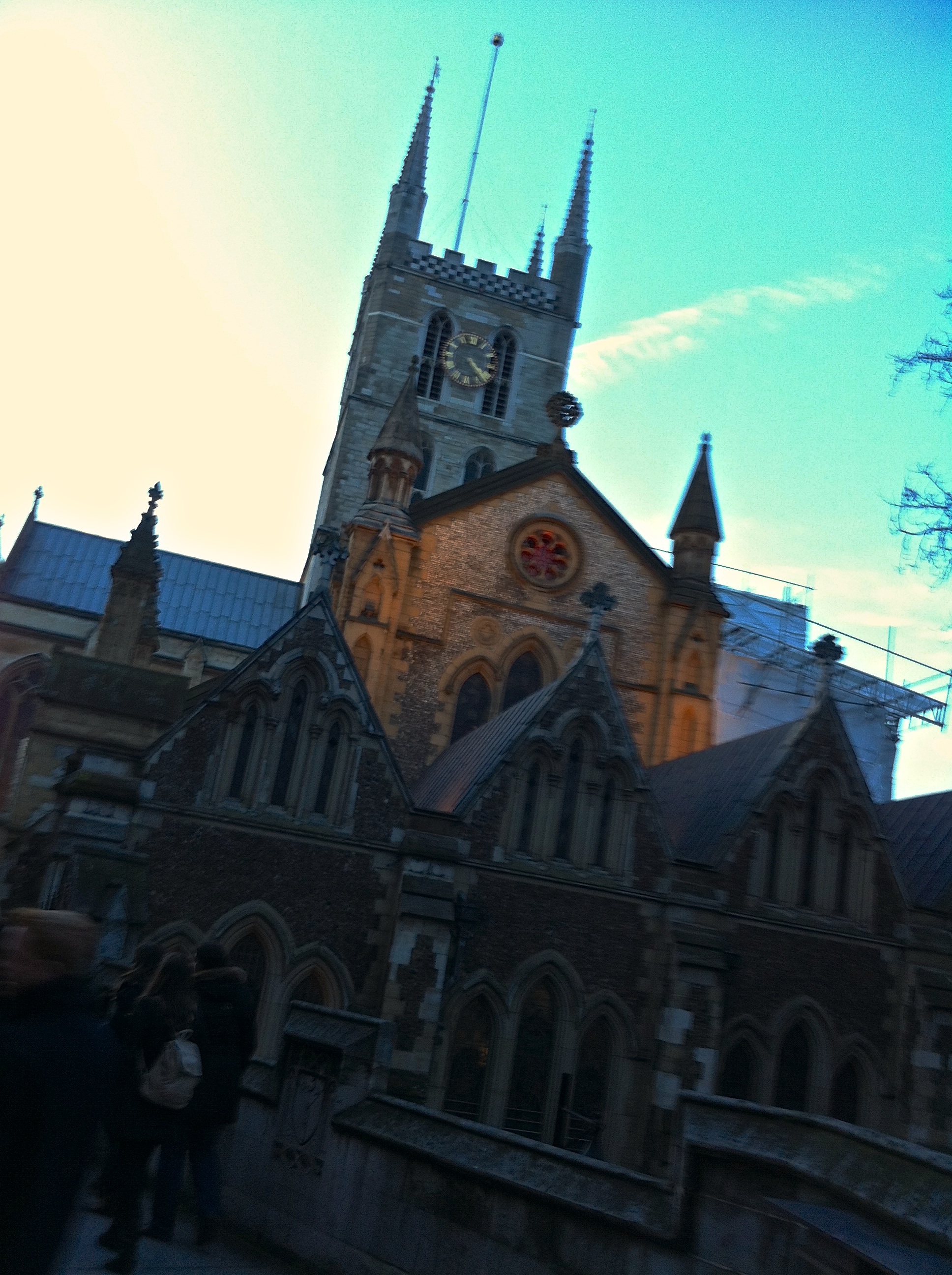
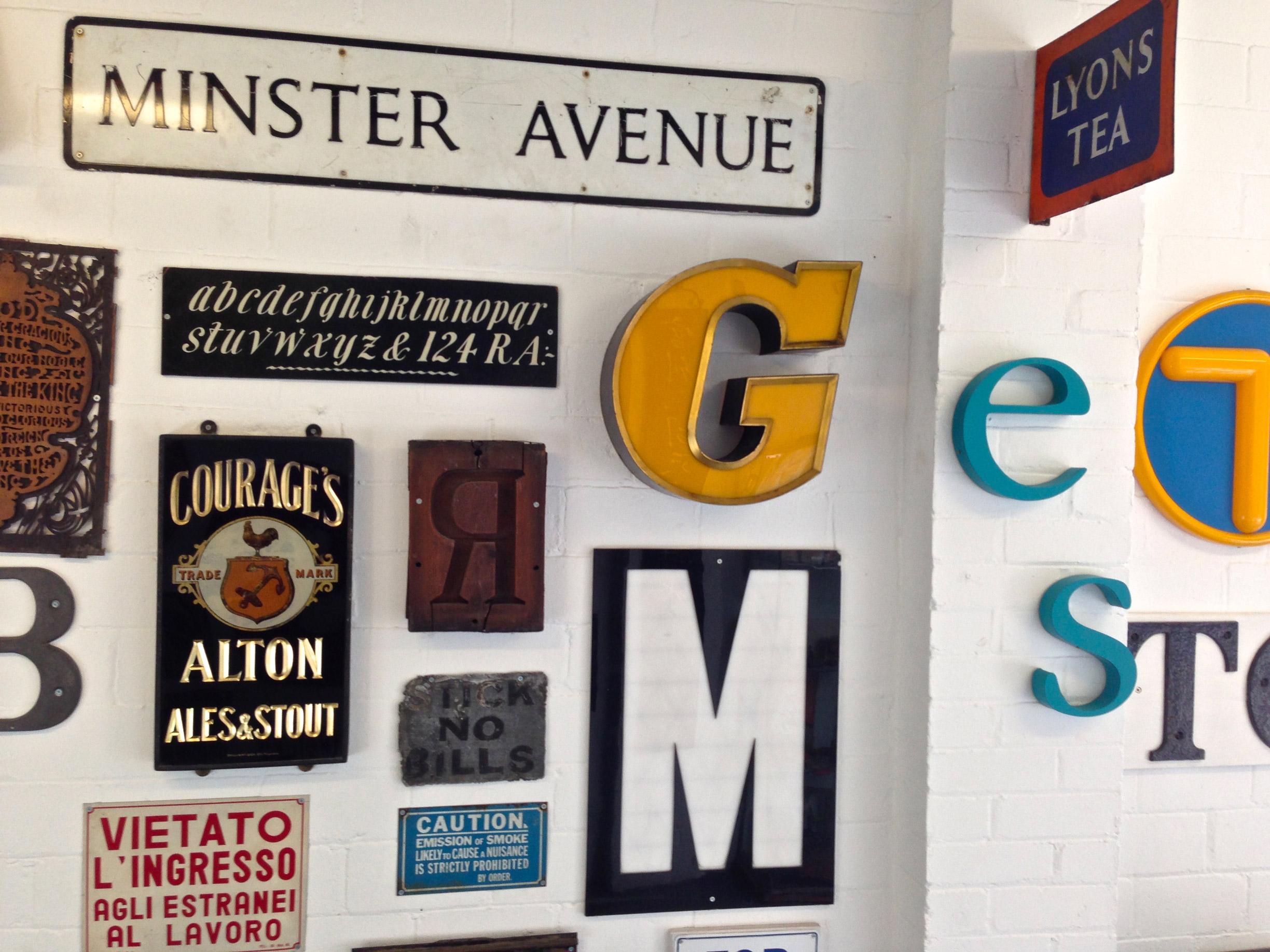
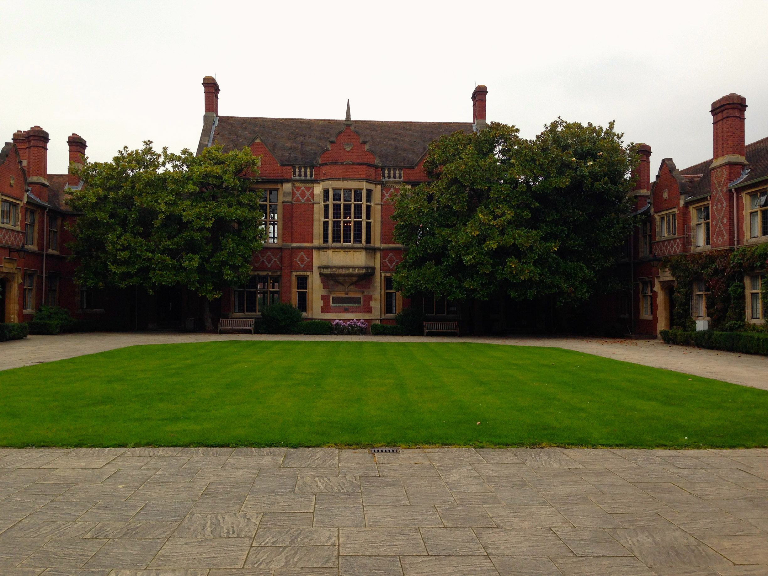
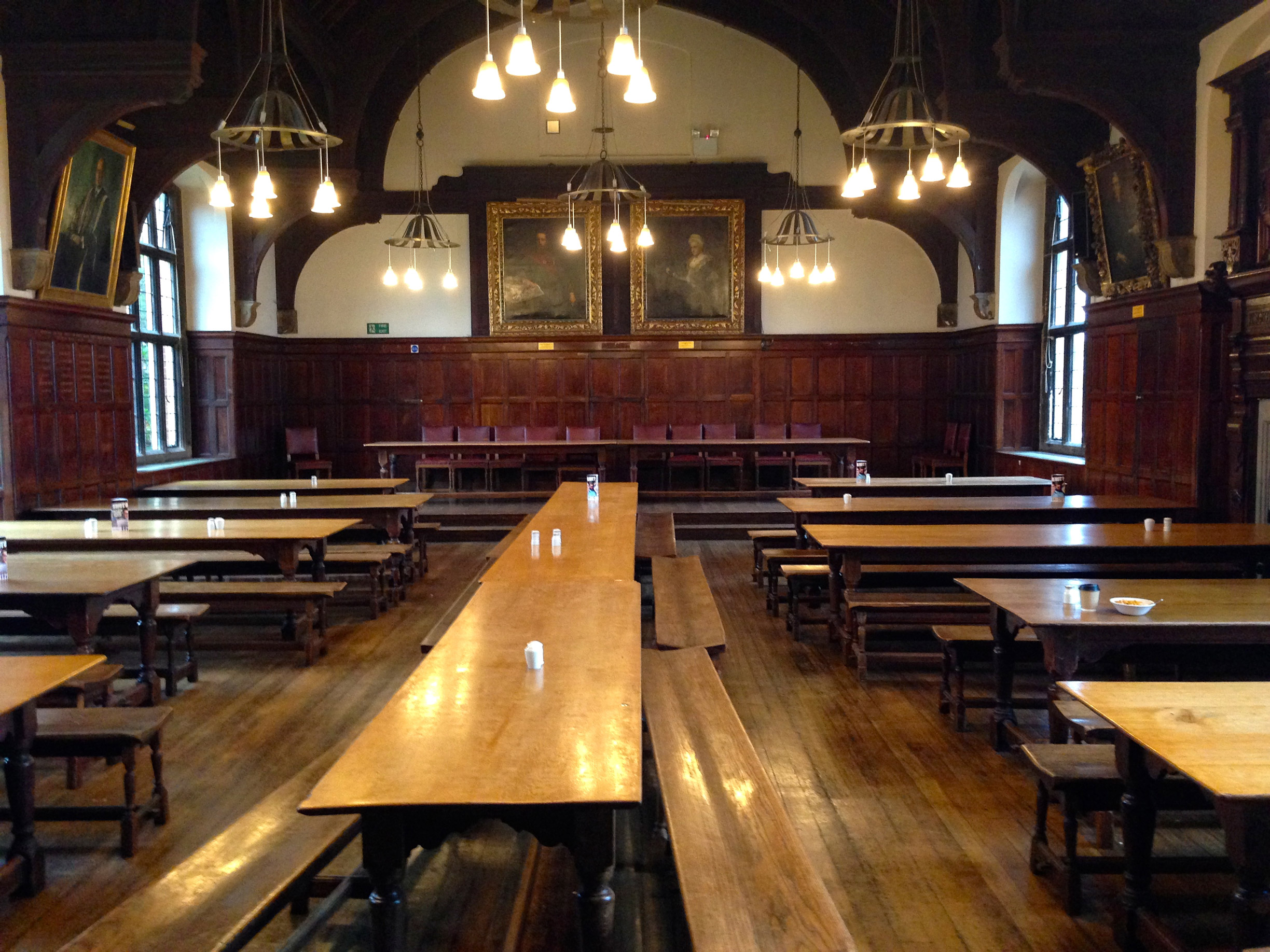
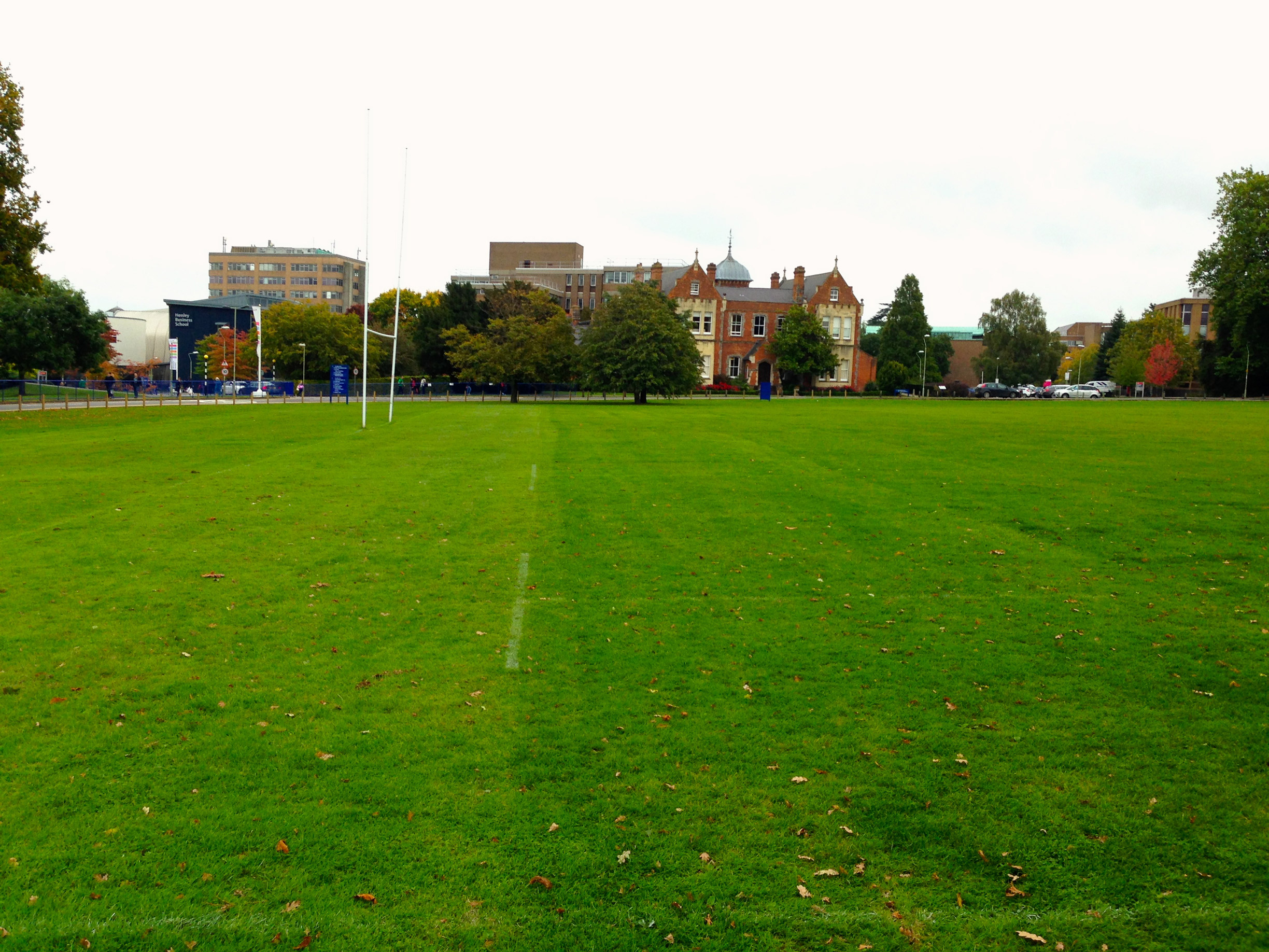
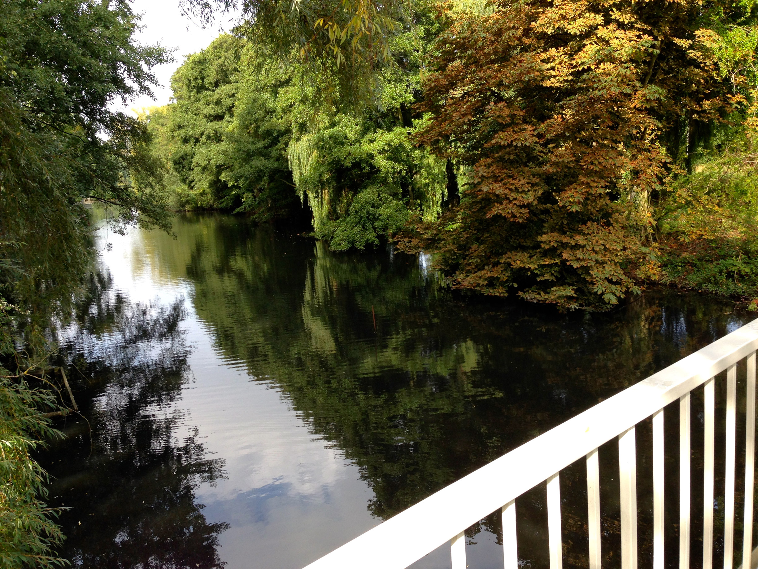
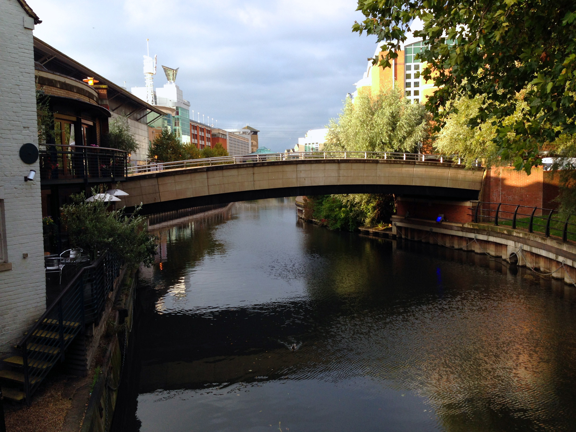
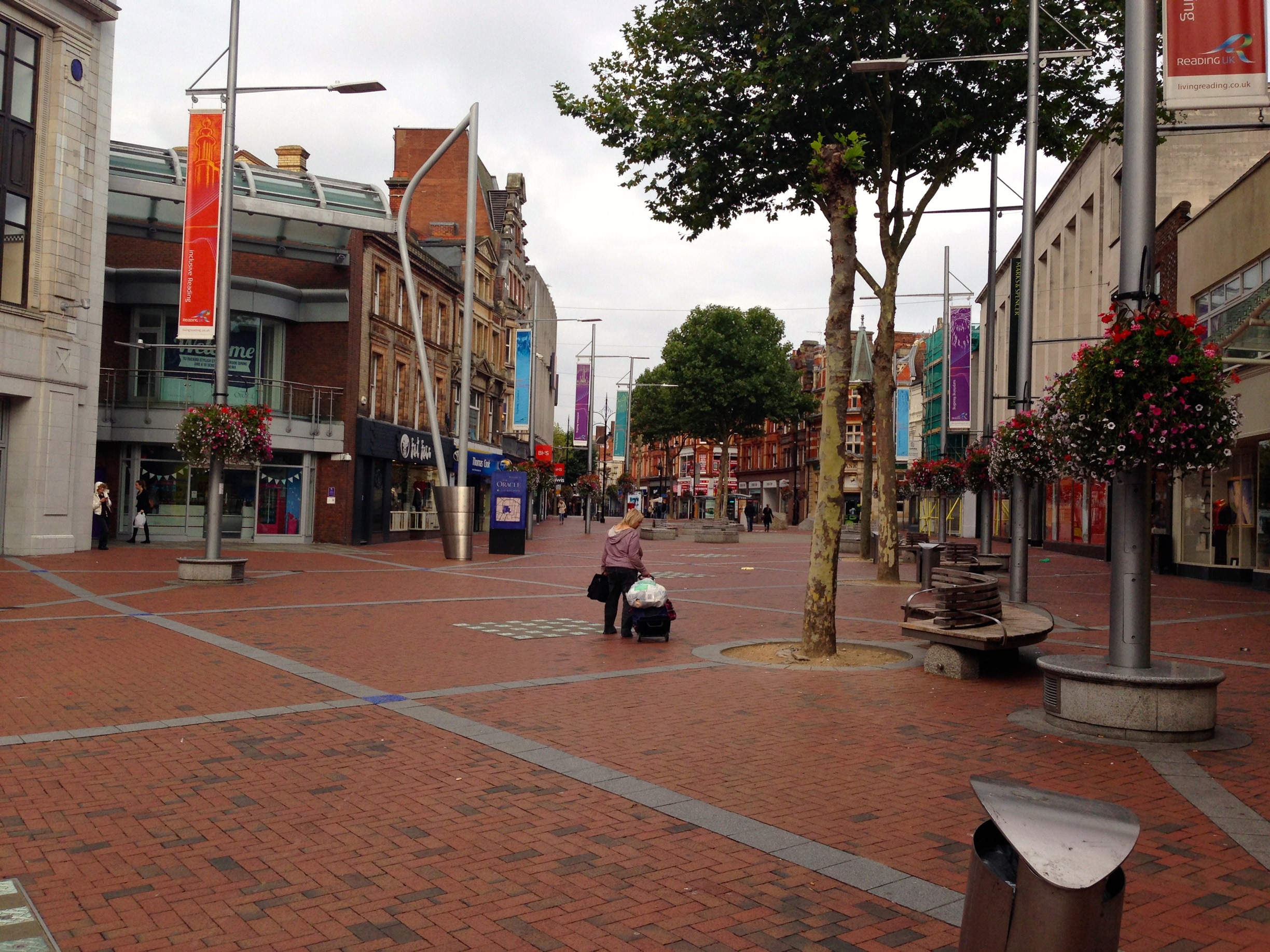
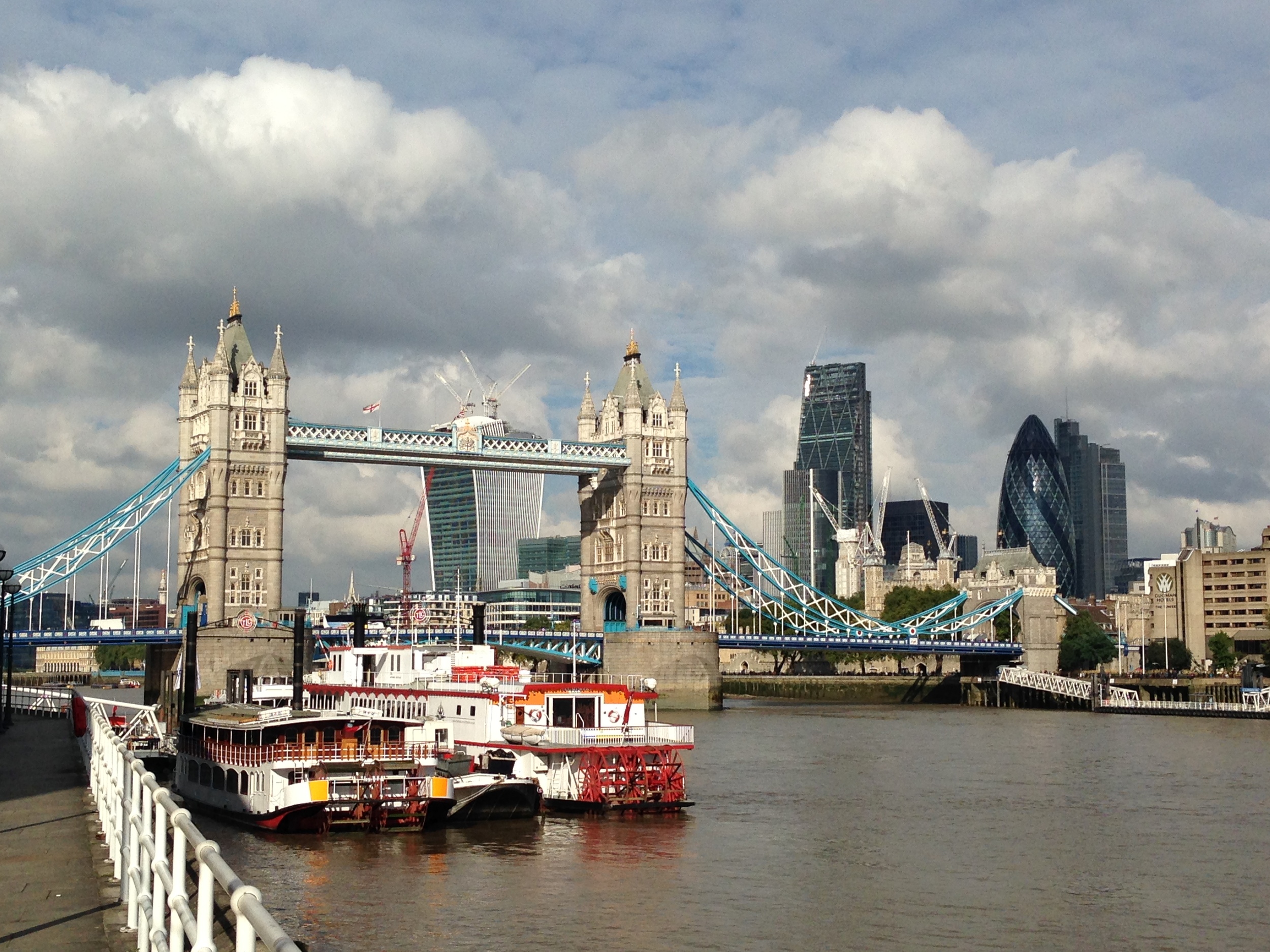
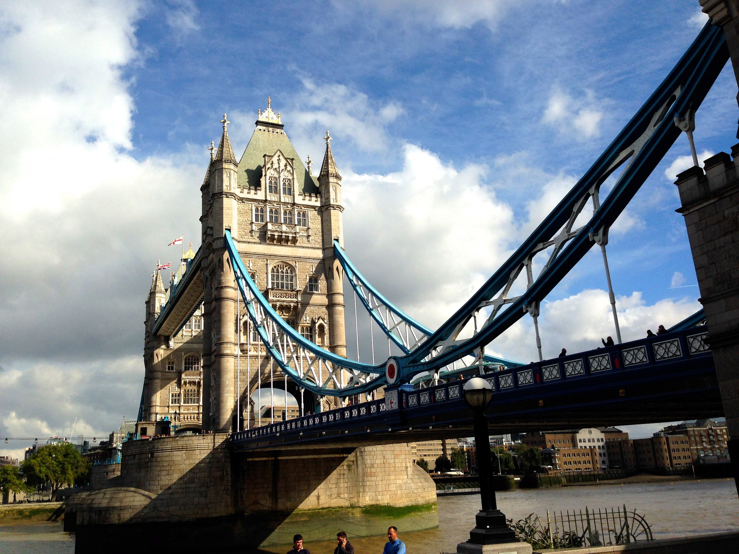
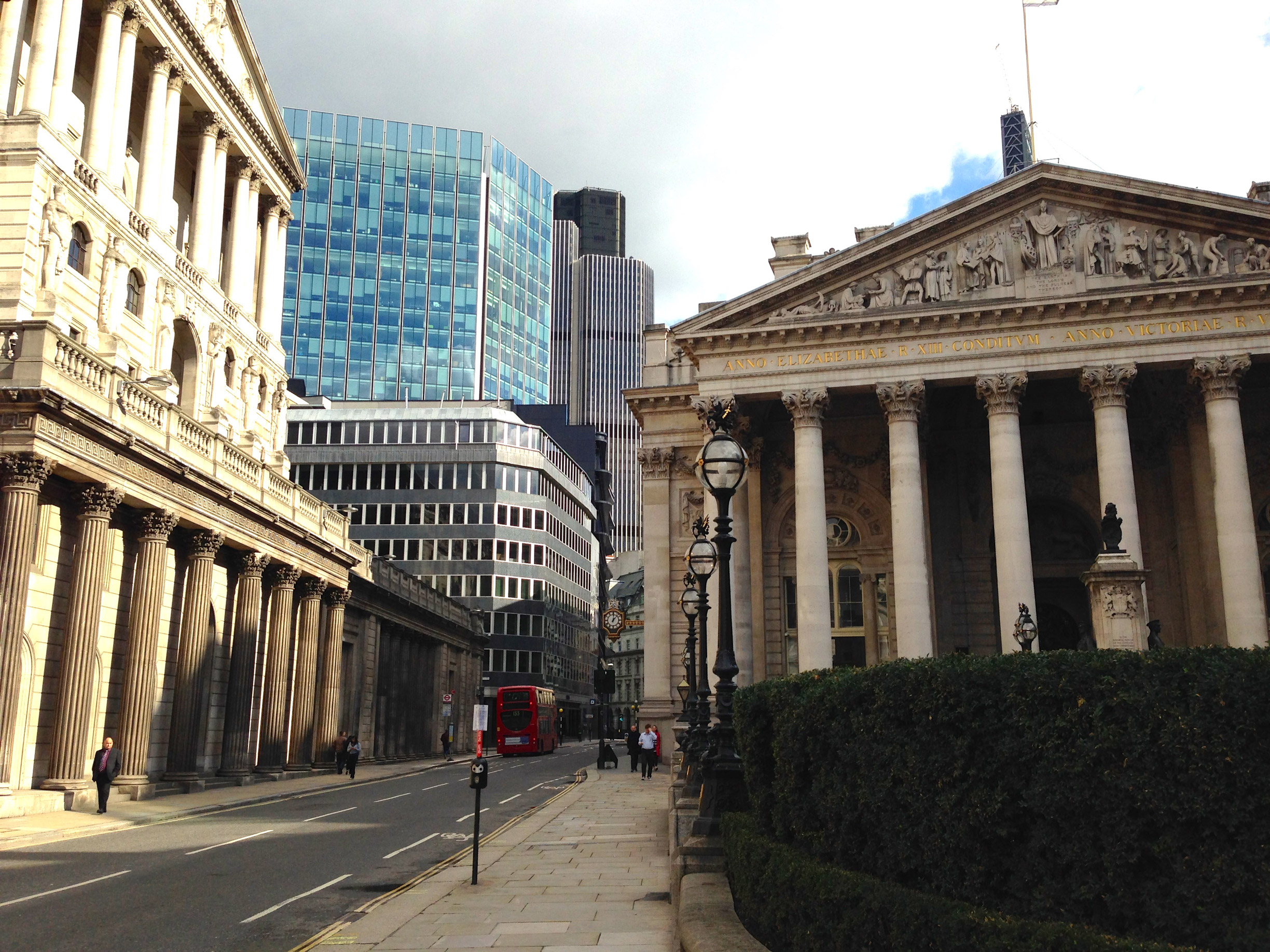
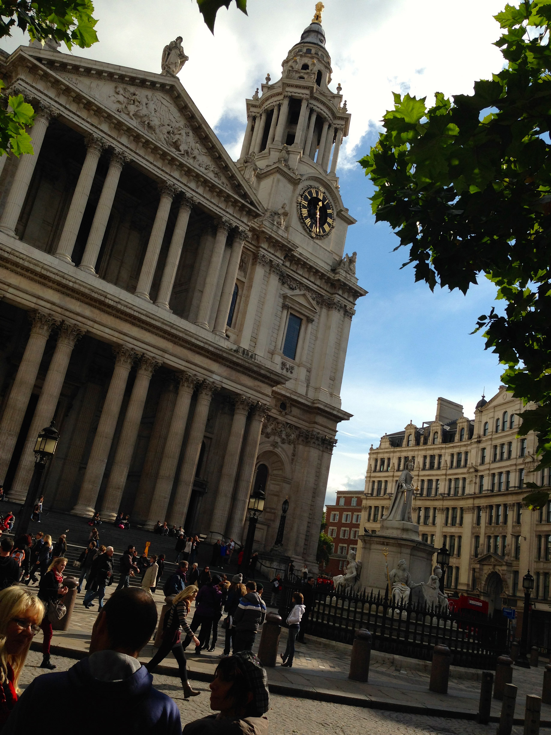
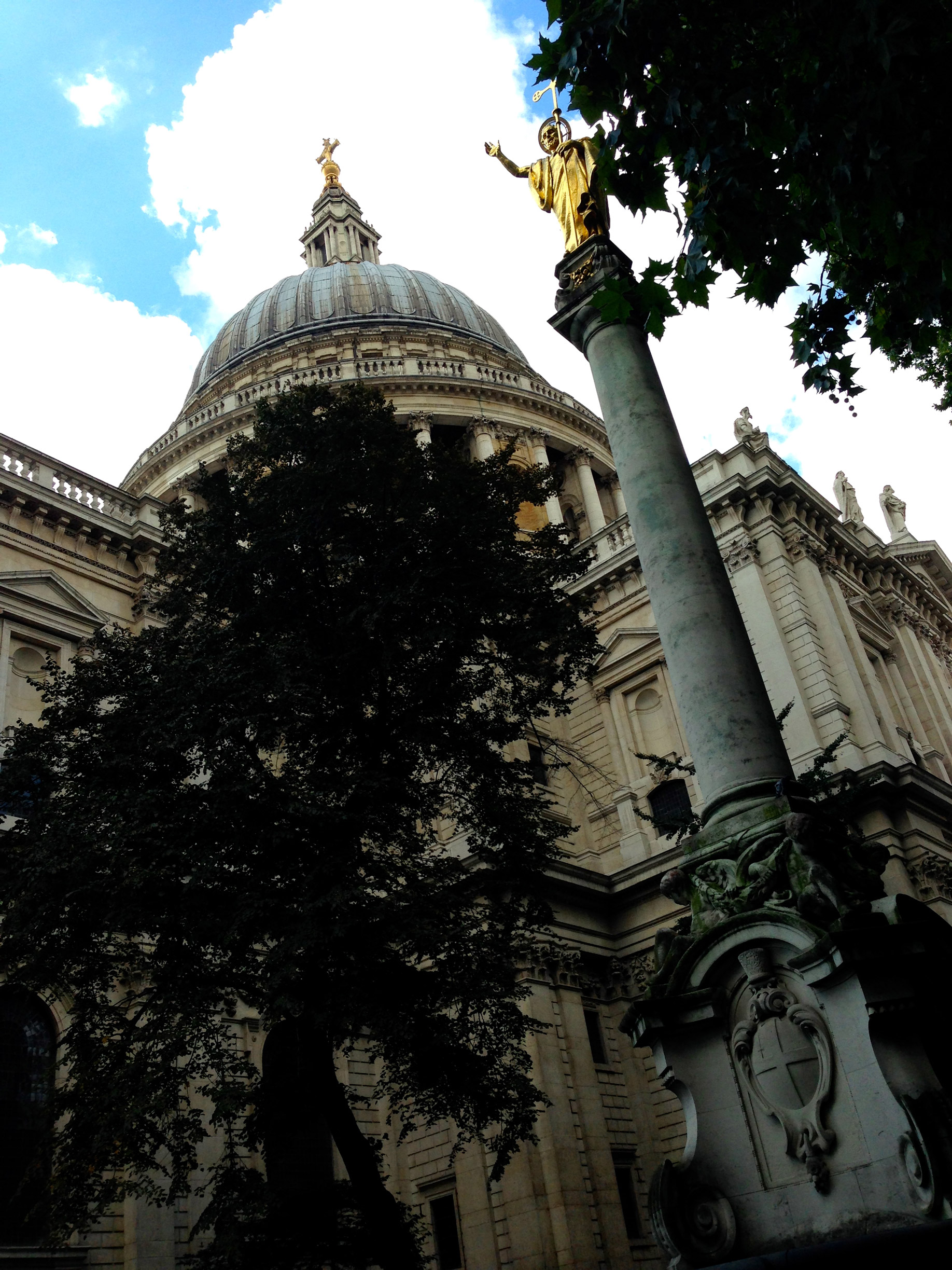
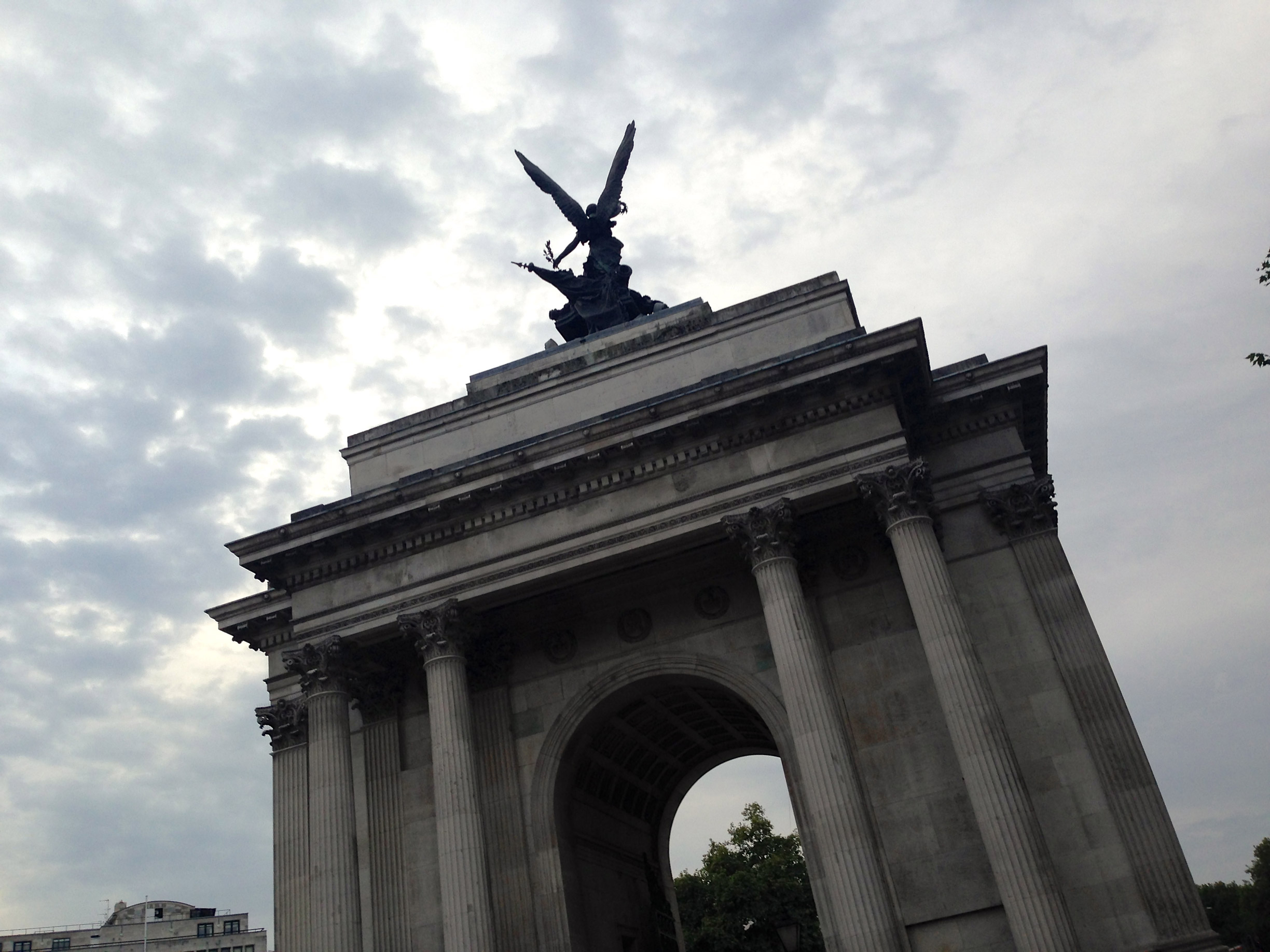
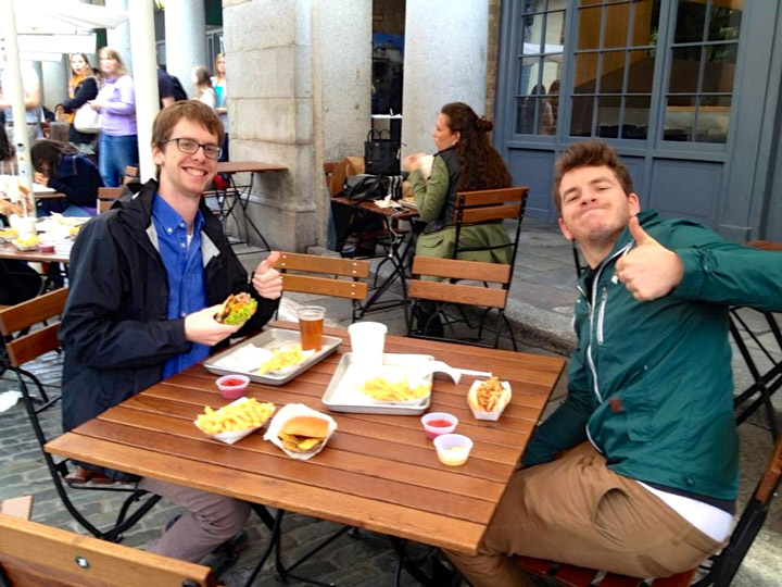
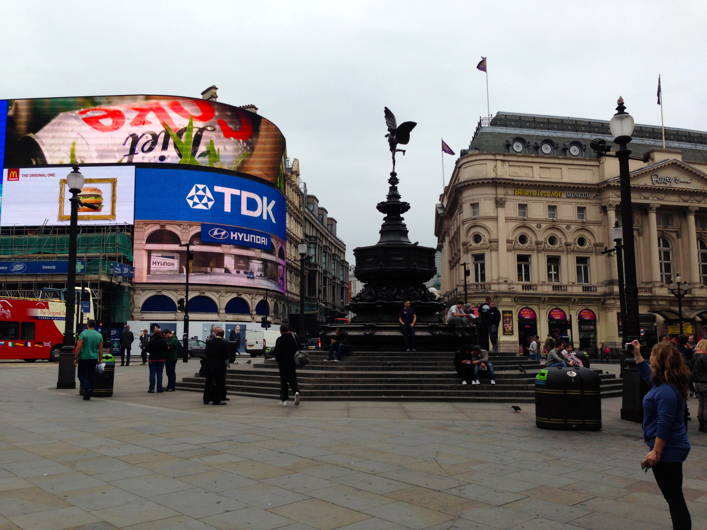
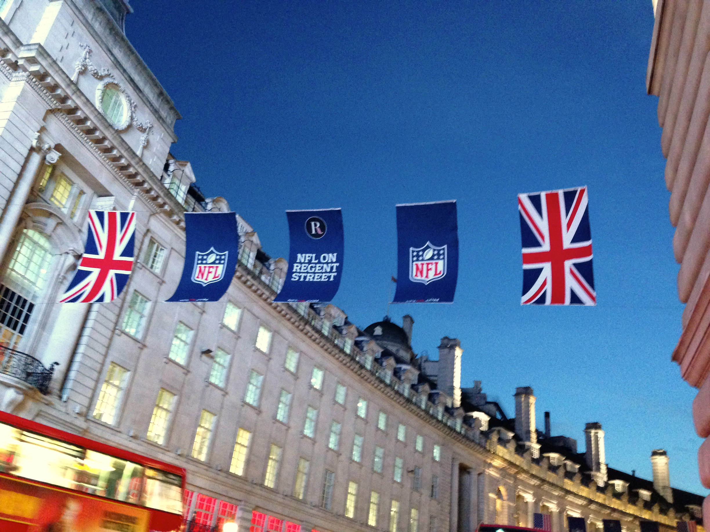
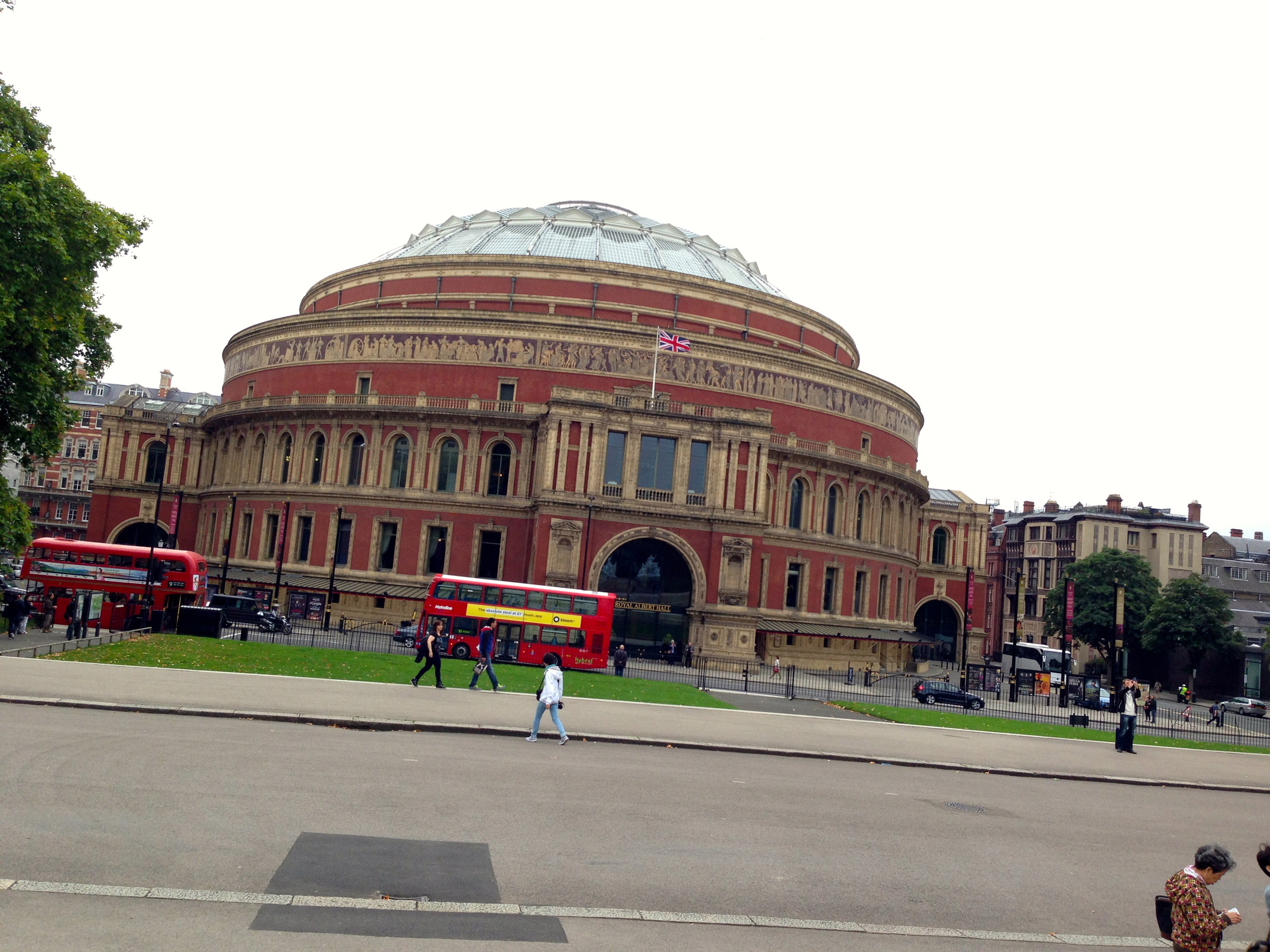
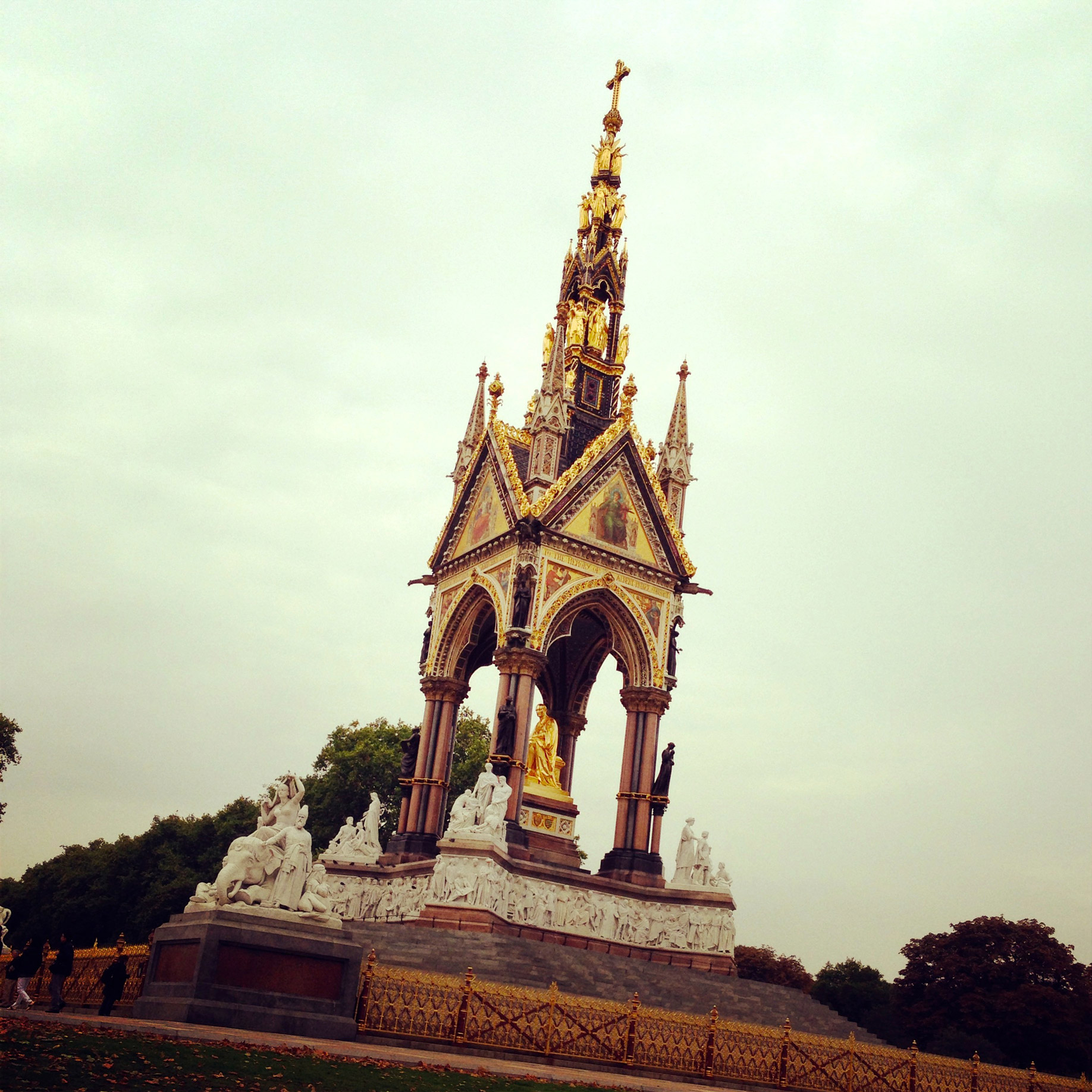
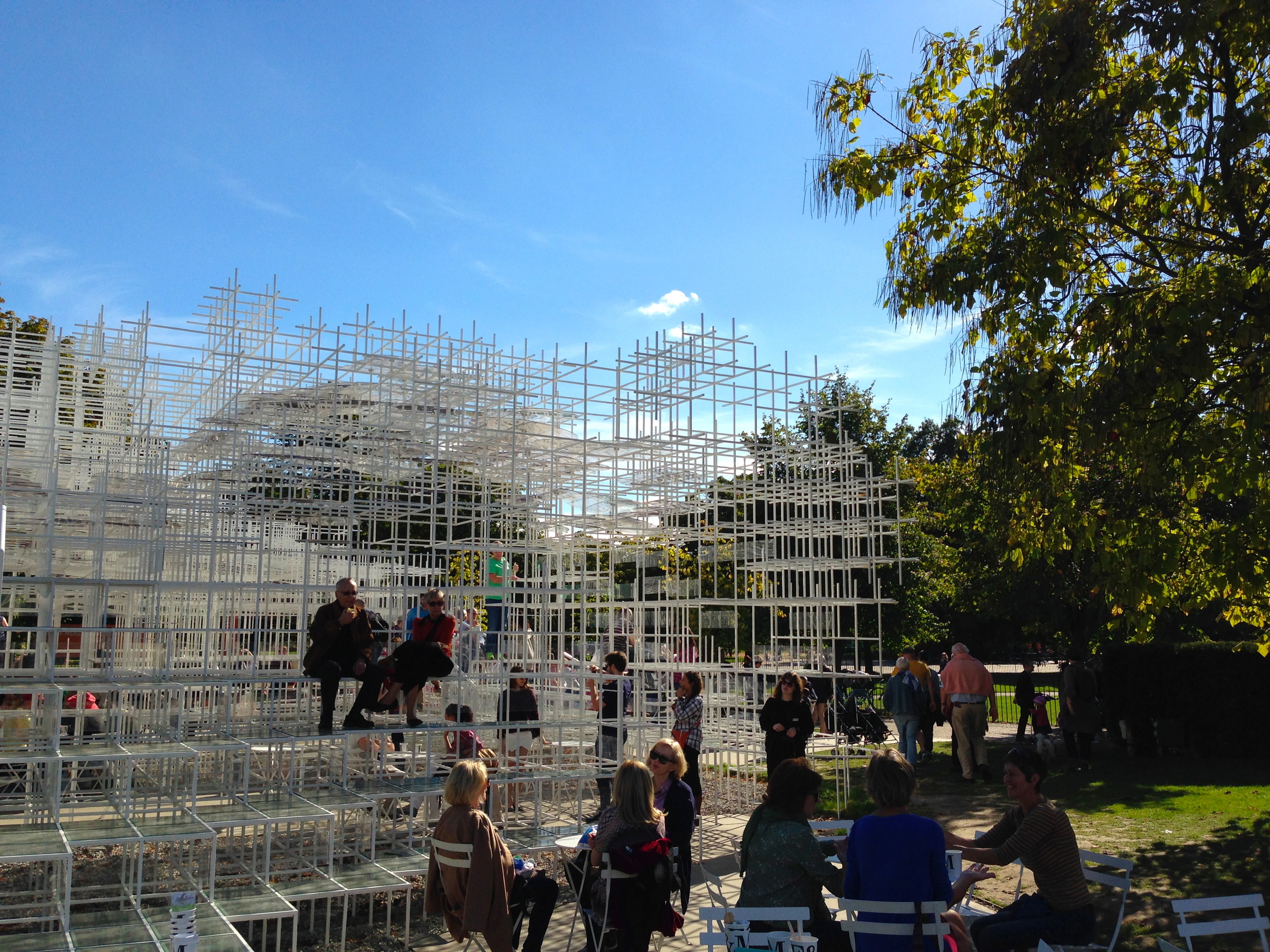
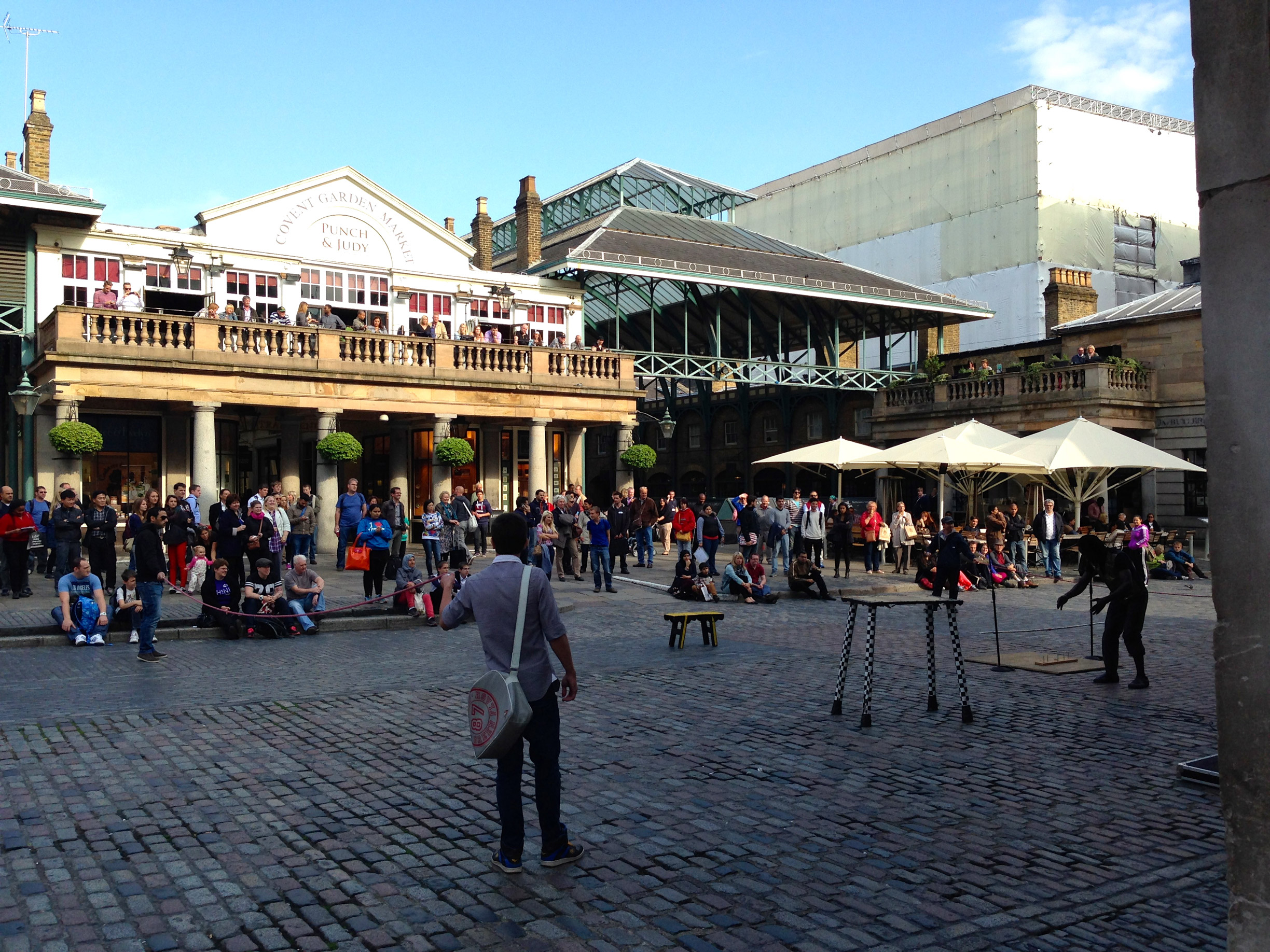
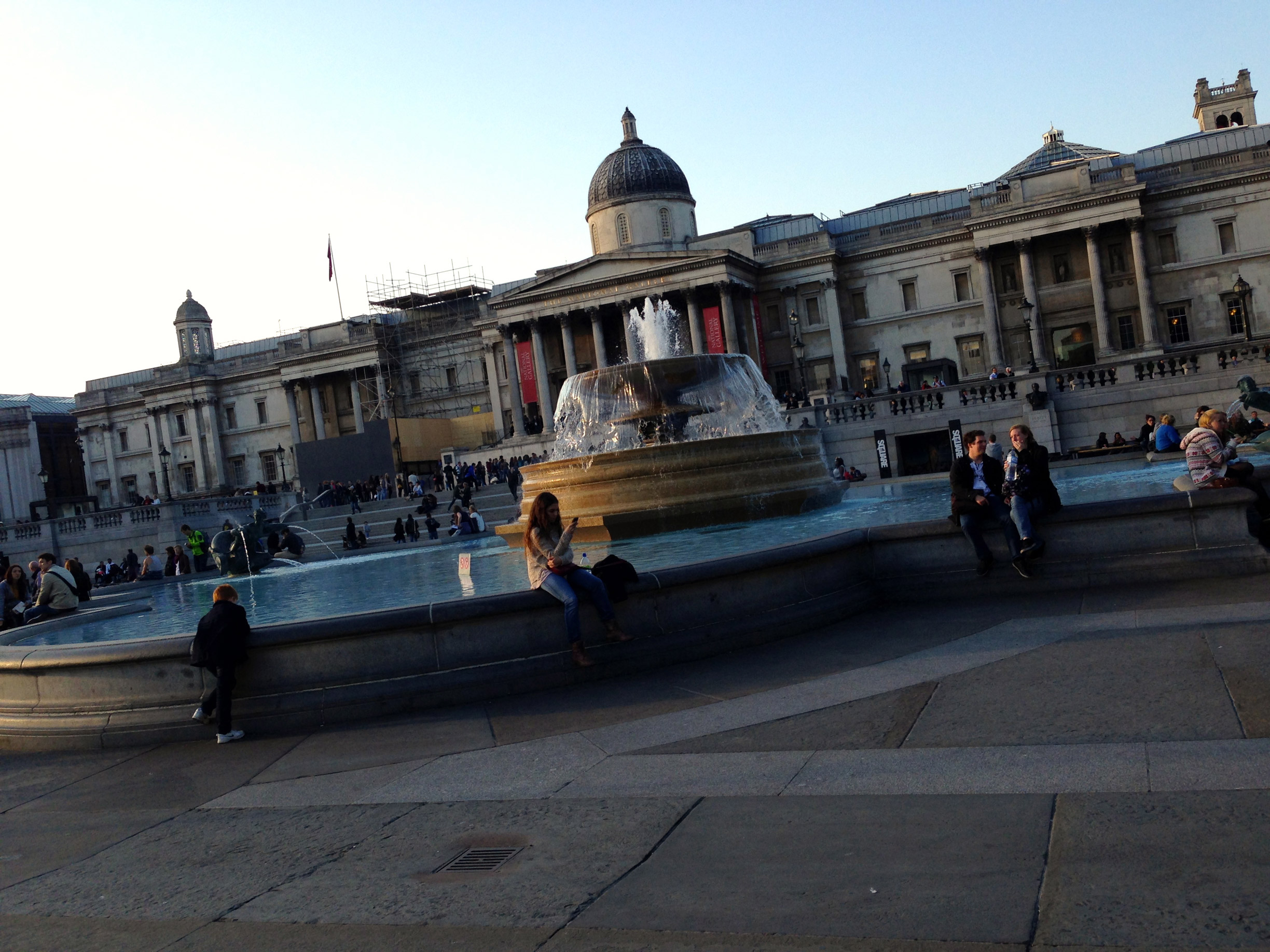
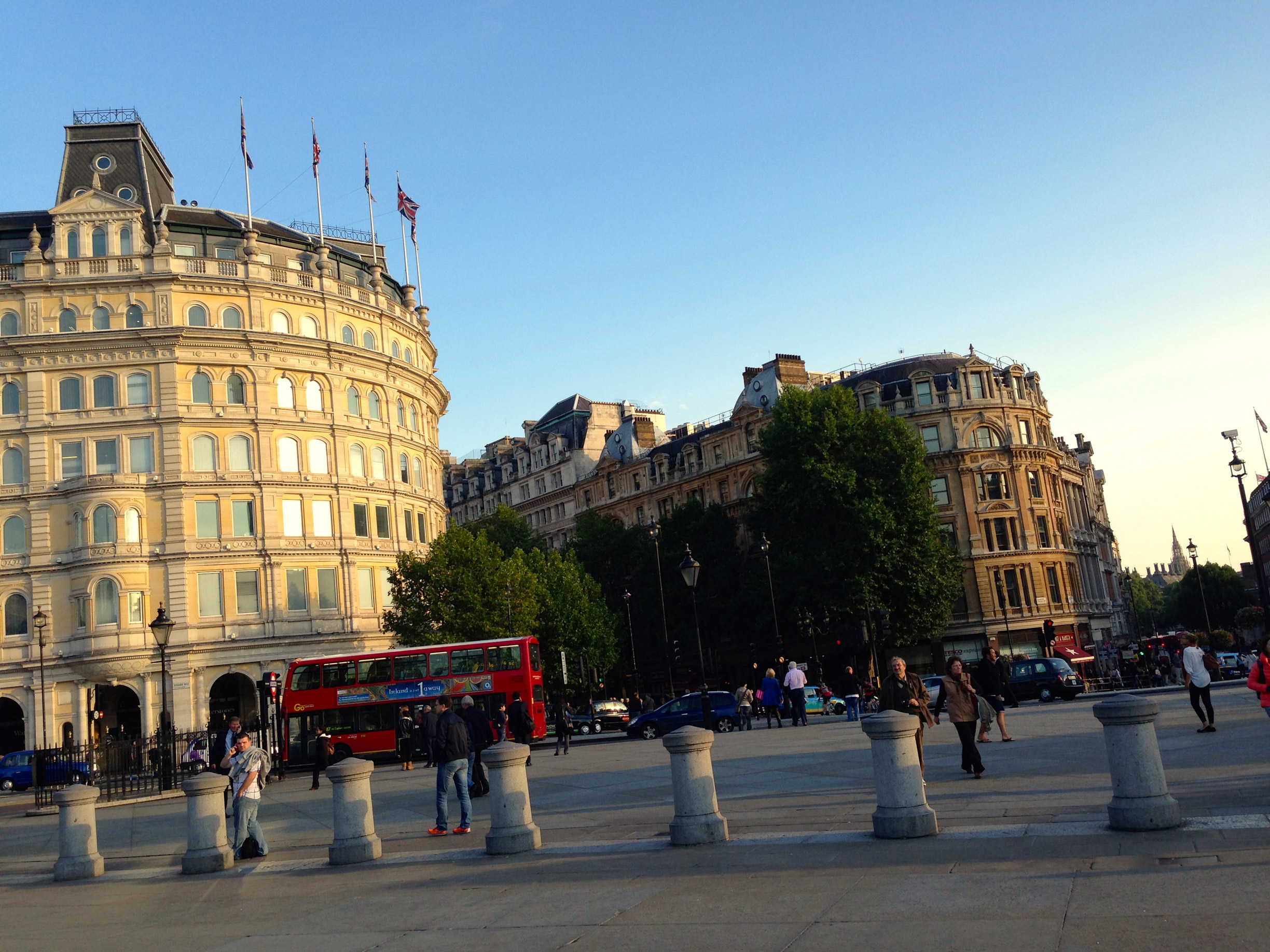
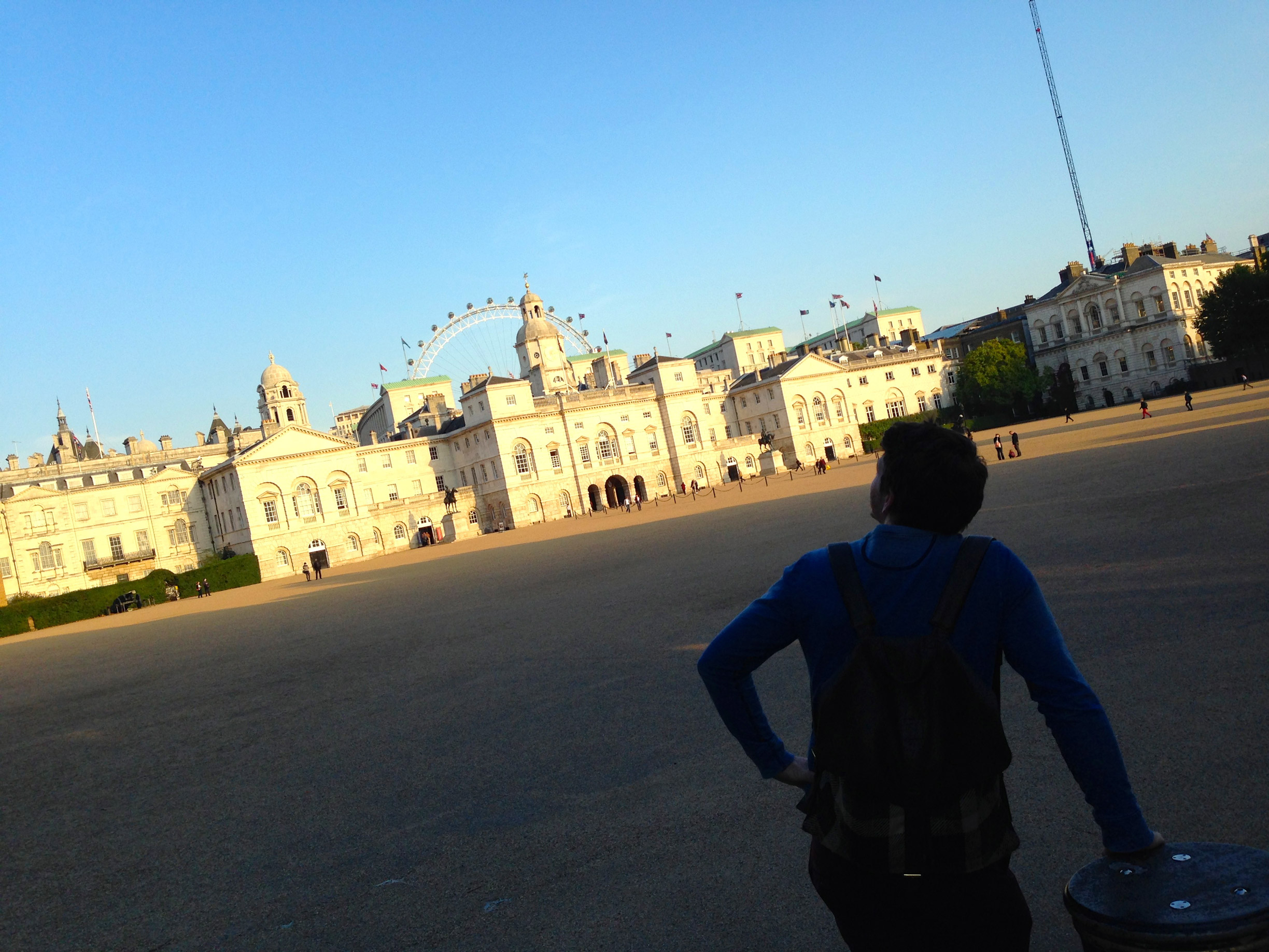
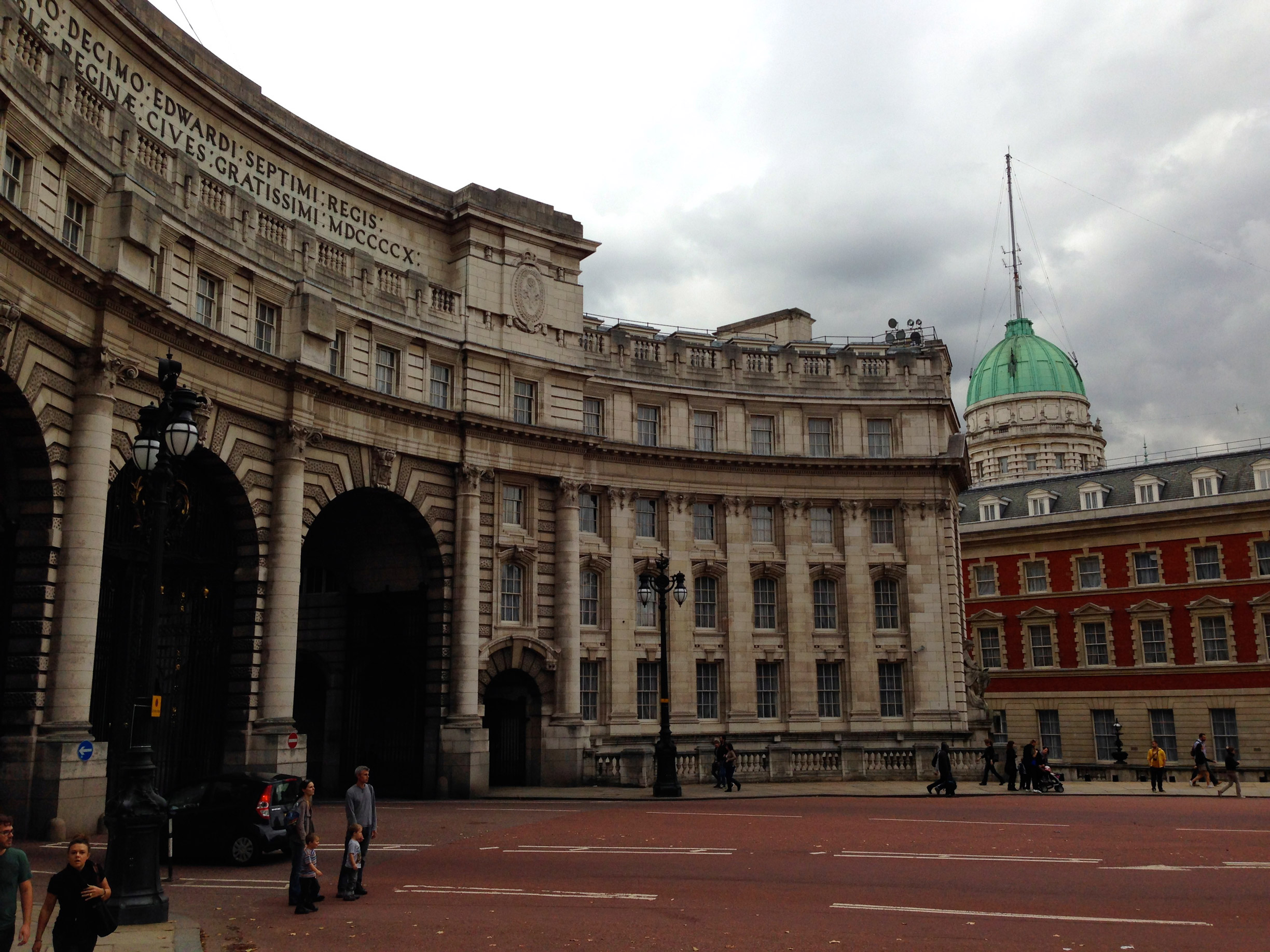
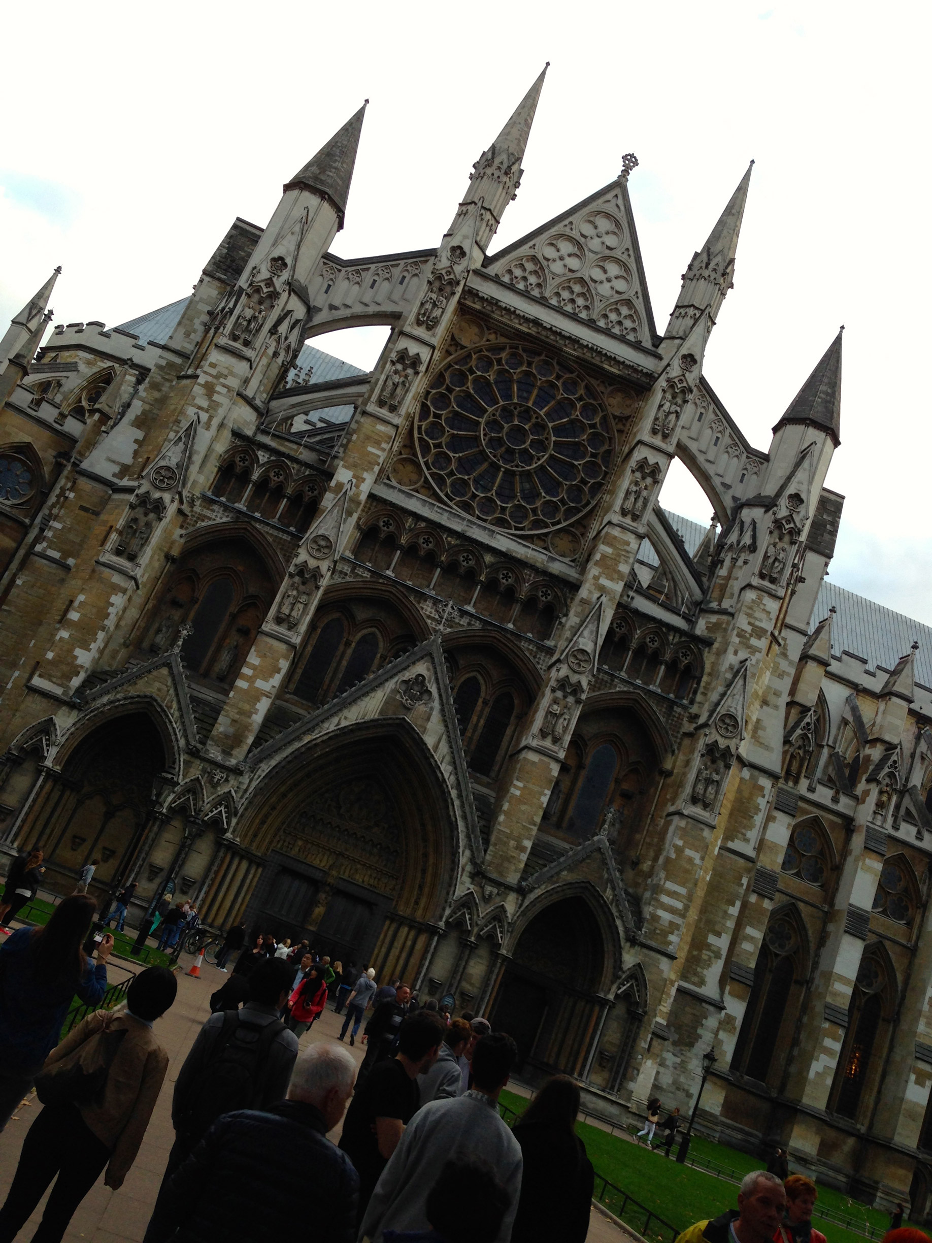
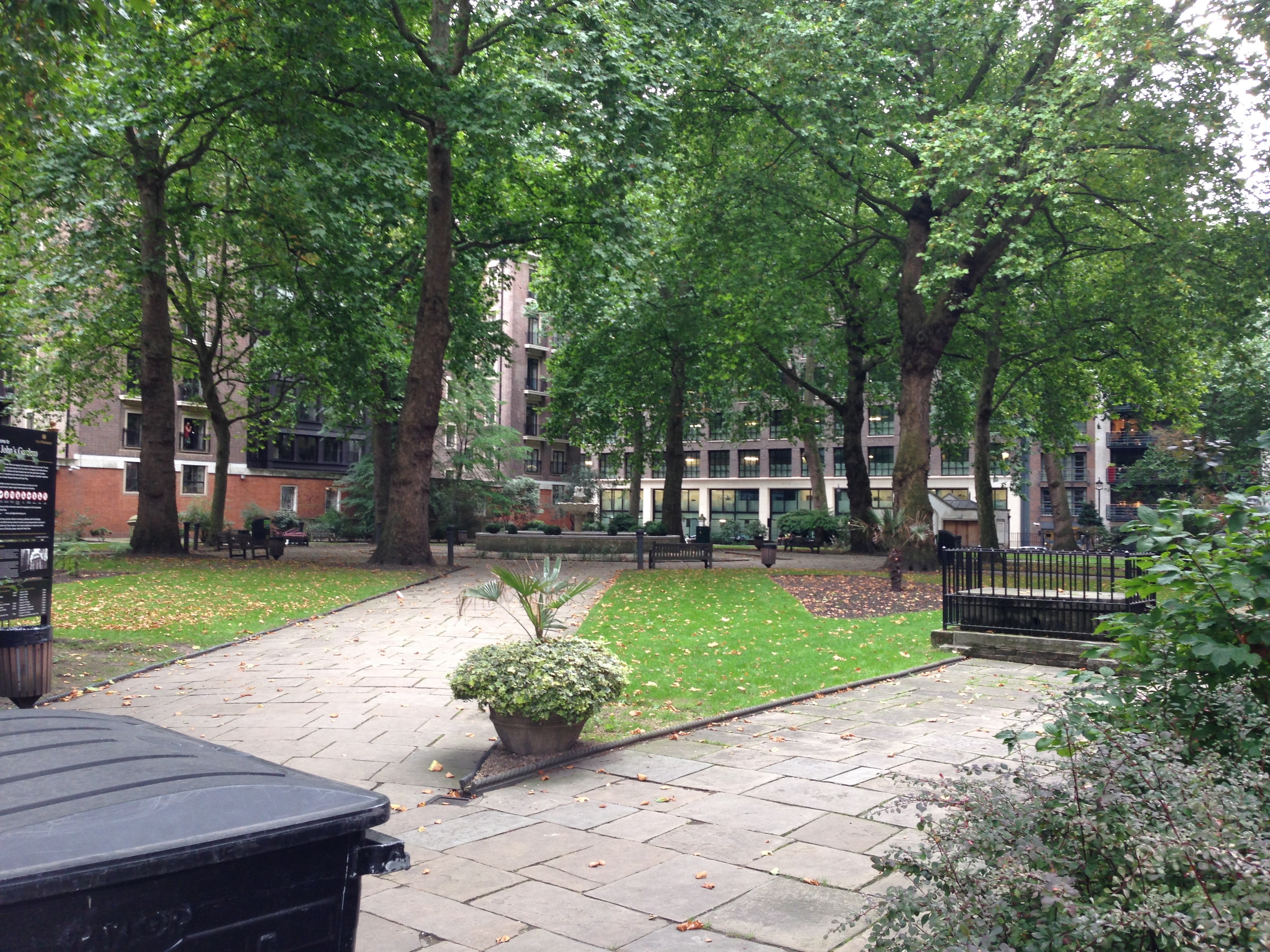
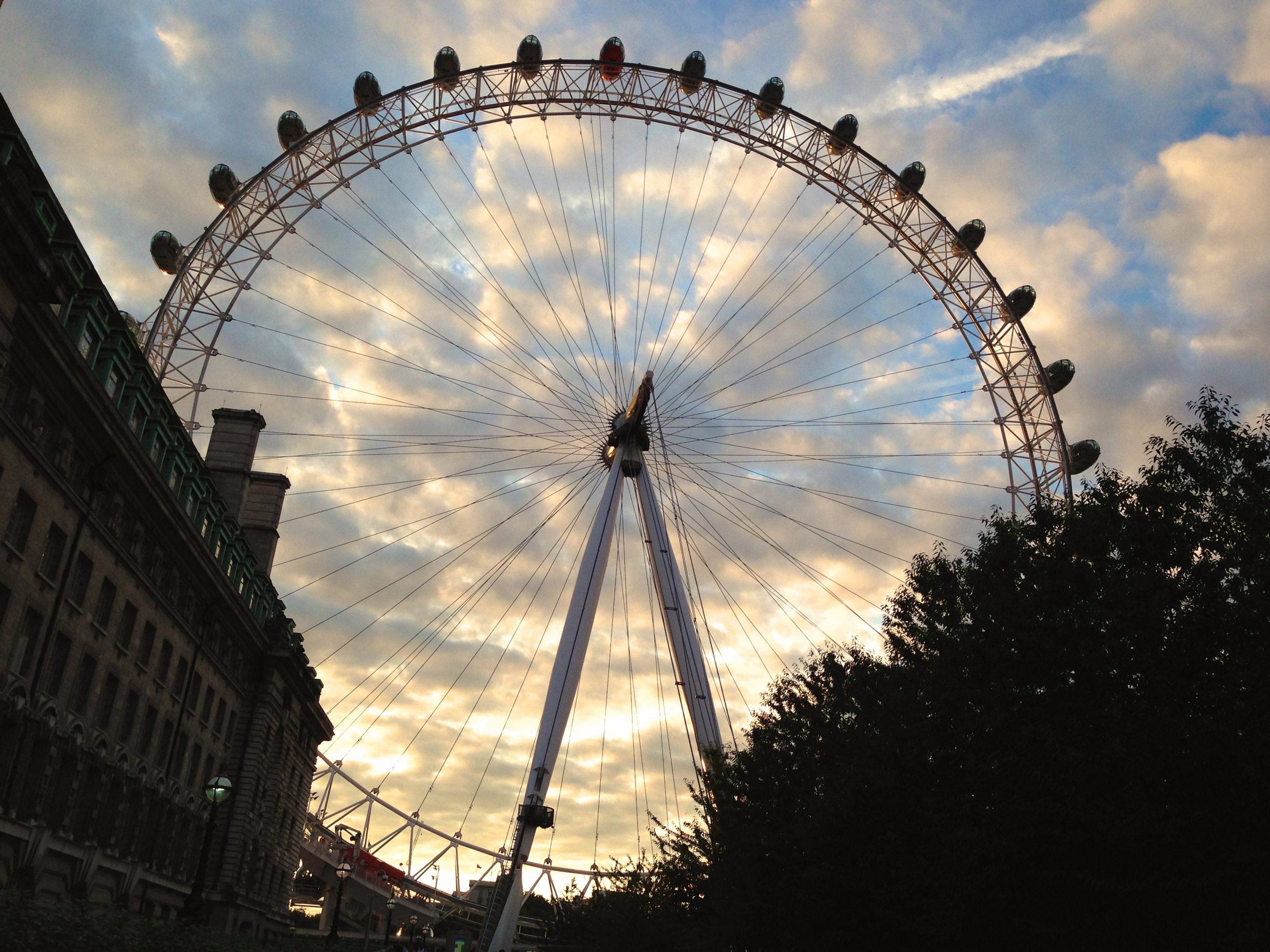
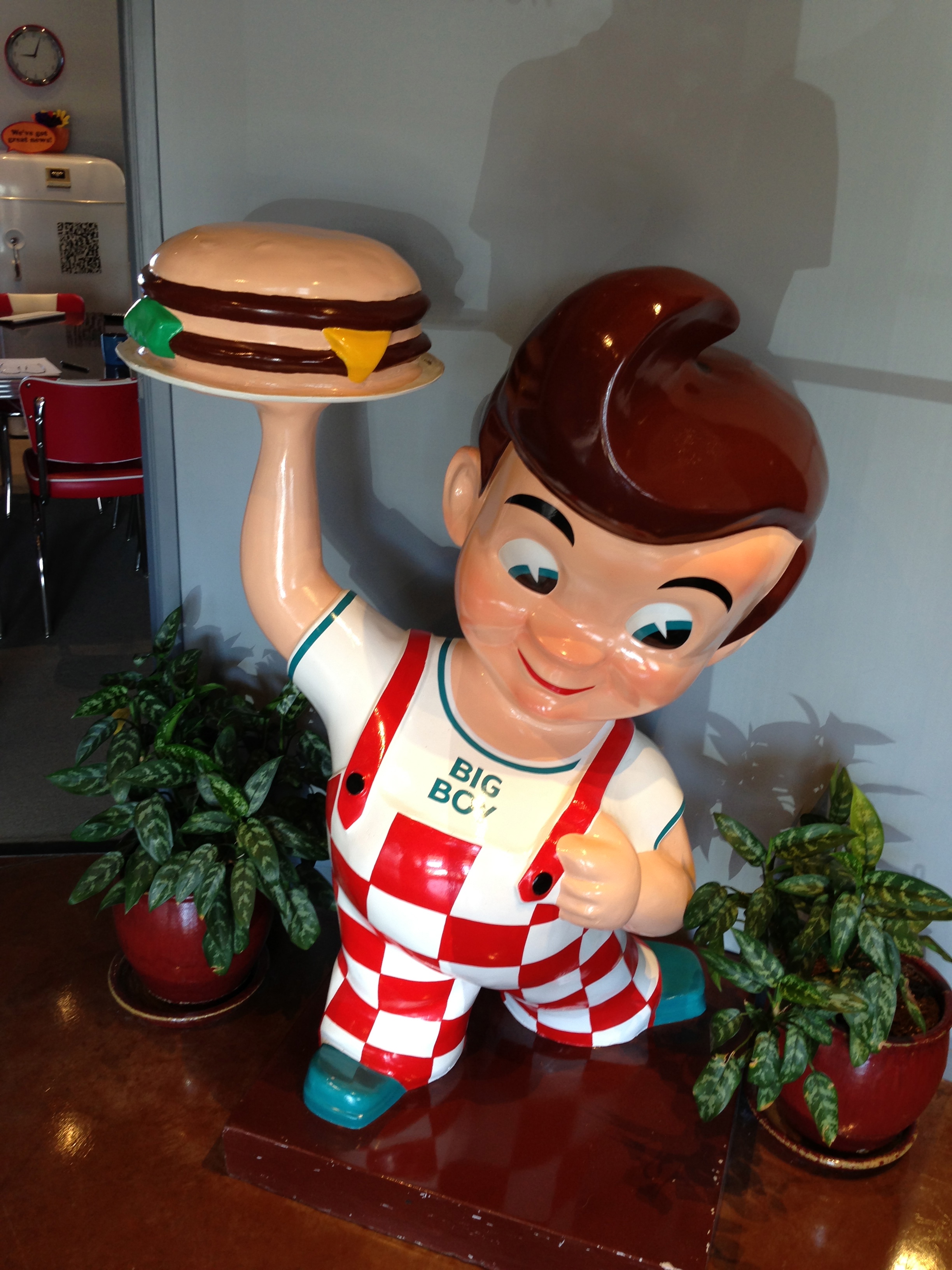
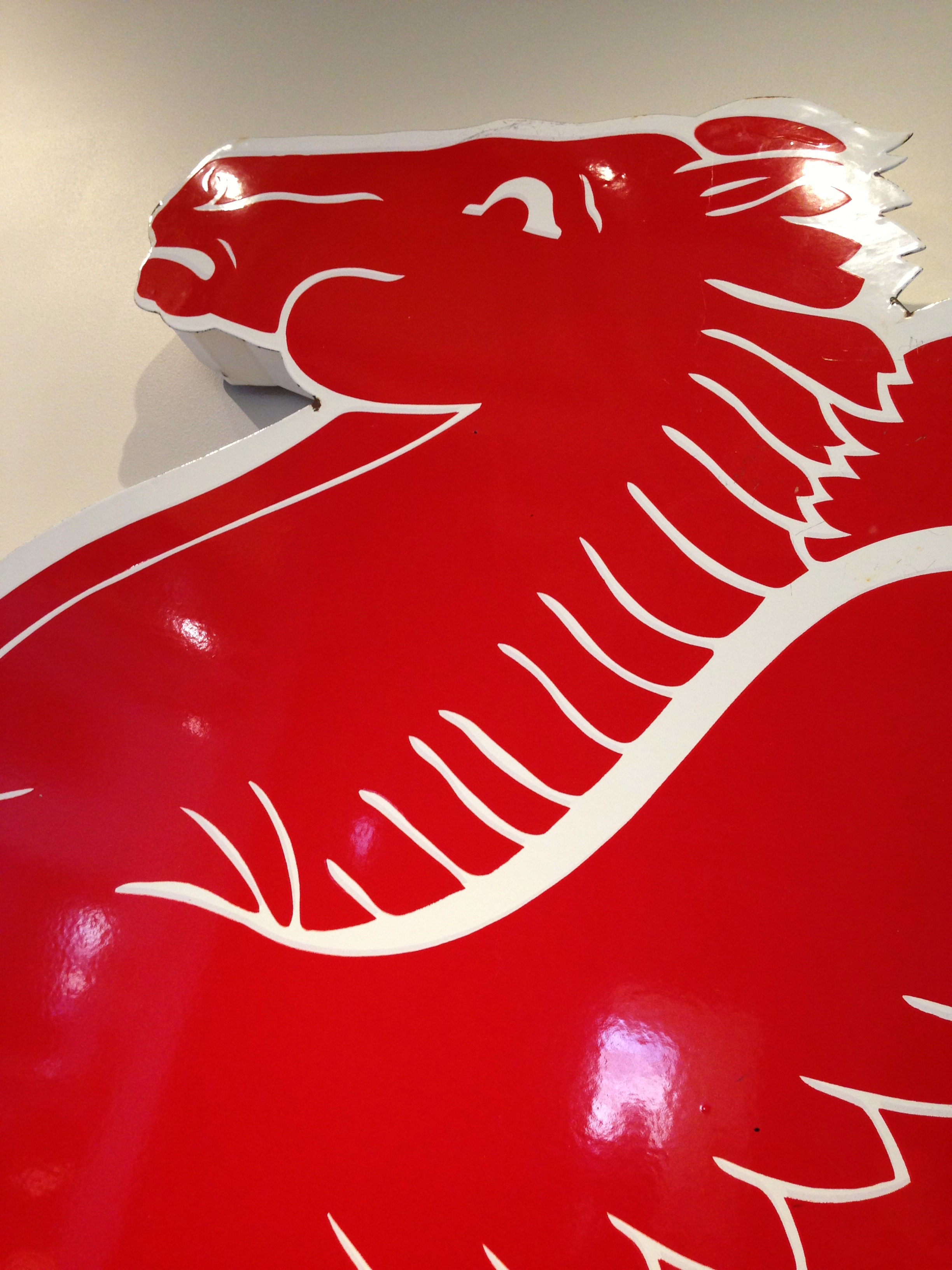
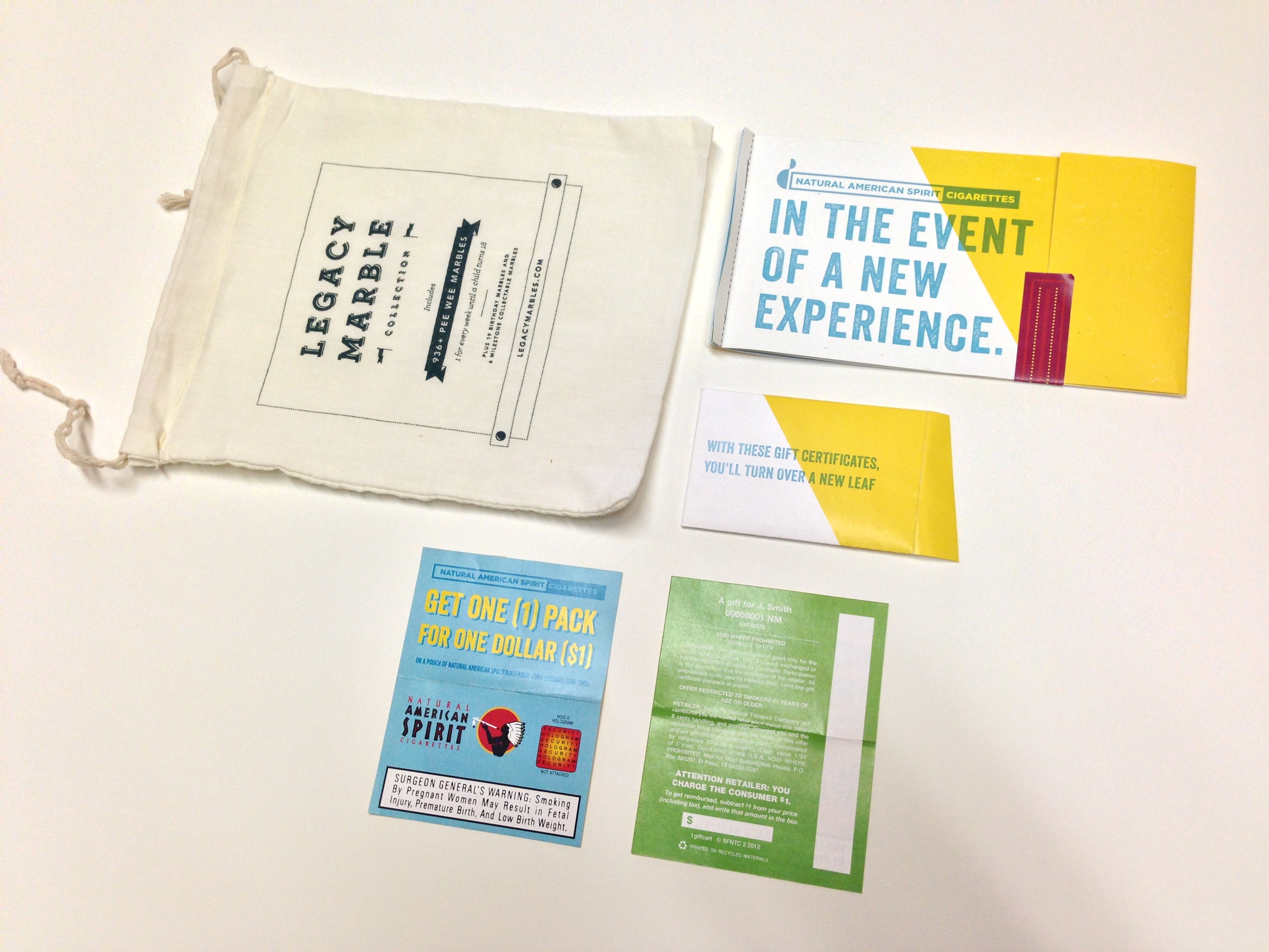
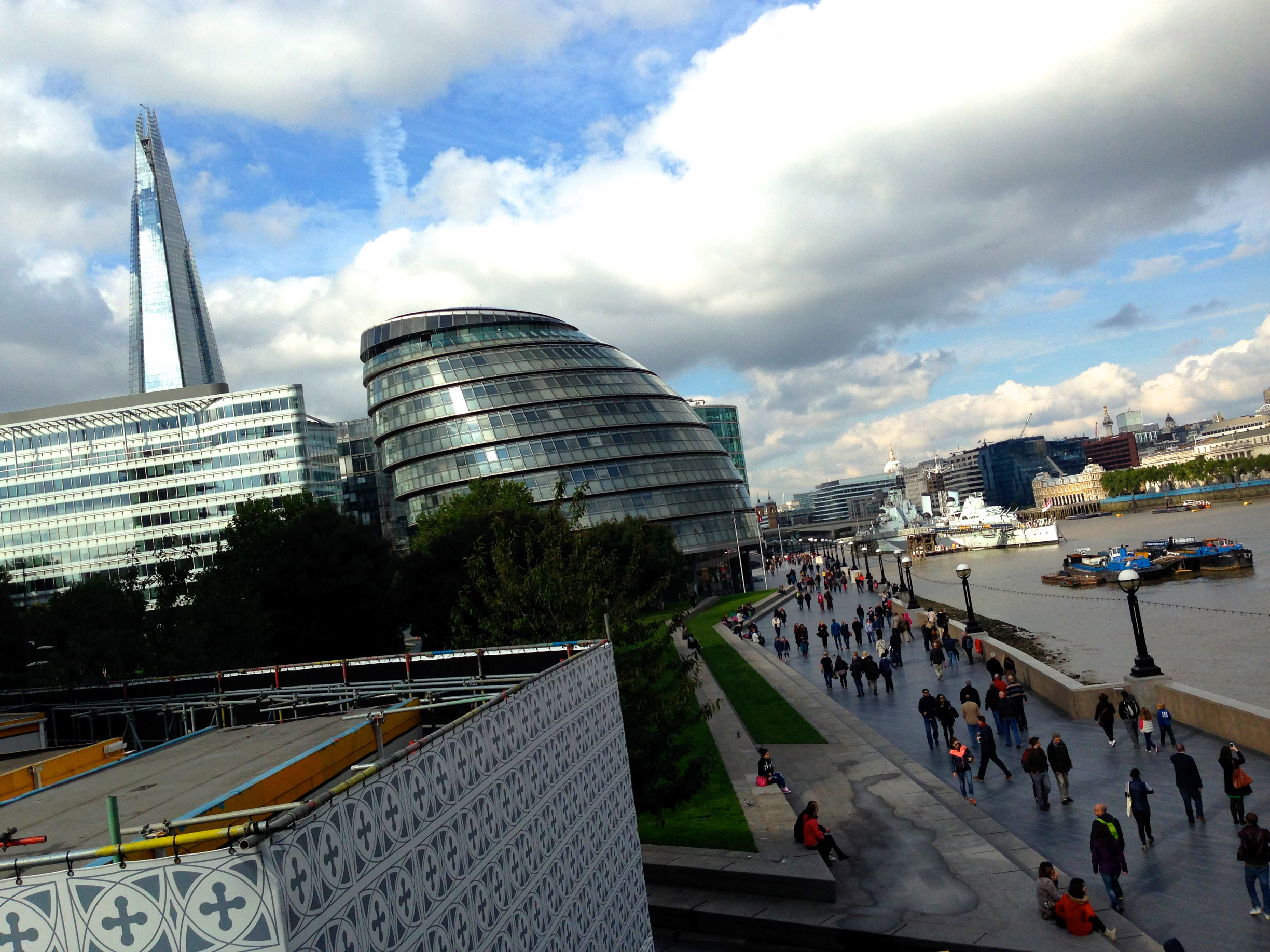
These are by no means "good" photographs. I just walk around and point my phone at things I think are cool and click a button. Hope you enjoy a few of them though! Some things I saw in London: The Wellington Arch, Buckingham Palace, St. James Park, Trafalgar Square, The National Gallery, The Thames, St. Paul's Cathedral, The Millennium Bridge, Tate Modern, The Shard, Southwark Cathedral, Borough Market and many more awesome places. I have seen most of these things before, but its always nice to visit again! P.s. The first two images are actually form Reading town centre! 

Type Design vs Hand Lettering


My former classmate, and good friend, Megan Teel recently asked me whether she should pursue a intensive study on hand lettering or type design. I started answering the question but soon realized it’s a more complex issue. I wanted to share my thoughts on the subject below.


First of all, I believe both of these subjects are noble and difficult forms of design. I also would like to think I have experience in both since I did much hand lettering in college and am now studying type design at Reading University. But to answer which one a designer should choose to pursue is difficult for many reasons.

My answer depends largely on what you qualify as “hand-lettering”. It is such an ambiguous word. Hand lettering can mean drawing grungy lettering with a pencil or ballpoint pen (like what I did in college lol) or creating custom made, high quality, digitally drawn logos. The former of these two styles is a fad. I think many designers will say the same. People really dig the hand-made, quick, rustic aesthetic currently, but companies and clients are always going to want what is vogue at the moment. You can see this in the clients that I have worked for in the past. Many just want what is cool and trendy, pay me quick, then they are on their way to the next job. It’s business, we have to embrace that. But that’s why we must not only single ourselves out as a one-trick pony. We should strive to create great timeless design that can be attractive to many different clients because of our critical eye for detail and typography.

However, my guess is custom lettering will never go away. Many designers (me included) and firms do custom lettering. It has been a profession for hundreds of years. Since way before the first digital font, before Gutenberg created moveable types for his press, and even before the scribes “hand lettered” one bible for years, people have been creating lettering.

All of this leads to the next option – Creating type design. Custom type in many ways is hand lettering that can function as “type” for a specific reason or client. Creating “functional” typefaces is an even more difficult task though than just creating a few letters or words for a brand. I think putting restraints on yourself to develop something that actually has to work as type for many different mediums and people instead of just creating lettering for an aesthetic choice is respectable, but not better. Both have their merits. Learning new programs on the computer can never really harm you either. Getting a feel for Glyphs, Robofont, or any other design software for that matter, will only broaden your perception on what lettering, type, and typography is.

Learning about the history of typography and creating type design will push the designer to create more beautiful letterforms through the ability to notice details in the design. This will help any designer to have a greater knowledge of letters and the reasons why they are made, thus helping the designer create beautiful designs and solutions for a whole slew of media. This knowledge and practice of typography could be manifested in hand lettered posters, logos, web type, packaging, custom typefaces for a company, ornamental monograms, or just the ability to distinguish good fonts from bad.

Also of course you have to think about your own perspective. Why do you want to design type or lettering? What are the ends to this incredibly complex means? Do you want to create calligraphy for wedding cards, or a branding for your favourite local eatery, or a workhorse text face for a scientific magazine? There are so many different fields and branches of lettering/type design that it is hard to answer the initial question: which direction to choose, hand lettering or type design. A knowledge about the design and history of letterforms and graphic design will undoubtedly lead the designer to better typographic solutions whichever path they choose.

This is the same question I was asking myself while I was in college. I ended up with the thought that leaning about the history of type and graphic design and practicing drawing everyday will help me create beautiful typography and design no matter what medium or client. And that’s why I am here at Reading University studying Type Design and Typography!

My advice is this. Get out a sketchbook and start drawing crazy letters with all sorts of weird pens and pencils. Maybe you’ll enjoy it. I know it’s my favorite thing to do.
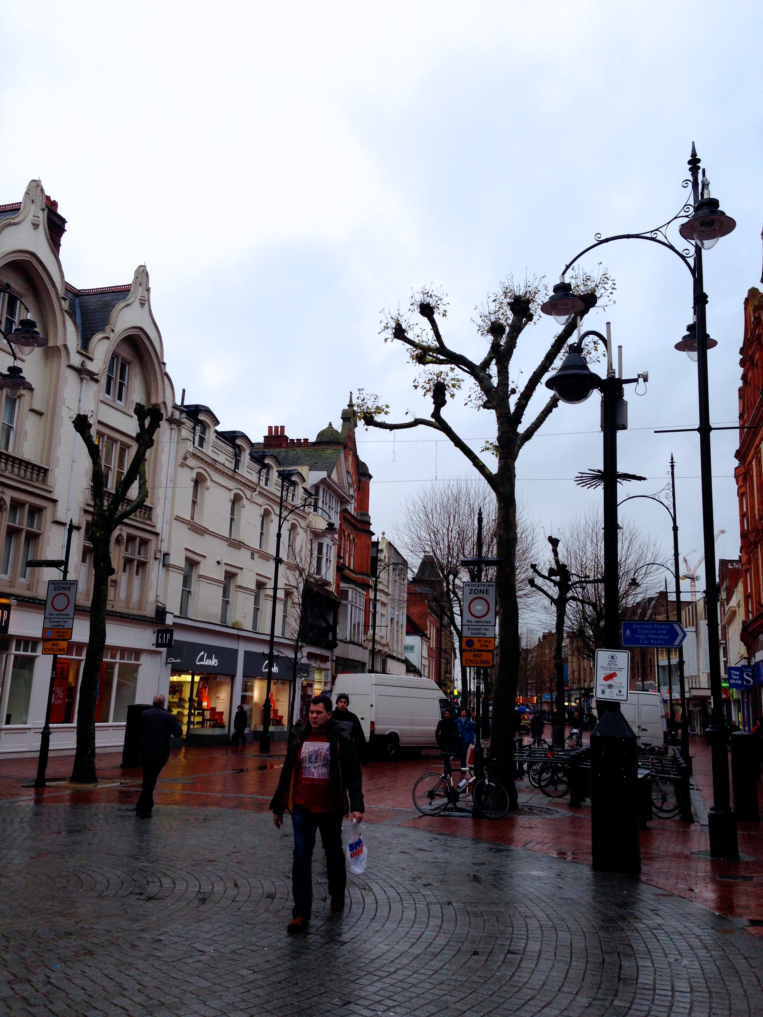
 

Travels around London and Reading

Being three weeks into my adventure I decided it was probably time to put up a post about my travels into London and around Reading so far. I have been to London now three times and will probably go back this soon for a lecture on Frederick Warde at St. Brides Library on Fleet street. 

My three adventures to London were all extremely fun and in a way, very normal. London is such an inviting city that you almost don't feel like you are in a major capital of the world. It's full of such beautiful old buildings and parks that you sometimes forget you are in a modern metropolis packed with 18 million people! Then you get on the tube and all that goes away. However, I have been really impressed by the tube. most trains arrive ever 2-3 minutes, all the cars and stations are really modern and clean, and there are cushioned seats (!!!). I have gone to see Westminster, The Eye, Picadilly Circus, Covent Garden, comedy shows in Islington, shopping on High Street Kensington, Tower Bridge, St. Paul's Cathedral, and that one big clock thing you all have heard of I'm sure.

In general though, I love going into London either for a day trip to hear a lecture, or for a longer stay to see all the sights. It is an amazing city so do yourself a favor and come visit. 

Below are some select images from Reading first, then London picks up when you see Tower Bridge (obvs!). Big props to Nick Abrams and his lovely girlfriend Beth for hanging out and being tourists together.

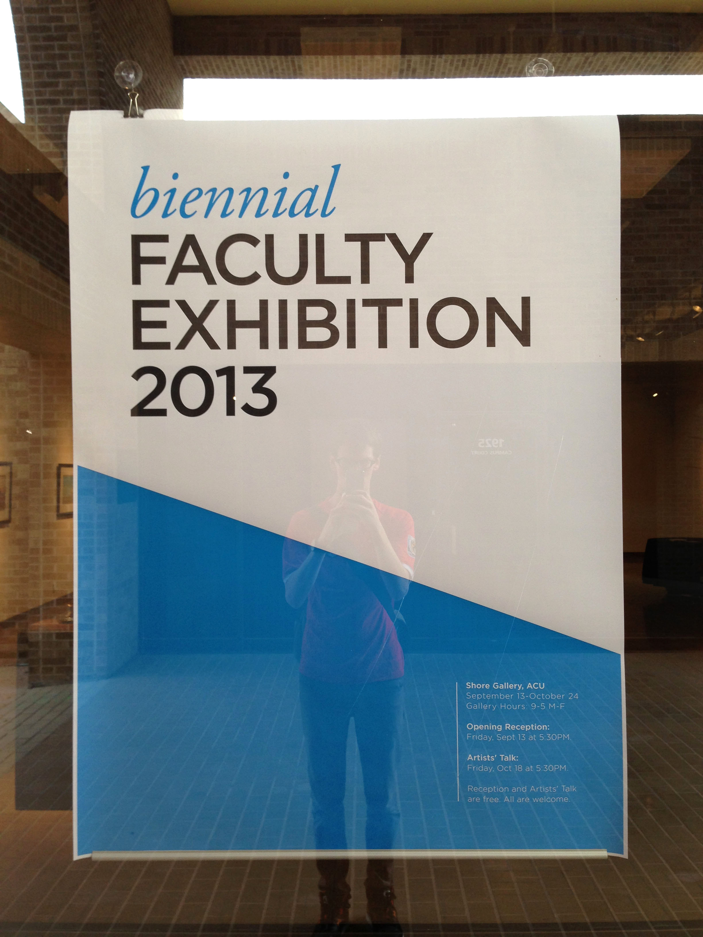
2013 ACU Biennial Faculty Exhibition

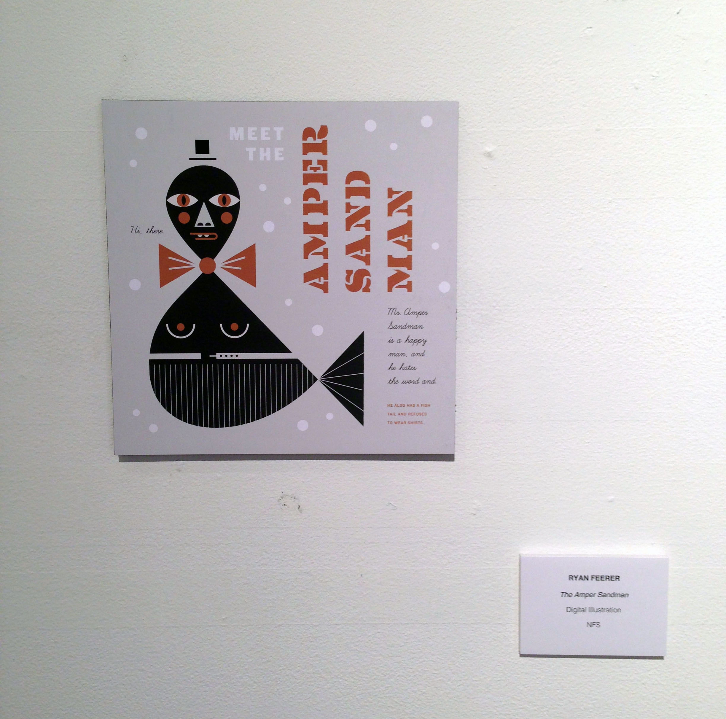
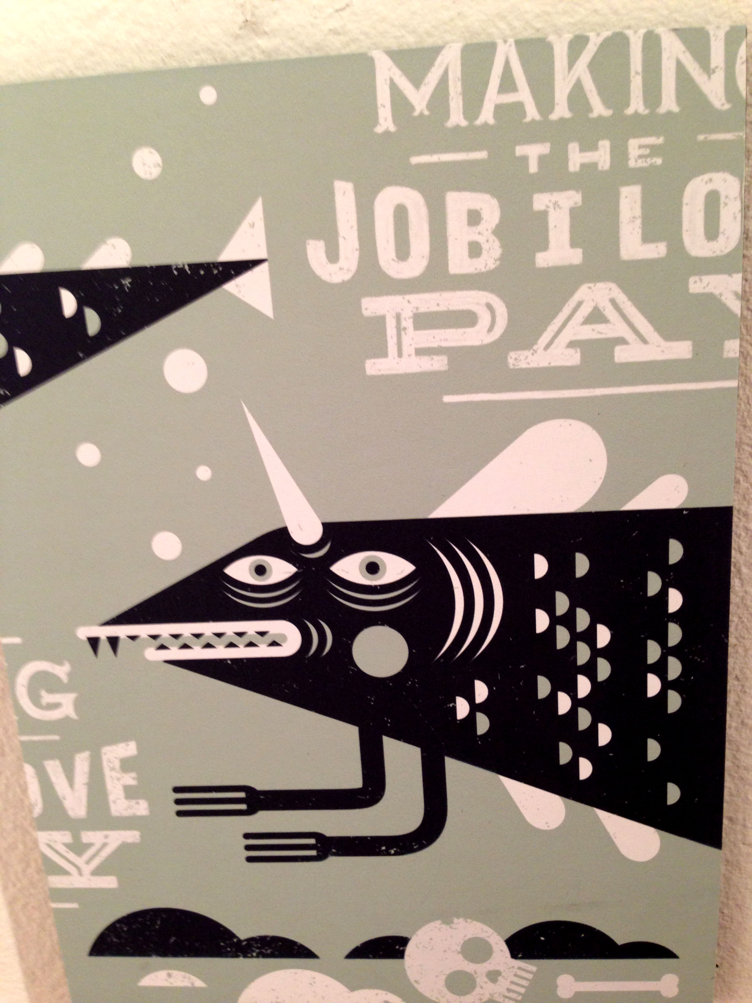
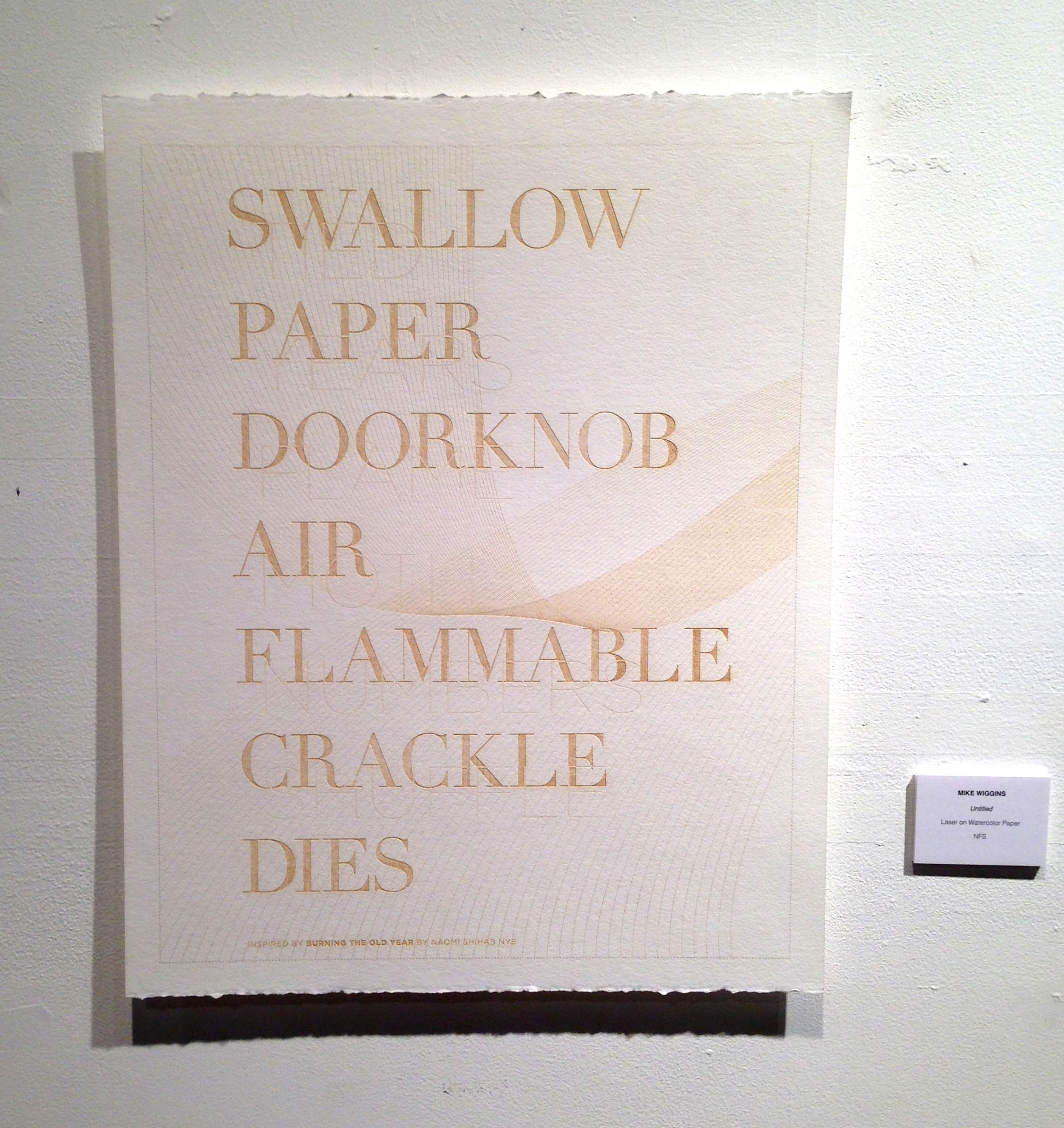
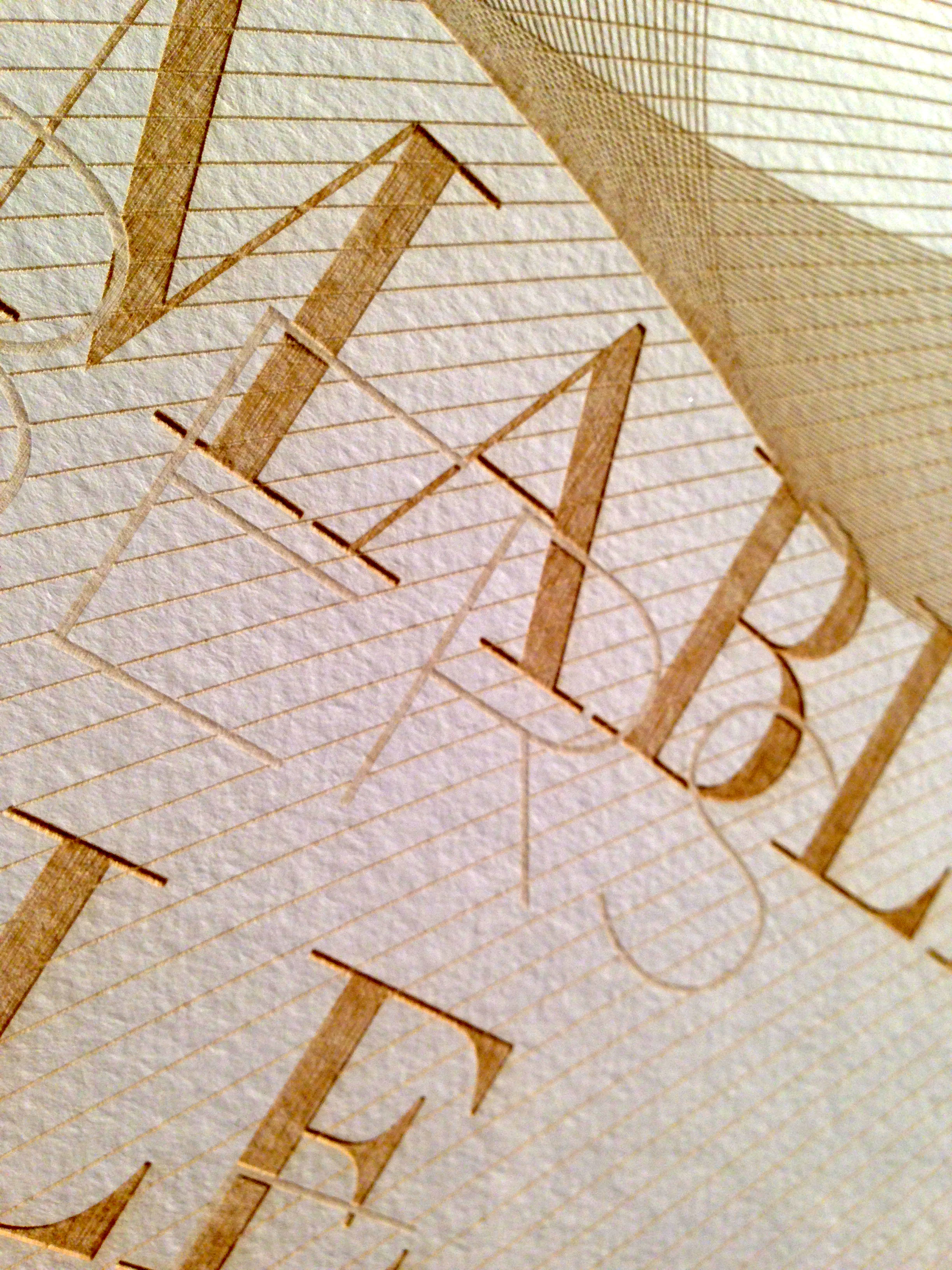
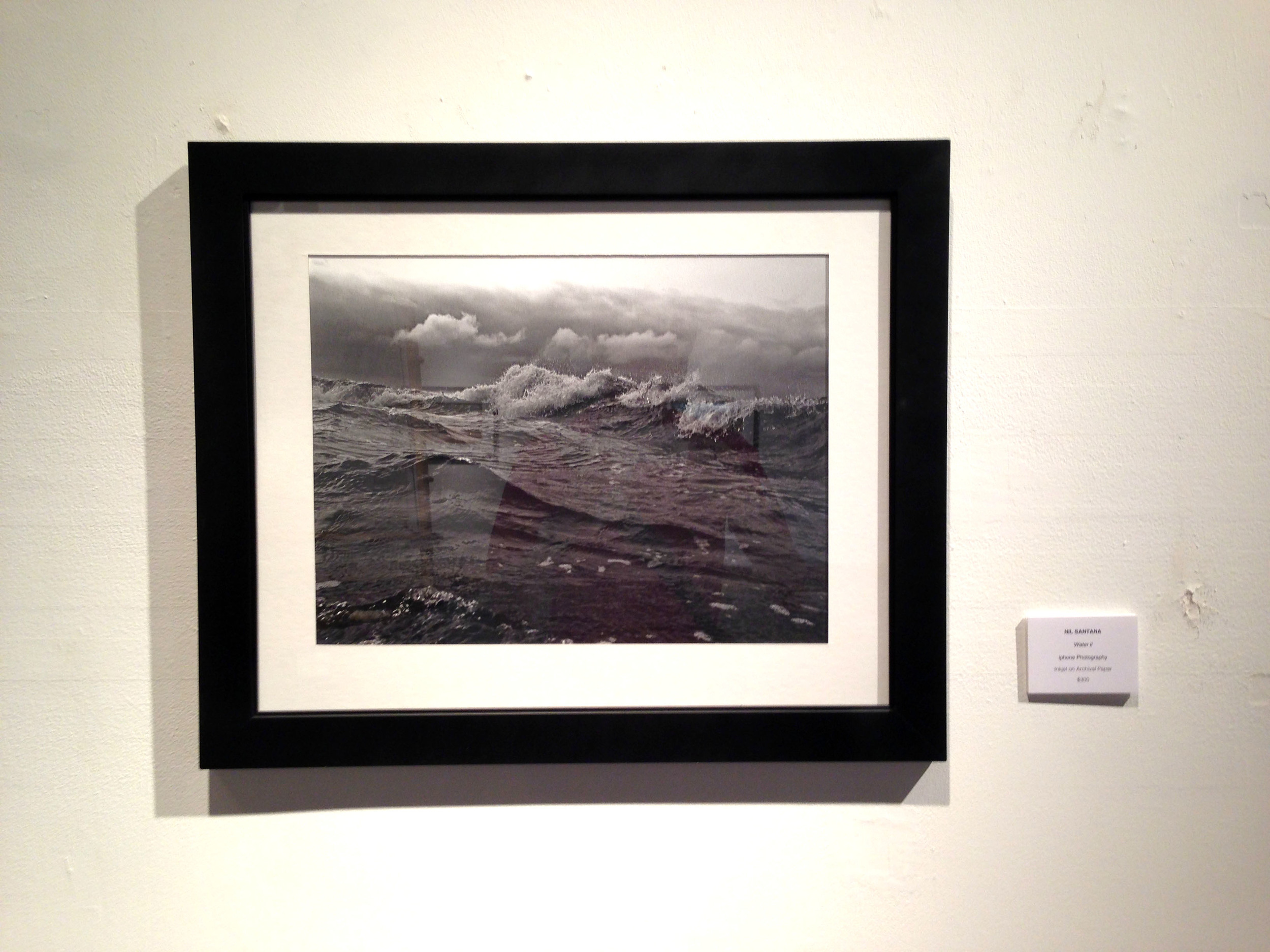
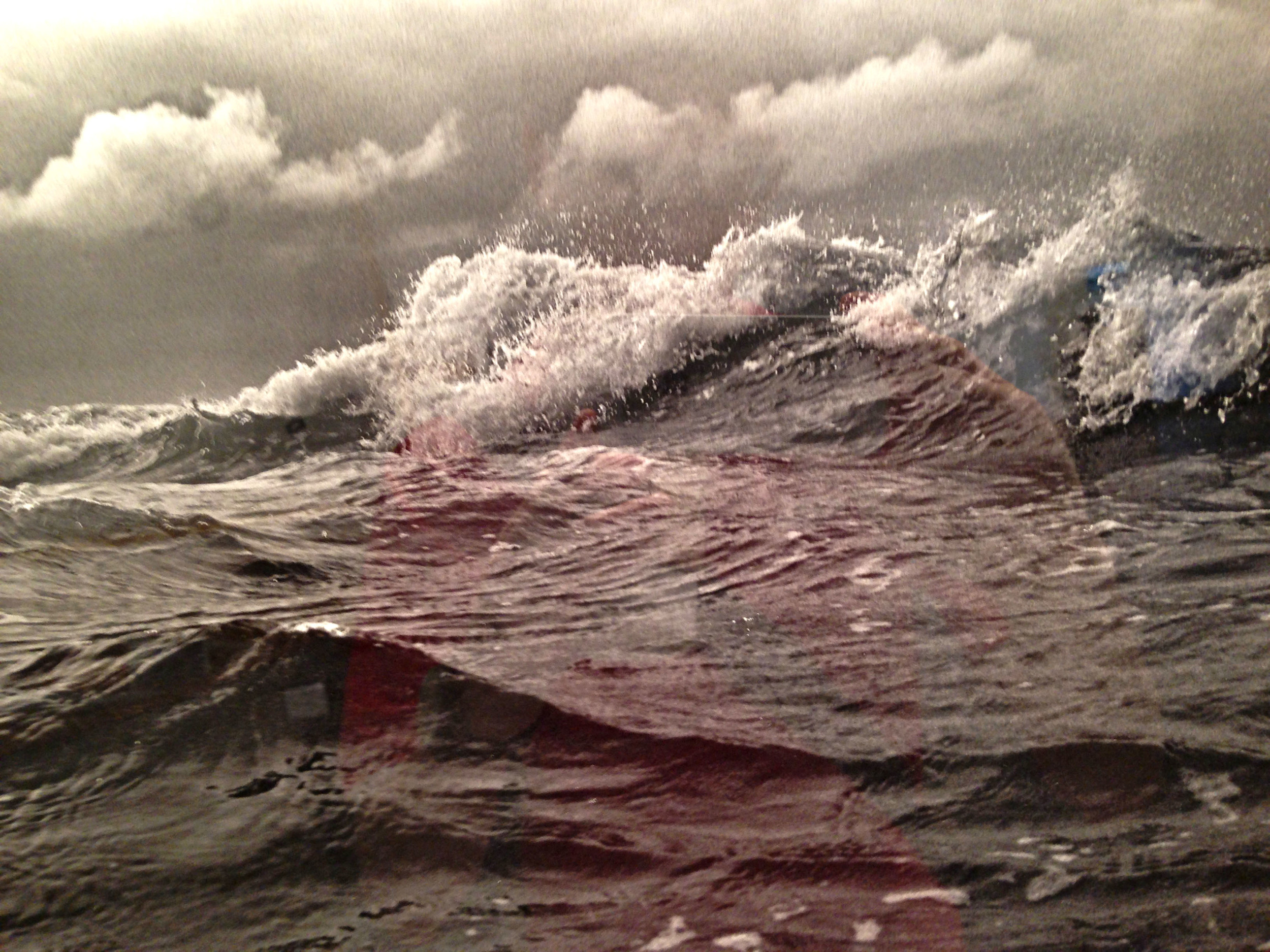
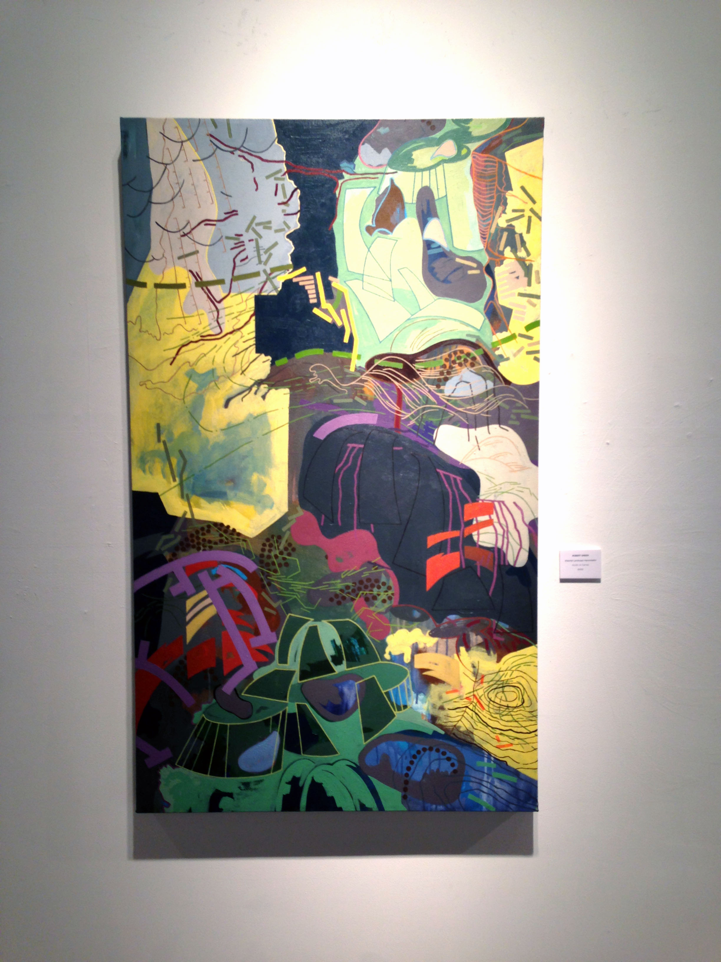
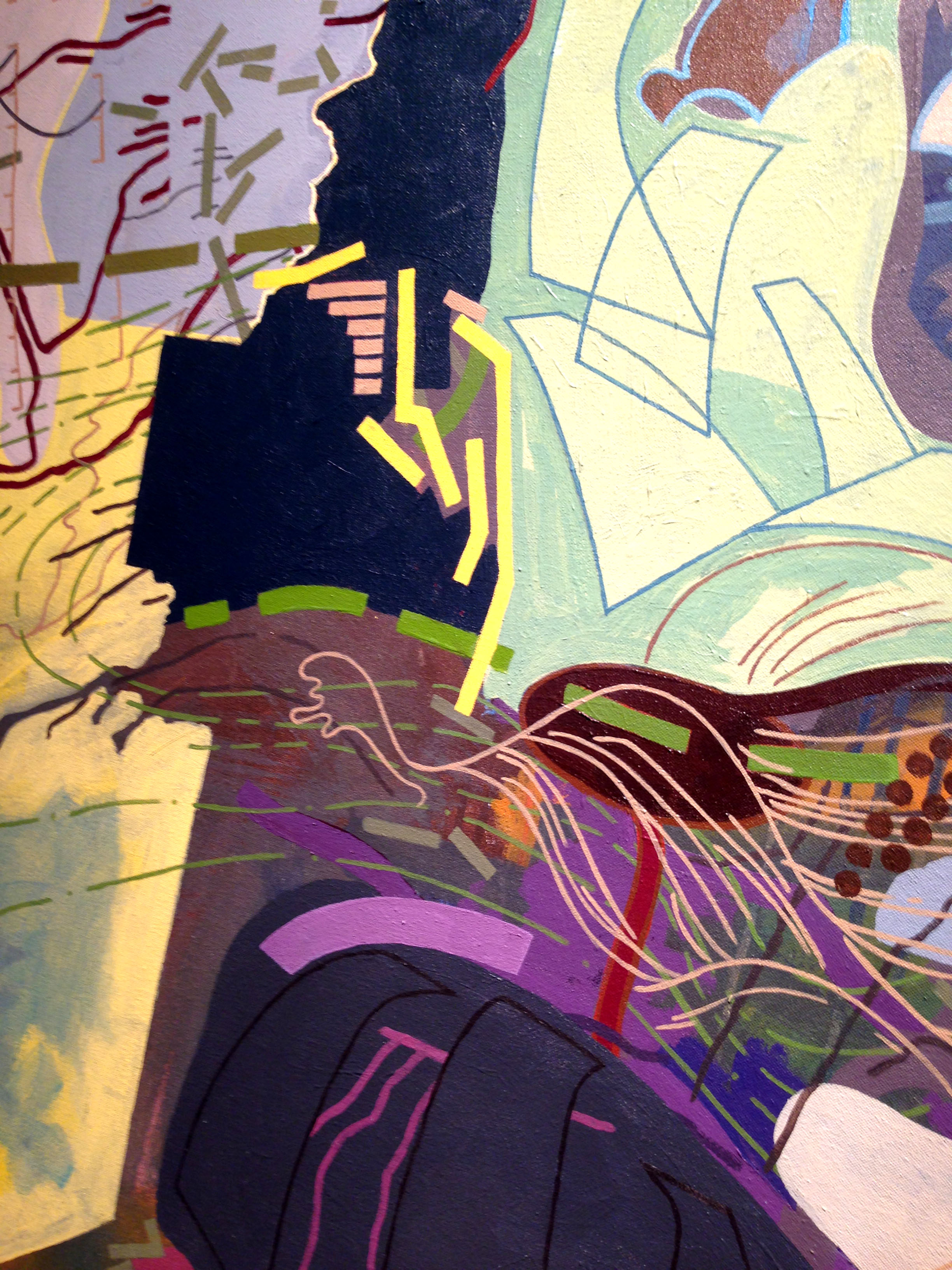
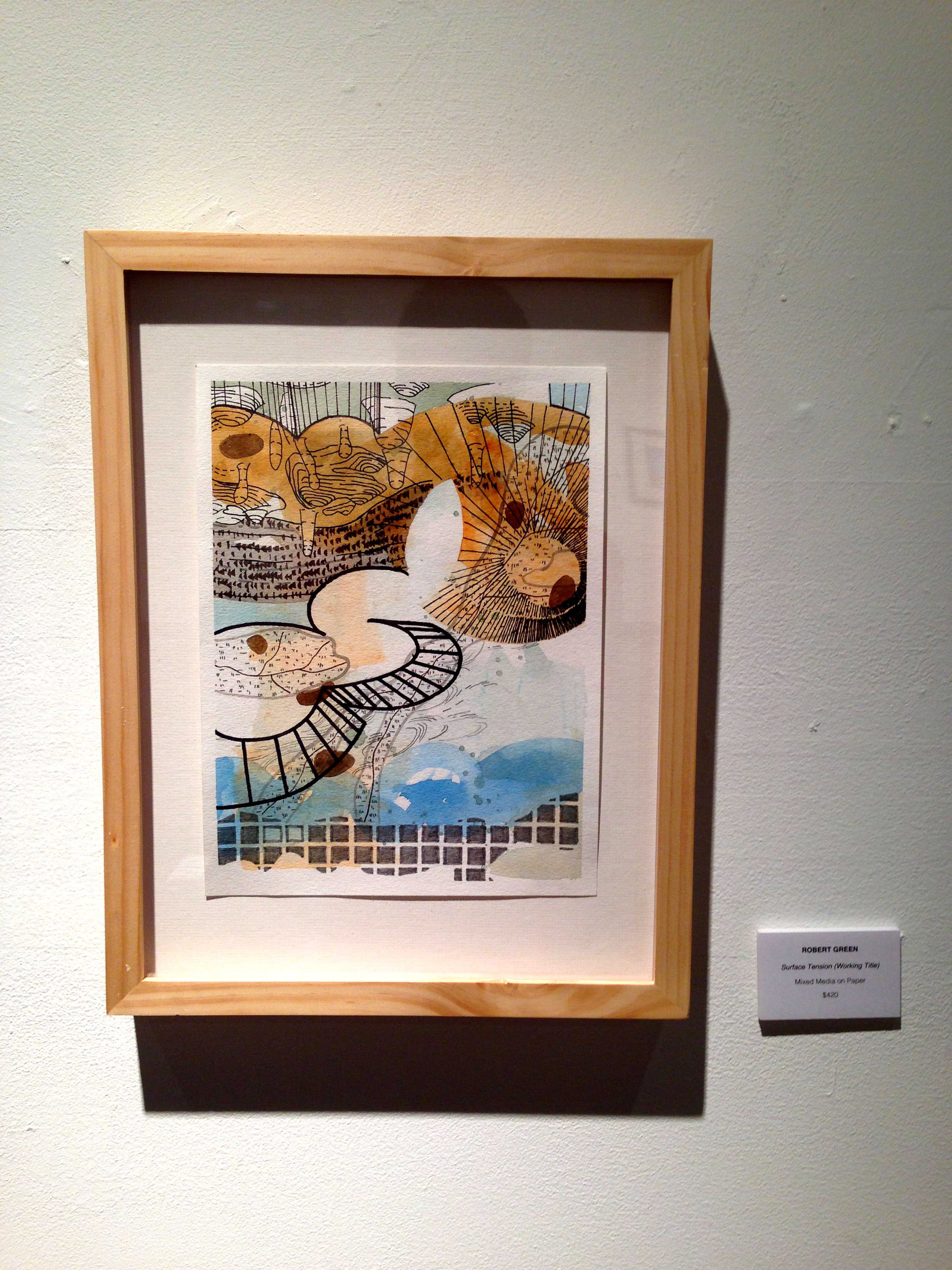
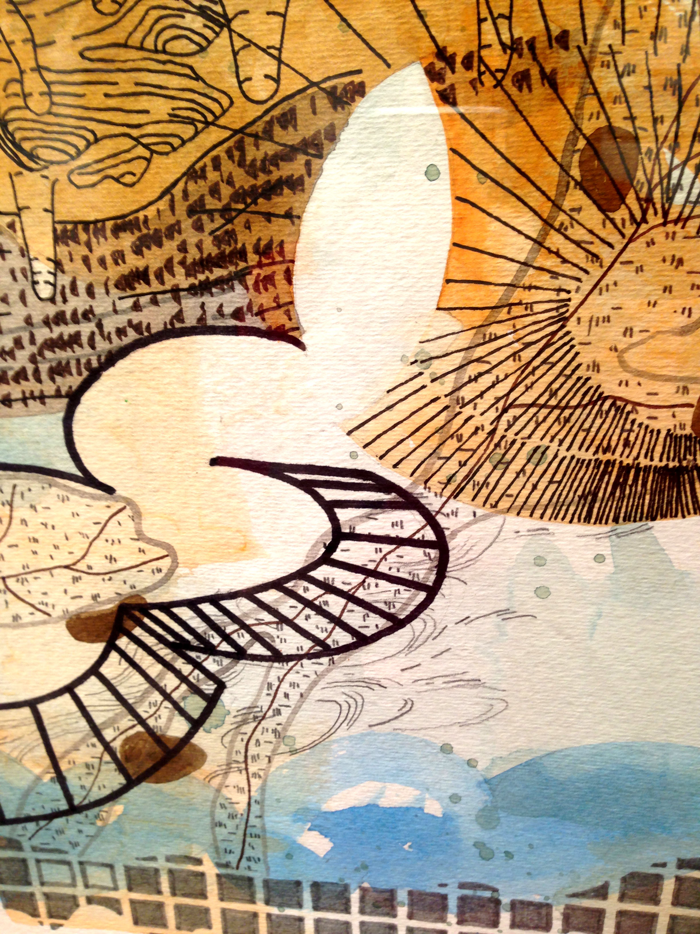
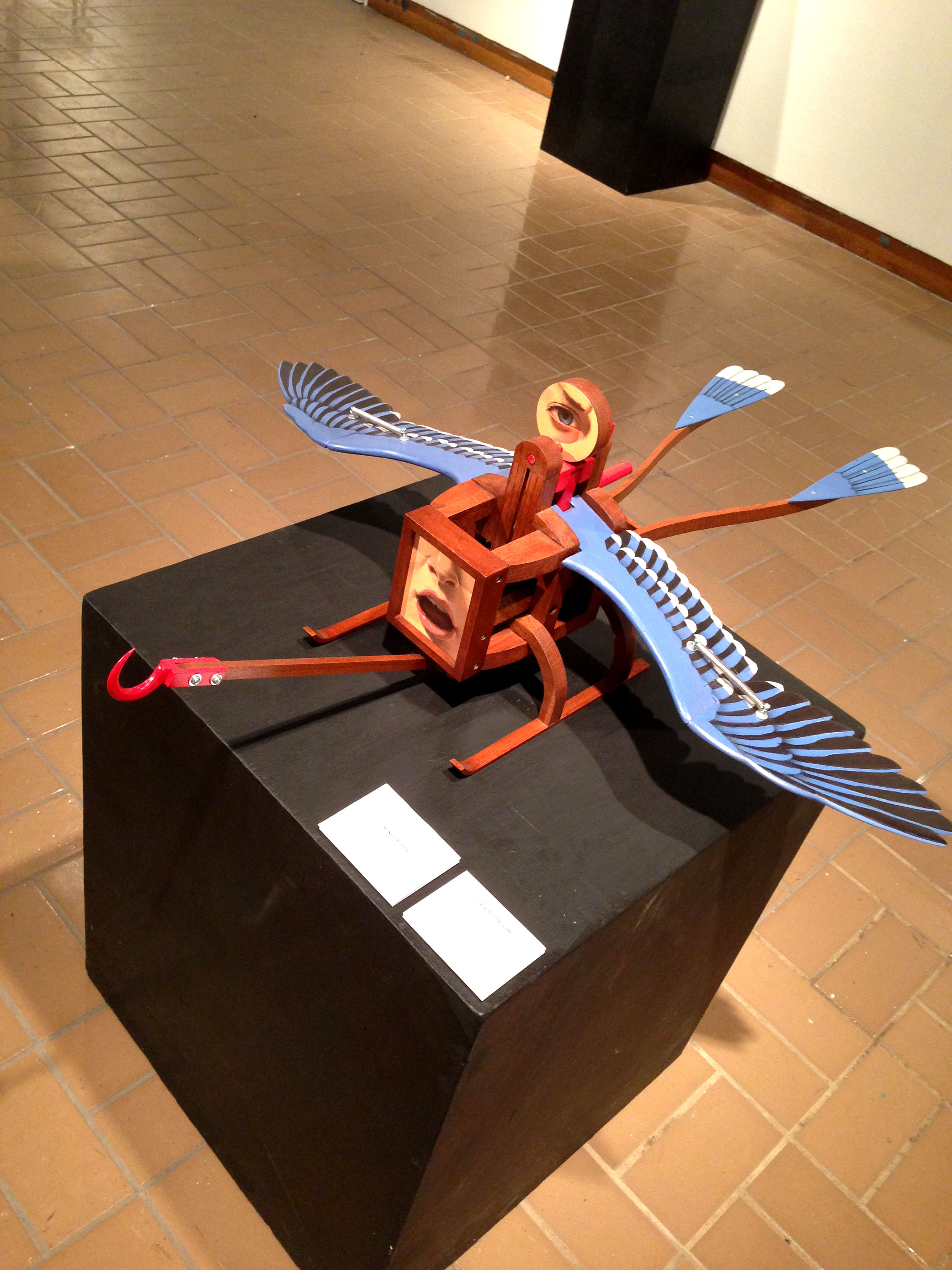
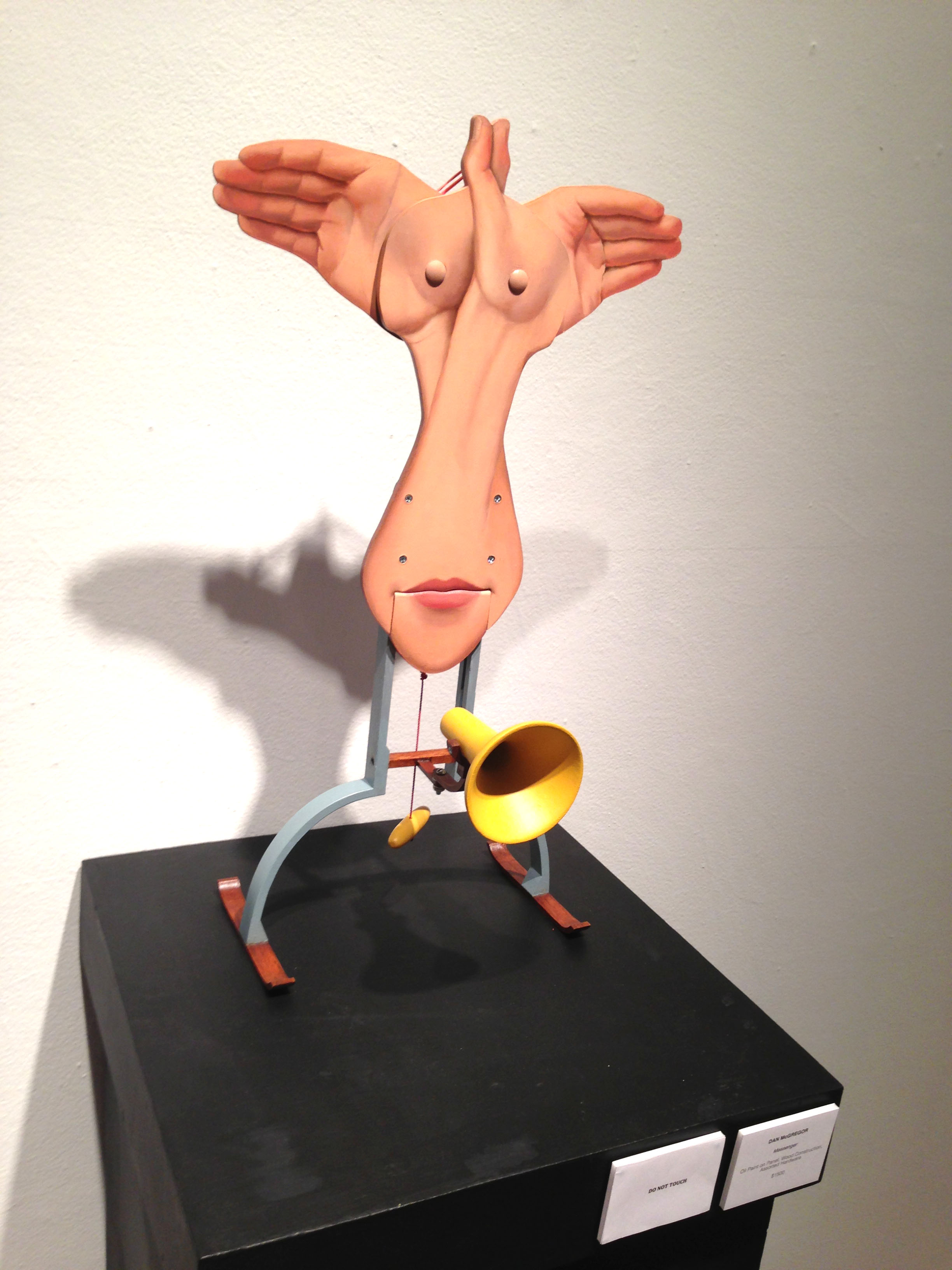
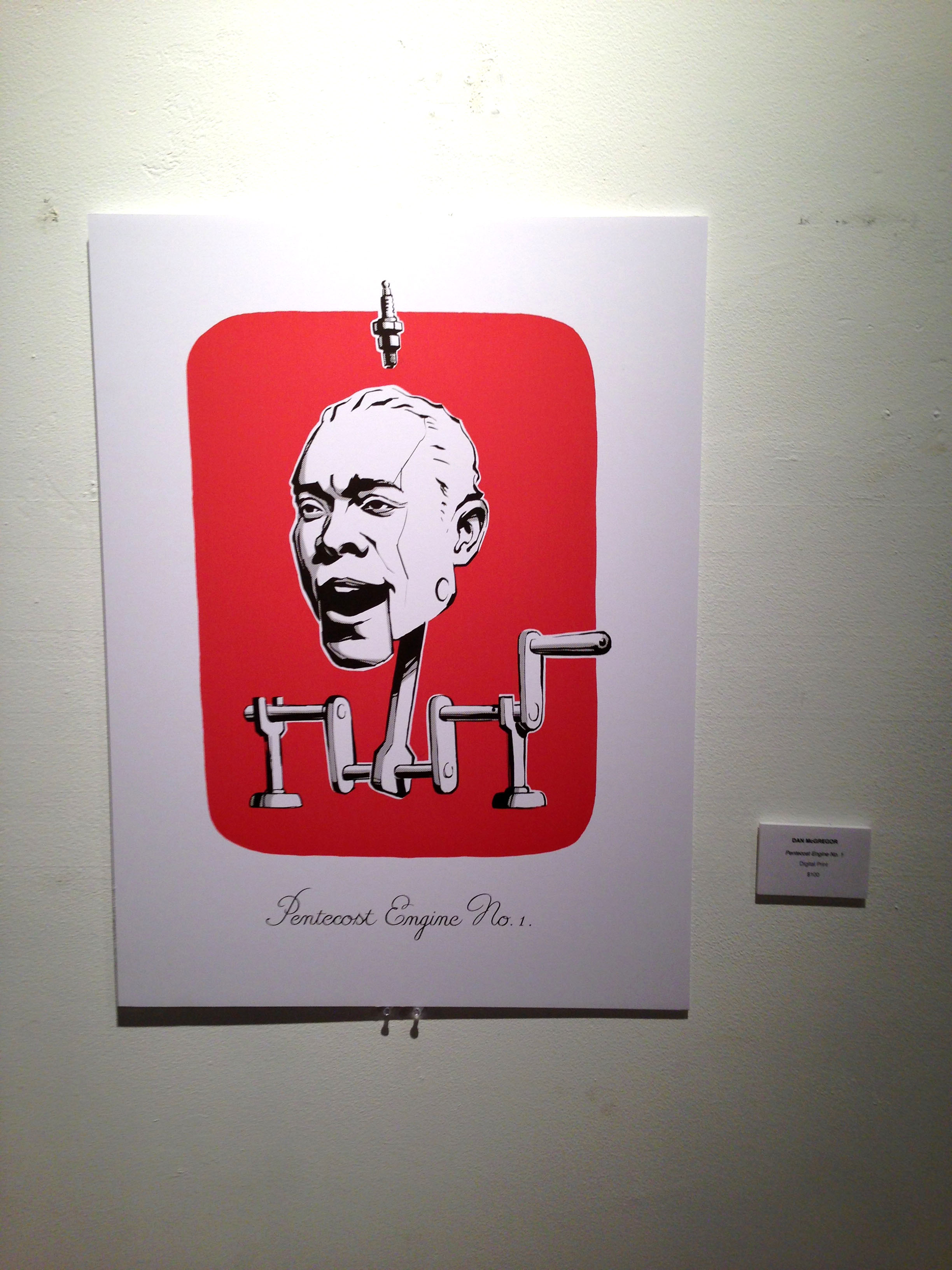
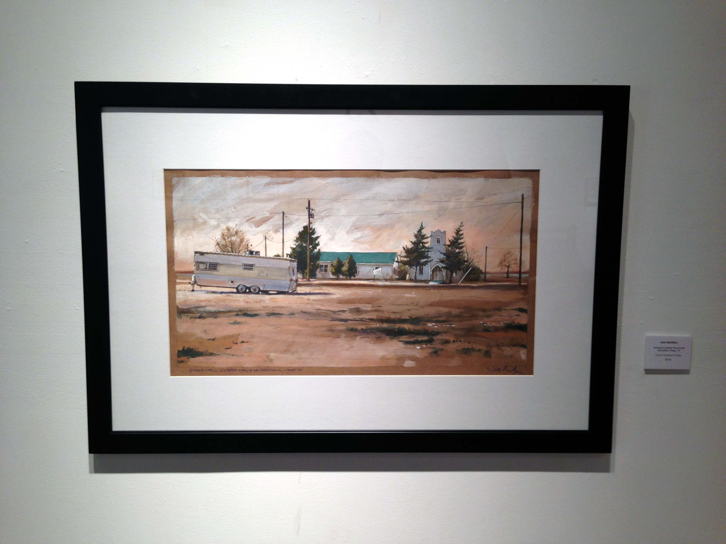
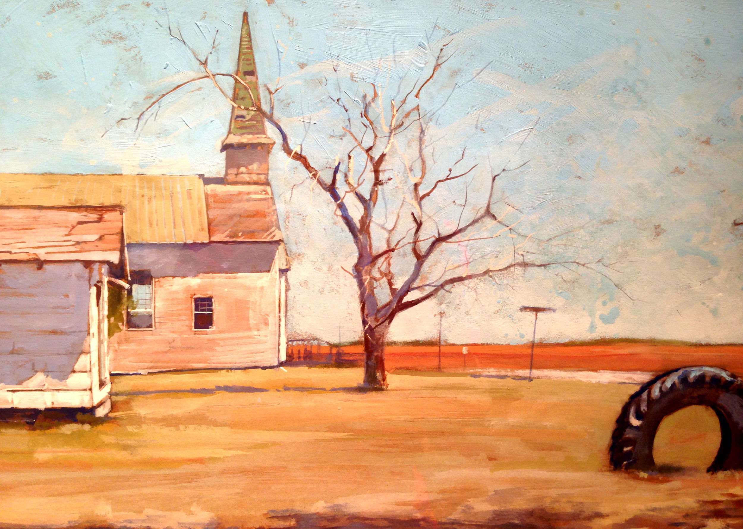
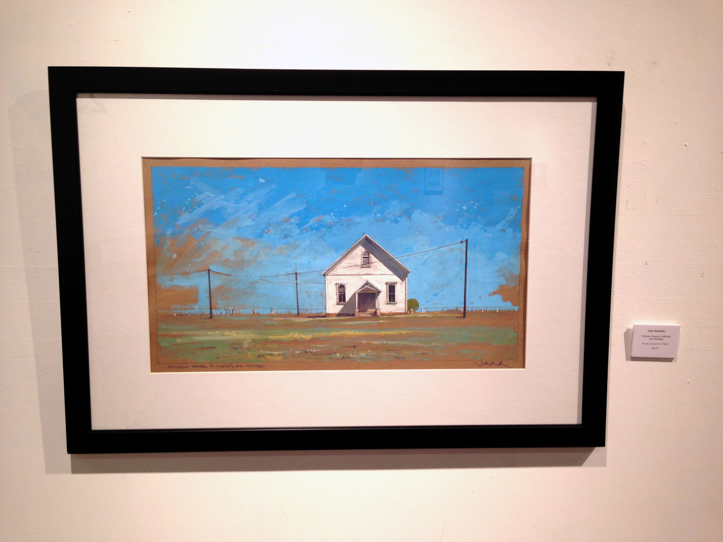
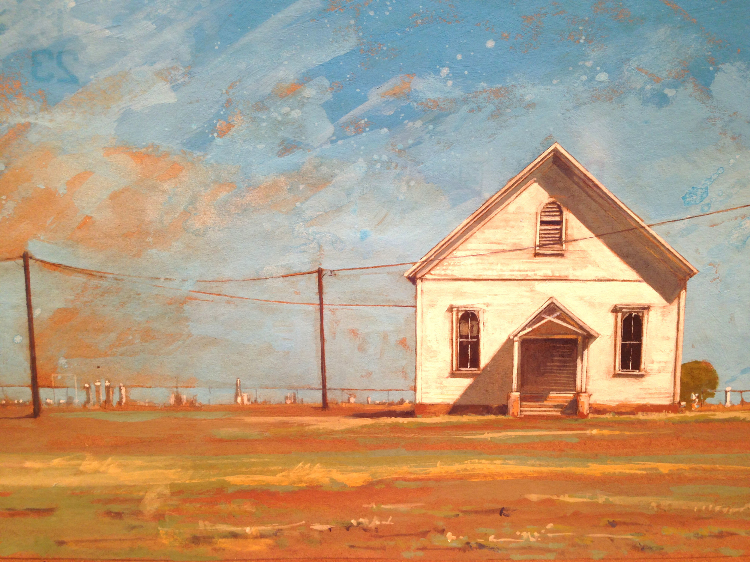
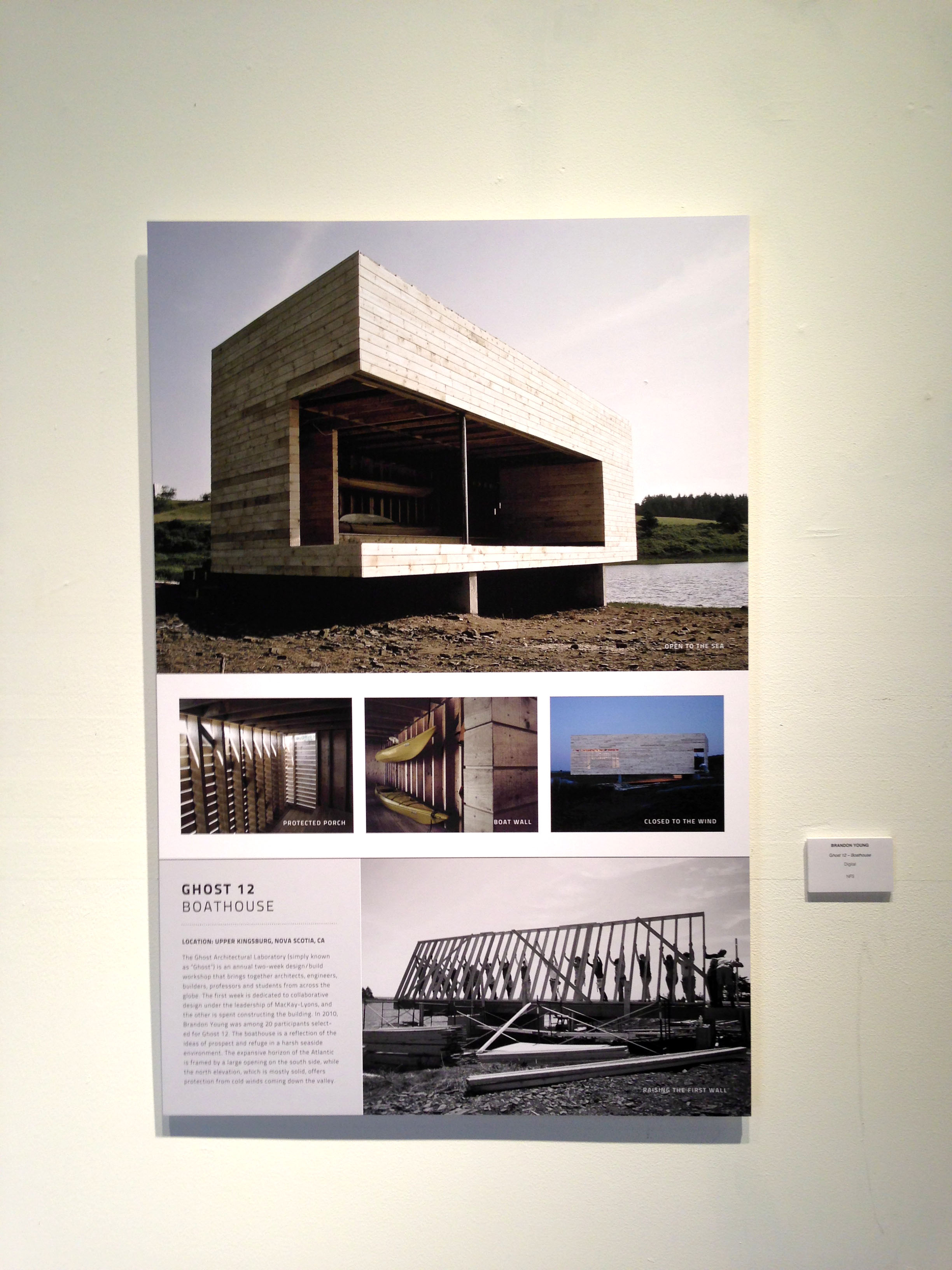
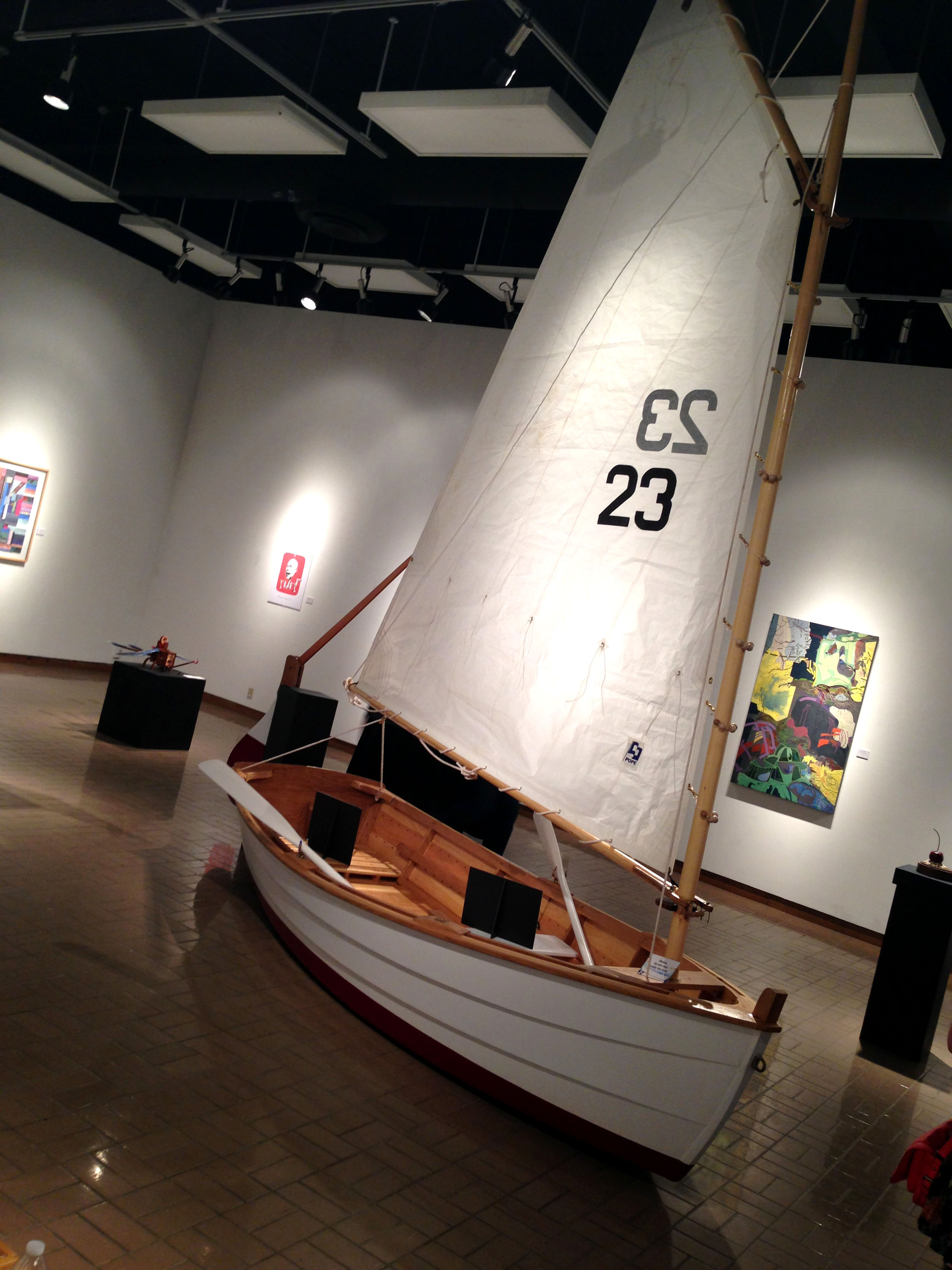
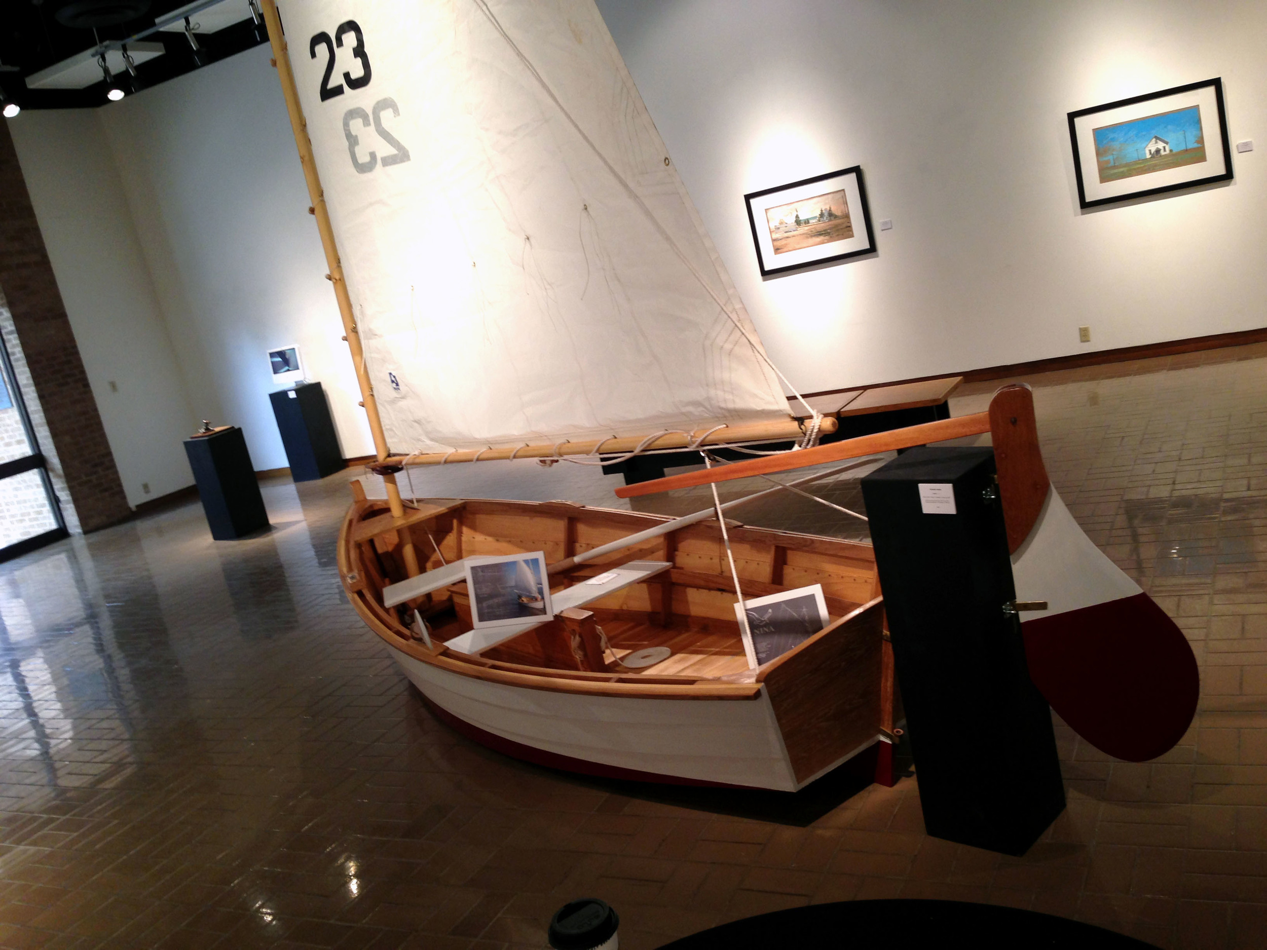
I was lucky enough to be taught by some of the best artists and designers in all the land. While visiting Abilene this week I heard that the Biennial Faculty Exhibition was opening on the 13th. The show was amazing. So much great work was showcased. It was evident to me that the faculty are not only gifted artists, but are also constantly looking to improve and create just as much as the students are.

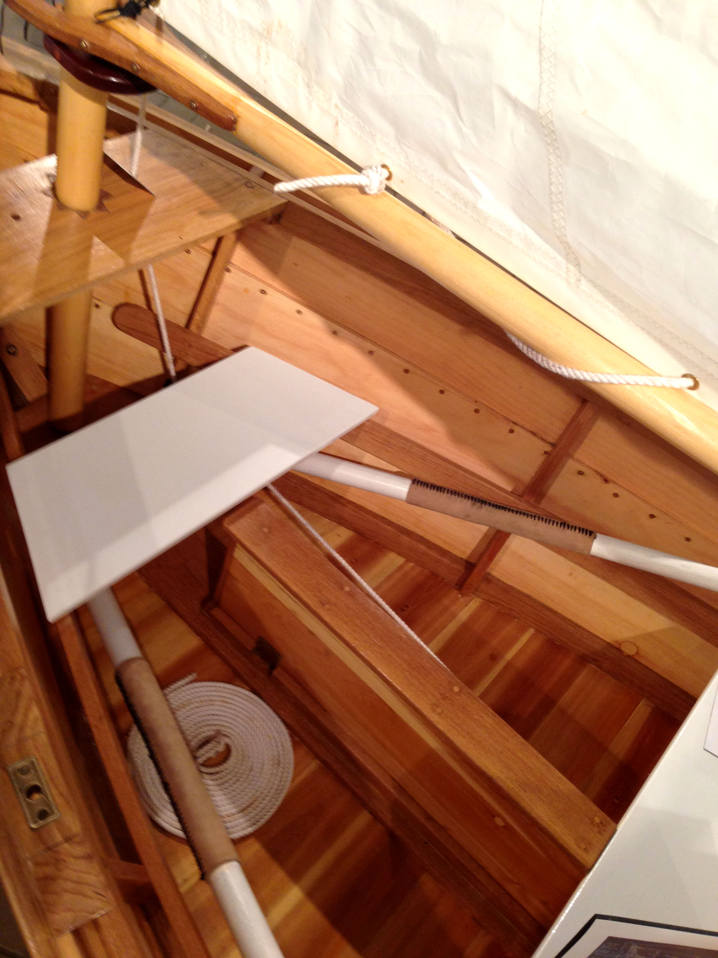
The works explored almost every form of art and design. There were whimsical illustrations, beautiful typography, laser-engraved posters, black & white photography, typographical paintings, kinetic sculptures, gouache landscapes, beautiful jewelry, and even a hand-built sailboat! Unfortunately I wasn't able to take photos of everything, but I really wanted to share and promote the work of my former professors. Have a look! Sorry the photos are not as epic as the work is.


Norman Ives

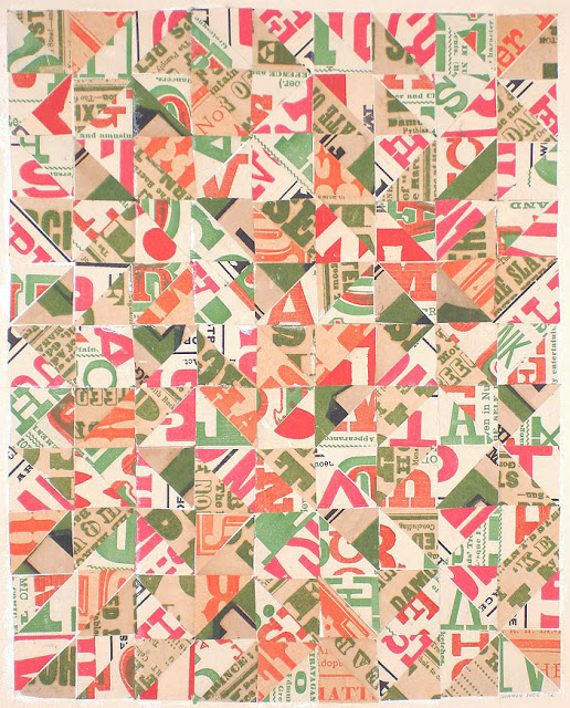
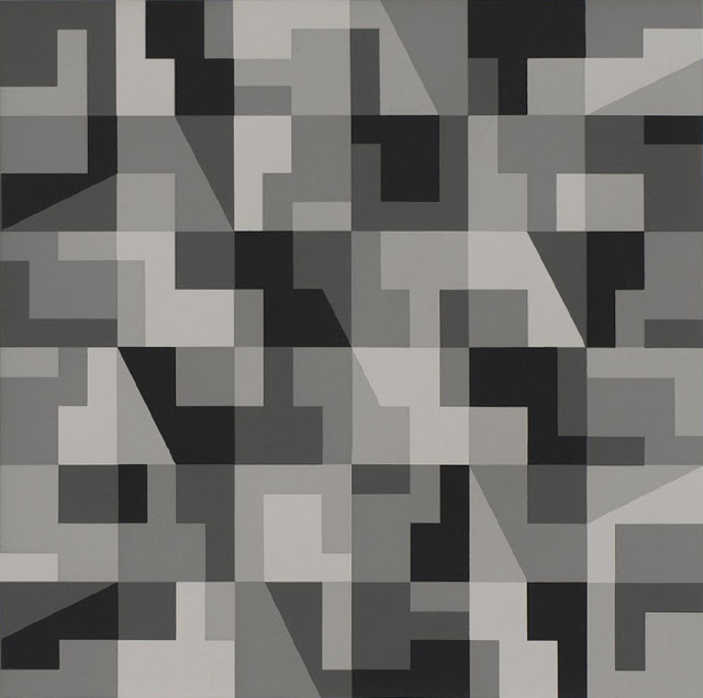
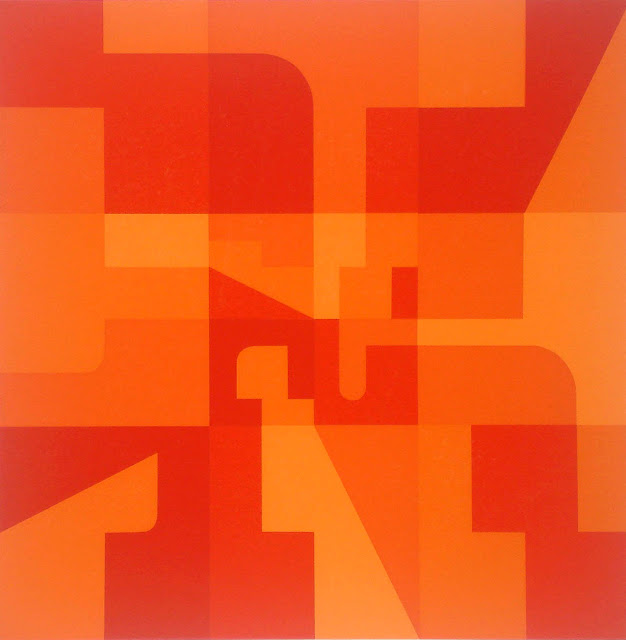
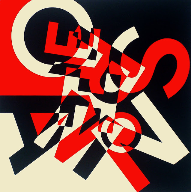
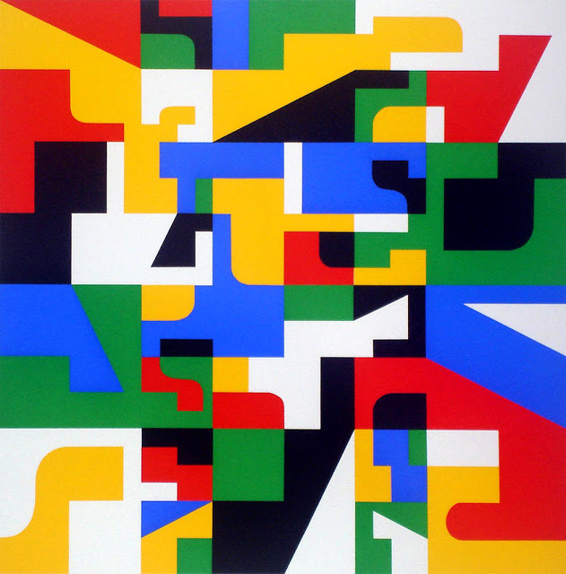
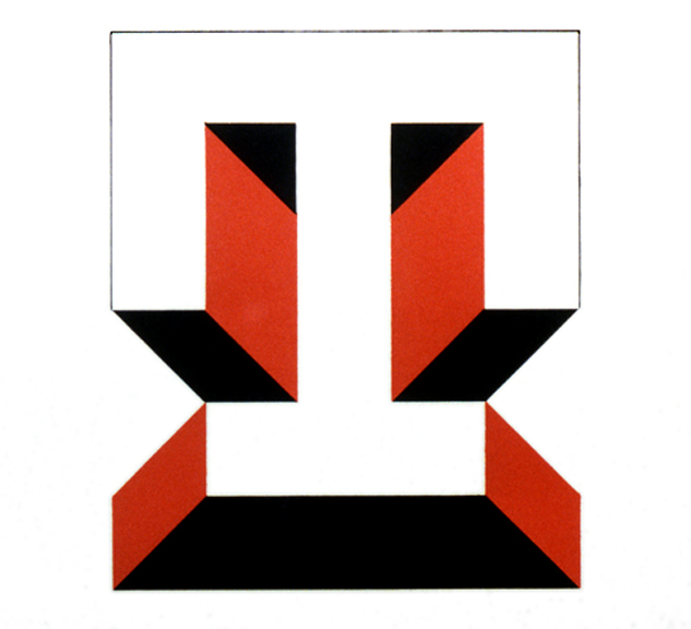
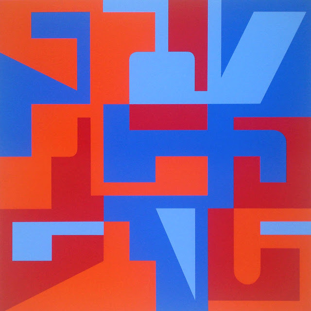
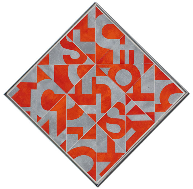
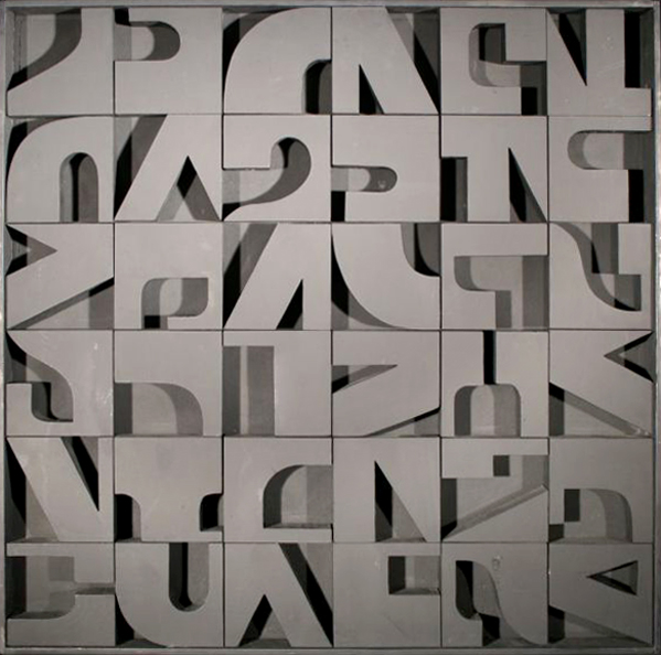
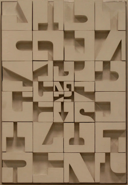
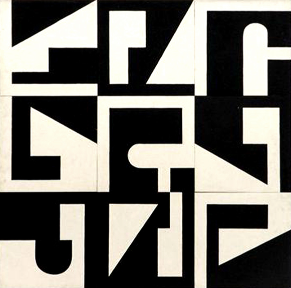
This Friday I was given a fantastic going-away present by my good friend and co-worker Sarah Ives. Her grandfather Norman Ives was a brilliant artist and designer. He created beautiful designs by layering, fragmenting, and cropping letterforms. Sarah and her family have many Ives originals and it saddens me that I never was able to purchase one while living close to the family in Santa Fe. Norman Ives and his contemporaries are truly an inspiration to me. 

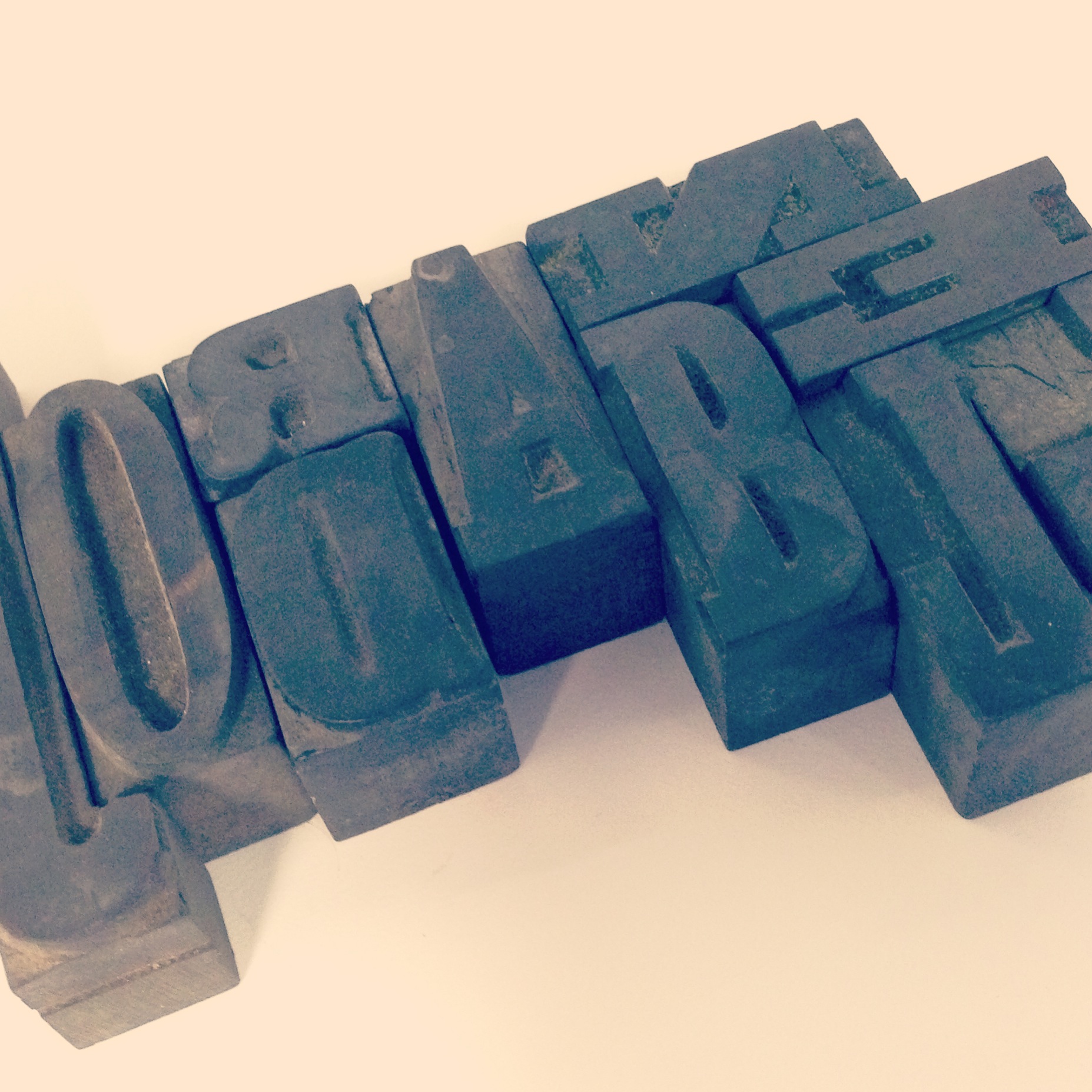
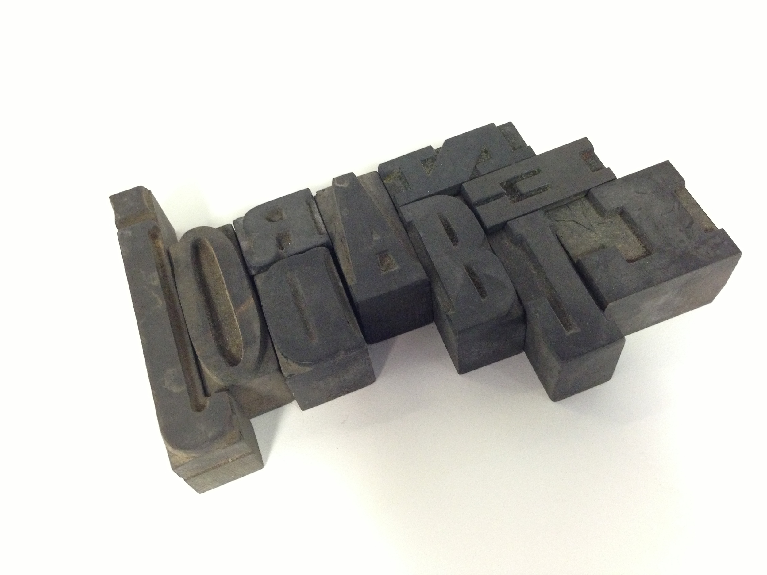
The Ives still have a huge collection of the original wood type he frequently used. Sarah dug up all the characters in my name and gave them to me. Letterpress wood type from the collection of one of my idols?! Such a fitting and well thought out gift. Especially since I am off to Reading to study type and design.

Again, thank you Sarah. Amazing. 

A few of Ives' designs are below along with a short bio from MidCenturia –

American artist, designer and teacher Norman Ives (1923-1978) studied under Josef Albers and Herbert Matter as a member of the inaugural class of Yale University's Graphic Design program. Upon his graduation from the program in 1952 he was invited to become a member of its faculty, eventually becoming a full professor in 1972. During the 1950's he worked with Herbert Matter on various design projects including those for the New Haven Railroad and Knoll International. Ives' artistic works included paintings, collages, prints and bas-reliefs which often incorporated fragmented letterforms.


Last day at Cisneros :[

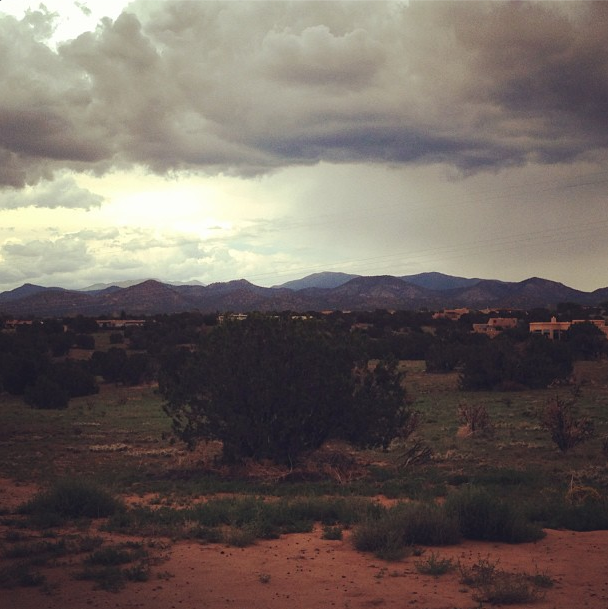
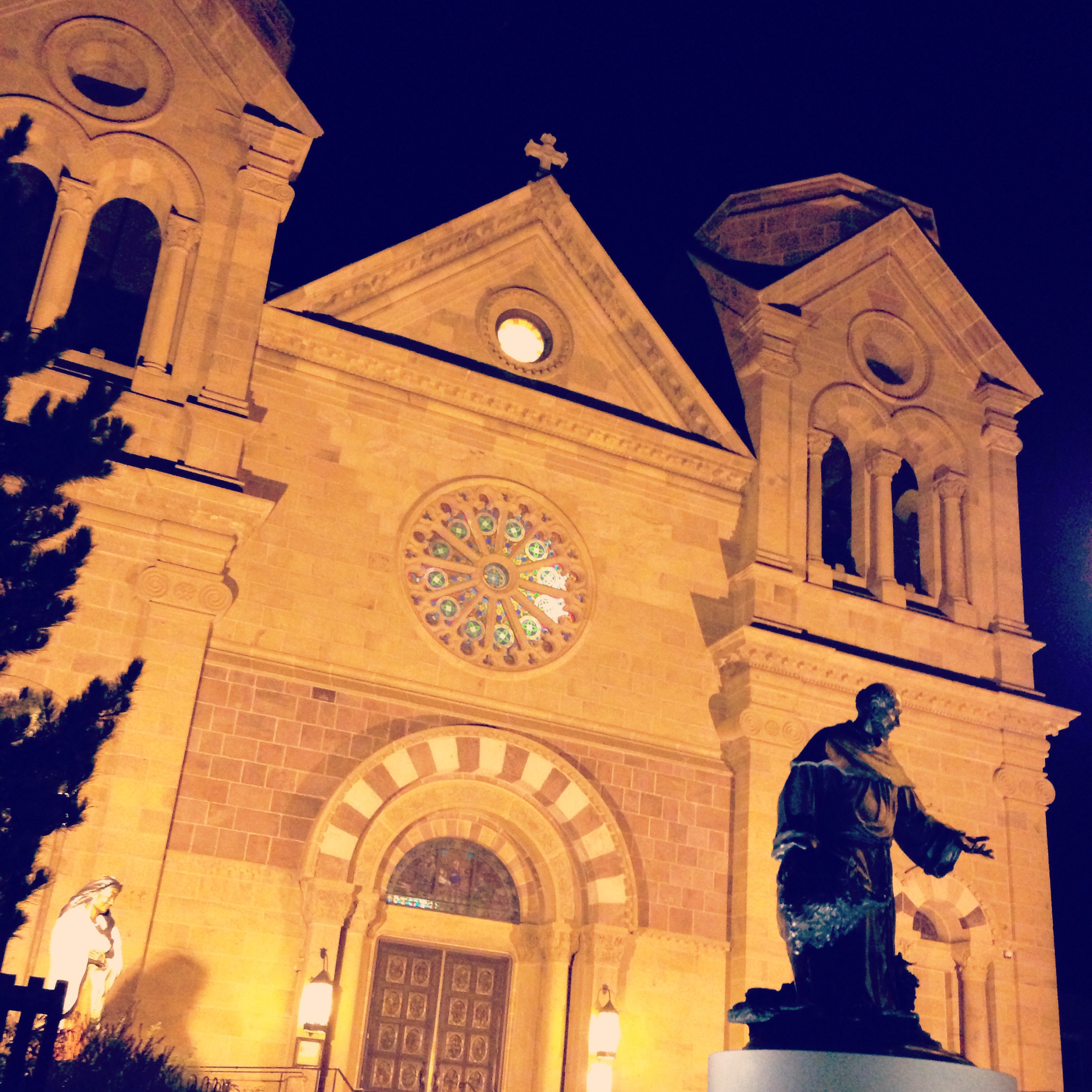
My last day at Cisneros Design here in sunny Santa Fe was this past Friday. I will miss these dudes and the Santa Fe community immensely. However it wasn't all tears and goodbyes! Cisneros knows how to throw epic parties. My good friend and co-worker Louis created his "famous" margaritas at work and then afterwards, we all went to Kelly Cancios' house for football, ribs, and classic tailgatin' games. Loads of fun. Pics from my last couple of weeks are below. Goodbye Santa Fe. you are an enchanting, beautiful, and weird place.


Thank you Cisneros and Santa Fe

I am extremely excited to travel to England and learn at Reading! But before that I had to make some difficult decisions. Unfortunately today, I turned in my two weeks notice. It was not an easy task. I have loved working at Cisneros Design and I have learned an incredible amount since starting here. So without any further ado, shout out time!

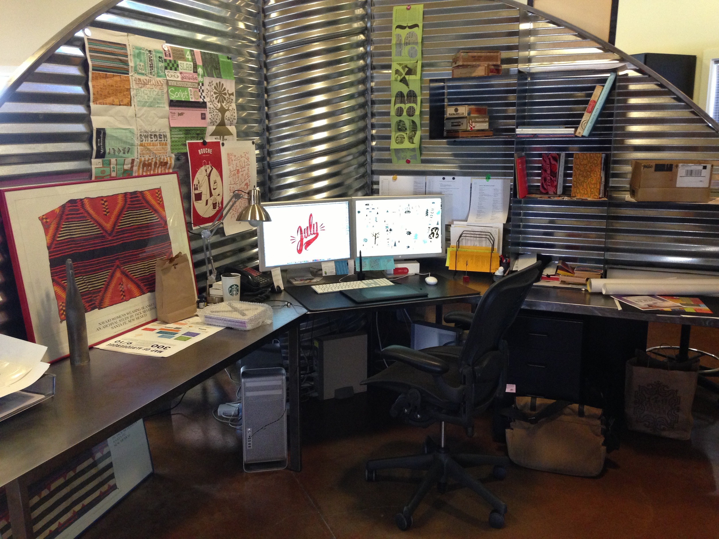
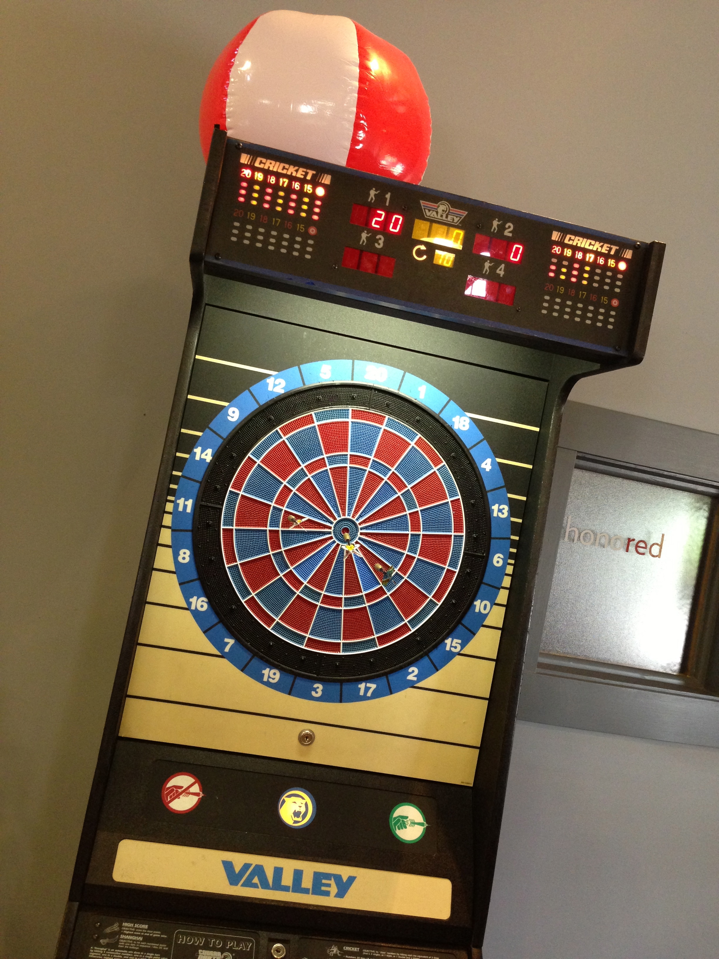
Fred Cisneros, the owner of the firm, gave me a wonderful opportunity at a job directly out of college. I cannot thank him enough for this experience. He also allowed us all to play darts, foosball, and "peach schnapps" (don't ask), at work. He also gave us a fridge full of brews to which I believe no amount of thanks can repay. All of these things gave Cisneros Design a really chill workplace environment. I cannot ever expect to have such wonderful coworkers or such an amazing office space. Truly an experience I will never forget. 

My creative director Eddie is one of the nicest and funniest designers I have ever met. She encouraged and inspired me on all of my projects and made every scenario fun and unique. My projects only became better with her guidance and direction. She also forced me to learn InDesign to which I am ultimately grateful.

My last shout-out is to a fellow Wacoan – Randy Stewart. Randy was the one that brought me to Cisneros. His mother ironically works in the space underneath my buddies Deuxtone at an art gallery in Waco. She told my friend Tanner about a job opening here at Cisneros. Fortunately, Tanner let me in on the job and told me to apply. The rest is history. Randy is a wonderful designer and friend. I've shared many a laugh with the Wacoan and wish they could continue. He is an excellent artist, creator, thinker, gamer, competitor, and dart-thrower. I will truly miss our nerdy discussions and his epic beard.
The employees of Cisneros are absolutely wonderful and I will miss them. To all of Cisneros Design I say, thank you. You have truly inspired me. Rock on. 


Pencil > Pixel

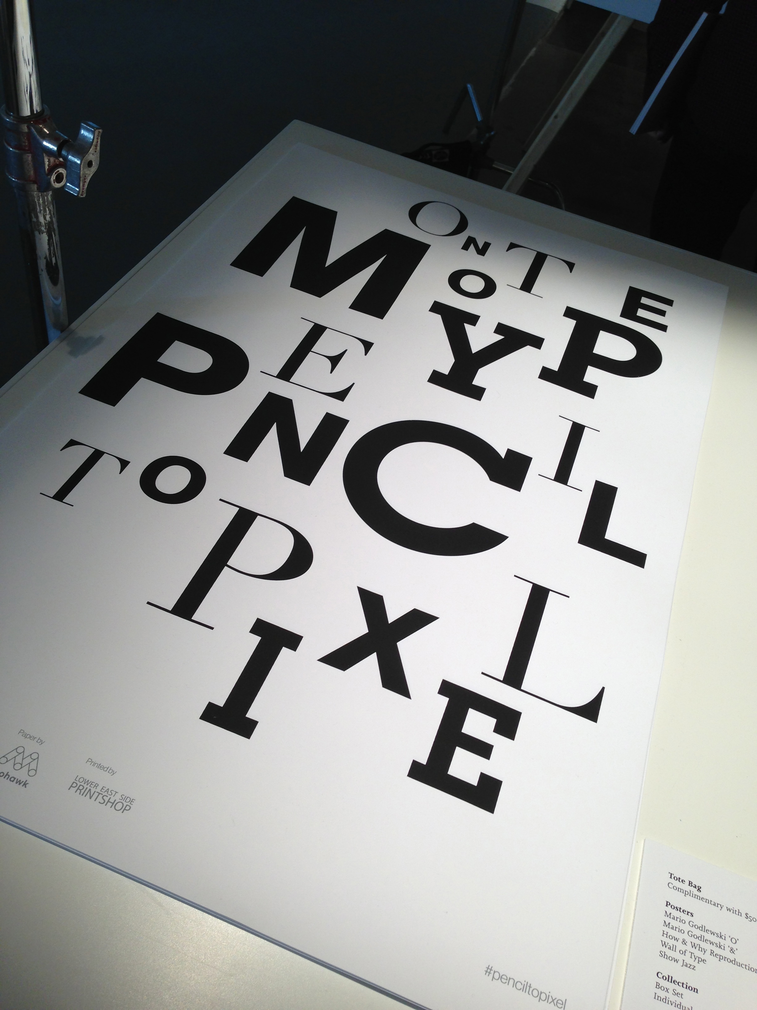
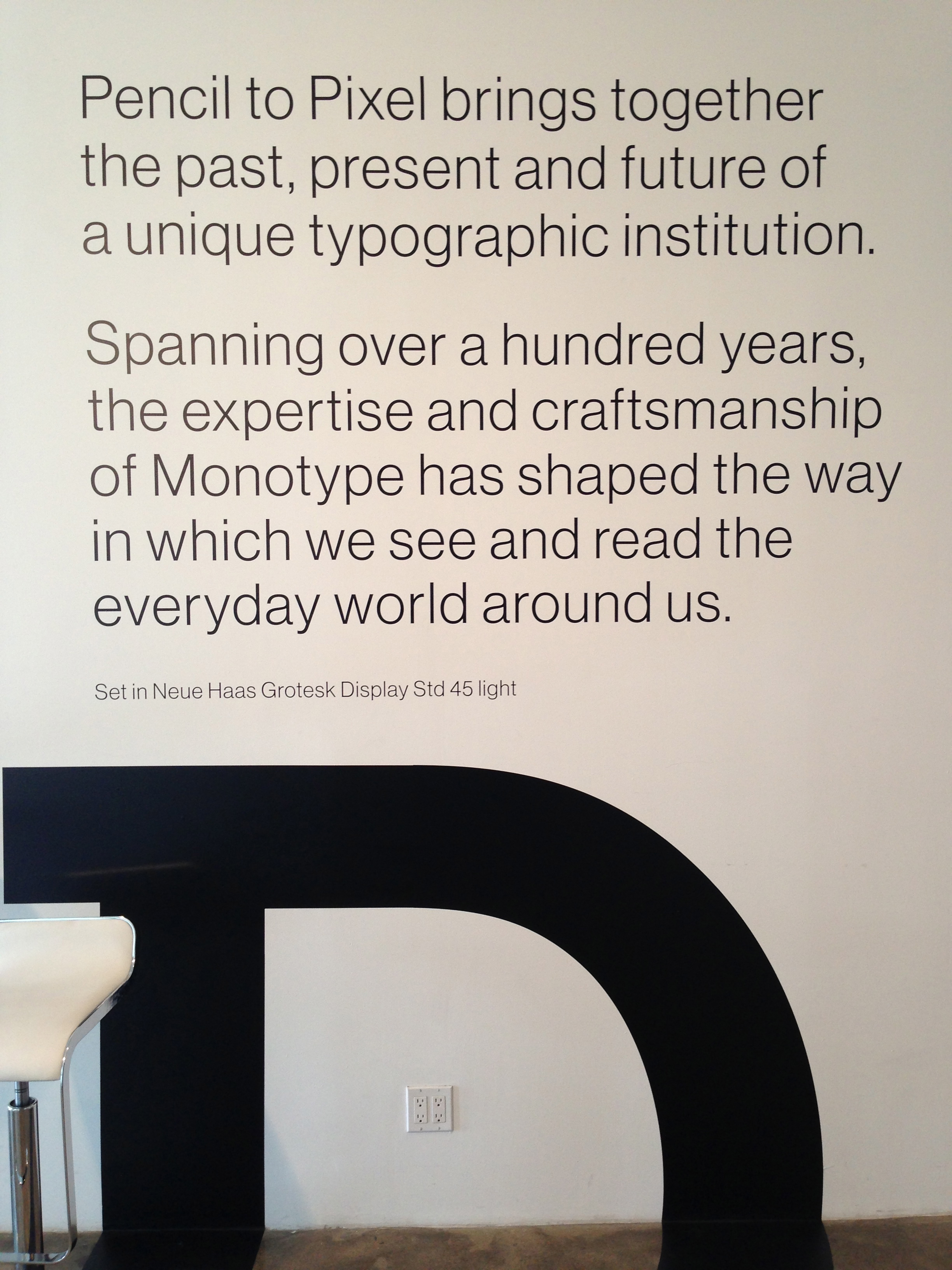
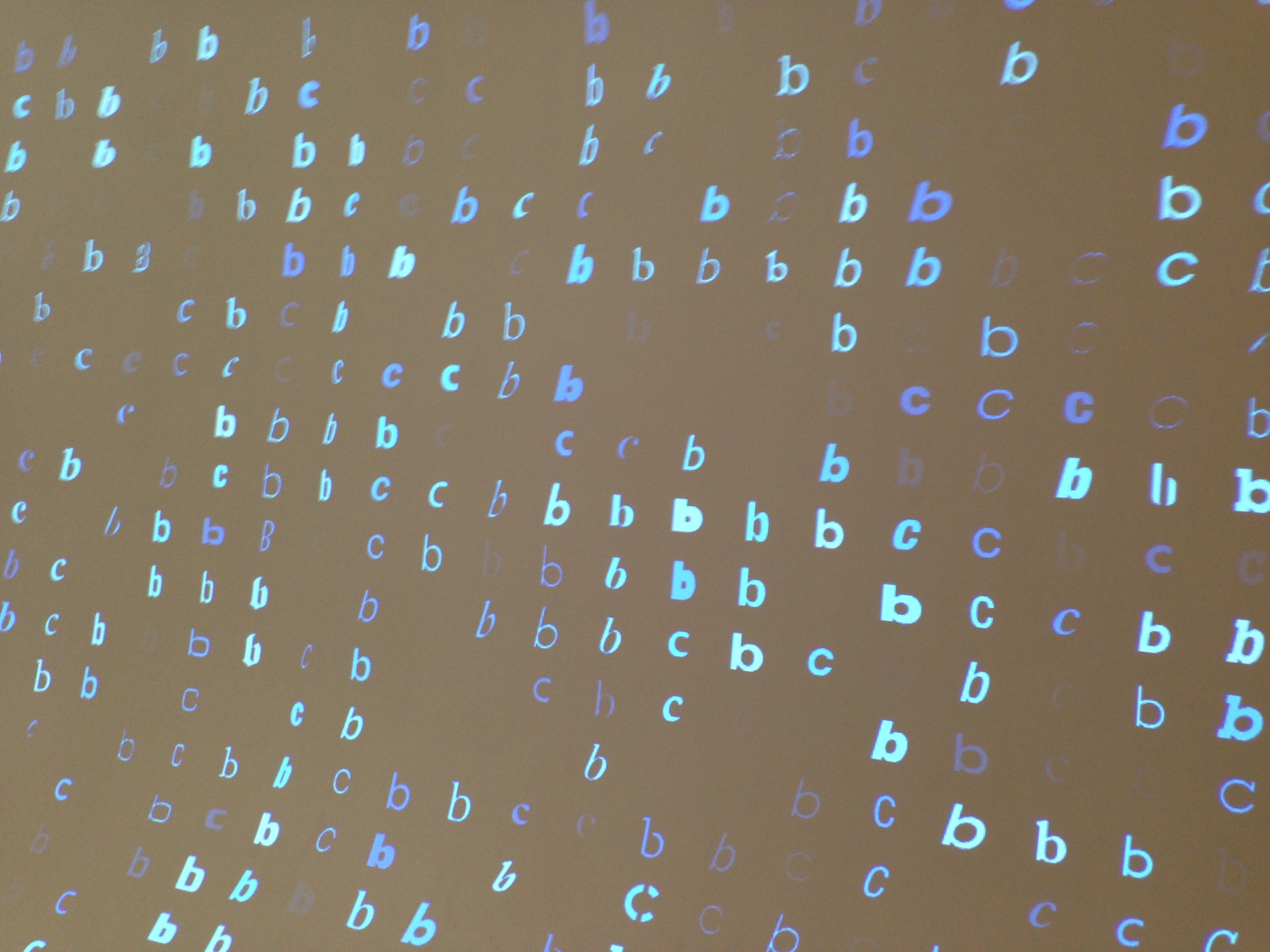
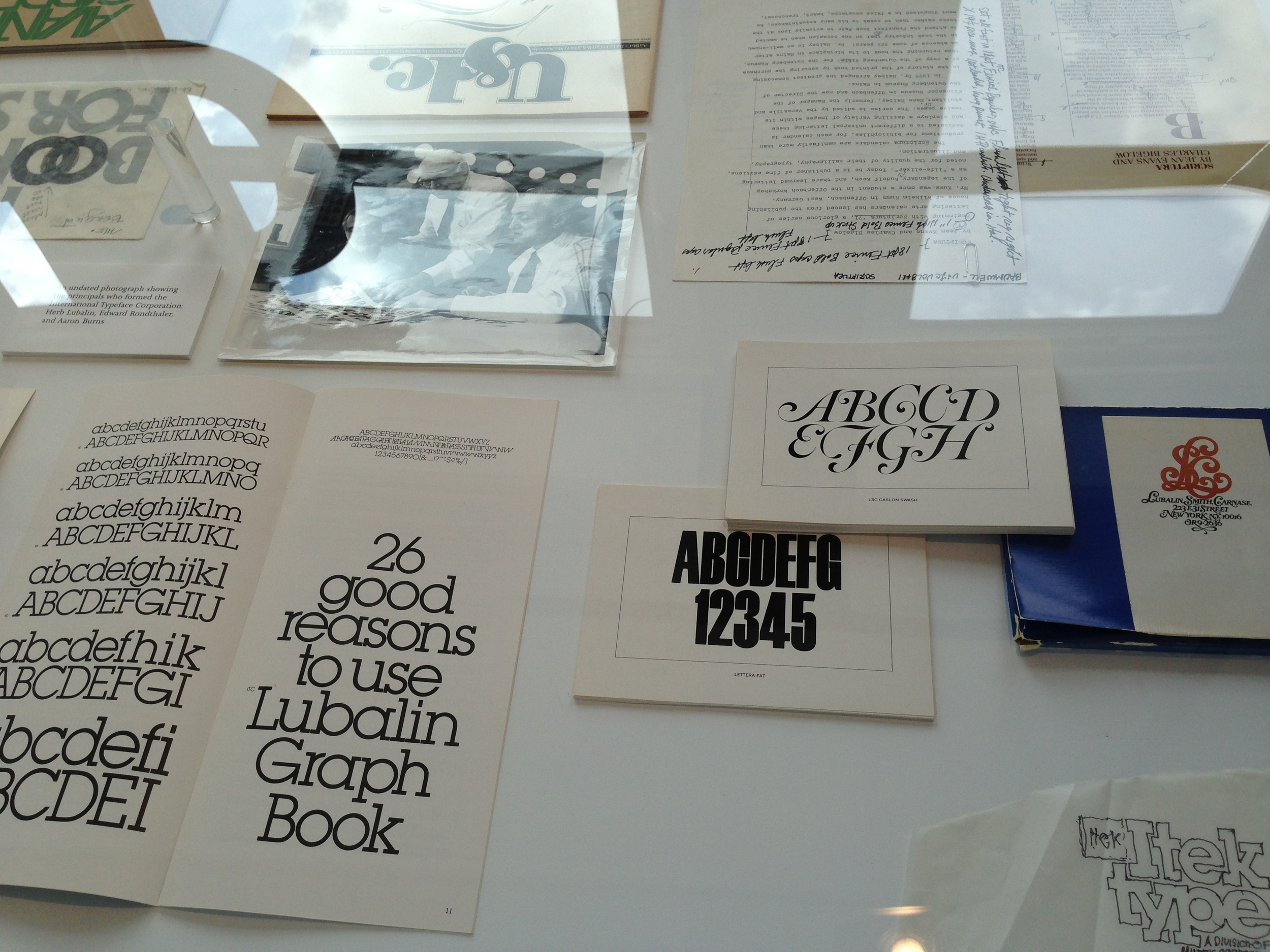
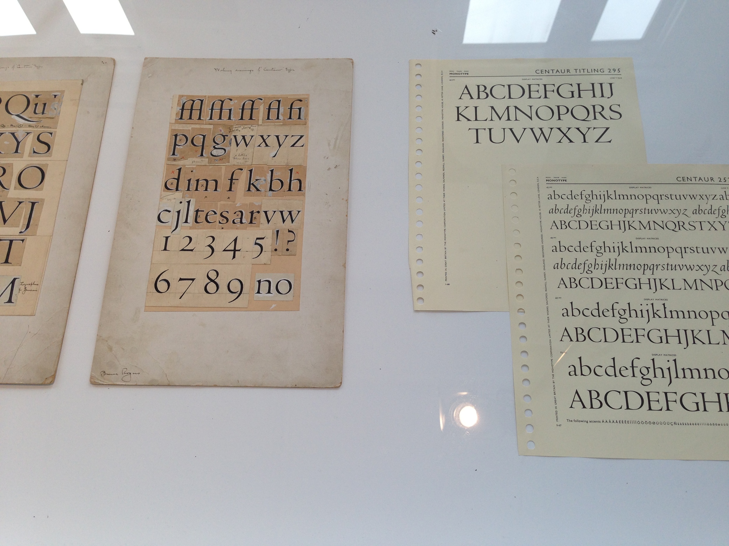
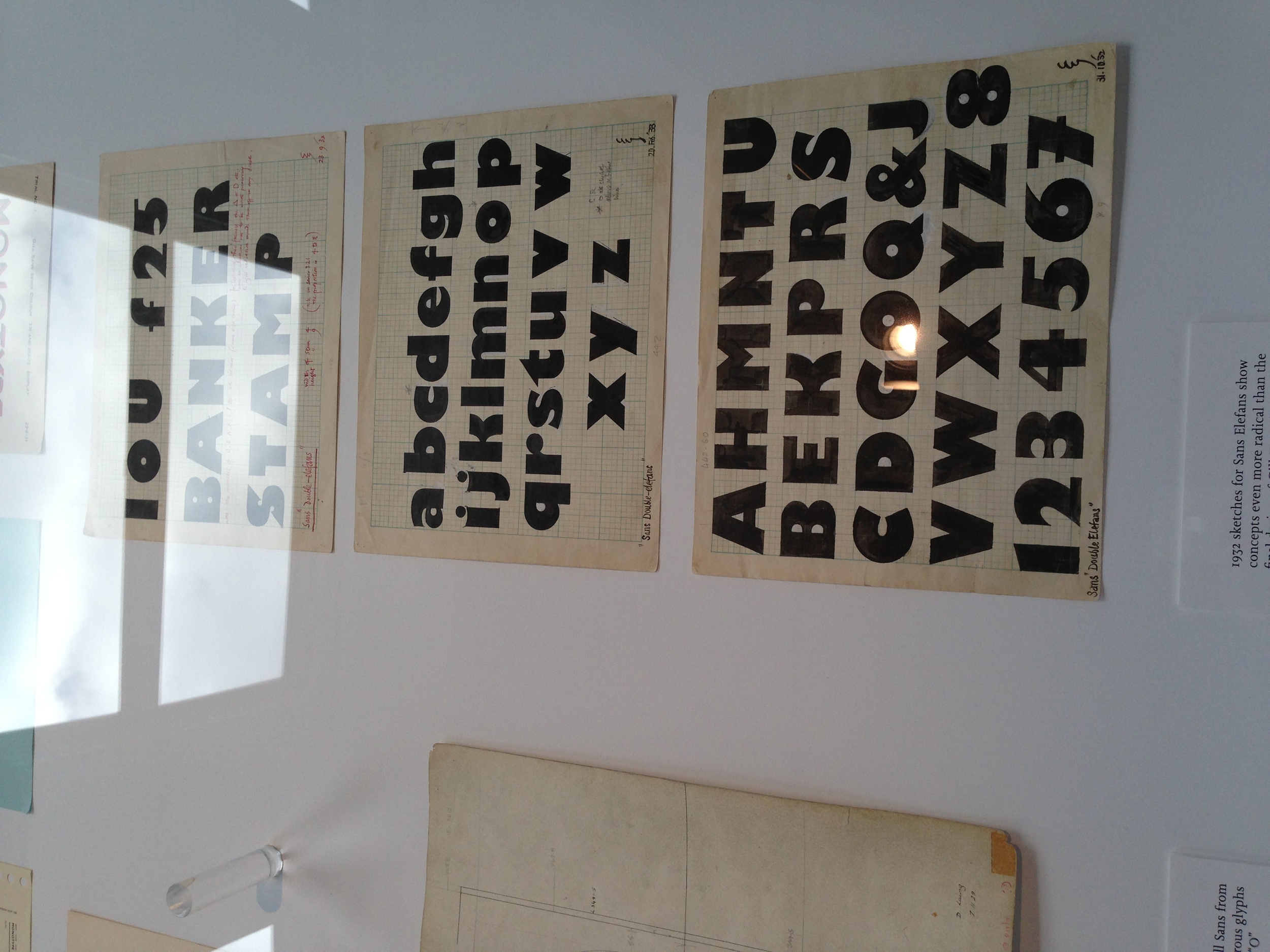
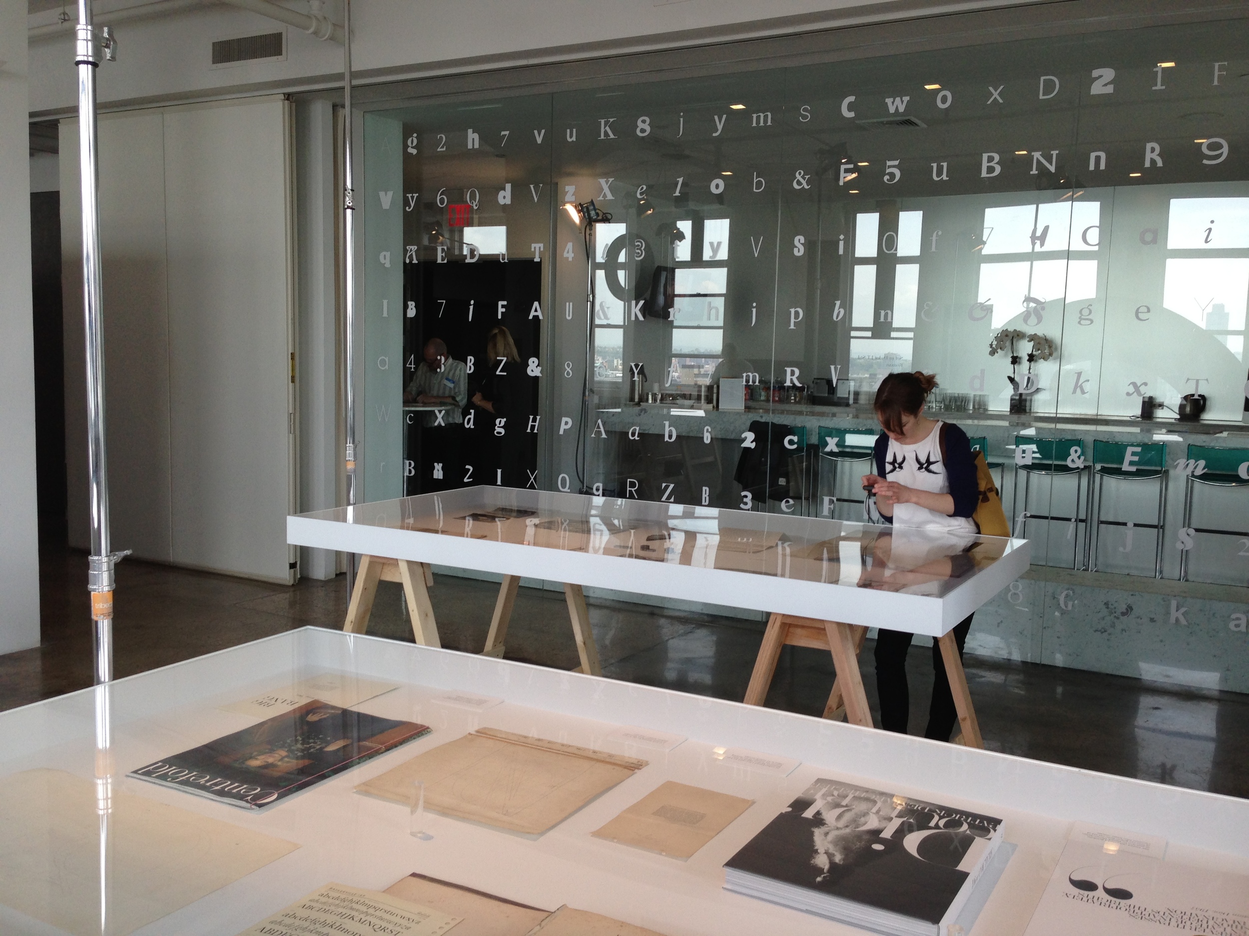
Recently I have been reading more blogs/texts relating to typography and type design. The subject has always fascinated me, but the spark was reignited earlier this summer when I went to Monotype's "Pencil to Pixel" exhibit in NYC.

It was the week before I left for New York and I stumbled across the event – probably via one of the great designers I follow on twitter. The exhibit was free so I decided to check it out. Monotype (the global leaders on typography) and Dan Rhatigan put on a great presentation over the history of modern typography. They had it all. There were original printed books by Firmin Didot and John Baskerville, drawings by Eric Gill, and even a spectacular hands-on presentation over responsive design with web typography. It was truly a type nerds paradise.

I was very impressed by not only the typographic materials and near artifacts in the Monotype archive, but also the amount of knowledge and history that Dan was able to share with us. It was a great learning experience for someone invested in type. Maybe next year they will show the exhibit again! You will not want to miss it.  


* First picture from Monotype .


dan-at-tour.jpg

Shout out!

Throughout college and high school I have had many people inspire me and encourage me to pursue graphic design as a profession. One epic dude comes to mind first - my former boss and professor, Mike Wiggins. Mike is the department chair of the Art & Design Department at Abilene Christian University. He was the first person that told me I could draw letters for a living. I owe my career to this man. He showed me the basics and fundamentals in type and also prepared me for a career devoted to the graphic arts! He is also a nice guy and a rad skateboarder. Mike and the gang at ACU (future posts on my other mentors are being written ASAP!) have definitely inspired me and without them I would not be where I am today. A thousand times, thank you!