ATypI 2017 – A Personal Process

I recently had the privilege of giving this talk at the 60th anniversary of ATypI in Montréal, Canada. Gerry Leonidas (now the president of ATypI – congrats!) thought it might be a good idea to hold a more informal, interactive presentation to students, graduates, aspiring type designers, and in general, young professional designers. The talk was meant to inform, inspire, and give further insight into my personal process throughout H&Co's most recent, and potentially most atypical, project – Inkwell. For those who couldn't make it, read on! 

ATypI-JB.jpg

The Wild West

I have been interested in letter forms and drawing in general ever since I was really young. I went to a design school in West Texas and it was there that I was taught the fundamentals of art and design, multiple media and their impact on individual artistic process, and most moving to me, the importance of hand skills and the tools that you use. Thus, I really enjoy and feel the need to make things with my hands. You may ask “so, why typeface design then, Jordan?!” – sometimes I wish I was building a shelf, or painting on a canvas, or doing gestural drawings in charcoal; but in a way, type design includes these, and many more artistic practices in one. We construct systems and miniature programs that we can control and manipulate. And we may only draw in black and white, but when mixed together those shapes paint grey on the page. 

ATypI-JB_NEW3.jpg

For me though, nothing beats picking up a pencil and sketching. Does that mean I have tons of notebooks, color-coded and organized by season or project? Actually... yeah, kinda; but I also sketch everywhere – napkins, receipts, old sketches, orders of ceremony, and yes, the handy sketchpad. But my new favorite media to draw on is the iPad. It’s not for every project or sketch, but the iPad, like most new tools, opens up doors and possibilities that can be new, and pretty exciting. Every app or program has its own tools or ways of mark-making and that’s extremely interesting to me. In these examples, I’m using Notability’s two drawing tools.  

ATypI-JB_NEW4 (1).jpg

So, combining hand-skills and type has been my focus, and somehow, this work got me a job at a lovely boutique graphic design firm in Santa Fe, New Mexico called Cisneros Design, and later into the MATD program at the University of Reading; and as I was finishing my MATD thesis in NYC, I began working as a typeface designer at Hoefler & Co, where I’ve been for three years this week.

Style as System

However, Reading University is where this story really begins, and it’s where I met this guy –Gerard Unger. One of my most favorite professors and meaningful mentors. If you have not read Riccardo Oloco’s interview with Gerard, get on it. He’s just as wonderfully insightful and inspiring in print as he was during the year I was at Reading.

ATypI-JB16.jpg

In one of his first lessons, Gerard instructed us to sketch a word in four different lettering styles. And, as someone who became interested in type design through lettering, this was perfect for me. Jonathan once said something that I keep coming back to: “There are great type designers who work to avoid revealing a personal style, and there are great type designers whose work is enriched by their strong personal style, and in the latter group is Gerard Unger.” To me, this project was the manifestation of that quote. 

Accidentally, or being simply ignorant of the consequences, I used the same brush to create my four drawings, and Gerard made an observation that I most definitely did not catch. He remarked that one of the styles nearly looks like it could be an italic for another. That they could be paired, although they were quite unique. This may not have even been the point of the lesson, but it was exciting. 

ATypI-JB21.jpg

Not only did I have a more concrete vision for my thesis project (that would later turn into this type family, Odelay), but it also made me start thinking about tools and their importance in my design once again. This project and Gerard’s insight also made me question how far you could you push stylistic combinations in relation to the tool used? Or even, on a more simplistic level, the roman/italic relationship.

So, this study of stylistic relationships with Unger led me to another question: what actually is a type family? Or, what can a typeface family be? Does a typeface family have to have Italics? More than 1 or 2 weights? Widths? Text and Display styles? Grades or other technical aspects?

ATypI-JB23.jpg

Or, can a type family have a broader definition, simply encompassing multiple styles within a working system? If so, how would these styles be related in said family, and in what ways could they interact or be used practically? And what can we look at for guidance or inspiration here? 

IMG_8395.JPG

There were the renaissance writing masters that were able to move effortlessly and purposefully from one hand to another. The great English calligrapher and type designer Edward Johnson implemented uncials, italics, emboldened caps, swashes, and even some simplified capitals for the small text in this map of his home town. But there’s also many more contemporary artists that use letterforms in their work. 

One of these artists that Jonathan and I share a mutual admiration for is Charles Shulz. Everyone recognizes the iconic lettering of Peanuts, but one of the things that I especially loved as a kid was the effect when Snoopy sat down at the typewriter: the lettering would shift, to something typewriter-inspired — which is funny, and unexpected, and a really effective way of immediately signaling that what you’re reading is no longer dialog, but something being written. I loved the way Schulz used different styles of lettering to gently, yet distinctly, connote different kinds of language. 

ATypI-JB27.jpg

Jonathan and I also remembered the superb work of Edward Gorey (for those of you who don’t know Gorey’s work, you’re in for a treat. I learned about Gorey years ago in a printmaking context actually, as many of his illustrations are amazingly dry-point etchings. His stories are brilliant: they’re elegant and deeply subversive, dark fantasies set in a vaguely Victorian universe full of mustached gentlemen and ladies with parasols. They generally involve people being driven insane, or hapless infants coming to some grisly fate. You know, good family fun.

ATypI-JB28.jpg

He was a master lettering artist, and I’m not talking so much about his skill as a draftsman, but rather his perceptiveness about what letters can mean. The title pages for his stories always reveal a deep love for lettering, and he works these different styles of letter into the stories themselves, in ways that are always apropos, from the slab serif [in this slide] that signals “old-time baseball uniforms” to the blackletter that identifies a proverb. But I especially love the way he uses lettering not only for display, but for text. 

ATypI-JB30.jpg

When we designers at a type conference talk about “lettering,” we’re almost always talking about large, solitary things: logos, headlines, these things that are grand, and have a great opportunity for pyrotechnics or likes on social media. And while I do love this kind of lettering, I also love the rarer species of lettering that’s used for text. Gorey uses the traditions of typography to confer legitimacy on the fantasy, whether it’s the bookish presentation of a caption that uses romans for text and italics for titles, or an epigram whose attribution is set in small caps, in just the way that a graphic designer might do. Gorey was obviously a keen student of typography on three different levels: what letters look like, what different styles of letter forms can express, and how typography can be used to articulate content.

Typeface designers think constantly about these three different perspectives, and how their unity can yield typefaces that are not only interesting, but also useful. At H&Co, we find ourselves using lettering every day to shape content, and not just in our roles as designers. I would say Jonathan’s notes on these proofs is perhaps the best example of how lettering and typography can come together in a very interesting way to shape content. 

ATypI-JB35.jpg

This slide was a note to Sara Soskolne, one of our senior typeface designers. And perhaps as with Gorey, it’s less about the lettering itself, and more about Jonathan’s affection for using different typographic styles together. I suppose you could dissect a note like this to say that it’s generally set in script (1), with occasional highlights set in sans serif small caps (2); a sort of wide, decorated in-line(3); and even a pen-drawn bold(4). But I think it presents to the reader differently, as simply a single statement that uses noticeable styles the way a typographer might employ bold or italic.

ATypI-JB36.jpg

And to me, that’s the most interesting thing about handwriting, as opposed to calligraphy. Calligraphy formalizes its mannerisms, and the qualities of its tools, and refines them into a particular style, much like my earlier lettering project and this example above by the brilliant Gerrit Noordzij. But handwriting is less consciously structured, and therefore has more freedom to move between different styles. Style is incidental to what handwriting is: handwriting is principally the record of an author’s words, and only incidentally possessed of style in the typographic sense. 

Inkwell

ATypI-JB42.jpg

With our most recent project, and the one that I have been using throughout these slides, we wanted something that borrowed the best parts of type, calligraphy, and handwriting. The versatility of type, but none of typography’s artificiality: type after all is synthetic, institutional, more anonymous than personal, which as a communication tool is generally its strength. But instead of artificiality, what I wanted was something from calligraphy: its organic quality. Calligraphy is genuinely hand-made, warm and natural — it’s the product of the wrist, the elbow, and the shoulder — but it’s too mannered for what we had in mind, since by design it coalesces into a formal style. An antidote to this formality is found in handwriting, which is as informal as letters can be — and I really love the way handwriting reveals authorship, which you can think of as a writers voice, instead of concealing its personality. But then handwriting can often be disorderly, if not downright sloppy. So my question was whether it might be possible to strain out the virtues of these three kinds of lettering, and eliminate their shortcomings, and that’s what we attempted to do with Inkwell.

ATypI-JB43.jpg

I had been working on Inkwell since about November 2015 when Jonathan slid this piece of paper over to me. I had honestly thought he wrote my name and title on a sheet of paper. Though that may seem crazy, the early drawings of Inkwell were very organic and a bit inconsistent – and not in a bad way mind you! Even then, we could see the inconsistencies benefiting, rather than harming, the design. The illusion was bulwarked further since many of the forms had a lot of the idiosyncrasies from his handwriting as well. I was tricked, and it felt amazing. Looking back on this memory though, it’s a bit odd. Creating an illusion of handwriting was not necessarily one of the main goals of this project. Yes, a goal was to create a system of handwritten forms in multiple lettering styles. And yes, we did want it to have a potential for delivering robust authorship and typographical hierarchy, but to have a trompe l’œil effect? Not really our intention. 

Jonathan initially conceived of this family back in 2004, incidentally just before my first year of high school (lol). It was inspired by his search to find the right typographic solution to the tonality issue on the map of his wedding invitations. As graphic designers we’ve probably all had this problem. Since the map is an illustration, you don’t want to use a typeface as it generally looks too institutional, as if you’re making a map for the venue itself. But straight calligraphy feels out of place too, as it feels too historical or from some fantasy realm. Inkwell is an attempt to create a family of fonts that feels like hand-written text: how you might letter the entire contents of a book or encyclopedia, if you had infinite time, patience, and skill. 

ATypI-JB51.jpg

We began by talking about the weight, and how it should be applied. Jonathan originally imagined Inkwell as a collection of alphabets that could all be the product of the same pen, and therefore all with a consistent stroke width; but a companion boldface is obviously a valuable thing for a designer to have. And even if the design were to stick to a single weight, it seems to me that choosing that weight is important. So we decided to expand the family from a single medium weight into a range of weights, bounded by a technical pen Thin and a graffiti marker Black. 

After Inkwell’s introduction, we got to work on the initial style – the Serif. We obviously couldn't stop here though so over the next year or so we sketched small caps and some swash caps and even swash small caps ‘cause why the hell not. But like I said earlier, it wouldn't be a typeface family ready for complex typography without Italics, right? We wanted more though, and so we sketched a Sans, as well as an Italic companion. After all, my handwriting feels closer to this, rather than a slabby serif. We gave Inkwell a Blackletter that blends Roman and Gothic forms, since, after all, it is all drawn by the same hand with the same tools. We drew an Open Sans for titling, much in the style that you may find on a blueprint or patent diagram. But we also wanted something a bit more ornate, so we added a Tuscan with twisting, doubled strokes instead of bifurcated endings because that felt more natural to a handwritten methodology. And we saved the Script for last, but it's definitely not the least of the styles. One can use all these styles for document typography or as display, with the styles even paired at different sizes to produce interesting illustrations of the intended tool.


Ideas for future projects

So, what now? What can we do with this? I have a few ideas: 

Authorship
I’ve talked a lot about authorship today. Giving structure to typography is incredibly important and can be made easier depending on the tools that the designer has at his or her disposal. Multiple styles can not only assist hierarchical purposes in document design, but also benefit authorship or the individuality of said user. Inkwell boasts many different voices and aesthetics, which can be useful for many different environments and contexts. Don’t be afraid to use your voice, or even two! Especially if your trying to create a map for a wedding.

Gestures & motifs of lettering
As I alluded to earlier, while drawing Inkwell, I thought often of writing instruments and the specific motions involved. We are familiar with how each stroke of the pen creates a certain amount of contrast and stress, but I feel like we can do a better job at illustrating the effects of these gestures in our designs. 

When Jonathan and I began working together on Inkwell, one of our first conversations was about how serifs should connect, which meant dissecting Jonathan’s sketches to see how they worked, then abstracting from these a set of rules, and then seeing if any characters didn’t fit the mold. This was the beginning of the “Inkwell Bible,” a long and growing collection of guidelines about what Inkwell should do. We used an organizational app, (shoutout to Trello!) to record these thoughts: How should serifs and transitions be constructed with regards to our natural handwritten gestures. One of the ways we tried to keep things from becoming monotonous was to try and apply these strategies differently throughout the character set, so that things like caps and small caps don’t follow the same underlying design. Therefore, within the serifs, spurs, overshoots, accidentals, and other funky variations there is unity through diversity. Because of this diversity, some shapes can be simplified, translated, or altogether different for specific typographical purposes. In many ways, Inkwell became about doing the things that you typically don’t do in a typeface, since our goal was to introduce not consistency but variation, up to the point where it even becomes noticeable. 

R.gif

When all these ideas come together, we have within any given glyph many small oddities mixing: The quick rotation of the wrist that I do when the ornamental stroke on the left of the Blackletter capital R slashes into the stem; the extroverted downstroke of said stem that overlaps the serif at the bottom a bit too far; the overly confident loop at the top; even the quick flick at the end of the leg. These aspects of our hand movements & gestures are uniquely individual, and as I learned in figure drawing, they not only help establish a style and voice, but they can also can serve a function as well. 

ATypI-JB66.jpg

You can see the functional aspect of these oddities in both a micro and macro level. Micro differences as in the minute changes in form of all the circular elements of a specific glyph set, and macro differences like the changes in form between divergent styles of lettering. 

test_360-$5.gif
test_360-8&.gif

Conventions of typography & drawing
The images above are an illustration of just some of the unorthodox drawing methods we incorporated into Inkwell. These idiosyncratic moments and gestures are drawn a bit different from one master to another, sometimes even at different angles. Drawing like this is generally discouraged due to interpolation compatibility, but we exploited it in order to create more organic instances and even some funny moments like in the first example where the vertical hairline in the ‘5’ goes from completely isolated, to touching, to fully breaking through the stroke above. Instead of hindering our design, this drawing style helps the various weights to not appear so homogenous. I love seeing people playing with drawing conventions in their types, and I hope to see more of it in future projects. This practice does present a couple of fun and difficult questions though: Are these details in reality superfluous? And if so, is that bad? Do they possibly harm readability or legibility a bit too much thus causing unnecessary distractions? Maybe. But the answers to these questions must come with context in relation to the typeface or system they are within. Even so, there are many problems to solve other than Beatrice Warde’s “crystal goblet”. For within our handwriting are layers of messages. Besides the message that it’s literally carrying in the content, the forms are also delivering tone, intentionality, and acknowledgment. This can be seen in everything from why it’s difficult to select a font for a wedding map, to the notes we send to one another in the office.

ATypI-JB71.jpg

There are always inadvertent slips and other humanistic moments within lettering and handwriting, but these moments give our messages a genuine personality; whether blunt and serious, or gentle and easy-going, and how we style this text effects the message as well. Emphasizing with all-caps, a quickly written script, or an entirely different style altogether does indeed effect the message’s reception. I will say, all fonts exhibit a personality in some way – but I’m interested in seeing how far we can imbue our written idiosyncrasies into our work while balancing usability. Inkwell is, among many other things, our attempt to play with this atypical idea. 

ATypI-JB75.jpg

For me, this was the single most fun and educational design project I’ve ever attempted. All projects are different, but we learn something from each, and you bring that something to the next one. Inkwell encouraged me to think about authorship and individuality, written gestures, family structure, and typographic orthodoxy in general, in a whole new light, and that in turn has given me an unquenchable thirst to continue learning and practicing design with these themes in mind. Fortunately, this project is potentially never-ending! I now want to add many more styles to Inkwell that fit within and broaden this idea, but time is not so kind. I hope to keep working on this problem for years to come though, because gestural, idiosyncratic lettering, and playful style pairing are two aspects of this profession that I’ve been interested in since graduate school.

I came here wanting to give a more in-depth look into my personal process and yes, Inkwell too. However, I’ll end on this: Weird sh*t is good, and we need more of it ;) 

ATypI-JB77.jpg

- JB


Thank you to UQÀM for hosting us, Gerry Leonidas, Liron Lavi, and the board at ATypI for inviting me to be apart of this special lectureship, and a special thanks to all the volunteers that helped all week to make sure the conference went smoothly. Last, but certainly not least, a major thank you to Jonathan Hoefler and everyone at H&Co for their support and help throughout this project. It was a pleasure and an honor. See you next year in Antwerp! 

Antwerp.jpg

The Santa Barbara Vernacular

This post may be a bit late, but I feel like I should post it anyways mainly because I told so many I would and since it's a topic I care greatly about. Enjoy! - JB

Introduction

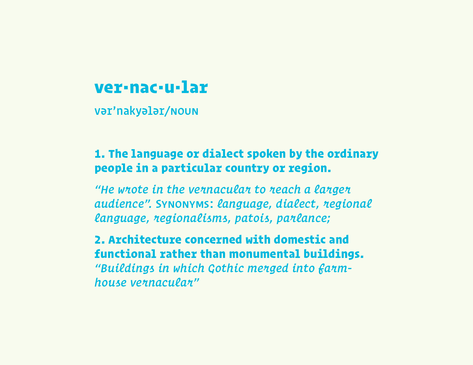
For the past couple years I have been incredibly obsessed with local, vernacular lettering styles and the reasons why certain neighborhoods, cities or countries either have, or are tied with, a specific kind of type and/or lettering style. At this point we should probably define “vernacular” though and determine how this definition pertains to us as type designers and letterers. If you just Google “vernacular” these are the definitions you that show up: 1. The language or dialect spoken by the ordinary people in a particular country or region. “He wrote in the vernacular to reach a larger audience”. Synonyms: language, dialect, regional language, regionalisms, patois, parlance; 2. Architecture concerned with domestic and functional rather than monumental buildings. “Buildings in which Gothic merged into farm- house vernacular”.  In saying that, what makes humanistic sans serifs, like Hoefler & Co.’s Ideal, feel so “English”? High contrasted, delicate serif faces so “French”? Or oddly enough, Helvetica (which is Swiss in origin) seemingly so “New York” today? 

Background & Context

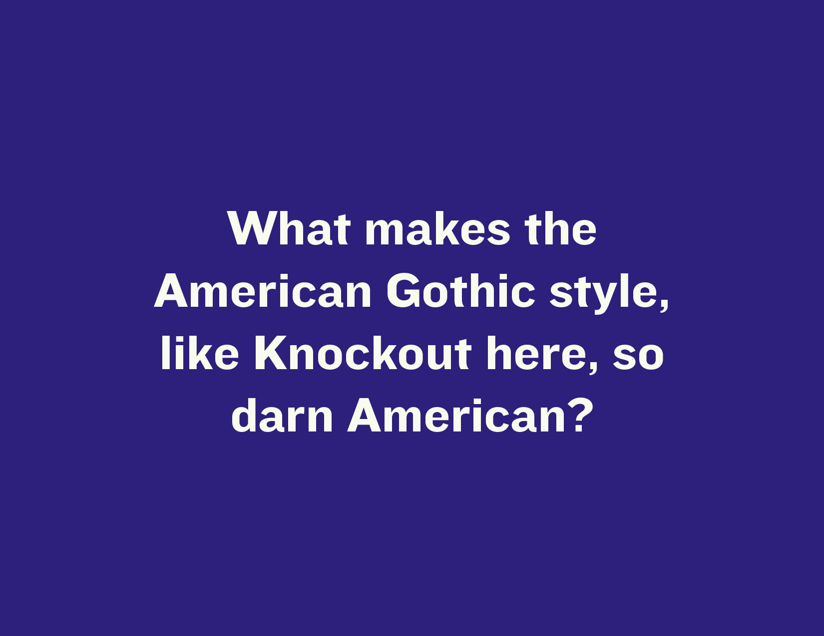
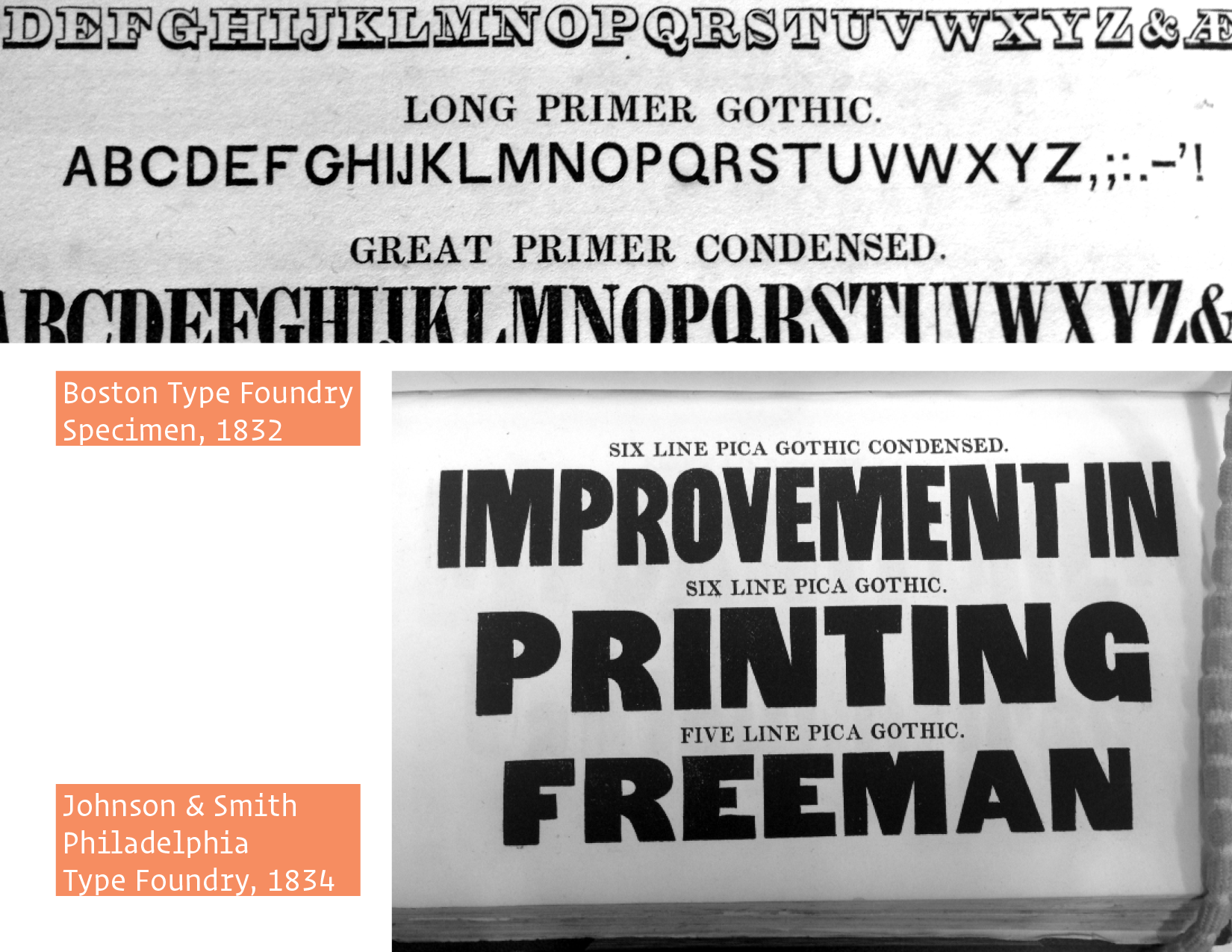
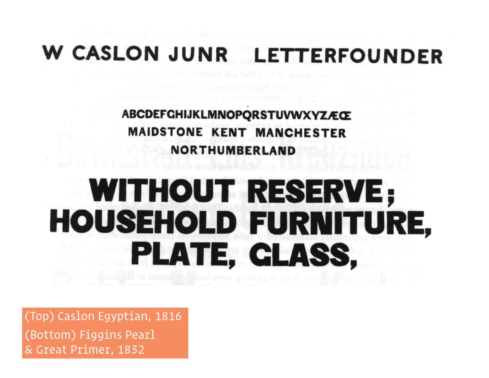
These questions convinced me to explore a related research topic during my time at the Reading University Master of Typeface Design Program  a couple of years ago – I cannot believe its been that long! However, my question was not so broad. I focused my inquiry to just American types, since I am American and I thought it would be easier to access the books, specimens, and resources needed for this investigation. My main question was what makes the American Gothic style, [Franklin, Knockout, Trade] so American?  My secondary question was whether they differed locally, from city to city – Were Boston’s types similar to Philly’s from the same time period? – But before I could really answer this question, I found myself digging through older specimens from some of the first US foundries scattered around the Northeast, looking for any sans serif types at all that might steer me towards earlier examples of American gothic types. Columbia University’s Butler Library and the New York Public Library were absolutely instrumental to my research here. I found some extremely early types , but not older than any sans serifs that were being used in Europe at the time.  This was honestly a bit disappointing. I wanted to find an American type that was distinctly unique and not just appropriated from abroad but, somehow now, it makes sense this way, ha! However, American foundries and designers, like ATF and Benton, definitely imbued some of their own style and make huge contributions to the development of the sans serif in the decades and centuries to come, so its all good! 

My talk is not necessarily about American sans serifs, I have written about that enough; this topic is related though. Local character, or the interesting or unusual qualities of individuality that belong to a particular region or area, can be found in so many genres of art and design throughout the world and in my opinion, a very under-researched topic. This is one reason why the prospect of locality in American Gothics was so interesting to me. Even though I have submitted this paper and it's “done”, as you all are probably familiar, there is always something else to add or contribute to any piece of writing or design. So, this study acts as sort of an extension to my original research.

A Unique Voice

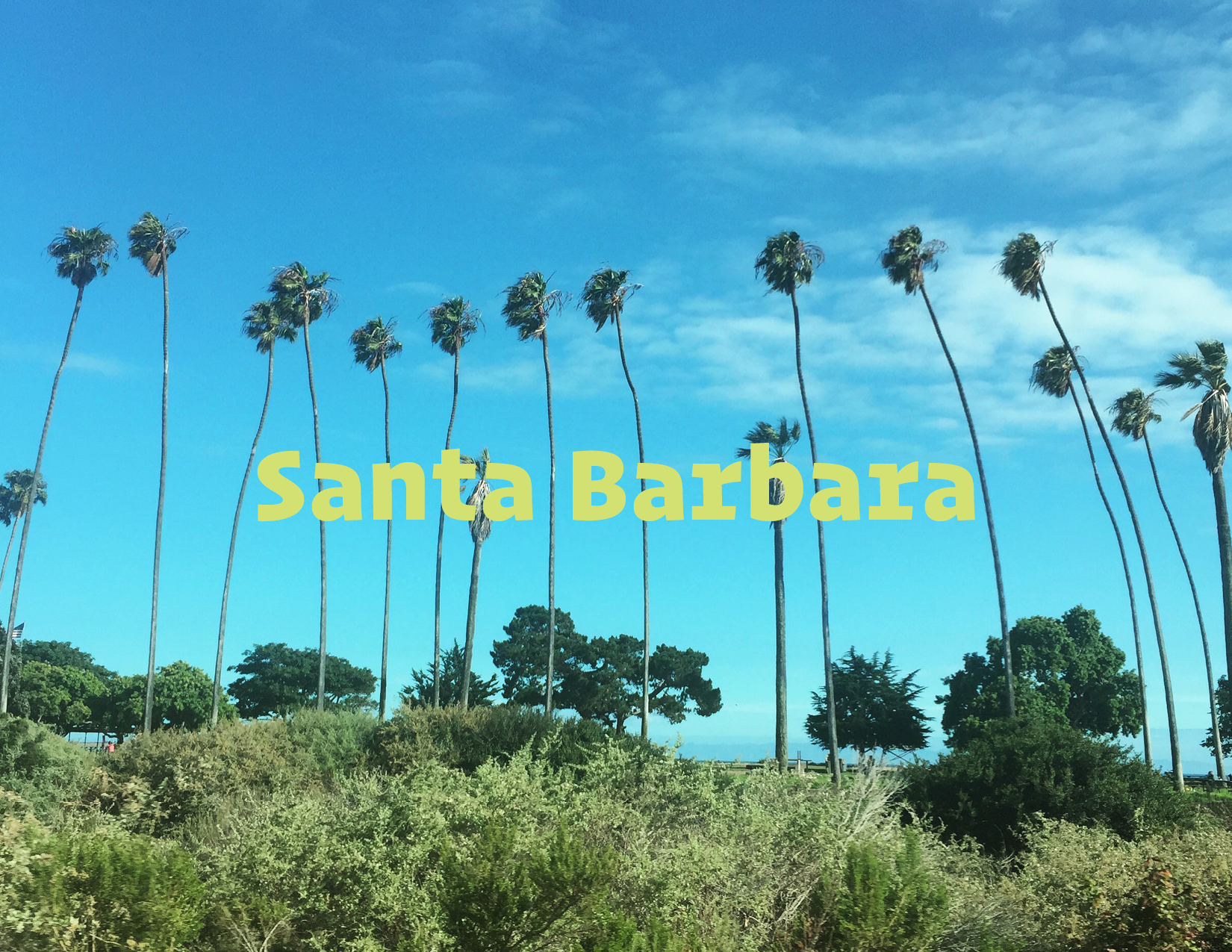
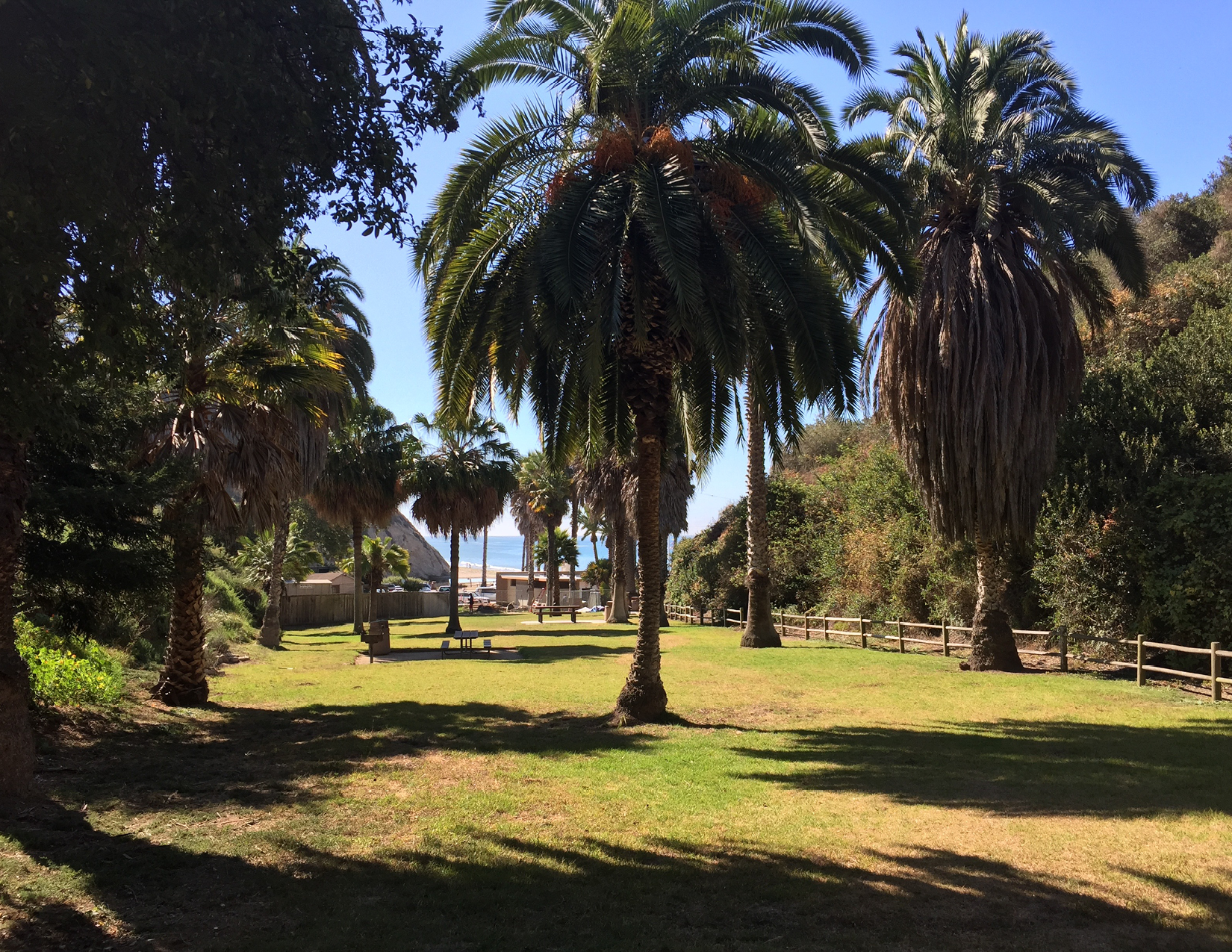
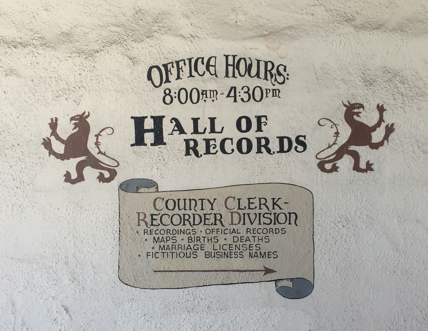
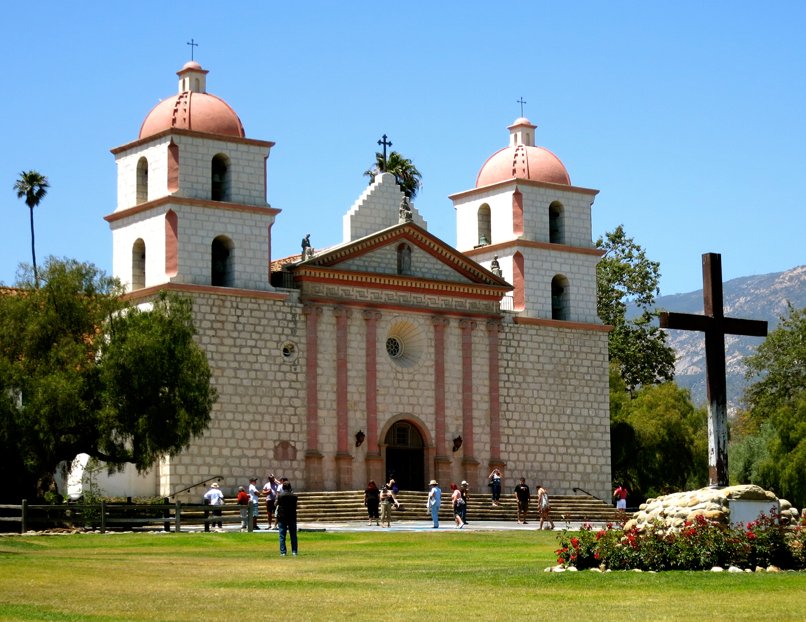
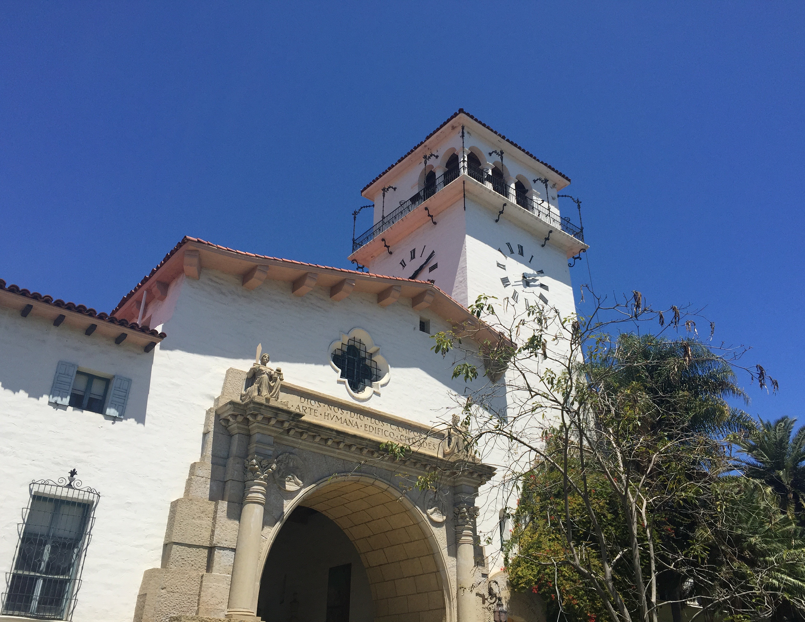
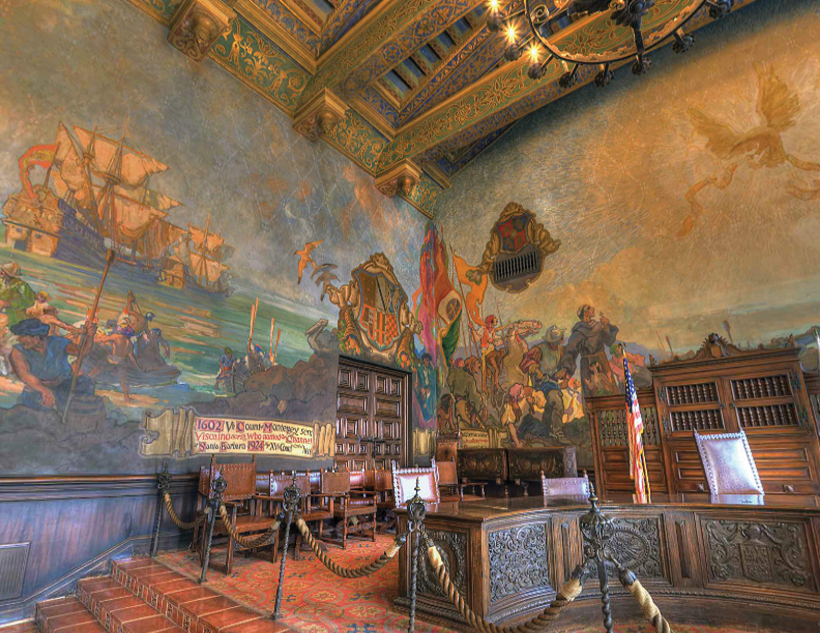
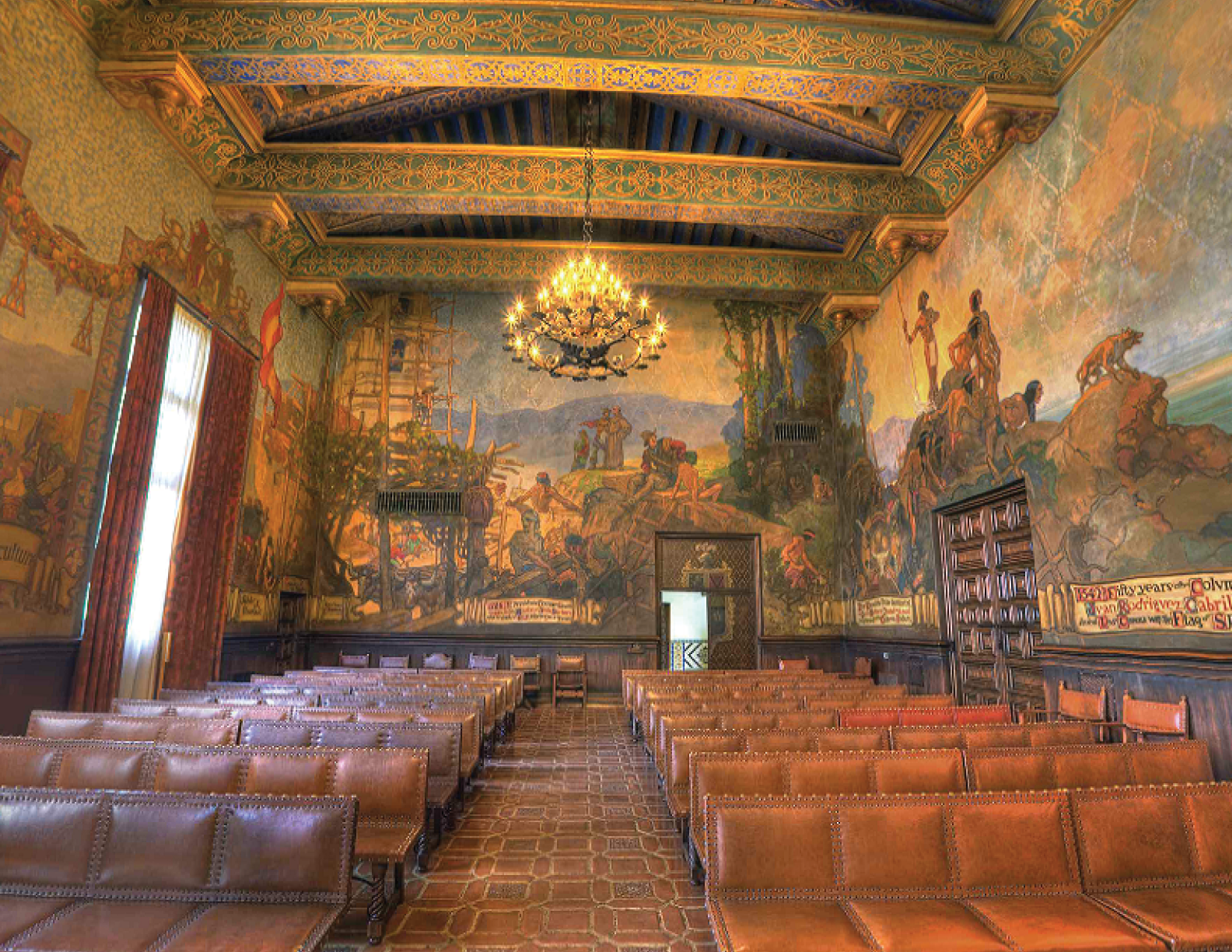
All that to say, one of the greatest examples of a truly interesting style adopted by a specific region comes from a very beautiful little town north of Los Angeles in California – Santa Barbara.  I have a good friend in NYC from there who was getting married this past summer, so I took a week off and flew out overly-excited by the prospect of relaxing in the mid-80s weather on a sunny beach. Wouldn’t that been nice... Of course, it didn’t happen exactly like that. We were all quite busy preparing for the wedding, but I did have a couple days to myself afterwards to hang out around the city and explore. Being a type designer and fan of all things typographic, walking around a new city on a sunny afternoon and looking for some cool lettering was incredibly exciting. Santa Barbara is stunning.  If you’ve never been, I strongly suggest visiting. Especially if you are interested in lettering, Architecture, beautiful weather, beer, (you know, that kinda junk), go. It’s a wonderful lil’ town. Kate told me to check out the Courthouse and Mission while I was there because they have in her words, “some really cool letters!”. Once I got there, I was stunned. The façade of the building is beautiful , and Kate was not lying. They were indeed very cool.  Not only were these letterforms beautifully painted by an obvious professional, but in a style so different form what I’m used to seeing on government buildings that when I realized what I was looking at it set me back a bit! “A state agency really put the effort into making something look historically correct and beautiful?! Nahhhh...” It’s unheard of right? I instantly fell in love with the signs and letter forms . I took pictures of everything I could I planned a mass-Instagram spam to show this stuff off and hopefully get some replies on either A) a brief description of the history behind the style or at least B) Who painted it. At about this time, H&Co begun our Instagram account (finally, right?!) and Jonathan and our community manager were looking for submissions to post. I took this as a queue, and uploaded these photos with some of the questions that I had. I never thought I’d get an actual experienced, educated response from a local, much less, a freelance job out of taking photos of cool stuff in California, but it happened! A most chill native of Santa Barbara named Dirk Brandts emailed me giving me all kinds of information on these letterforms, their history, and some leads on who paints the signs today. 

A Quick History of The Lettering

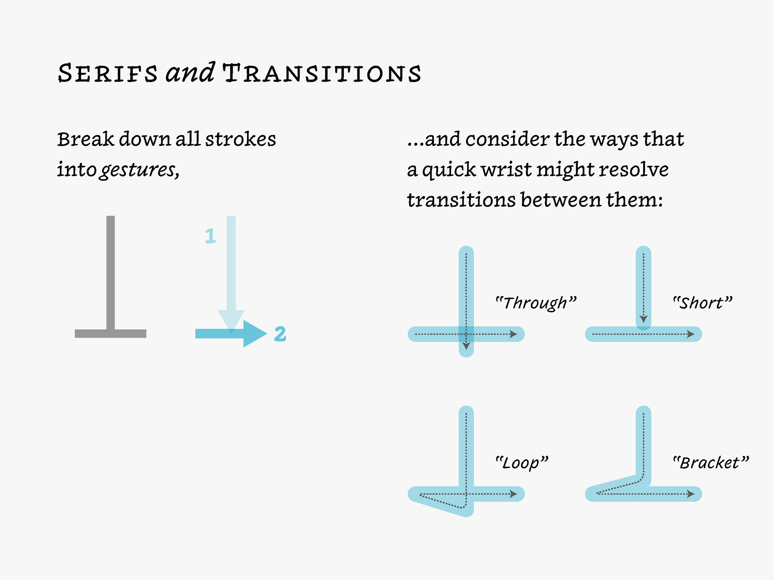
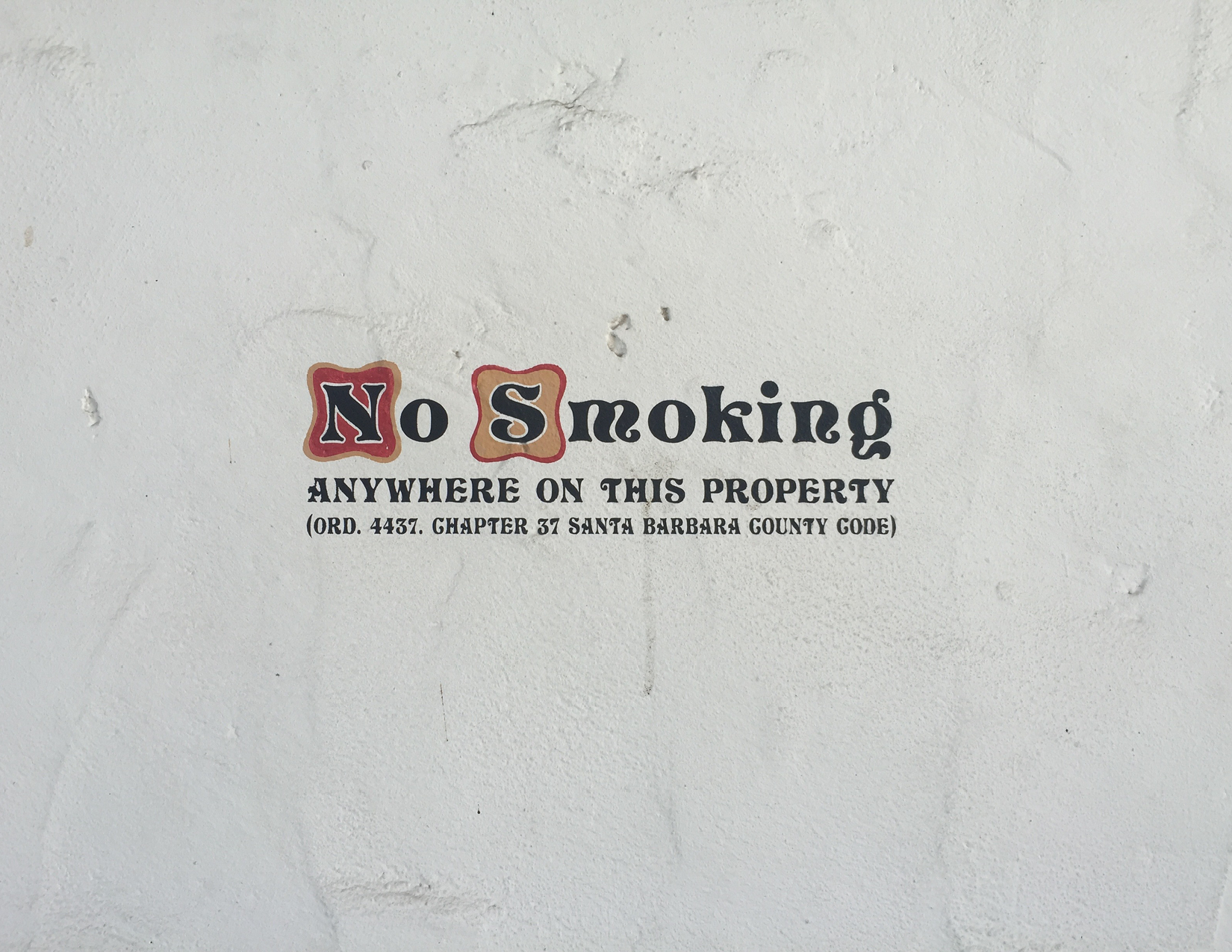
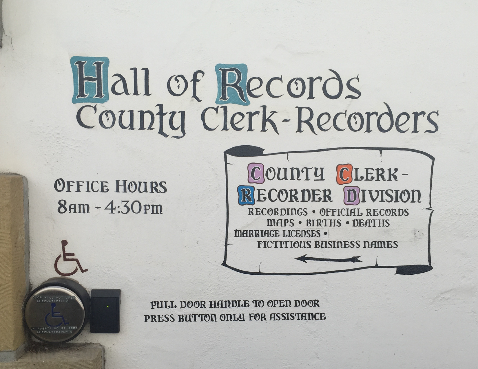
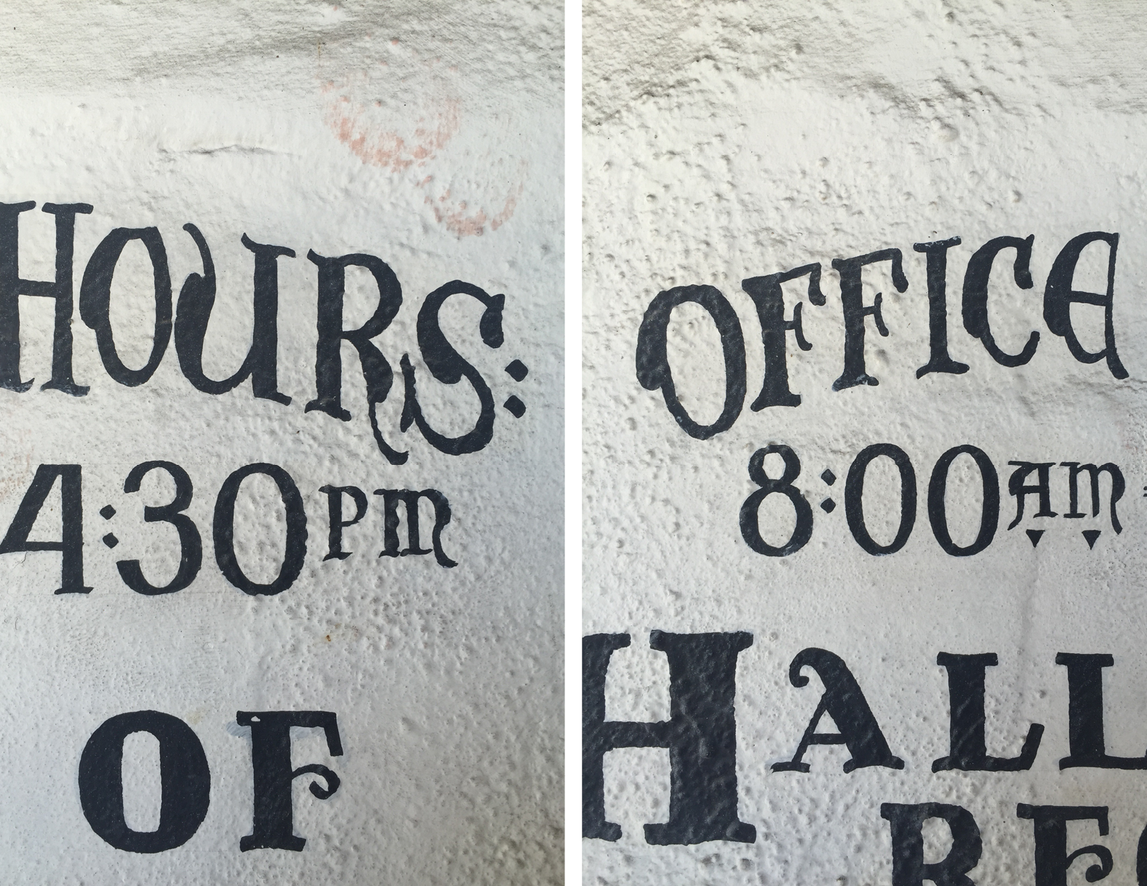
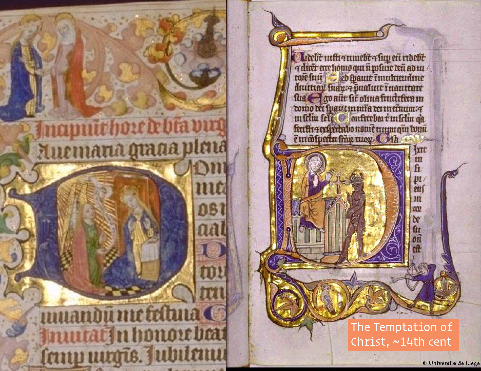
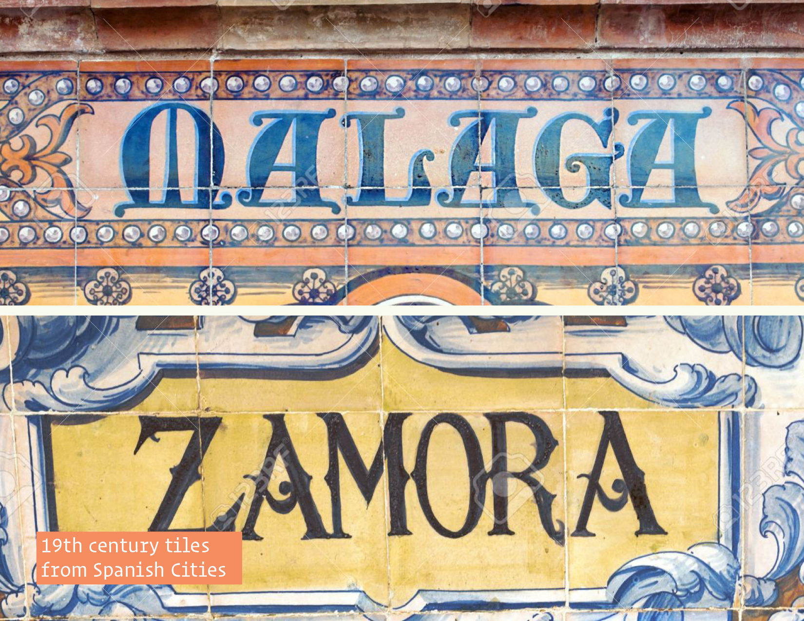
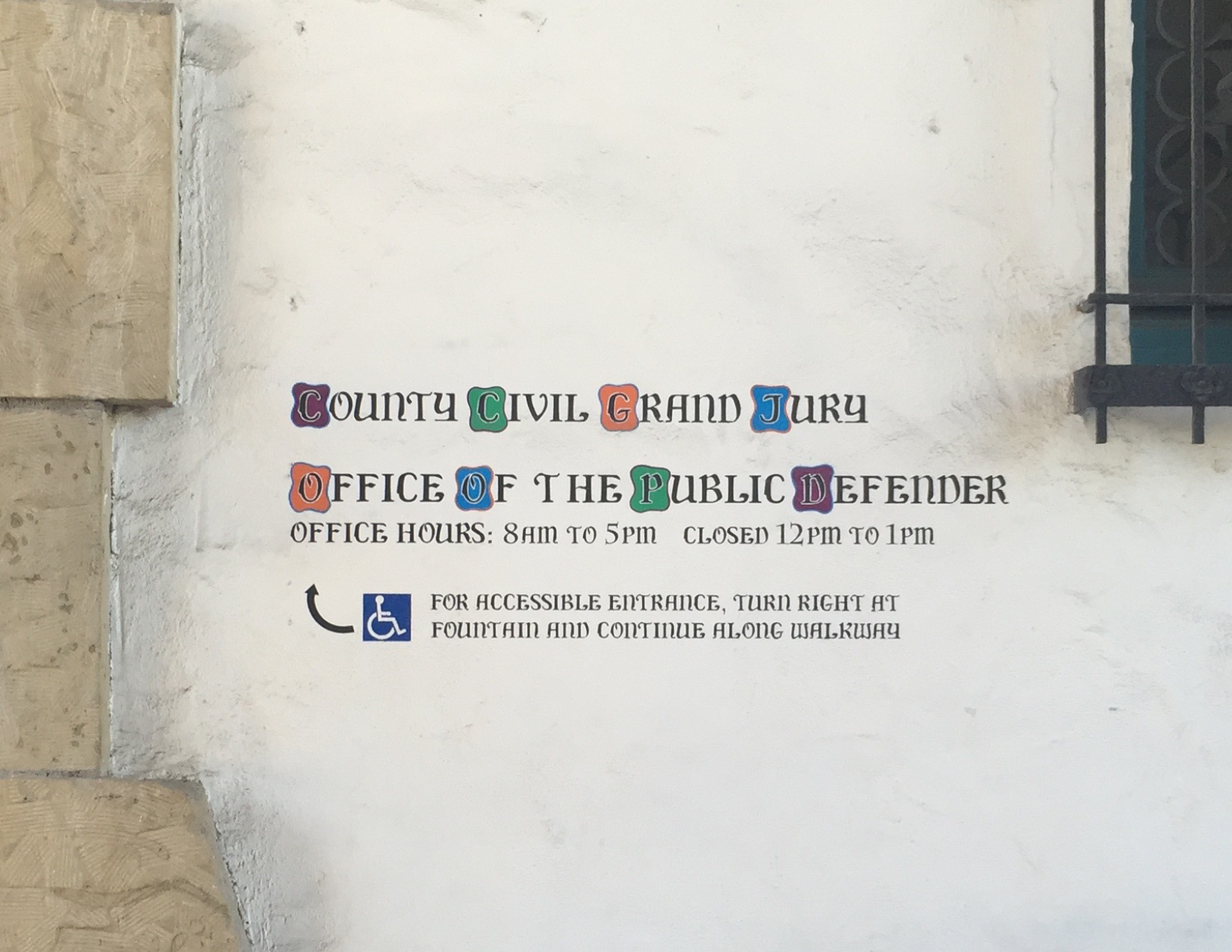
The history of this lettering goes way back to the middle ages in Lombardia, northern Italy and later adopted in Portugal, Spain, &c.. These letterforms are versals in the “Lombardic” style. In part, they are derived from Roman Rustic capitals and half-uncial forms, and they often stood in for blackletter majuscules, or capitals. Their primary function was/is to begin a line of text, a verse – hints the name – which was generally set in blackletter text. Therefore, the Lombardic style is generally not set as running text. You could see this manifested all throughout the buildings in Santa Barbara. {back to 14} Also, since these Lombardic versals were initials, they were generally not written, in the common sense of the word, but drawn: shapes built up by multiple strokes from a brush, not written with a quill. You can see this feature all throughout the bulbous, funky forms. 

The Spanish Colonial Style

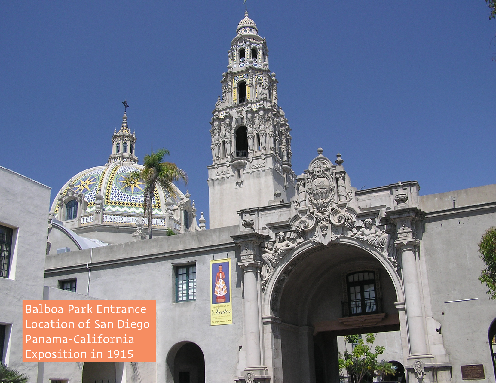
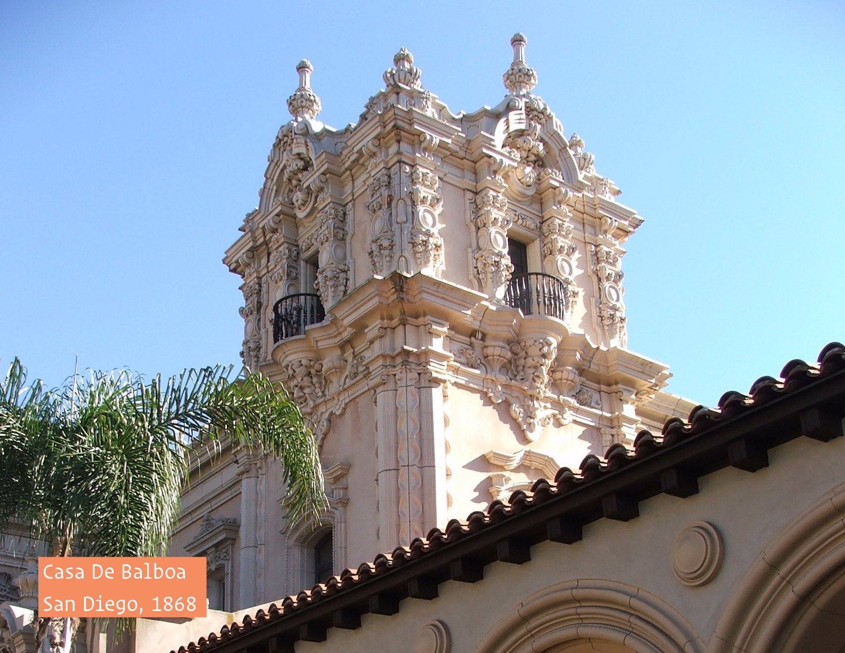
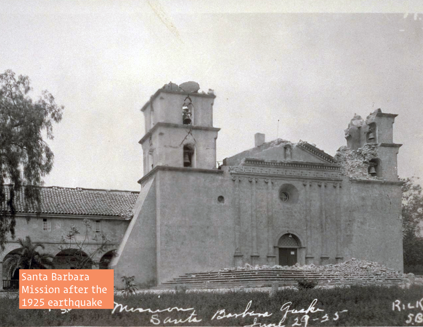
“The major location of design and construction in the Spanish Colonial Revival style was California, especially in the coastal cities.  In 1915 the San Diego Panama-California Exposition, with architects Bertram Goodhue and Carleton Winslow Sr., popularized the style in the state and nation. It is best exemplified in the California Quadrangle, built as the grand entrance to that Exposition which is now in Balboa Park, a national landmark.  It was here that people were introduced to the style of architecture and most likely, the Lombardic-inspired letterforms.  The city of Santa Barbara adopted the style to give it a unified Spanish character after widespread destruction in the 1925 Santa Barbara earthquake.  It’s County Courthouse is a prime example of the style.”  Many of the architects and designers who were involved in Santa Barbara’s rebuild were not only inspired by the design from the exposition, but were also active in Hollywood, as set designers, painters, craftsman, &c.

The Inspiration

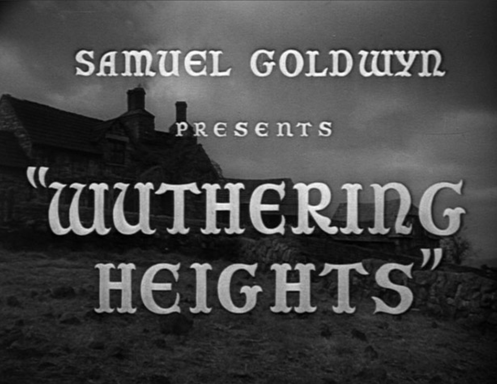
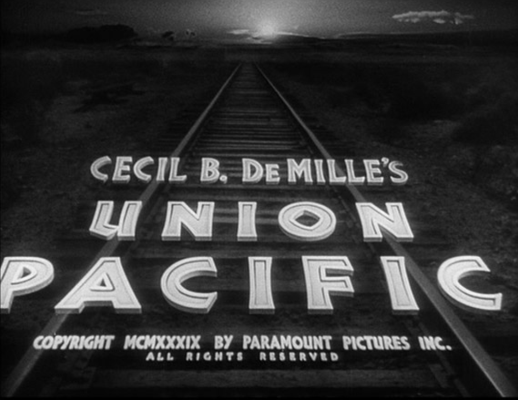
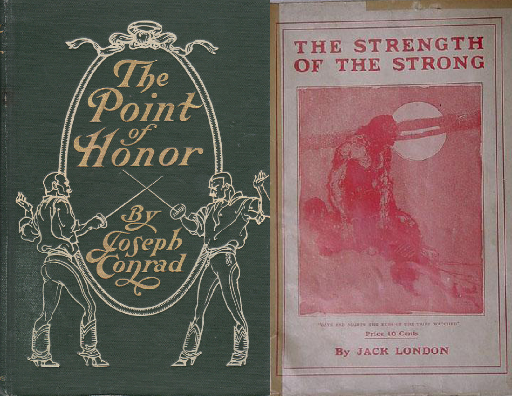
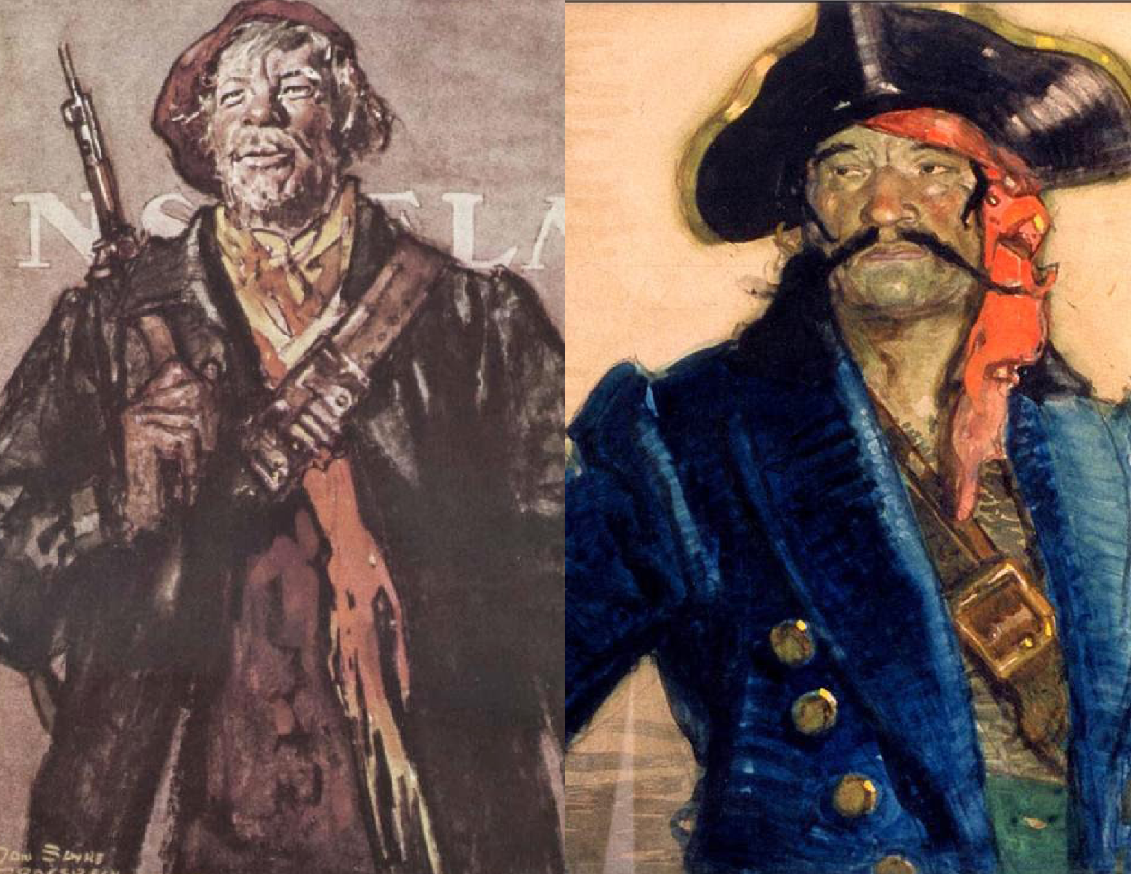
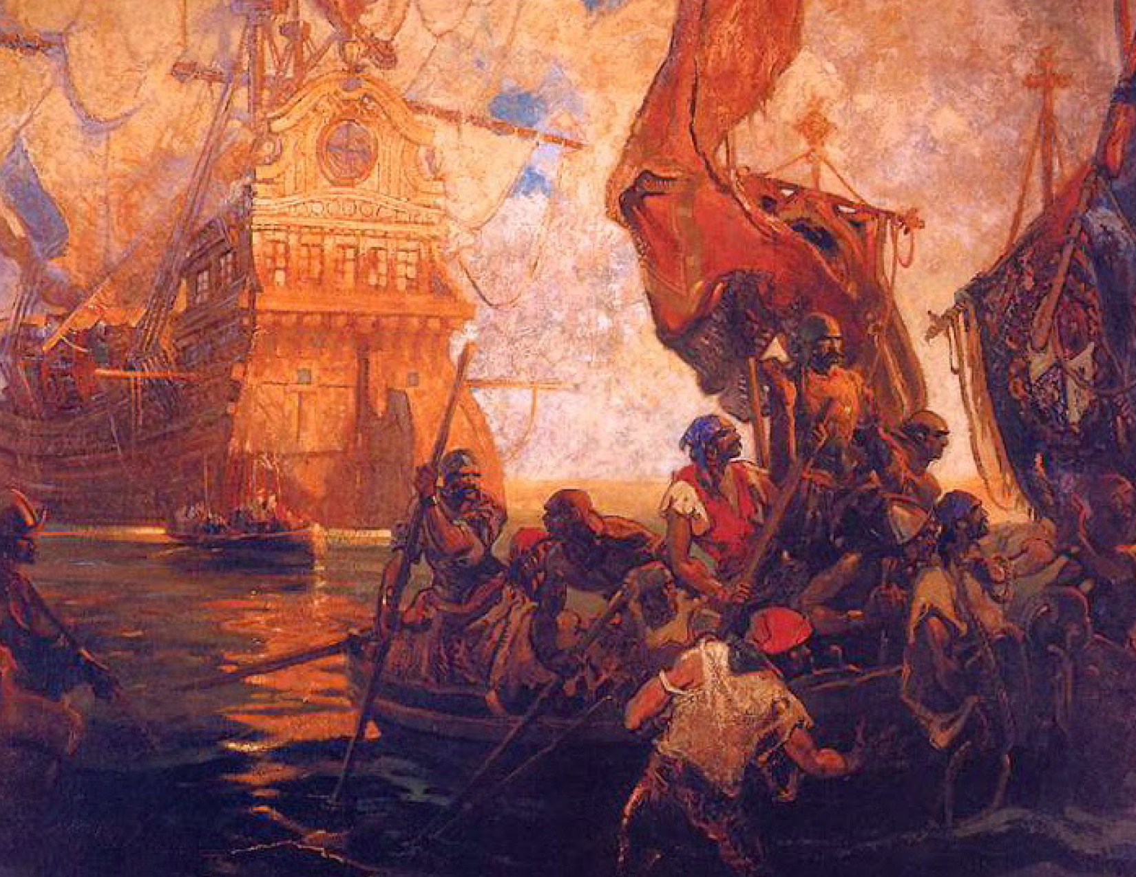
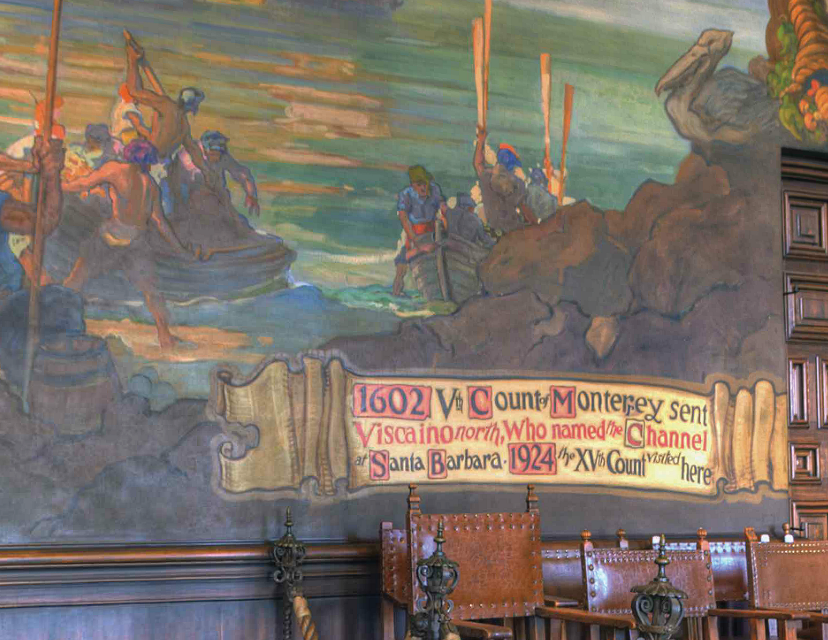
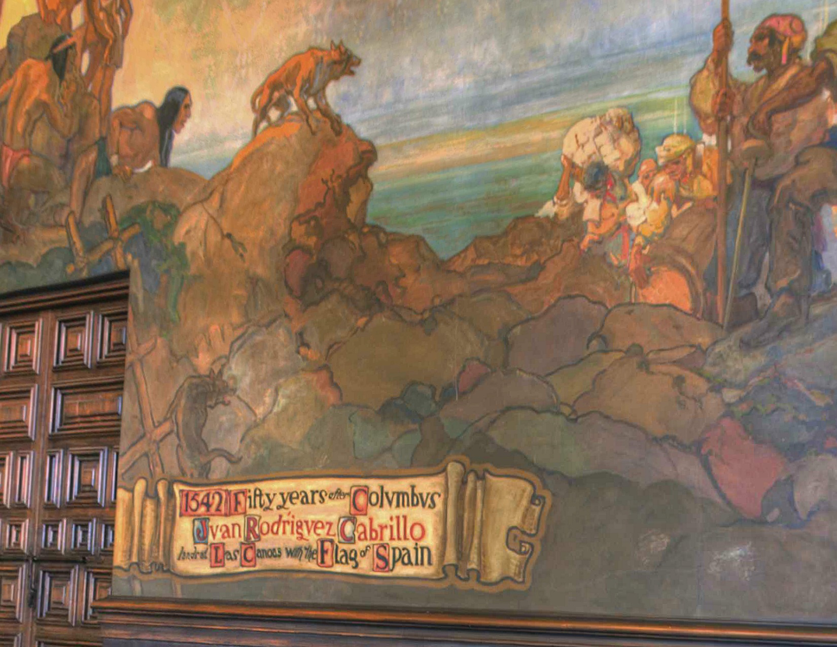
One of these Californian artisans was an enigma named Daniel Sayre Groesbeck (1879-1950) who actually worked on that last film. His life is actually not very well recorded and so we don't have a ton of specifics, but in 1905 he moved from California to Chicago to pursue illustration. Supposedly he even worked on book designs for Joseph Conrad & Jack London.  He was then deployed to Russian in 1919 to help end the Civil War there. He served as a gunner and also took part in a number of theatrical productions put on by the troops, fittingly designing scenery and costumes. So, it makes sense that later that year, Groesbeck returned from service and begun, among other artistic endeavors, working for the film maker Cecil B. DeMille as a studio artist {Dominique from the Buccaneer}. It seems, by the look of the detailed sketches and drawings while working on some epic films, he had a special talent for ‘visualizing’ a dramatic scene and capturing his ideas. He even included a bit of lettering on some of his paintings and sketches as well! By 1926 DeMille & Groesbeck had a good working partnership and were casting some bigger stars as well. This artistic collaboration is reflected in the great romantic, Biblical, and historical films made by DeMille over the next 20 years – King of Kings, The Buccaneer, Union Pacific, Reap the Wild Wind, Unconquered, Samson and Delilah. During this prolific period in the ‘20s, he settled in Santa Barbara. Because of this experience and his unique artistic skill-set, he was soon getting work in the area. The local County National Bank hired him to paint a large mural of explorer Juan Rodríguez Cabrillo’s 1542 California expedition for its new building on State Street, and he was paid quite well to execute the 9-by-12-foot work. “The Landing of Cabrillo” brought Groesbeck national recognition as a muralist. This mural now hangs outside the Mural Room at the Santa Barbara County Courthouse and undoubtedly helped Groesbeck secure the courtroom commission, which is, coincidentally, our main focus today: This giant mural , covering each of the four walls in the very large courtroom and measuring 6,400 sq/ft, is considered by most Grosebeck’s masterpiece. It depicts important historical scenes from the communities past, and is really something to behold in person.  The reason why this is such an important piece, to not only Groesbeck, but to Santa Barbara in general, is because it contains some very early examples of the Spanish Colonial-influenced blackletter and Lombardic lettering that we now see beautifully painted on the side of these government buildings.  

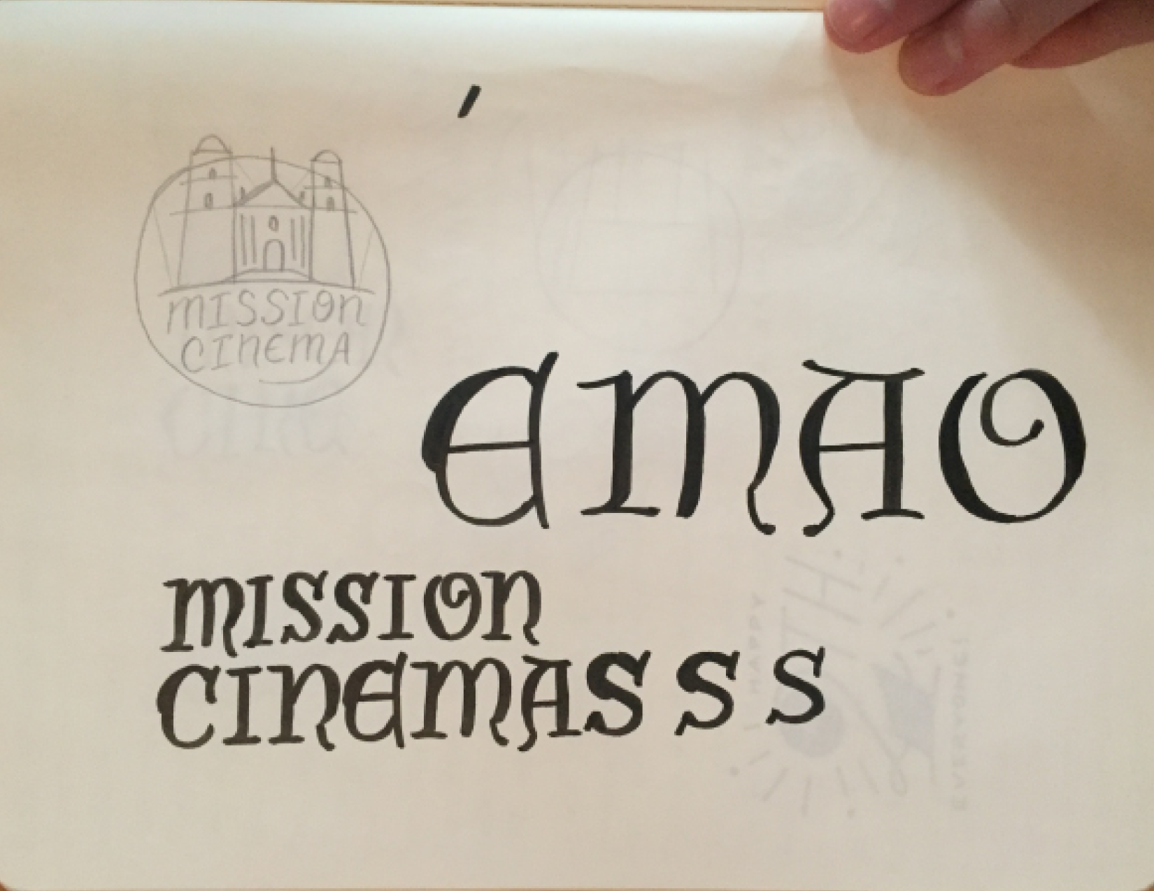
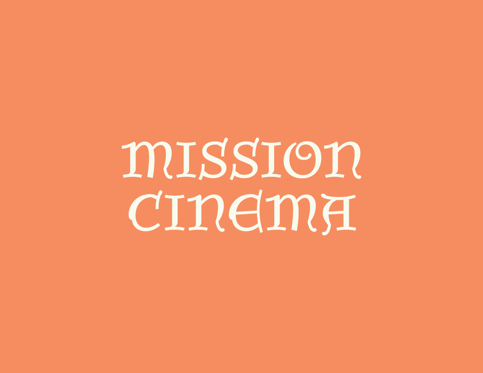
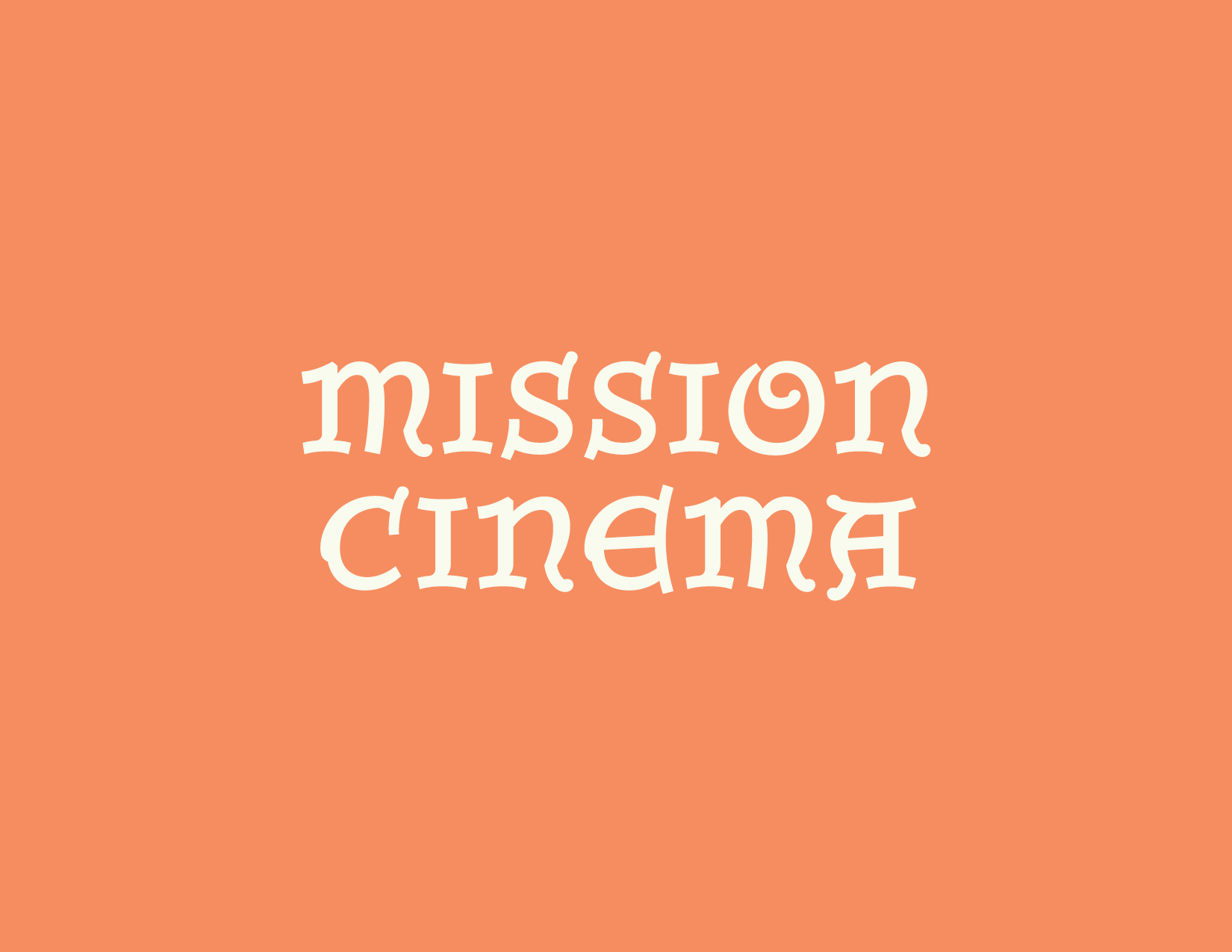
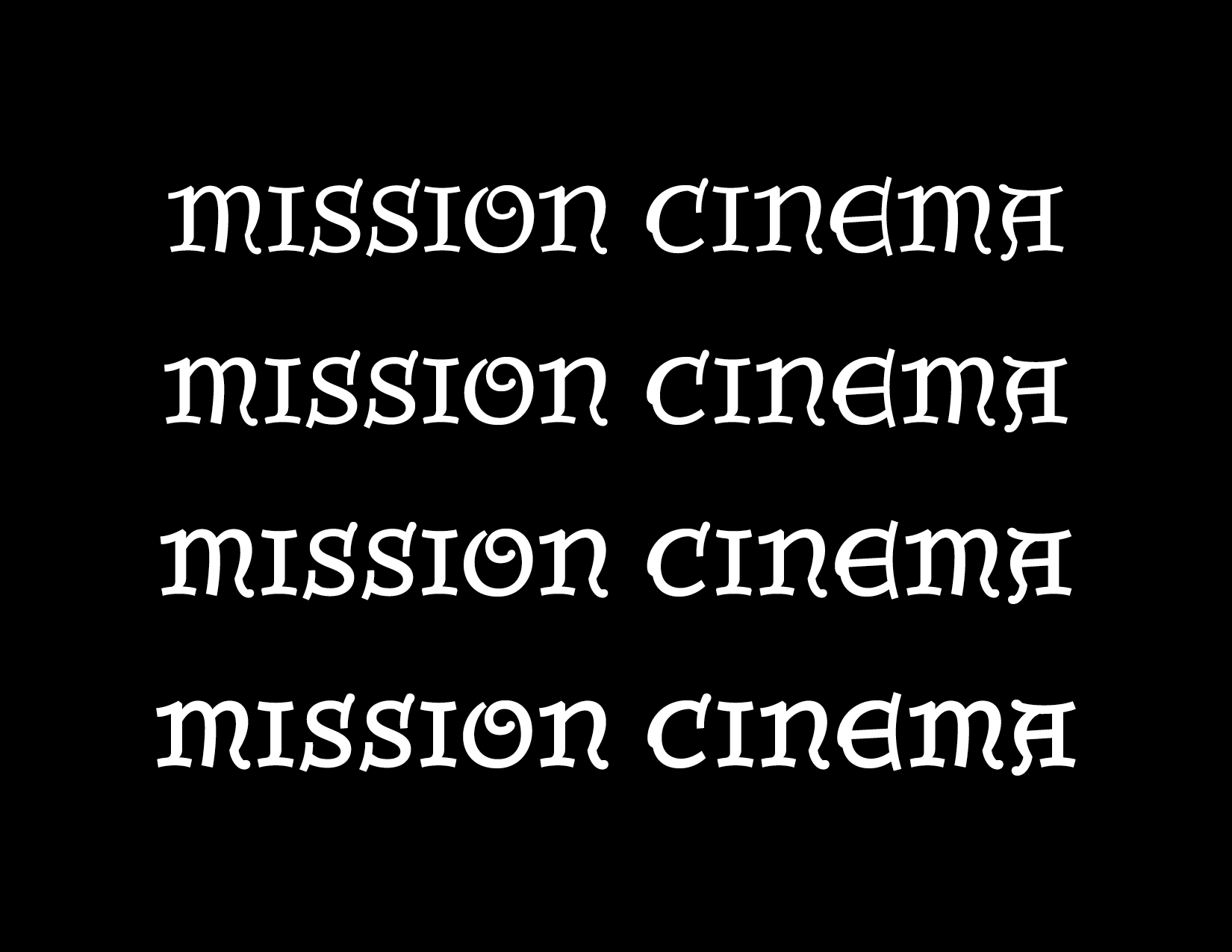
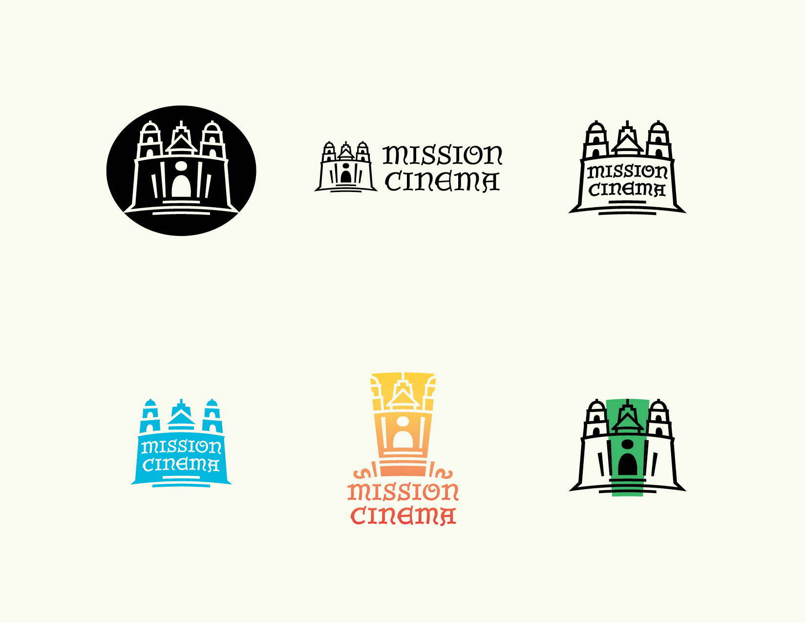
So, why am I going on and on about some crazy Californian artist and his murals? Well, After reading the articles sent to me on Spanish Colonial influence on Architecture in Cali, Grosebeck, Santa Barbara, the Courthouse Mural Room, and the beautiful painted lettering found within, I was enthused and just had to talk to this guy that helped me out. Dirk was pretty surprised some kid from Texas was so interested in this subject, but I guess he doesn’t generally talk to obsessive type designers. Thankfully though, he had a common interest in this subject as well – After decades of producing films in the US & Europe, he decided to start his own film and production company in his home town of Santa Barbara. Oddly like Groesbeck... He was looking for an identity designer to create the branding for this new company, Mission Cinema. Ideas were already spinning.  I was all in to say the least.

Practical Aspect

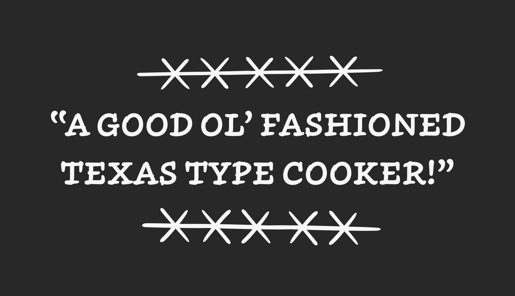
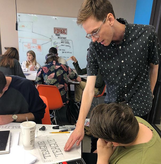
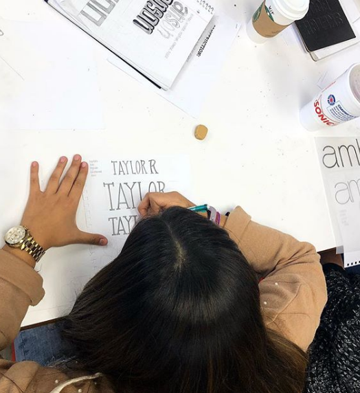
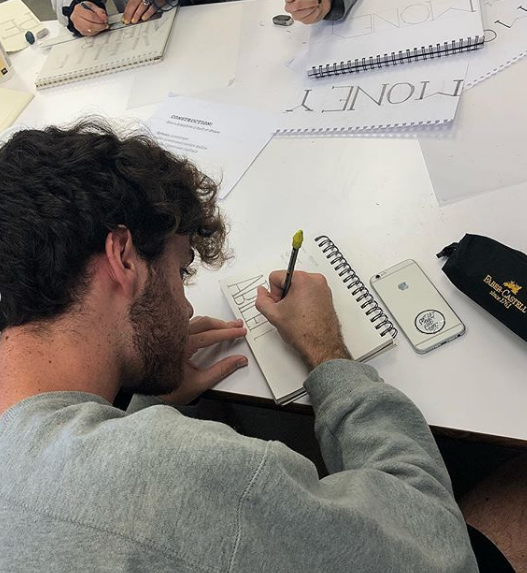
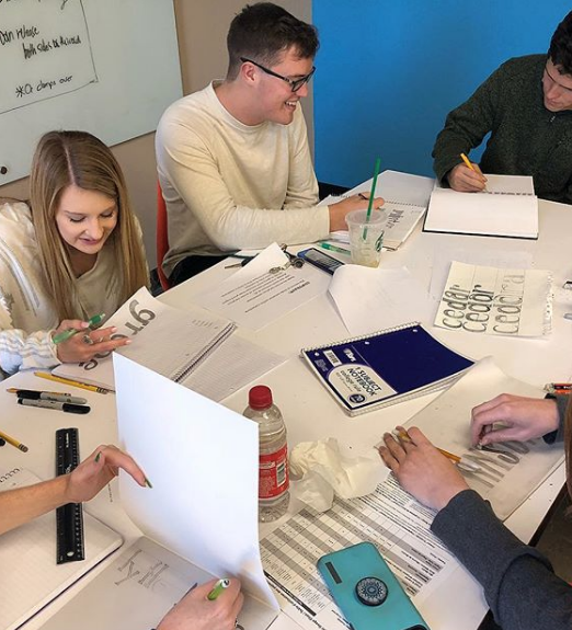
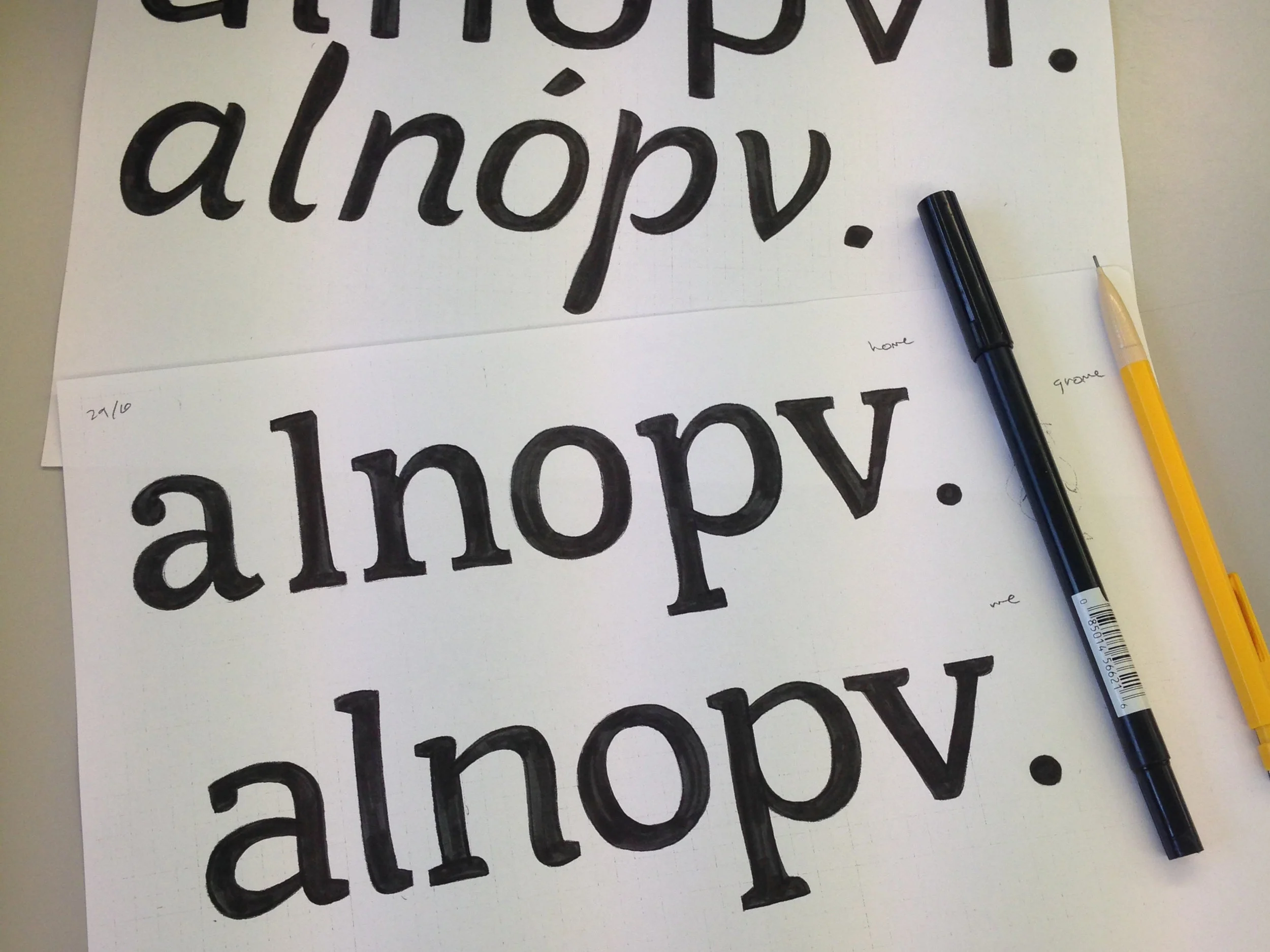
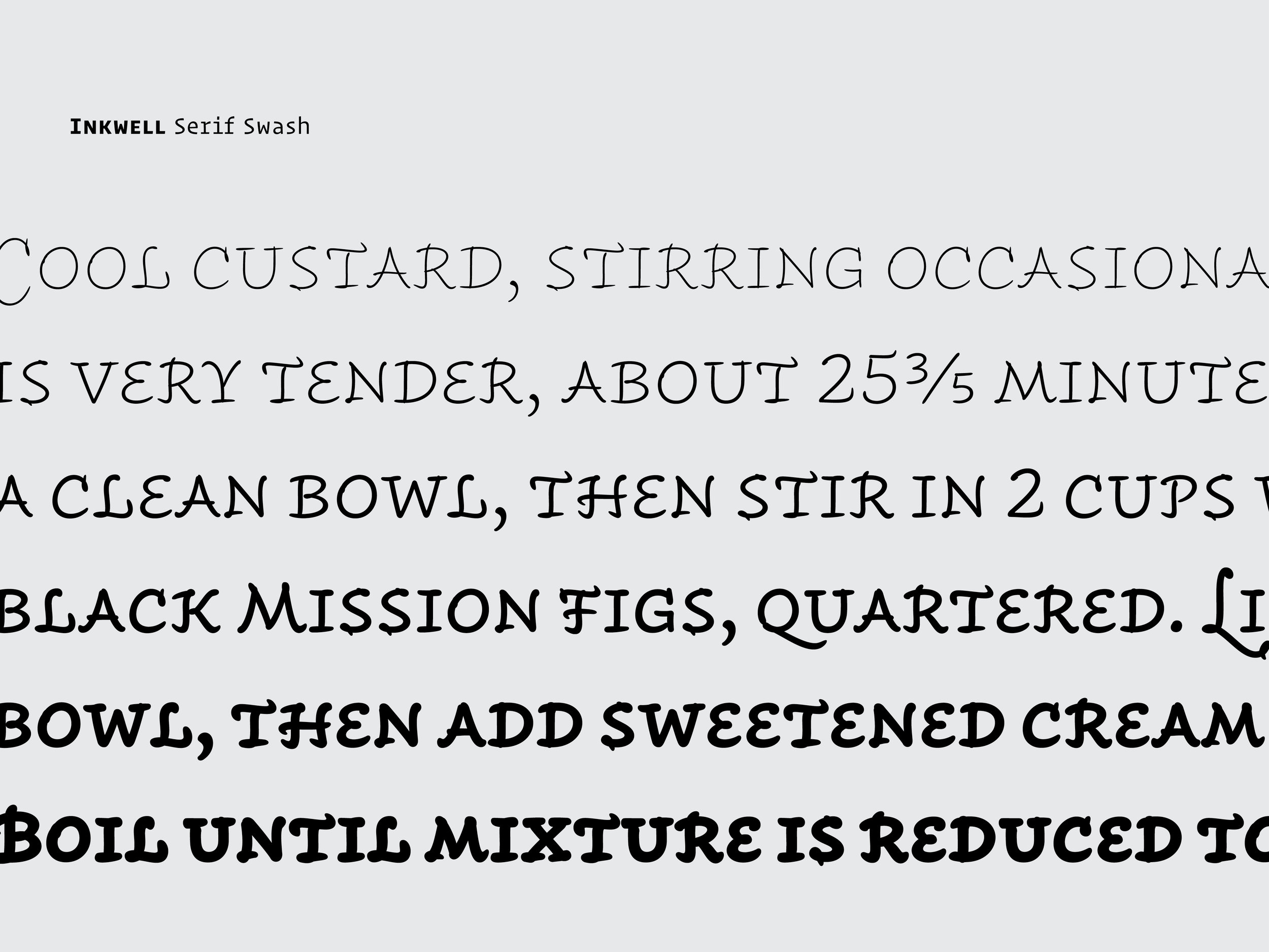
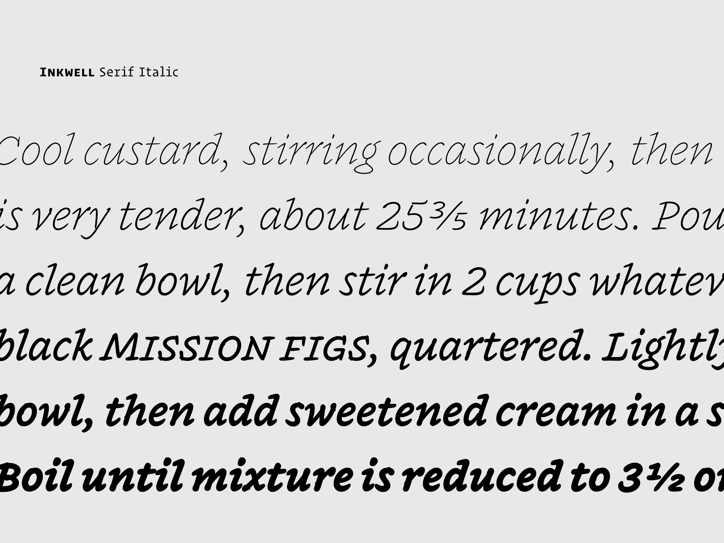
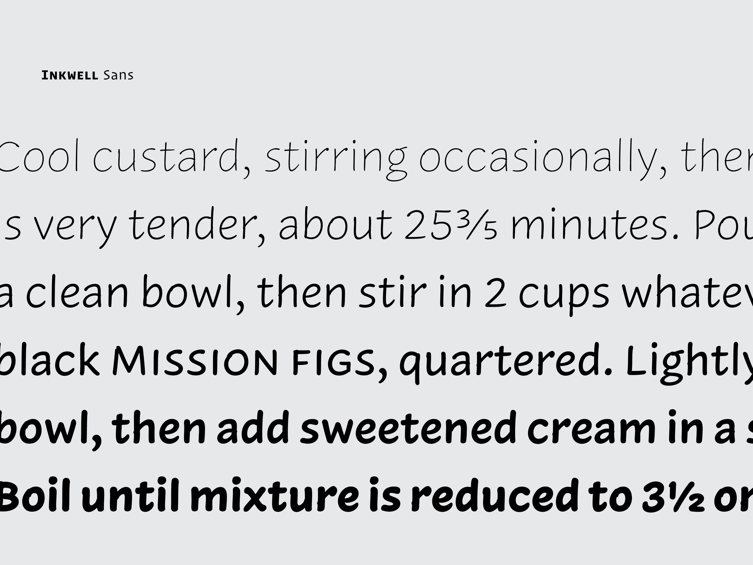
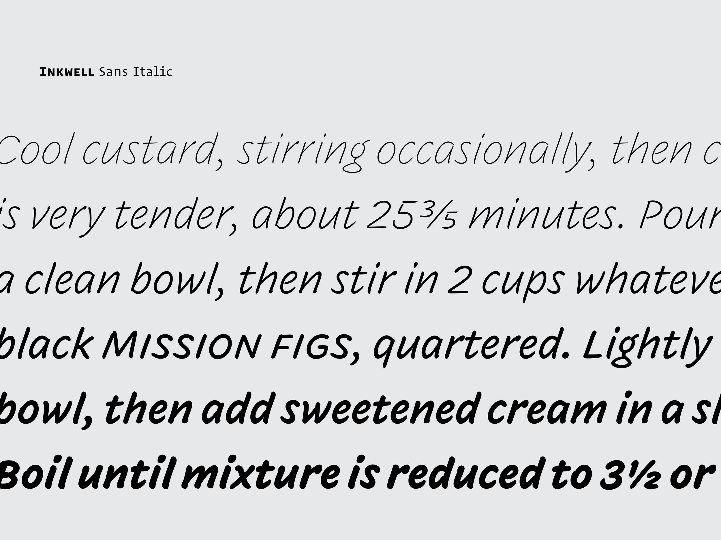
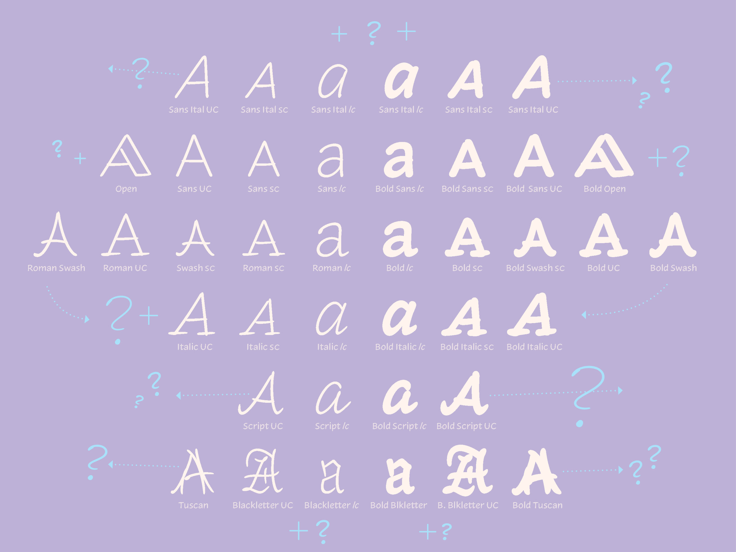
This story also directly relates on a very practical level with the workshop I led in Philadelphia: Taking a bit of historical, found lettering and expanding upon its design – whether that means new styles, weights, widths, or character sets, it doesn’t matter. What matters is the context of the project. Once the context is established and understood, any of these style extensions may be appropriate for the specified project. For Dirk and Mission Cinema , it meant creating an identity for a local film company that will be seen in huge ranges of sizes and mediums – from a few feet tall on the silver screen to a couple millimeters high on a business card, the identity had to be flexible, practical, and most importantly, driven by the local aesthetic and history. So, I drew two related styles based off the same Lombardic skeleton , and interpolated, or mathematically blended, to make grades, or intermediate steps,  so that the client can use the lettering at many different sizes and the design wont look disparate, lightweight, or out of place when paired with the various different icons on many different mediums.  Creating a flexible identity is a very contemporary issue that is being addressed in many different design projects and businesses today, along with some of our past projects at H&Co. I was very happy to be able to combine a historical subject (the Mission) with a local lettering style, to create a range of adaptable designs for an amazing client.  It really is all about the client though, isn’t it? I was lucky enough to be able to work with a supremely cool dude that truly cared about the context and history of his design. This is very important and I think we can all use a bit more thought and care when we attempt to appropriate something historical for a modern cause. There are beautiful things all around us. Let’s find beautiful ways to use them today.  

– From "Vernacular Lettering and Santa Barbara’s Unique Voice"
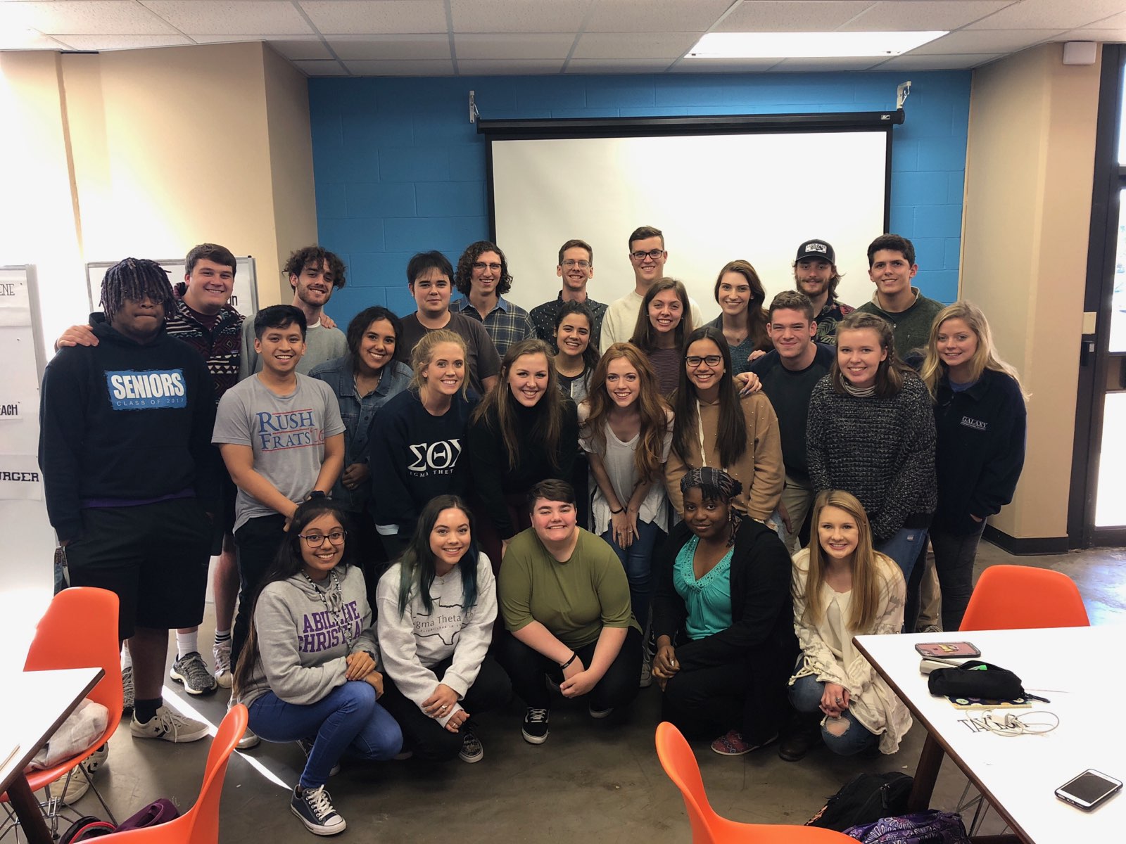
   Philadelphia, March 2016

Typographics

New York in the spring is seriously awesome. Warm weather hits, everyone is outside on the balconies and in the parks, kicking back, eating well, and enjoying the city. Maybe all the terrible winter weather is really worth it?! 

Another great thing about this time of year is all the wonderful conferences going on around the world in our little typographic realm. Kerning just finished and ISType starts tomorrow, but the most infant of them, Typographics held in NYC, initiated its 1st gathering today. The likes of Roger Black, Louise Fili, Steven Heller, Seymour Chwast, Paula Scher, Erik van Blockland, Alexander Tochilovsky, Sumner Stone, and of course, the brilliant Jonathan Hoefler kicked it off with talks spanning "the good old days" of typography before the Mac, to live interpolation & animation on the web. It's been spectacular day for us typophiles. 

In Jonathan's truly inspiring talk, he shared a few pretty sweet images – Along with the amazing photo of himself when he was 18 (which I unfortunately was not able to screen grab quick enough ;] ), and the images & sounds from his father's "Industrial Musicals", he also had a slide of our team photos that were recently taken. Something about seeing our photos up there was just really freakin' awesome. So proud to be apart of this fantastic team! 

If you can, tune into the live stream tomorrow for more amazing talks from some of the world's best. 

Image taken from from @AJWShaughnessy – Thanks!

Image taken from from @AJWShaughnessy – Thanks!

Type Design vs Hand Lettering


My former classmate, and good friend, Megan Teel recently asked me whether she should pursue a intensive study on hand lettering or type design. I started answering the question but soon realized it’s a more complex issue. I wanted to share my thoughts on the subject below.


First of all, I believe both of these subjects are noble and difficult forms of design. I also would like to think I have experience in both since I did much hand lettering in college and am now studying type design at Reading University. But to answer which one a designer should choose to pursue is difficult for many reasons.

My answer depends largely on what you qualify as “hand-lettering”. It is such an ambiguous word. Hand lettering can mean drawing grungy lettering with a pencil or ballpoint pen (like what I did in college lol) or creating custom made, high quality, digitally drawn logos. The former of these two styles is a fad. I think many designers will say the same. People really dig the hand-made, quick, rustic aesthetic currently, but companies and clients are always going to want what is vogue at the moment. You can see this in the clients that I have worked for in the past. Many just want what is cool and trendy, pay me quick, then they are on their way to the next job. It’s business, we have to embrace that. But that’s why we must not only single ourselves out as a one-trick pony. We should strive to create great timeless design that can be attractive to many different clients because of our critical eye for detail and typography.

However, my guess is custom lettering will never go away. Many designers (me included) and firms do custom lettering. It has been a profession for hundreds of years. Since way before the first digital font, before Gutenberg created moveable types for his press, and even before the scribes “hand lettered” one bible for years, people have been creating lettering.

All of this leads to the next option – Creating type design. Custom type in many ways is hand lettering that can function as “type” for a specific reason or client. Creating “functional” typefaces is an even more difficult task though than just creating a few letters or words for a brand. I think putting restraints on yourself to develop something that actually has to work as type for many different mediums and people instead of just creating lettering for an aesthetic choice is respectable, but not better. Both have their merits. Learning new programs on the computer can never really harm you either. Getting a feel for Glyphs, Robofont, or any other design software for that matter, will only broaden your perception on what lettering, type, and typography is.

Learning about the history of typography and creating type design will push the designer to create more beautiful letterforms through the ability to notice details in the design. This will help any designer to have a greater knowledge of letters and the reasons why they are made, thus helping the designer create beautiful designs and solutions for a whole slew of media. This knowledge and practice of typography could be manifested in hand lettered posters, logos, web type, packaging, custom typefaces for a company, ornamental monograms, or just the ability to distinguish good fonts from bad.

Also of course you have to think about your own perspective. Why do you want to design type or lettering? What are the ends to this incredibly complex means? Do you want to create calligraphy for wedding cards, or a branding for your favourite local eatery, or a workhorse text face for a scientific magazine? There are so many different fields and branches of lettering/type design that it is hard to answer the initial question: which direction to choose, hand lettering or type design. A knowledge about the design and history of letterforms and graphic design will undoubtedly lead the designer to better typographic solutions whichever path they choose.

This is the same question I was asking myself while I was in college. I ended up with the thought that leaning about the history of type and graphic design and practicing drawing everyday will help me create beautiful typography and design no matter what medium or client. And that’s why I am here at Reading University studying Type Design and Typography!

My advice is this. Get out a sketchbook and start drawing crazy letters with all sorts of weird pens and pencils. Maybe you’ll enjoy it. I know it’s my favorite thing to do.


Resources

I decided to start a list of reading material after a student asked me what books on type/typography I have been reading lately or which books were most influential to me as a type design student. Of course this is not a complete list, but it is a list full of articles, magazines, books and blogs that have inspired me. If you have any suggestions, please add them in a comment below. Hope you enjoy!


Books

Simon Garfield, Just My Type. Avery, 2010

Ellen Lupton, Thinking With Type. Princeton, 2010

Steven Heller & Louise Fili, Scripts: Elegant Lettering from Design's Golden Age. Thames & Hudson, 2012

Steven Heller & Talarico Lita, Typography Sketchbooks. Thames & Hudson, 2012

Steven Heller & Philip B Meggs (eds), Texts on Type: Critical Writings on Typography. Allworth Press, 2001

Rob Roy Kelly, American Wood Type: 1828–1900. Da Capo, 1977

Robert Bringhurst, The Elements of Typographic Style. Hartley & Marks, 3rd Edition, 2004

Walter Tracey, Letters of Credit. David R Godine, 1987

Gerard Unger, Theory of Type Design. nai010, 2018

Hyphen Press

Robin Kinross, Modern Typography. 2nd Edition. 2005

Gerritt Noordzij, The Stroke: Theory of Writing of the Pen. 2005

Fred Smeijers, Counterpunch: Making Type in the Sixteenth Century; Designing Typefaces Now. 1996
 

Magazines

Typography Papers (Distributed through Hyphen but the site is down currently)

Eye Magazine and also the Blog – Type Tuesdays is also great

Codex Magazine


Blogs

John Boardley’s I Love Typography. Definitely read the Type History Series, including The First Roman Fonts, and pay more attention to the designer interviews; start with Seb Lester’s.

Stephen Coles’ Typographica. Great collection of type reviews and articles. Read anything that sounds interesting to you. It's all good!

C.A.S.T Foundry’s Medium. High quality writing here from Riccardo Olocco and company. Definitely read his interview with Gerrard Unger

Peter Bil’ak and Johanna Bil’ak-Balusíková’s Typotheque

James Edmonson’s blog at Oh no Type Co. The “Process” and “Teaching” tabs have some real gems in there.

First Talk - Information Graphics Class at ACU

Recently I was asked by my former professor Ryan Feerer to give a talk to his information graphics class at my Alma Mater – ACU. I was hesitant at first to accept, but what was there to lose (besides making a fool of myself). I took Ryan up on it as long as he would take blame if the talk sucked. He asked me to speak on working and living in Santa Fe, current projects I'm designing, and what my plans are for the future. I decided to put up the slides from that talk below. Of course they don't make much sense without the talking included, but they are divided into the 3 main speaking points – What Up (working and living in Santa Fe), Current Projects, and Plans For The Future (Reading University MATD). Maybe you can follow the progression and talk without the words ;)

I thoroughly enjoyed speaking to the class and was surprised at how many great questions they had at the end. A few questions were along the lines of: "How would you suggest to prepare for a job like what you had at Cisneros Design?" or "What do you wish you had learned or studied more of while you were in school at ACU?". Another student asked me about the books or magazines I'm reading currently to prepare for Reading and my future in design. An open discussion on these resources will be covered in my next post.  


Slides from the presentation