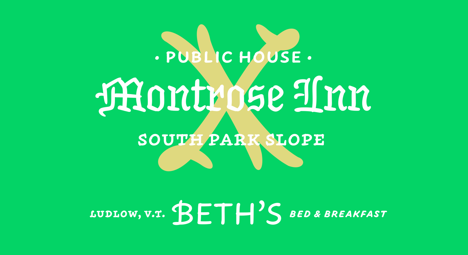
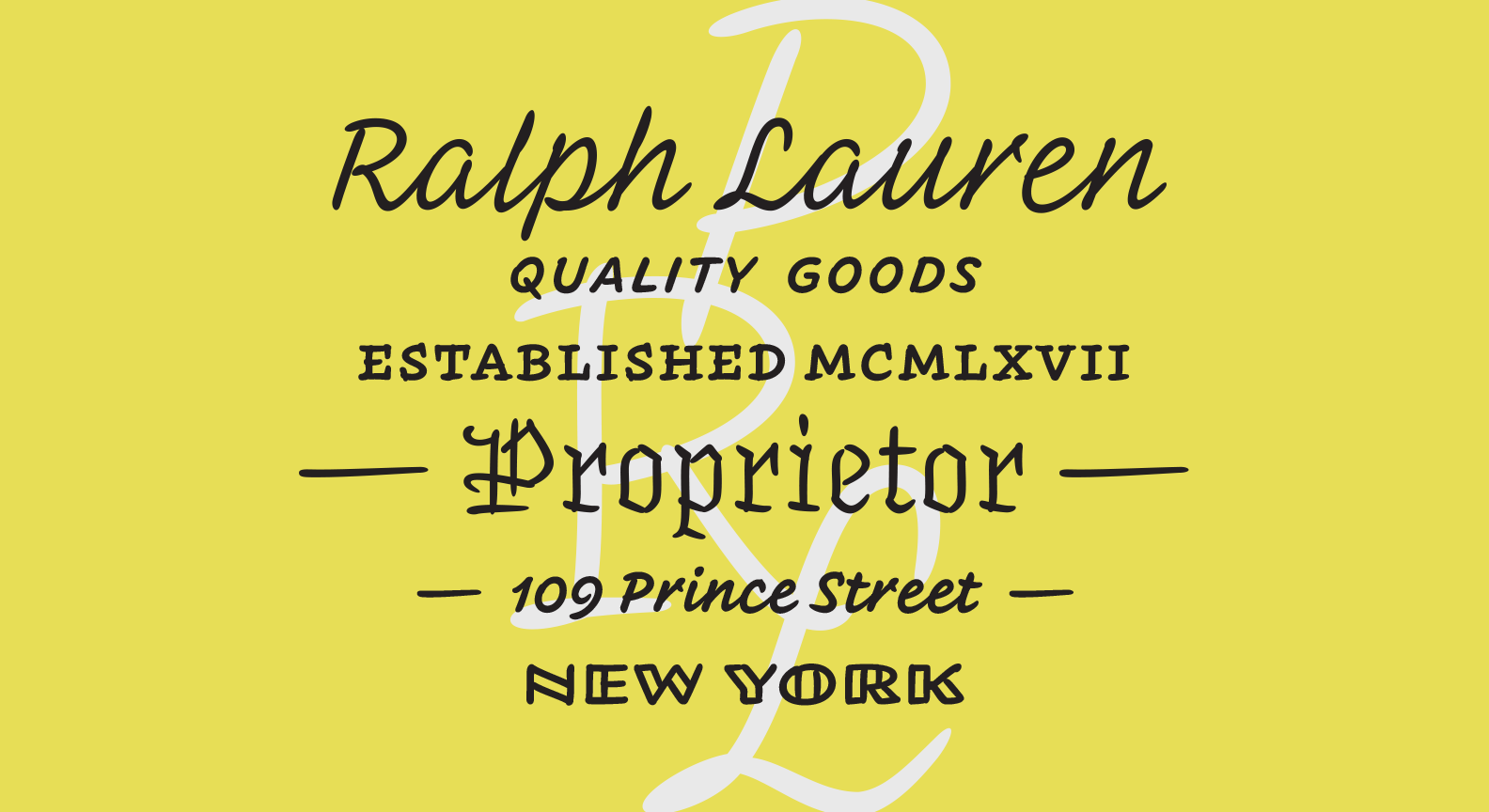
If you are reading this, you are looking at Hoefler&Co.’s latest typeface, Inkwell! This one is incredibly special for me. Jonathan and I developed this typeface over the last 22 months or so, with it’s origins actually going back over a decade. Jonathan has written a fabulous post about Inkwell’s history, philosophies and main ideas here, so I’ll tell a different story —
It feels like a very long time since Jonathan slid a piece of paper over to me and asked if I’d like to spearhead this project. I looked down at the paper, up at him with a bewildered look on my face. “well”, he said, “what do you think?!” In my head I was thinking, “umm, why did you write my name and title out on a sheet of paper?!”. The small document nearly looked like a hand drawn business card. This was my introduction to early Inkwell, then entitled “Craft”. As that may seem ridiculous now, the early drawings of Inkwell were very raw. Printed in dark grey and at about the same height as handwriting, it was convincing. The illusion was bulwarked even further since many of the forms had a lot of the same idiosyncrasies as Jonathan’s handwriting. I was tricked and it felt amazing. I let out what most likely was a hysterical giggle in acceptance.
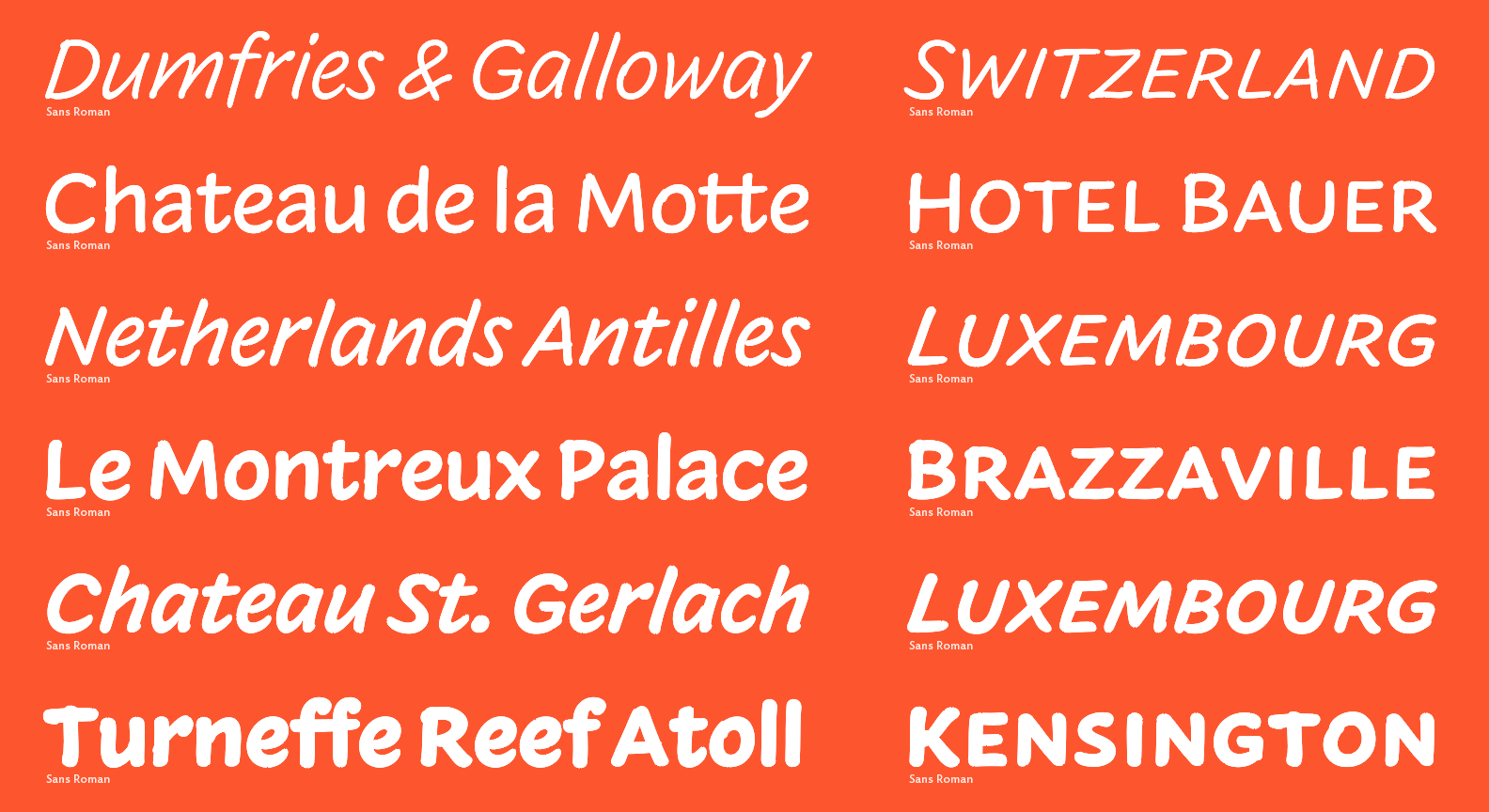
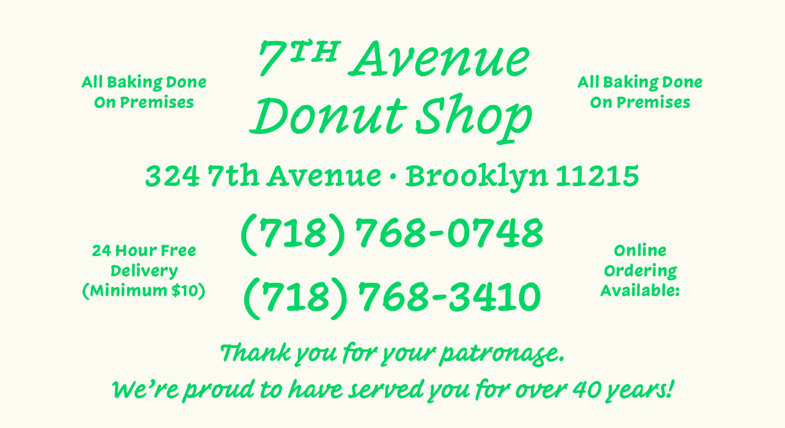
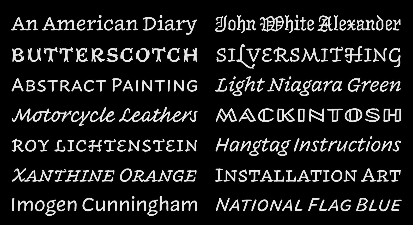
Looking back on this memory though, it’s a bit funny. Creating an illusion of handwriting was not necessarily one of the main goals of this project. Yes, a goal was to create a system of handwritten forms in multiple lettering styles. And yes, we did want it to have a potential for delivering robust typographical hierarchy. But to have a trompe l’œil effect? That was not really our intention. Inkwell, with its multiplicity of styles, questions the perimeter of the “type family” as we commonly understand it. Inkwell also uses the needs of authors, with the articulation of complex information in mind, to help better define what a twenty-first century typeface can be. It challenges typographic orthodoxy, hierarchy, and - as Jonathan concisely stated - what makes a serious typeface serious. But possibly most importantly to me, Inkwell advocates lettering and a playful combination of styles – two topics that interested me early on in my type design education and practice.
Combining hand-skills and letterforms was my focus in art school, so lettering quickly became my preferred means of design. This interest persisted into my time at Reading University’s MATD program in 2013. This is where I met Gerard Unger, one of my all time favorite professors and mentors. If you have not read my good friend Riccardo Olocco’s interview with Gerard, get on it. He’s just as wonderfully insightful and inspiring as he was during the year I was at Reading. In one of his first lessons, Gerard gave us a multi-style lettering project. As someone who became interested in type design through lettering, this was extremely exciting. I used the same pen to create my drawings, and Gerard made an observation that I most definitely did not catch. One of the styles nearly looked like it could be an italic for another one of the drawings; that these drawings could be paired, although they were quite unique. This may not have even been the point of the lesson but it got me thinking about how far you could push stylistic combinations in relation to the tool used. It eventually became a weighty interest of mine, and here we are today.
Let’s fast forward to November 2015. Jonathan may have seen this interest of mine, and thought I could add something special to Inkwell. For this, I am quite grateful. It was an absolute pleasure to work on this project. The moment you think you understand a subject is the best time to challenge your expectations and expertise. Inkwell did that for me in spades. I’m a big fan of having fun with type so I hope Inkwell brings you even a smidgen of joy. If so, I’ll consider it a victory. – JB
