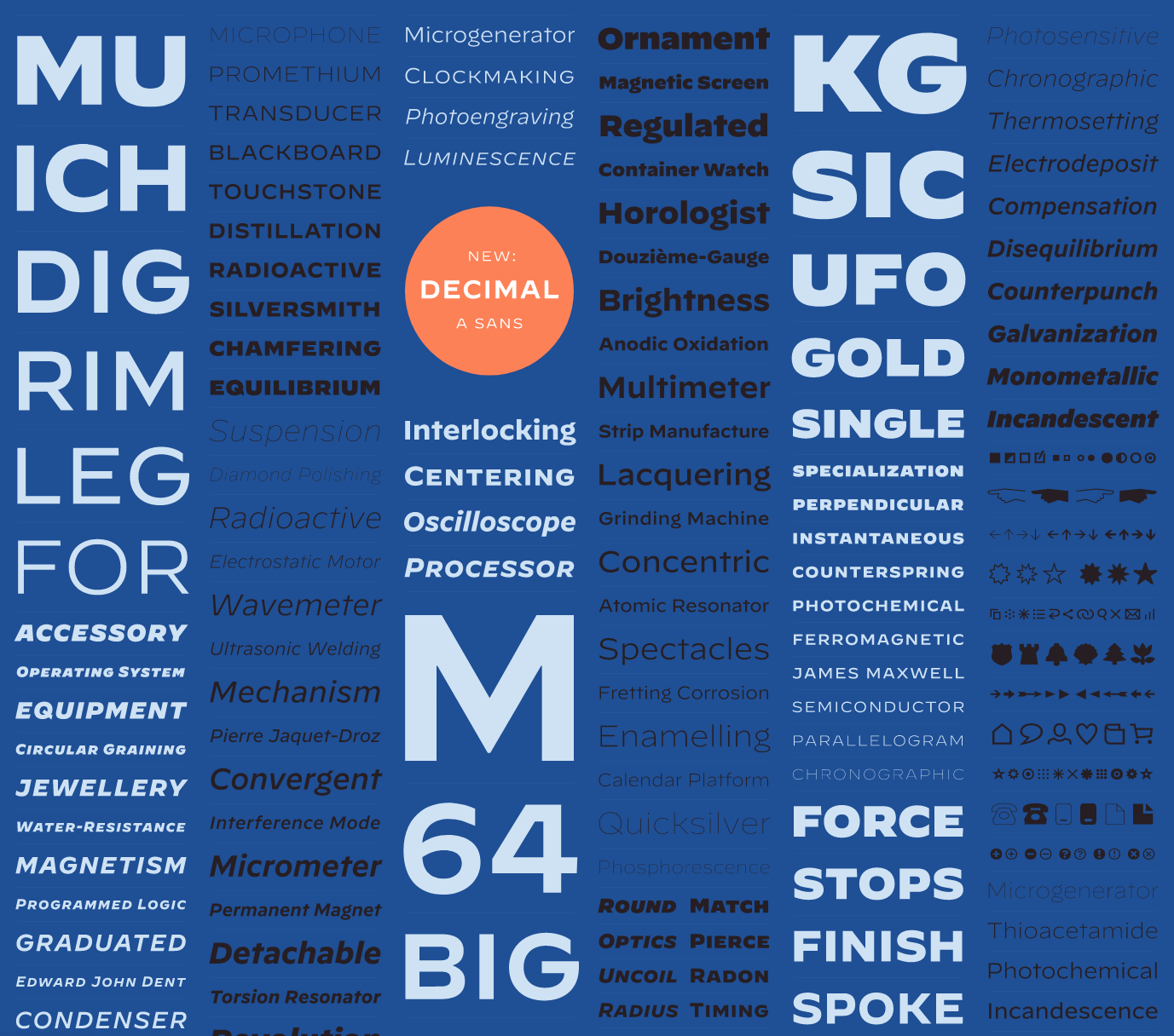
I’m very happy to present DECIMAL, Hoefler & Co.’s latest typeface. Check out the backstory here, and watch the history and process of designing it on Abstract Season 2! I do hope you guys enjoy the fonts and the show. A lot of blood, sweat, and tears went into getting this one across the finish line – but it was worth it!


Inkwell Condensed
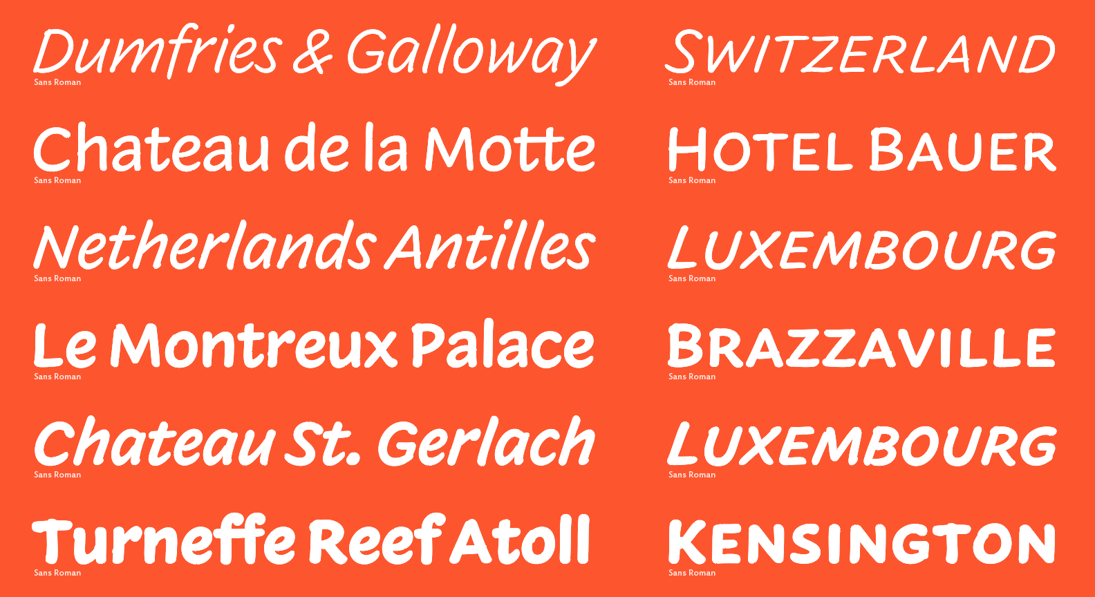
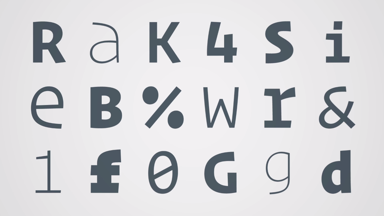
Today at Hoefler & Co. we launched Inkwell Condensed, the latest in the Inkwell series – a universe of ‘handwritten typefaces,’ designed to have the informality and expressiveness of writing, but the credibility and ease of type. Thanks to Jonathan I had the pleasure of working on this type last year and am really happy to see it rolled out today. Thanks to the entire type team for helping out and Brian Hennings for some truly spectacular artwork (see the banner image in the Featured tab). Couldn’t have done it without y’all.
If you want to learn more about Inkwell or the story behind the condensed please read Jonathan’s excellent post here. Definitely better than anything I could have written lol. Enjoy!
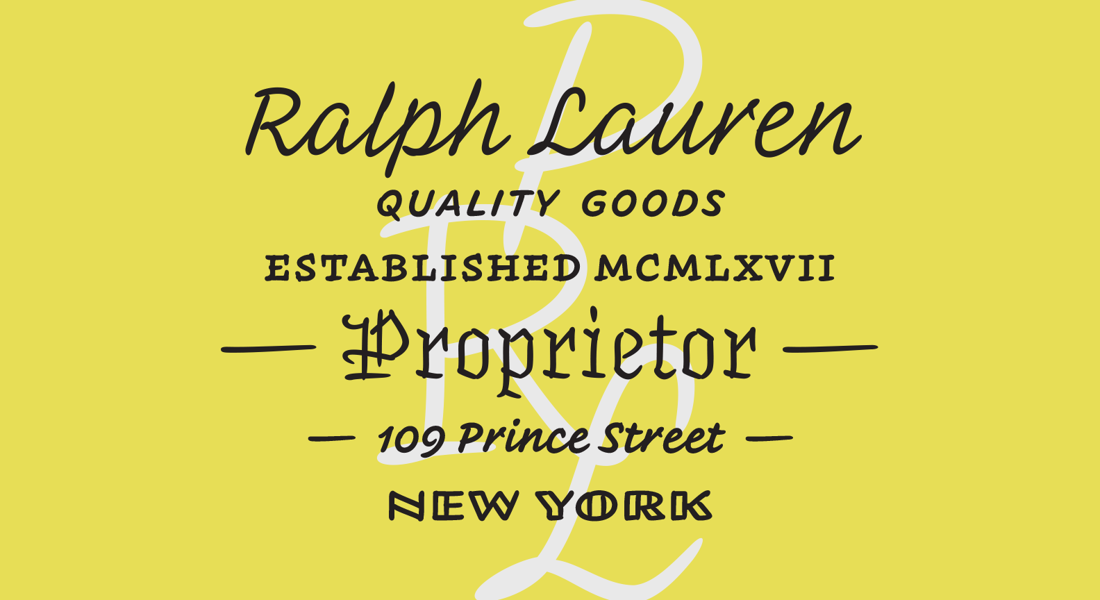
Introducing Inkwell!
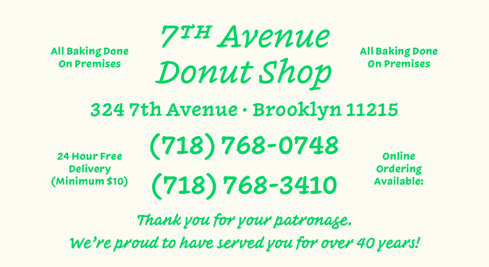
If you are reading this, you are looking at Hoefler&Co.’s latest typeface, Inkwell! This one is incredibly special for me. Jonathan and I developed this typeface over the last 22 months or so, with it’s origins actually going back over a decade. Jonathan has written a fabulous post about Inkwell’s history, philosophies and main ideas here, so I’ll tell a different story —
It feels like a very long time since Jonathan slid a piece of paper over to me and asked if I’d like to spearhead this project. I looked down at the paper, up at him with a bewildered look on my face. “well”, he said, “what do you think?!” In my head I was thinking, “umm, why did you write my name and title out on a sheet of paper?!”. The small document nearly looked like a hand drawn business card. This was my introduction to early Inkwell, then entitled “Craft”. As that may seem ridiculous now, the early drawings of Inkwell were very raw. Printed in dark grey and at about the same height as handwriting, it was convincing. The illusion was bulwarked even further since many of the forms had a lot of the same idiosyncrasies as Jonathan’s handwriting. I was tricked and it felt amazing. I let out what most likely was a hysterical giggle in acceptance.
Looking back on this memory though, it’s a bit funny. Creating an illusion of handwriting was not necessarily one of the main goals of this project. Yes, a goal was to create a system of handwritten forms in multiple lettering styles. And yes, we did want it to have a potential for delivering robust typographical hierarchy. But to have a trompe l’œil effect? That was not really our intention. Inkwell, with its multiplicity of styles, questions the perimeter of the “type family” as we commonly understand it. Inkwell also uses the needs of authors, with the articulation of complex information in mind, to help better define what a twenty-first century typeface can be. It challenges typographic orthodoxy, hierarchy, and - as Jonathan concisely stated - what makes a serious typeface serious. But possibly most importantly to me, Inkwell advocates lettering and a playful combination of styles – two topics that interested me early on in my type design education and practice.
Combining hand-skills and letterforms was my focus in art school, so lettering quickly became my preferred means of design. This interest persisted into my time at Reading University’s MATD program in 2013. This is where I met Gerard Unger, one of my all time favorite professors and mentors. If you have not read my good friend Riccardo Olocco’s interview with Gerard, get on it. He’s just as wonderfully insightful and inspiring as he was during the year I was at Reading. In one of his first lessons, Gerard gave us a multi-style lettering project. As someone who became interested in type design through lettering, this was extremely exciting. I used the same pen to create my drawings, and Gerard made an observation that I most definitely did not catch. One of the styles nearly looked like it could be an italic for another one of the drawings; that these drawings could be paired, although they were quite unique. This may not have even been the point of the lesson but it got me thinking about how far you could push stylistic combinations in relation to the tool used. It eventually became a weighty interest of mine, and here we are today.
Let’s fast forward to November 2015. Jonathan may have seen this interest of mine, and thought I could add something special to Inkwell. For this, I am quite grateful. It was an absolute pleasure to work on this project. The moment you think you understand a subject is the best time to challenge your expectations and expertise. Inkwell did that for me in spades. I’m a big fan of having fun with type so I hope Inkwell brings you even a smidgen of joy. If so, I’ll consider it a victory. – JB
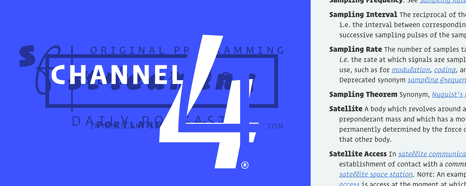
Operator
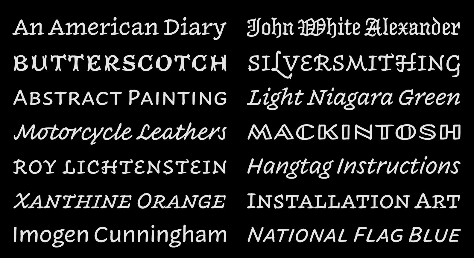
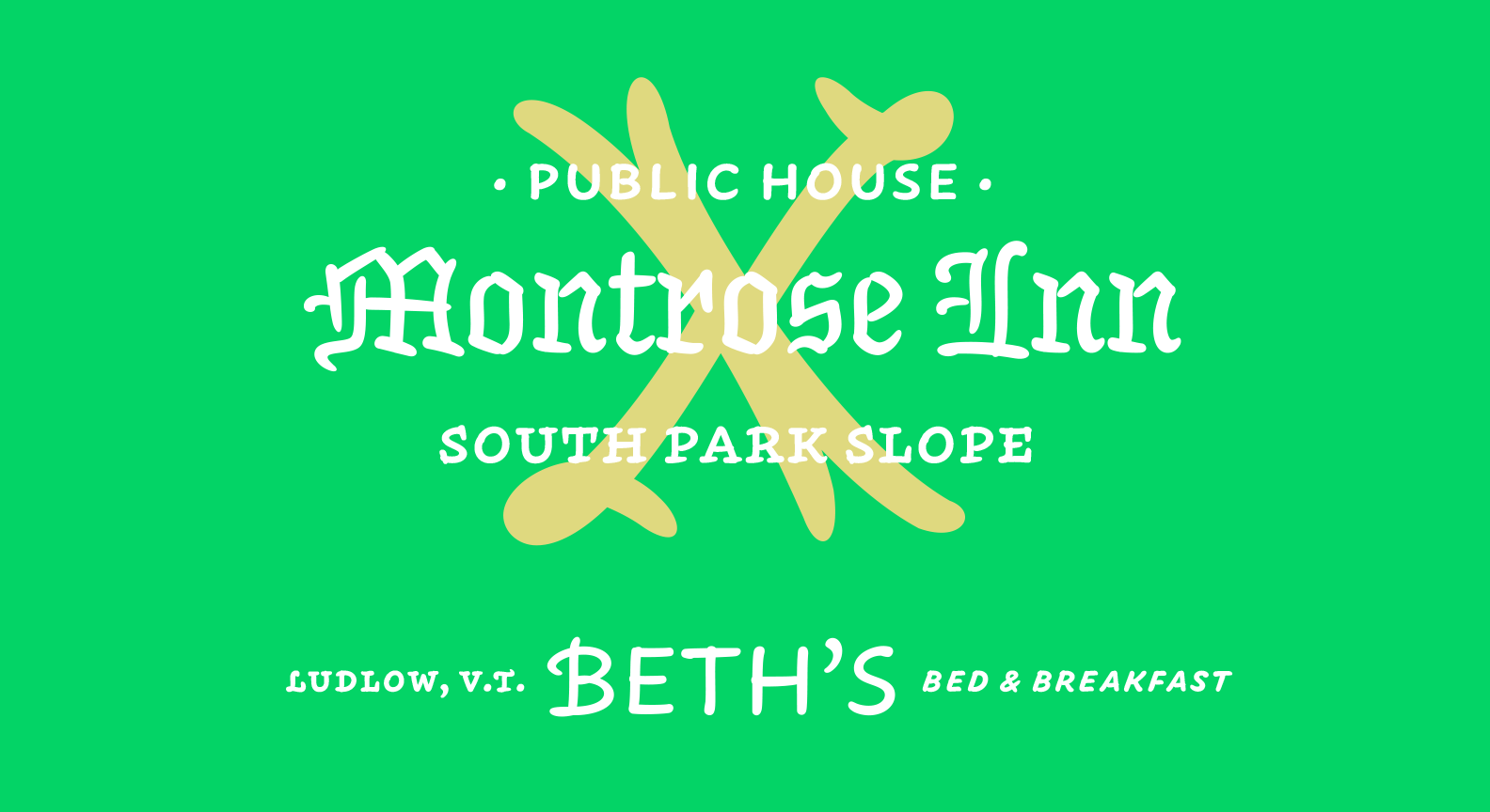
Today we released the second major project I have worked on in my time at H&Co – Operator! What an absolute joy it is to share this with everyone. I will start off this (hopefully short) post by saying it is not my own design. It was an incredible team effort from the entire H&Co staff but Jonathan Hoefler and Andy Clymer are the real heros here. I'll give a brief explanation below:
On most of my projects, Andy is my supervisor. This was the case during the Archer Ultra extension since he had experience designing the originals. After that project wrapped up he asked if I could help out with Operator. I was giddy. I had seen some proofs around the office and loved where this project was headed. Also, we didn't have anything like this in our library. To be working on the first H&Co monospace typeface was pretty darn exciting too. Operator has the right amount of digital flair, but still fells human. It's quirky, but still manages to behave in serious settings. These are the kind of design problems that I love solving – how do you give a design enough character or personality without invading its usability or functional aspects? I dabbled around with this question some during my time at Reading, but ever since I joined the team at H&Co and have worked on projects like Archer Ultra and now Operator, it's now starting to become a serious interest of mine. As for many in the history of art and design, the balance of personality and function is a welcome challenge and I have absolutely loved working on these projects. We hope you enjoy Operator. Check it out!


Archer Ultras!

With this being my first official typeface release, I have been looking forward to announce Archer Heavyweights for some time now. I started working on this project on my second day at H&Co., we finished it up earlier this summer, and I have loved every minute of the process. As a designer, you truly learn a lot about type design when drawing an Ultra-weight extension. All the fundamentals of type design become very pronounced due to the increased weight and smaller amount of negative space you can work with. This causes just about everything to hinge on 1-2 unit (1000upm) moves – which ironically sounds backwards since there is so much weight to work with.
In Archer, I worked on many different aspects of type design that I didn't have much experience at or never even attempted before. This included very thorough kerning, comprehensive testing on multiple platforms, subsetting, and many other forms of production and mastering. Some people may say these tasks are a bit dull, but I actually enjoyed them! These necessary tasks taught me so much more about my project and type design in general. They also gave me further insight into what goes into a truly well-designed product. Anyways, I could blab on and on about how much I enjoyed designing thicc Archer, but Jonathan writes much more elegantly about it on our site. Check it out, and I hope you enjoy!
Typographics
New York in the spring is seriously awesome. Warm weather hits, everyone is outside on the balconies and in the parks, kicking back, eating well, and enjoying the city. Maybe all the terrible winter weather is really worth it?!
Another great thing about this time of year is all the wonderful conferences going on around the world in our little typographic realm. Kerning just finished and ISType starts tomorrow, but the most infant of them, Typographics held in NYC, initiated its 1st gathering today. The likes of Roger Black, Louise Fili, Steven Heller, Seymour Chwast, Paula Scher, Erik van Blockland, Alexander Tochilovsky, Sumner Stone, and of course, the brilliant Jonathan Hoefler kicked it off with talks spanning "the good old days" of typography before the Mac, to live interpolation & animation on the web. It's been spectacular day for us typophiles.
In Jonathan's truly inspiring talk, he shared a few pretty sweet images – Along with the amazing photo of himself when he was 18 (which I unfortunately was not able to screen grab quick enough ;] ), and the images & sounds from his father's "Industrial Musicals", he also had a slide of our team photos that were recently taken. Something about seeing our photos up there was just really freakin' awesome. So proud to be apart of this fantastic team!
If you can, tune into the live stream tomorrow for more amazing talks from some of the world's best.

Image taken from from @AJWShaughnessy – Thanks!