Label Craft

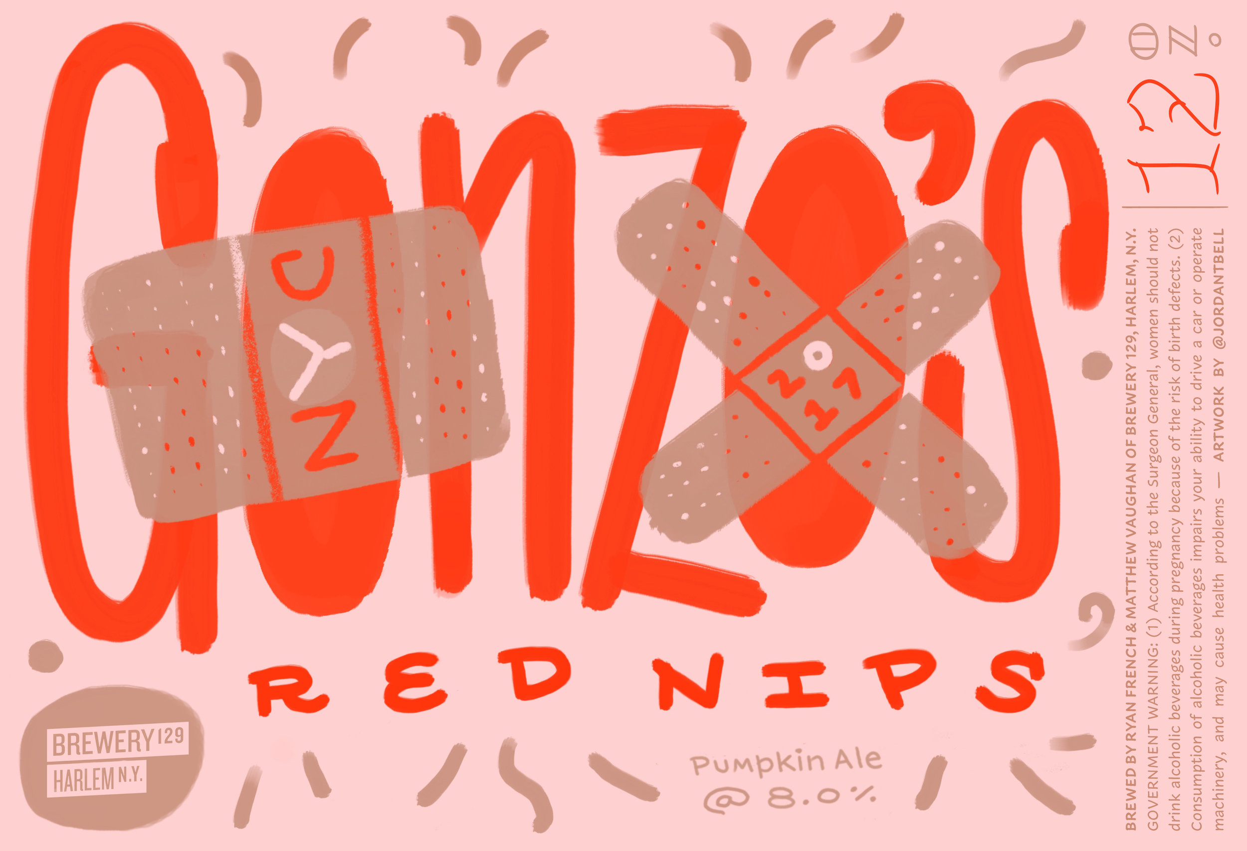
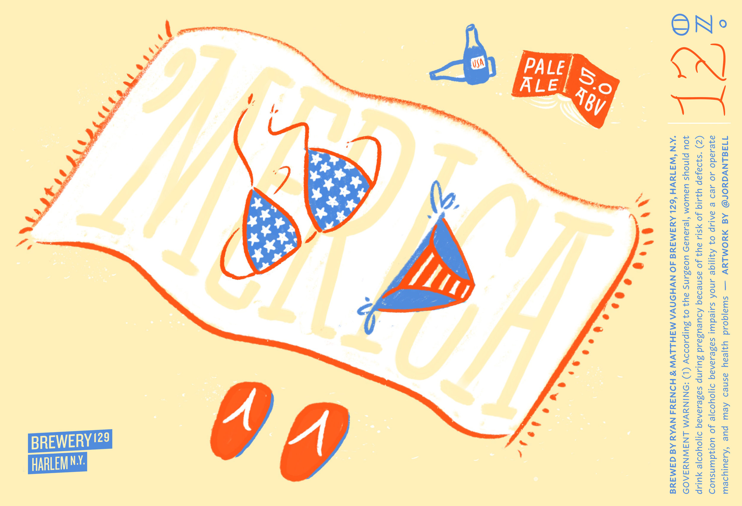
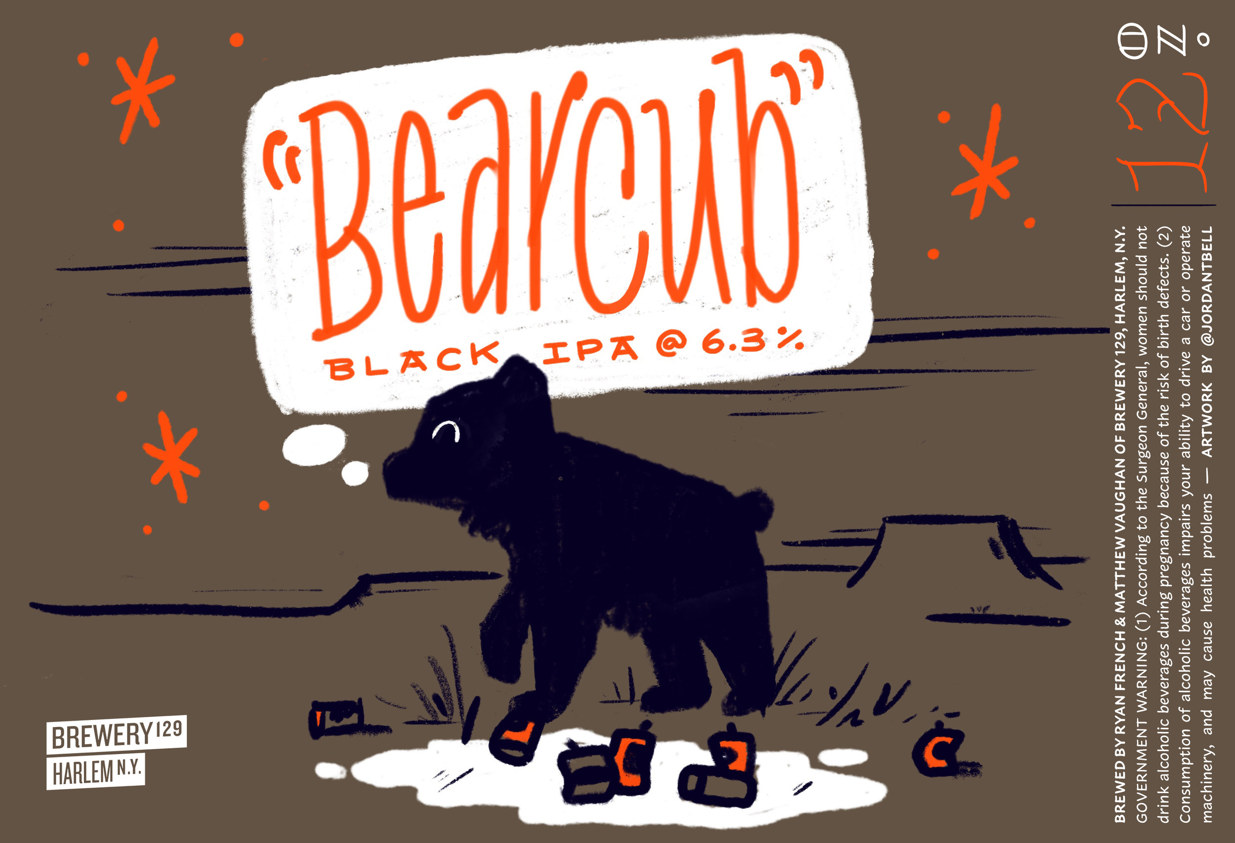
Far too often today artists and designers are overlooked or not accredited for their art. Bummer right? Ready for another one? Much of their work is sold and distributed all over the world, but sadly ends up in a landfill like your basic Starbucks cup (please recycle!). Yes, I am talking about beer, but don’t worry folks, I’m here to say the labels attached to this most choice malty beverage are most definitely art and the brilliant designers behind these thoughtful pieces deserve recognition (or at least to be paid!).

So, earlier this year I began a new project called Label Craft to archive my growing collection of craft beer labels. You can find it at @label_craft or check out the full, un-cropped images on Flickr. If beer isn’t your thing, please reconsider it’s hoppy goodness? If labels aren’t your thing, that’s fine! Peel ‘em off and send them my way. You’ll be thanked and accredited accordingly.

Here’s a few personal favorites. I hope you’ll follow along. Cheers! 🍻

WAVES (BØLGER) by Keith Shore for Mikkeller San Diego.


AMERICANA by Colin Healey for Prairie Artisan Ales


OH1 by Jeff Rogers for Transmitter Brewing & Other Half


HYPERSLEEP by Small Stuff for Other Half.


SIGNAL TO NOISE by Lauren Grimm for Grimm Artisan Ales


FRUIT FRENZY by Abbey Lossing for Five Boroughs Brewing Co.


Shiner Bock by McGarrah-Jessee for Shiner & The Spoetzel Brewery

Santa Barbara Mission Gravestones

While I was in Santa Barbara this summer I came across these spectacular gravestones in the Old Mission graveyard. Thankfully Emily brought her DSLR so we were able to leave with some nice photos. I should be clear though, I cannot claim many of these beautiful shots. Emily knows her way around a camera much better than I do!

Currently I do not know who is responsible for these expertly carved stones (potentially a few different hands at work?), but if you have any information on the subject please get in touch.

Brewery 129

Every year that I have lived in New York City (grand total of three!) I have attended the Brooklyn Homebrew Festival – an annual Springtime event in Gowanus that celebrates the best home made brew in New York City in a friendly competition.

Last year, my good friend Ryan decided to enter the competition, under the name Brewery 129 – after the Harlem street where the first batches of his Black IPA Bear Cub were made. Unsurprisingly, it did quite well! Before the festival, he asked me to whip up a design for the brewery and beer. I made a simple, but flexible branding system inspired by NYC street signs, and labels for the three beers that he has brewed so far. As a type designer I am always thinking in black & white (which is evident in the branding system) but with the labels, I wanted to introduce color and illustration to bring in some of Ryan’s personable character and jolly personality into the visuals are the brewery. Around the same time I visited The Met’s inspiring David Hockney exhibit and was reminded of how intimate and complex his work was, even though many of the forms and colors were pared back, or limited. So, I began a series of illustrations that were completely designed in ProCreate on my iPad, but based on the story behind each beer and expressed in a limited, but convivial color palette.

If you find yourself in need of some suds in April, please do join us at the Brooklyn Homebrew Festival! We’ll have our latest, Gonzo’s Red Nips on tap: a celebratory strong pumpkin ale brewed for our pal Gonzo for completing the 2017 NYC Marathon. Come have a pint and say hey!

Type Fight!

I've been following Type Fight for years. I first found out about the competition as an young graphic design student in Abilene, Texas. Five years later, I am a contender! I'm up against the very talented Mercè Núñez. Hoping for a nice, clean fight :D

Type Fight was a powerful and inspirational site for us as students because it forced the designers & letterers to work with incredible boundaries and restraints – 1000x1000, cannot collaborate, not too illustrative, no physical objects, but no color or style limitation. These parameters are generally quite different from an actual clients request where there very well might be no size or medium limitation, but a specific color palette or aesthetic may be required. Overall, these were exciting (and educational!) projects to analyze and critique as a student. Why would the hardly recognizable blackletter 'a' get 70% of the vote over a clean, beautifully drawn script? The more fights you see the easier it becomes to predict trends or winners, but its still good fun and a nice break from student work. 

All that to say, I’m super excited and honored to have been asked to participate. Thanks Drew and Bryan and great fight Mercè! 

I wanted to share a bit of the process behind my submission. So, I posted up a new screen shots below. The first being the initial drawing of the skeleton of my submission. I started by drawing the inner-most and outer-most shapes, then 'interpolated' them (or algorithmically blended with specific software tools created by type designers), I was left with these 5 instances in-between the two poles.  Secondly, I interpolated even more instances to create the next drawing. Since these lines were even closer to each other it created a nearly chrome-like effect. Because of this, I nearly submitted it as my entry into Type Fight as is. After these two sketches, I began to construct the final design. I used the first drawing as the wireframe of the 'neon lights' and the second drawing was used as the 'backing' of the 3-dimensional signage. I then started adding color, shadows, and texture. The third shot appeared somewhere in that process and at the time I thought it was freakin' awesome. Which it is obviously not lol. I continued to work on the piece and even toyed with the idea of a bitmap, pixilated iteration (shot #4) but in the end I tossed up a new color scheme, added a bit of texture for shadows, some detail here and there, and shot it over to the fine folks at Type Fight.

Hope that was fun, informative or at least interesting. Peace! JB

Tattoo Lettering

My good friend Sarah asked me to design a tattoo for her recently. I had never designed something that would be permanently adhered to someones body, so I gladly accepted! She wanted one of her favorites quotes, written in the original Greek, along her forearm. My good friend Matthew, who holds a doctorate in Theology and is also more or less expert in Greek scripture, transliterated the text and gave me the correct grammar and phrasing. We obviously don't mess around when it comes to designing Greek! After doing a bit of research into Greek handwriting models, I found some beautiful forms and even natural ligatures. I incorporated some of these newfound forms into my sketches – primarily done with pencil and felt tip pen. The outcome was this humanistic, brush-inspired, lettering you see below.

It simply states, "Love bears all things".

LoveBearsAllThingsTattoo2.png

Three months

Hard to believe I have been living in New York City for over three months now. In some senses it feels like I've been here for much longer than that. When I look back on having to move twice, finish a dissertation, and start a new job, it really seems like that all happened over 6 months or possibly a whole year; but definitely not in the first month of being here! In other ways though, I still feel very new to the City — like the times where my internal compass fails me and I have to pull out my phone and spin in circles to figure out which direction I'm facing when I visit unfamiliar areas. I also completed 2 months at H&Co earlier this week, which is equally parts mind-boggling and wonderful. I am working on some very exciting projects and cannot wait until they are released into the wild for all of you fine folks to use in your designs. Until then, feast your eyes upon the beautiful Quarto and the latest Discover Typography

Since I moved to Brooklyn within the month, I have been reading up on its rich history and have been watching a fantastic documentary recommend to me by my pals Troy Leinster and Colin Ford entitled (quite matter-of-factly) "New York: A Documentary. If you have 17+ hours (yes you read that correctly, a seventeen hour long doc) to spend glued to a screen, I highly recommend it. Along this vein, in my spare time I have been practicing lettering and writing with basic instruments/tools to experiment with the skeletons of various lettering styles. The sketch below are the names of the six original villages in Brooklyn that I lettered with just a basic #2 pencil. 

I have enjoyed New York so much since arriving and feel very blessed to be able to hang out and work with some of the nicest, coolest, & most talented dudes in this ol' town. Cheers!