A quick sketch of band names I drew on my iPad using ProCreate and a custom brush

A quick sketch of band names I drew on my iPad using ProCreate and a custom brush
I recently had the privilege of giving this talk at the 60th anniversary of ATypI in Montréal, Canada. Gerry Leonidas (now the president of ATypI – congrats!) thought it might be a good idea to hold a more informal, interactive presentation to students, graduates, aspiring type designers, and in general, young professional designers. The talk was meant to inform, inspire, and give further insight into my personal process throughout H&Co's most recent, and potentially most atypical, project – Inkwell. For those who couldn't make it, read on!
The Wild West
I have been interested in letter forms and drawing in general ever since I was really young. I went to a design school in West Texas and it was there that I was taught the fundamentals of art and design, multiple media and their impact on individual artistic process, and most moving to me, the importance of hand skills and the tools that you use. Thus, I really enjoy and feel the need to make things with my hands. You may ask “so, why typeface design then, Jordan?!” – sometimes I wish I was building a shelf, or painting on a canvas, or doing gestural drawings in charcoal; but in a way, type design includes these, and many more artistic practices in one. We construct systems and miniature programs that we can control and manipulate. And we may only draw in black and white, but when mixed together those shapes paint grey on the page.
For me though, nothing beats picking up a pencil and sketching. Does that mean I have tons of notebooks, color-coded and organized by season or project? Actually... yeah, kinda; but I also sketch everywhere – napkins, receipts, old sketches, orders of ceremony, and yes, the handy sketchpad. But my new favorite media to draw on is the iPad. It’s not for every project or sketch, but the iPad, like most new tools, opens up doors and possibilities that can be new, and pretty exciting. Every app or program has its own tools or ways of mark-making and that’s extremely interesting to me. In these examples, I’m using Notability’s two drawing tools.
So, combining hand-skills and type has been my focus, and somehow, this work got me a job at a lovely boutique graphic design firm in Santa Fe, New Mexico called Cisneros Design, and later into the MATD program at the University of Reading; and as I was finishing my MATD thesis in NYC, I began working as a typeface designer at Hoefler & Co, where I’ve been for three years this week.
Style as System
However, Reading University is where this story really begins, and it’s where I met this guy –Gerard Unger. One of my most favorite professors and meaningful mentors. If you have not read Riccardo Oloco’s interview with Gerard, get on it. He’s just as wonderfully insightful and inspiring in print as he was during the year I was at Reading.
In one of his first lessons, Gerard instructed us to sketch a word in four different lettering styles. And, as someone who became interested in type design through lettering, this was perfect for me. Jonathan once said something that I keep coming back to: “There are great type designers who work to avoid revealing a personal style, and there are great type designers whose work is enriched by their strong personal style, and in the latter group is Gerard Unger.” To me, this project was the manifestation of that quote.
Accidentally, or being simply ignorant of the consequences, I used the same brush to create my four drawings, and Gerard made an observation that I most definitely did not catch. He remarked that one of the styles nearly looks like it could be an italic for another. That they could be paired, although they were quite unique. This may not have even been the point of the lesson, but it was exciting.
Not only did I have a more concrete vision for my thesis project (that would later turn into this type family, Odelay), but it also made me start thinking about tools and their importance in my design once again. This project and Gerard’s insight also made me question how far you could you push stylistic combinations in relation to the tool used? Or even, on a more simplistic level, the roman/italic relationship.
So, this study of stylistic relationships with Unger led me to another question: what actually is a type family? Or, what can a typeface family be? Does a typeface family have to have Italics? More than 1 or 2 weights? Widths? Text and Display styles? Grades or other technical aspects?
Or, can a type family have a broader definition, simply encompassing multiple styles within a working system? If so, how would these styles be related in said family, and in what ways could they interact or be used practically? And what can we look at for guidance or inspiration here?
There were the renaissance writing masters that were able to move effortlessly and purposefully from one hand to another. The great English calligrapher and type designer Edward Johnson implemented uncials, italics, emboldened caps, swashes, and even some simplified capitals for the small text in this map of his home town. But there’s also many more contemporary artists that use letterforms in their work.
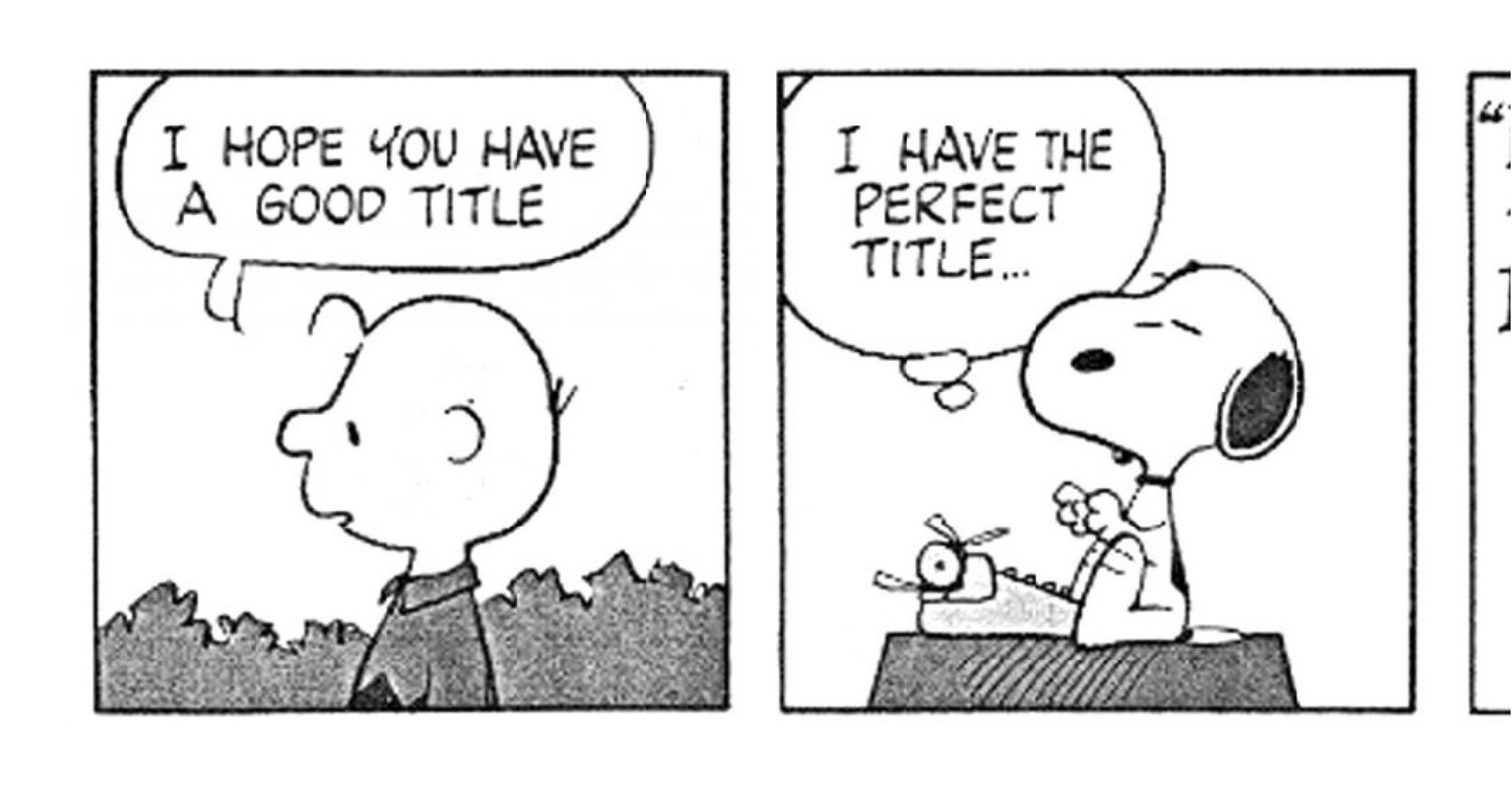
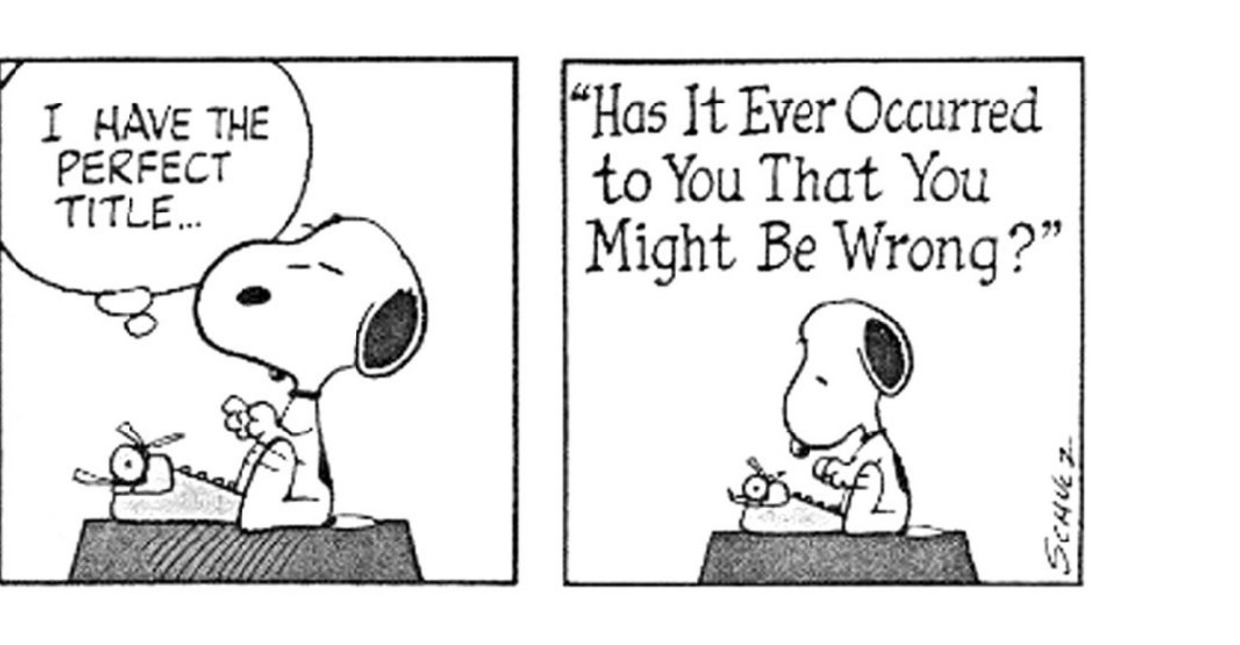
One of these artists that Jonathan and I share a mutual admiration for is Charles Shulz. Everyone recognizes the iconic lettering of Peanuts, but one of the things that I especially loved as a kid was the effect when Snoopy sat down at the typewriter: the lettering would shift, to something typewriter-inspired — which is funny, and unexpected, and a really effective way of immediately signaling that what you’re reading is no longer dialog, but something being written. I loved the way Schulz used different styles of lettering to gently, yet distinctly, connote different kinds of language.
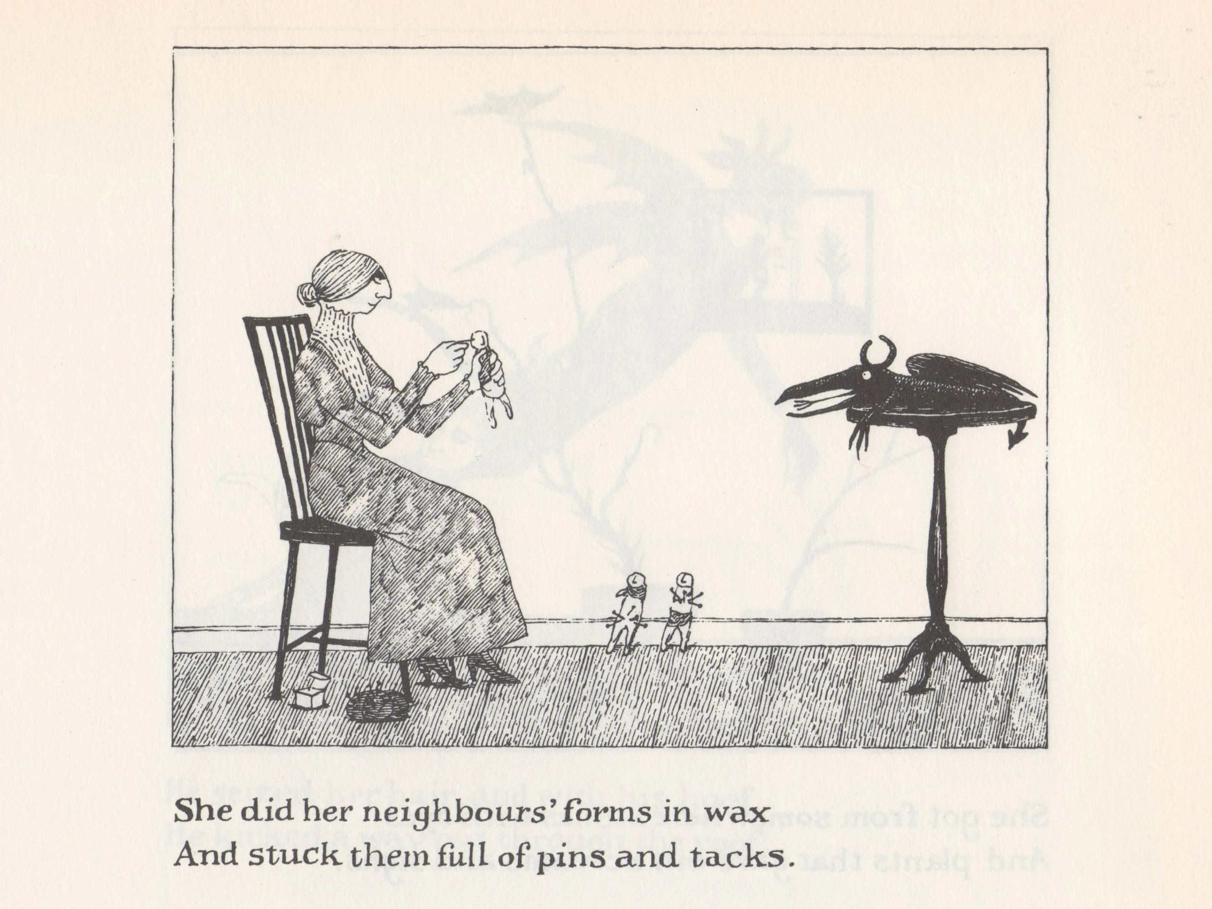
Jonathan and I also remembered the superb work of Edward Gorey (for those of you who don’t know Gorey’s work, you’re in for a treat. I learned about Gorey years ago in a printmaking context actually, as many of his illustrations are amazingly dry-point etchings. His stories are brilliant: they’re elegant and deeply subversive, dark fantasies set in a vaguely Victorian universe full of mustached gentlemen and ladies with parasols. They generally involve people being driven insane, or hapless infants coming to some grisly fate. You know, good family fun.
He was a master lettering artist, and I’m not talking so much about his skill as a draftsman, but rather his perceptiveness about what letters can mean. The title pages for his stories always reveal a deep love for lettering, and he works these different styles of letter into the stories themselves, in ways that are always apropos, from the slab serif [in this slide] that signals “old-time baseball uniforms” to the blackletter that identifies a proverb. But I especially love the way he uses lettering not only for display, but for text.
When we designers at a type conference talk about “lettering,” we’re almost always talking about large, solitary things: logos, headlines, these things that are grand, and have a great opportunity for pyrotechnics or likes on social media. And while I do love this kind of lettering, I also love the rarer species of lettering that’s used for text. Gorey uses the traditions of typography to confer legitimacy on the fantasy, whether it’s the bookish presentation of a caption that uses romans for text and italics for titles, or an epigram whose attribution is set in small caps, in just the way that a graphic designer might do. Gorey was obviously a keen student of typography on three different levels: what letters look like, what different styles of letter forms can express, and how typography can be used to articulate content.
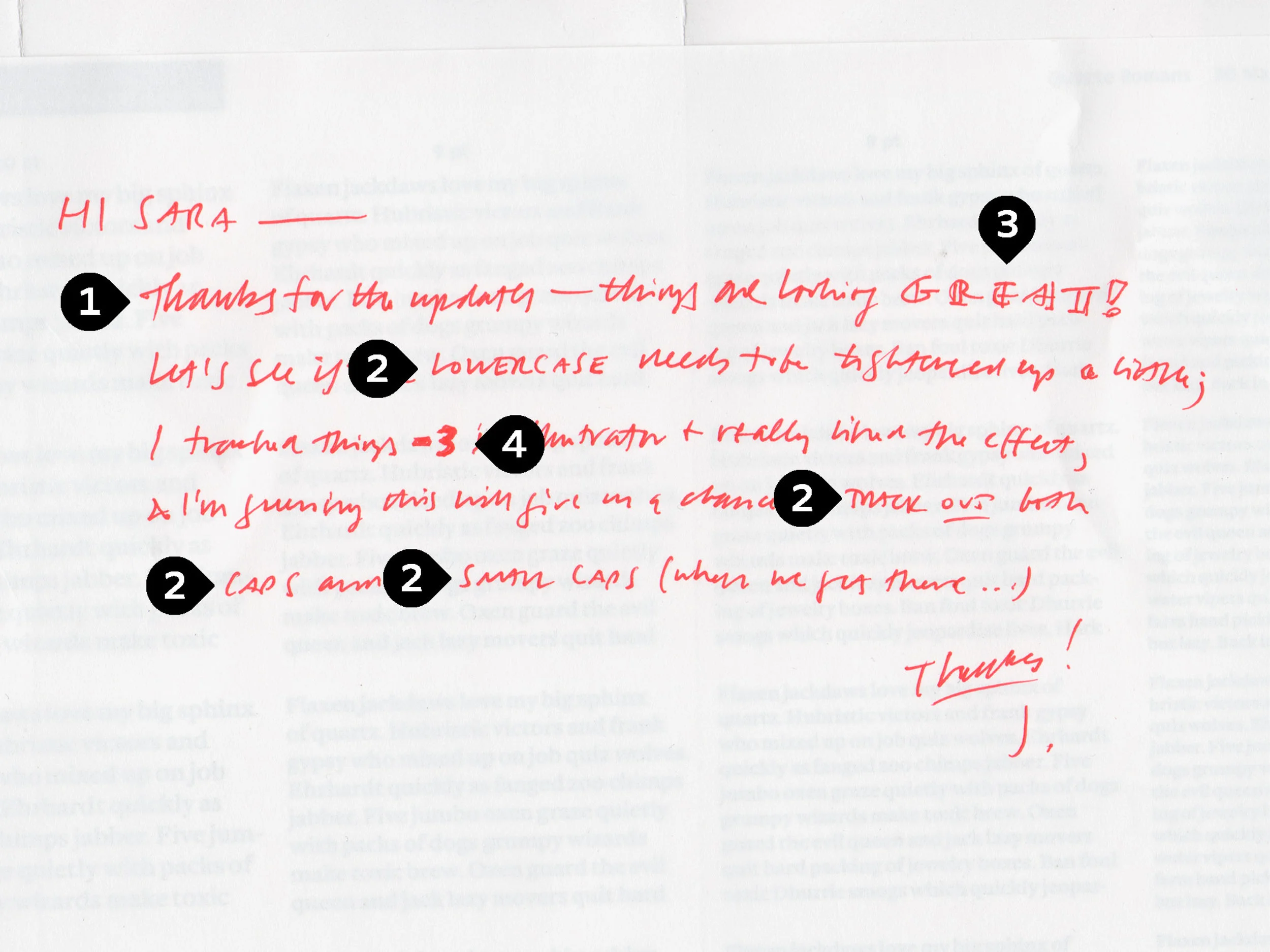
Typeface designers think constantly about these three different perspectives, and how their unity can yield typefaces that are not only interesting, but also useful. At H&Co, we find ourselves using lettering every day to shape content, and not just in our roles as designers. I would say Jonathan’s notes on these proofs is perhaps the best example of how lettering and typography can come together in a very interesting way to shape content.
This slide was a note to Sara Soskolne, one of our senior typeface designers. And perhaps as with Gorey, it’s less about the lettering itself, and more about Jonathan’s affection for using different typographic styles together. I suppose you could dissect a note like this to say that it’s generally set in script (1), with occasional highlights set in sans serif small caps (2); a sort of wide, decorated in-line(3); and even a pen-drawn bold(4). But I think it presents to the reader differently, as simply a single statement that uses noticeable styles the way a typographer might employ bold or italic.
And to me, that’s the most interesting thing about handwriting, as opposed to calligraphy. Calligraphy formalizes its mannerisms, and the qualities of its tools, and refines them into a particular style, much like my earlier lettering project and this example above by the brilliant Gerrit Noordzij. But handwriting is less consciously structured, and therefore has more freedom to move between different styles. Style is incidental to what handwriting is: handwriting is principally the record of an author’s words, and only incidentally possessed of style in the typographic sense.
Inkwell
With our most recent project, and the one that I have been using throughout these slides, we wanted something that borrowed the best parts of type, calligraphy, and handwriting. The versatility of type, but none of typography’s artificiality: type after all is synthetic, institutional, more anonymous than personal, which as a communication tool is generally its strength. But instead of artificiality, what I wanted was something from calligraphy: its organic quality. Calligraphy is genuinely hand-made, warm and natural — it’s the product of the wrist, the elbow, and the shoulder — but it’s too mannered for what we had in mind, since by design it coalesces into a formal style. An antidote to this formality is found in handwriting, which is as informal as letters can be — and I really love the way handwriting reveals authorship, which you can think of as a writers voice, instead of concealing its personality. But then handwriting can often be disorderly, if not downright sloppy. So my question was whether it might be possible to strain out the virtues of these three kinds of lettering, and eliminate their shortcomings, and that’s what we attempted to do with Inkwell.
I had been working on Inkwell since about November 2015 when Jonathan slid this piece of paper over to me. I had honestly thought he wrote my name and title on a sheet of paper. Though that may seem crazy, the early drawings of Inkwell were very organic and a bit inconsistent – and not in a bad way mind you! Even then, we could see the inconsistencies benefiting, rather than harming, the design. The illusion was bulwarked further since many of the forms had a lot of the idiosyncrasies from his handwriting as well. I was tricked, and it felt amazing. Looking back on this memory though, it’s a bit odd. Creating an illusion of handwriting was not necessarily one of the main goals of this project. Yes, a goal was to create a system of handwritten forms in multiple lettering styles. And yes, we did want it to have a potential for delivering robust authorship and typographical hierarchy, but to have a trompe l’œil effect? Not really our intention.
Jonathan initially conceived of this family back in 2004, incidentally just before my first year of high school (lol). It was inspired by his search to find the right typographic solution to the tonality issue on the map of his wedding invitations. As graphic designers we’ve probably all had this problem. Since the map is an illustration, you don’t want to use a typeface as it generally looks too institutional, as if you’re making a map for the venue itself. But straight calligraphy feels out of place too, as it feels too historical or from some fantasy realm. Inkwell is an attempt to create a family of fonts that feels like hand-written text: how you might letter the entire contents of a book or encyclopedia, if you had infinite time, patience, and skill.
We began by talking about the weight, and how it should be applied. Jonathan originally imagined Inkwell as a collection of alphabets that could all be the product of the same pen, and therefore all with a consistent stroke width; but a companion boldface is obviously a valuable thing for a designer to have. And even if the design were to stick to a single weight, it seems to me that choosing that weight is important. So we decided to expand the family from a single medium weight into a range of weights, bounded by a technical pen Thin and a graffiti marker Black.
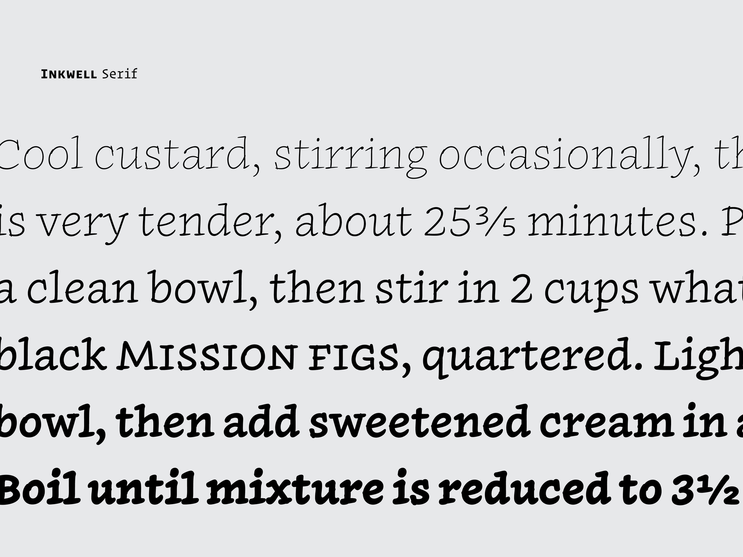
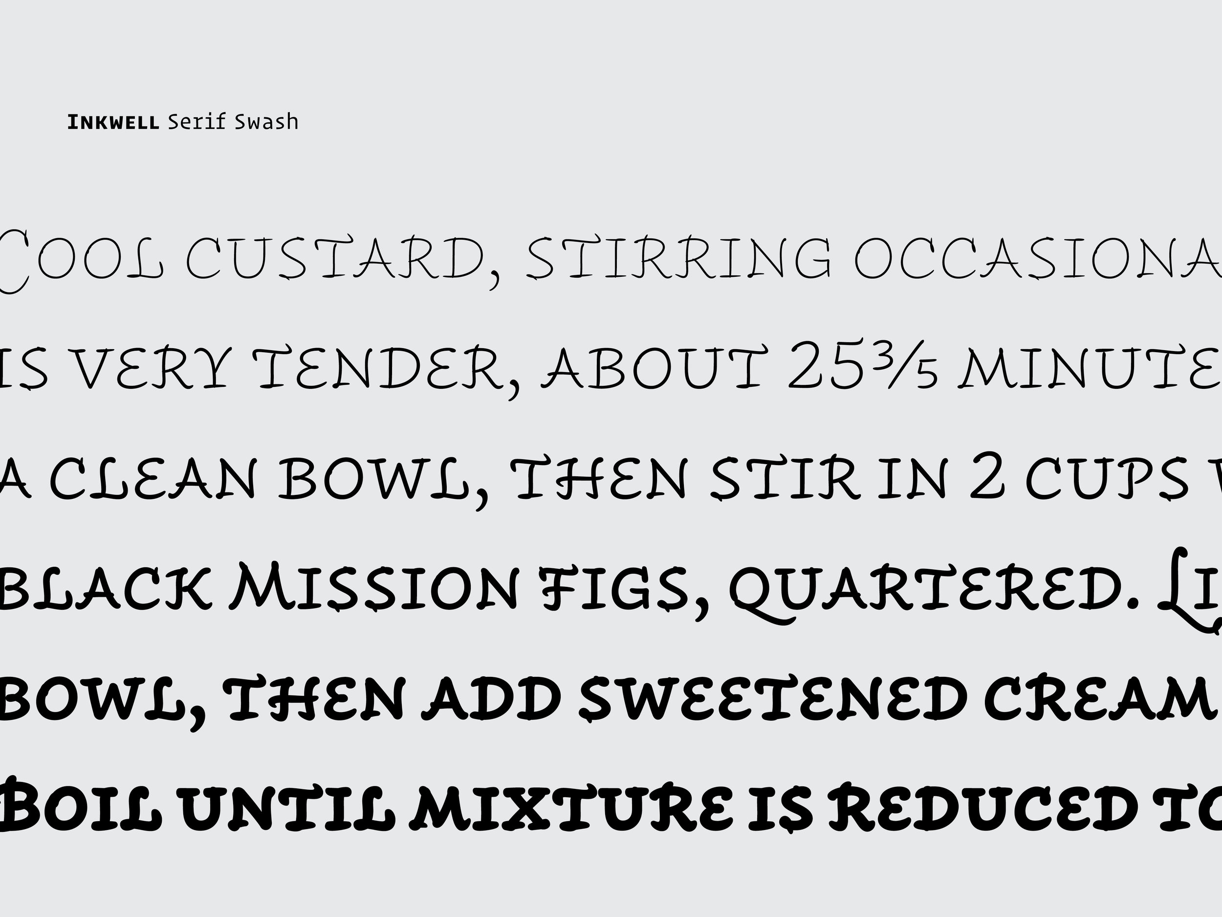
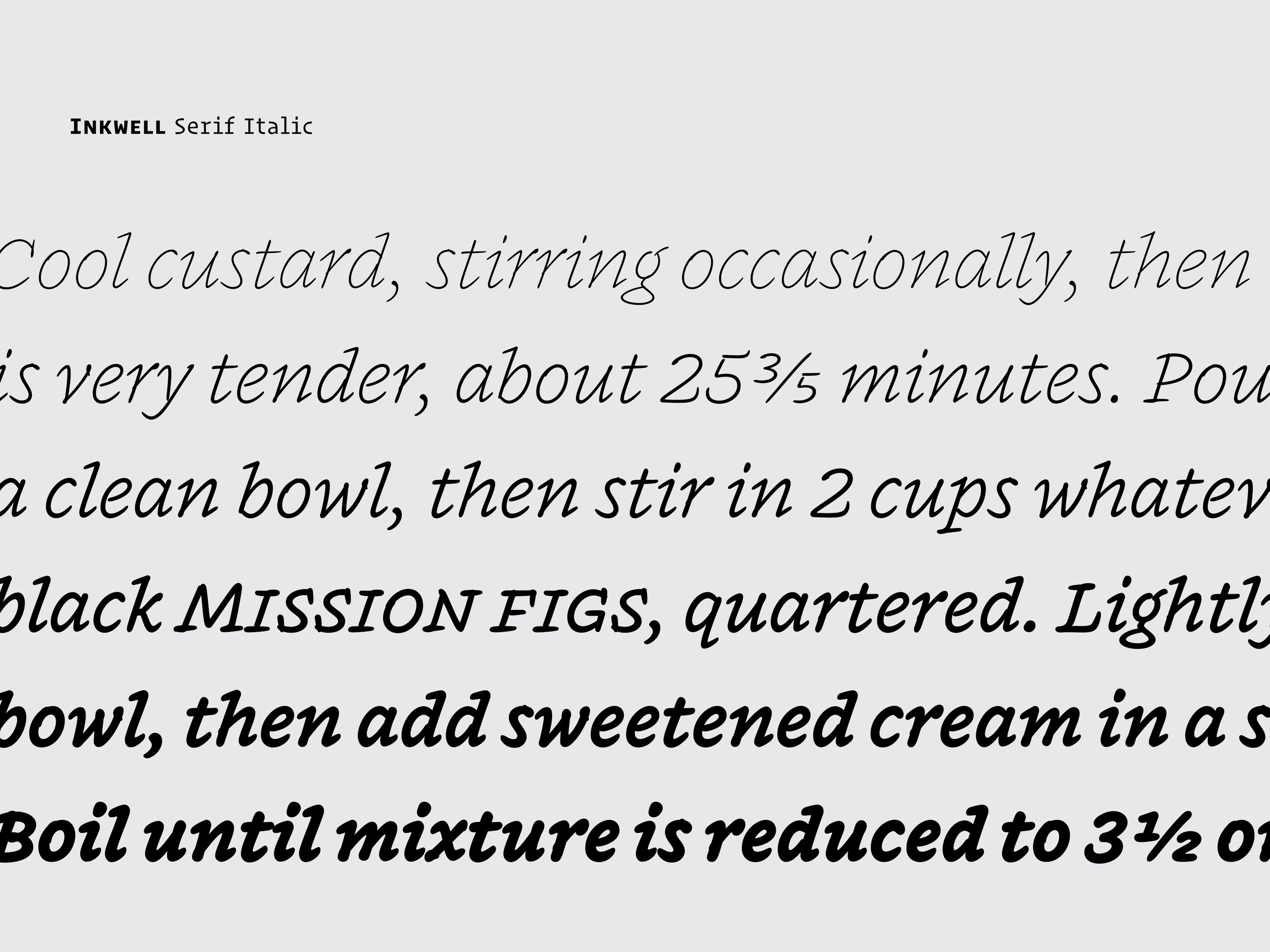
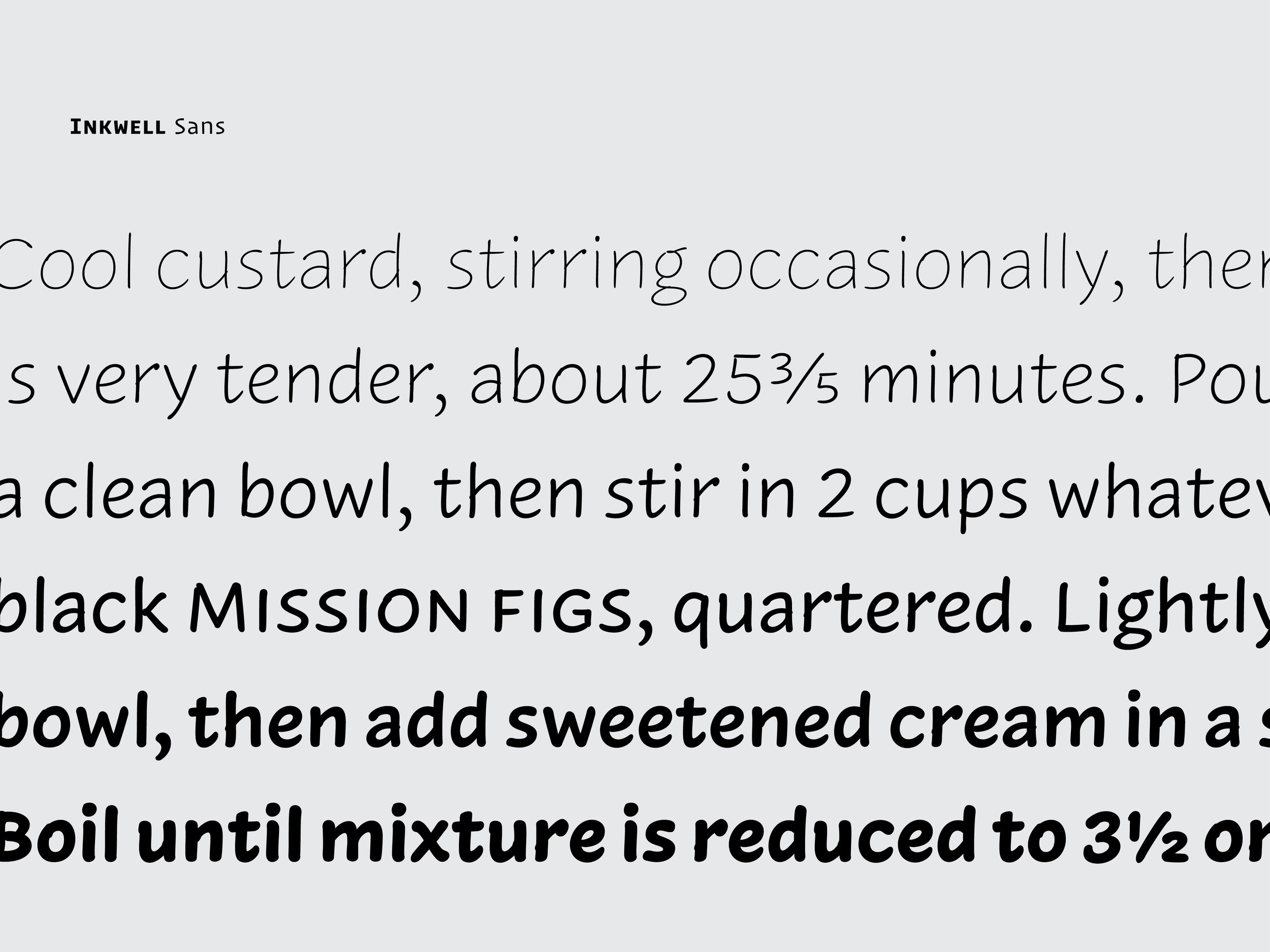
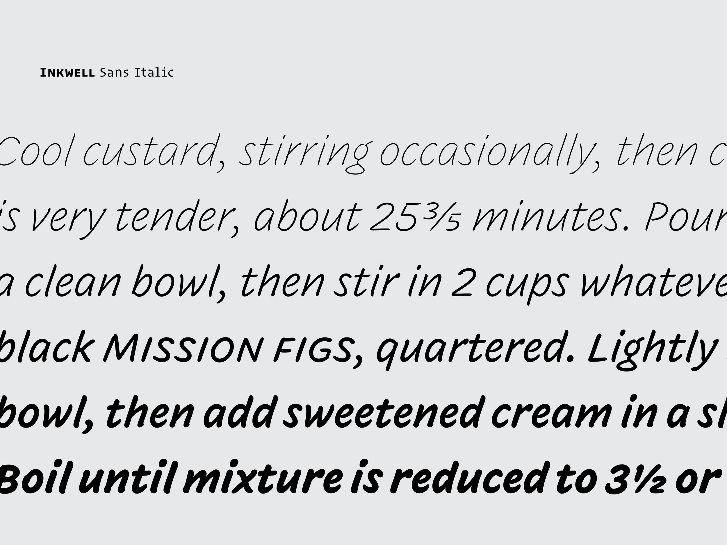
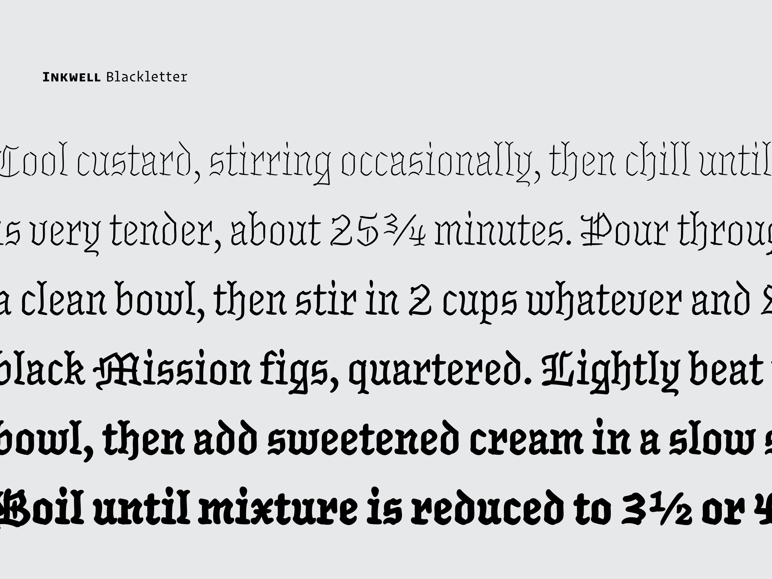
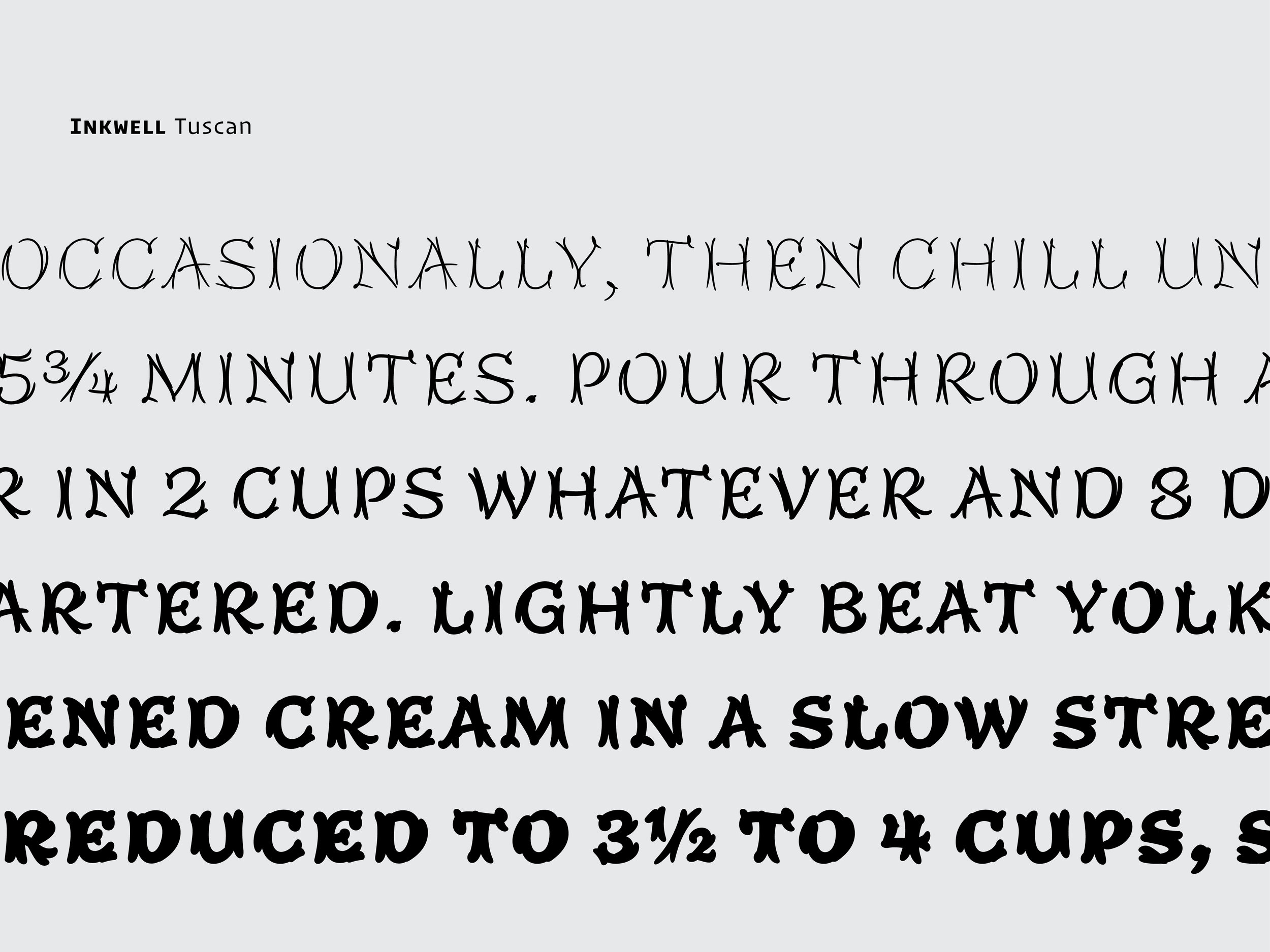
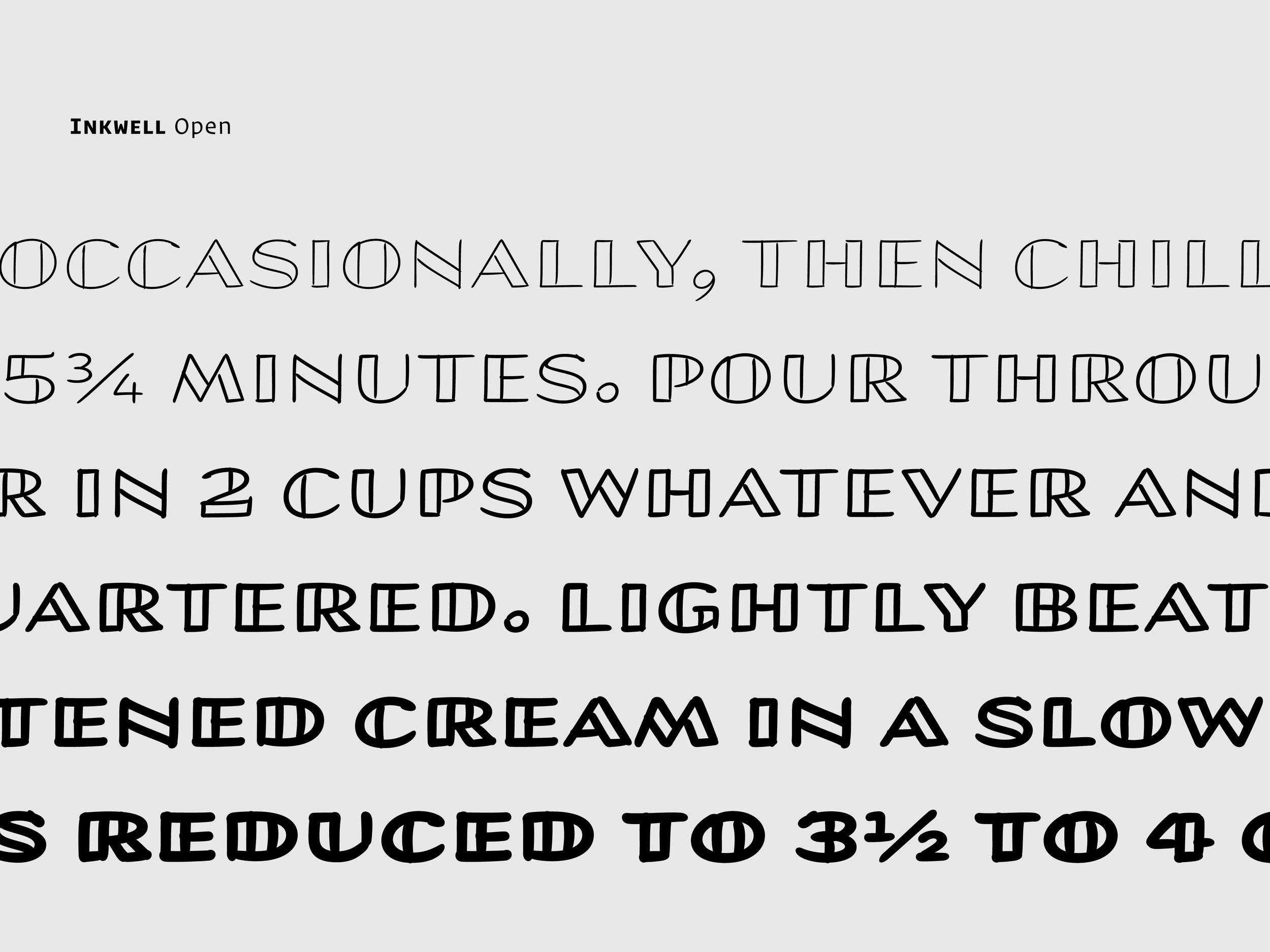
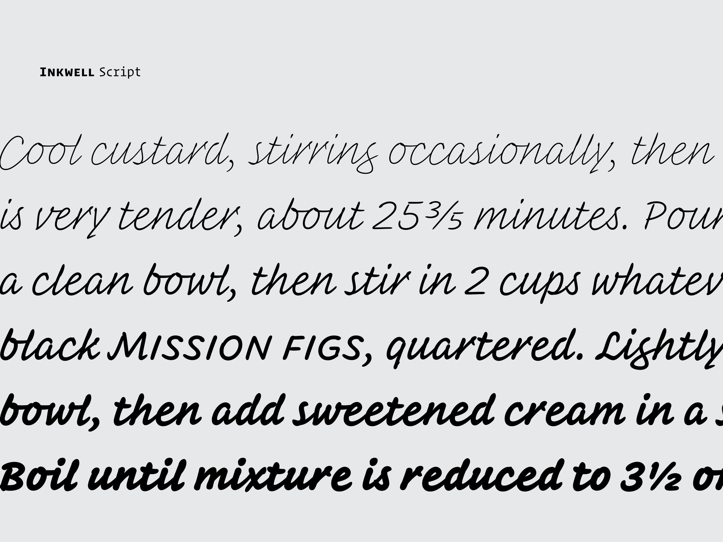
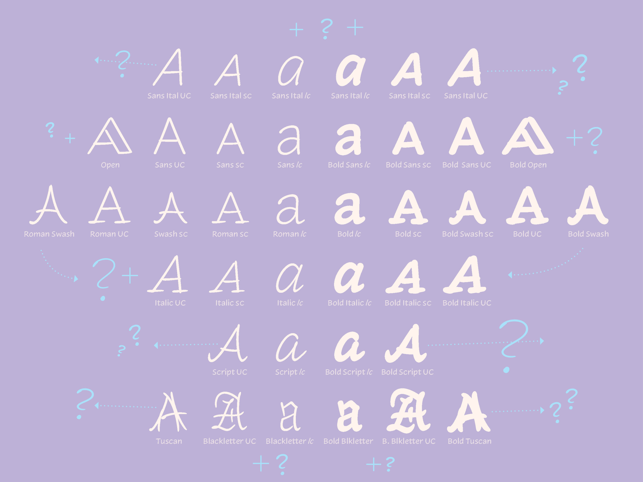
After Inkwell’s introduction, we got to work on the initial style – the Serif. We obviously couldn't stop here though so over the next year or so we sketched small caps and some swash caps and even swash small caps ‘cause why the hell not. But like I said earlier, it wouldn't be a typeface family ready for complex typography without Italics, right? We wanted more though, and so we sketched a Sans, as well as an Italic companion. After all, my handwriting feels closer to this, rather than a slabby serif. We gave Inkwell a Blackletter that blends Roman and Gothic forms, since, after all, it is all drawn by the same hand with the same tools. We drew an Open Sans for titling, much in the style that you may find on a blueprint or patent diagram. But we also wanted something a bit more ornate, so we added a Tuscan with twisting, doubled strokes instead of bifurcated endings because that felt more natural to a handwritten methodology. And we saved the Script for last, but it's definitely not the least of the styles. One can use all these styles for document typography or as display, with the styles even paired at different sizes to produce interesting illustrations of the intended tool.
Ideas for future projects
So, what now? What can we do with this? I have a few ideas:
Authorship
I’ve talked a lot about authorship today. Giving structure to typography is incredibly important and can be made easier depending on the tools that the designer has at his or her disposal. Multiple styles can not only assist hierarchical purposes in document design, but also benefit authorship or the individuality of said user. Inkwell boasts many different voices and aesthetics, which can be useful for many different environments and contexts. Don’t be afraid to use your voice, or even two! Especially if your trying to create a map for a wedding.
Gestures & motifs of lettering
As I alluded to earlier, while drawing Inkwell, I thought often of writing instruments and the specific motions involved. We are familiar with how each stroke of the pen creates a certain amount of contrast and stress, but I feel like we can do a better job at illustrating the effects of these gestures in our designs.
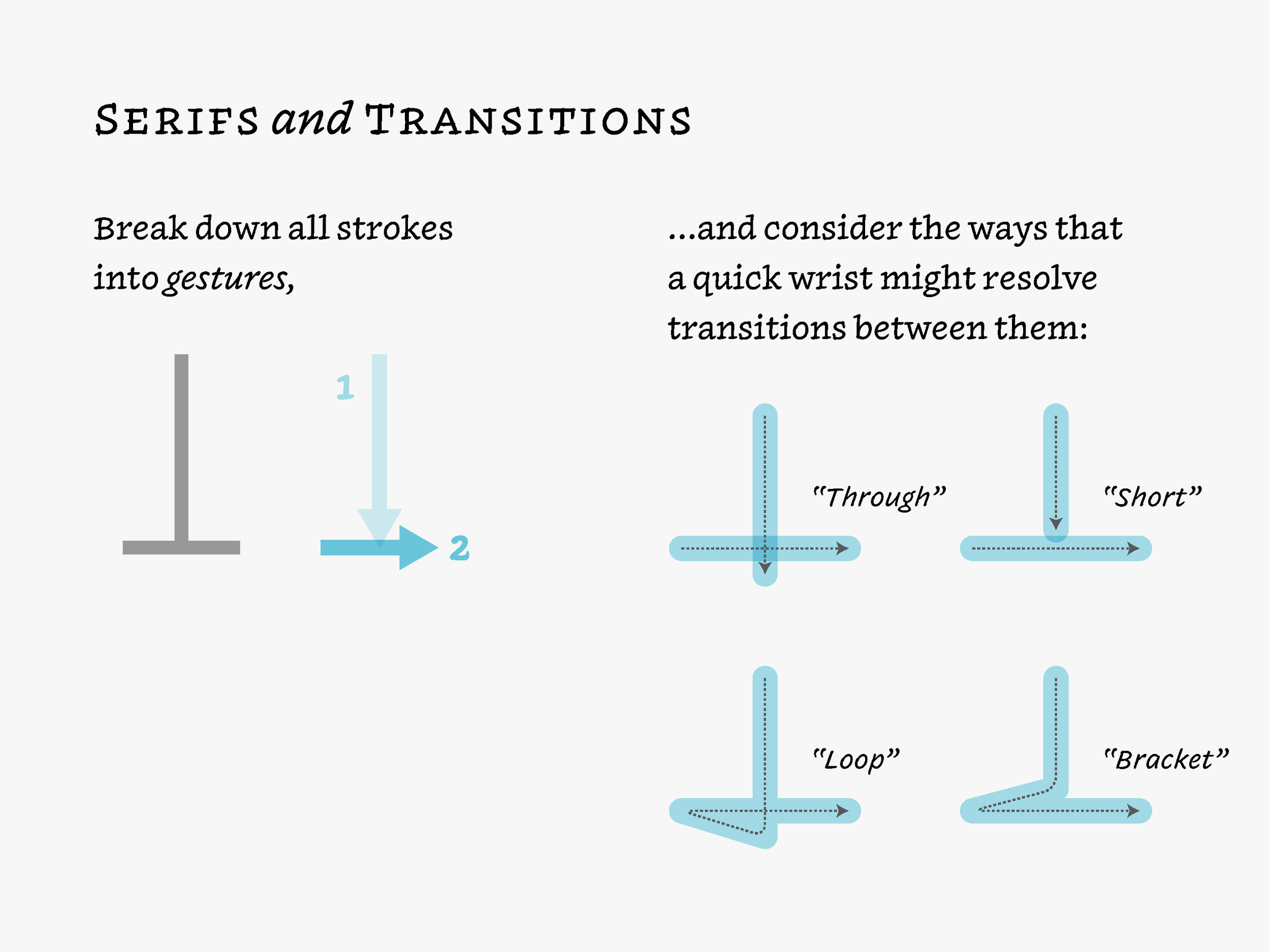
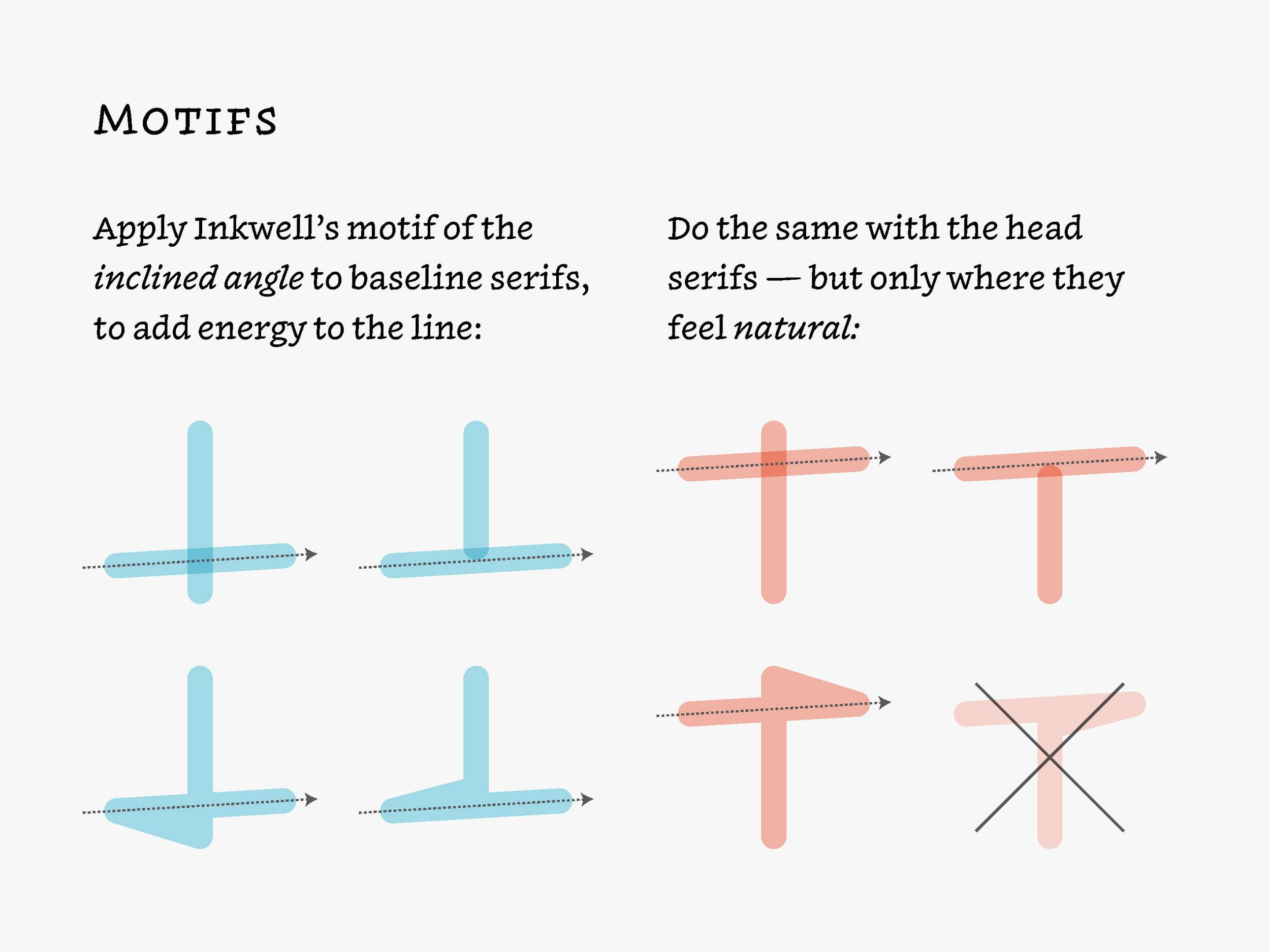
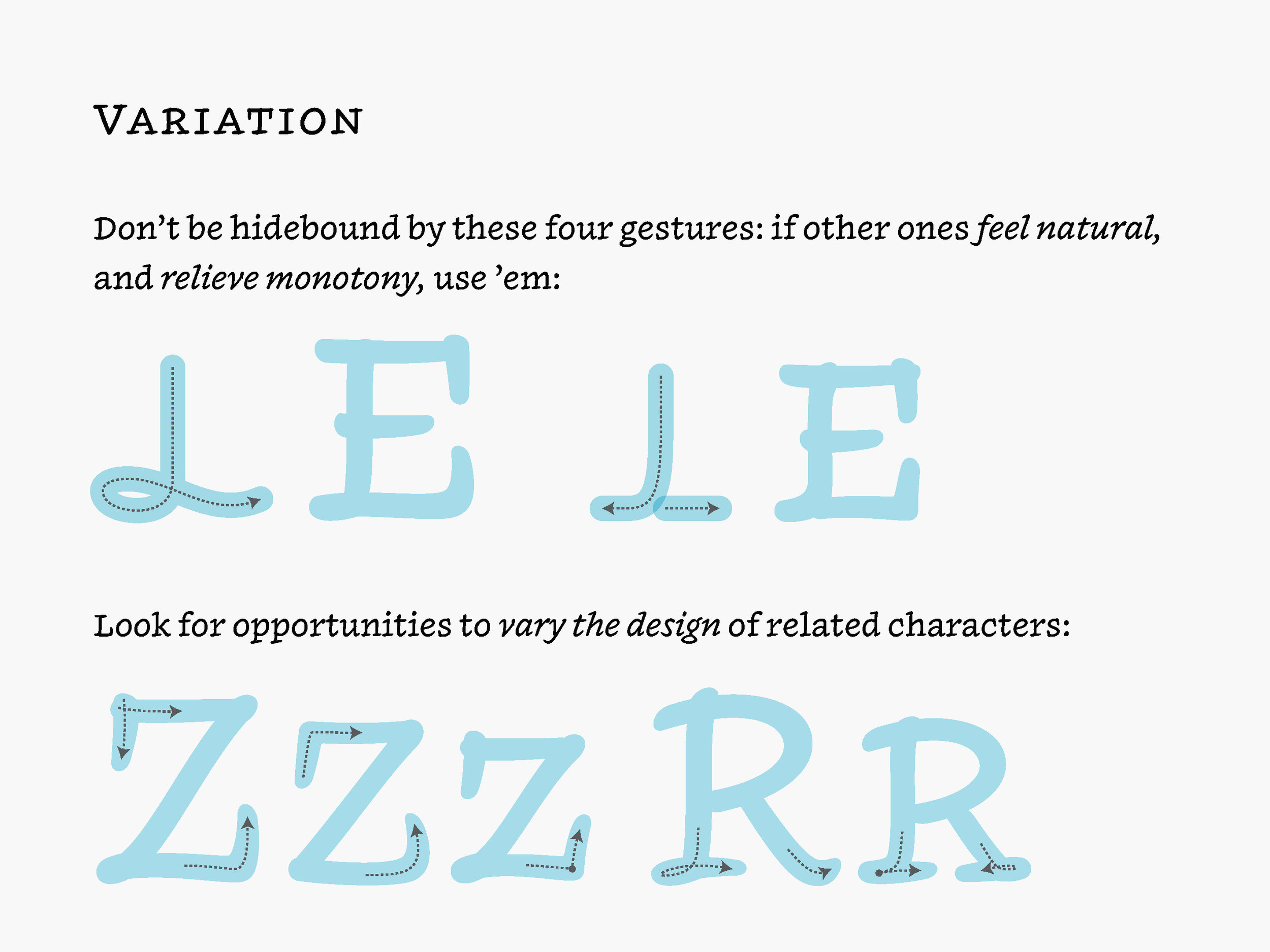
When Jonathan and I began working together on Inkwell, one of our first conversations was about how serifs should connect, which meant dissecting Jonathan’s sketches to see how they worked, then abstracting from these a set of rules, and then seeing if any characters didn’t fit the mold. This was the beginning of the “Inkwell Bible,” a long and growing collection of guidelines about what Inkwell should do. We used an organizational app, (shoutout to Trello!) to record these thoughts: How should serifs and transitions be constructed with regards to our natural handwritten gestures. One of the ways we tried to keep things from becoming monotonous was to try and apply these strategies differently throughout the character set, so that things like caps and small caps don’t follow the same underlying design. Therefore, within the serifs, spurs, overshoots, accidentals, and other funky variations there is unity through diversity. Because of this diversity, some shapes can be simplified, translated, or altogether different for specific typographical purposes. In many ways, Inkwell became about doing the things that you typically don’t do in a typeface, since our goal was to introduce not consistency but variation, up to the point where it even becomes noticeable.
When all these ideas come together, we have within any given glyph many small oddities mixing: The quick rotation of the wrist that I do when the ornamental stroke on the left of the Blackletter capital R slashes into the stem; the extroverted downstroke of said stem that overlaps the serif at the bottom a bit too far; the overly confident loop at the top; even the quick flick at the end of the leg. These aspects of our hand movements & gestures are uniquely individual, and as I learned in figure drawing, they not only help establish a style and voice, but they can also can serve a function as well.
You can see the functional aspect of these oddities in both a micro and macro level. Micro differences as in the minute changes in form of all the circular elements of a specific glyph set, and macro differences like the changes in form between divergent styles of lettering.
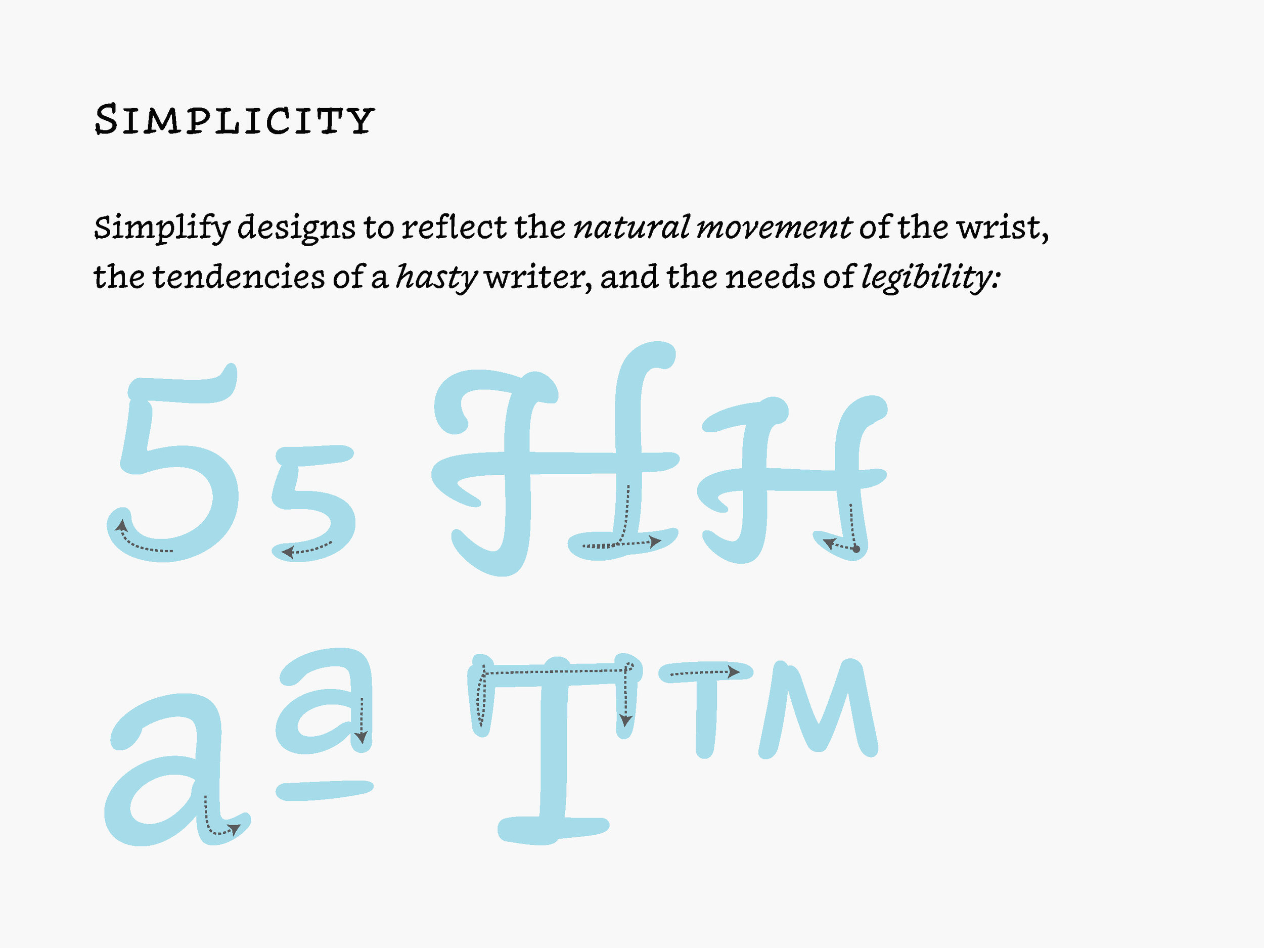
Conventions of typography & drawing
The images above are an illustration of just some of the unorthodox drawing methods we incorporated into Inkwell. These idiosyncratic moments and gestures are drawn a bit different from one master to another, sometimes even at different angles. Drawing like this is generally discouraged due to interpolation compatibility, but we exploited it in order to create more organic instances and even some funny moments like in the first example where the vertical hairline in the ‘5’ goes from completely isolated, to touching, to fully breaking through the stroke above. Instead of hindering our design, this drawing style helps the various weights to not appear so homogenous. I love seeing people playing with drawing conventions in their types, and I hope to see more of it in future projects. This practice does present a couple of fun and difficult questions though: Are these details in reality superfluous? And if so, is that bad? Do they possibly harm readability or legibility a bit too much thus causing unnecessary distractions? Maybe. But the answers to these questions must come with context in relation to the typeface or system they are within. Even so, there are many problems to solve other than Beatrice Warde’s “crystal goblet”. For within our handwriting are layers of messages. Besides the message that it’s literally carrying in the content, the forms are also delivering tone, intentionality, and acknowledgment. This can be seen in everything from why it’s difficult to select a font for a wedding map, to the notes we send to one another in the office.
There are always inadvertent slips and other humanistic moments within lettering and handwriting, but these moments give our messages a genuine personality; whether blunt and serious, or gentle and easy-going, and how we style this text effects the message as well. Emphasizing with all-caps, a quickly written script, or an entirely different style altogether does indeed effect the message’s reception. I will say, all fonts exhibit a personality in some way – but I’m interested in seeing how far we can imbue our written idiosyncrasies into our work while balancing usability. Inkwell is, among many other things, our attempt to play with this atypical idea.
For me, this was the single most fun and educational design project I’ve ever attempted. All projects are different, but we learn something from each, and you bring that something to the next one. Inkwell encouraged me to think about authorship and individuality, written gestures, family structure, and typographic orthodoxy in general, in a whole new light, and that in turn has given me an unquenchable thirst to continue learning and practicing design with these themes in mind. Fortunately, this project is potentially never-ending! I now want to add many more styles to Inkwell that fit within and broaden this idea, but time is not so kind. I hope to keep working on this problem for years to come though, because gestural, idiosyncratic lettering, and playful style pairing are two aspects of this profession that I’ve been interested in since graduate school.
I came here wanting to give a more in-depth look into my personal process and yes, Inkwell too. However, I’ll end on this: Weird sh*t is good, and we need more of it ;)
- JB
Thank you to UQÀM for hosting us, Gerry Leonidas, Liron Lavi, and the board at ATypI for inviting me to be apart of this special lectureship, and a special thanks to all the volunteers that helped all week to make sure the conference went smoothly. Last, but certainly not least, a major thank you to Jonathan Hoefler and everyone at H&Co for their support and help throughout this project. It was a pleasure and an honor. See you next year in Antwerp!
I've been following Type Fight for years. I first found out about the competition as an young graphic design student in Abilene, Texas. Five years later, I am a contender! I'm up against the very talented Mercè Núñez. Hoping for a nice, clean fight :D
Type Fight was a powerful and inspirational site for us as students because it forced the designers & letterers to work with incredible boundaries and restraints – 1000x1000, cannot collaborate, not too illustrative, no physical objects, but no color or style limitation. These parameters are generally quite different from an actual clients request where there very well might be no size or medium limitation, but a specific color palette or aesthetic may be required. Overall, these were exciting (and educational!) projects to analyze and critique as a student. Why would the hardly recognizable blackletter 'a' get 70% of the vote over a clean, beautifully drawn script? The more fights you see the easier it becomes to predict trends or winners, but its still good fun and a nice break from student work.
All that to say, I’m super excited and honored to have been asked to participate. Thanks Drew and Bryan and great fight Mercè!
I wanted to share a bit of the process behind my submission. So, I posted up a new screen shots below. The first being the initial drawing of the skeleton of my submission. I started by drawing the inner-most and outer-most shapes, then 'interpolated' them (or algorithmically blended with specific software tools created by type designers), I was left with these 5 instances in-between the two poles. Secondly, I interpolated even more instances to create the next drawing. Since these lines were even closer to each other it created a nearly chrome-like effect. Because of this, I nearly submitted it as my entry into Type Fight as is. After these two sketches, I began to construct the final design. I used the first drawing as the wireframe of the 'neon lights' and the second drawing was used as the 'backing' of the 3-dimensional signage. I then started adding color, shadows, and texture. The third shot appeared somewhere in that process and at the time I thought it was freakin' awesome. Which it is obviously not lol. I continued to work on the piece and even toyed with the idea of a bitmap, pixilated iteration (shot #4) but in the end I tossed up a new color scheme, added a bit of texture for shadows, some detail here and there, and shot it over to the fine folks at Type Fight.
Hope that was fun, informative or at least interesting. Peace! JB
If I haven't been busy designing multiple typefaces and rewriting my dissertation proposal I've been hiding out in my flat watching House of Cards or True Detective (amazing stuff, really). The past couple of months have seen my typefaces and designs completely evolve. Hopefully that evolution is for the better. There is so much 'behind the scenes work' when all you want to change is, for example, a curve on the shoulder of the "n" or how the descenders look. When you modify one little thing you have to do it to all the glyphs over 3 masters (Thin, Regular, and Fat) and to the italics (which also have 3 masters)! But the design is in the details, so changing tiny things have made big differences. All that to say, I am enjoying my designs and my education (and also that True Detective... wow).
We recently had a week of design with Gerard Unger and a Adobe FDK (Font Development Kit) workshop with Frank Grießhammer from @kioskfonts. Both sessions and designers gave me really great feedback and also strengthened my ideas on the direction and use of my project.
I only have one more week of class until our Spring Break – which is an amazing five weeks long. But before then, I have to send in a revised disertation proposal and I also have to present my project for the final critique of the semester. During the break, I will be visiting Dublin and maybe some of the Irish countryside. This past week though, I have been in Antwerp, Amsterdam and The Hague visiting museums of art and typography, eating delicious food, and hanging out with some really cool kids. More on that in the next post though. Hope you enjoy the designs below!
We are now approaching the end of the first term here at Reading University MATD and I (would like to think) have made progress on my practical work! While I have been developing my typefaces, I had been working on other projects as well. You can see some of these designs in the "Featured" tab above.
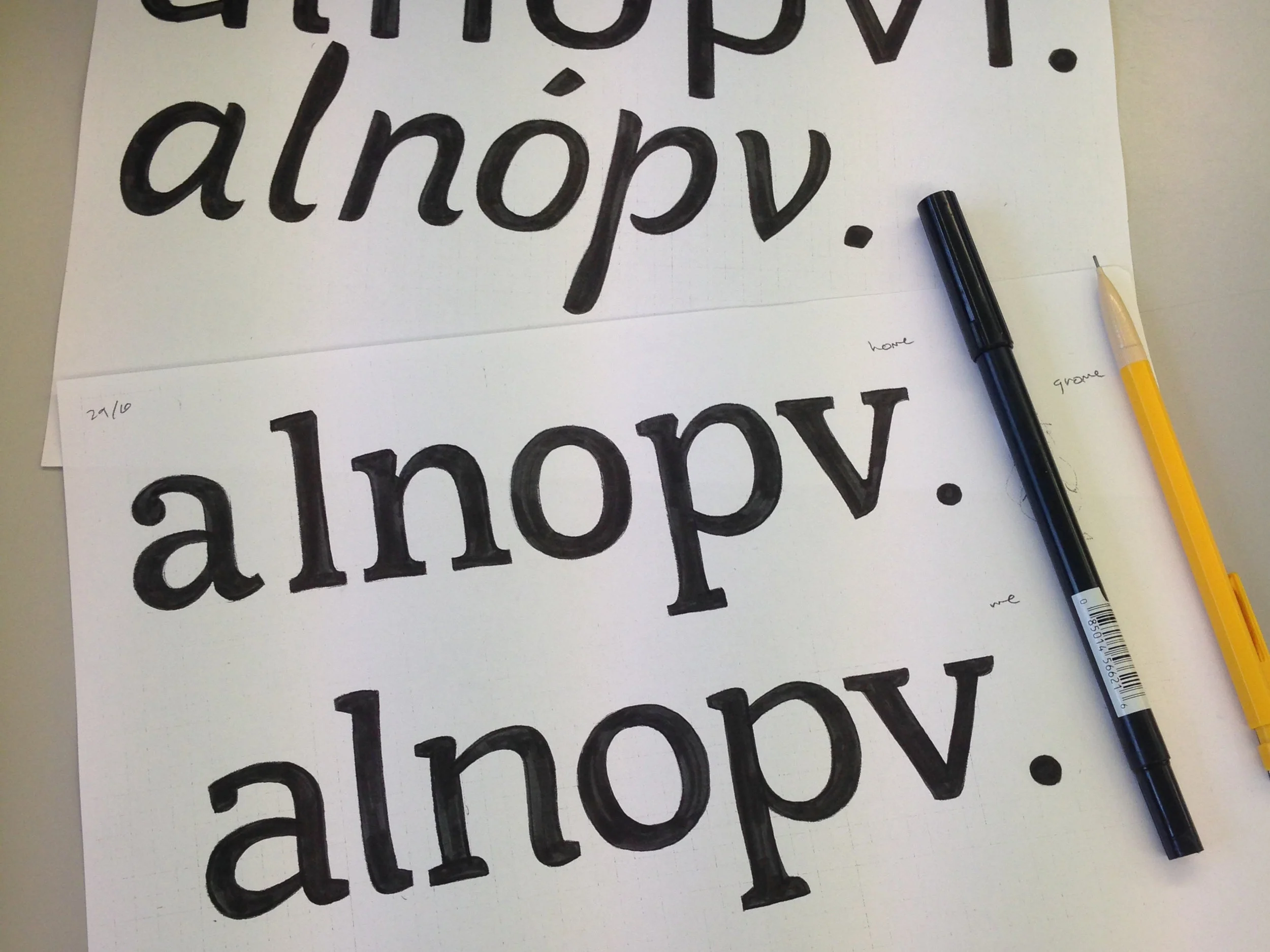
For the first of my typeface projects I have created a friendly, versatile serif family that will be accompanied by extreme weights (thin and FAT) that can be used for editorial or general use. This project will probably be my main focus throughout the year, since it will have many weights and styles. I also believe this typeface has the most potential of the bunch because I do not know many on the market that are similar. I drew inspiration from humanistic imperfections in writing, and the aesthetic qualities of brush lettering. You can see this typeface in the first 3 examples at the bottom of this article.
But even before I drew my first "a" of that typeface, I started creating an "italic" that wasn't even first thought of as an italic. I drew this font first as brush lettering for a project at Cisneros Design. I looked at it one day and thought to myself, "hmm, that could be neat as a typeface!" So, in reality, it is a italic with no regular. I thought about adding a regular to it, but maybe it's more of a lone wolf and can get along just fine by itself! Some thought I was crazy at first, but this idea of creating an italic before the regular is quite fun and will hopefully lead to even more exciting discoveries. You can see this font in the fourth string of text below.
I also was roaming around the intertron (yes, technical term) one day and stumbled across an old type specimen by the Ludlow Typograph Company in Chicago that dates back to 1958. However, inside the specimen there are typefaces that were punched and cut in the 1920s. A few of these designs caught my eye with their brilliant, unique, vintage feel and I wondered if anyone had made digital drawings of them. After perusing around some nerdy typography sites, I found nothing. So, I decided to start digitising revivals of my own! Obviously though, my drawings are not direct revivals, but merely inspired revivals. Not only have I been able to learn more about this company and the designs, but I have also enjoyed every minute (or countless hours) of reviving the type. This project is no where near complete, but I plan on working on it when I have some spare time. This font is shown on the last line below.
Hopefully something in these typefaces will catch your eye. These are works in progress, but feedback and critique are greatly appreciated. Enjoy.