Created this guy while on holiday in Texas. It's a good place with good people :]

Operator
Today we released the second major project I have worked on in my time at H&Co – Operator! What an absolute joy it is to share this with everyone. I will start off this (hopefully short) post by saying it is not my own design. It was an incredible team effort from the entire H&Co staff but Jonathan Hoefler and Andy Clymer are the real heros here. I'll give a brief explanation below:
On most of my projects, Andy is my supervisor. This was the case during the Archer Ultra extension since he had experience designing the originals. After that project wrapped up he asked if I could help out with Operator. I was giddy. I had seen some proofs around the office and loved where this project was headed. Also, we didn't have anything like this in our library. To be working on the first H&Co monospace typeface was pretty darn exciting too. Operator has the right amount of digital flair, but still fells human. It's quirky, but still manages to behave in serious settings. These are the kind of design problems that I love solving – how do you give a design enough character or personality without invading its usability or functional aspects? I dabbled around with this question some during my time at Reading, but ever since I joined the team at H&Co and have worked on projects like Archer Ultra and now Operator, it's now starting to become a serious interest of mine. As for many in the history of art and design, the balance of personality and function is a welcome challenge and I have absolutely loved working on these projects. We hope you enjoy Operator. Check it out!


“Puttin’ on the sheriff badge always did give me a sense of pride. Feels good to be back. Doin’ my best to help this here town of Kernsville. Buncha new faces ’round these parts. Lots of ‘em getting lazy, spacin’ out and lettin’ loose. Some nestlin’ up too close even. Back in the day those kinda characters got filed and beat into shape. These days it just takes a quick nudge here and a kindly kern there, and they’re back on the right track. Amblin’ down the smooth road of Fine Typography…”
– Sheriff’s opening monologue
Type Fight!
I've been following Type Fight for years. I first found out about the competition as an young graphic design student in Abilene, Texas. Five years later, I am a contender! I'm up against the very talented Mercè Núñez. Hoping for a nice, clean fight :D
Type Fight was a powerful and inspirational site for us as students because it forced the designers & letterers to work with incredible boundaries and restraints – 1000x1000, cannot collaborate, not too illustrative, no physical objects, but no color or style limitation. These parameters are generally quite different from an actual clients request where there very well might be no size or medium limitation, but a specific color palette or aesthetic may be required. Overall, these were exciting (and educational!) projects to analyze and critique as a student. Why would the hardly recognizable blackletter 'a' get 70% of the vote over a clean, beautifully drawn script? The more fights you see the easier it becomes to predict trends or winners, but its still good fun and a nice break from student work.
All that to say, I’m super excited and honored to have been asked to participate. Thanks Drew and Bryan and great fight Mercè!

I wanted to share a bit of the process behind my submission. So, I posted up a new screen shots below. The first being the initial drawing of the skeleton of my submission. I started by drawing the inner-most and outer-most shapes, then 'interpolated' them (or algorithmically blended with specific software tools created by type designers), I was left with these 5 instances in-between the two poles. Secondly, I interpolated even more instances to create the next drawing. Since these lines were even closer to each other it created a nearly chrome-like effect. Because of this, I nearly submitted it as my entry into Type Fight as is. After these two sketches, I began to construct the final design. I used the first drawing as the wireframe of the 'neon lights' and the second drawing was used as the 'backing' of the 3-dimensional signage. I then started adding color, shadows, and texture. The third shot appeared somewhere in that process and at the time I thought it was freakin' awesome. Which it is obviously not lol. I continued to work on the piece and even toyed with the idea of a bitmap, pixilated iteration (shot #4) but in the end I tossed up a new color scheme, added a bit of texture for shadows, some detail here and there, and shot it over to the fine folks at Type Fight.
Hope that was fun, informative or at least interesting. Peace! JB
Happy Holidays!

Archer Ultras!

With this being my first official typeface release, I have been looking forward to announce Archer Heavyweights for some time now. I started working on this project on my second day at H&Co., we finished it up earlier this summer, and I have loved every minute of the process. As a designer, you truly learn a lot about type design when drawing an Ultra-weight extension. All the fundamentals of type design become very pronounced due to the increased weight and smaller amount of negative space you can work with. This causes just about everything to hinge on 1-2 unit (1000upm) moves – which ironically sounds backwards since there is so much weight to work with.
In Archer, I worked on many different aspects of type design that I didn't have much experience at or never even attempted before. This included very thorough kerning, comprehensive testing on multiple platforms, subsetting, and many other forms of production and mastering. Some people may say these tasks are a bit dull, but I actually enjoyed them! These necessary tasks taught me so much more about my project and type design in general. They also gave me further insight into what goes into a truly well-designed product. Anyways, I could blab on and on about how much I enjoyed designing thicc Archer, but Jonathan writes much more elegantly about it on our site. Check it out, and I hope you enjoy!
New Yorkiversary
As a Freshman in college I dreamed of living in NYC. I knew a couple designers that lived or worked here and I thought they were the coolest cats in town. As a Sophomore, I traveled to NYC with the ACU design department to check out the museums, do some studio tours, talk with professionals, stare at graffiti, and to learn about outrageous rent prices. I think it was on that trip, sitting in Fette Sau in Williamsburg with some really chill dudes, that I decided I had to live here.
Now it's been a year folks. Does this finally mean I'm a New Yorker?! As the great Brooklynite Mos Def once said "We all have some place where we come from / This place that we come from is called home / Even though we may love, this place on the map / It ain't where ya from, it's where ya at". New York feels like a second home now. It ain't home, but it's definitely where I'm at, and I love it more everyday.
Tattoo Lettering
My good friend Sarah asked me to design a tattoo for her recently. I had never designed something that would be permanently adhered to someones body, so I gladly accepted! She wanted one of her favorites quotes, written in the original Greek, along her forearm. My good friend Matthew, who holds a doctorate in Theology and is also more or less expert in Greek scripture, transliterated the text and gave me the correct grammar and phrasing. We obviously don't mess around when it comes to designing Greek! After doing a bit of research into Greek handwriting models, I found some beautiful forms and even natural ligatures. I incorporated some of these newfound forms into my sketches – primarily done with pencil and felt tip pen. The outcome was this humanistic, brush-inspired, lettering you see below.
It simply states, "Love bears all things".

Typographics
New York in the spring is seriously awesome. Warm weather hits, everyone is outside on the balconies and in the parks, kicking back, eating well, and enjoying the city. Maybe all the terrible winter weather is really worth it?!
Another great thing about this time of year is all the wonderful conferences going on around the world in our little typographic realm. Kerning just finished and ISType starts tomorrow, but the most infant of them, Typographics held in NYC, initiated its 1st gathering today. The likes of Roger Black, Louise Fili, Steven Heller, Seymour Chwast, Paula Scher, Erik van Blockland, Alexander Tochilovsky, Sumner Stone, and of course, the brilliant Jonathan Hoefler kicked it off with talks spanning "the good old days" of typography before the Mac, to live interpolation & animation on the web. It's been spectacular day for us typophiles.
In Jonathan's truly inspiring talk, he shared a few pretty sweet images – Along with the amazing photo of himself when he was 18 (which I unfortunately was not able to screen grab quick enough ;] ), and the images & sounds from his father's "Industrial Musicals", he also had a slide of our team photos that were recently taken. Something about seeing our photos up there was just really freakin' awesome. So proud to be apart of this fantastic team!
If you can, tune into the live stream tomorrow for more amazing talks from some of the world's best.

Image taken from from @AJWShaughnessy – Thanks!
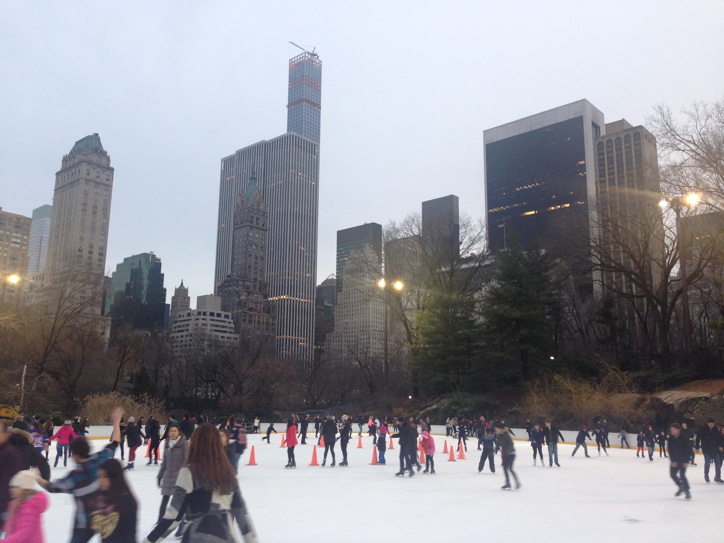
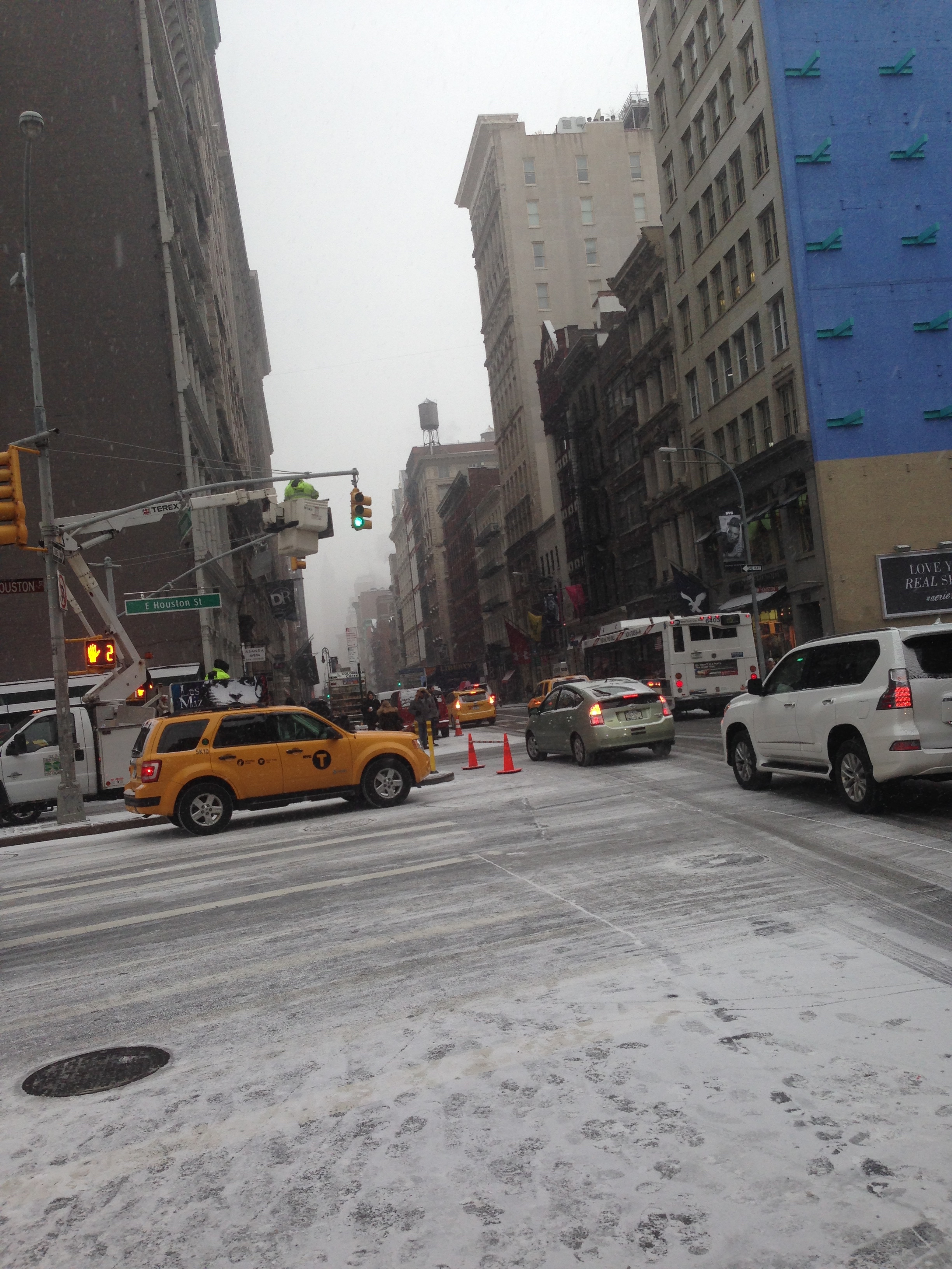
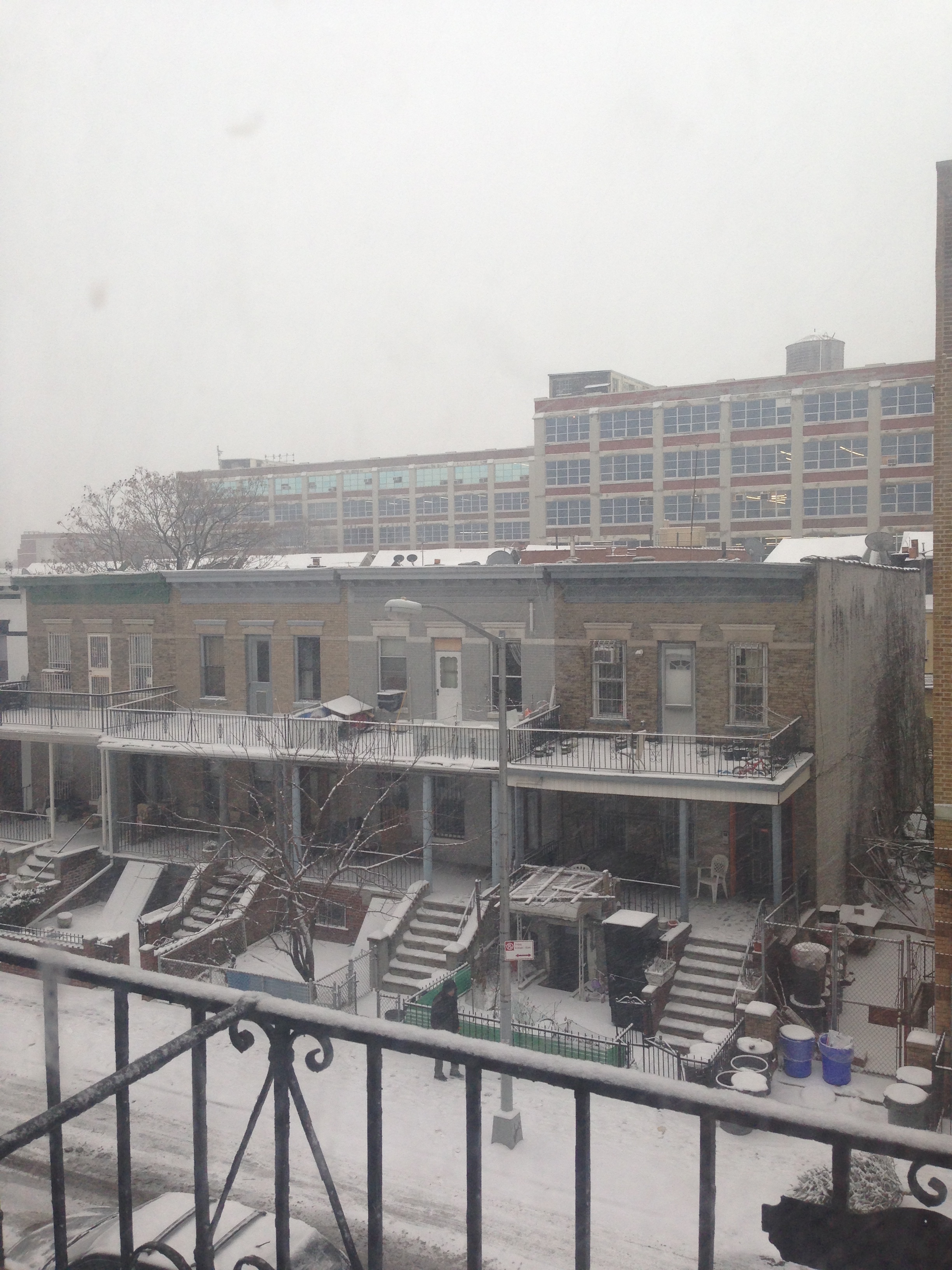
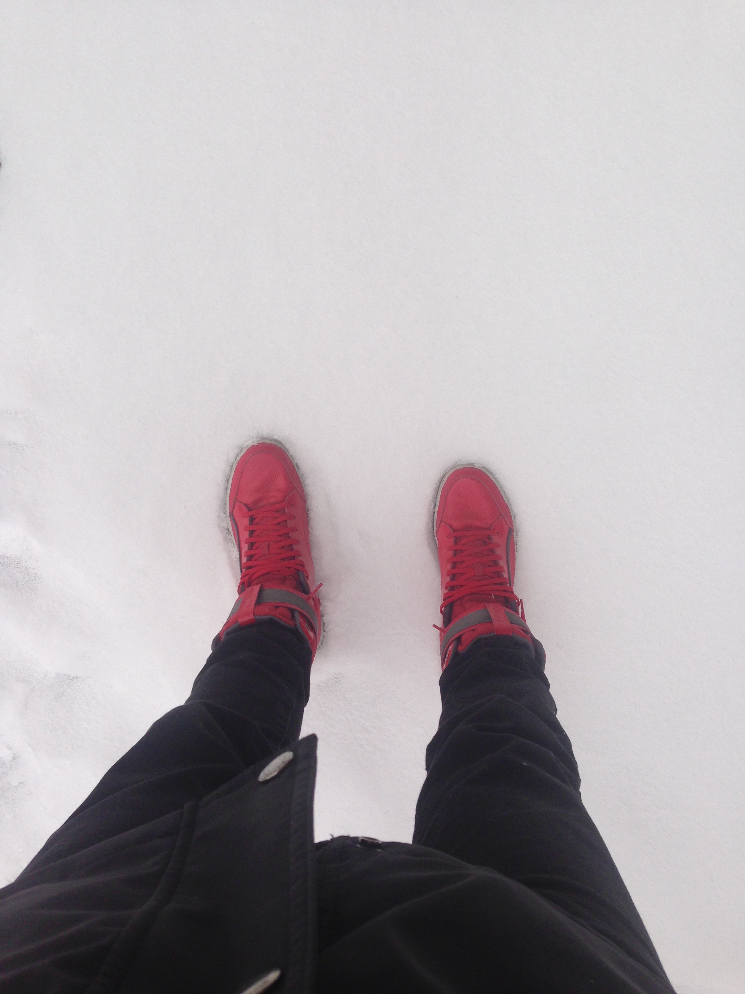
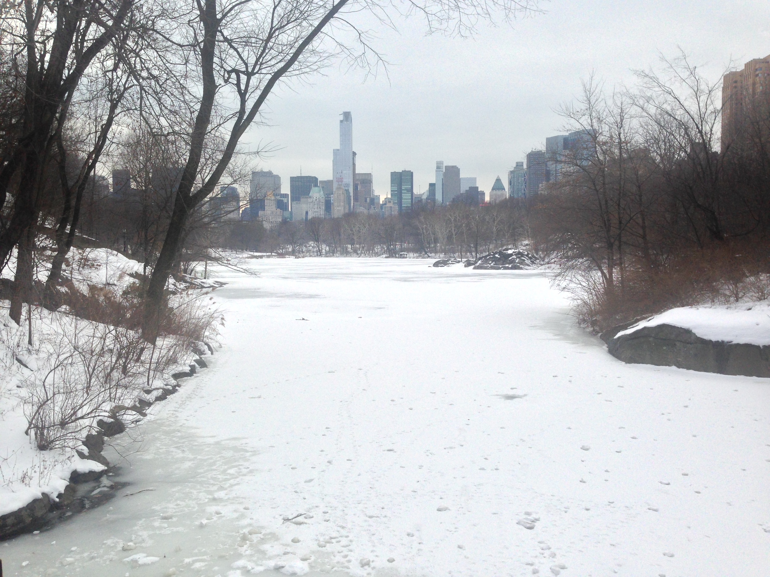
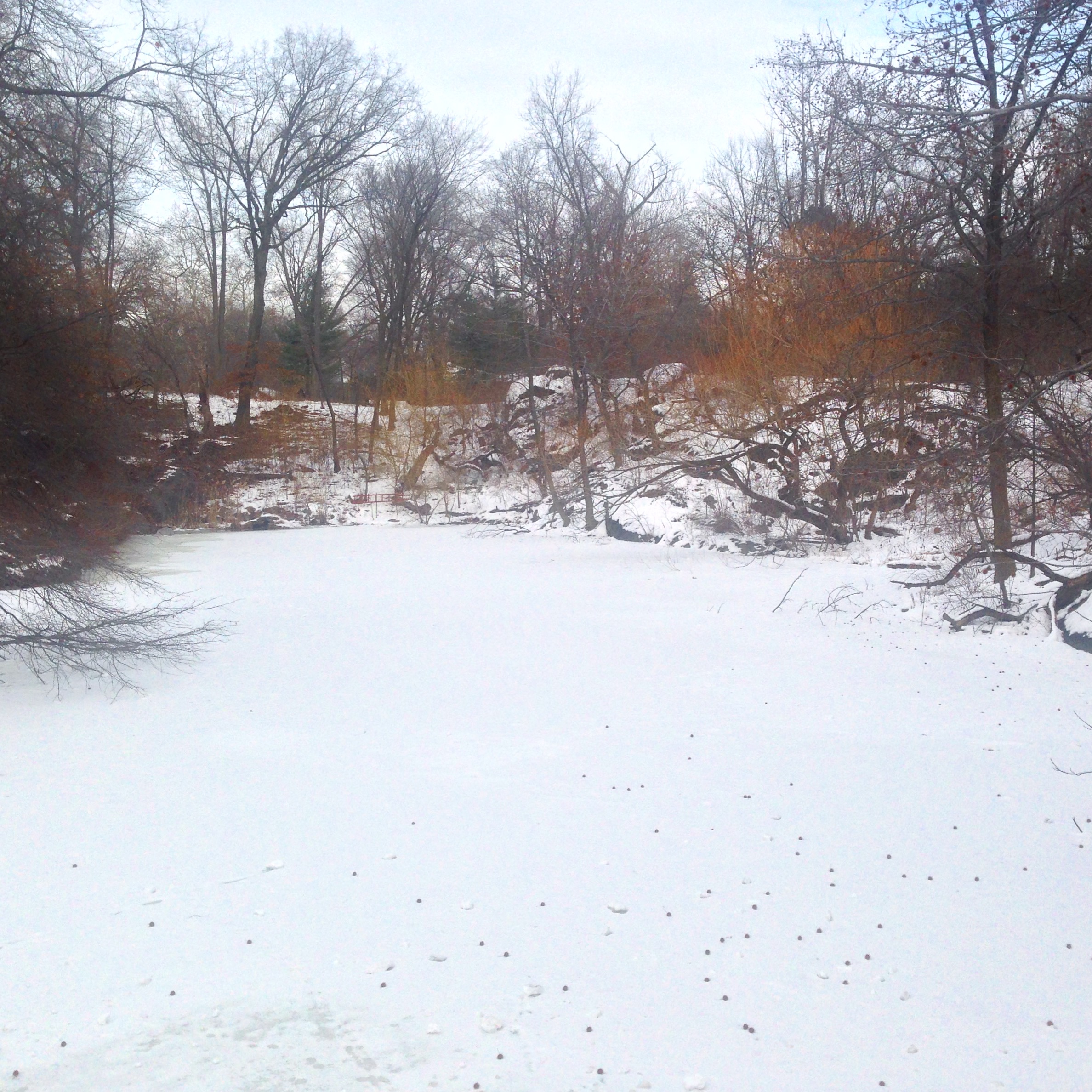
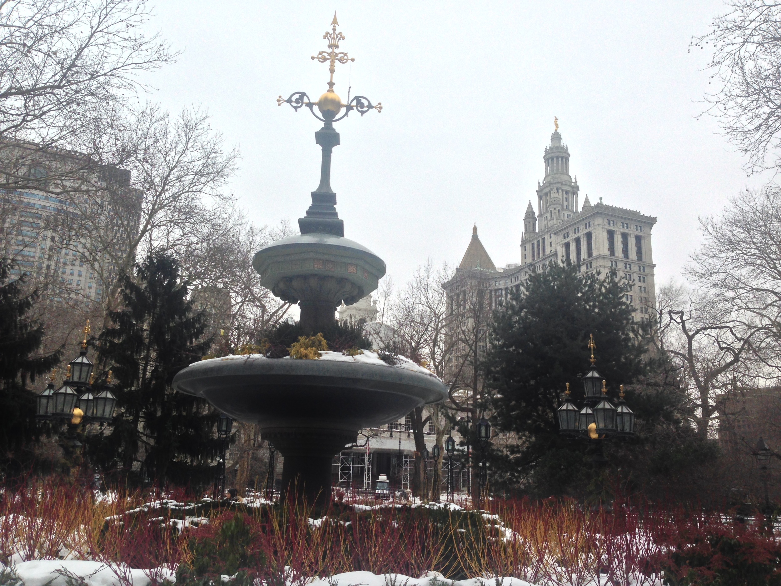
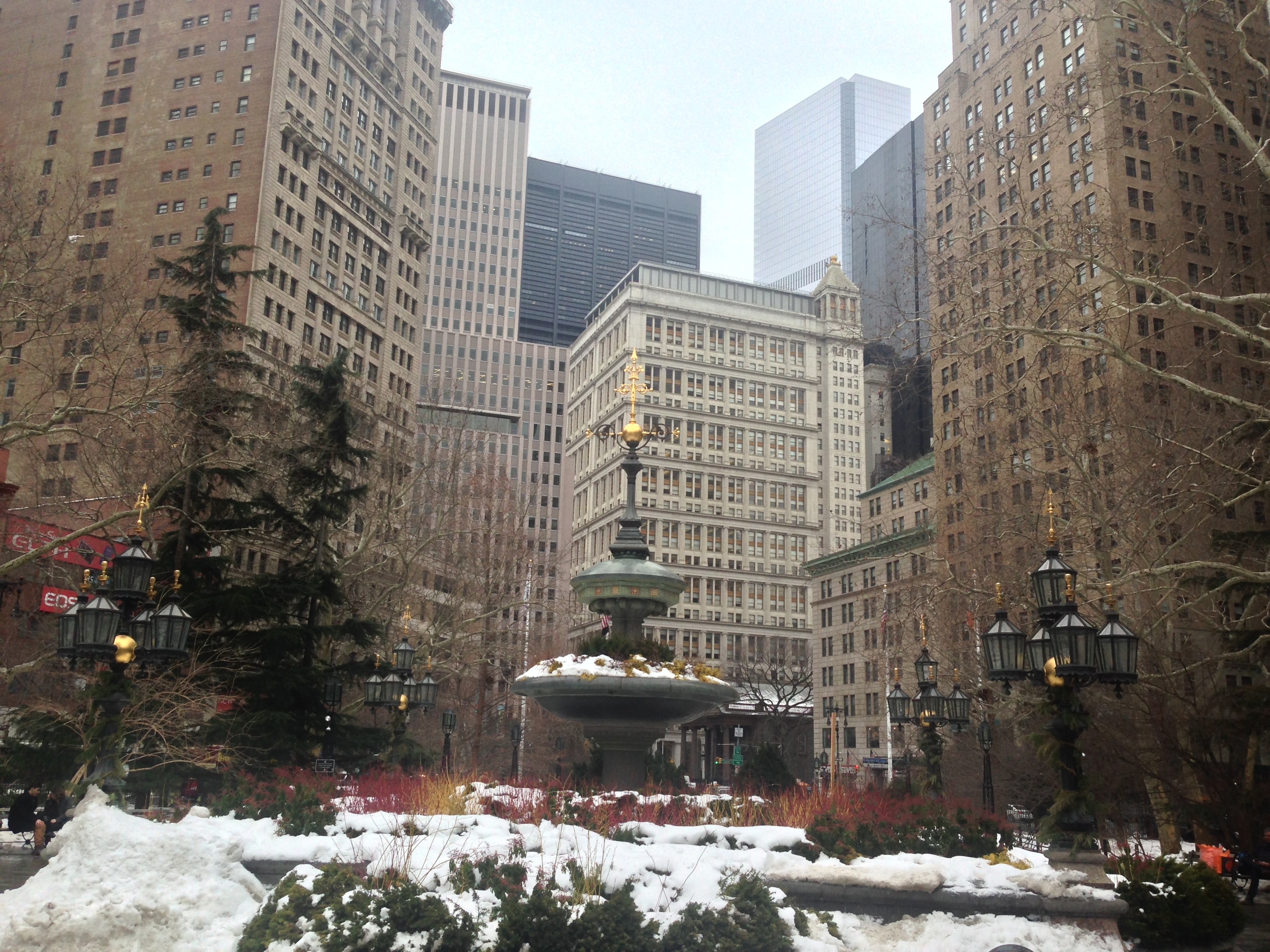
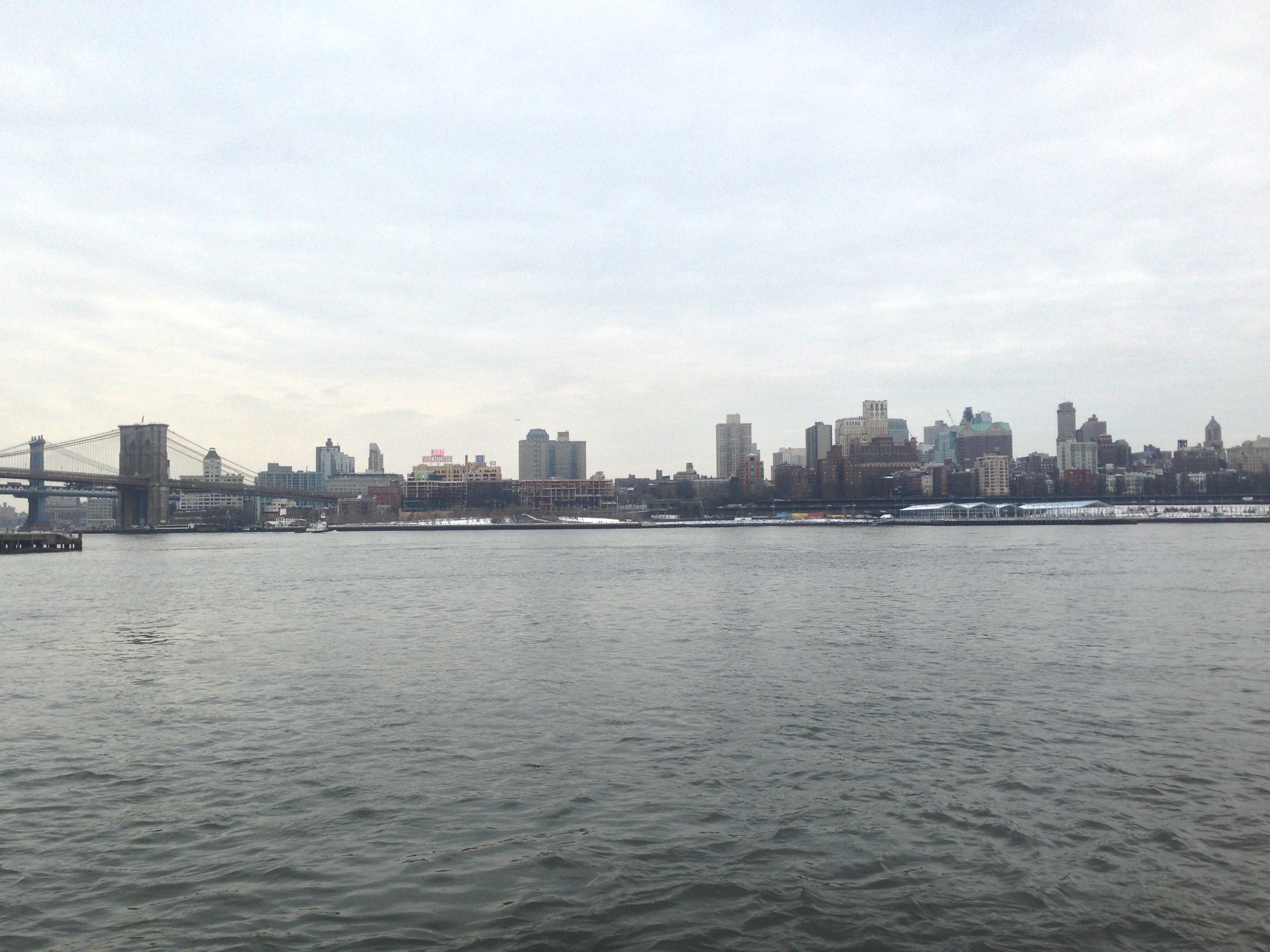
New York in the Winter
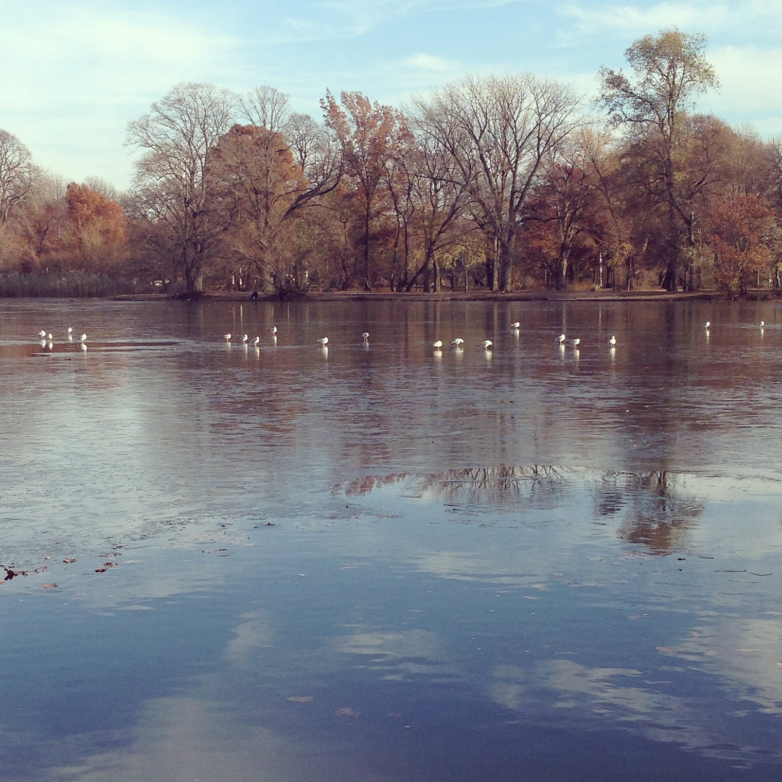
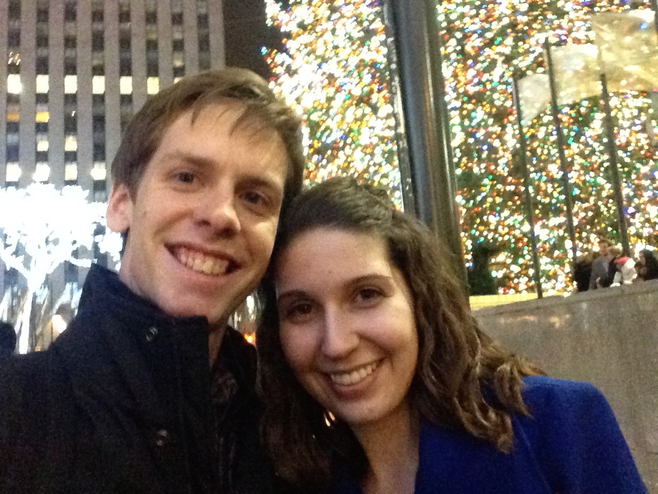
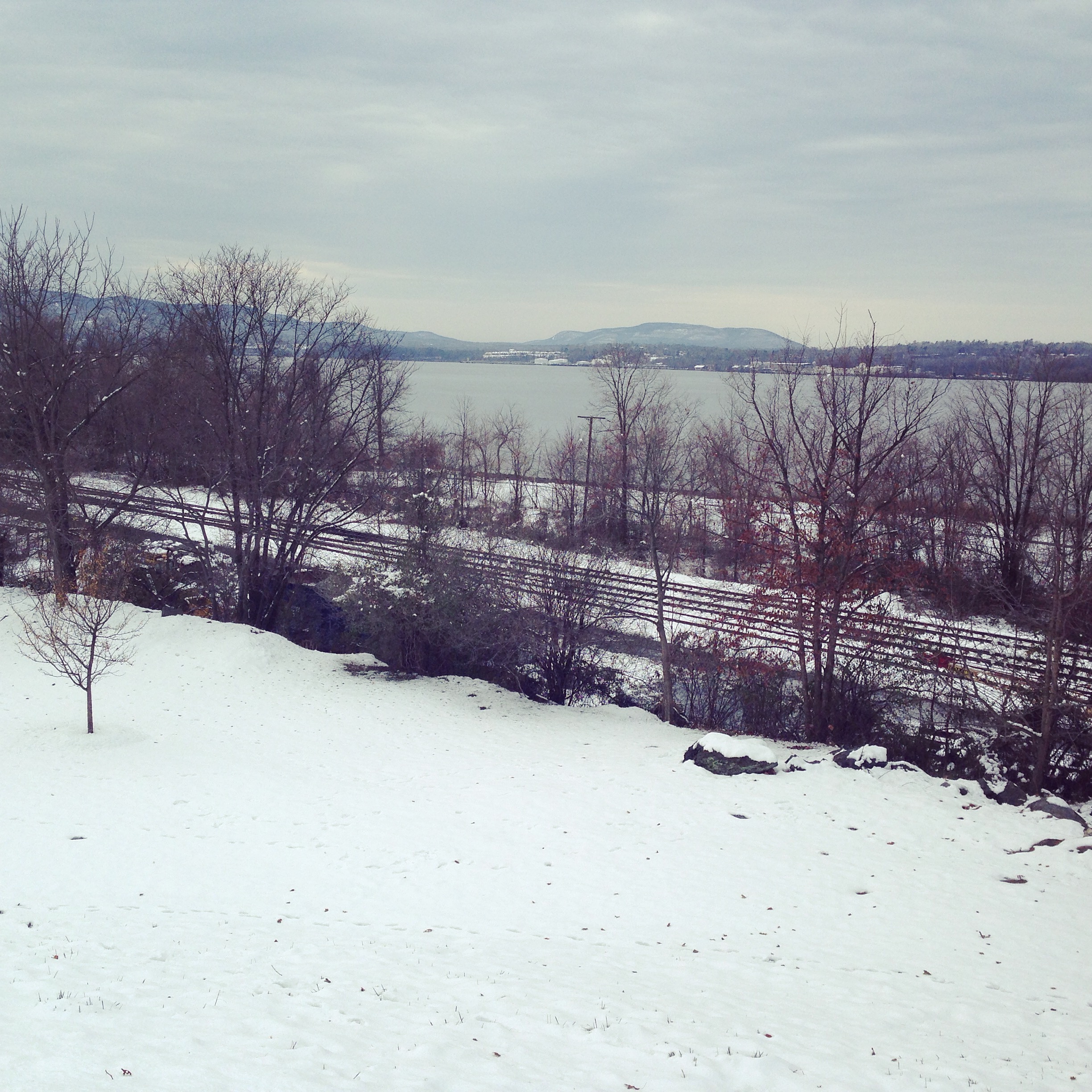
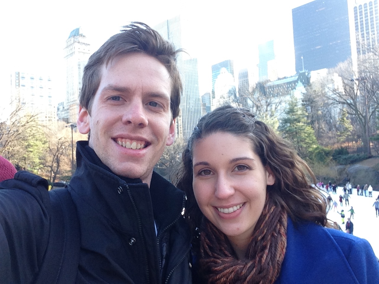
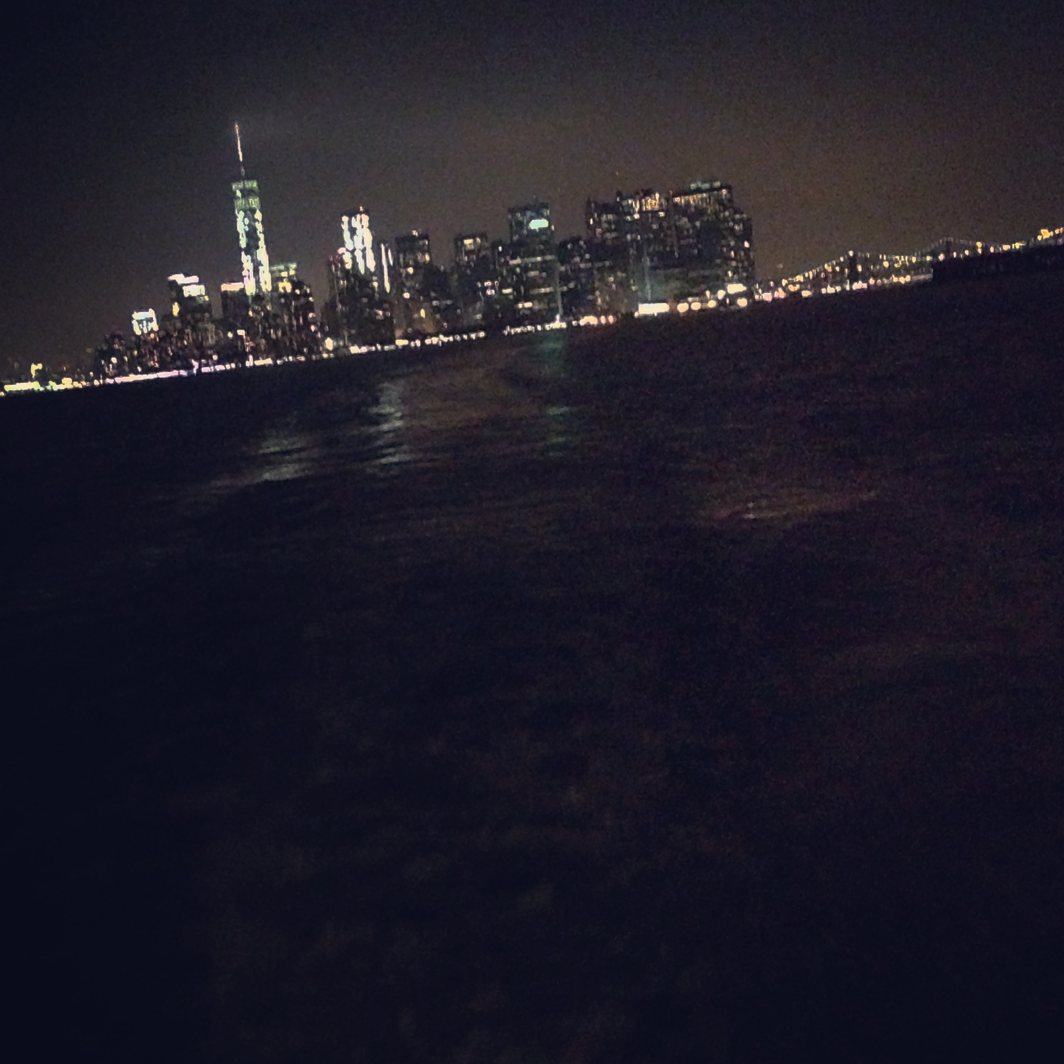
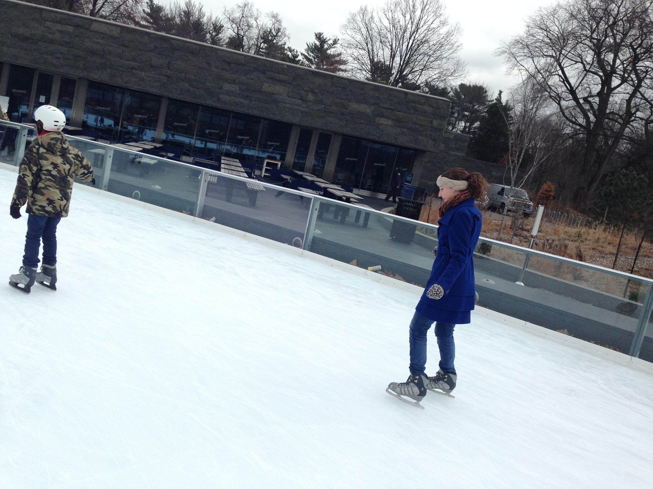
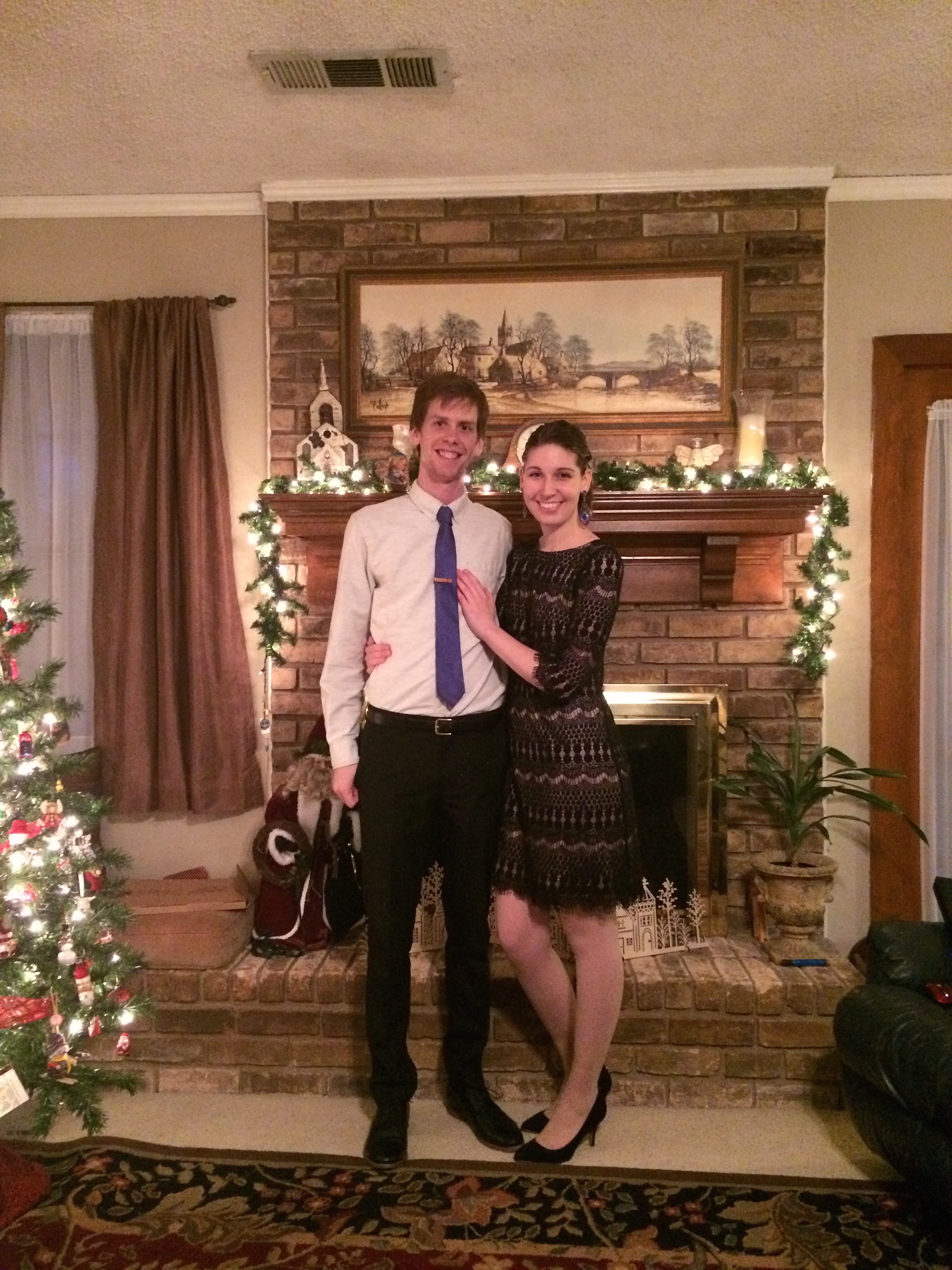
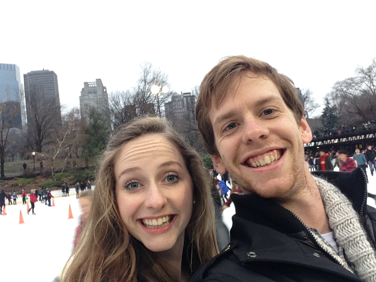
My first winter and six months (!!!) in New York City has been an absolute blast. Adventures to Philly, up-state New York, and trips back home to Abilene and Waco have been needed and exciting. The job at Hoefler & Co. has been wonderful and very encouraging. Recently, I started a couple of new exciting projects which are both challenging and very fun. Maybe I can't share said projects currently, but I can share some photos of the dreamy NYC winter!
However, as early as October I was dreading the winter here in NYC. In the past, I heard many stories from current and past New Yorkers about the dreadful conditions of the sidewalks, the razor-like wind that sweeps through the city, and the months-long depression that hovers above the City. It hasn't lived up to it though. I mean, yes — we had one day where everyone freaked out and sprinted the grocers for potatoes, water, and eggs; but the weathermen got too excited and the wintery mass instead decided to plague up-state and Long Island much more thoroughly than the mere 8 inches that The Big Apple received. Ever since that "blizzard" though, the precipitation and weather has maintained it's seasonal intent though. Unlike Texas, winter is a full 3-4 months here and is honestly quite consistent: sunny in the mornings, gradually becoming grey-er and colder. Some days it mists or lightly snows — nothing crazy; but definitely straight-up winter.
I sincerely don't mind it though. Sure, I miss the warmth of the sun and not sliding around on ice from time to time, but NYC in the winter is quite beautiful in it's own way. Maybe I have this mindset because I'm from Texas and I am used to finding beauty in unexpected places (the desolate expanse of West Texas plus the smell of oil and cattle comes to mind...), but there are some truly wonderful areas and views that are made even more beautiful (or possibly a different form of beautiful) because of the grey sky and snow.
Anyways, enjoy the pics of NYC in the wintertime. If you're in town let me know! Peace.