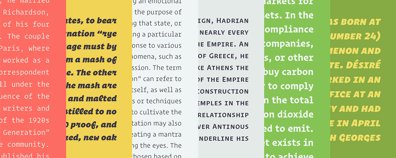
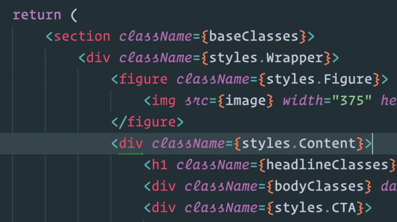
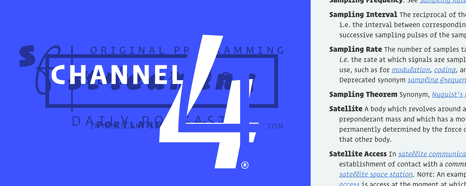
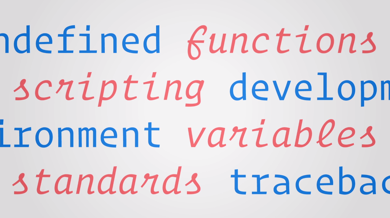
Today we released the second major project I have worked on in my time at H&Co – Operator! What an absolute joy it is to share this with everyone. I will start off this (hopefully short) post by saying it is not my own design. It was an incredible team effort from the entire H&Co staff but Jonathan Hoefler and Andy Clymer are the real heros here. I'll give a brief explanation below:
On most of my projects, Andy is my supervisor. This was the case during the Archer Ultra extension since he had experience designing the originals. After that project wrapped up he asked if I could help out with Operator. I was giddy. I had seen some proofs around the office and loved where this project was headed. Also, we didn't have anything like this in our library. To be working on the first H&Co monospace typeface was pretty darn exciting too. Operator has the right amount of digital flair, but still fells human. It's quirky, but still manages to behave in serious settings. These are the kind of design problems that I love solving – how do you give a design enough character or personality without invading its usability or functional aspects? I dabbled around with this question some during my time at Reading, but ever since I joined the team at H&Co and have worked on projects like Archer Ultra and now Operator, it's now starting to become a serious interest of mine. As for many in the history of art and design, the balance of personality and function is a welcome challenge and I have absolutely loved working on these projects. We hope you enjoy Operator. Check it out!
