
Three months
Hard to believe I have been living in New York City for over three months now. In some senses it feels like I've been here for much longer than that. When I look back on having to move twice, finish a dissertation, and start a new job, it really seems like that all happened over 6 months or possibly a whole year; but definitely not in the first month of being here! In other ways though, I still feel very new to the City — like the times where my internal compass fails me and I have to pull out my phone and spin in circles to figure out which direction I'm facing when I visit unfamiliar areas. I also completed 2 months at H&Co earlier this week, which is equally parts mind-boggling and wonderful. I am working on some very exciting projects and cannot wait until they are released into the wild for all of you fine folks to use in your designs. Until then, feast your eyes upon the beautiful Quarto and the latest Discover Typography!
Since I moved to Brooklyn within the month, I have been reading up on its rich history and have been watching a fantastic documentary recommend to me by my pals Troy Leinster and Colin Ford entitled (quite matter-of-factly) "New York: A Documentary. If you have 17+ hours (yes you read that correctly, a seventeen hour long doc) to spend glued to a screen, I highly recommend it. Along this vein, in my spare time I have been practicing lettering and writing with basic instruments/tools to experiment with the skeletons of various lettering styles. The sketch below are the names of the six original villages in Brooklyn that I lettered with just a basic #2 pencil.
I have enjoyed New York so much since arriving and feel very blessed to be able to hang out and work with some of the nicest, coolest, & most talented dudes in this ol' town. Cheers!

Starting a new life in New York City
NYC is a difficult place to live, no doubt. It's dirty, loud, expensive, and crowded. However, the pros definitely outweigh the cons. There so many events here that I am now worried I'll miss something! The longest I had ever been in NYC for was about 6 days last summer. Within that amount of time, I never really saw the grit and/or soul of New York while gazing up at the amazing architecture or taking leisurely strolls around the beautiful parks. However, after two weeks or so, you start to notice the crazy urban wildlife, the smells that just don't go away, and the crazy dudes that try to convince you that the birds are actually your deceased ancestors (yes, that happened). Everyday is an experience; you can never guess or prepare yourself for what is going to surprise you the next day. Some days this is awesome. Other days, its exhausting. Overall though, it has been an absolutely incredible 3 weeks.
In that amount of time I have eaten some amazing meals, saw a street fight, went to the U.S. Open qualifiers, spent too much money on fancy coffee, went to a exhibition showcasing type design work on road bikes, seen a man covered in pigeons, gotten lost [only!] a few times, saw a guy deliberately hit another car with his, mastered the subway, saw a bird vs squirrel battle in Central Park, doubted myself at least half-a-dozen times, spent countless hours in magnificent libraries, and made a ton of progress on my MATD dissertation. I hardly even had time to start looking for a job! Thankfully, I was contacted by two amazing firms. In the end, I went with what I felt was best for me at this time in my life.
In saying that, I will be starting a new job in September at the world-renowned design foundry of Hoefler & Co. in NYC as a type designer. The designs created by H&Co. influenced my work as a student and a professional and also partially inspired me to pursue type design and lettering as a career path (check out the amazing discover typography site). In saying that, it is a huge honor to be given an opportunity to work there. Cannot wait for my first day!
None of this would have been even remotely possible without my amazing professors at ACU who encouraged me and taught me almost everything I know about art & deign, my amazing friends and family who believed in me and never stopped pushing me, my brilliantly supportive girlfriend Emily, and of course, my fellow colleagues and the staff at Reading University's MATD program. You guys freakin' rock.
I am excited to start a new chapter here in New York, but also will greatly miss all of my friends abroad and at home in Texas. If you're ever in NYC, give me a ring, ya hear!
Cheers!

Post-Practical Work
We turned in our type specimen and the “Reflection on Practice” last Tuesday. It was incredible to see all of my classmates work and to see how far we had come. It’s also crazy to think that an entire year worth of practical design work could be displayed inside a 20 page booklet! However, all of the specimens look amazing and I’m jealous of every single one. I’ve been really impressed by all of my classmates work throughout the entire year. When you’re surrounded by great designers who produce stellar work it really inspires you to up your game. I have felt like I have grown a lot here not only as a designer, but as a student as well. I was just telling the head of our department, Gerry Leonidas, about how I have learned so much more than I thought possible. All the brilliant professors, workshops, guest lecturers, trips to museums, libraries, and various countries have made this year incredibly successful and even fun. It’s been very difficult at times, but in the end (of the practical work portion), I think it was an amazing experience and worth every penny. Now all we have to do is write an epic dissertation! Mine will be on the creation and localization of the American Gothics (or Grotesques if you wish). More on this later though.
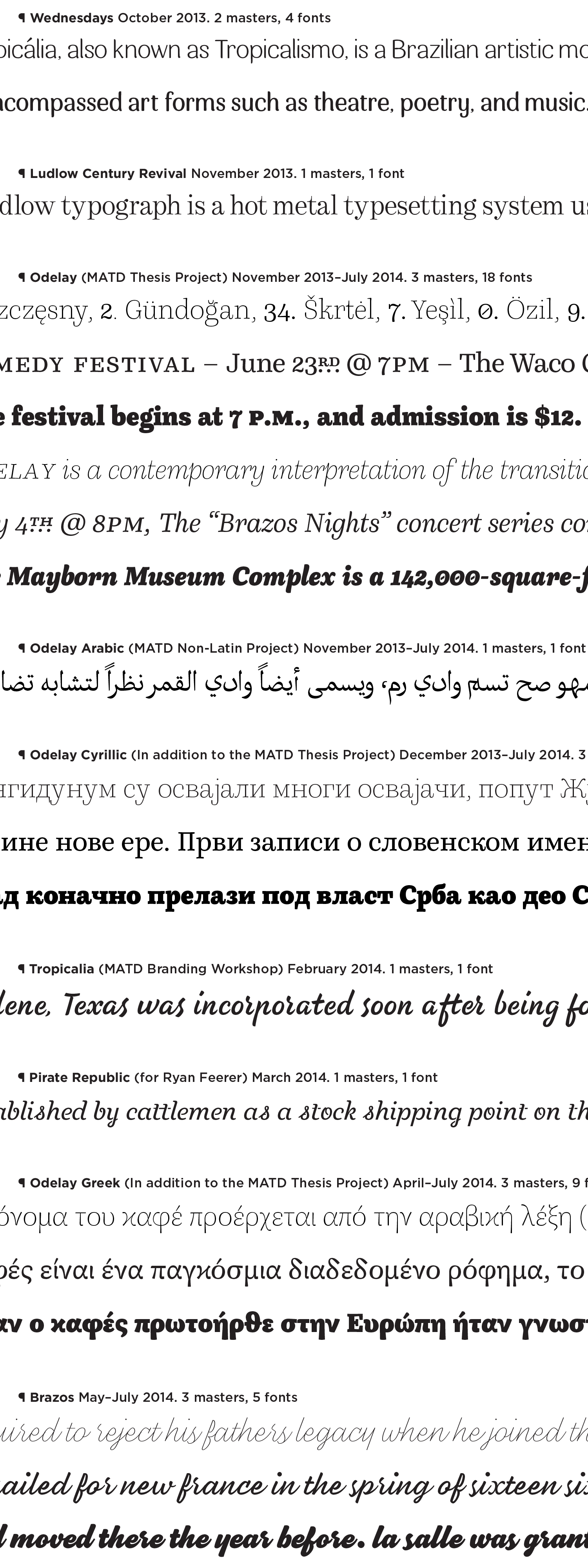
Like I said above, it’s kinda crazy to cram a year of practical design work into one booklet. Our specimen also only showed our ‘thesis project’, but we created a lot typefaces and lettering over the course of the program. So, I quickly typeset a few random lines below in all the ‘masters’ I designed over this past year in order from oldest, to latest. And as I looked back on the absolute rubbish I created a year ago, I smiled. I quickly realized that I have progressed as a designer just by looking at a timeline of faces I have drawn in the short span of 9 months. Below is the list of typefaces I created from October 2013 through July 2014. I’m not too ashamed of any of them, however, many are still works-in-progress. Hope you enjoy one or two!
* Squarespace does a bit of compression that I dunno how to turn off so be sure to right click the image and ‘open in new tab’. This should make it a bit better; might still look terrible though :P *
Switzerland
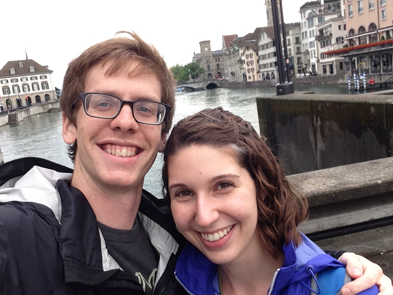
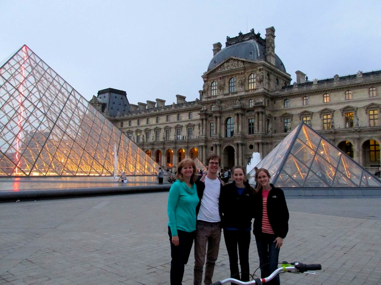
My girlfriend Emily was in Europe for the past month tagging along with her parents who semi-annually teach as study abroad professors. Mr. and Mrs. Tell are both (extremely talented) professors of music at mine and Emily's undergraduate university, ACU. Mad props to them both. Anyways, one week Emily had nothing to do in Leipzig, Germany (where her parents teach) and so she flew over here and spent a bit of time with me here in lovely Reading. We also ended up taking the usual day trips to Oxford and London, but nothing really compares with our adventure to Switzerland.
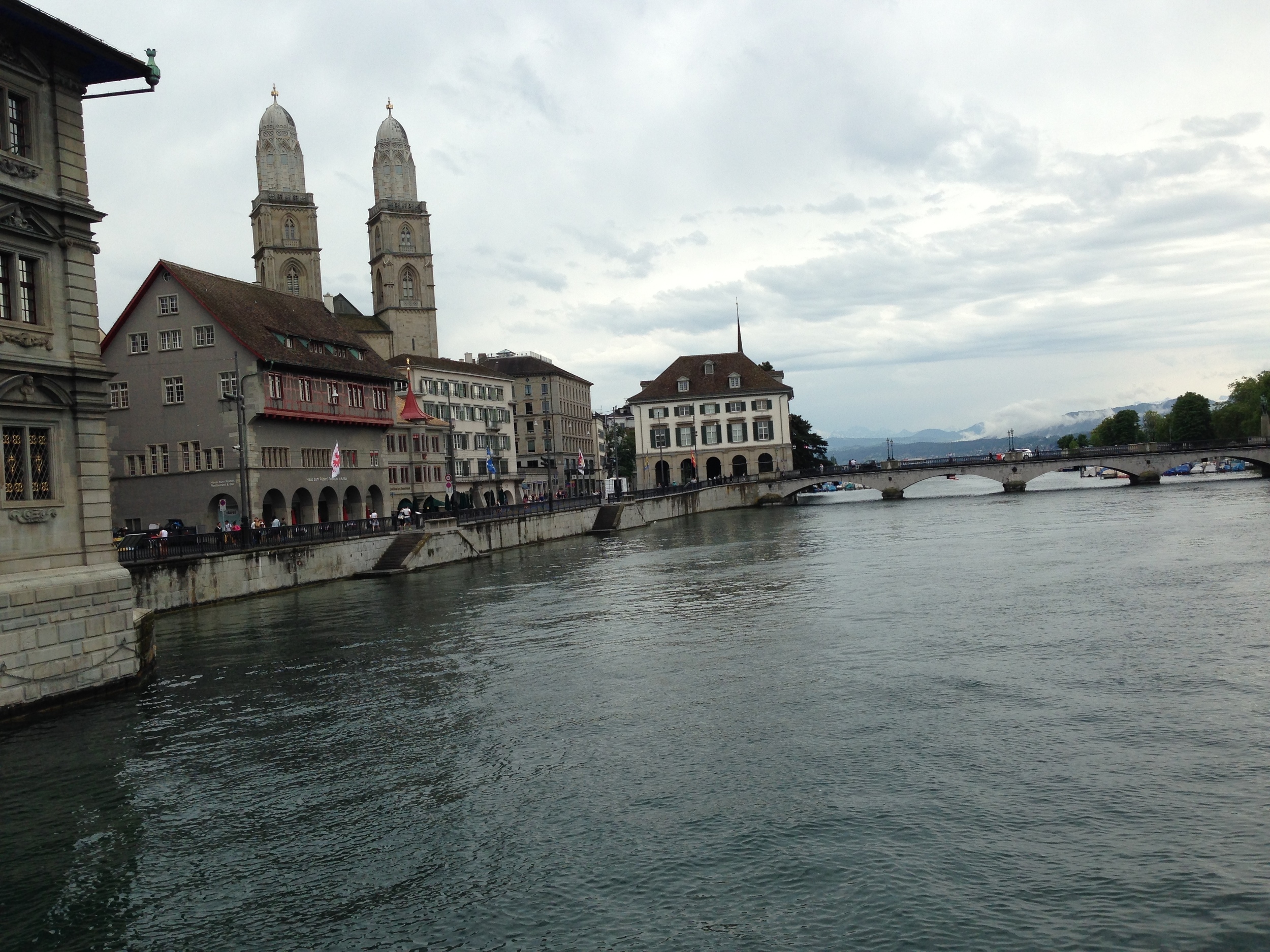
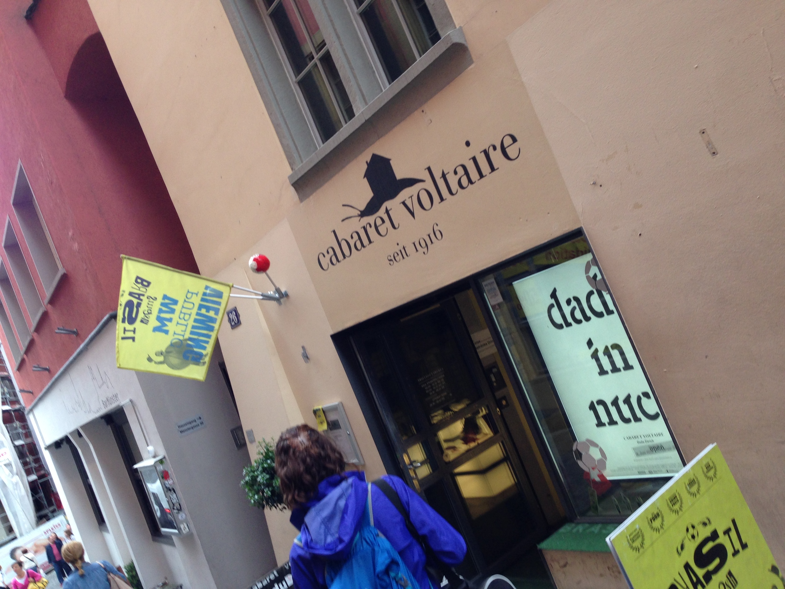
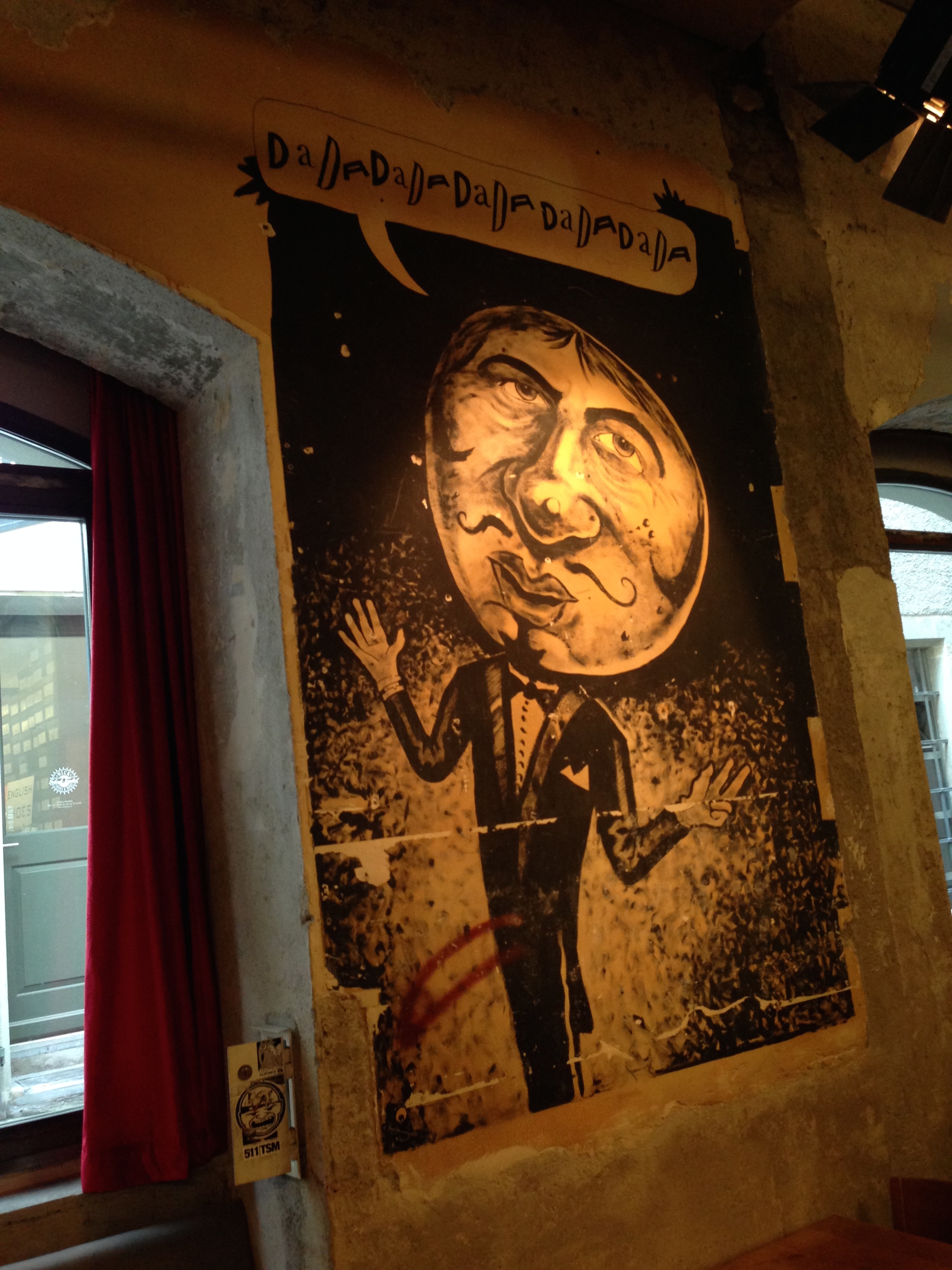
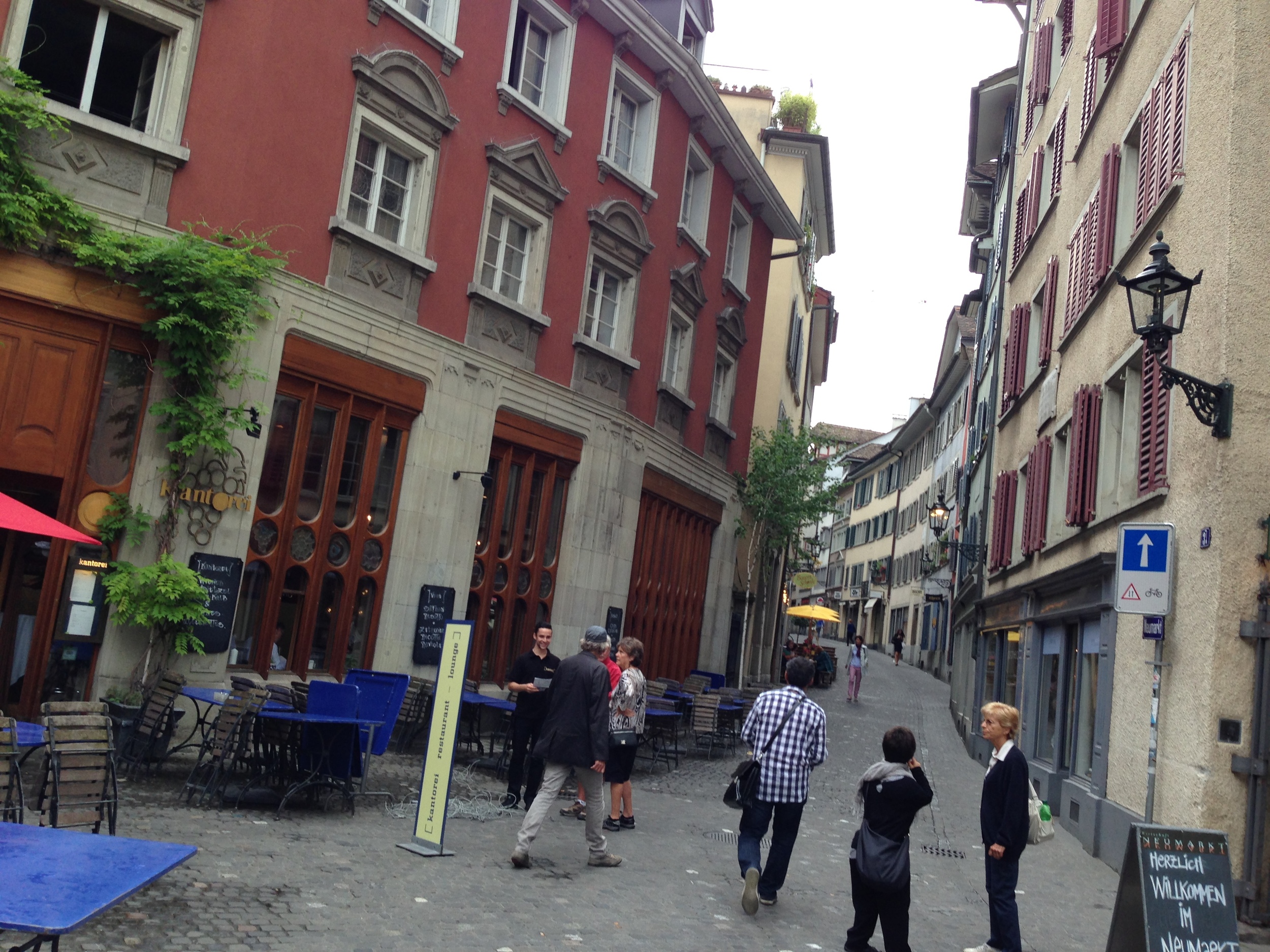
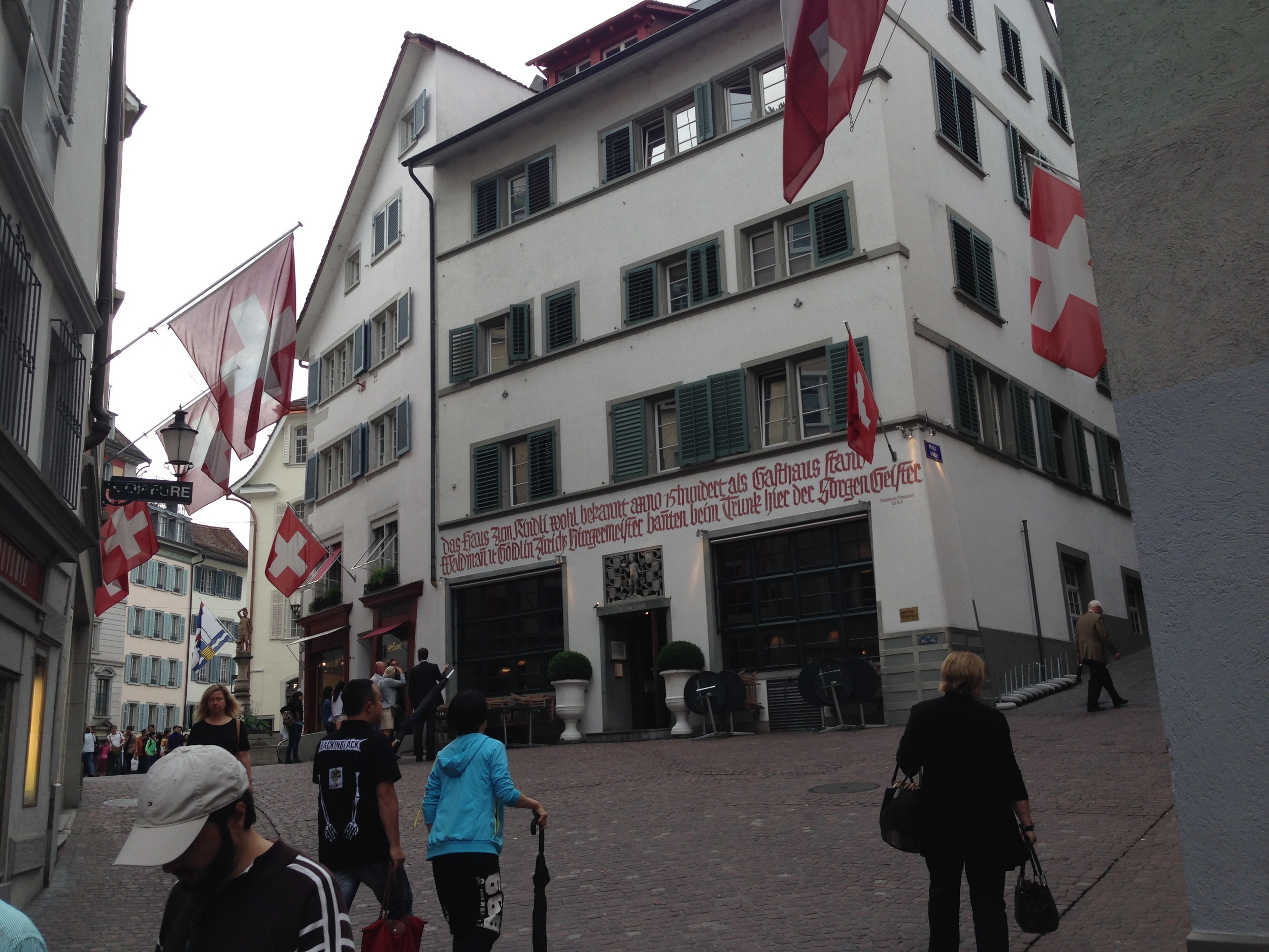
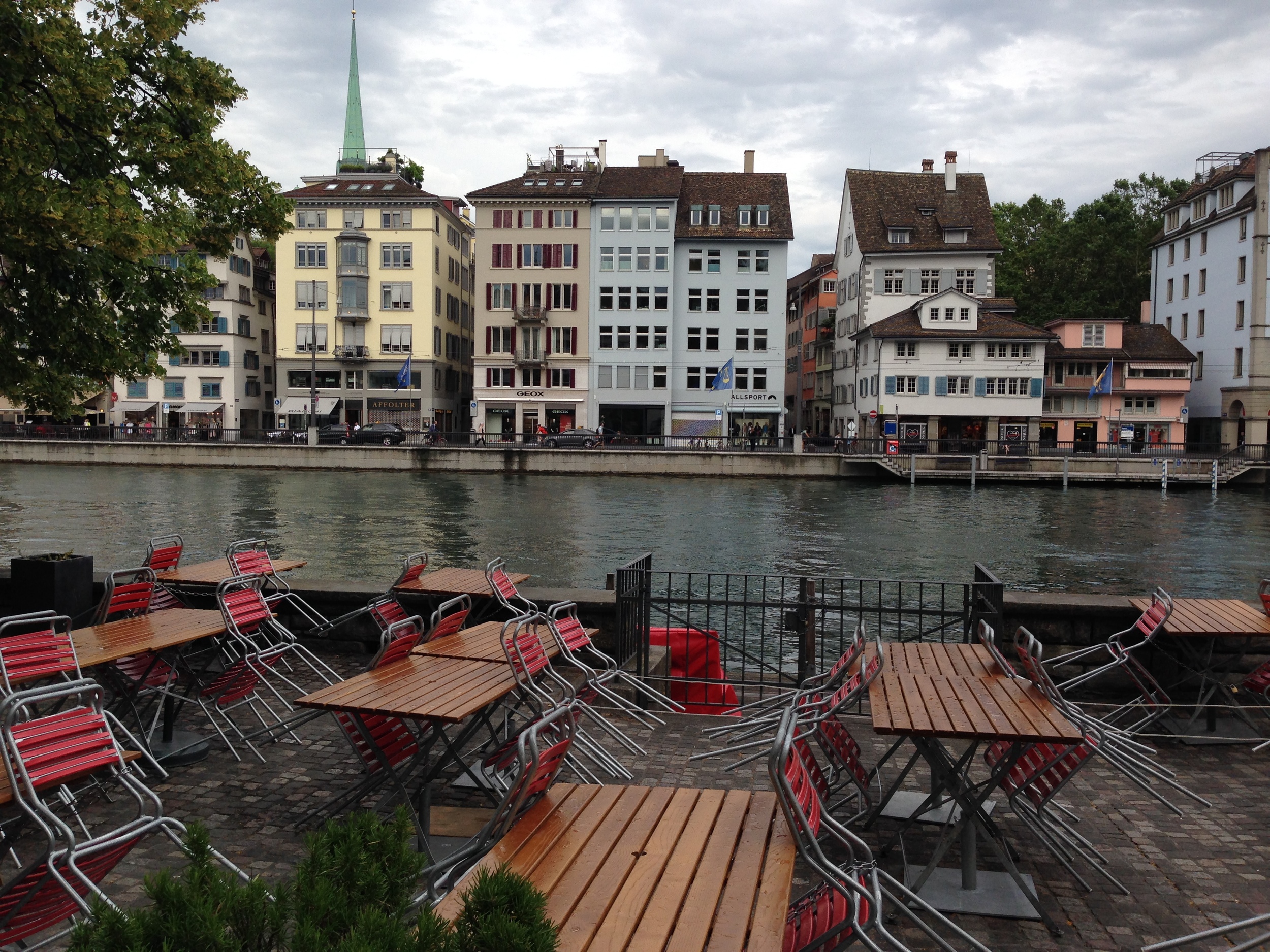
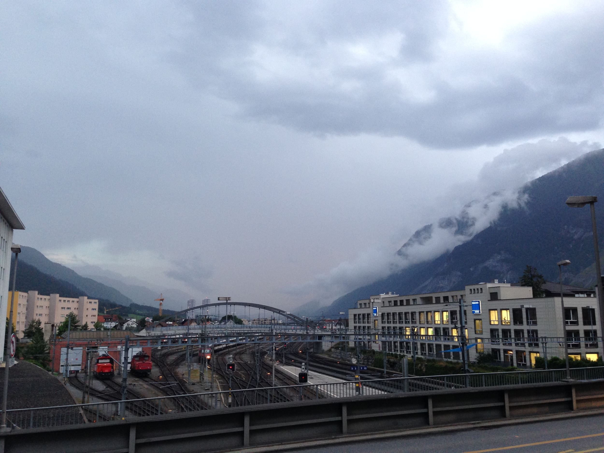
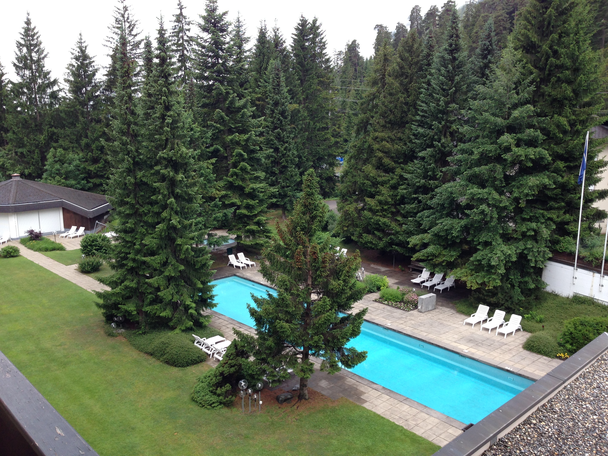
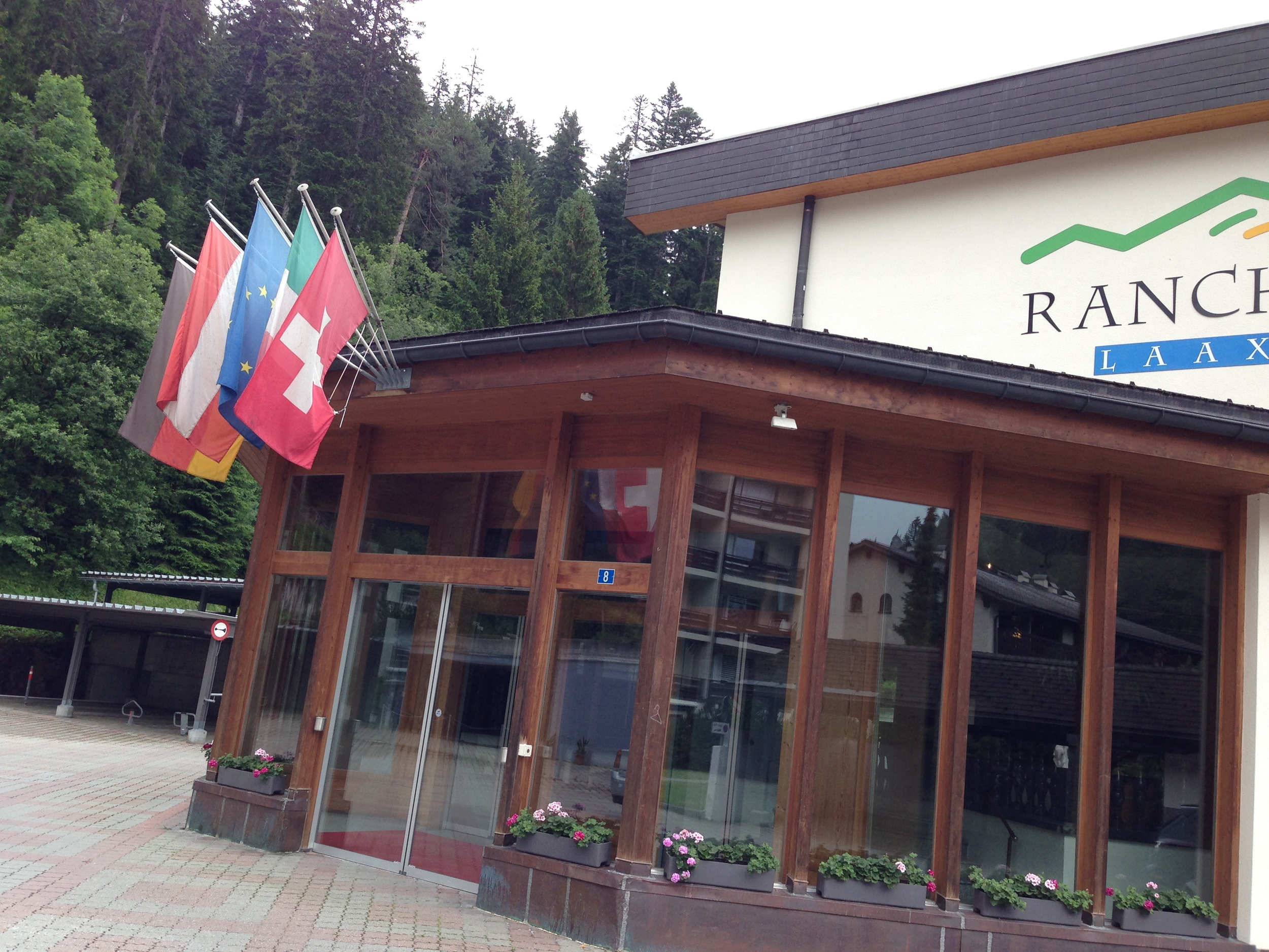
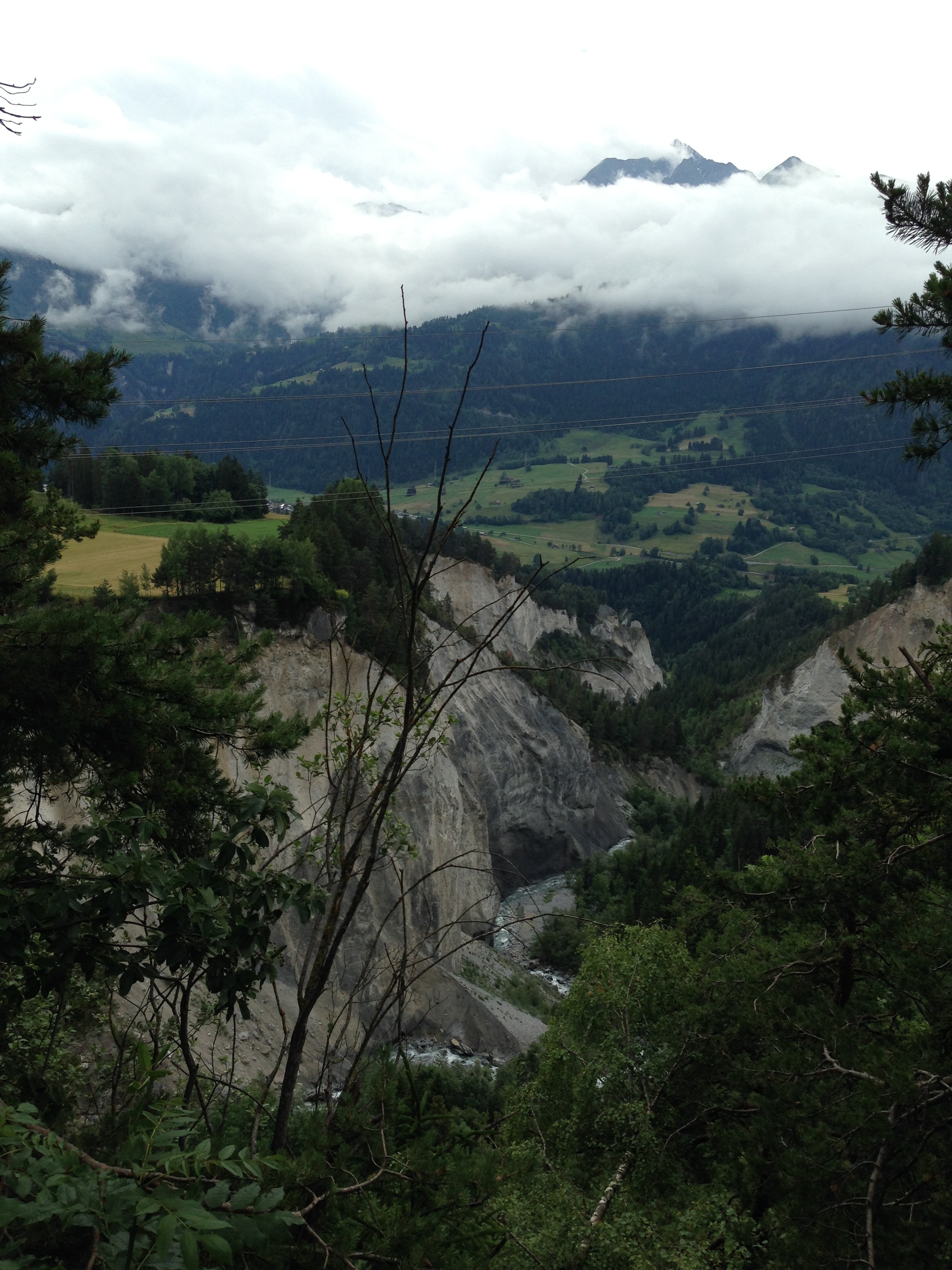
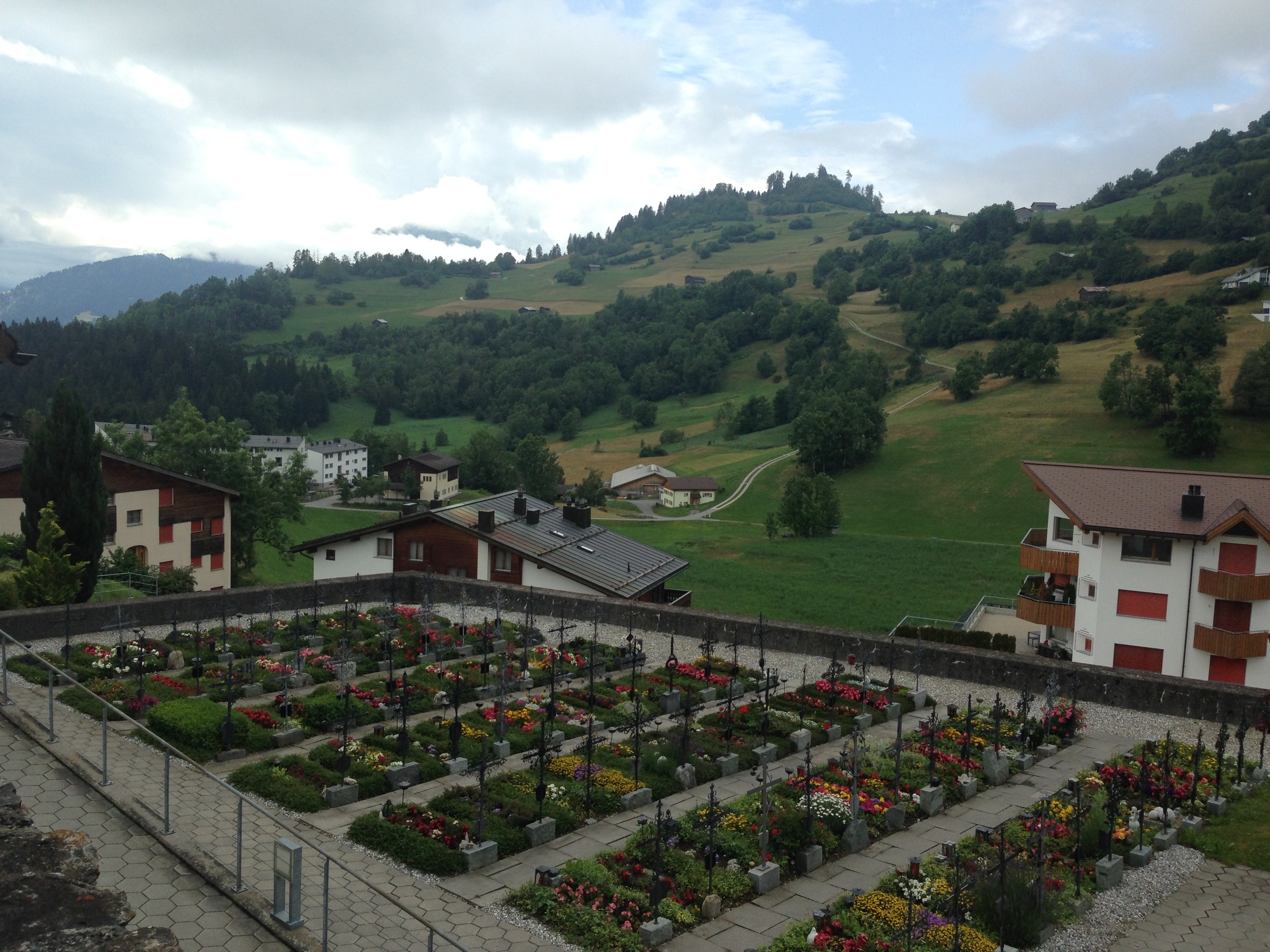
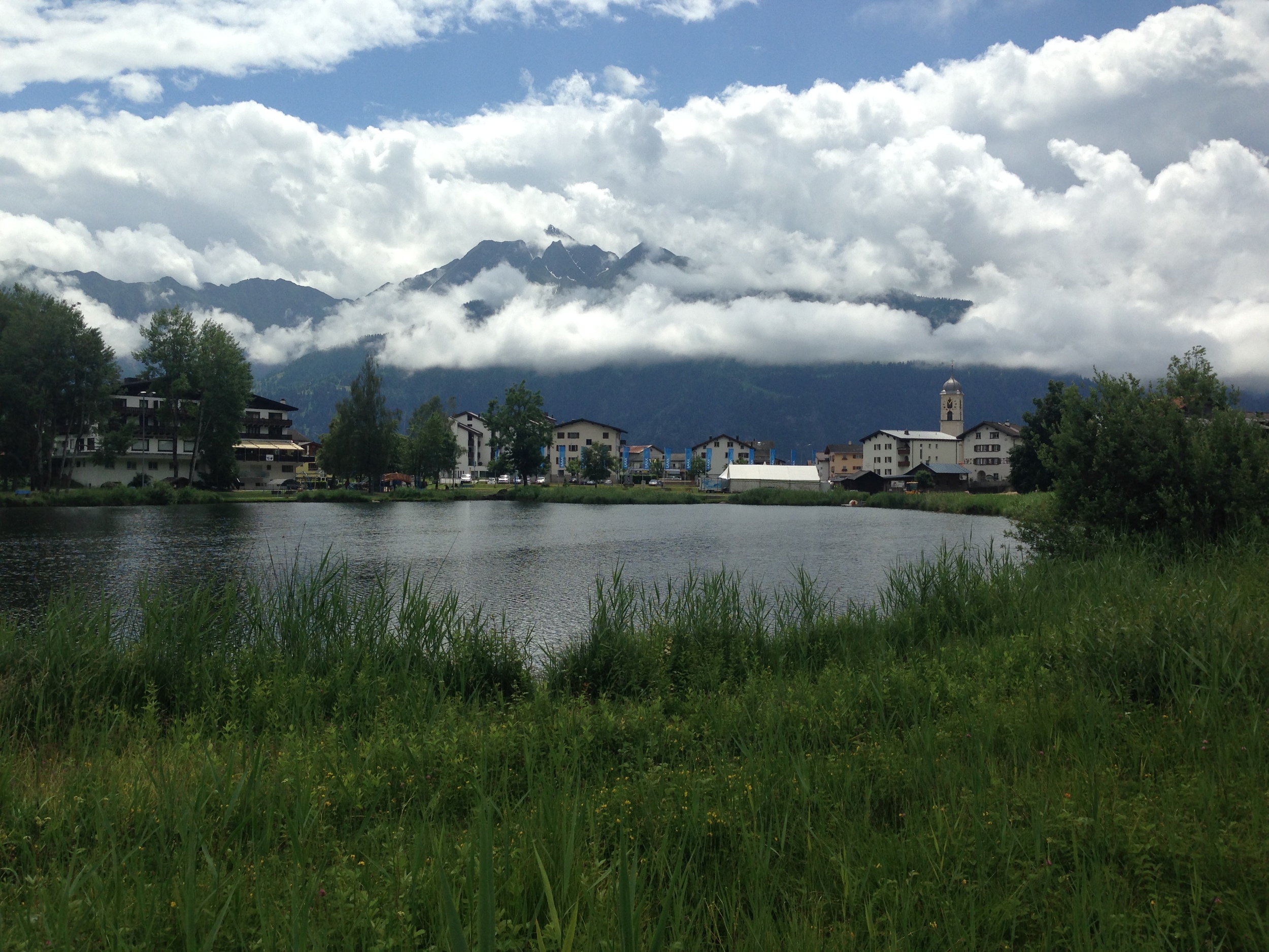
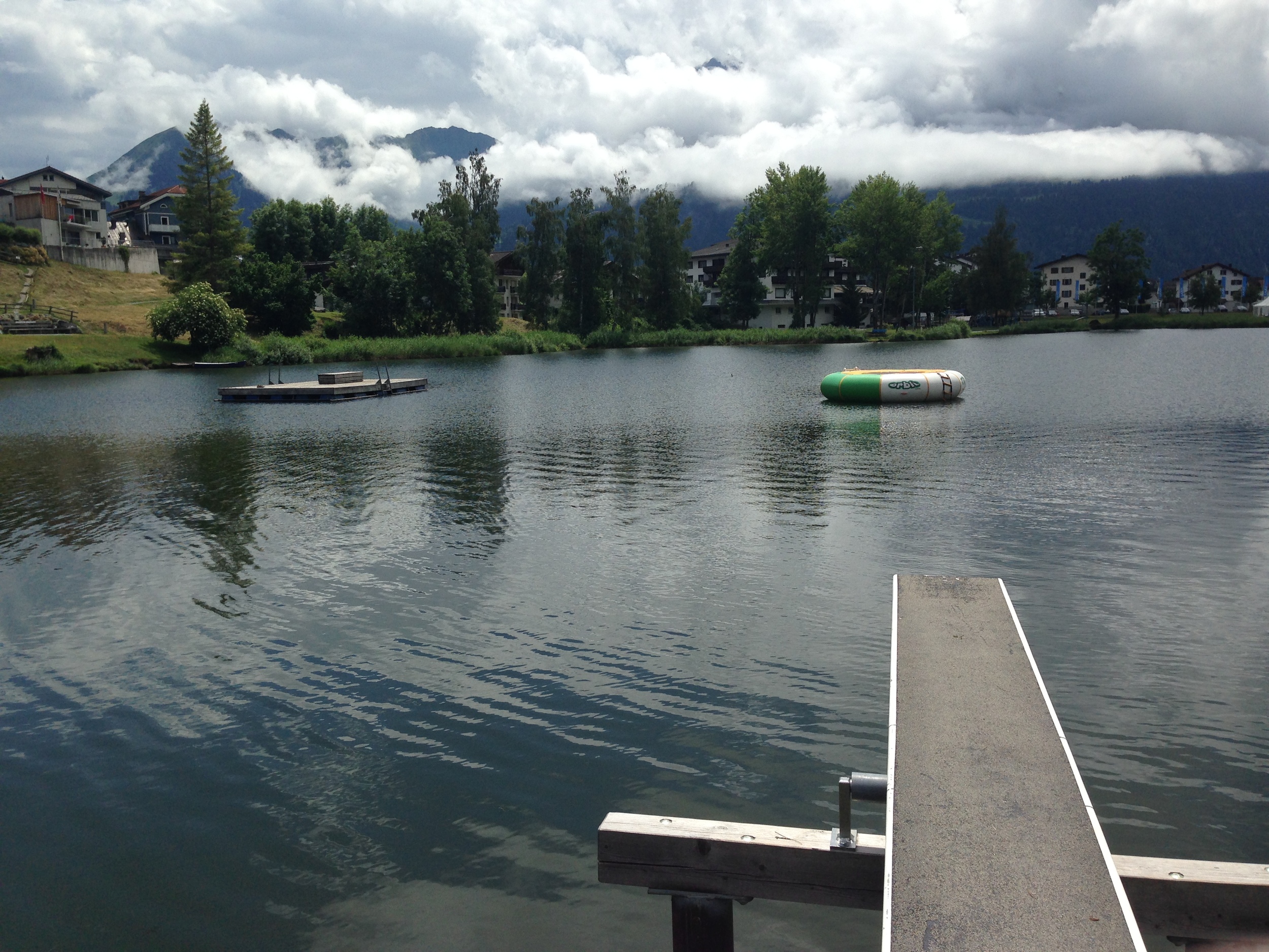
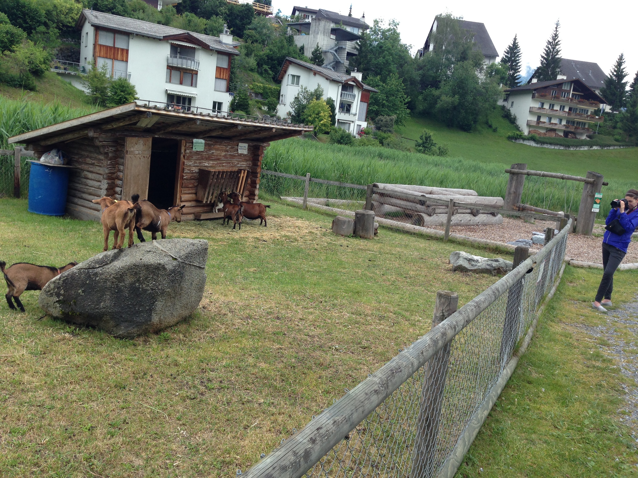
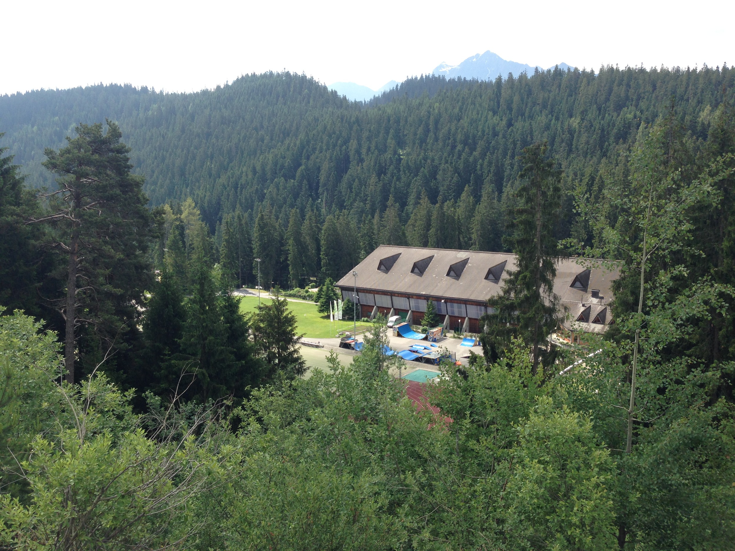
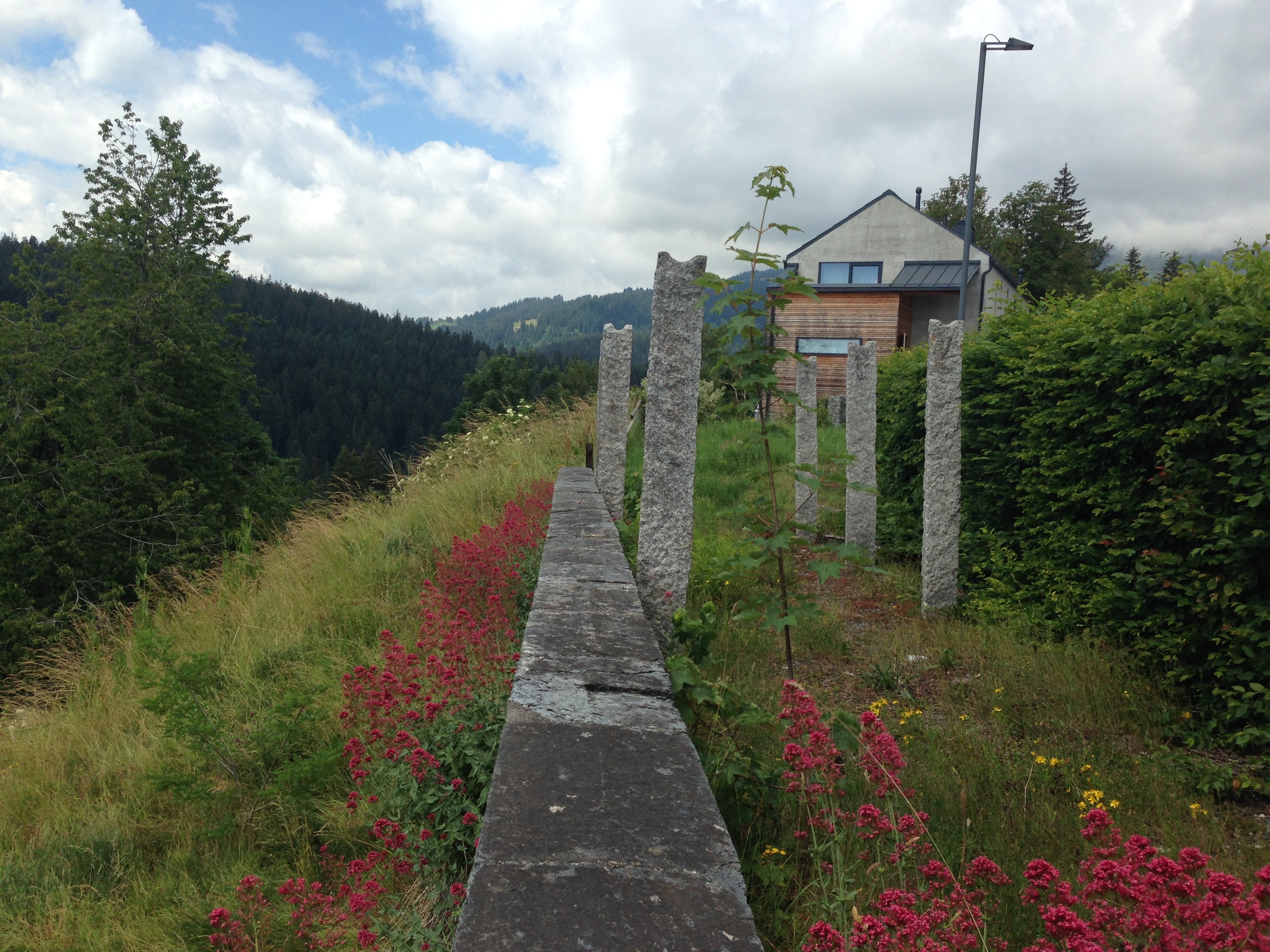
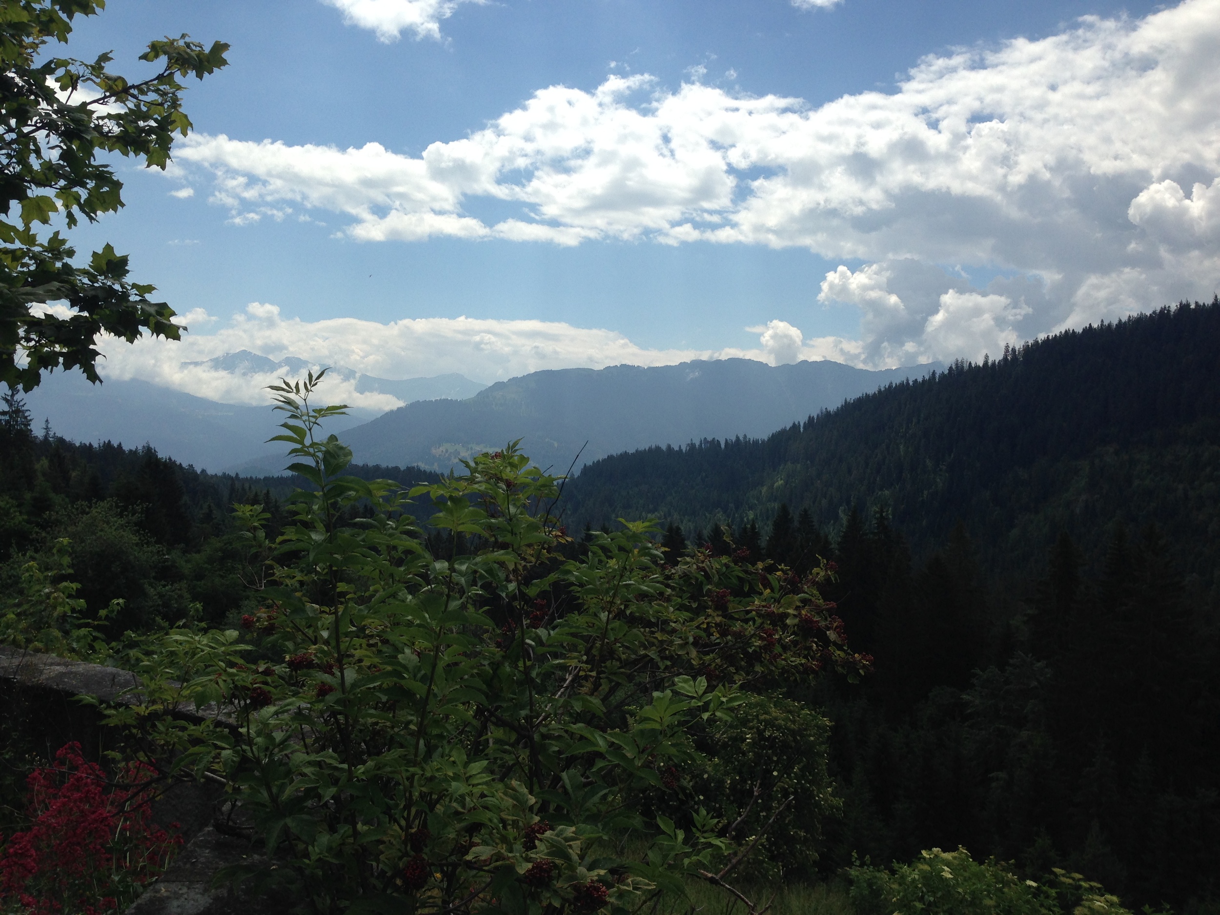
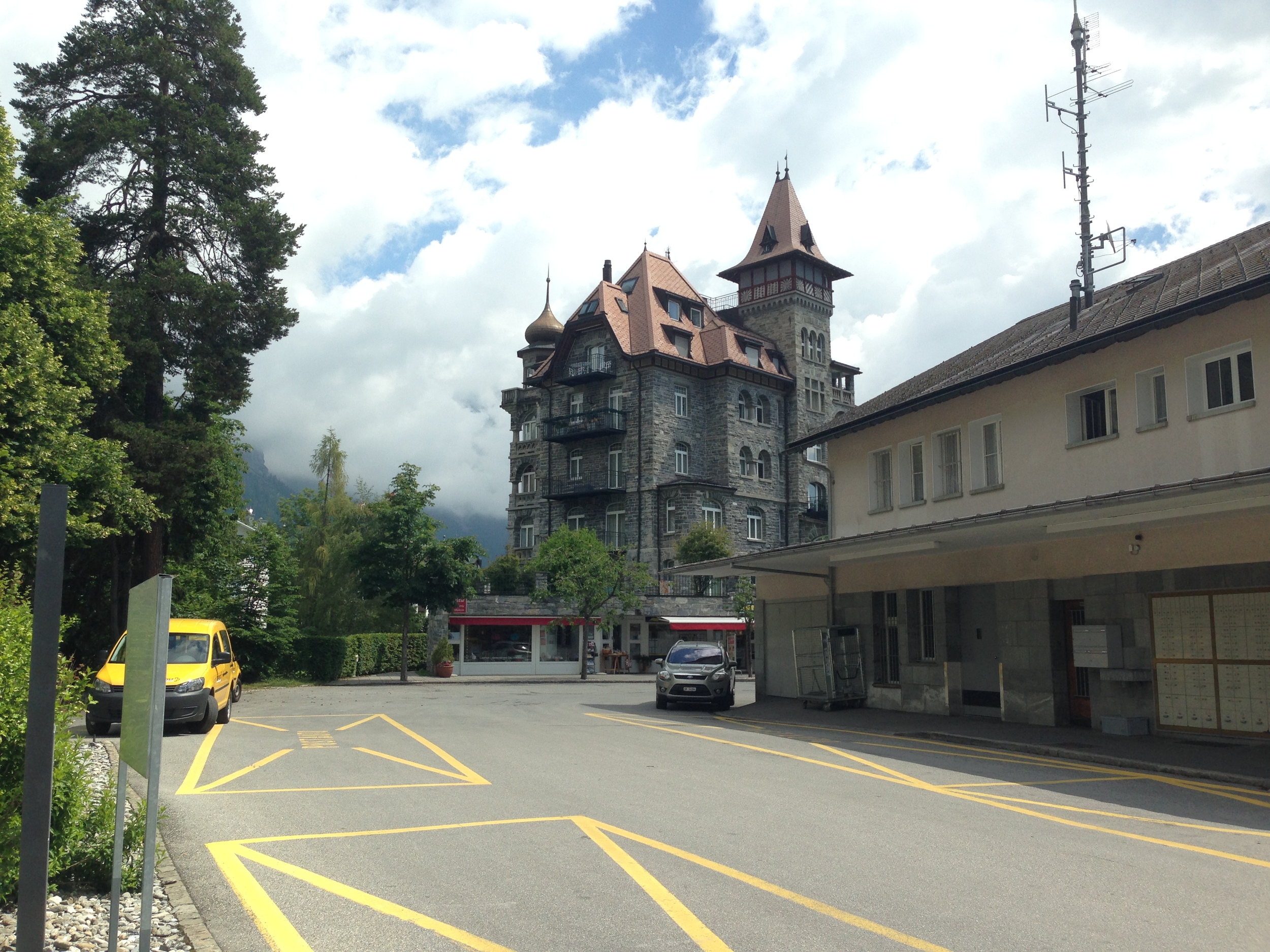
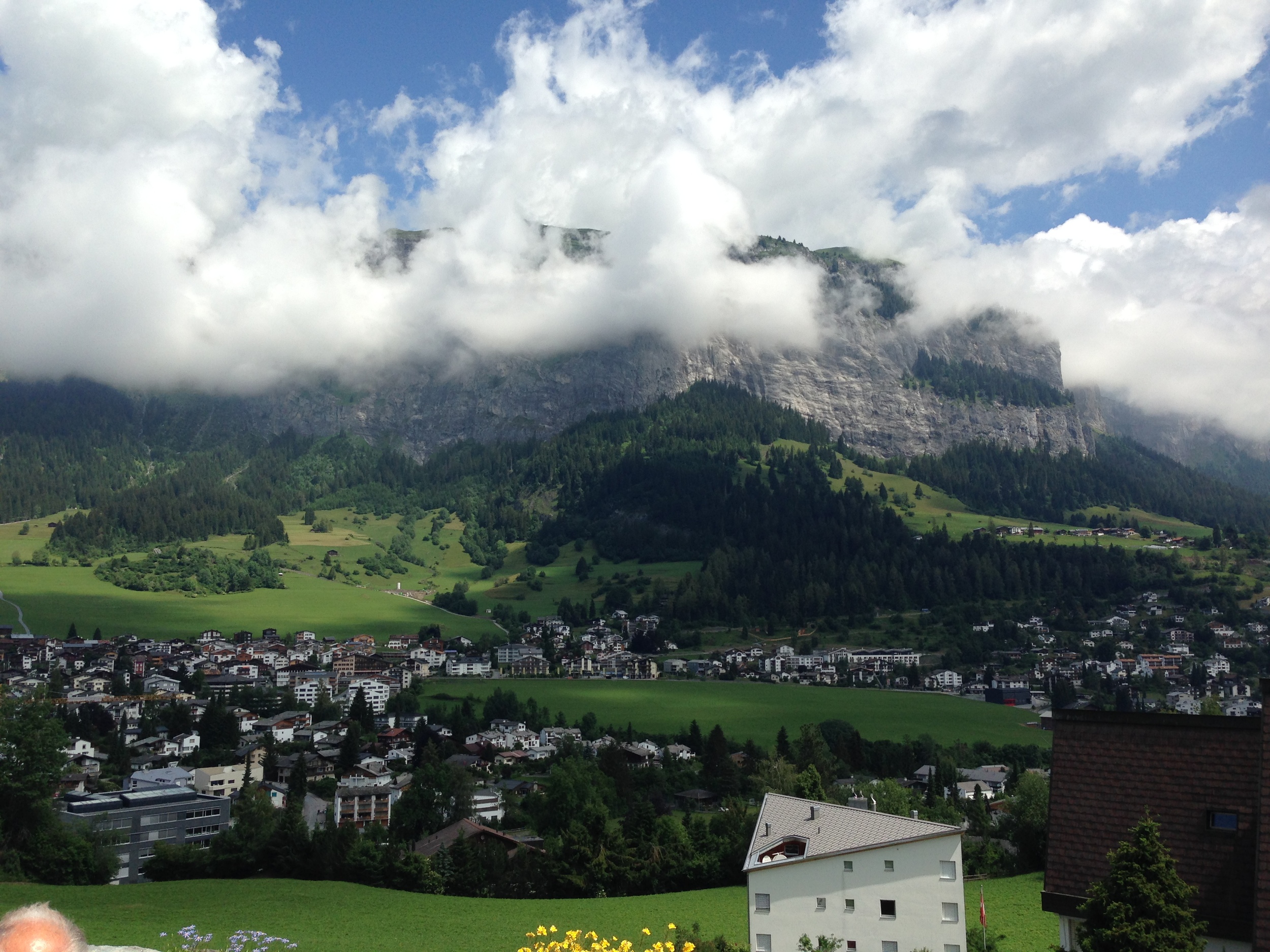
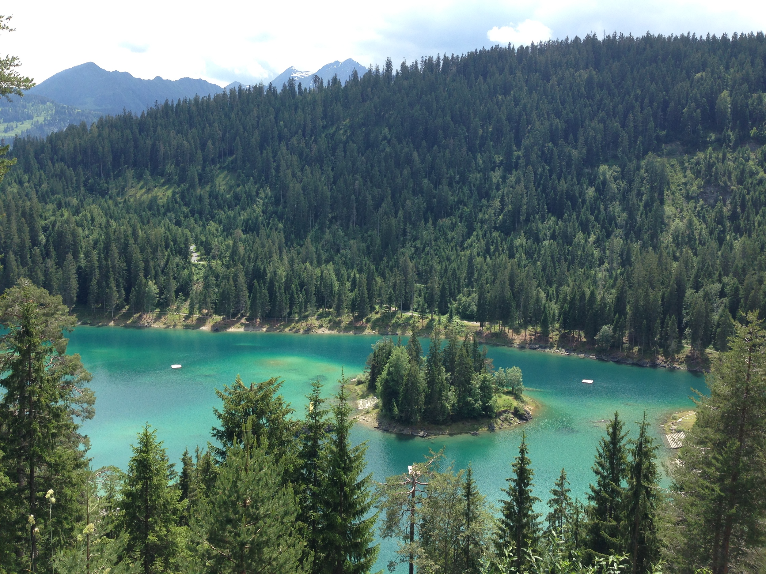
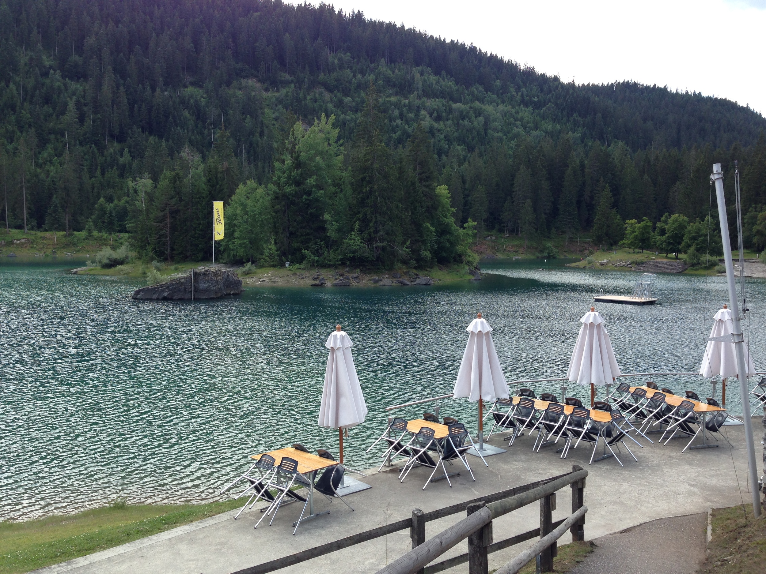
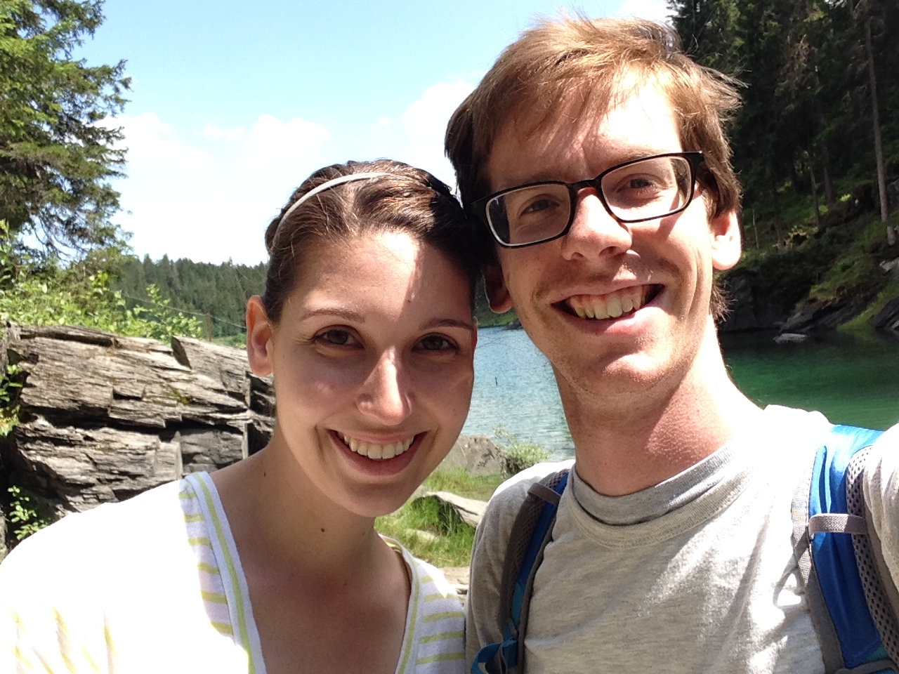
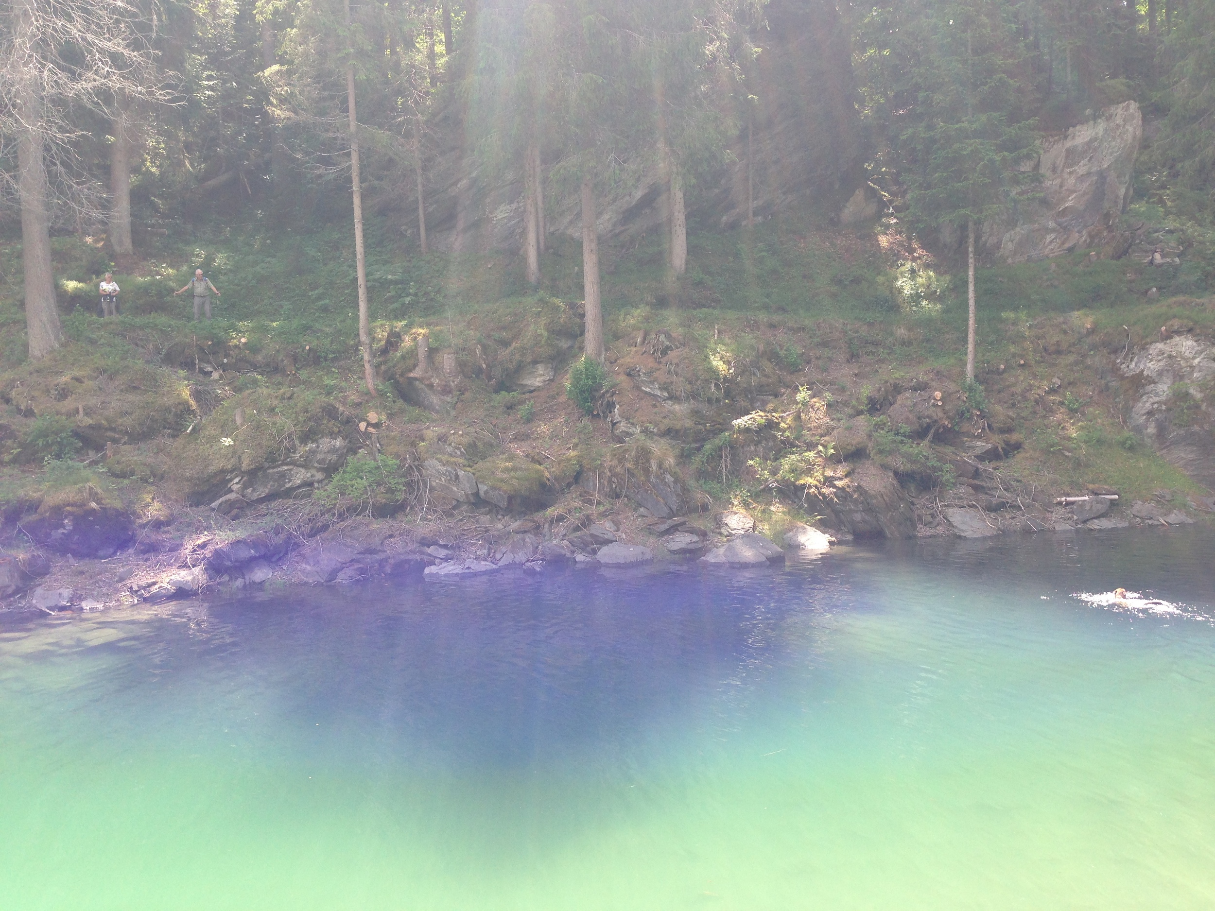
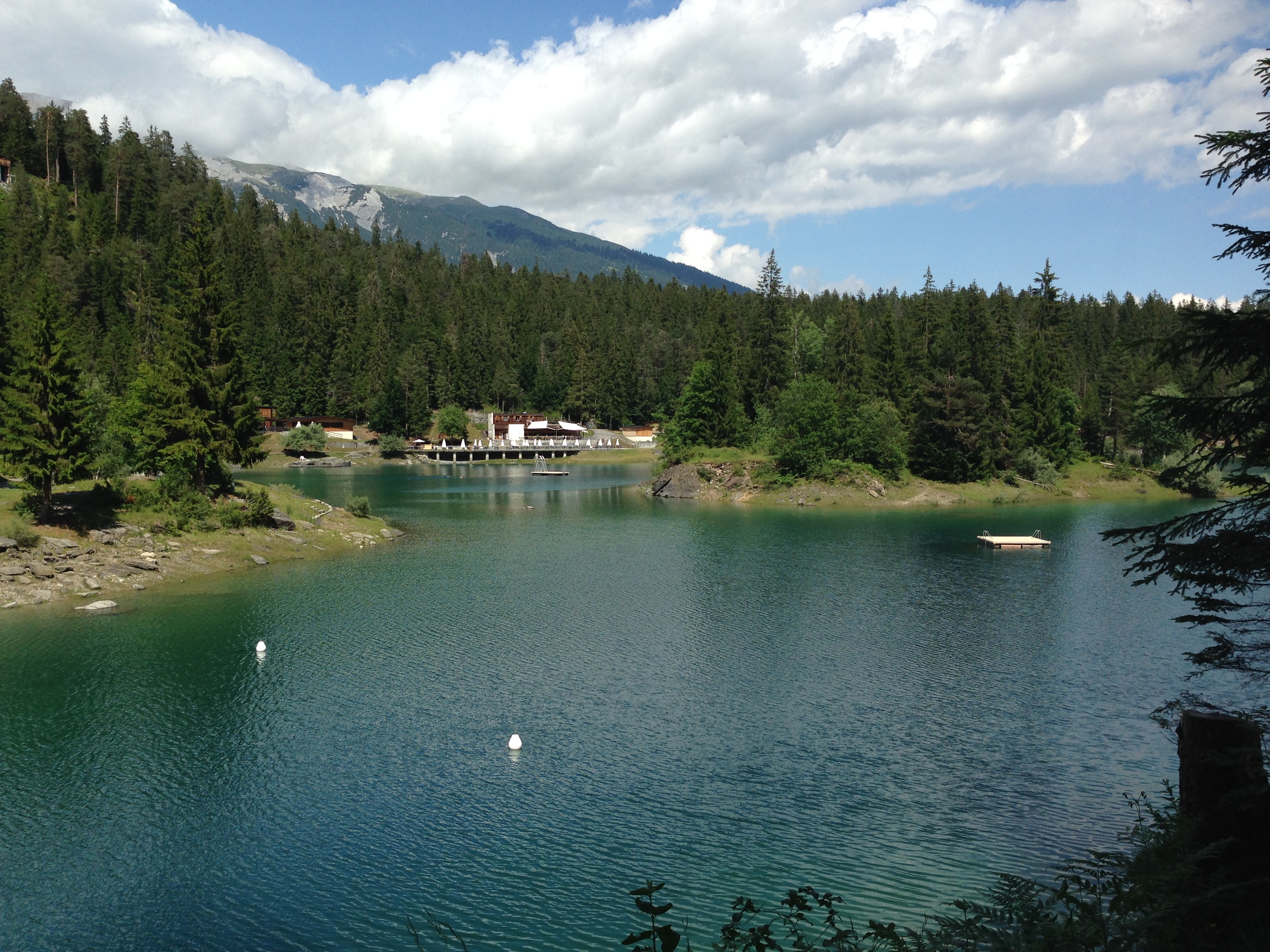
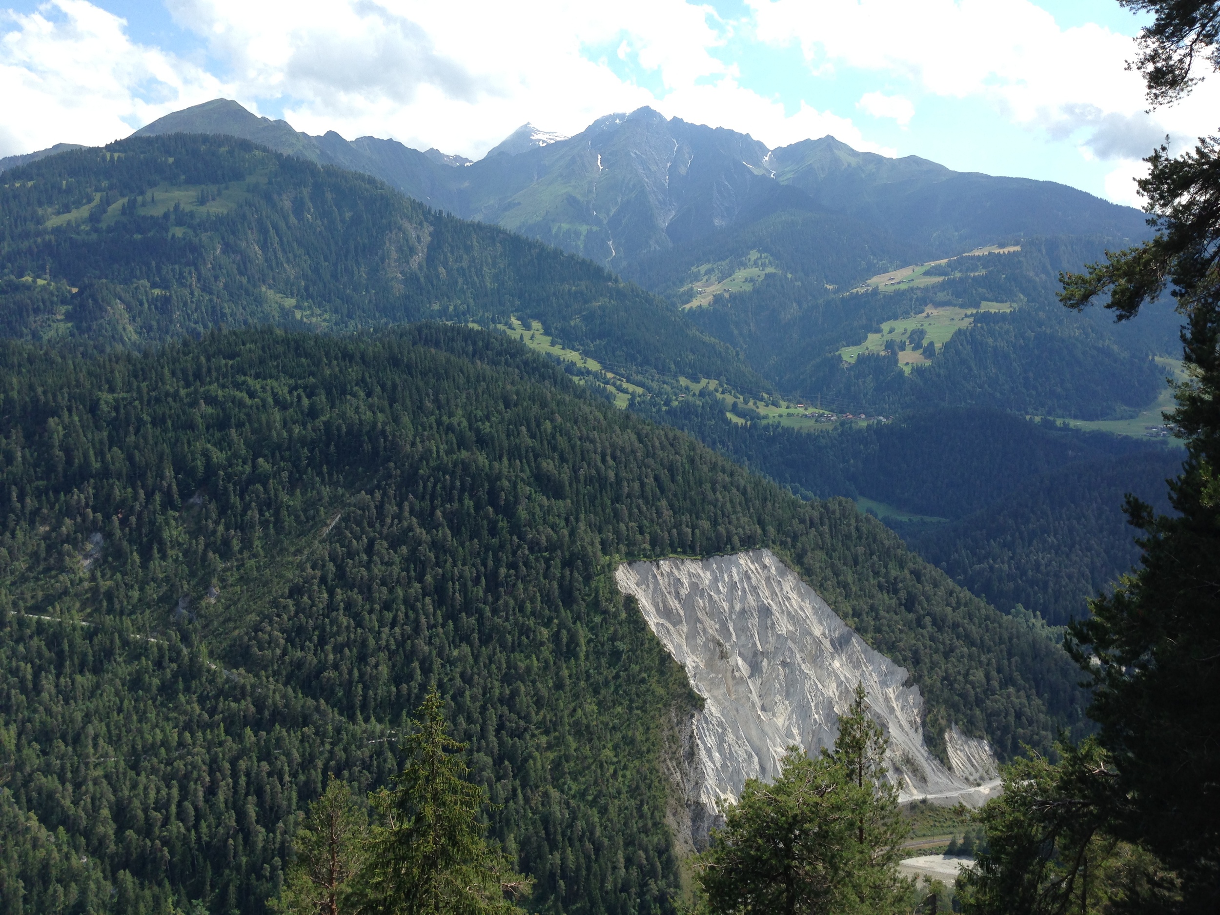
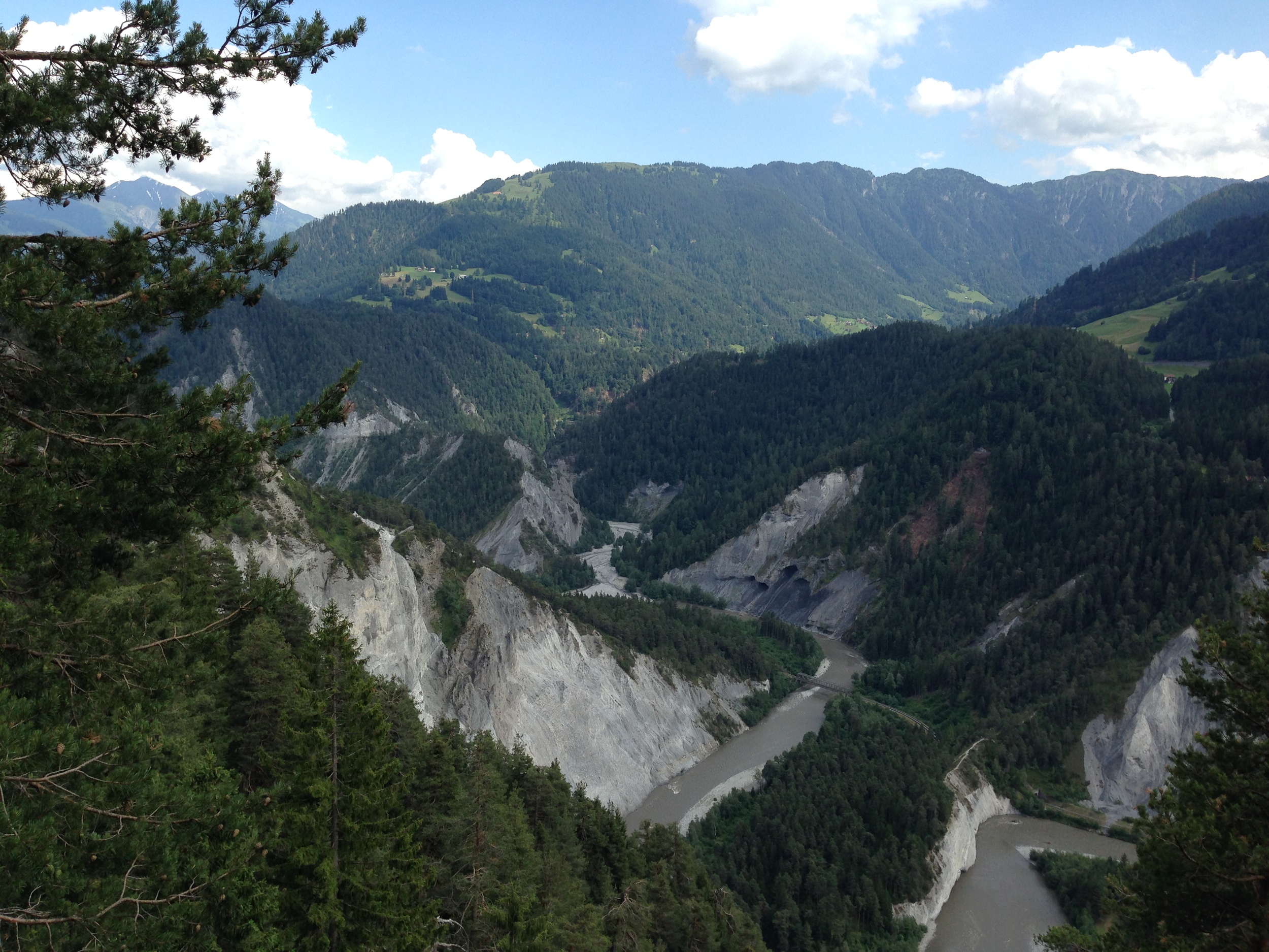
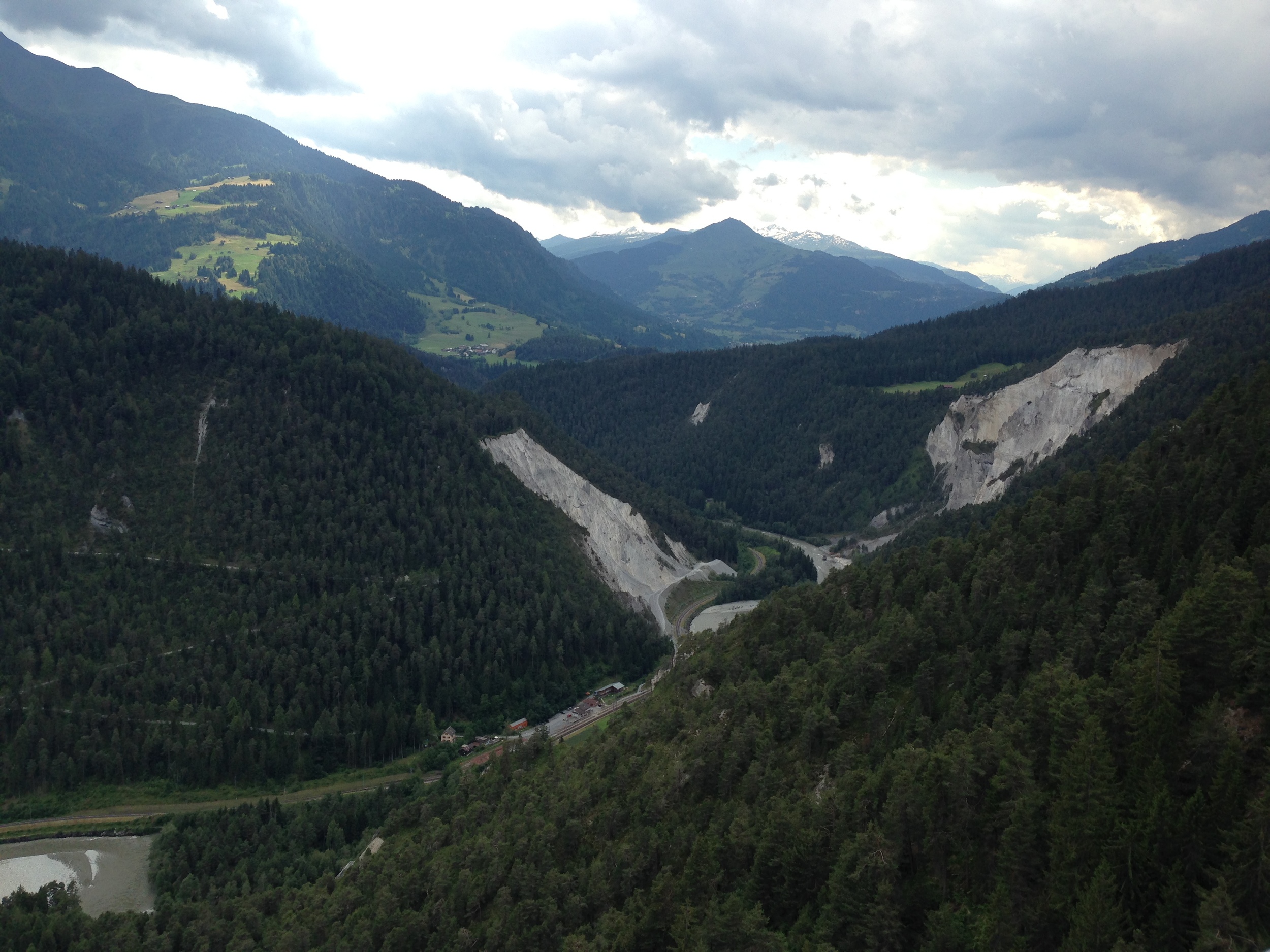
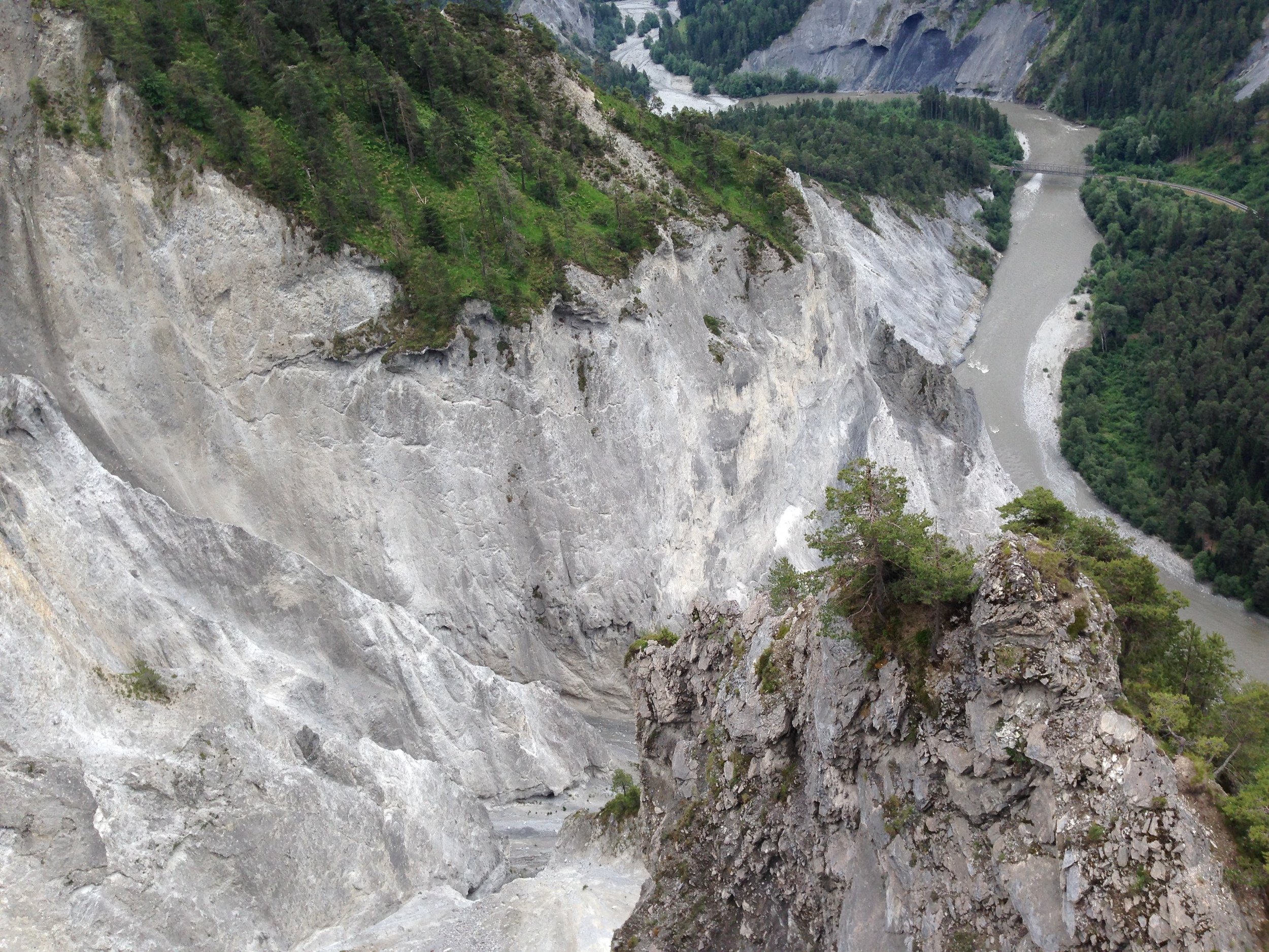
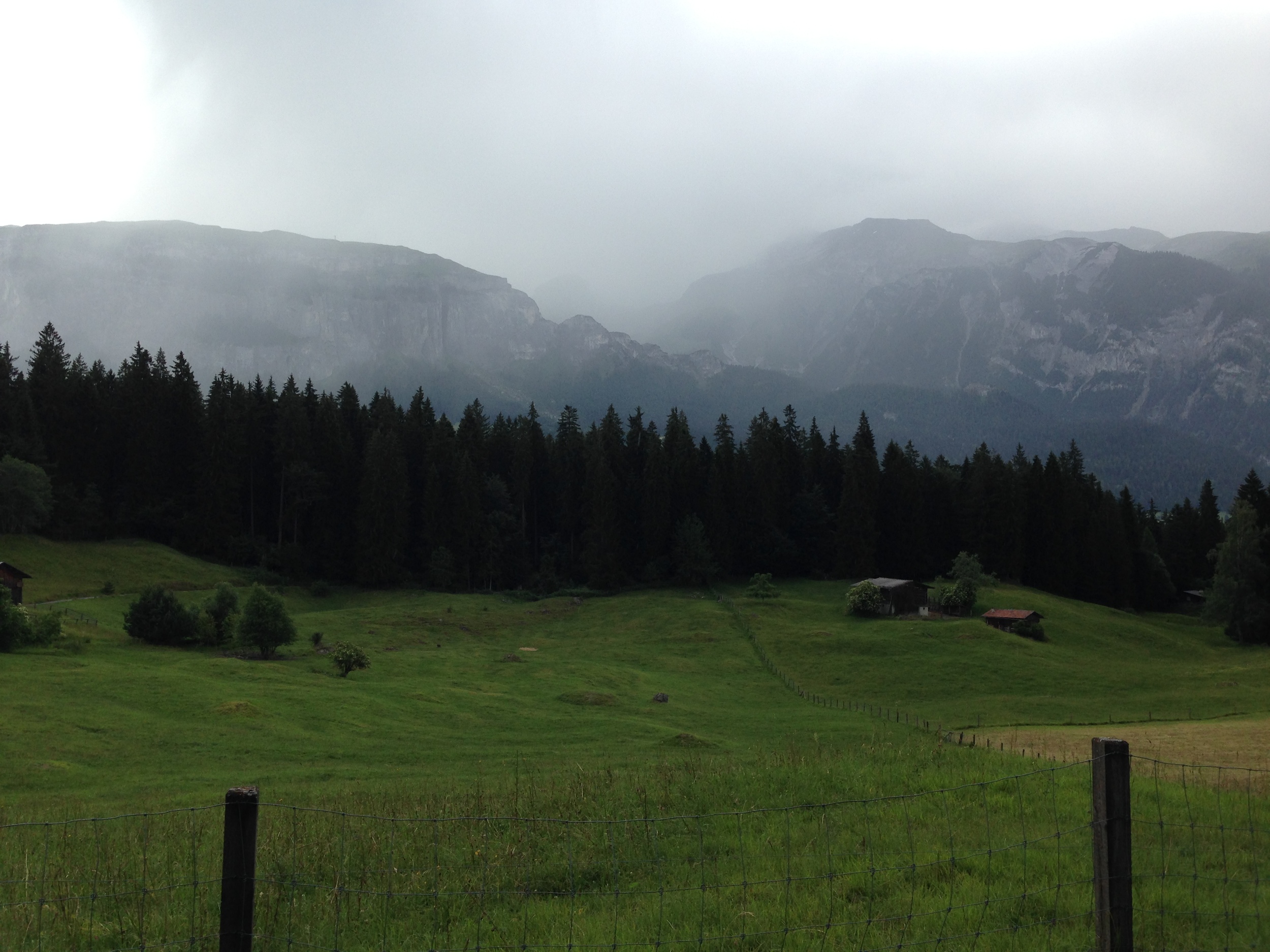
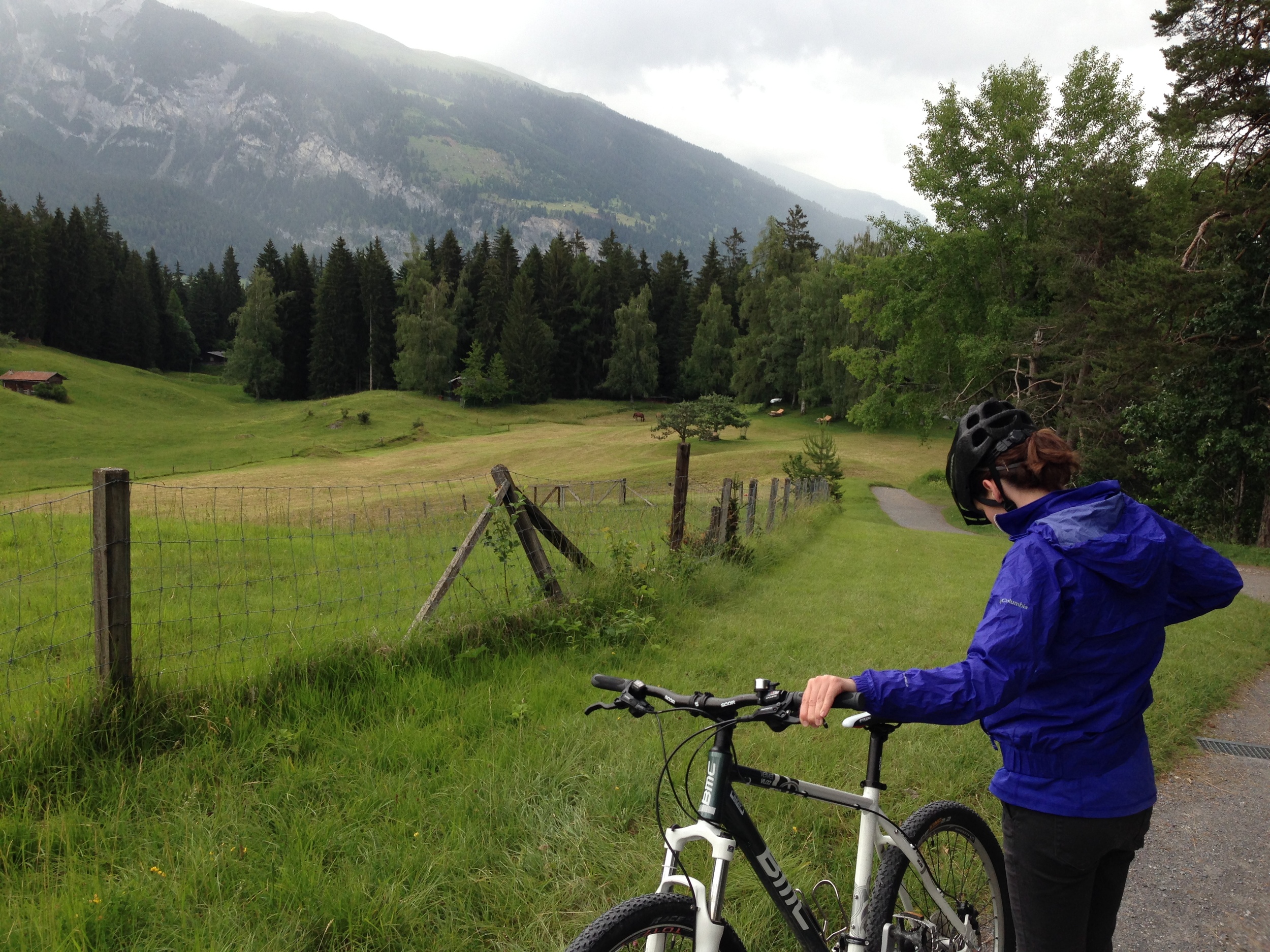
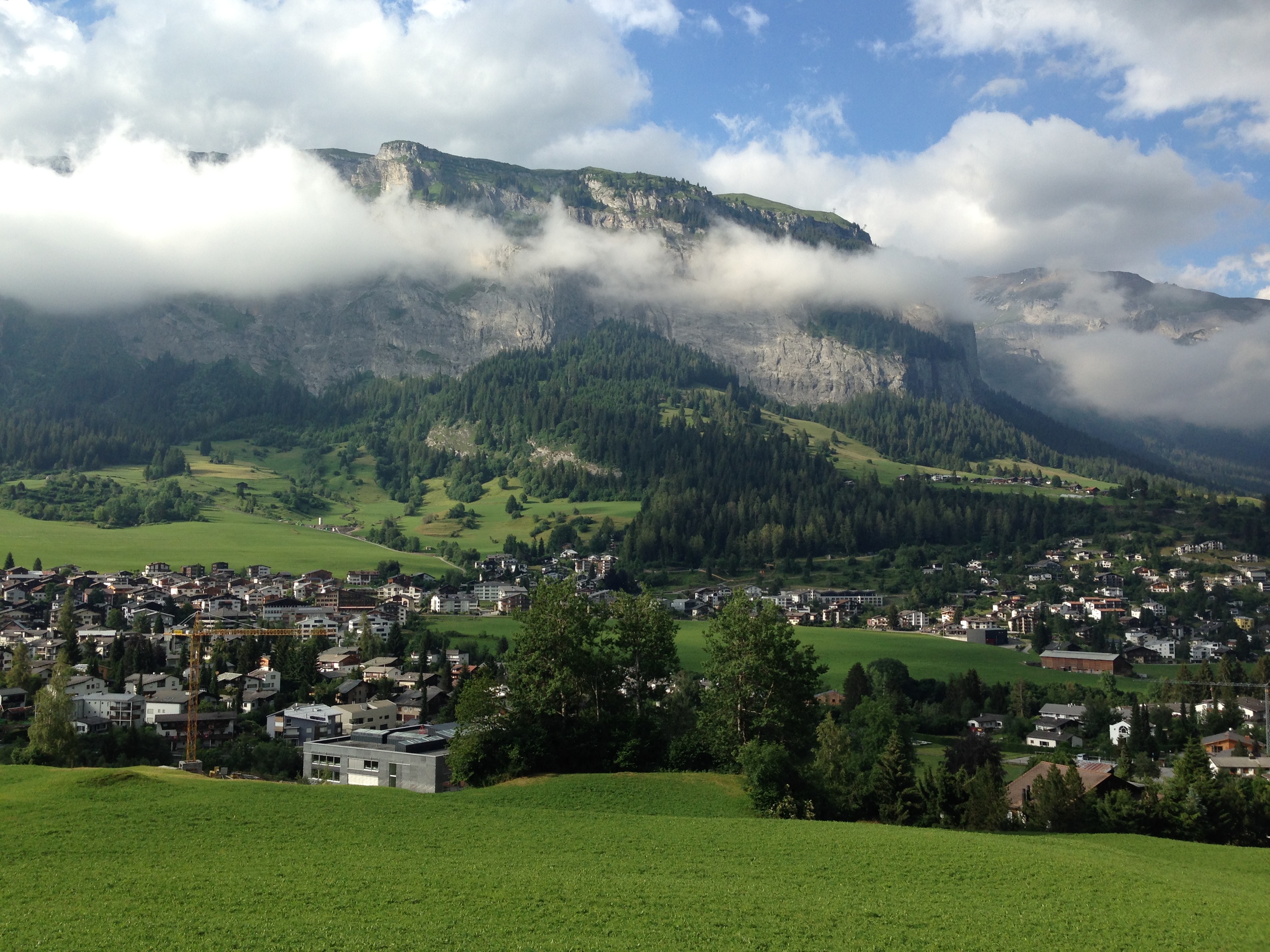
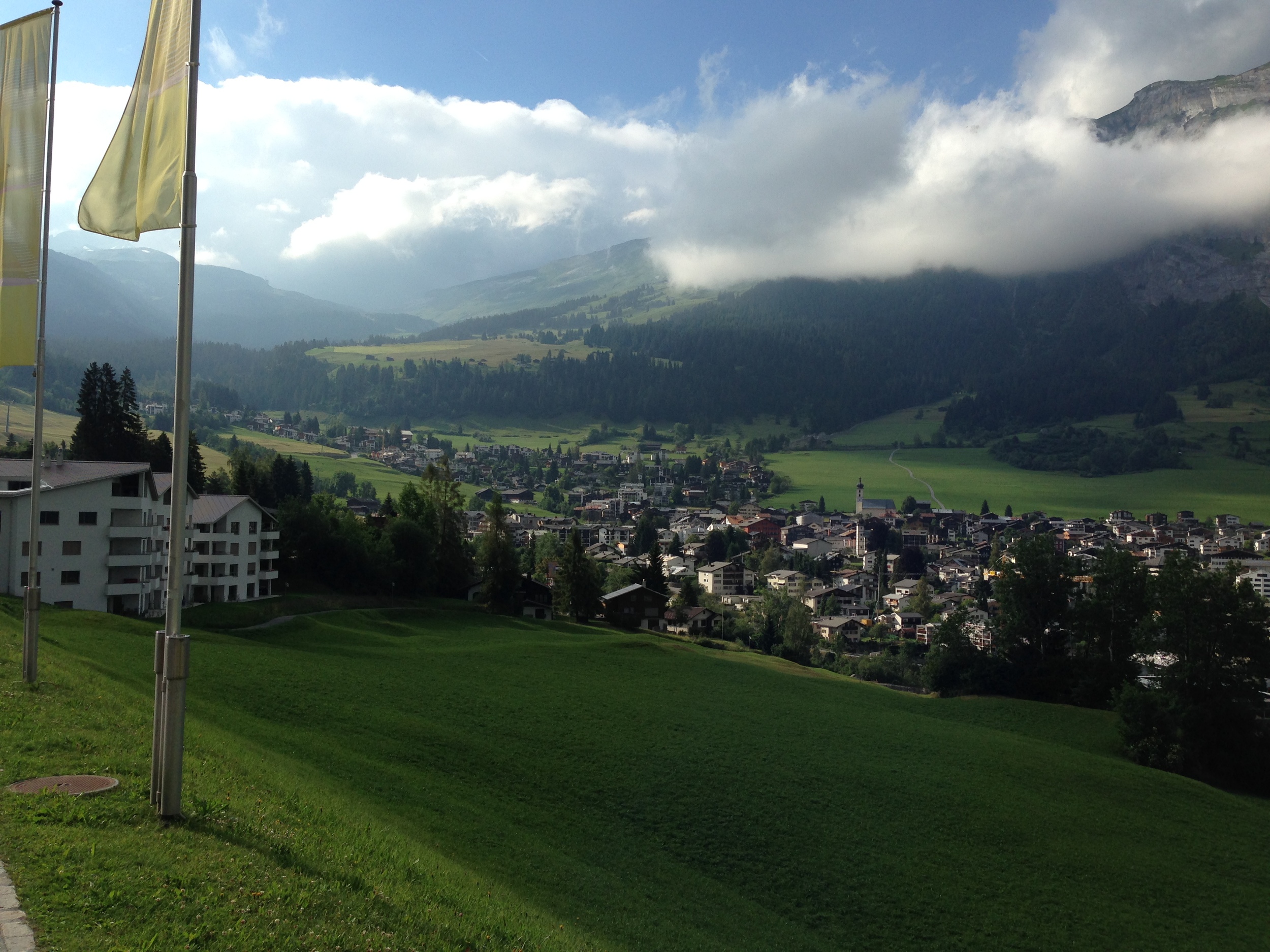
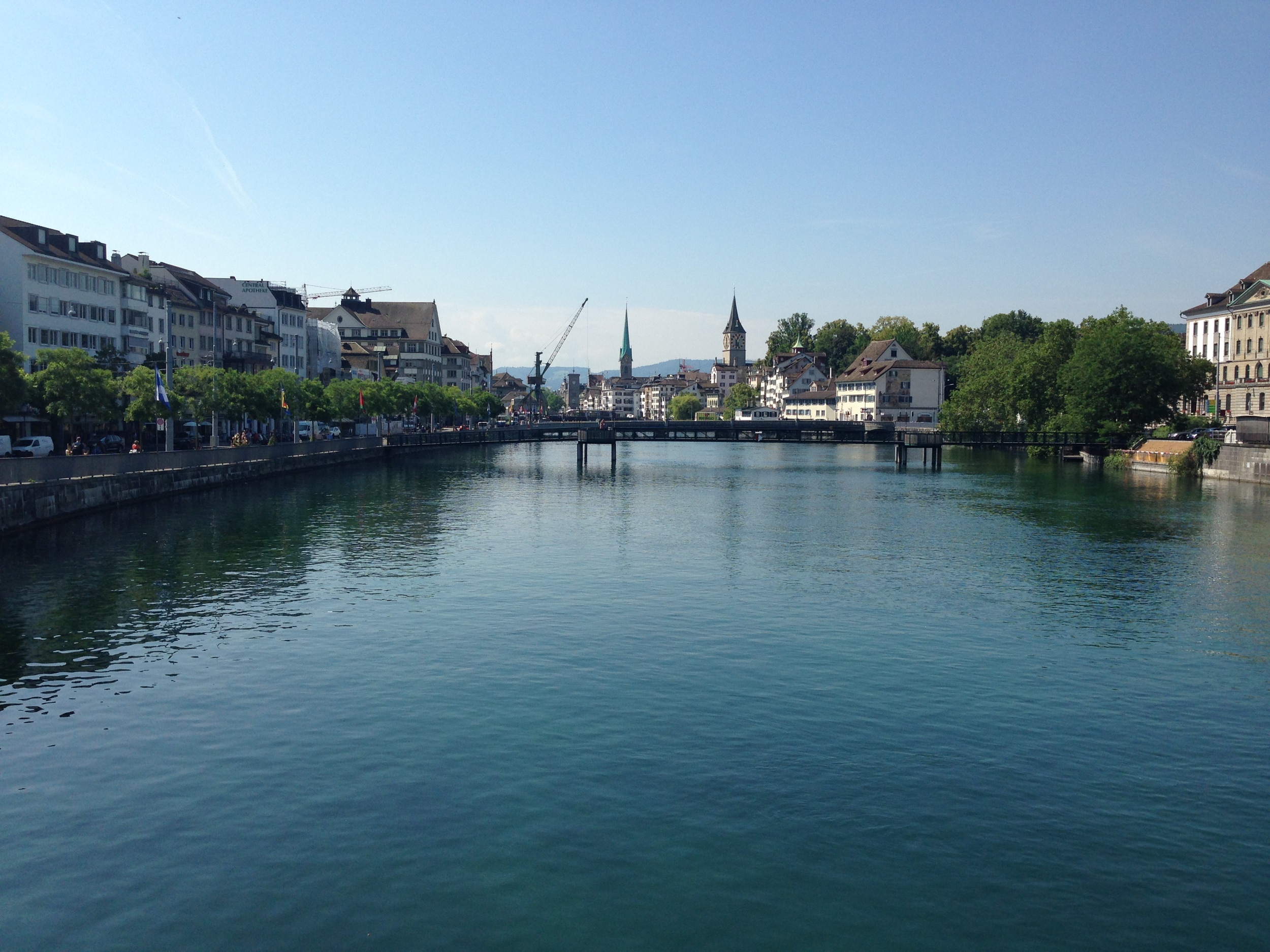
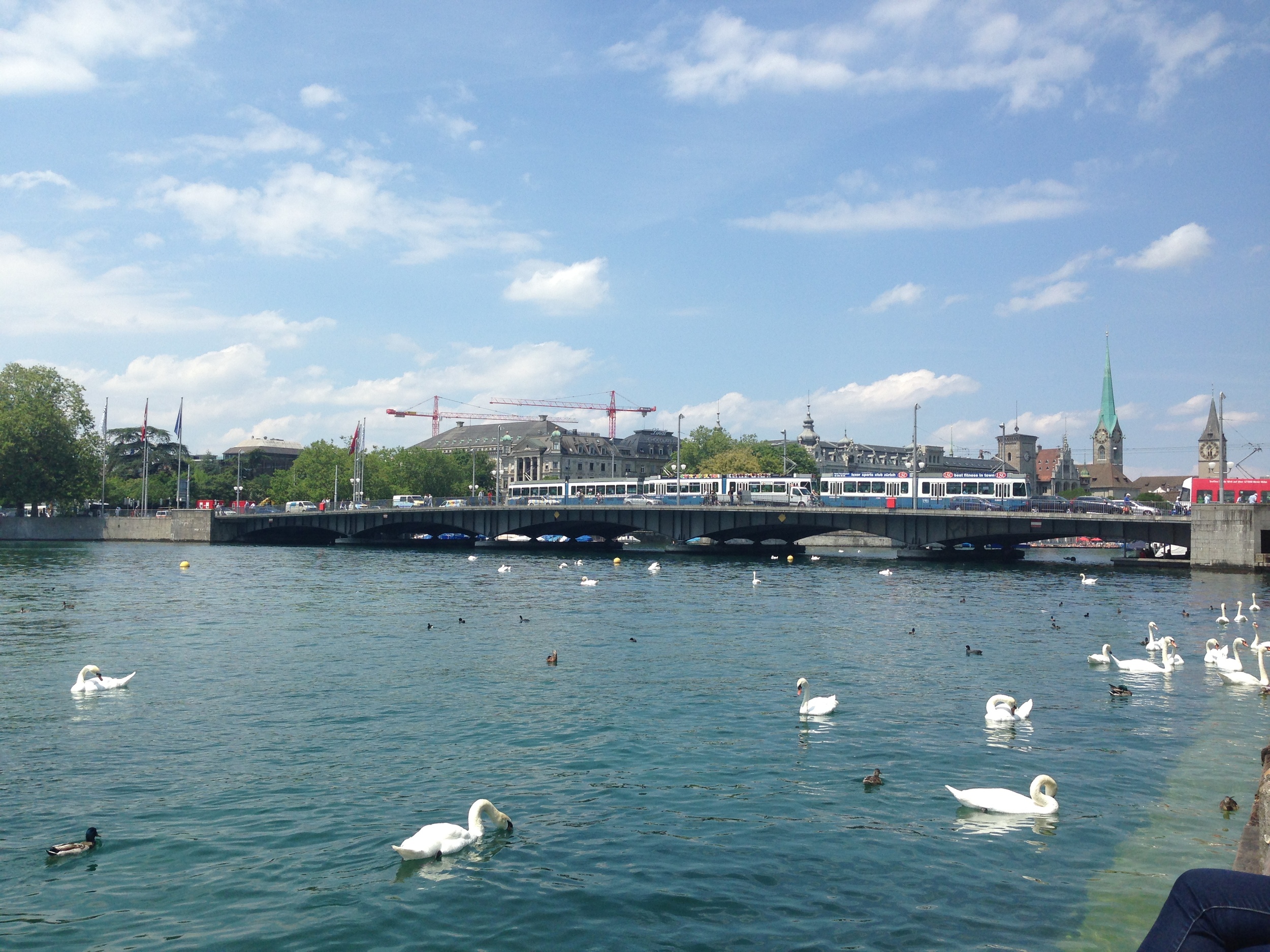
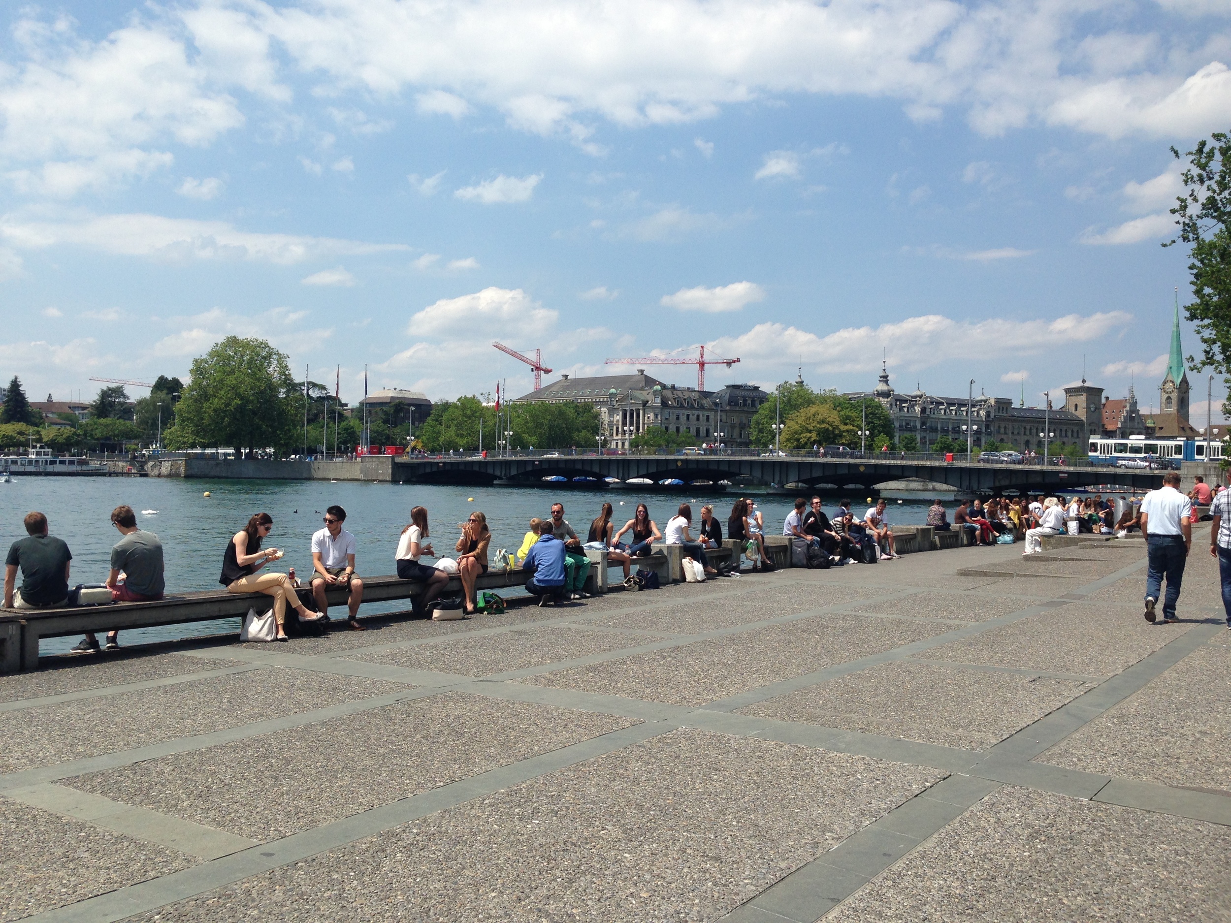
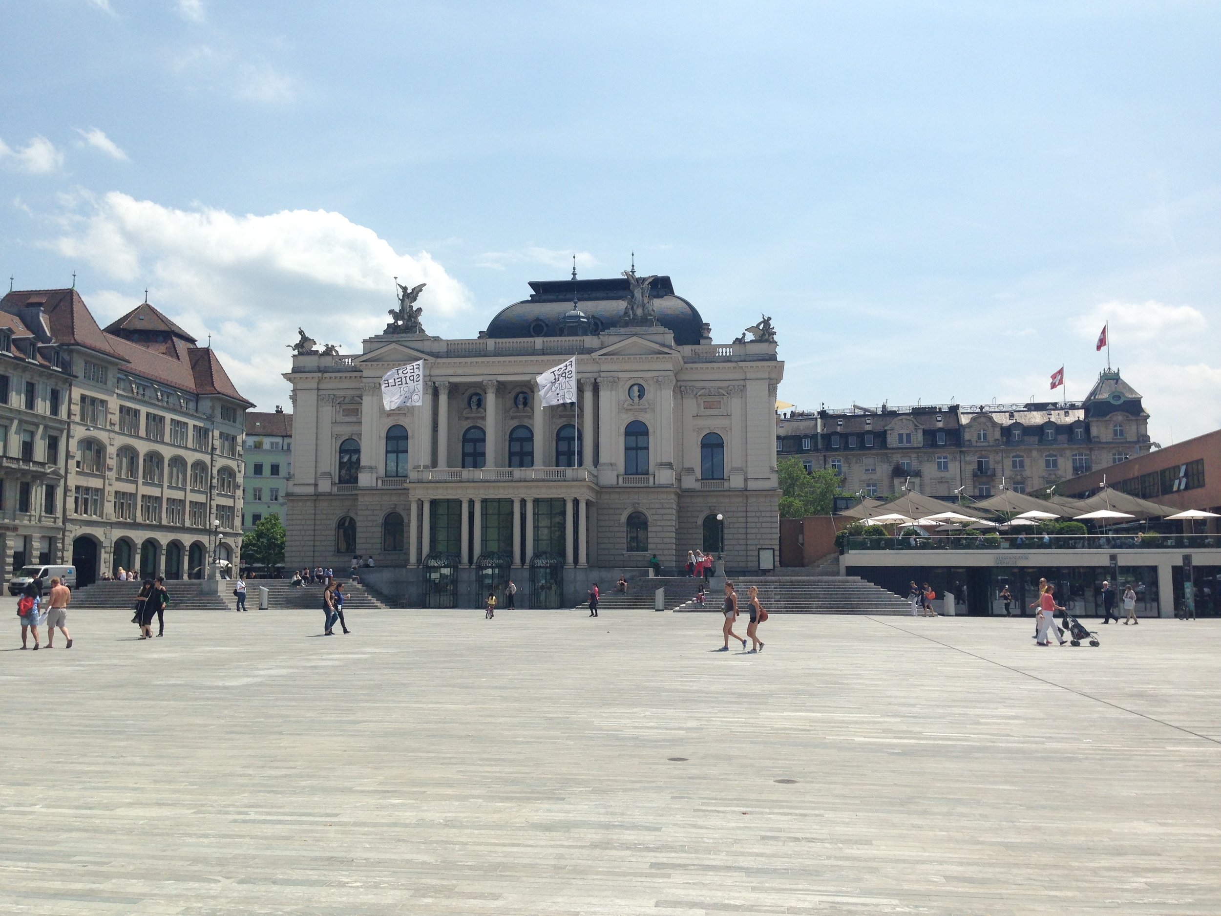
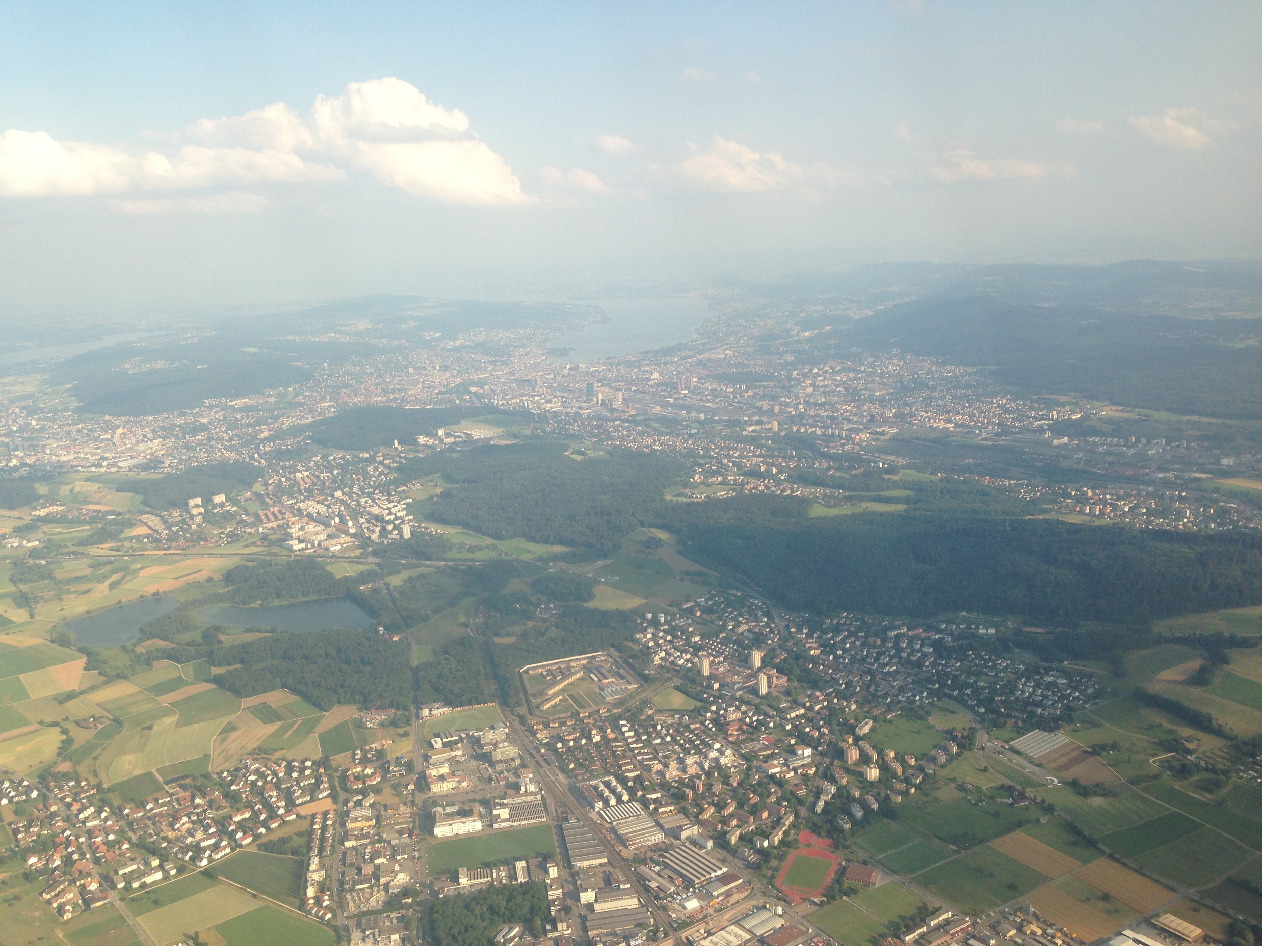
We were only in the Confoederatio Helvetica for about four days, but it was absolutely wonderful and a much needed holiday for me. We flew into Zurich and took a train into central Zurich and just wandered around for a bit. We walked down the river and enjoyed the brisk air, passing lovely (expensive) shops and cafes along the way. By the Rathaus (Town Hall) there is this bridge that goes over the river. From there you can look South and see the gigantic Zurich lake. We walked down these tiny streets (honestly more like corridors) and stumbled upon the Cabaret Voltaire (birthplace of Dada) and so we had to go in. After hanging out for a bit we took a 2 hour train that more or less went across the country to Chur – a smallish city in the South of Switzerland. After waiting for a bus, we finally arrived in Laax. We spent the next few days relaxing, cooking, riding bikes through magical forests, and gazing upon some of the most spectacular and majestic views I've ever seen. Every few minutes seemed to be a 'photo-op', but hey, that's just how awesome Switzerland is. In Flims, a town thats a 20 minute walk from Laax, we rented bikes and rode to the Caumasee (a beautiful loch) and the Rheinschlucht (Swiss Grand Canyon). Really amazing stuff, you guys.
After our stay in Laax, we ventured back to Zurich where I said goodbye to Emily in the train station. She went back to Berlin to meet up with her family and I stayed in town for a bit longer since my flight wasn't until later. I spent my time designing by the Zurichsee and relaxing.
Well, anyways. Enough of that – go to Switzerland! Even though its expensive, I think it was my favorite trip in the entire year I've been in Europe. There's even lil goats! Check it out!

Future Plans After the MATD
As I said in the last post, the end is in near! My time here at the MATD program in Reading is quickly (and unfortunately) approaching its end. I have just submitted my typeface to the department head, Gerry Leonidas. Now, all I have left to do is finish designing an awesome specimen book and write a short "Reflection on Practice" paper. Once I have done these two things, I will get on a long flight back to ATX. So, on July 25th I will be leaving the rainy, old, beautiful land of Britain to go back to Texas. Really excited for this, but it's honestly quite bittersweet. The program, travels, friends, and even the food will be greatly missed. The amazing libraries and reading rooms where I have had access to unbelievably old, priceless, beautiful manuscripts & books will now only be able to be visited through memories, photographs, and scans. The professors who have encouraged me to create (in my opinion) one of the best piece of design I have ever done will never be forgotten and can probably never be properly thanked. There have been many difficulties, and many more to come, but I believe my time (and money) here has been well spent. Cheers to the MATD!
I will go back to Waco and hang around with my girlfriend, family, and friends for a couple of weeks then I'm off again to start a new chapter of my life. Some time in August I will be moving to New York City to start a career in the Typographic Arts! I have always wanted to move to NYC, but never felt really prepared until now. Thankfully I have some ridiculously awesome friends up in the five boroughs that have helped my find a place to live and have even give me leads to jobs. Huge shout out to my bros Corey Hale, Jeff Rogers, and Ryan Feerer.
As they say in England, massive thanks to these top lads. Could not be where I am today if it wasn't for their help!

Friends, Family, Fonts and Future Plans
Over the course of the last 3 months many exciting things have happened. Instead of me flying to the States to see friends and family, the States came to me on two different occasions! My family came to visit for about 10 days and we traveled around South England and went to Paris for a few days. Then about two weeks after that, the Freeman Bros came for a visit. I have known Tanner and Braden Freeman ever since I was a kid, so it was great to catch up with them and travel around Europe together – even if it was almost an identical trip as the one I took with my family only weeks earlier, ha! All in all, we had some great adventures and had a lot of good conversation. Tanner runs a design studio in my hometown of Waco, Texas called Deuxtone. Everyone should check them out. Some really killer stuff coming from that two man studio in Downtown WTX.
As for myself, I have become immune to the effects of caffeine as I stay up late hours to push pixels and pull béziers. I have started a few new projects. Some of the projects are for my program – I am designing a general-use script type family where each weight corresponds to the tool used to draw it and how quickly it was drawn. I have also been given some new freelance opportunities from my wonderful clients and my bud Ryan Feerer. This may sound like a lot of work, but honestly, most of these projects are being filled under "FUN". They give me a nice break from slaving over my MATD type project or from writing my dissertation. Later, I will post WIP shots of some of these projects up on the "Featured" tab of my site.
The end is in sight though! I will submit my typeface design project in a few weeks. After that I will design an print a type specimen booklet to hand in as well. I am extremely excited to create and design a book with something I created and designed (design inception?)! After those two things are in, all I will have to focus on is writing and researching for my paper and a reflection on my time spent here at the MATD. Oh, and also an adventure! Me and my lovely girlfriend will take a much needed holiday to Switzerland. We will fly into Zurich then head south into the Swiss alps to the small village of Laax where we will find one of my type colleague's families condo. We will have hike and bike trails, ski lifts, transparent lakes, glaciers, and many, many mountains to explore.
In all, the past 3 months have been crazy, but awesome. It's amazing that I have friends and family that would fly all the way over here just to hang out with me (OK, and to see Europe...). It has been an amazing adventure so far and its not even over yet! However, I am extremely excited about what the future holds as well. More updates on that stuff soon. I have a big announcement on my plans after MATD that I cannot wait to share with you all.
Cheers!

The Emerald Isle
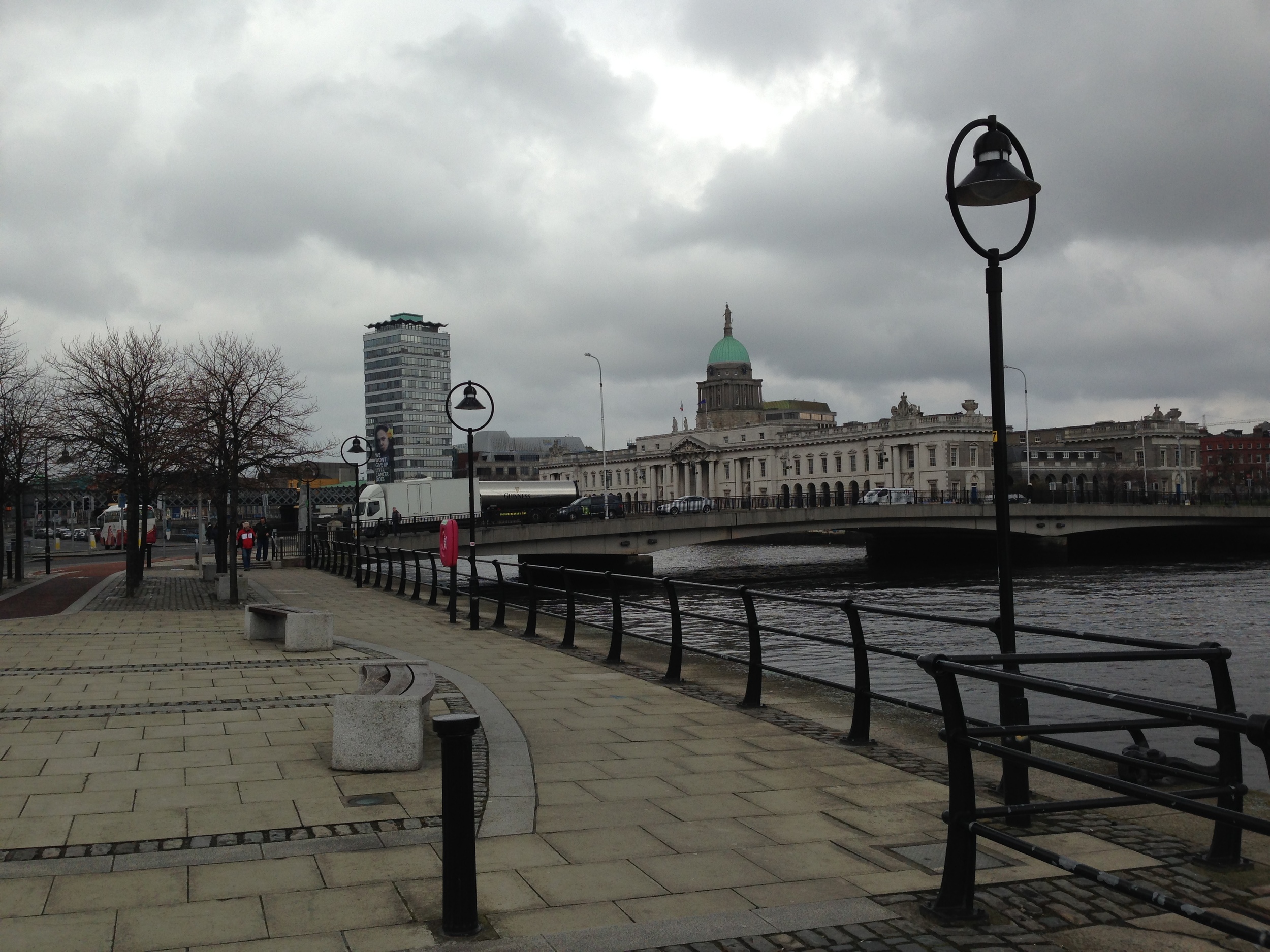
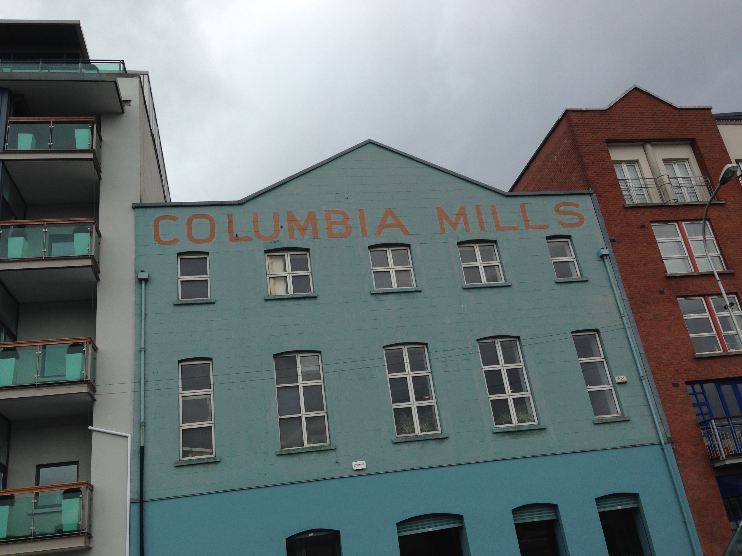
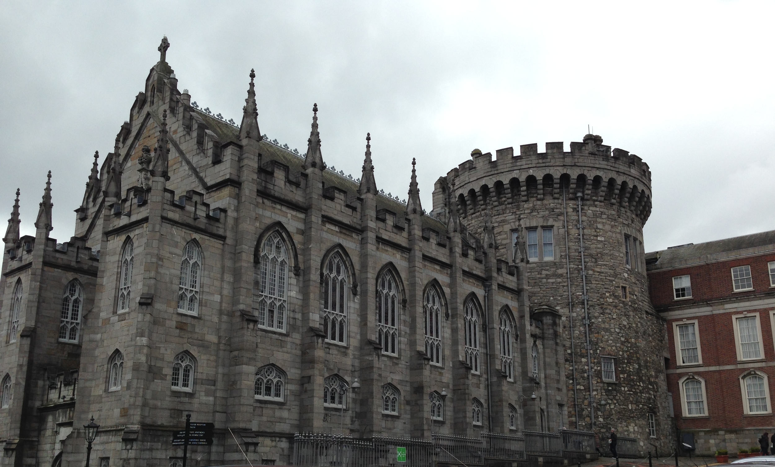
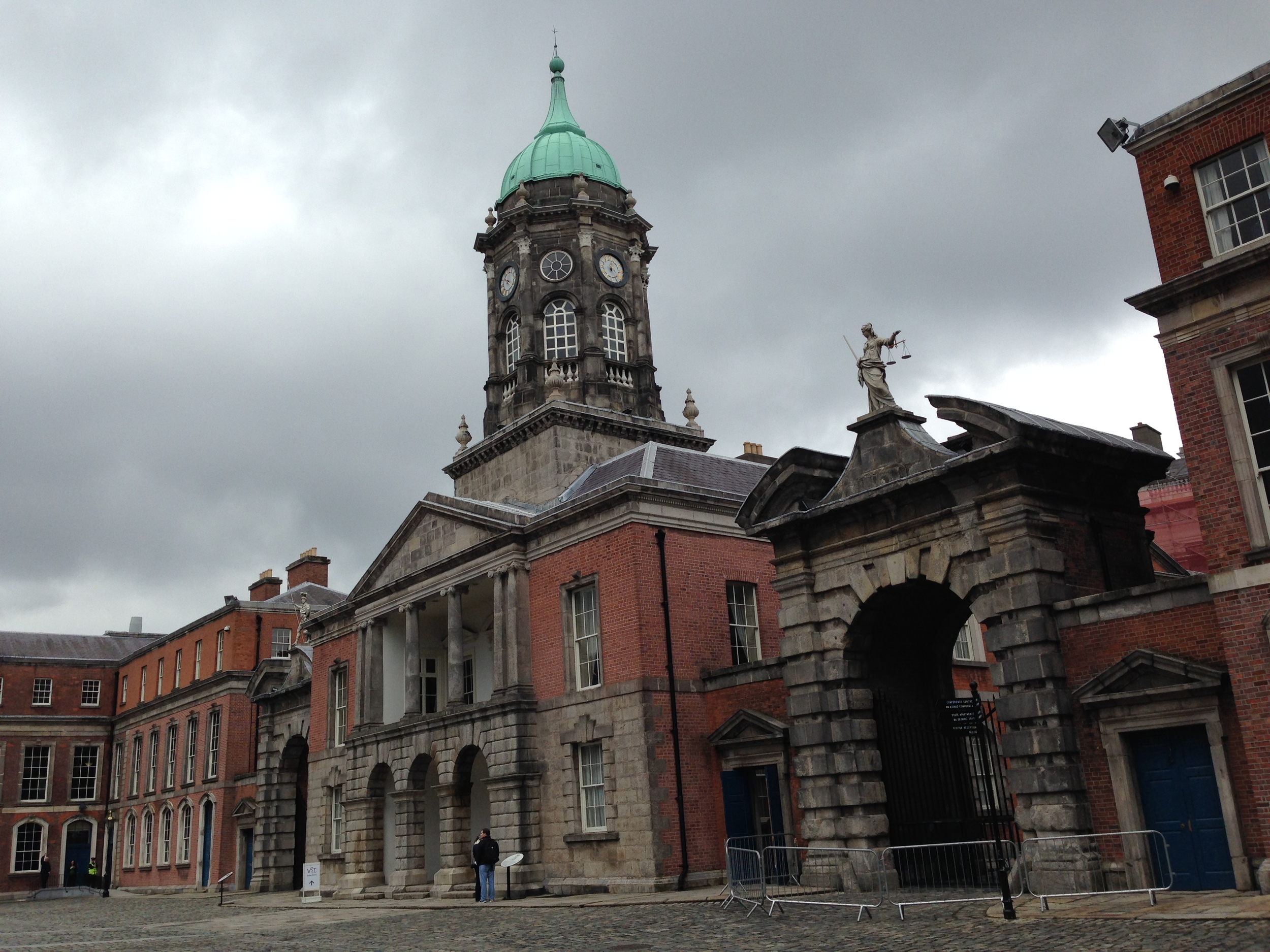
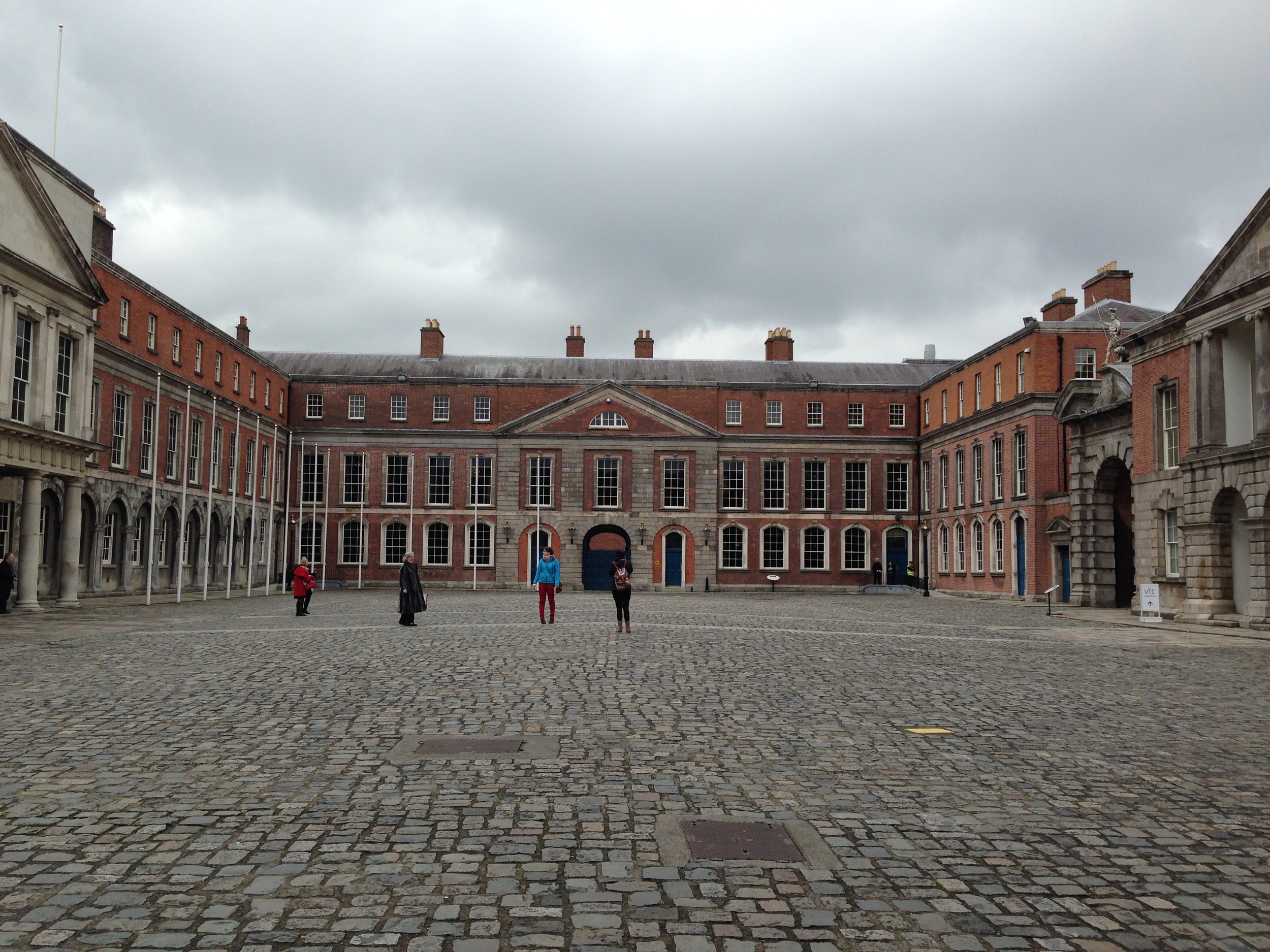
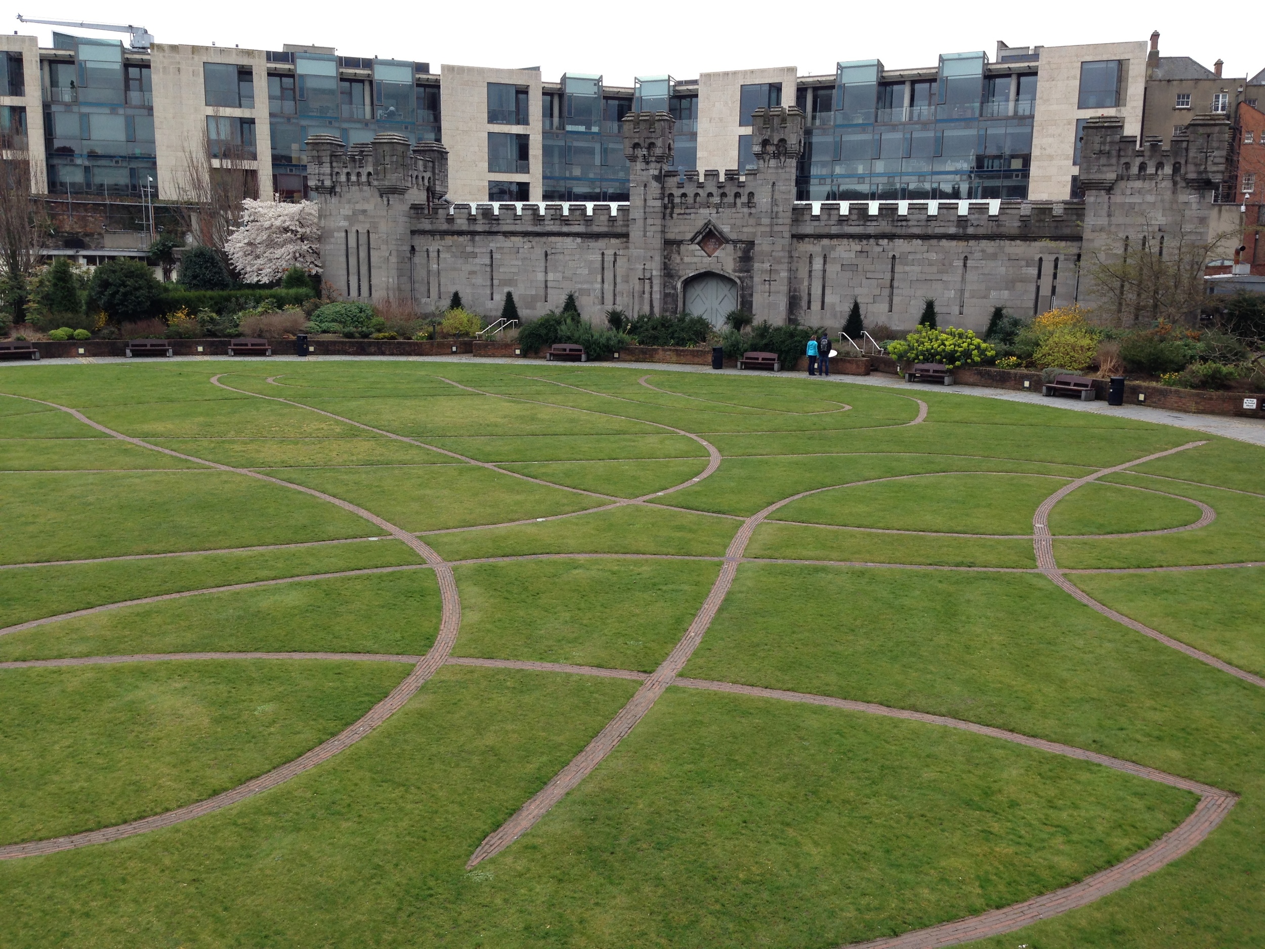
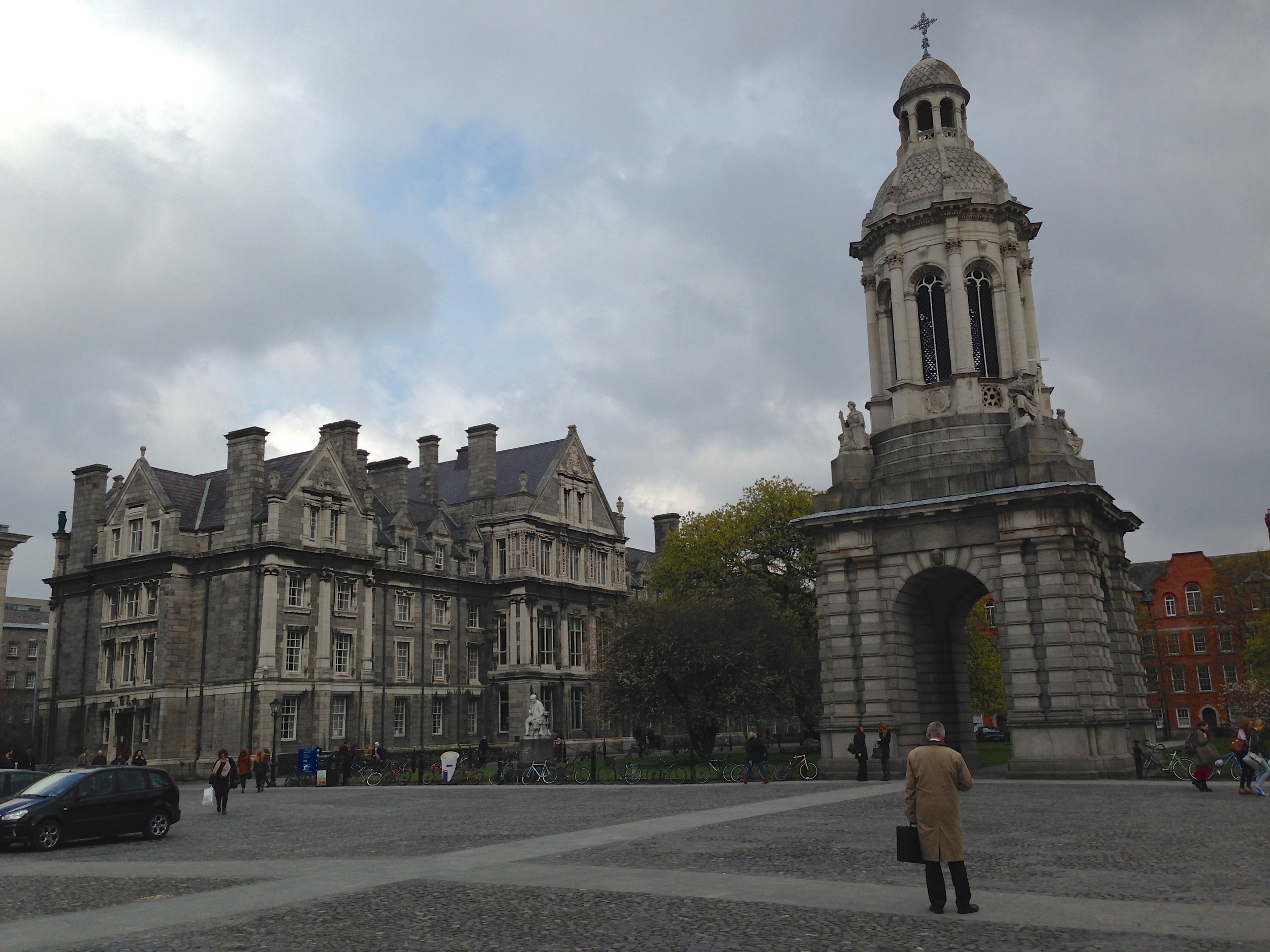
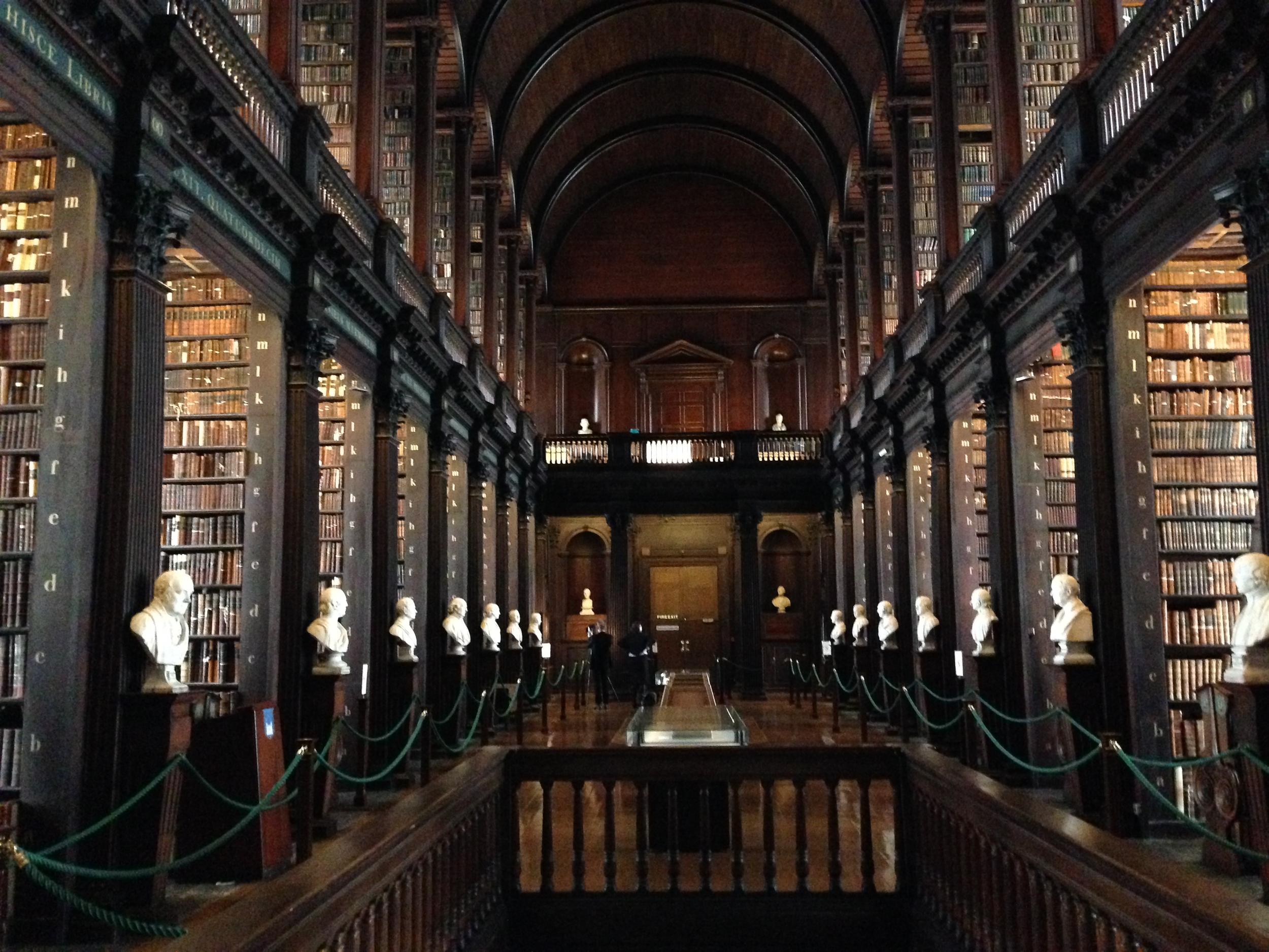
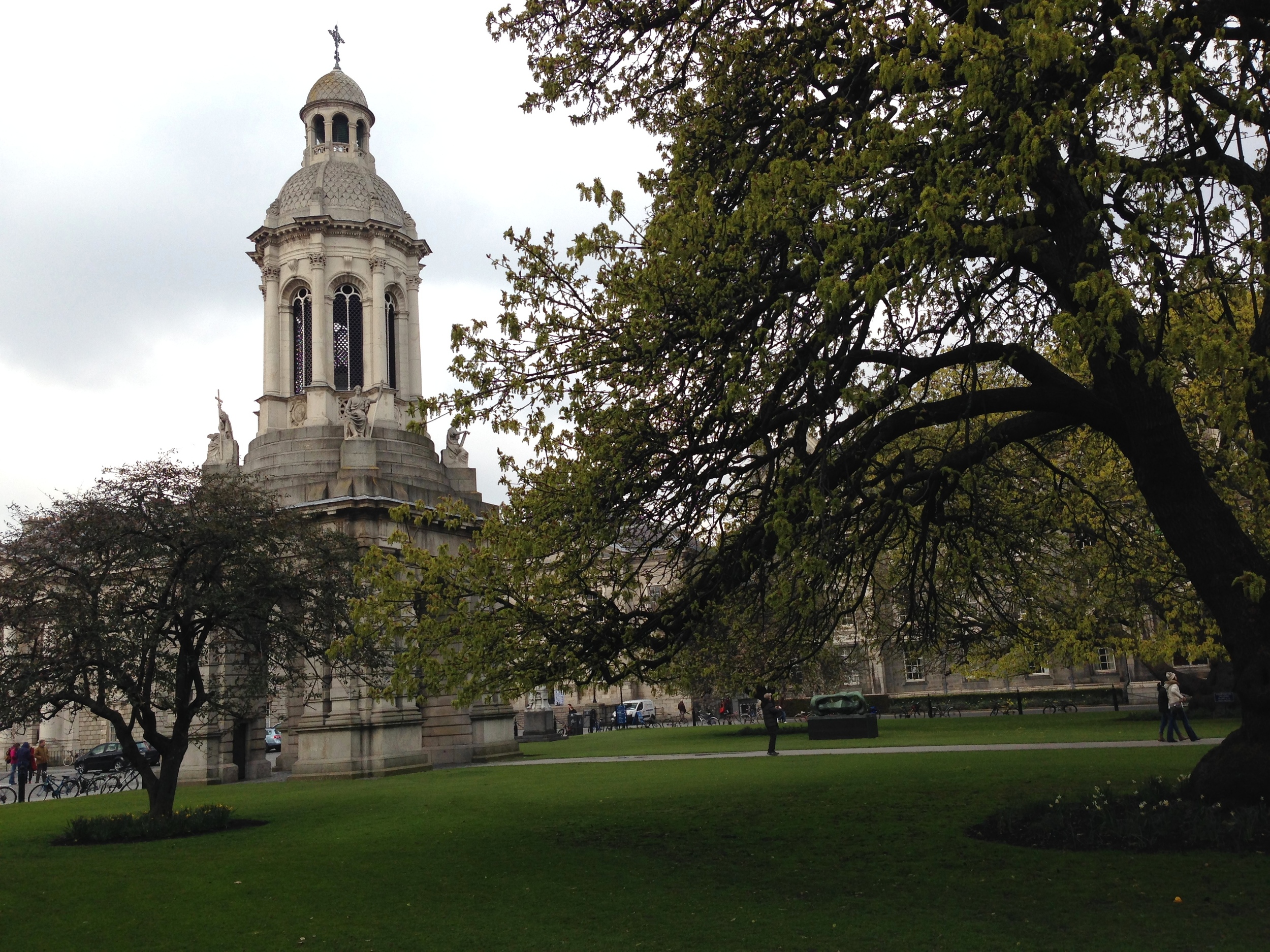
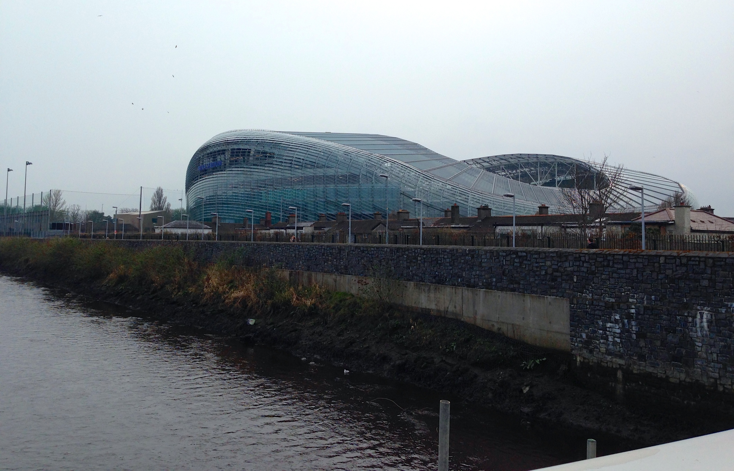
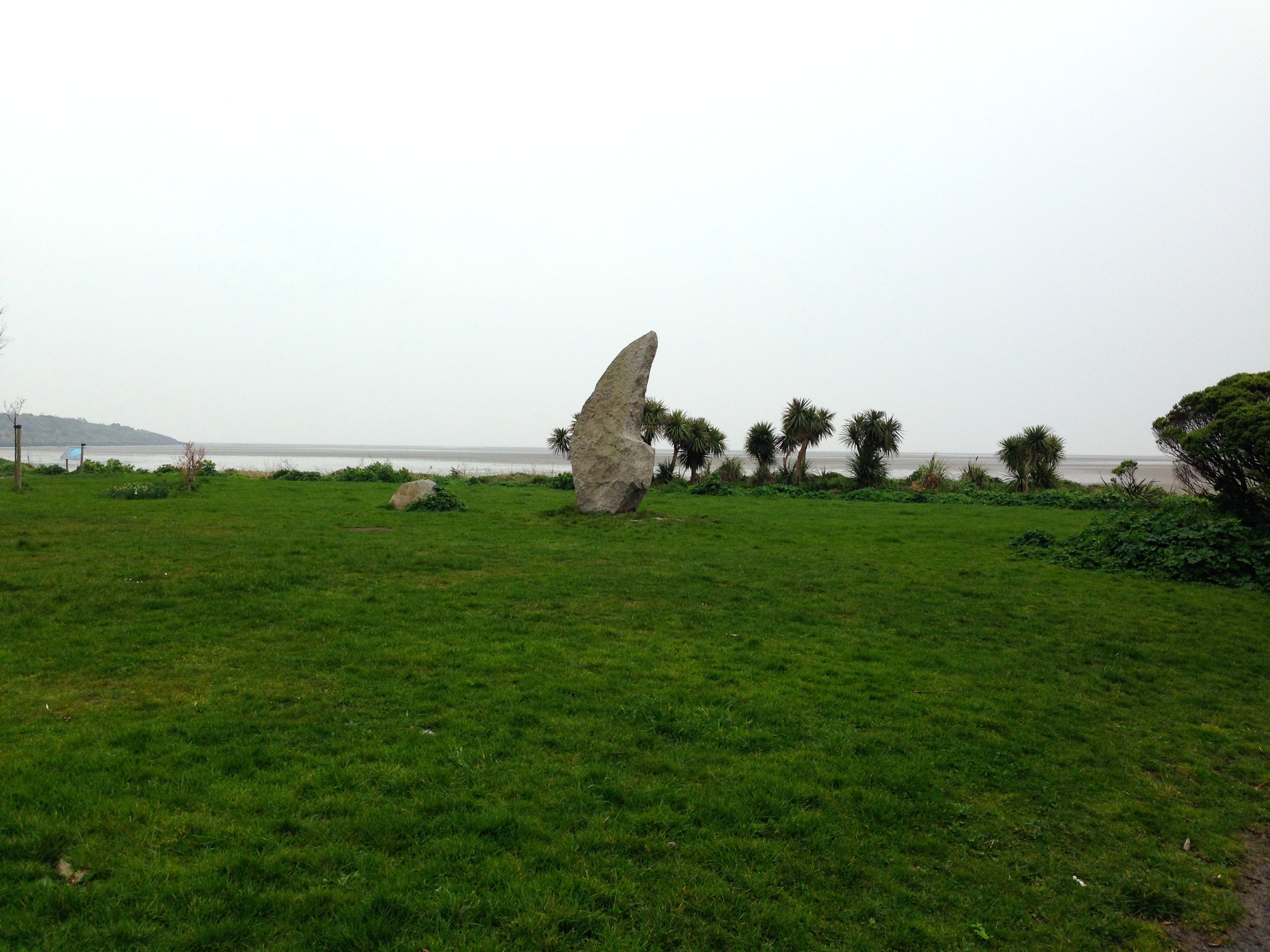
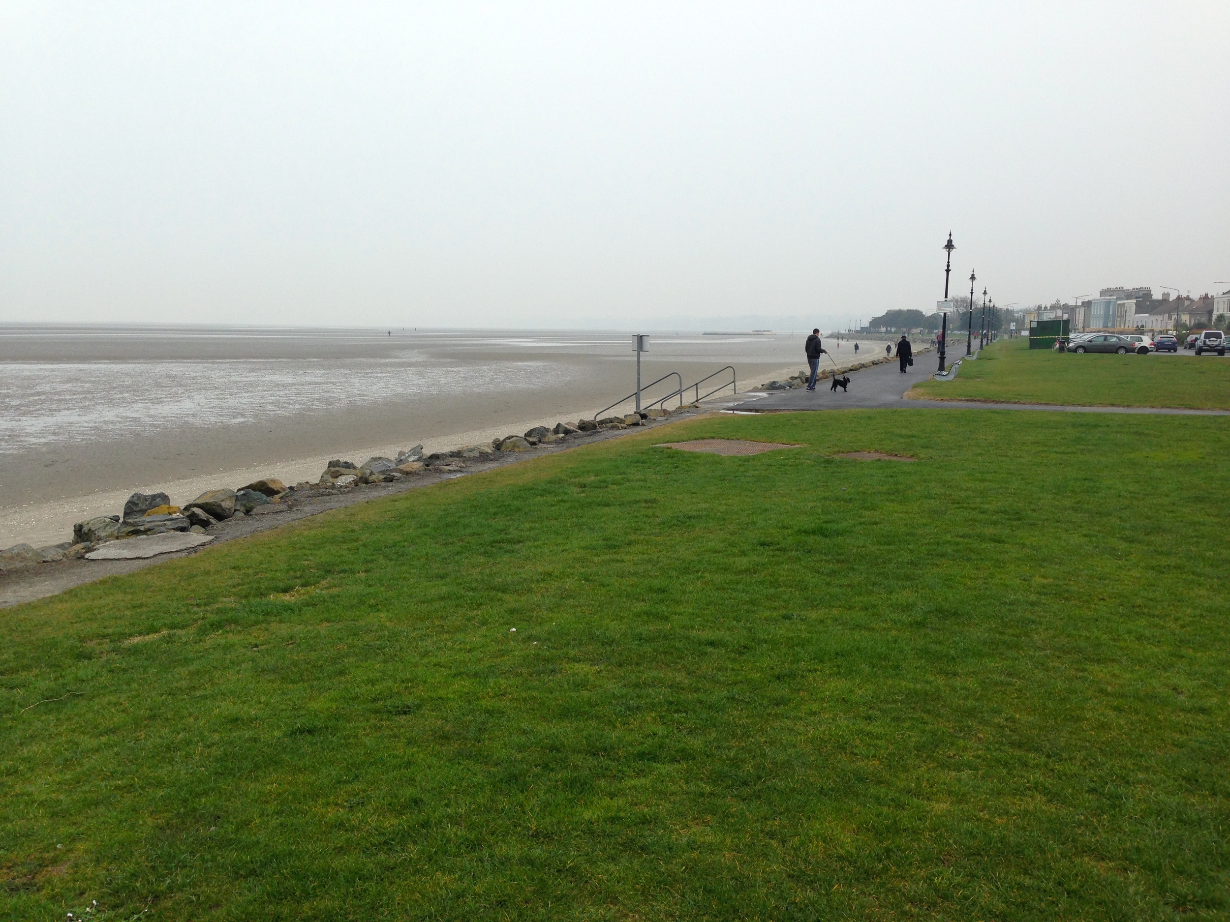
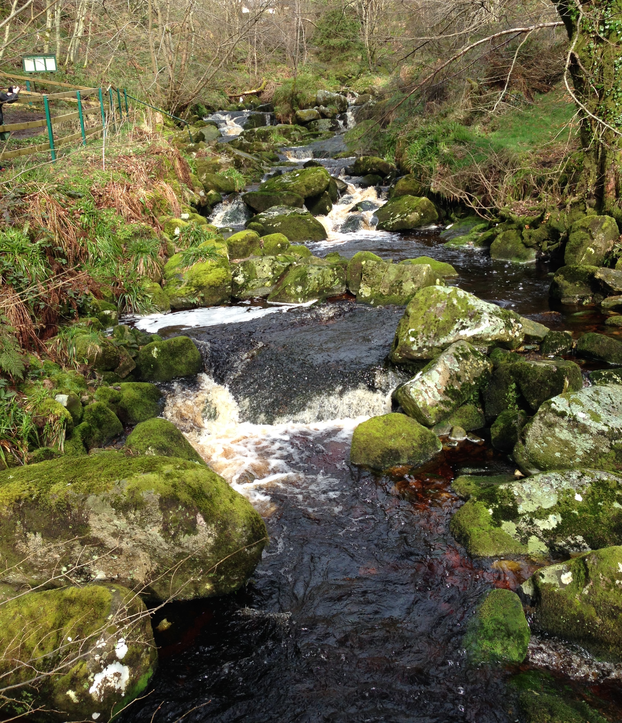
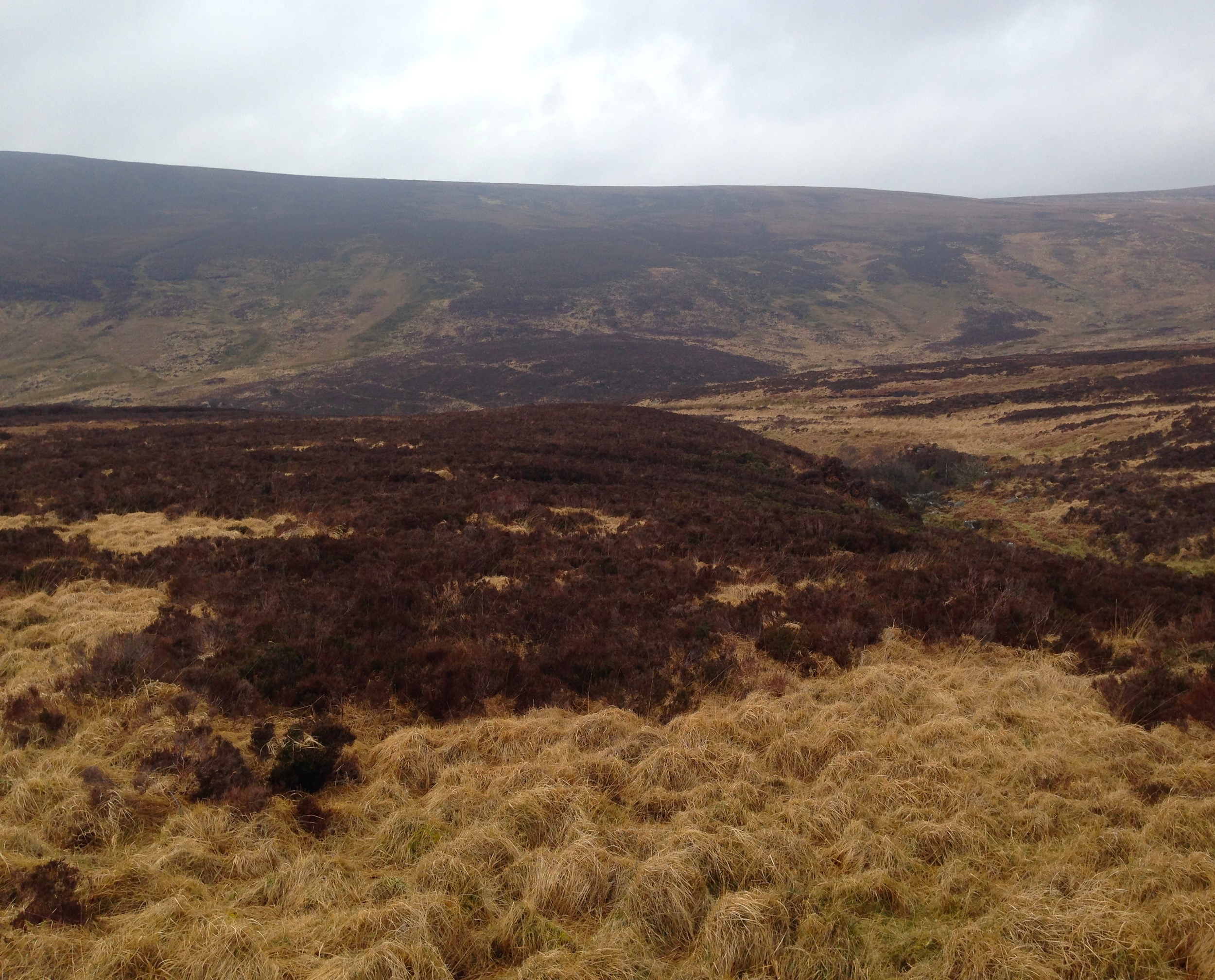
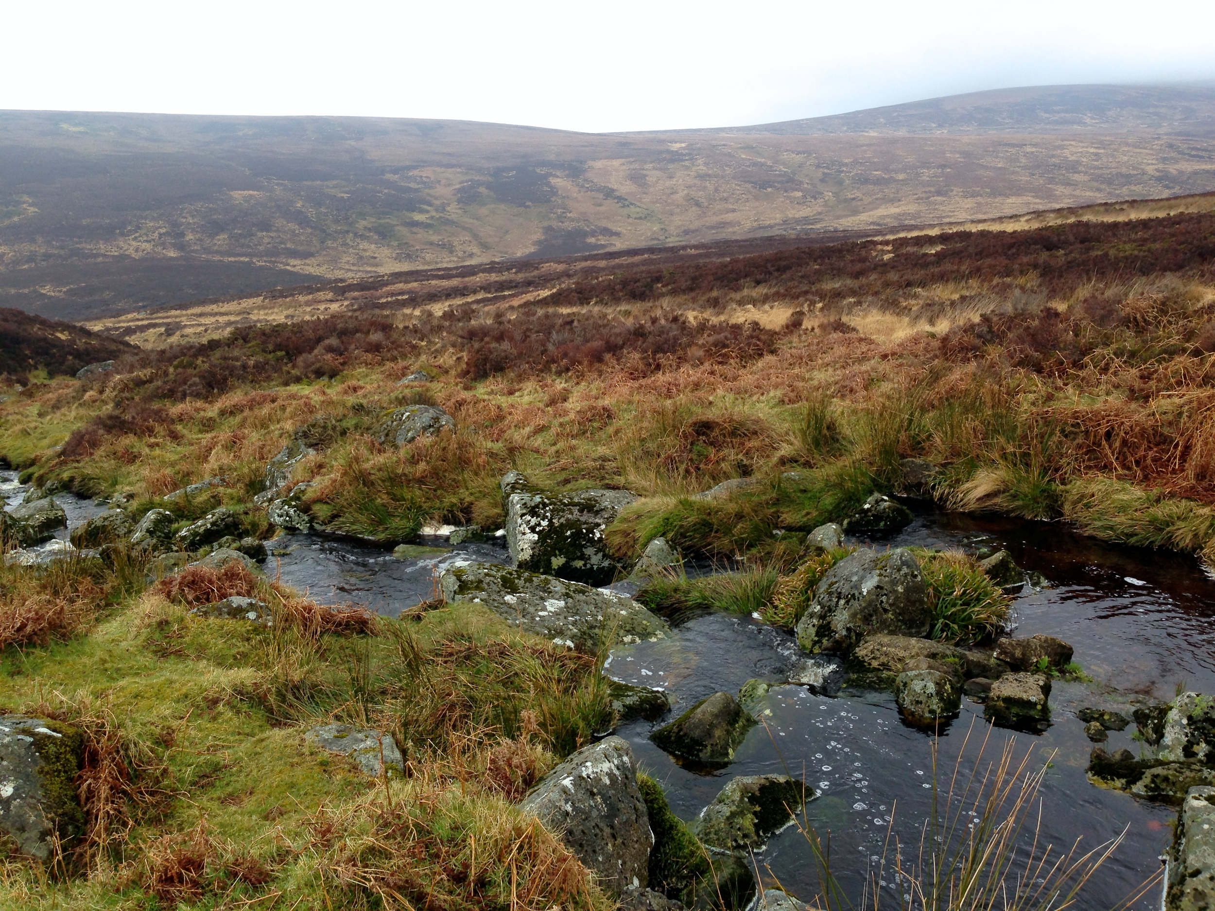
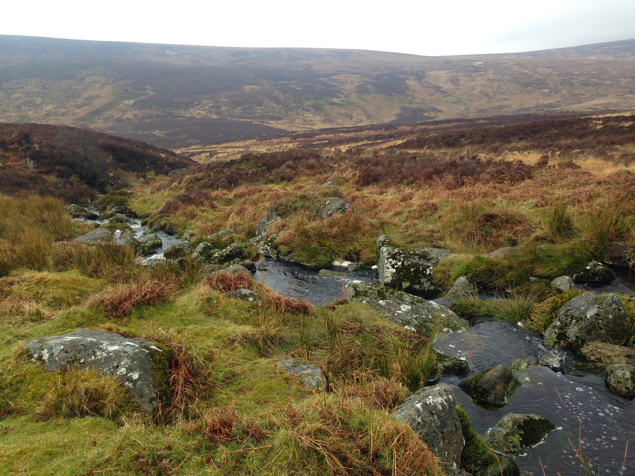
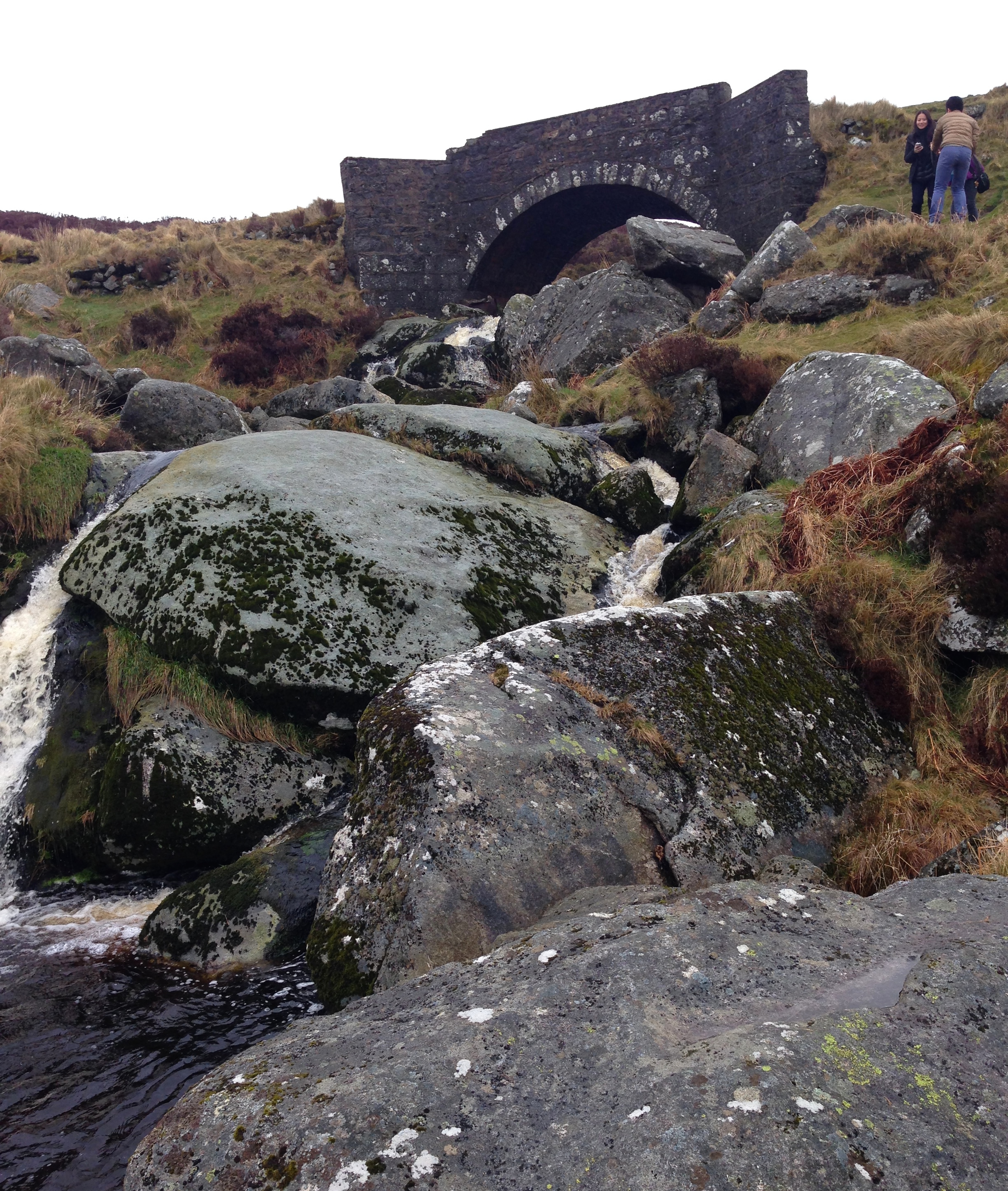
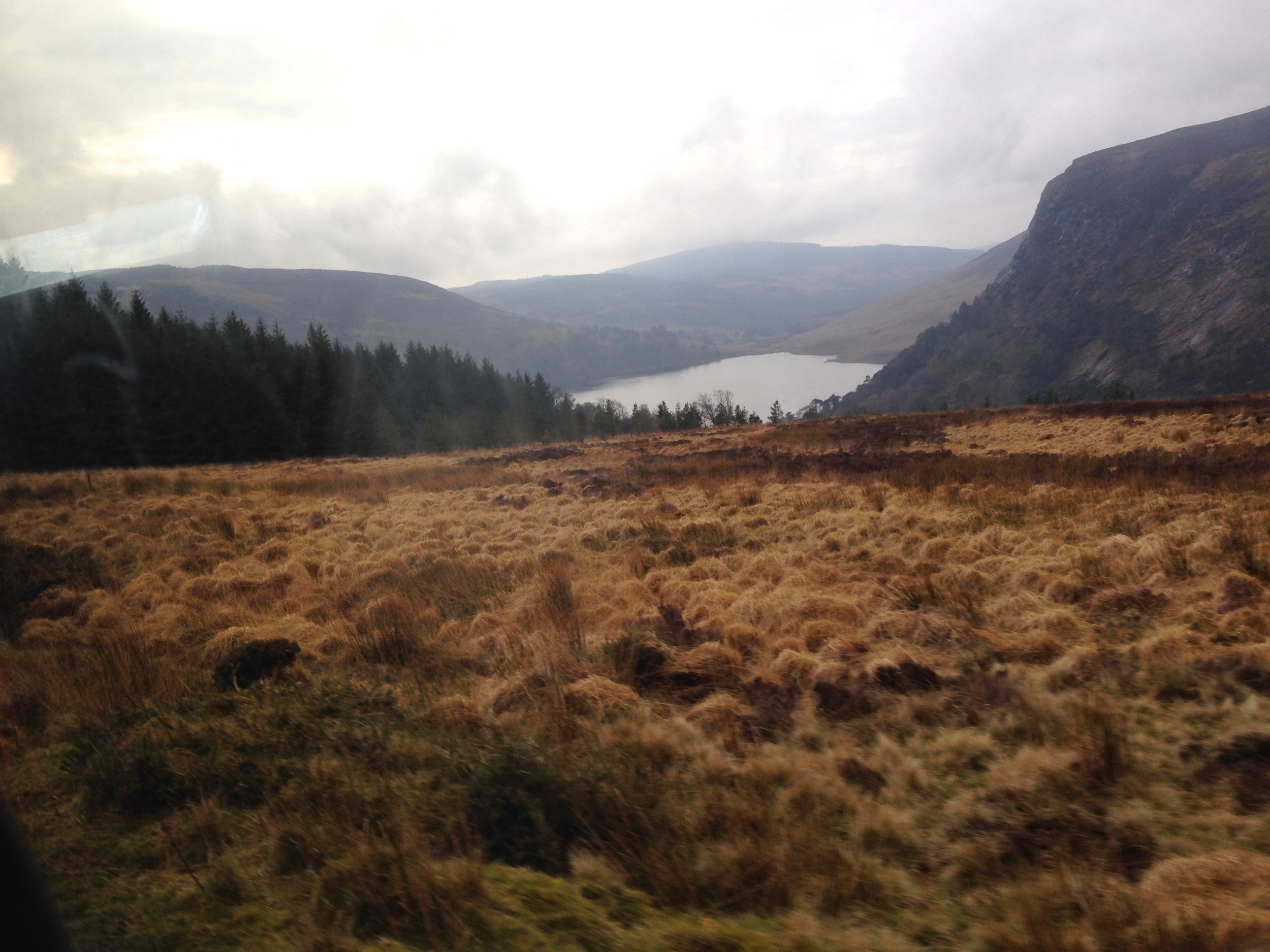
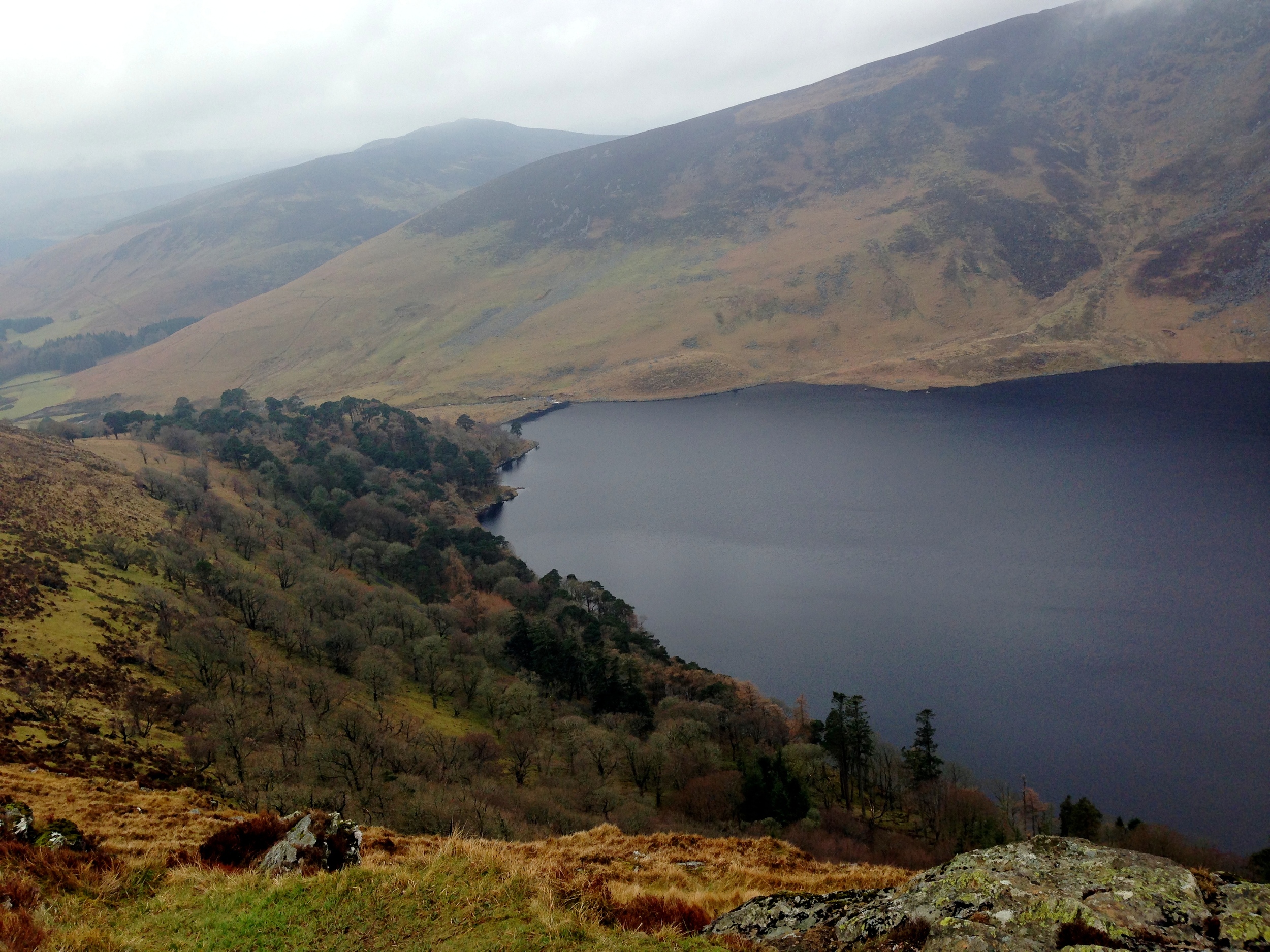
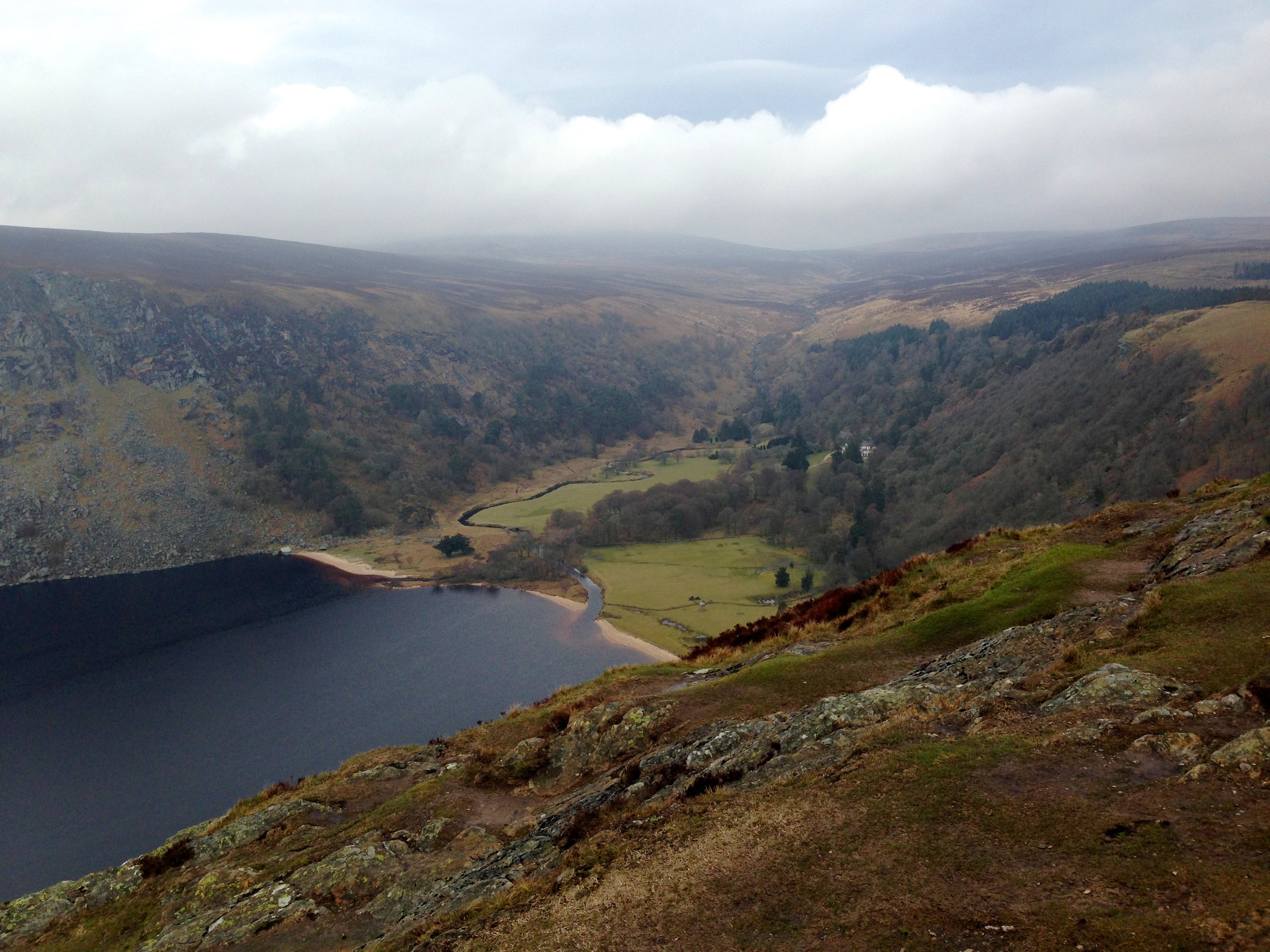
All who have not been to Ireland must go! It's a beautiful country and besides the copious amounts of rain, terrible hostels, and rude bus drivers, it's a very nice place to vacation to. Me and my friends Helen and Lisa went on a weekend trip to The Emerald isle a few days ago and I thought I should post some pictures. If you ever wondered why its called the Emerald Isle, just scroll down and look at the grass in the photos. I mean, its like green. Anyways, we stayed in Dublin and took a day trip to the Wicklow Mountain National Park where we say Lough Tay, some epic mountains, The Upper Lakes, and cute little Irish villages. Enjoy.
MATD > Belgium & The Netherlands
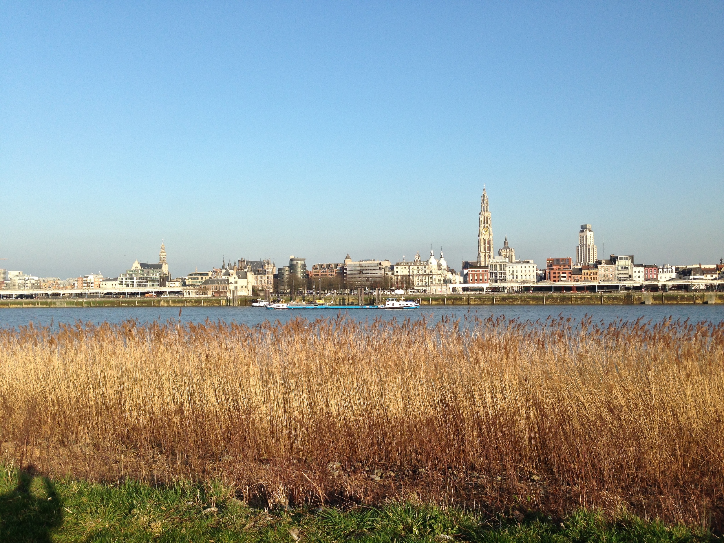
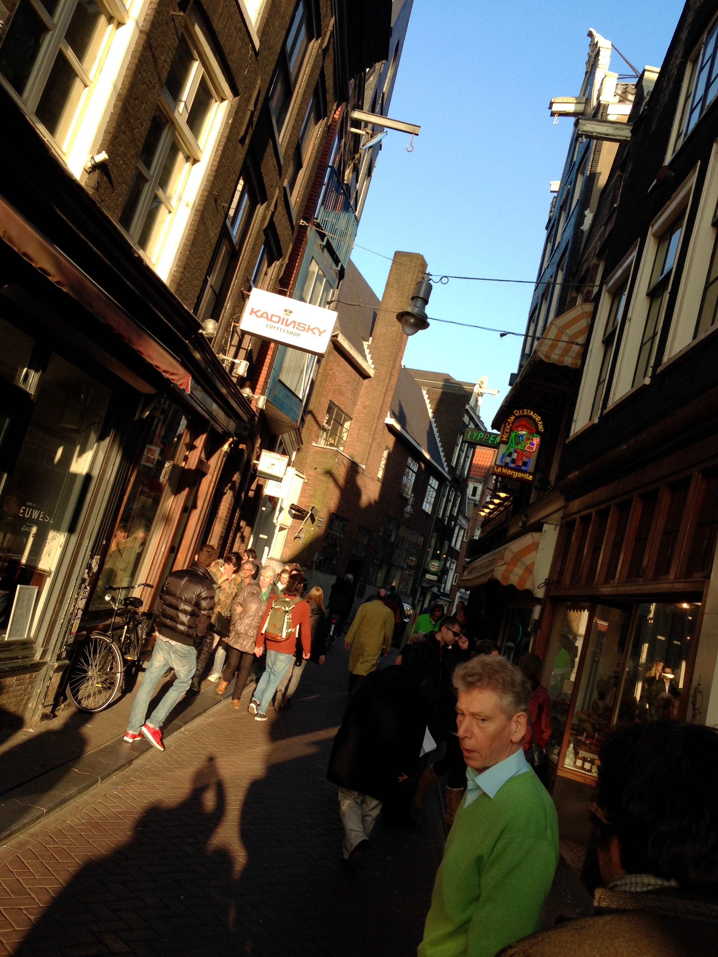
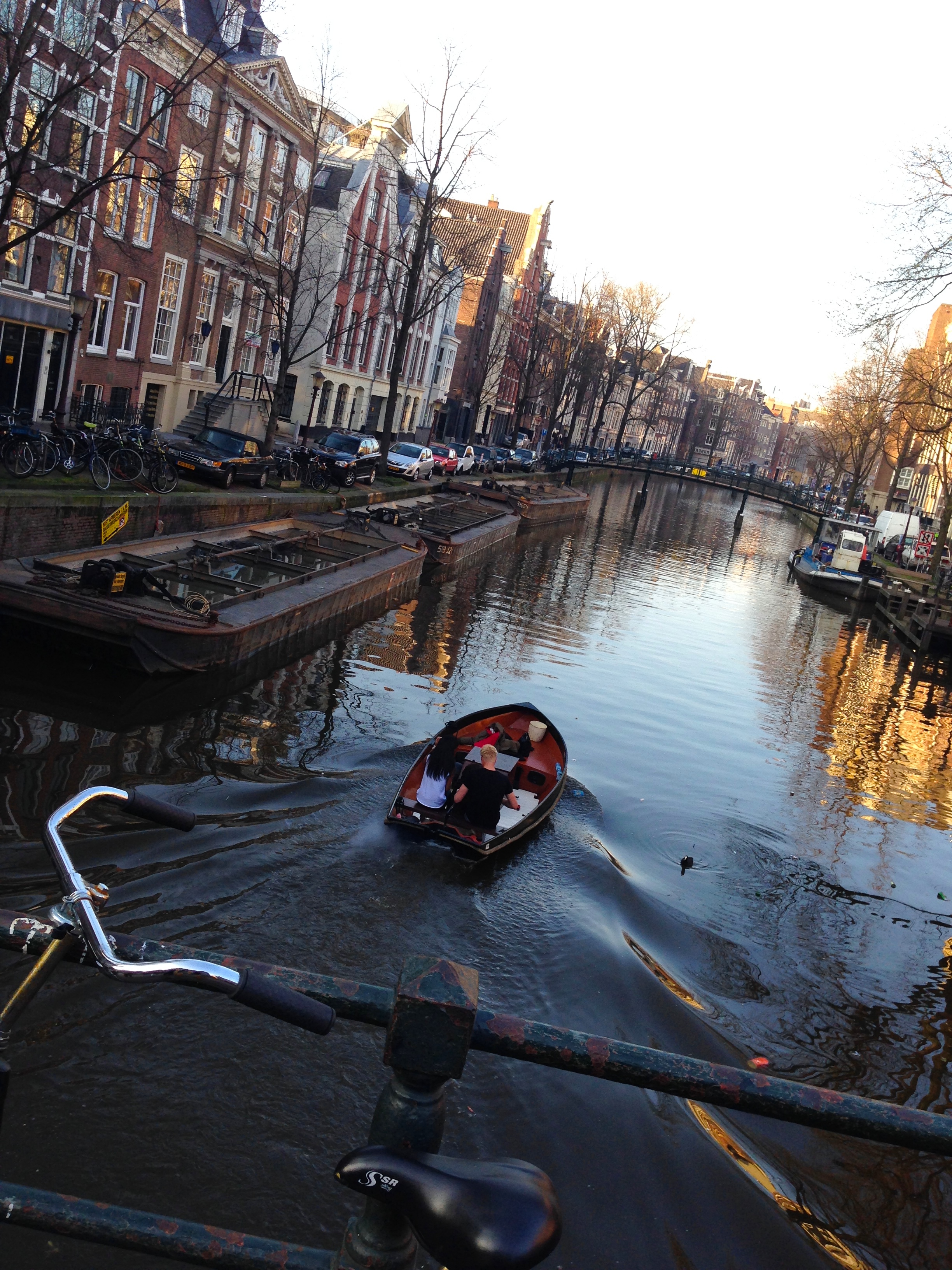
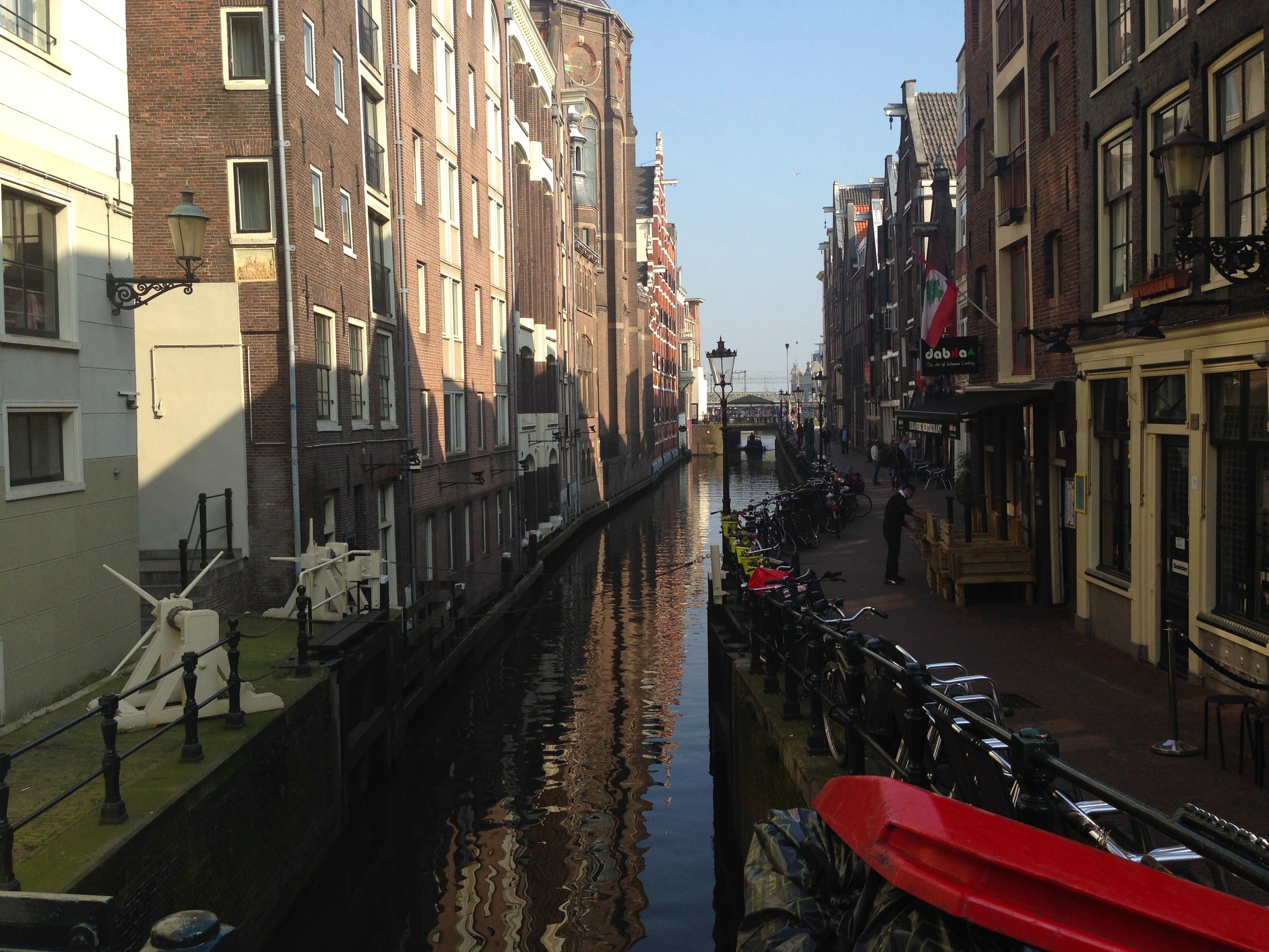
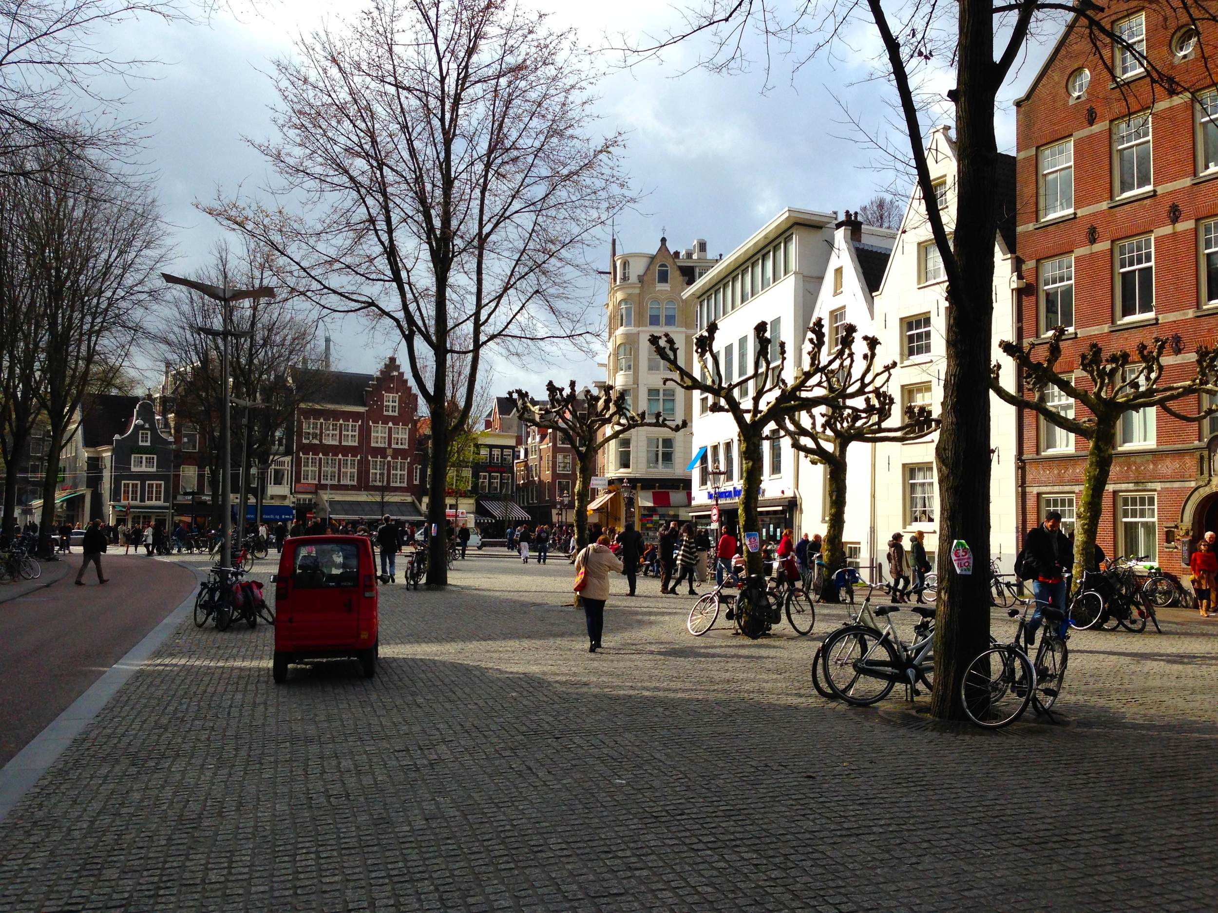
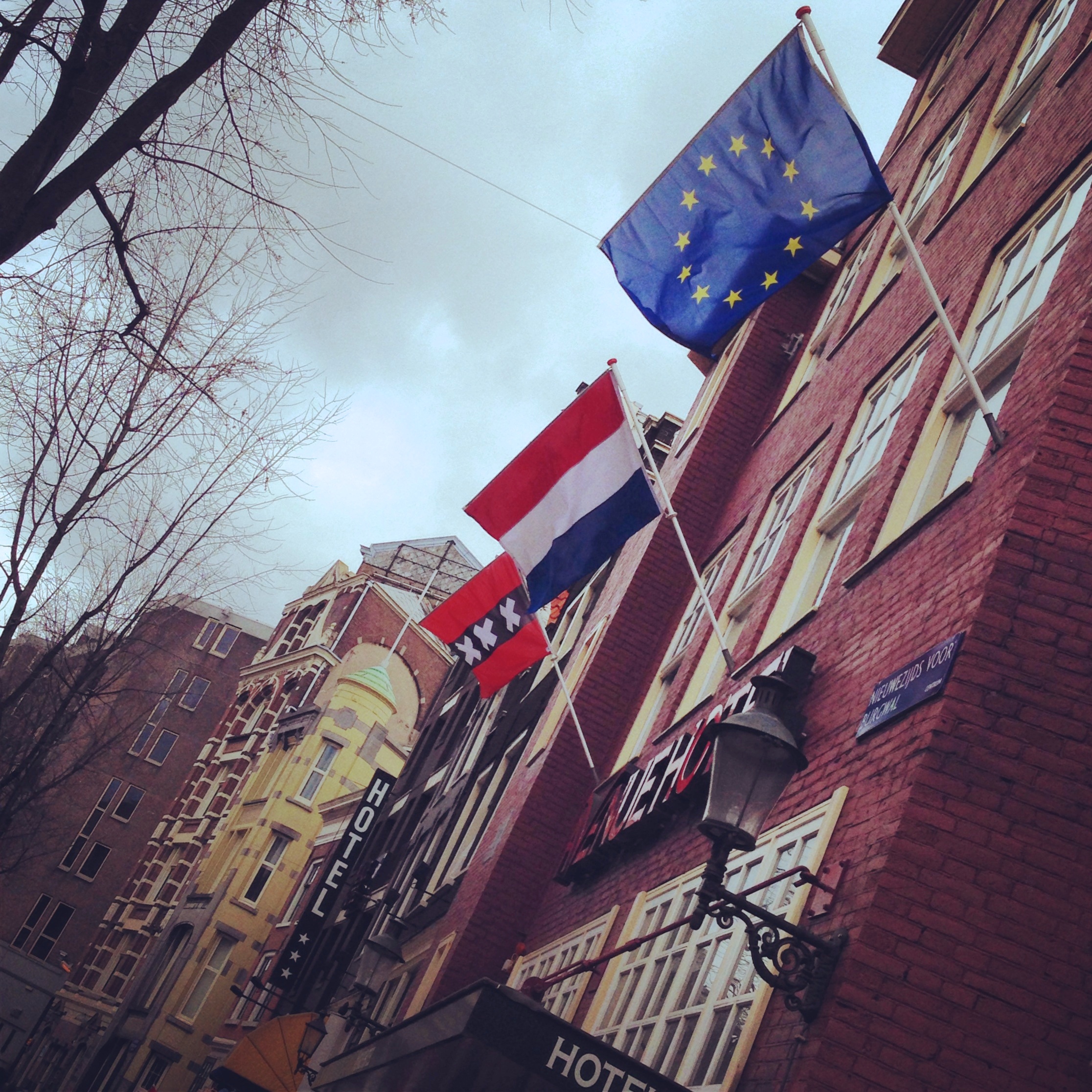
I recently got back from Belgium and the Netherlands. If you dont wanna read the rest of this article I'll sum it up quick: It was awesome. Scroll down for images taken in a hurry.
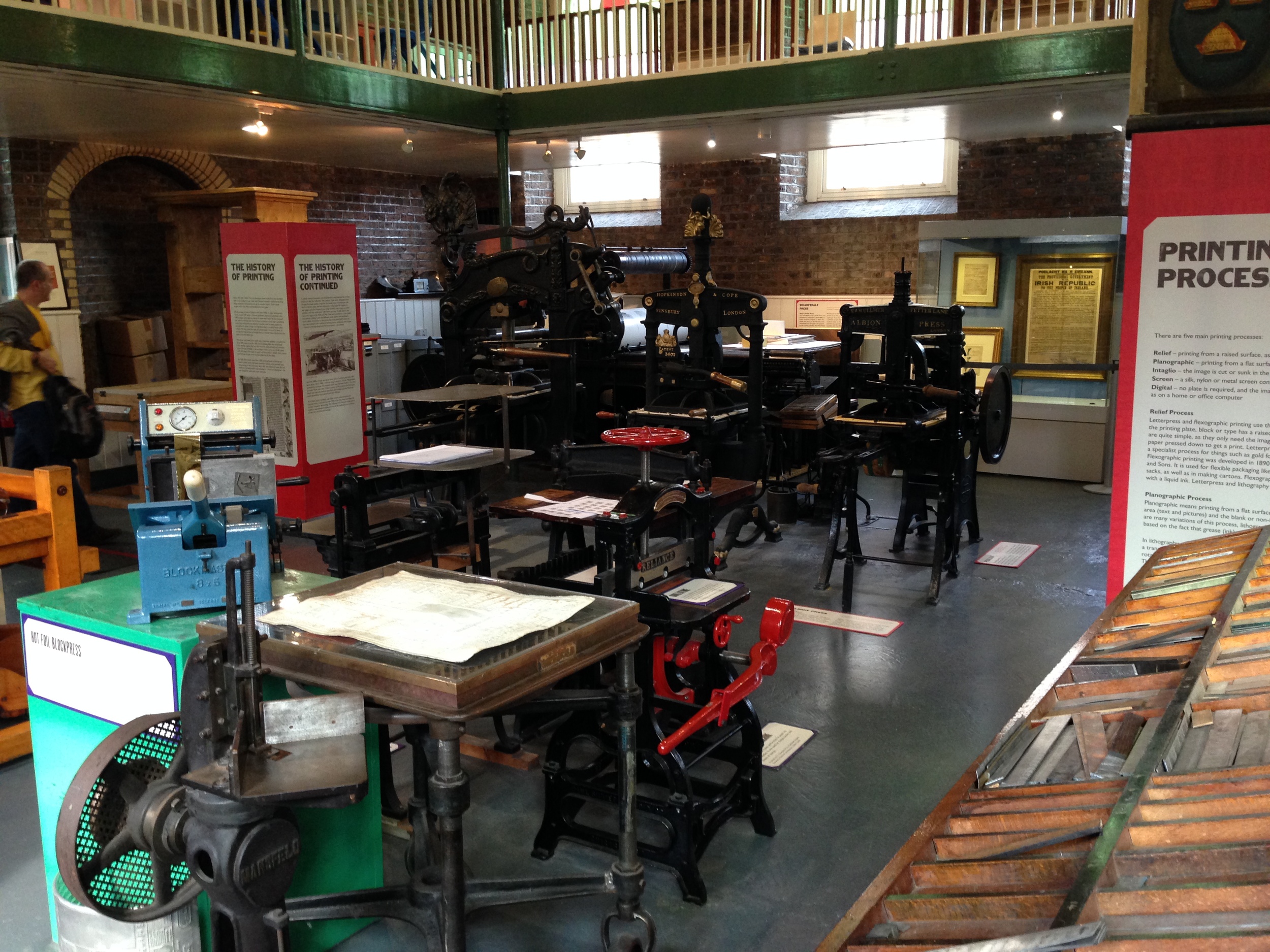
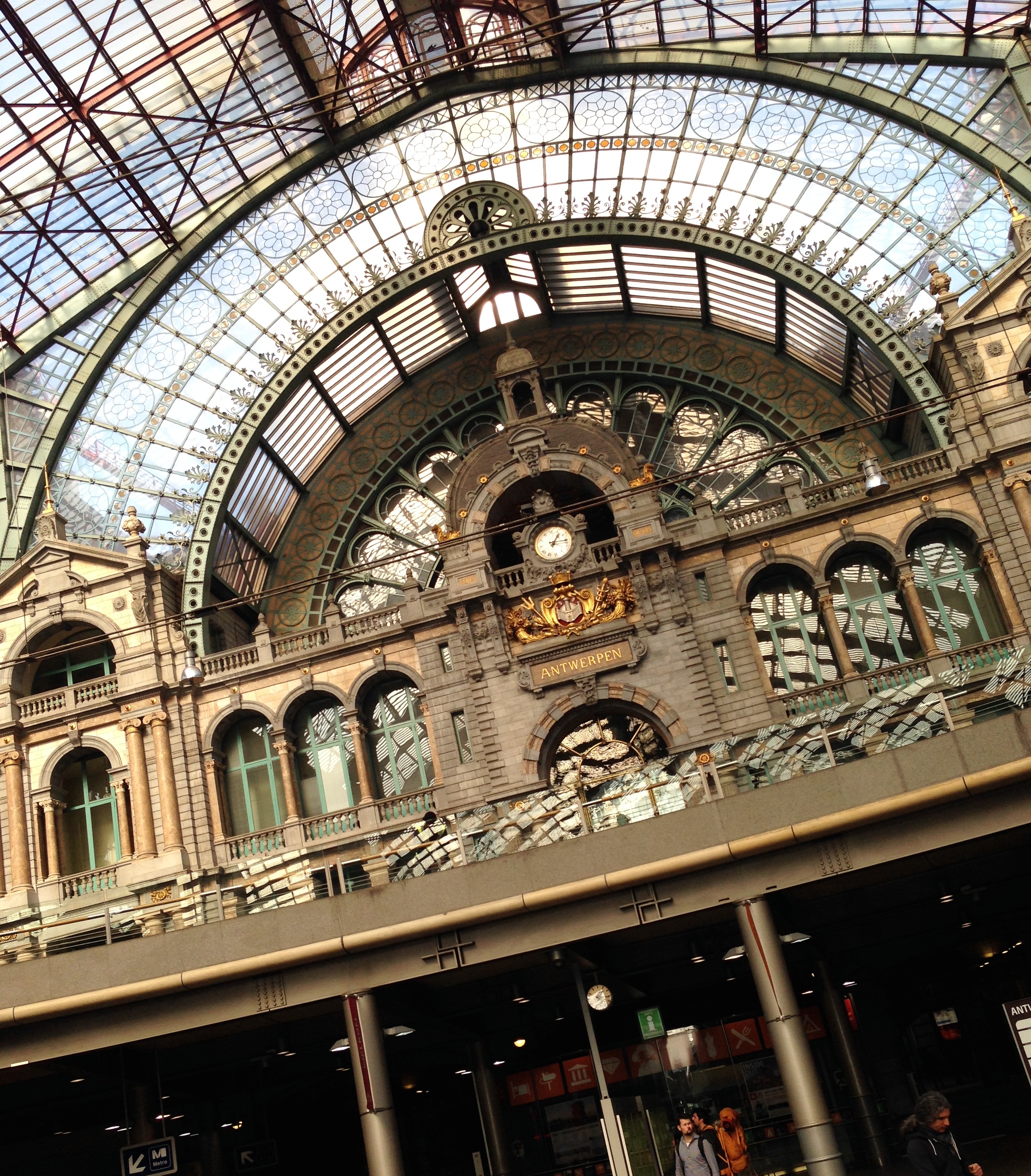
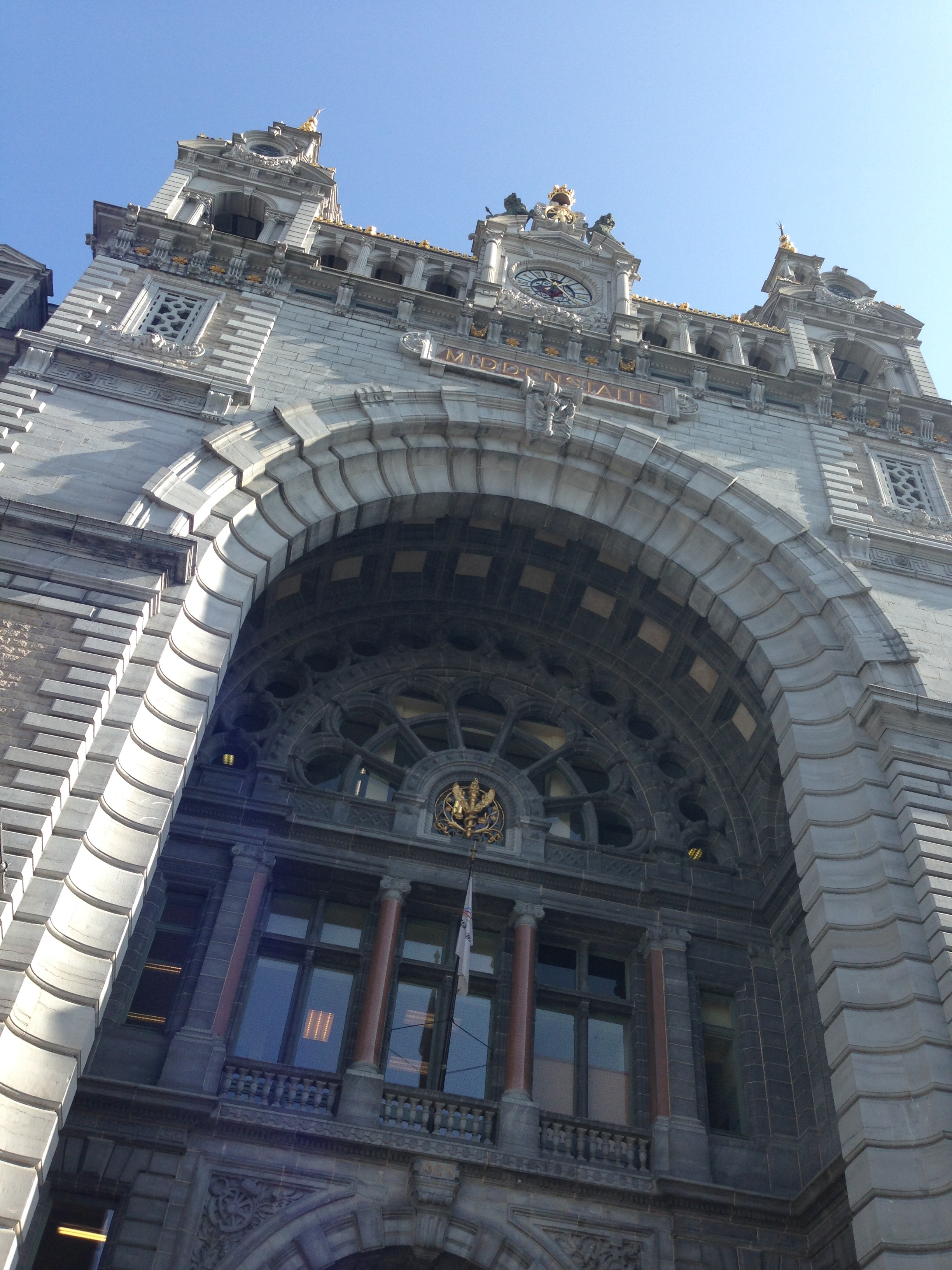
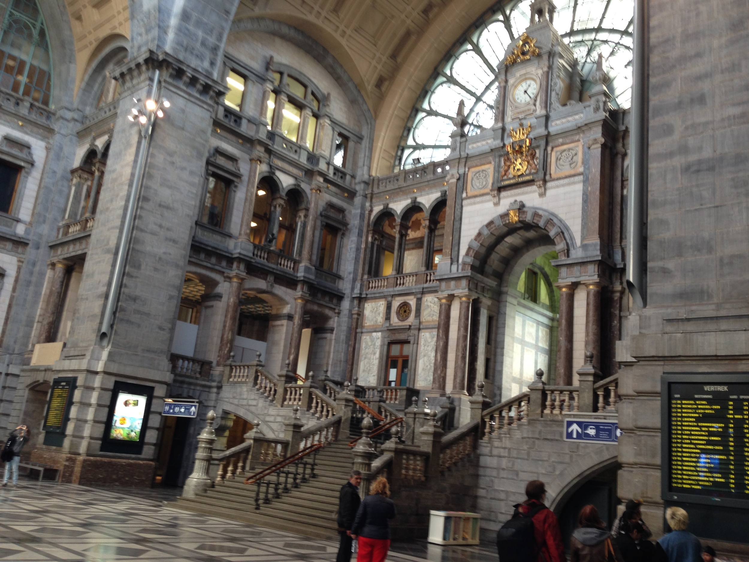
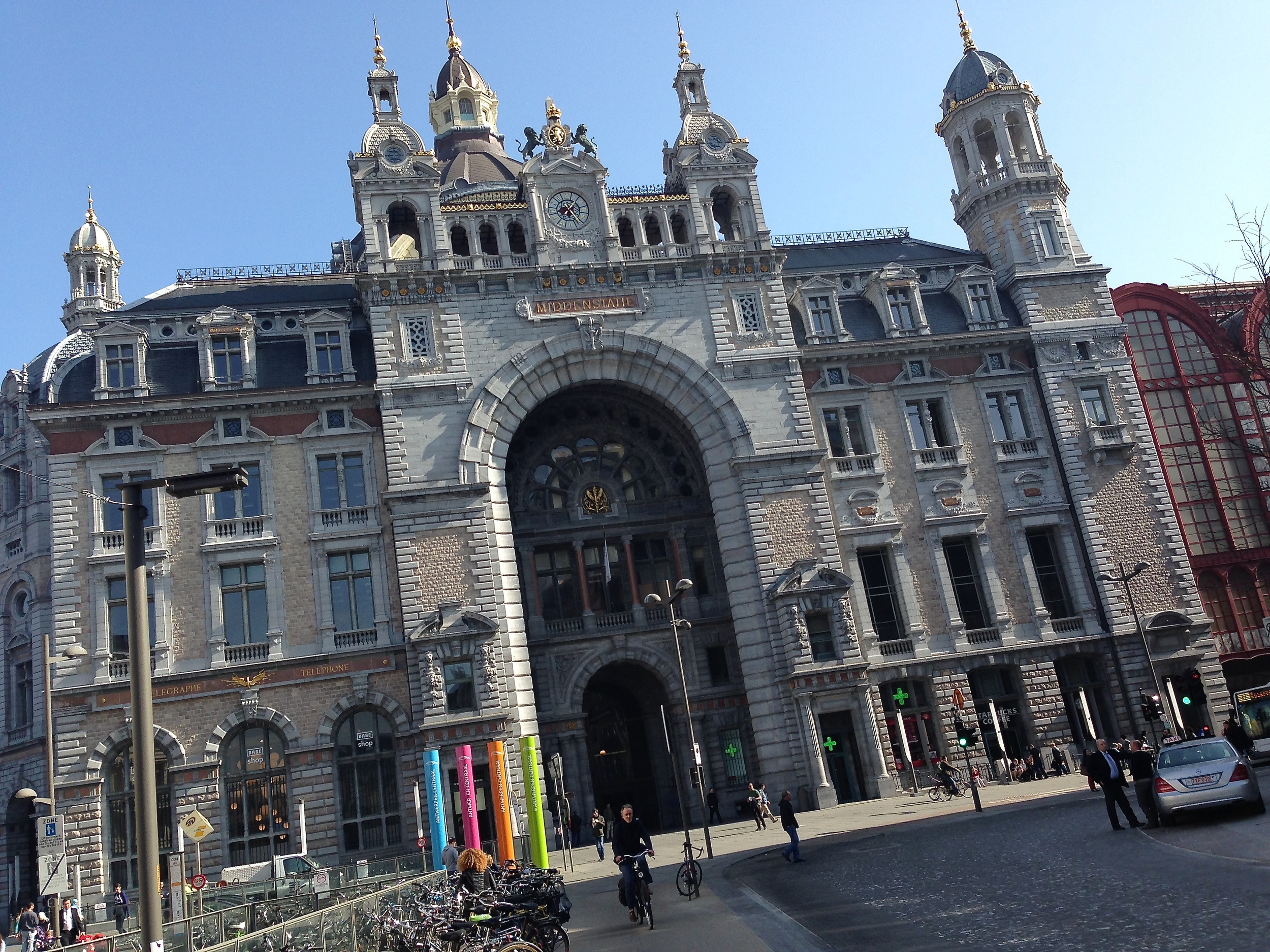
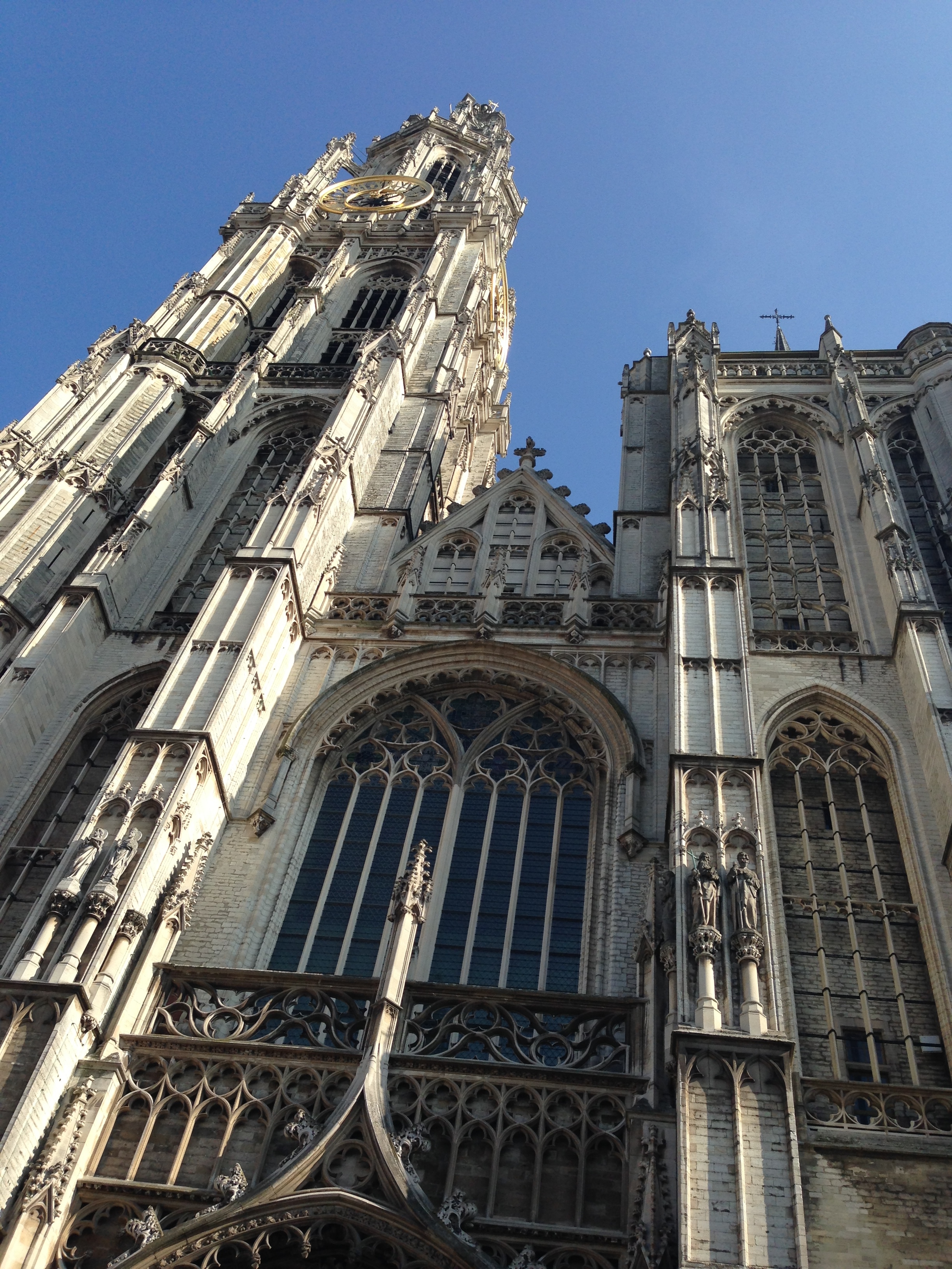
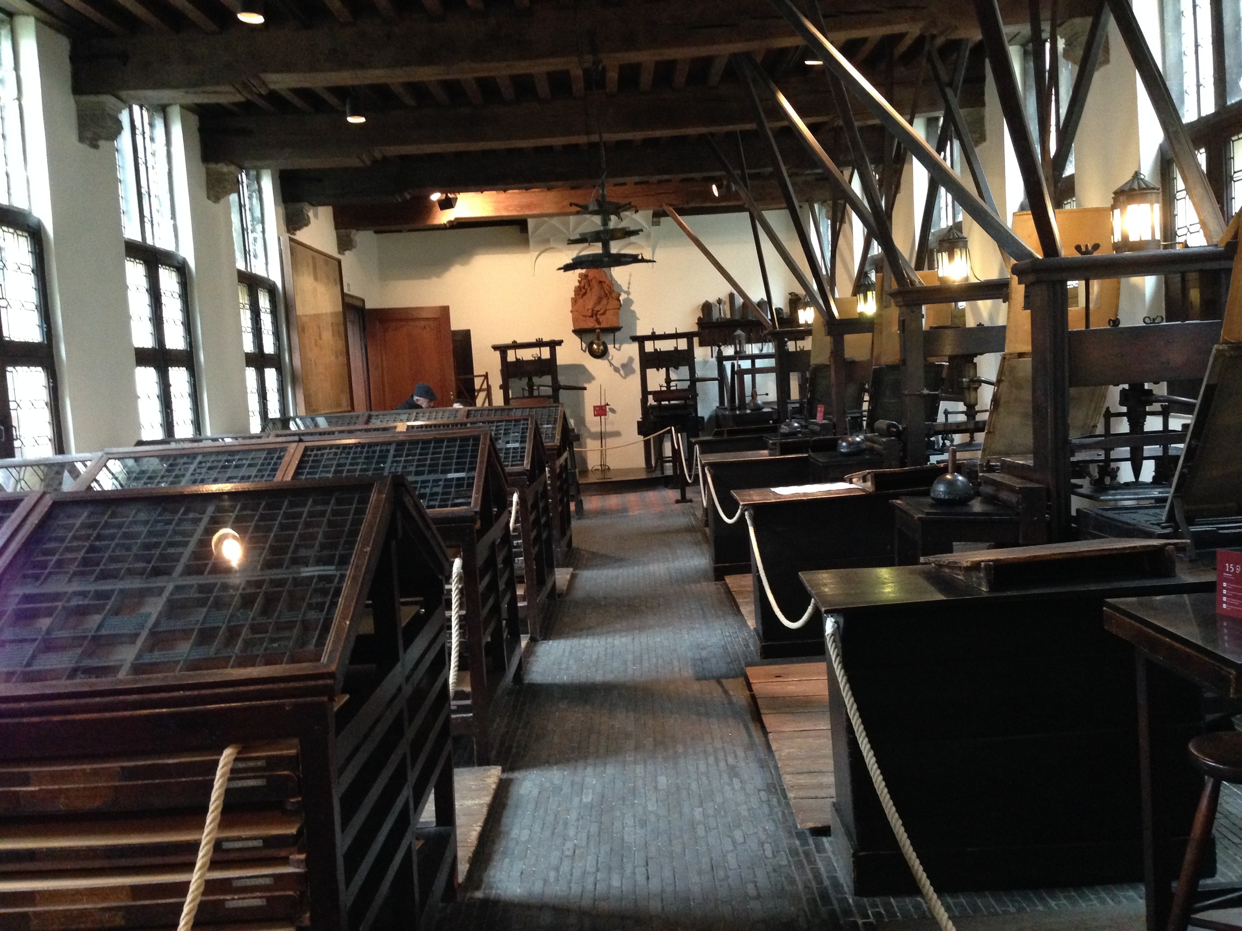
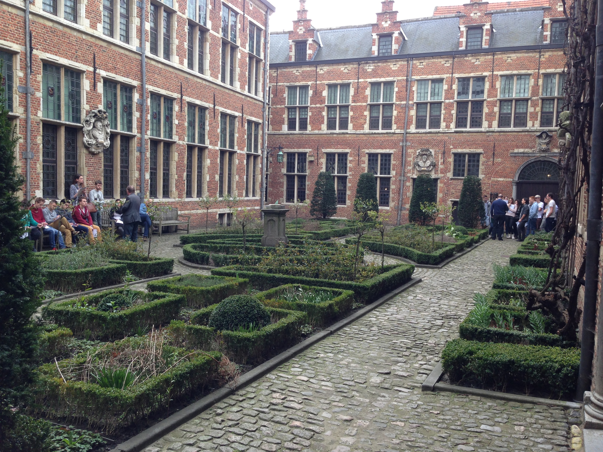
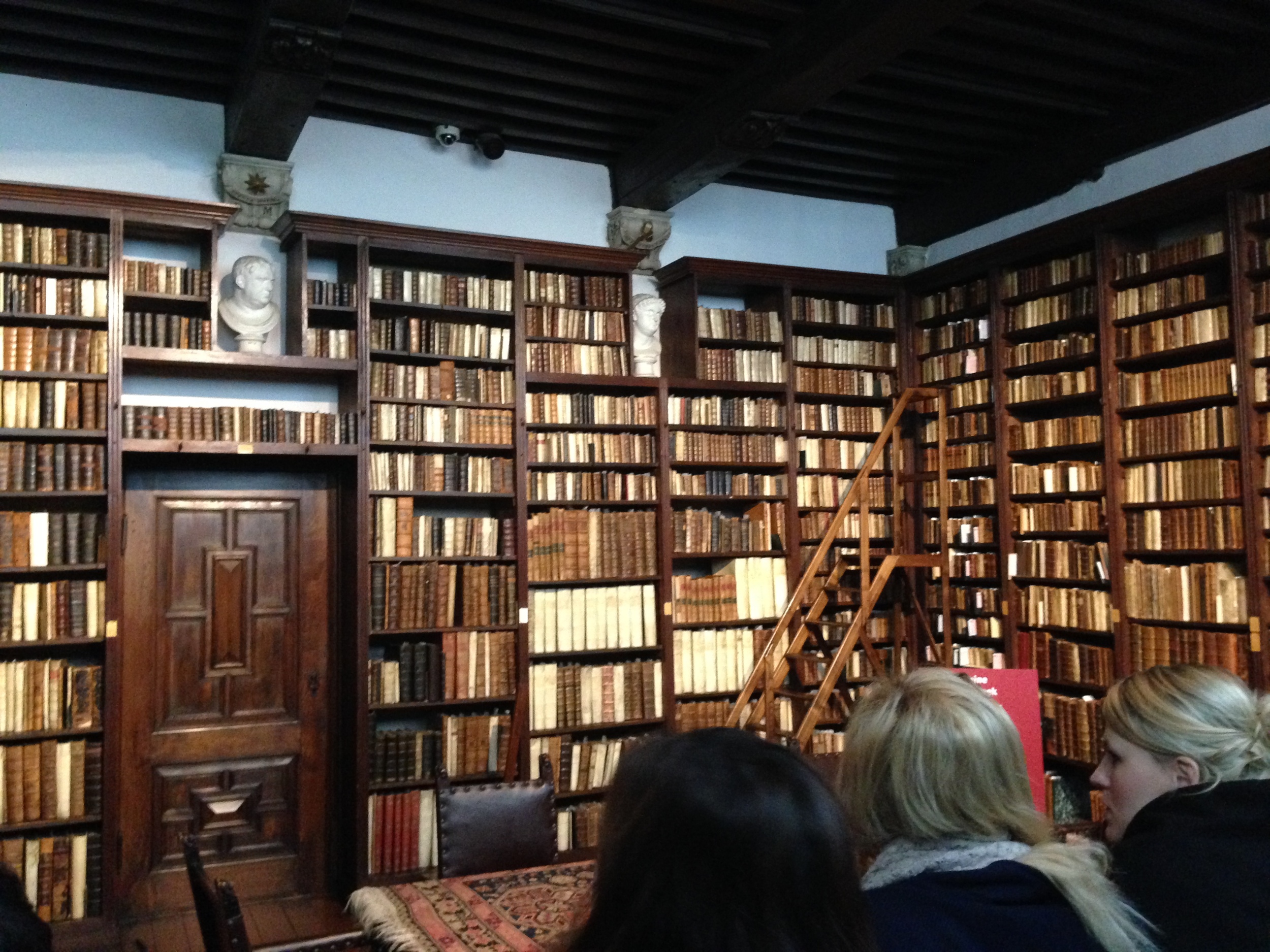
Our first stop was to Antwerp where we visited the Plantin-Moretus Museum. We viewed and studied some seriously old books and manuscripts. The sheer amount of books, manuscripts, bibles, presses, tools, and type was absolutely stunning. After an hour in this place your head starts to spin. But it's amazing that there even exists a museum on the history of type and the printers that used it 500 years ago.
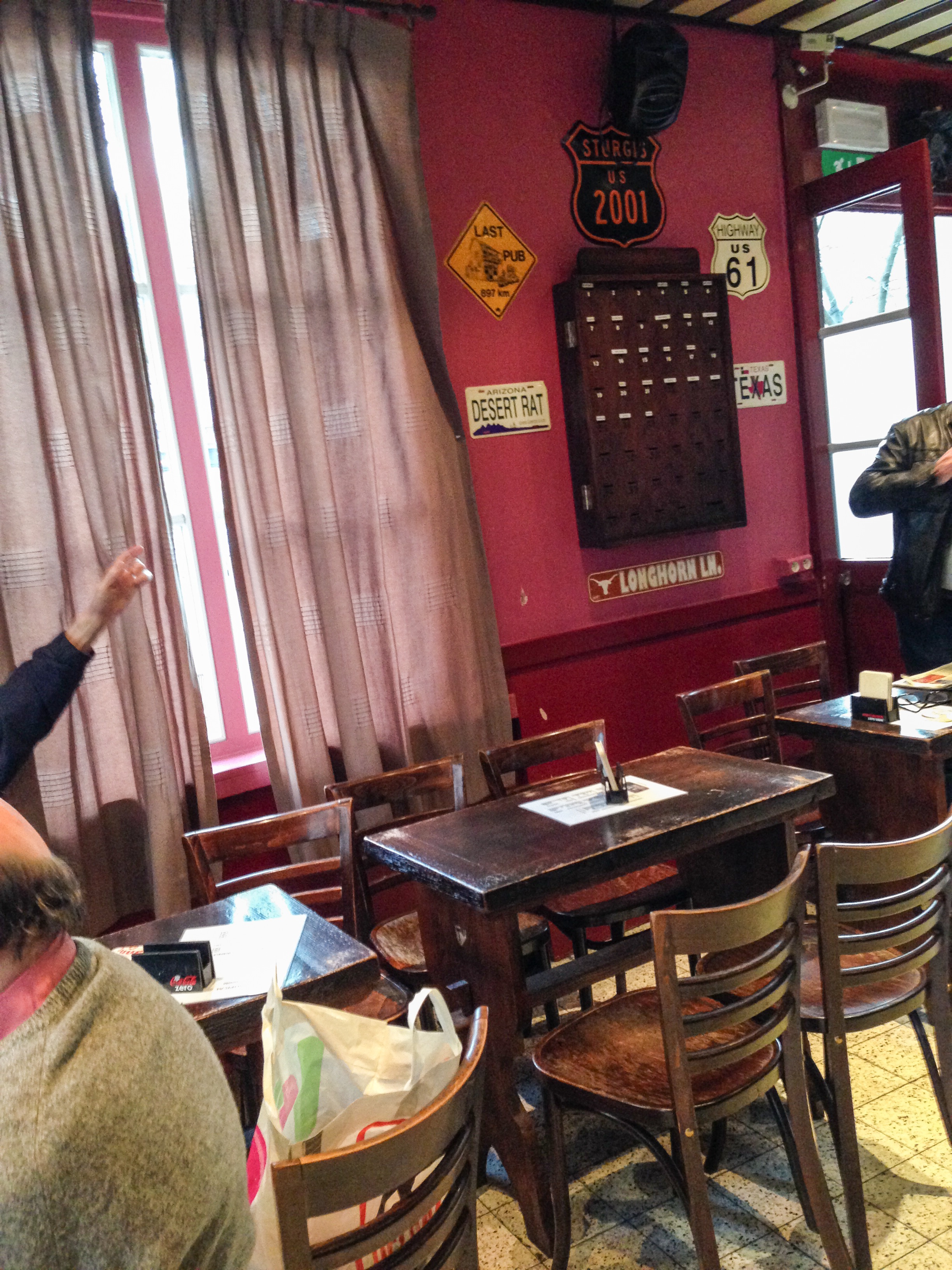
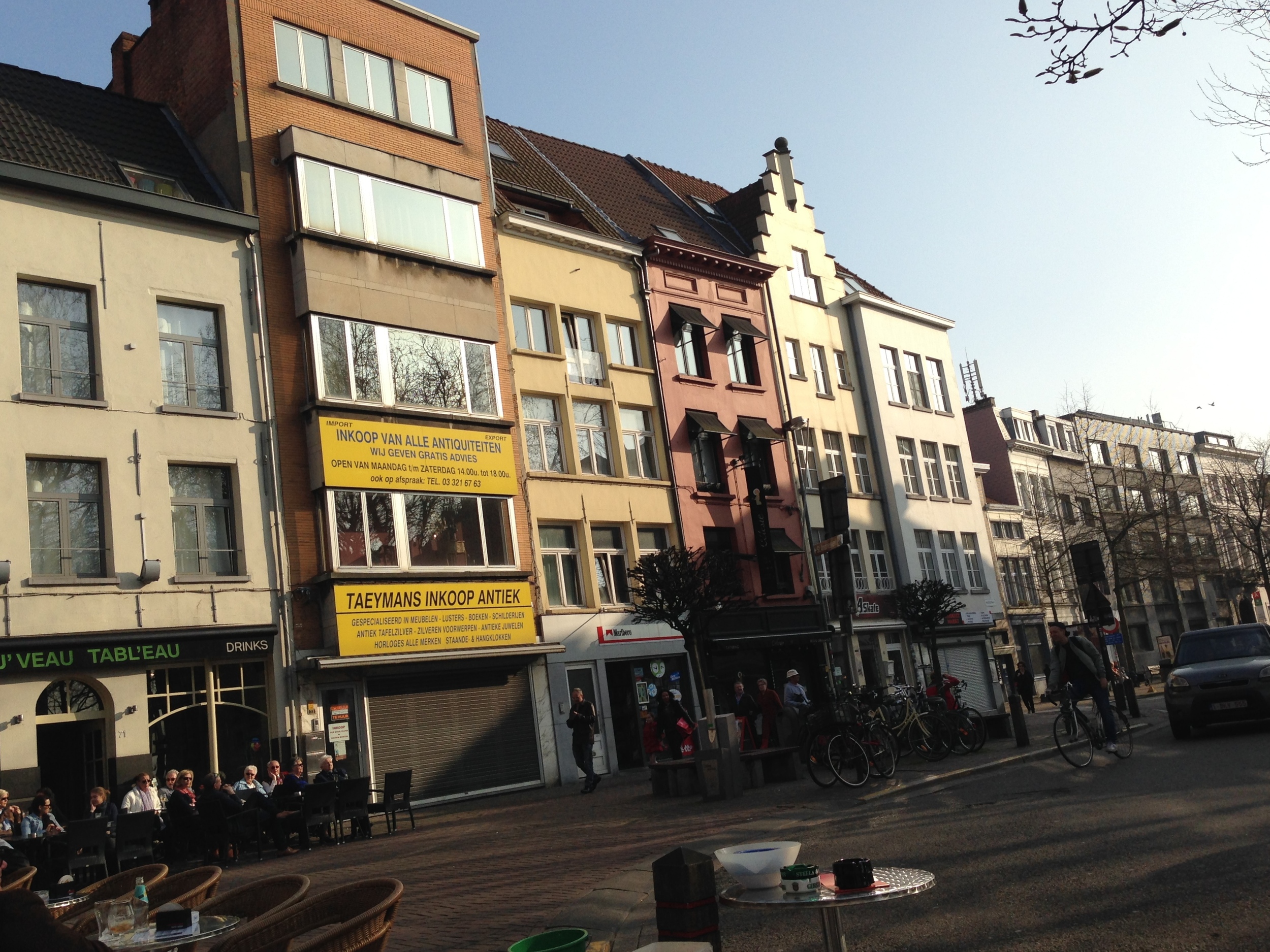
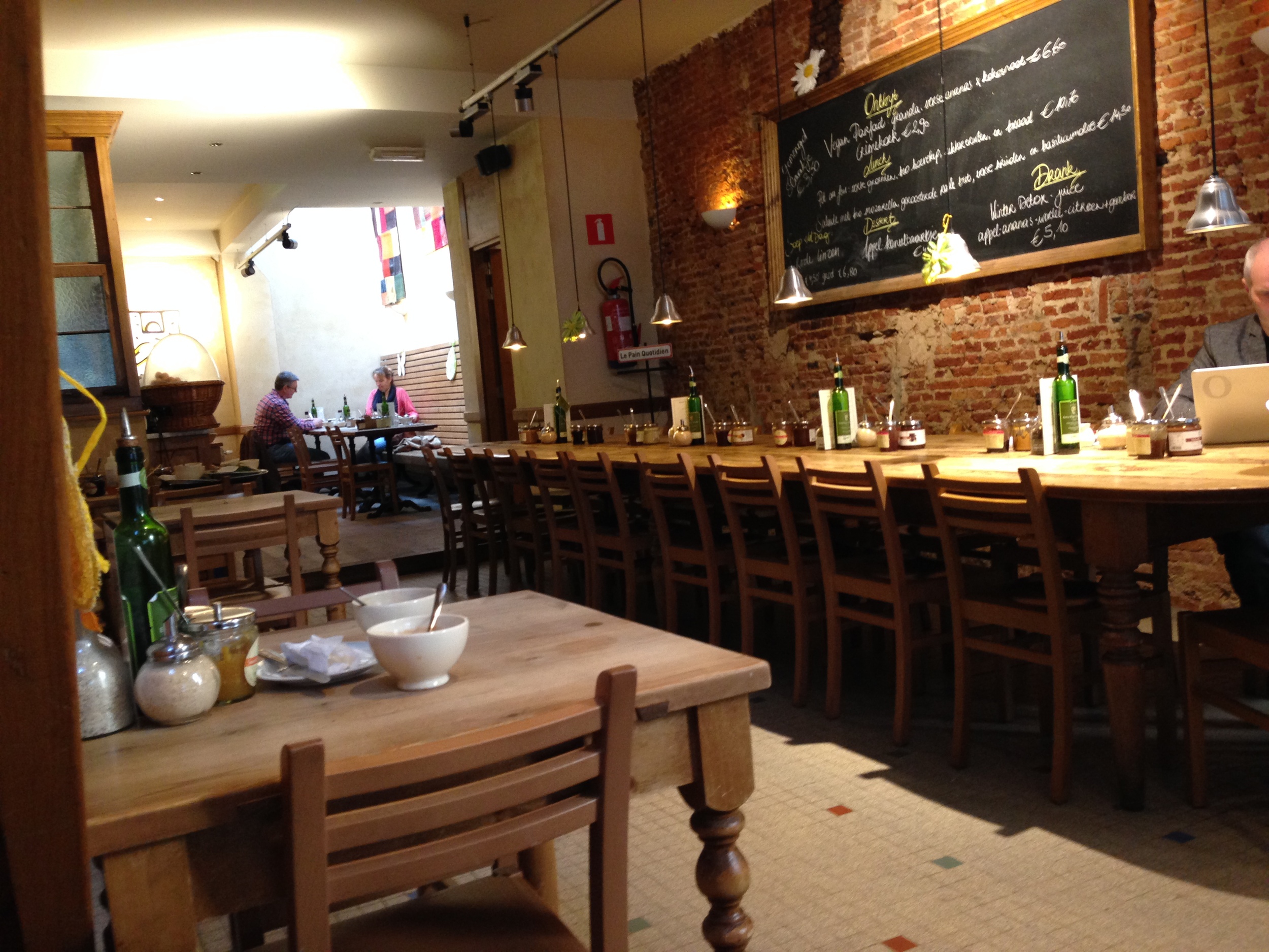
While in Antwerp I also ate more food than the average human being should in 2 days. Brunch at beautiful outdoor cafes, Belgium fries and waffles, Ethiopian all-you-can-eat, fantastic coffees and teas, and the Trappist brews proved how amazing Belgium cuisine is. I don't know if I have eaten that well since I came to Europe. If you've never been to Antwerp go. Even if its just for the cafes and waffles, you won't regret it.
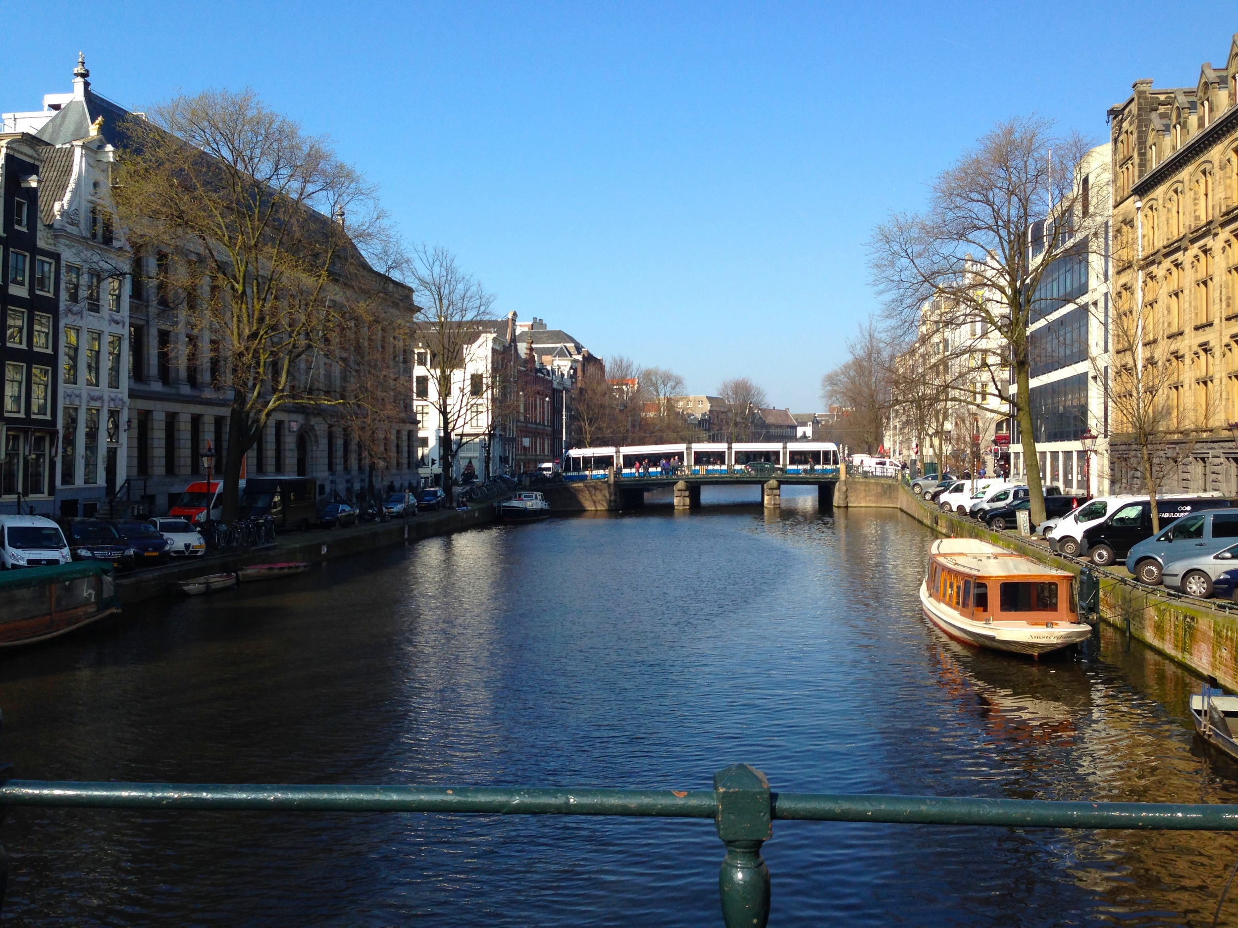
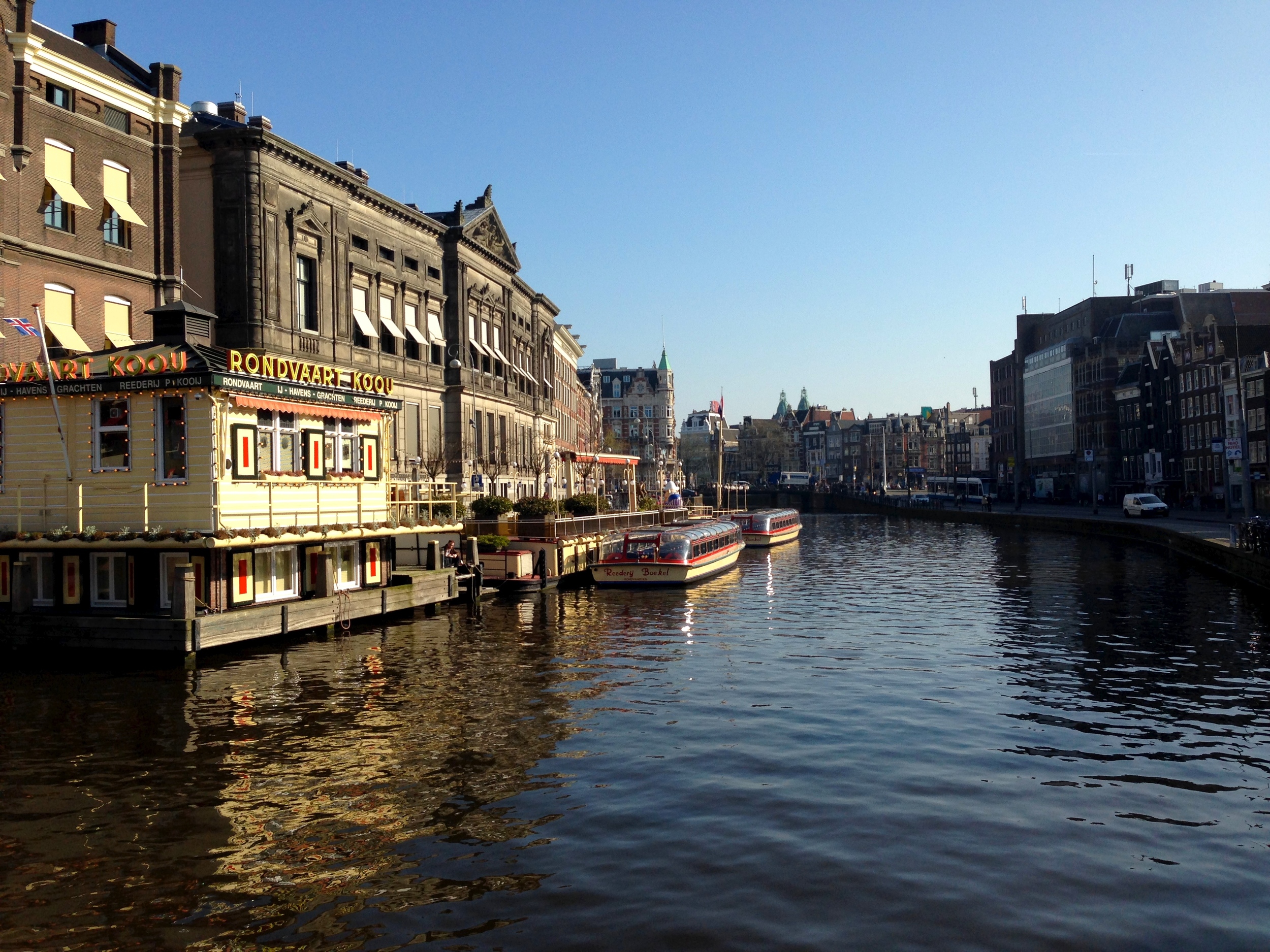
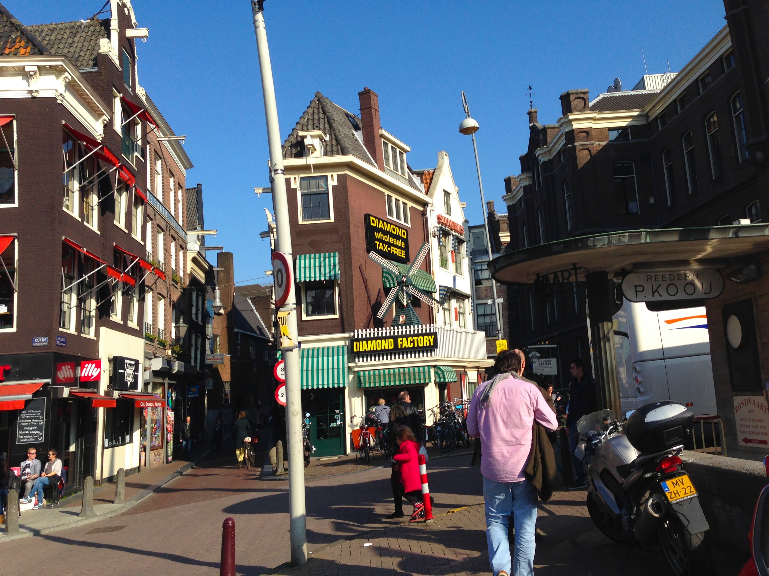
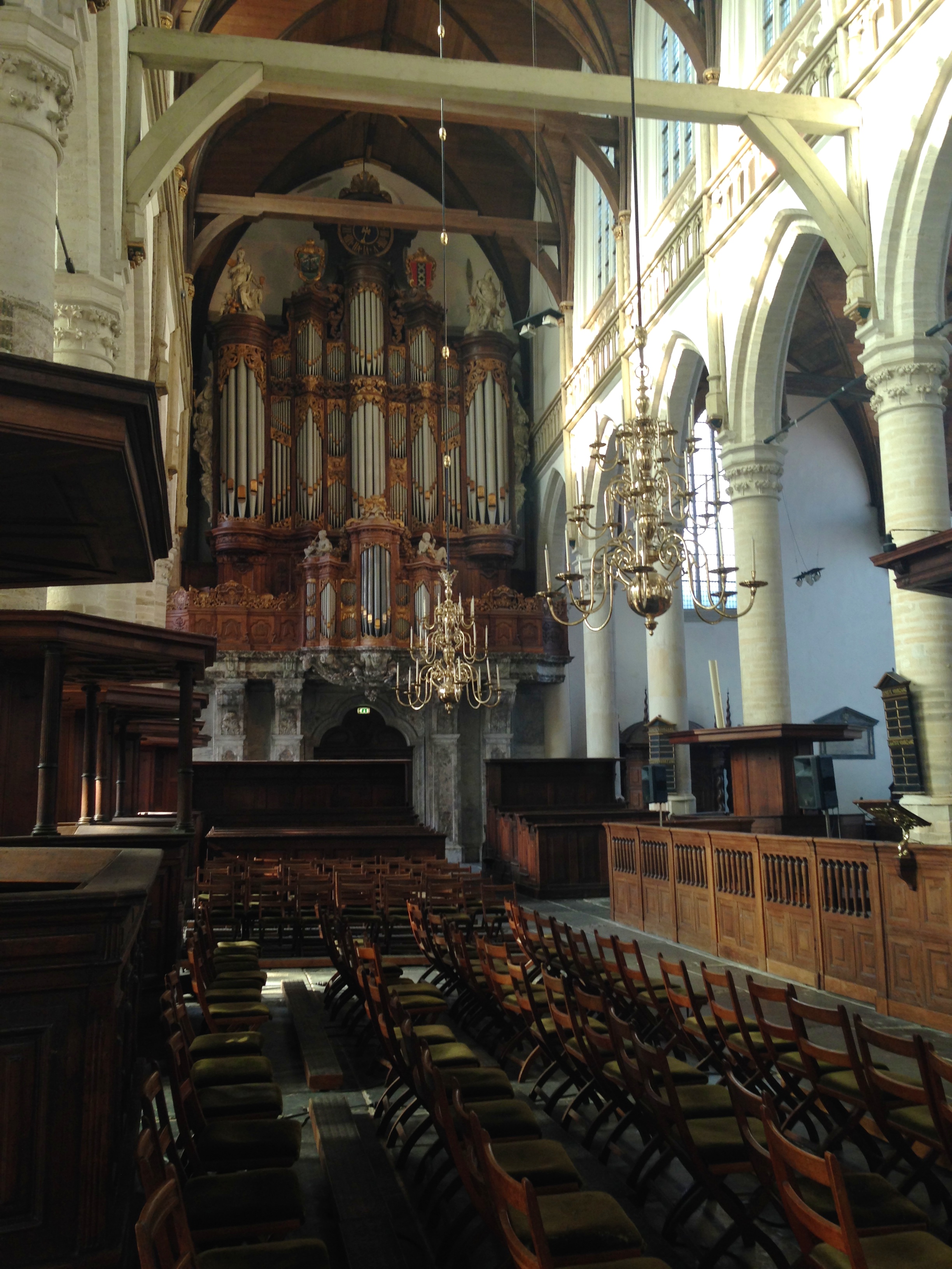
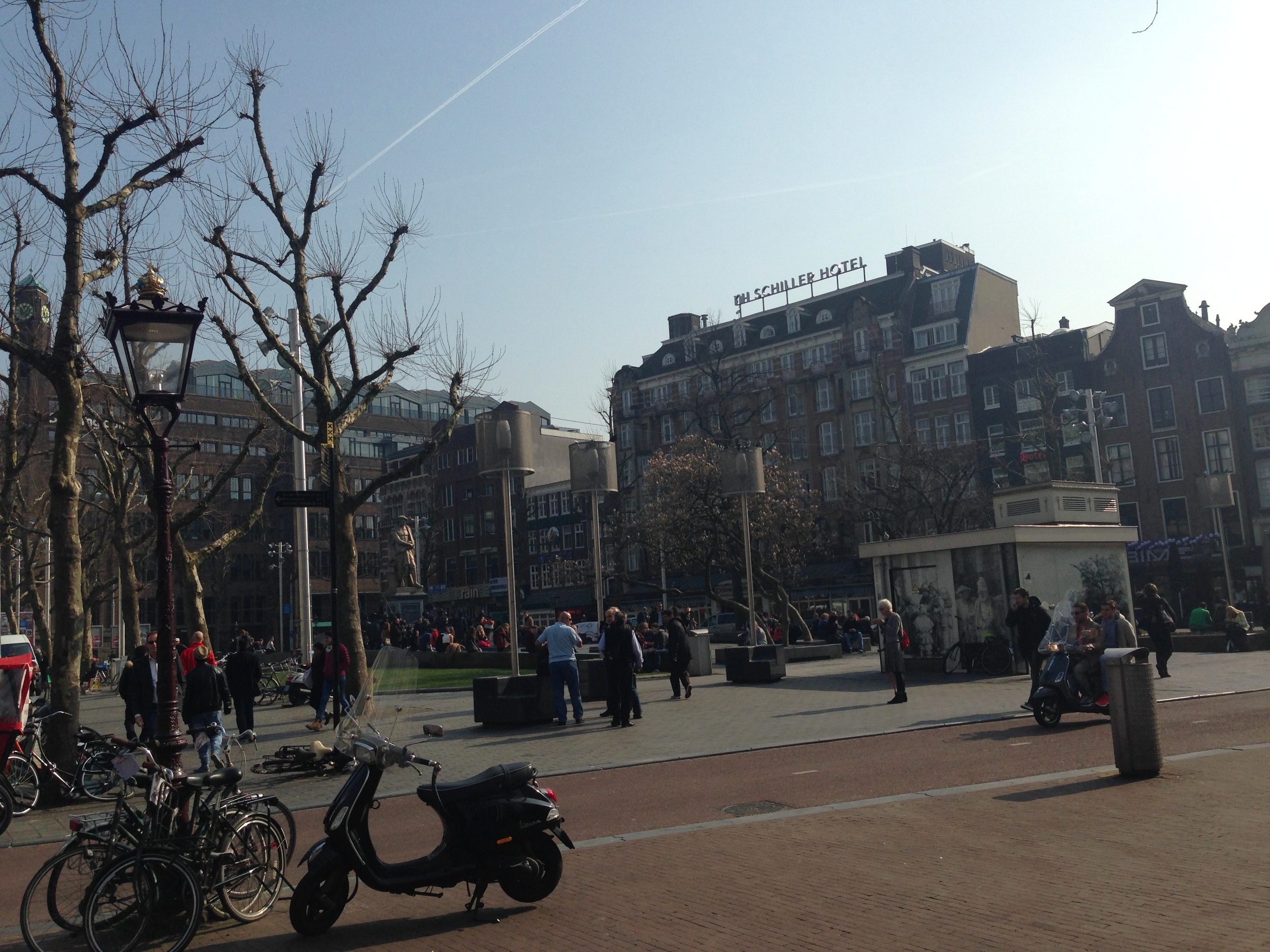
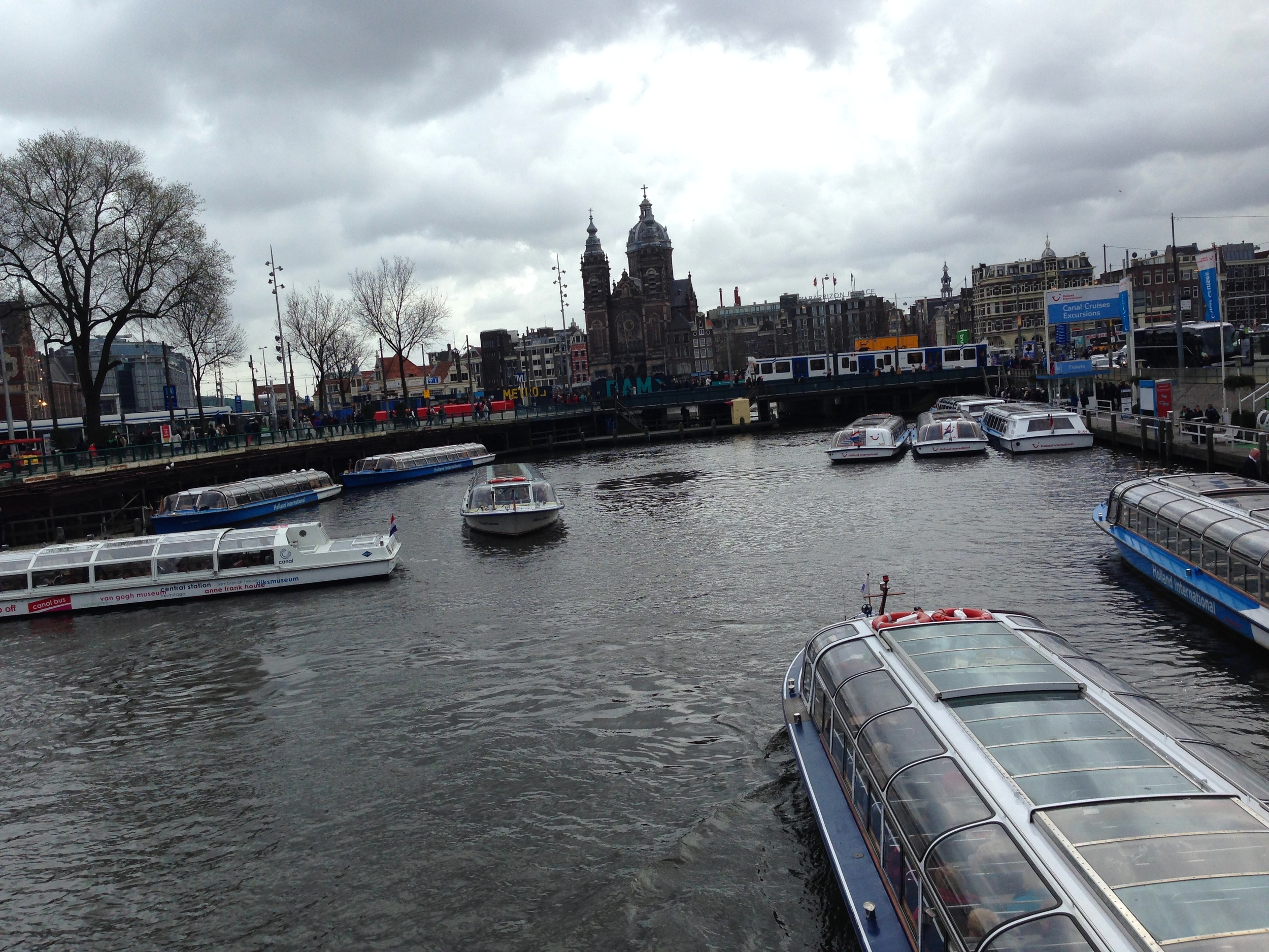
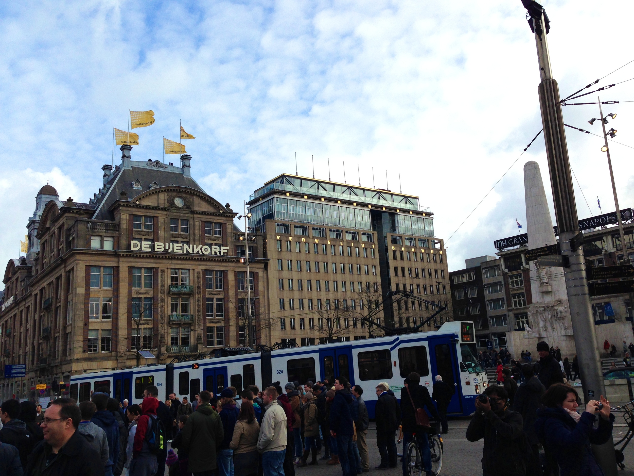
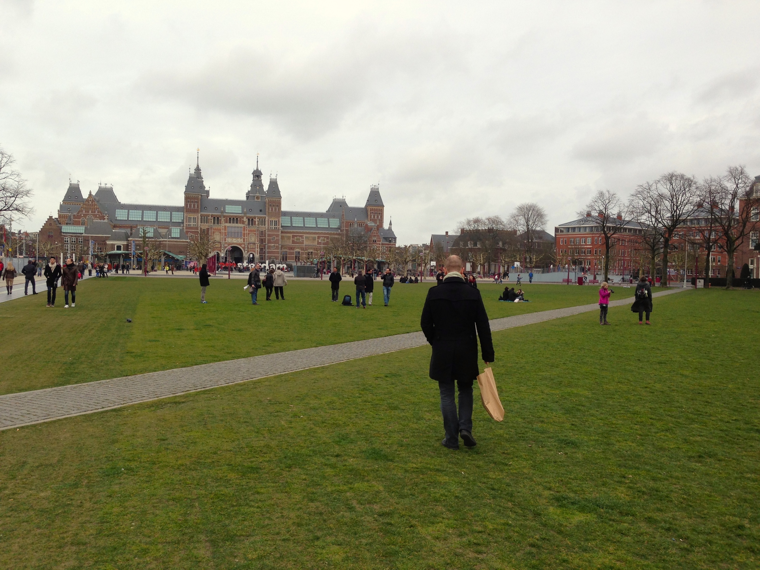
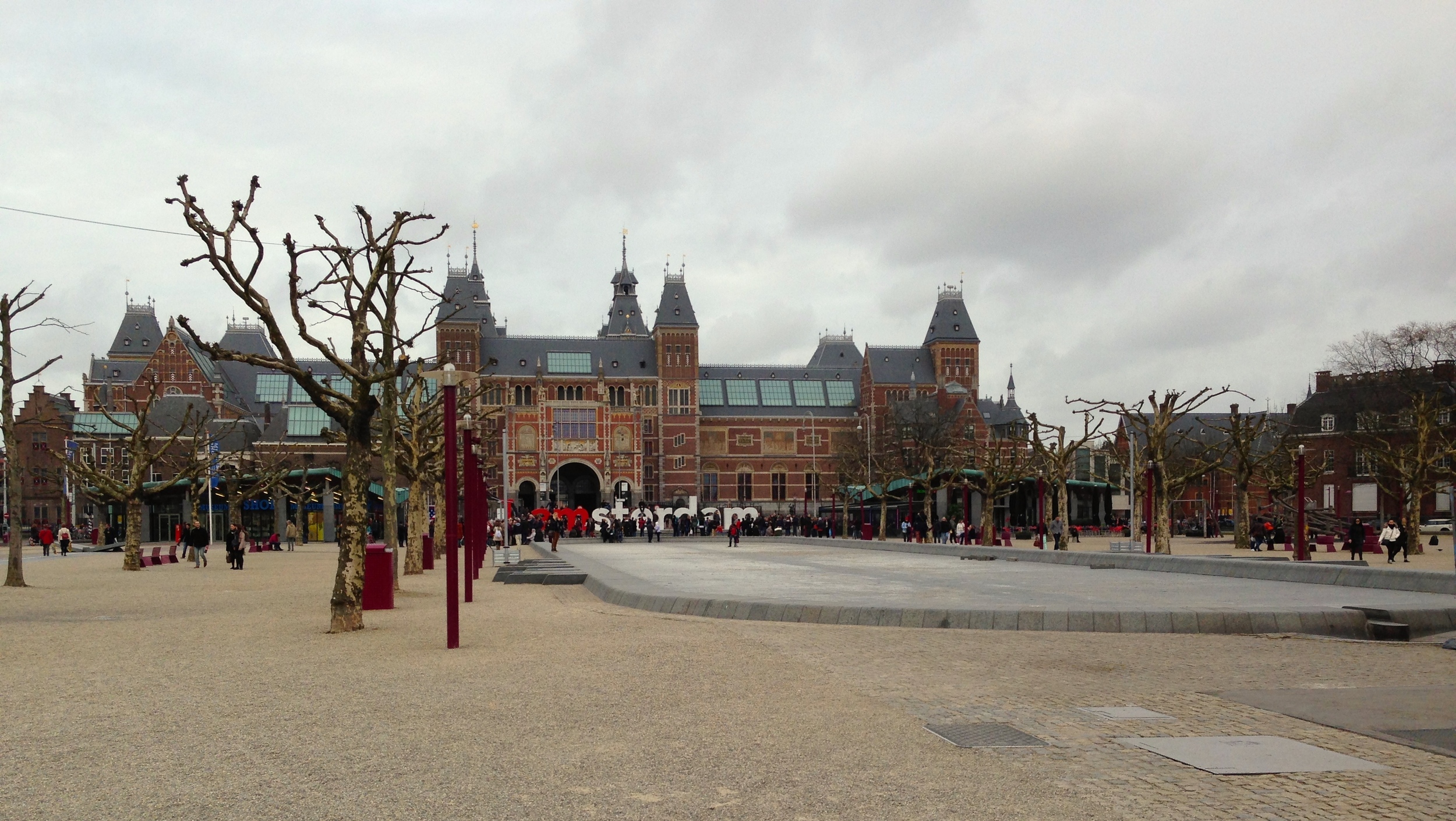
We left for Amsterdam midweek and immediately headed to the Special Collections at the University of Amsterdam. Another place with an unbelievable collection of antiques and rare books that you can hardly believe still exist. The entire list of items we saw can be found here. Gerard Unger was giving us an excellent presentation on the items retrieved from the archives there. He is a great speaker and a refined expert in this field, especially when it comes to Dutch type & graphic design. After that, Gerard led us to an Artists Club where I devoured half a chicken with potatoes and gravy. We had nice conversation and most likely a heated typographic debate.
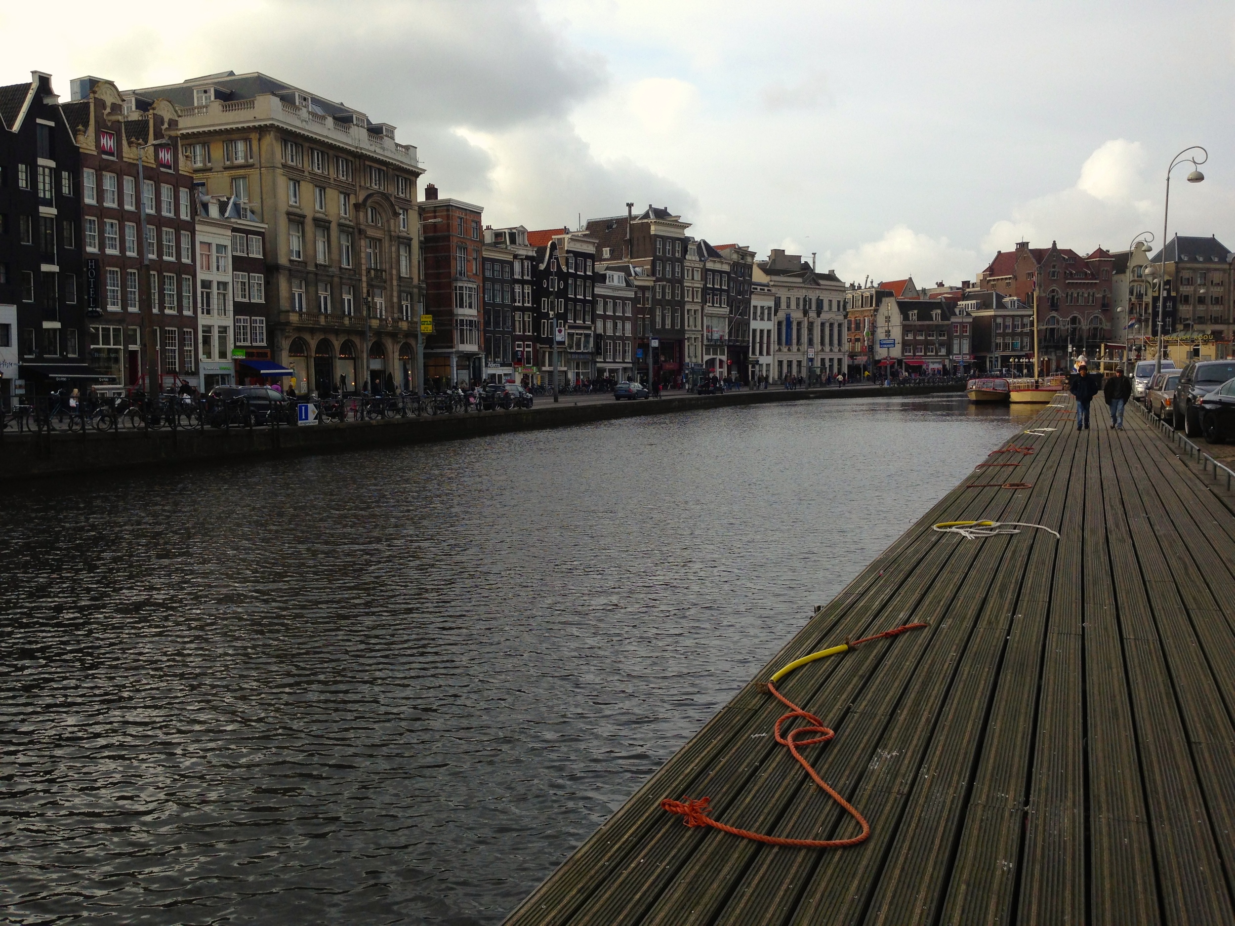
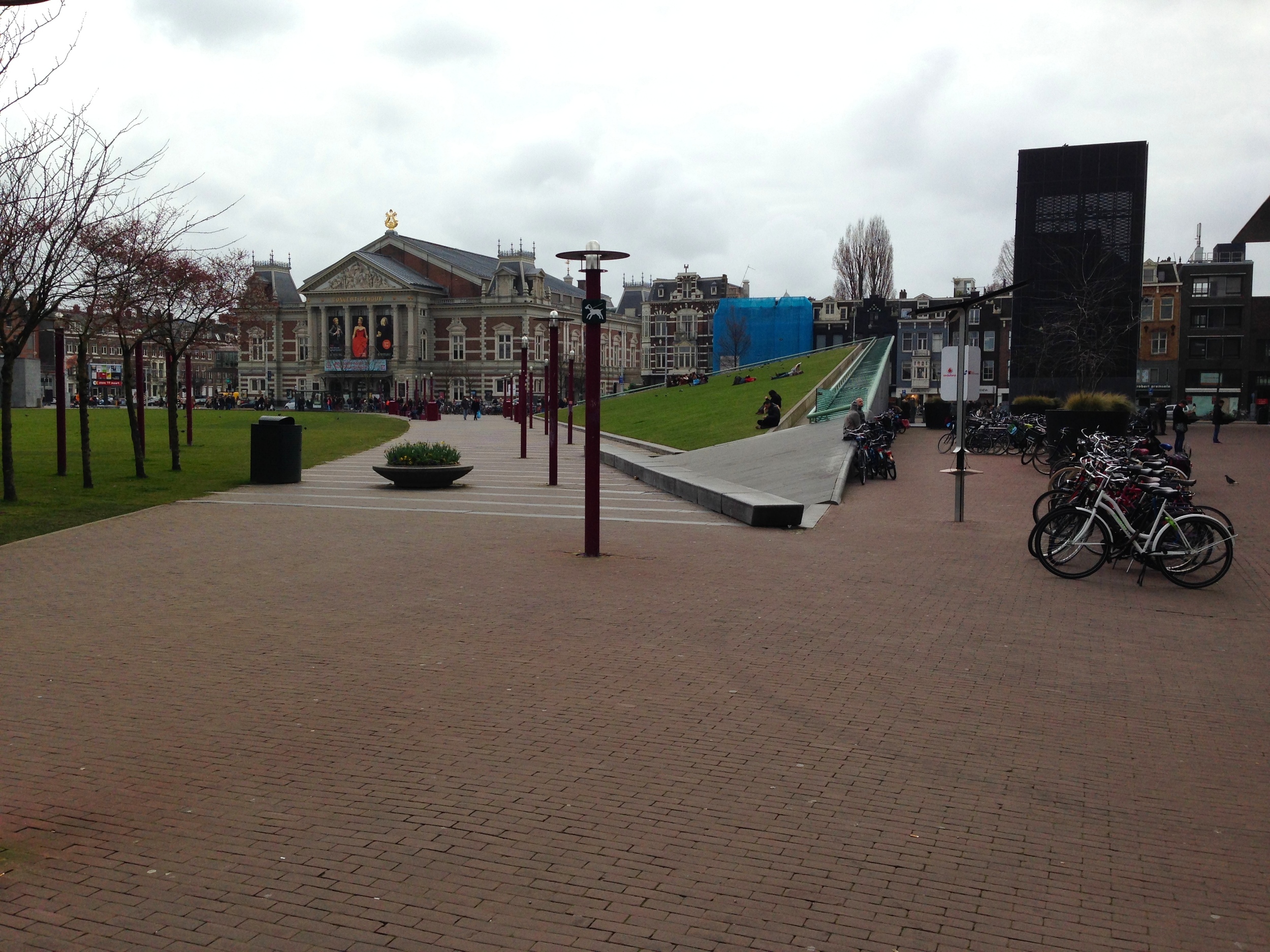
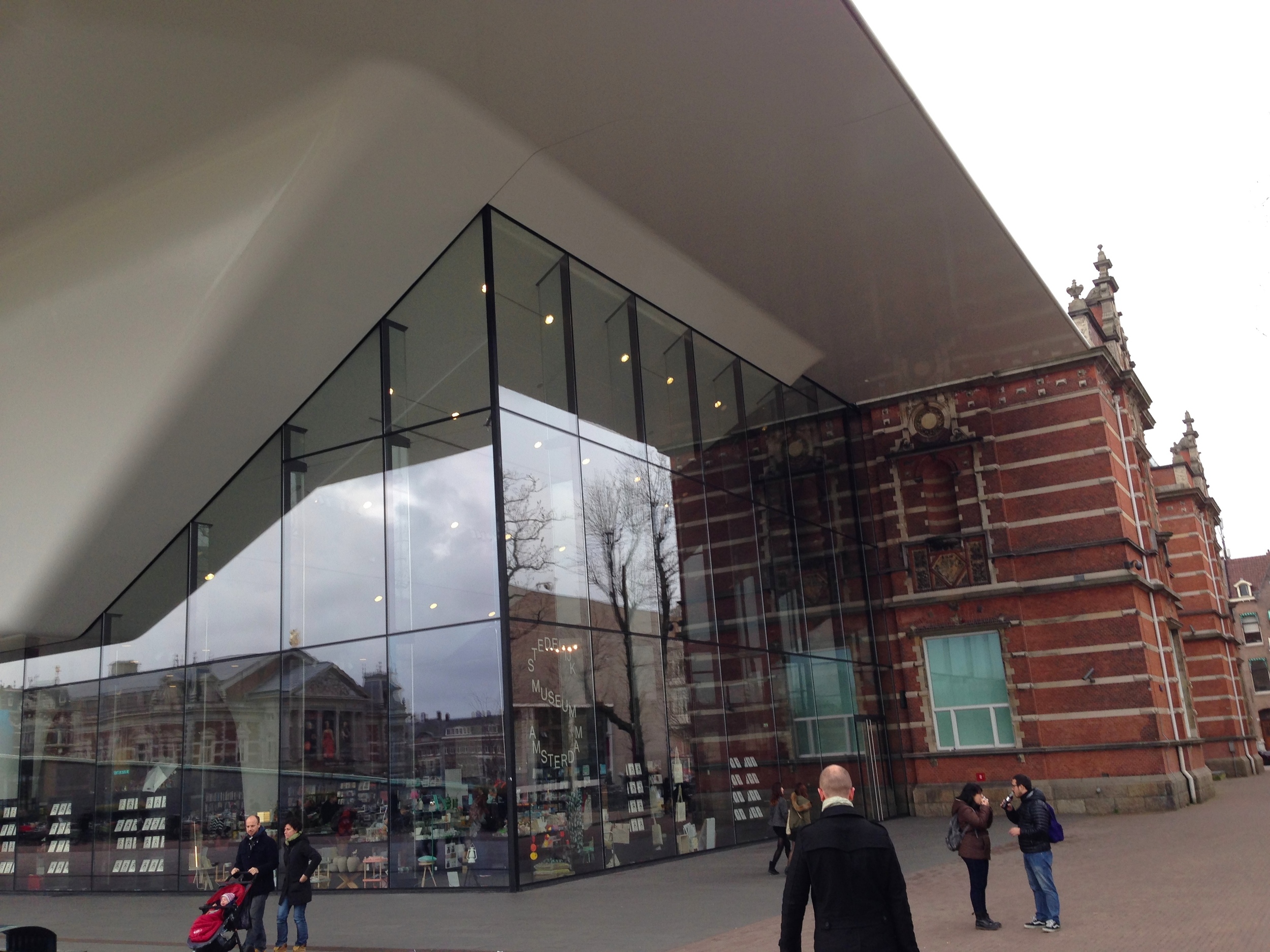
The next few days were spent exploring Amsterdam museums, libraries, and bookshops (oh, and pubs as well). We took a day trip to Haarlem where we visited the Enschede Museum. Later we went to Unger's favorite diner in Amsterdam. I had a smoked eel broodje. Yup, you read that right – smoked eel. Your'e all posers until you eat something as disgusting and slimy as an eel (it was actually like, crazy delicious). After that we went to the Rijksmuseum which houses many amazing works by Rembrant, Monet, van de Velde, Breitner, Vermeer, van Dijck, van Gogh, and many others.
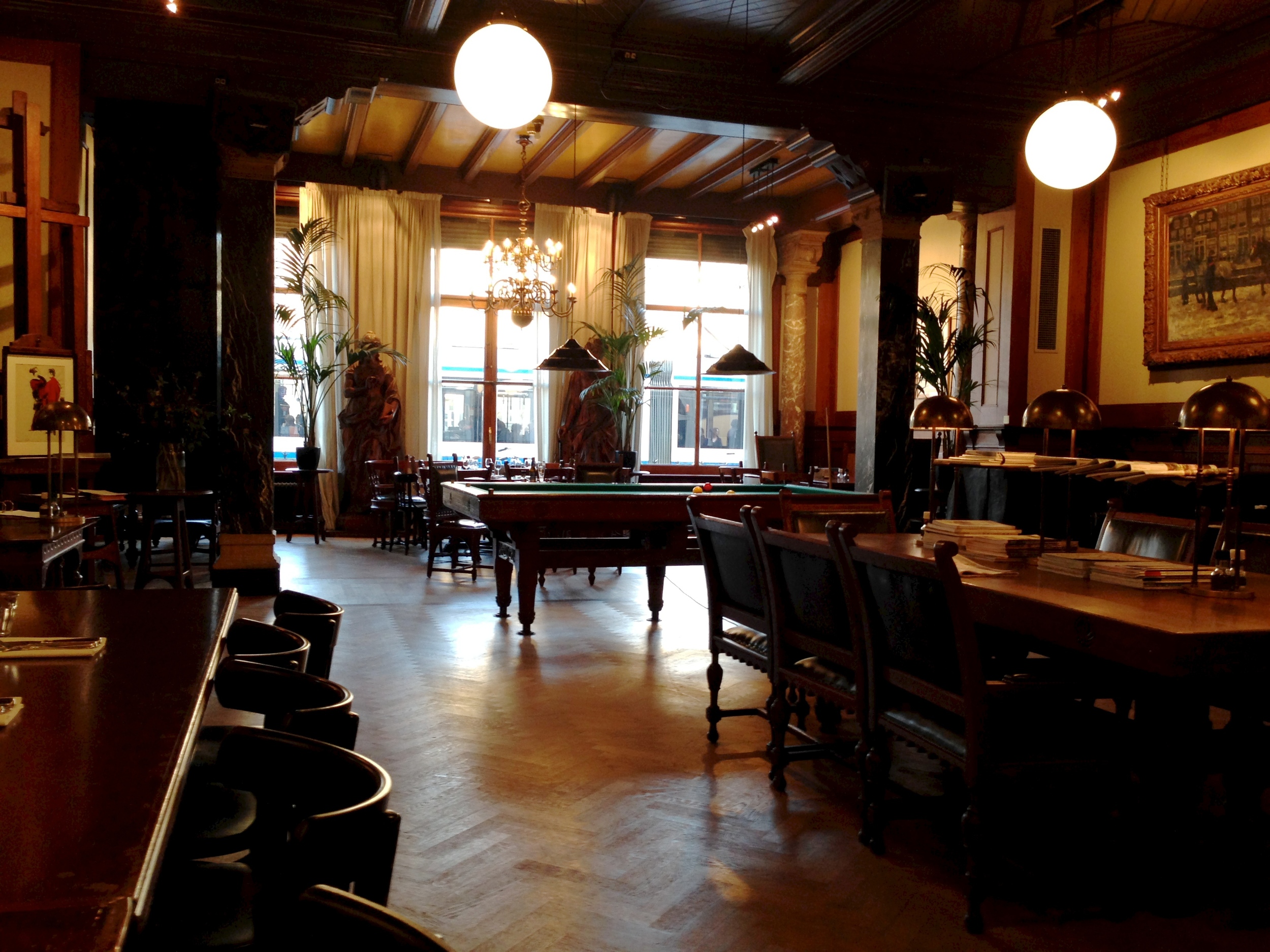
The next day we travelled to Den Haag (The Hague) and went to the The Meermanno Museum . After looking at some of the worlds most beautifully designed books, we headed to the KABK to eat lunch and meet up with the type design students. They gave us a seriously impressive presentation and schooled us in Foosball. In the great dutch tradition, they gave us an ice cold Heineken as well so we would all stop talking about type and start chatting about something more normal, like beer. After realising how terrible I was at foosball (even though I love soccer), Riccardo (italian colleague & friend) and I were invited to Gerard Unger's house for dinner. He prepared an absolutely amazing meal for us and then showed us some of his favourite Italian and Tex Avery comedies! What a cool dude.
Anyways, since I have now bored you with all the details, here are some crappy photos taken with my iPhone while walking around. Enjoy!


Design, Travel, and TV
If I haven't been busy designing multiple typefaces and rewriting my dissertation proposal I've been hiding out in my flat watching House of Cards or True Detective (amazing stuff, really). The past couple of months have seen my typefaces and designs completely evolve. Hopefully that evolution is for the better. There is so much 'behind the scenes work' when all you want to change is, for example, a curve on the shoulder of the "n" or how the descenders look. When you modify one little thing you have to do it to all the glyphs over 3 masters (Thin, Regular, and Fat) and to the italics (which also have 3 masters)! But the design is in the details, so changing tiny things have made big differences. All that to say, I am enjoying my designs and my education (and also that True Detective... wow).
We recently had a week of design with Gerard Unger and a Adobe FDK (Font Development Kit) workshop with Frank Grießhammer from @kioskfonts. Both sessions and designers gave me really great feedback and also strengthened my ideas on the direction and use of my project.
I only have one more week of class until our Spring Break – which is an amazing five weeks long. But before then, I have to send in a revised disertation proposal and I also have to present my project for the final critique of the semester. During the break, I will be visiting Dublin and maybe some of the Irish countryside. This past week though, I have been in Antwerp, Amsterdam and The Hague visiting museums of art and typography, eating delicious food, and hanging out with some really cool kids. More on that in the next post though. Hope you enjoy the designs below!
