This post may be a bit late, but I feel like I should post it anyways mainly because I told so many I would and since it's a topic I care greatly about. Enjoy! - JB
Introduction
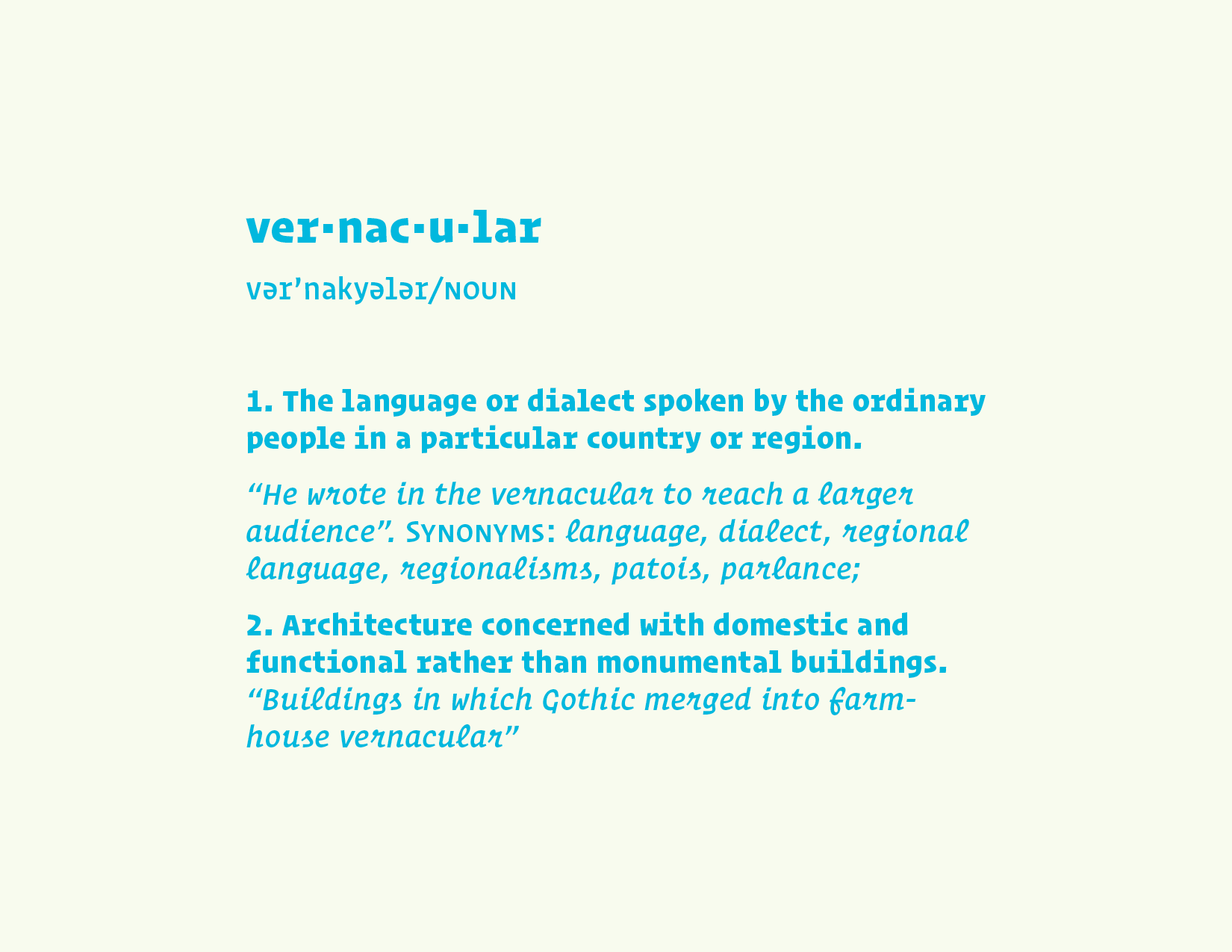
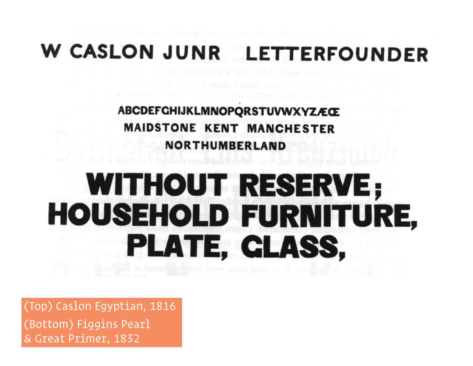
For the past couple years I have been incredibly obsessed with local, vernacular lettering styles and the reasons why certain neighborhoods, cities or countries either have, or are tied with, a specific kind of type and/or lettering style. At this point we should probably define “vernacular” though and determine how this definition pertains to us as type designers and letterers. If you just Google “vernacular” these are the definitions you that show up: 1. The language or dialect spoken by the ordinary people in a particular country or region. “He wrote in the vernacular to reach a larger audience”. Synonyms: language, dialect, regional language, regionalisms, patois, parlance; 2. Architecture concerned with domestic and functional rather than monumental buildings. “Buildings in which Gothic merged into farm- house vernacular”. In saying that, what makes humanistic sans serifs, like Hoefler & Co.’s Ideal, feel so “English”? High contrasted, delicate serif faces so “French”? Or oddly enough, Helvetica (which is Swiss in origin) seemingly so “New York” today?
Background & Context
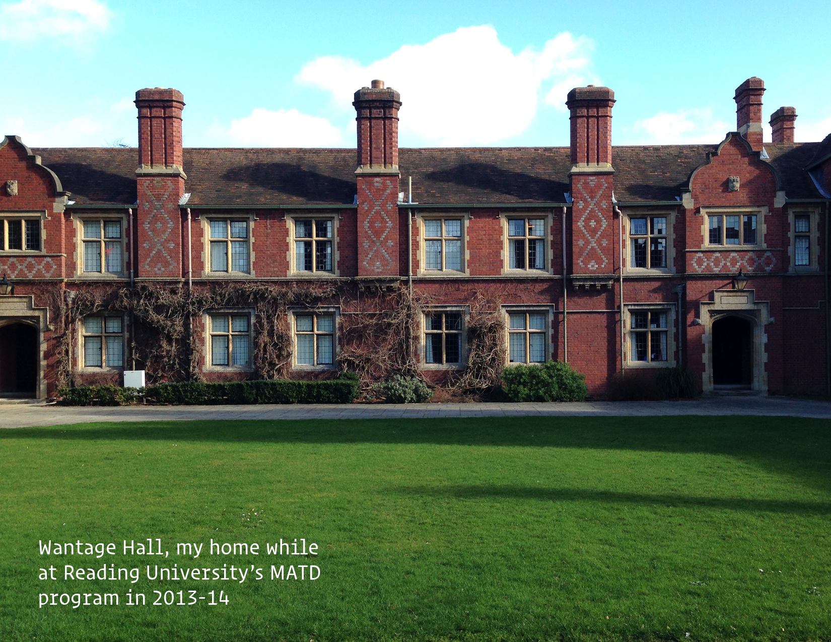
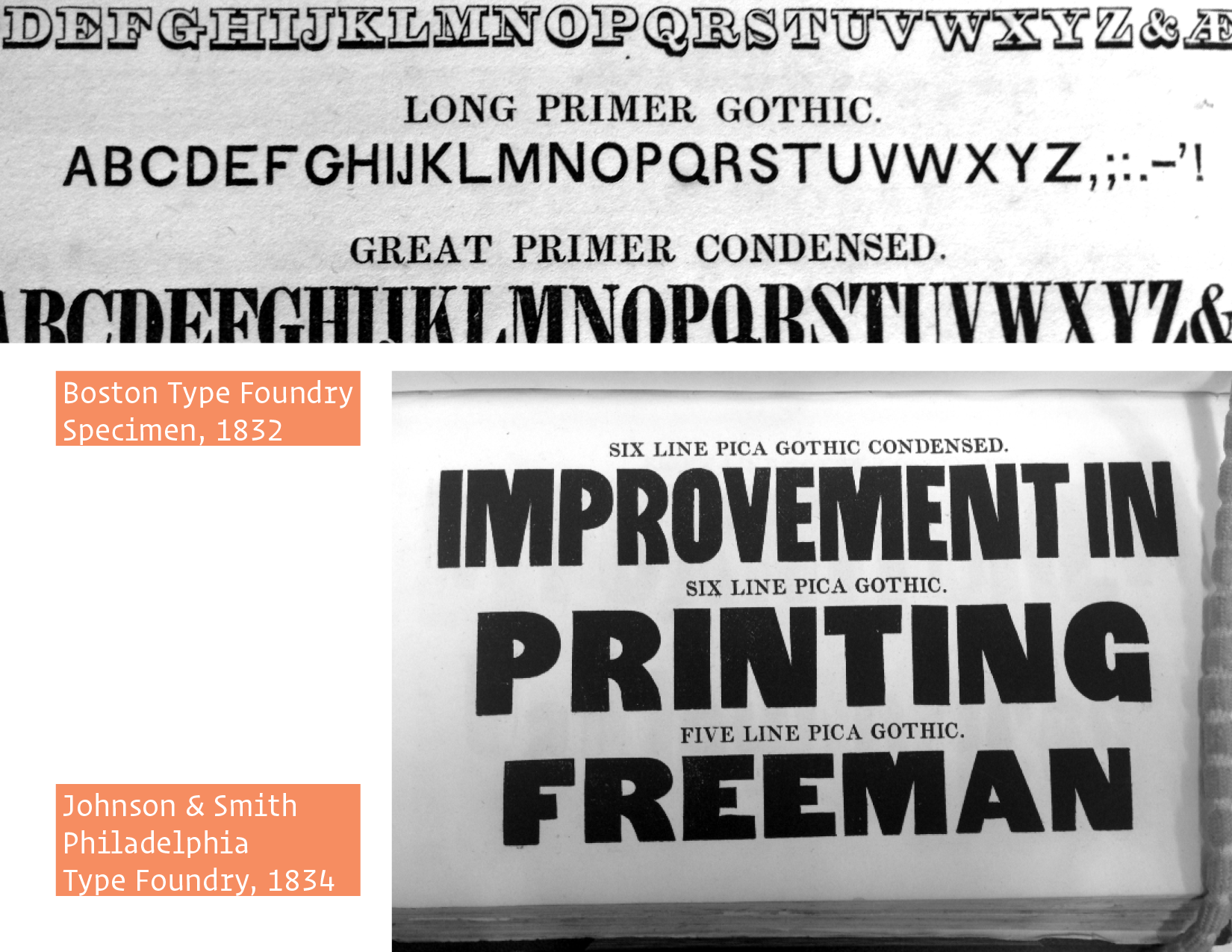
These questions convinced me to explore a related research topic during my time at the Reading University Master of Typeface Design Program a couple of years ago – I cannot believe its been that long! However, my question was not so broad. I focused my inquiry to just American types, since I am American and I thought it would be easier to access the books, specimens, and resources needed for this investigation. My main question was what makes the American Gothic style, [Franklin, Knockout, Trade] so American? My secondary question was whether they differed locally, from city to city – Were Boston’s types similar to Philly’s from the same time period? – But before I could really answer this question, I found myself digging through older specimens from some of the first US foundries scattered around the Northeast, looking for any sans serif types at all that might steer me towards earlier examples of American gothic types. Columbia University’s Butler Library and the New York Public Library were absolutely instrumental to my research here. I found some extremely early types , but not older than any sans serifs that were being used in Europe at the time. This was honestly a bit disappointing. I wanted to find an American type that was distinctly unique and not just appropriated from abroad but, somehow now, it makes sense this way, ha! However, American foundries and designers, like ATF and Benton, definitely imbued some of their own style and make huge contributions to the development of the sans serif in the decades and centuries to come, so its all good!
My talk is not necessarily about American sans serifs, I have written about that enough; this topic is related though. Local character, or the interesting or unusual qualities of individuality that belong to a particular region or area, can be found in so many genres of art and design throughout the world and in my opinion, a very under-researched topic. This is one reason why the prospect of locality in American Gothics was so interesting to me. Even though I have submitted this paper and it's “done”, as you all are probably familiar, there is always something else to add or contribute to any piece of writing or design. So, this study acts as sort of an extension to my original research.
A Unique Voice
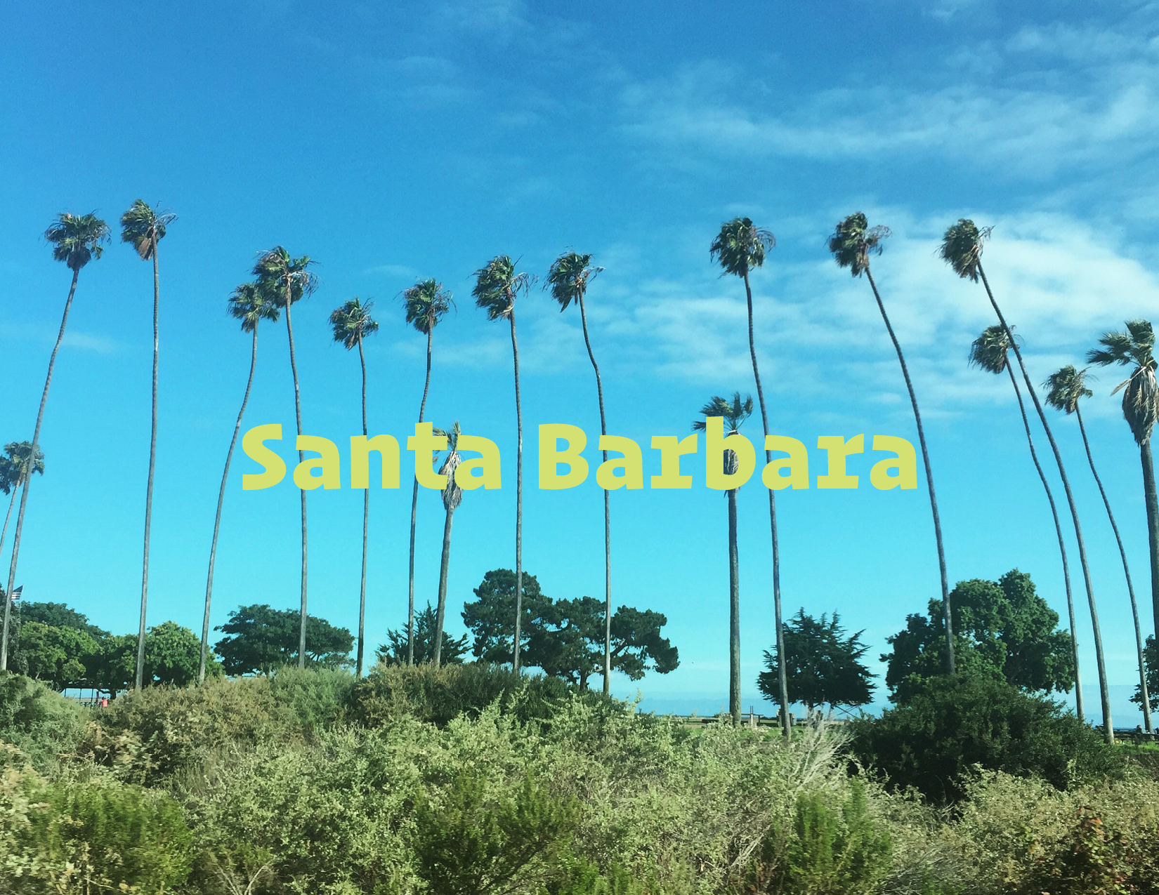
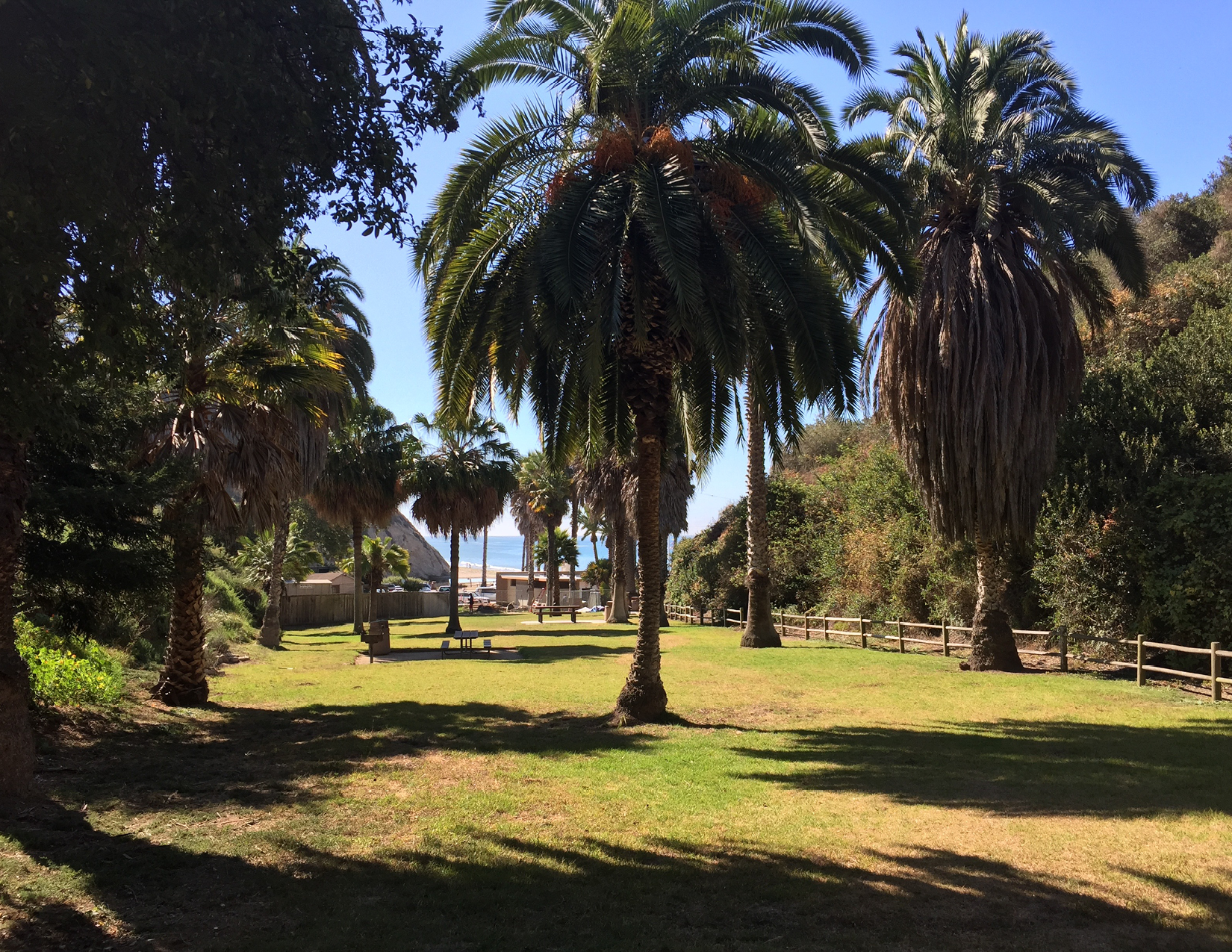
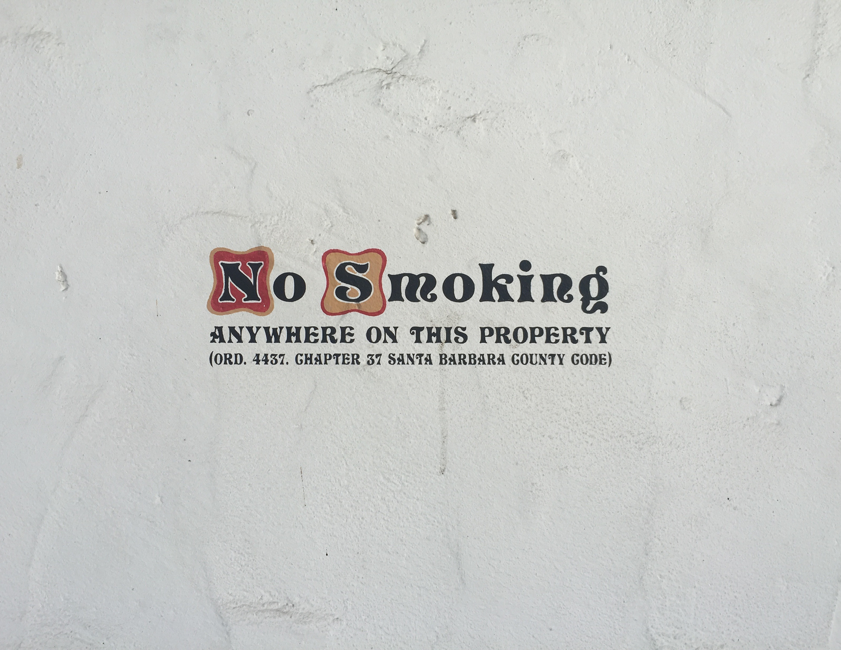
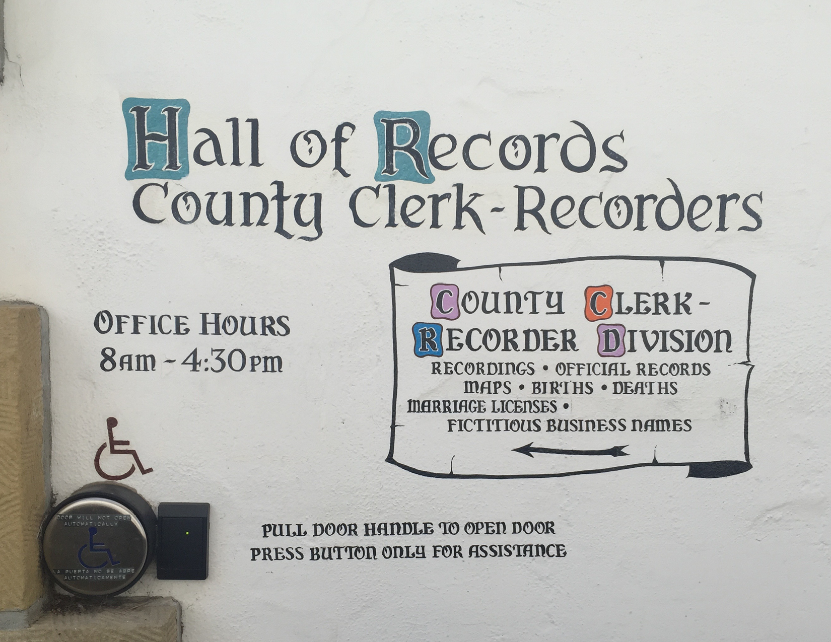
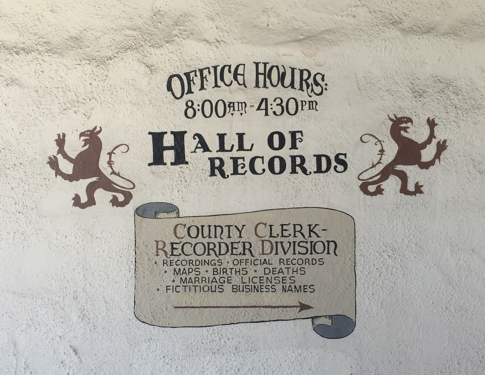
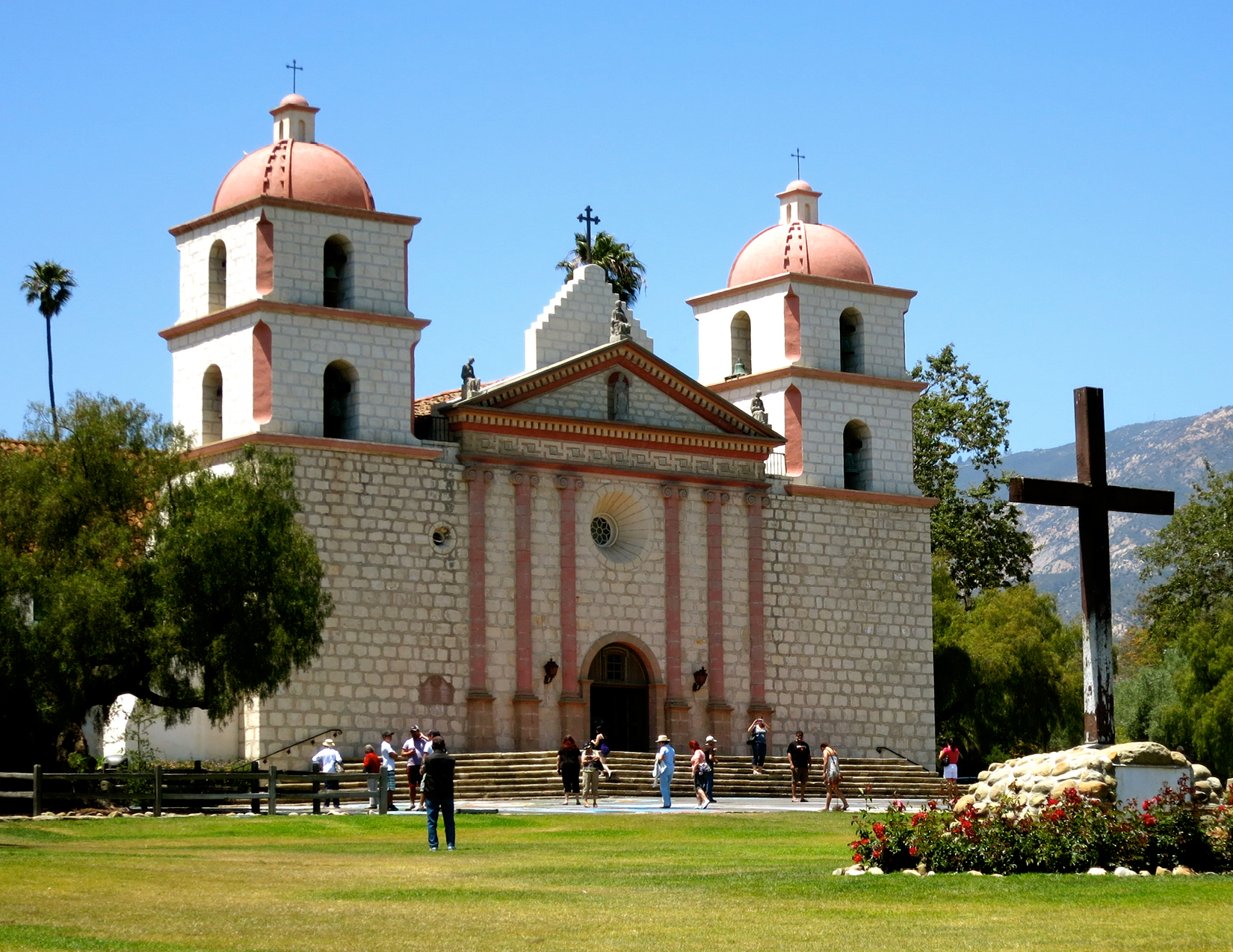
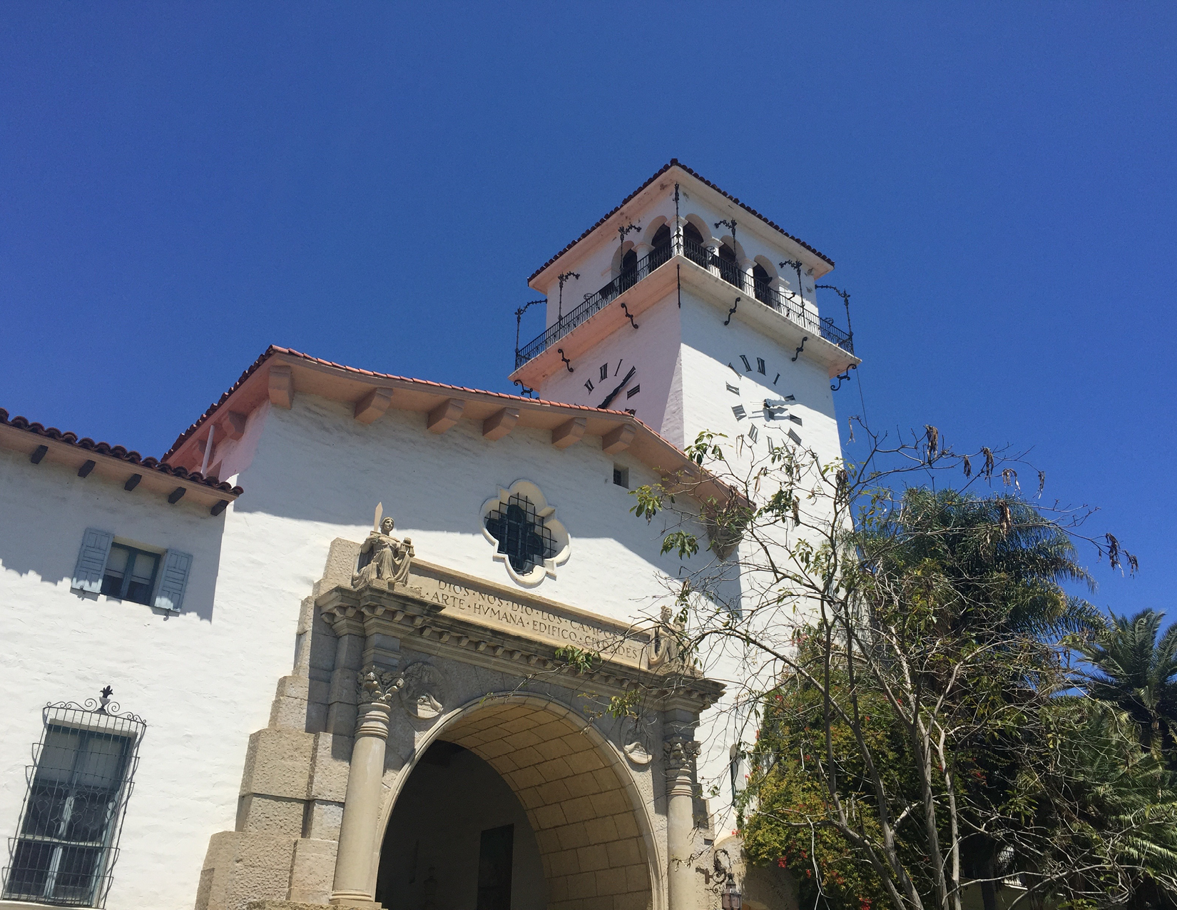
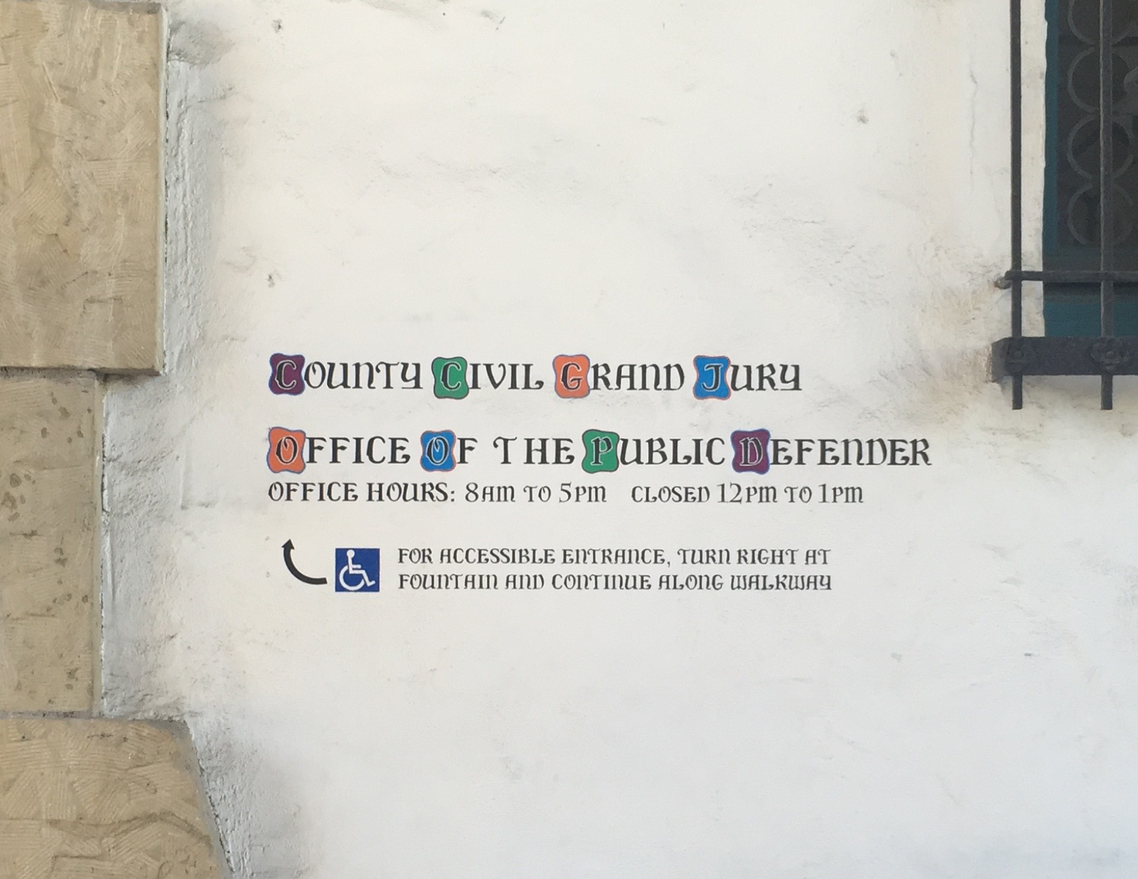
All that to say, one of the greatest examples of a truly interesting style adopted by a specific region comes from a very beautiful little town north of Los Angeles in California – Santa Barbara. I have a good friend in NYC from there who was getting married this past summer, so I took a week off and flew out overly-excited by the prospect of relaxing in the mid-80s weather on a sunny beach. Wouldn’t that been nice... Of course, it didn’t happen exactly like that. We were all quite busy preparing for the wedding, but I did have a couple days to myself afterwards to hang out around the city and explore. Being a type designer and fan of all things typographic, walking around a new city on a sunny afternoon and looking for some cool lettering was incredibly exciting. Santa Barbara is stunning. If you’ve never been, I strongly suggest visiting. Especially if you are interested in lettering, Architecture, beautiful weather, beer, (you know, that kinda junk), go. It’s a wonderful lil’ town. Kate told me to check out the Courthouse and Mission while I was there because they have in her words, “some really cool letters!”. Once I got there, I was stunned. The façade of the building is beautiful , and Kate was not lying. They were indeed very cool. Not only were these letterforms beautifully painted by an obvious professional, but in a style so different form what I’m used to seeing on government buildings that when I realized what I was looking at it set me back a bit! “A state agency really put the effort into making something look historically correct and beautiful?! Nahhhh...” It’s unheard of right? I instantly fell in love with the signs and letter forms . I took pictures of everything I could I planned a mass-Instagram spam to show this stuff off and hopefully get some replies on either A) a brief description of the history behind the style or at least B) Who painted it. At about this time, H&Co begun our Instagram account (finally, right?!) and Jonathan and our community manager were looking for submissions to post. I took this as a queue, and uploaded these photos with some of the questions that I had. I never thought I’d get an actual experienced, educated response from a local, much less, a freelance job out of taking photos of cool stuff in California, but it happened! A most chill native of Santa Barbara named Dirk Brandts emailed me giving me all kinds of information on these letterforms, their history, and some leads on who paints the signs today.
A Quick History of The Lettering
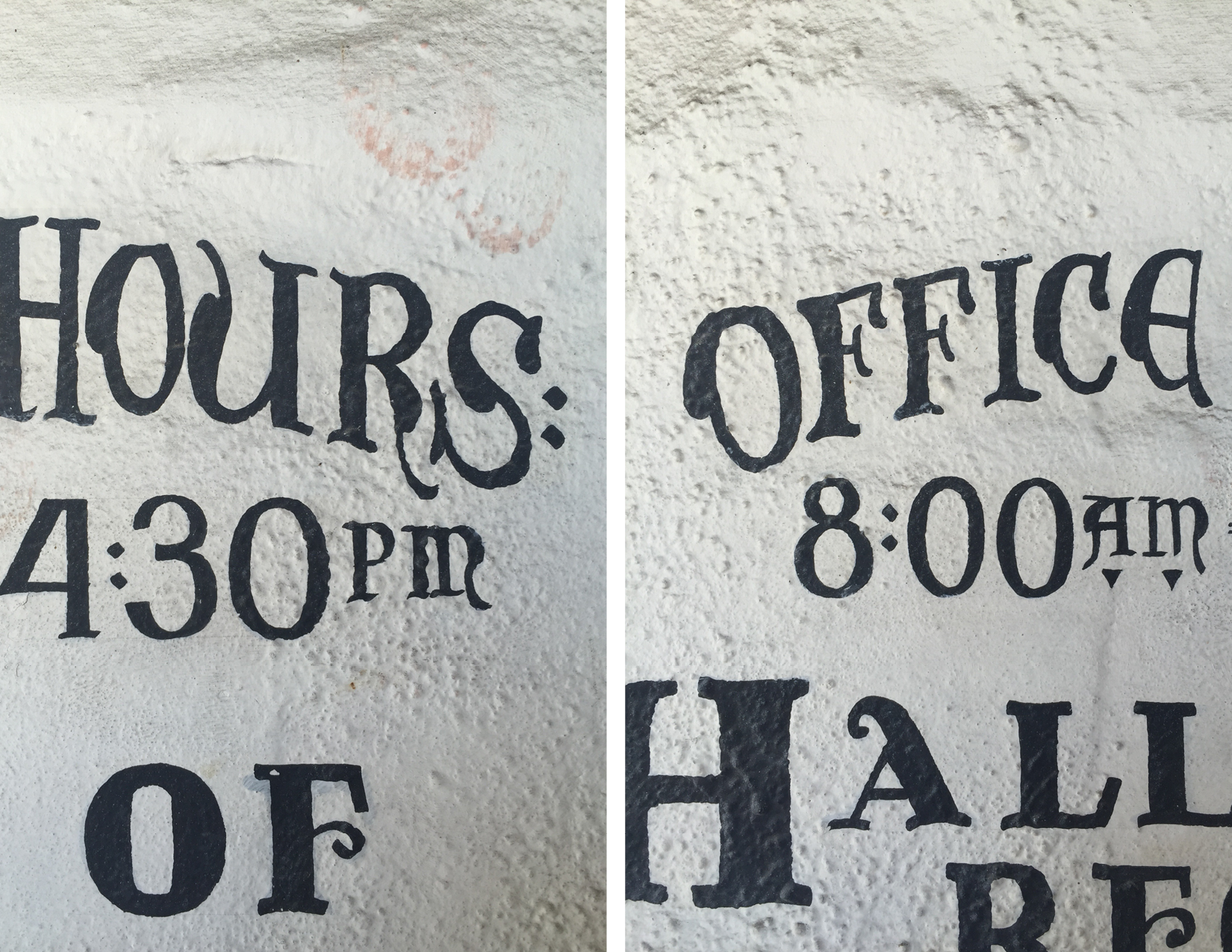
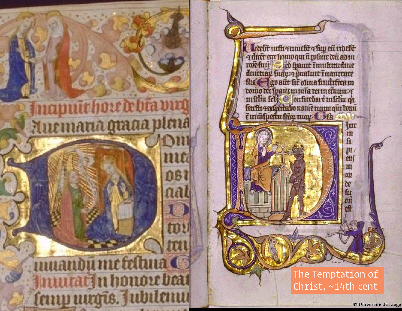
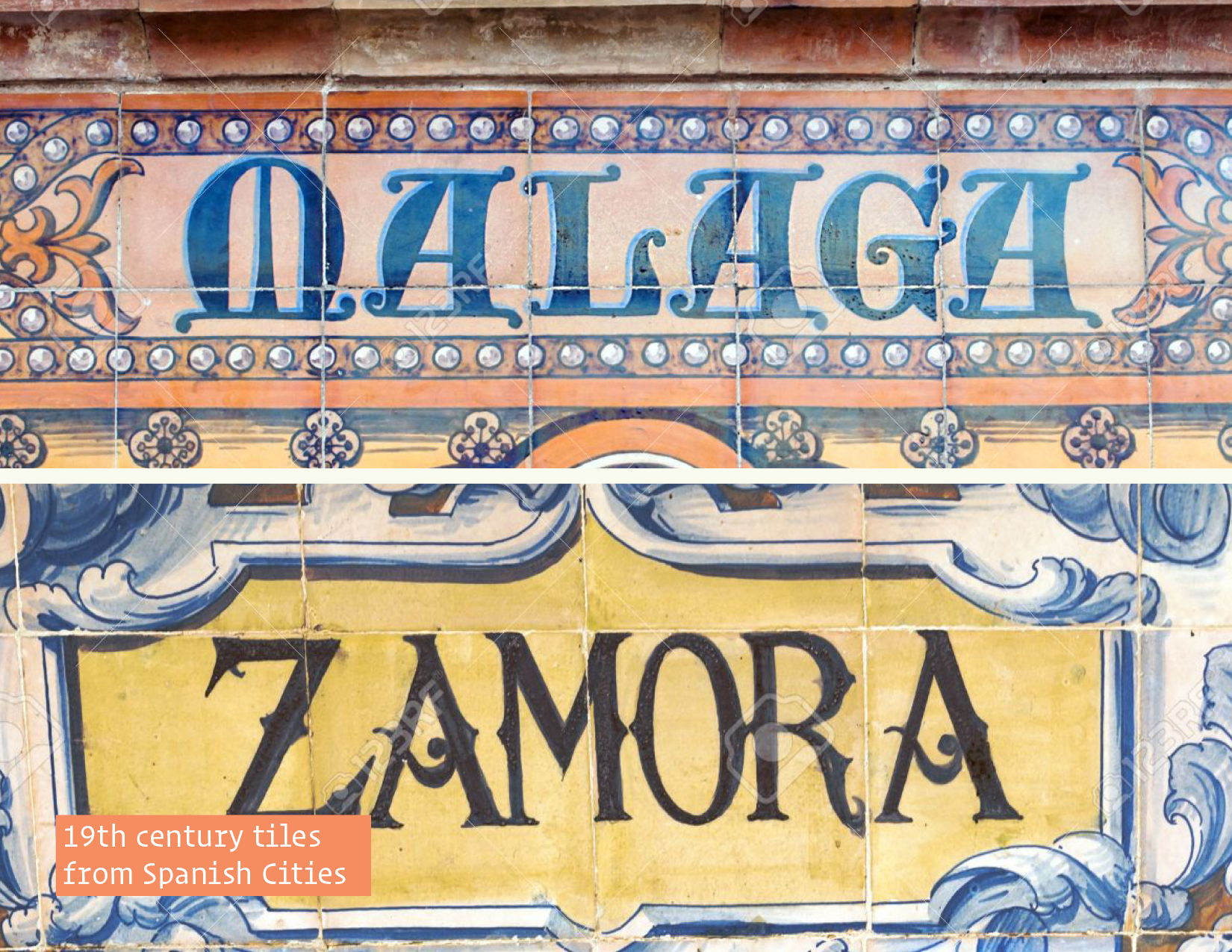
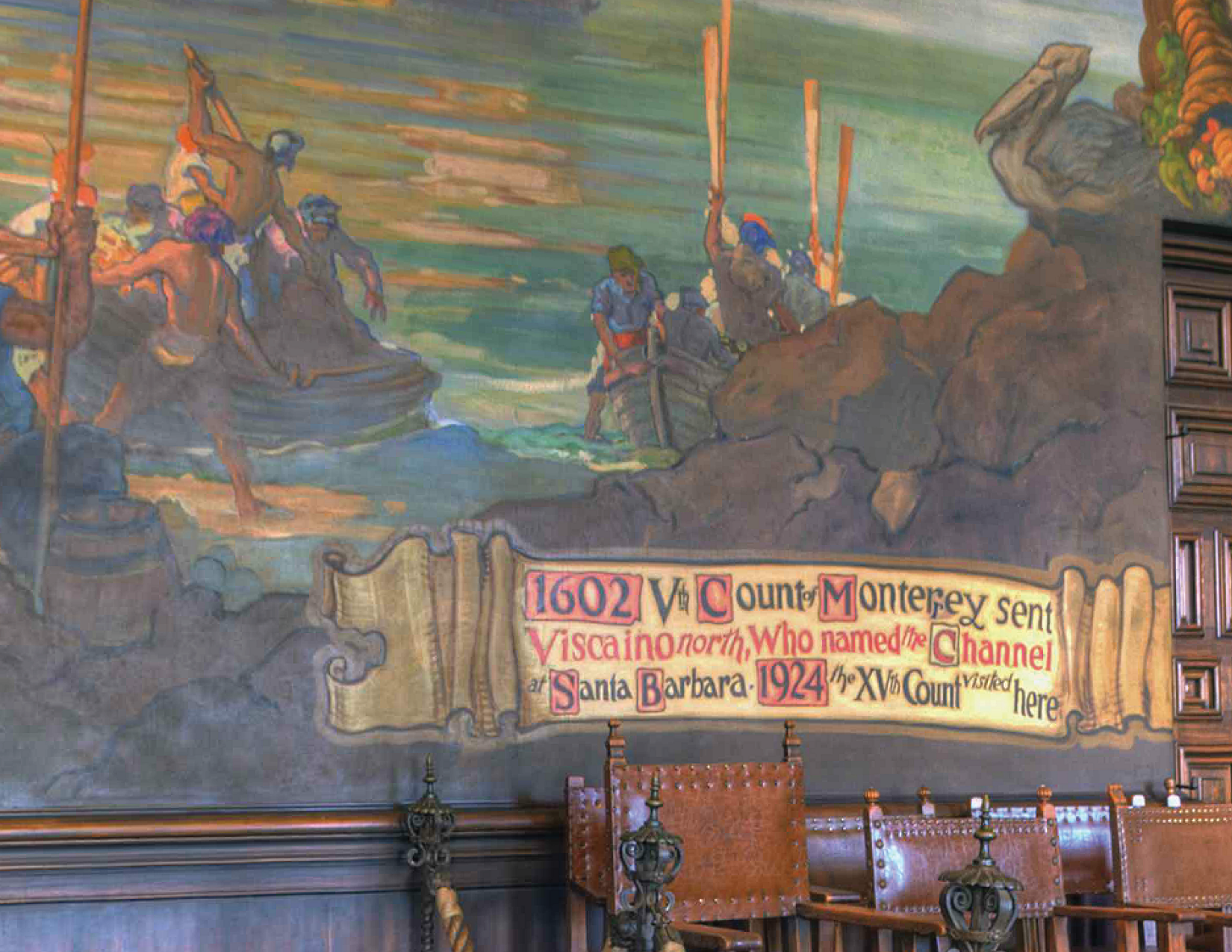
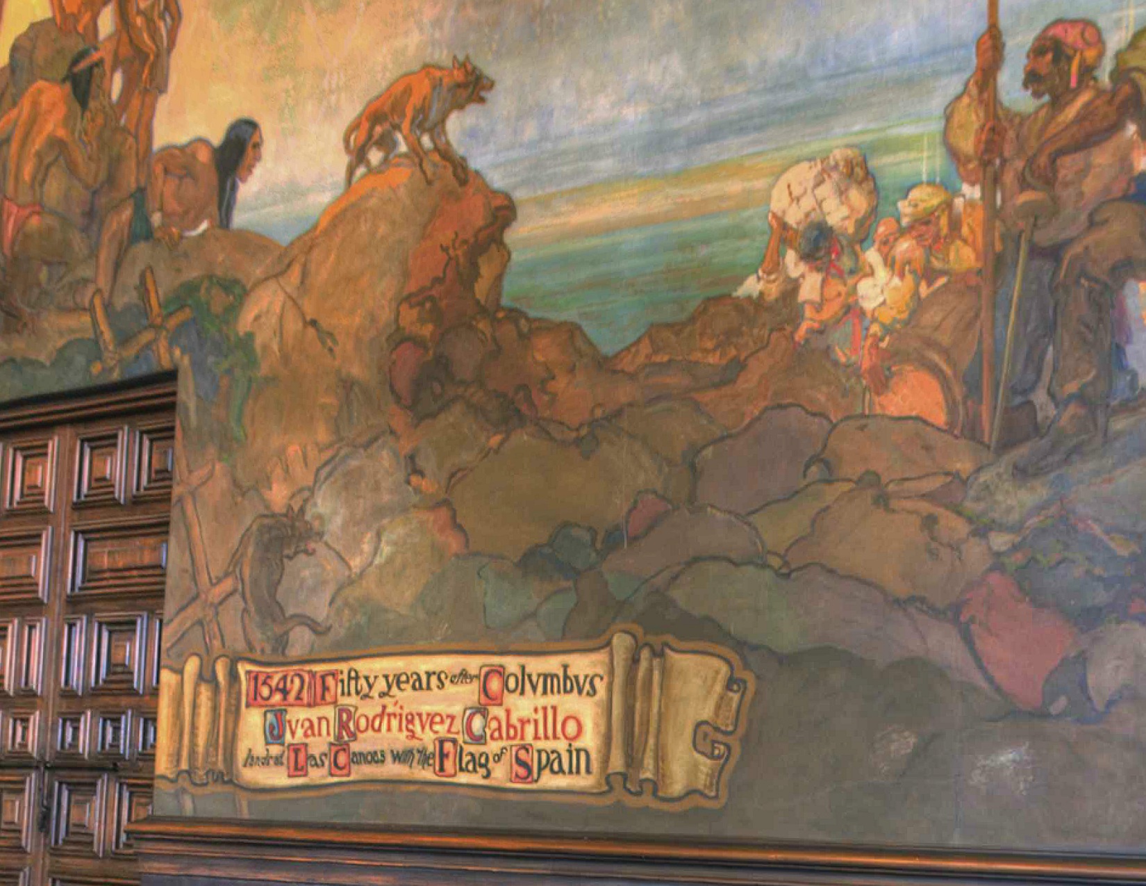
The history of this lettering goes way back to the middle ages in Lombardia, northern Italy and later adopted in Portugal, Spain, &c.. These letterforms are versals in the “Lombardic” style. In part, they are derived from Roman Rustic capitals and half-uncial forms, and they often stood in for blackletter majuscules, or capitals. Their primary function was/is to begin a line of text, a verse – hints the name – which was generally set in blackletter text. Therefore, the Lombardic style is generally not set as running text. You could see this manifested all throughout the buildings in Santa Barbara. {back to 14} Also, since these Lombardic versals were initials, they were generally not written, in the common sense of the word, but drawn: shapes built up by multiple strokes from a brush, not written with a quill. You can see this feature all throughout the bulbous, funky forms.
The Spanish Colonial Style
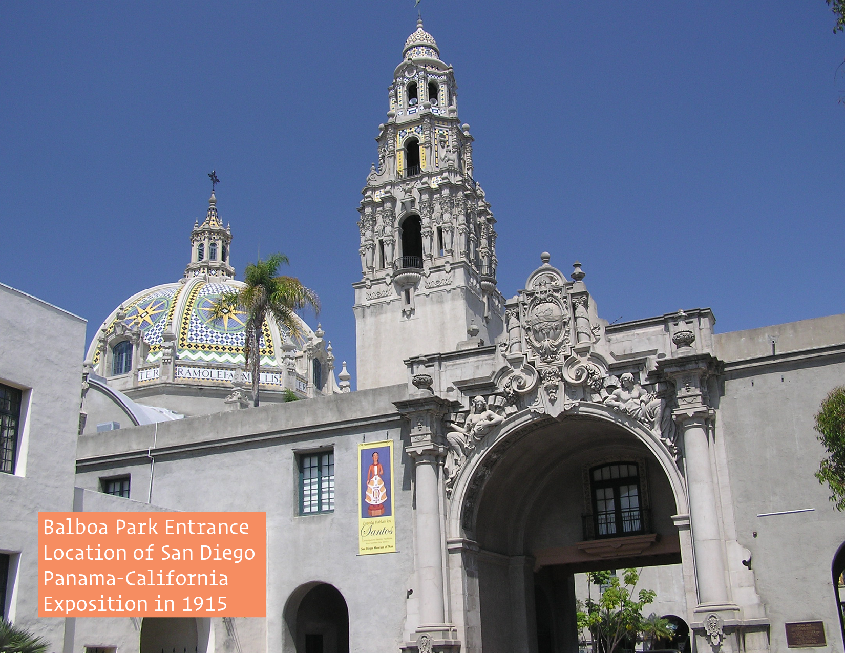
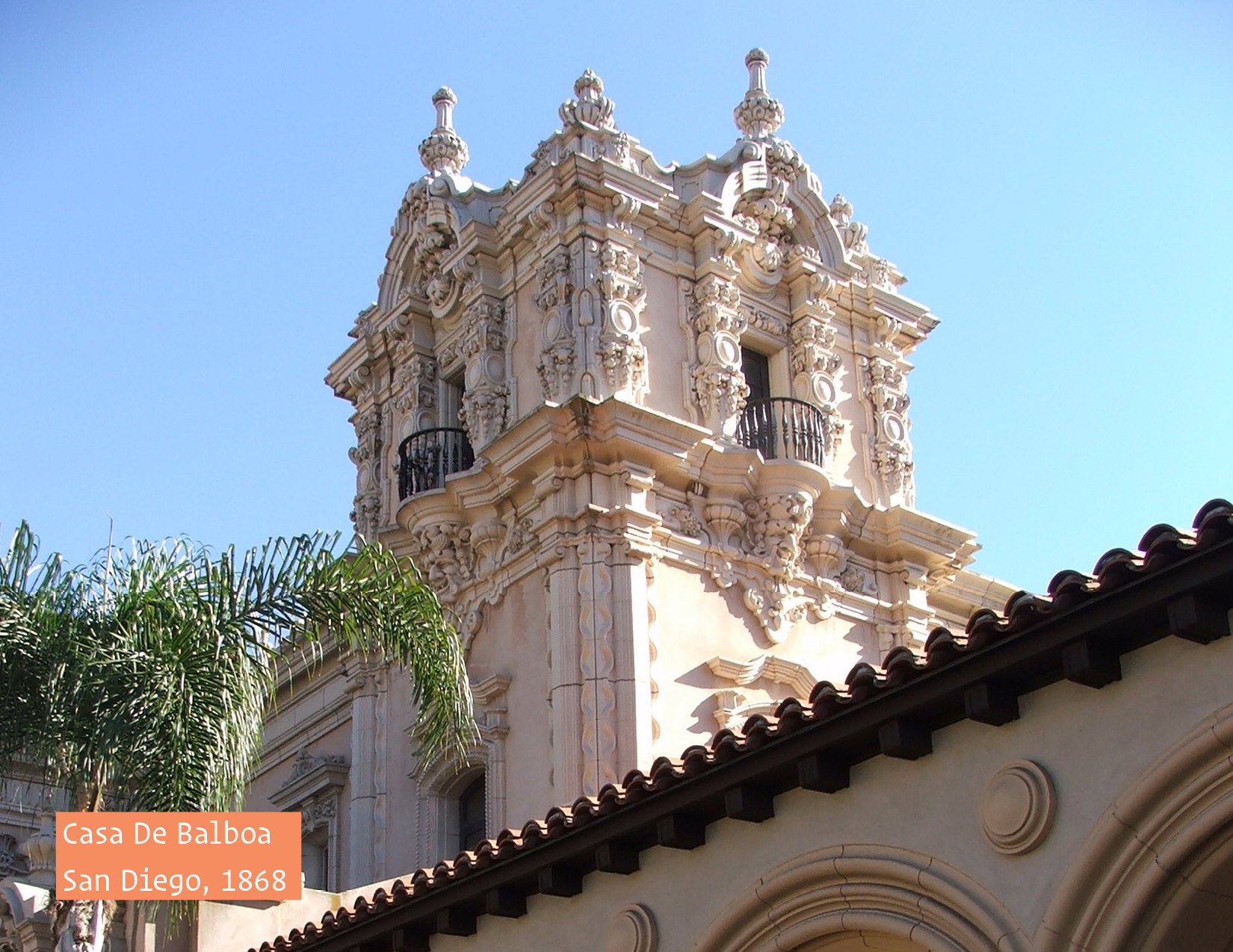
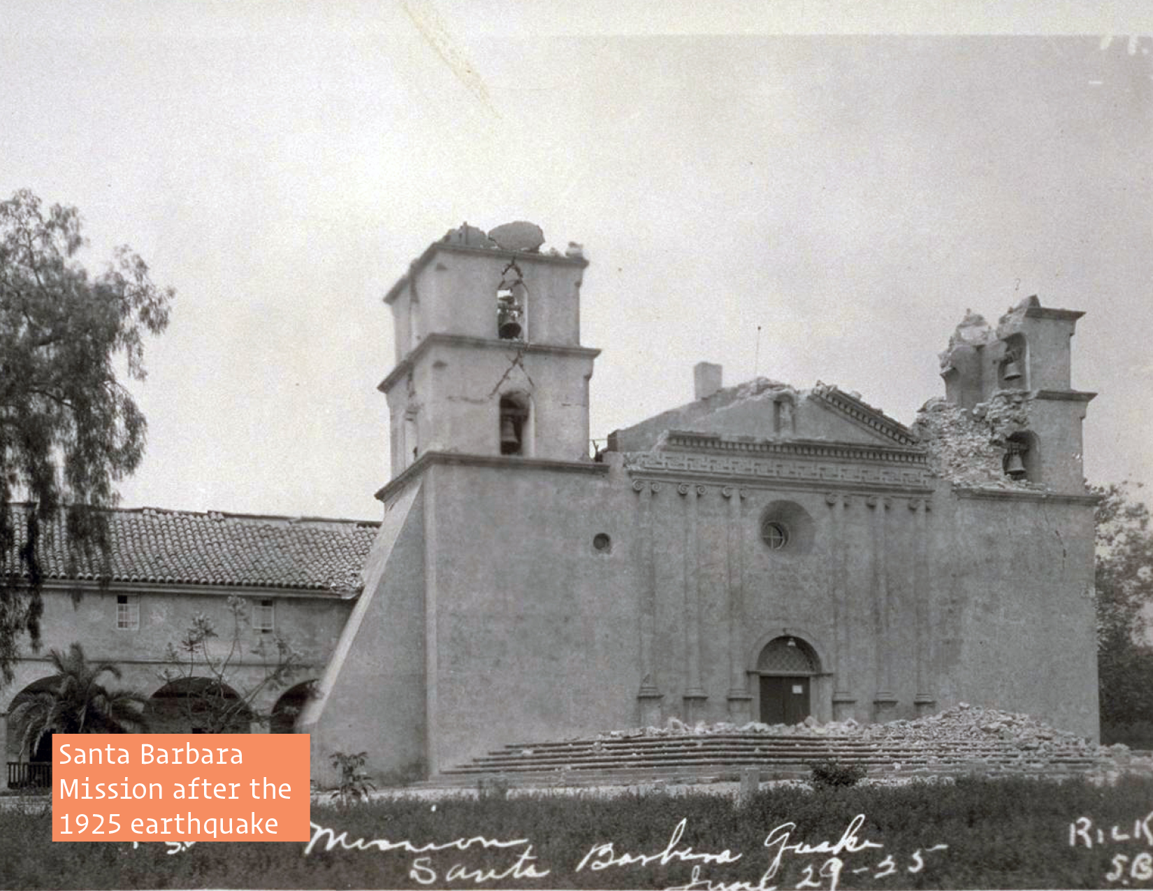
“The major location of design and construction in the Spanish Colonial Revival style was California, especially in the coastal cities. In 1915 the San Diego Panama-California Exposition, with architects Bertram Goodhue and Carleton Winslow Sr., popularized the style in the state and nation. It is best exemplified in the California Quadrangle, built as the grand entrance to that Exposition which is now in Balboa Park, a national landmark. It was here that people were introduced to the style of architecture and most likely, the Lombardic-inspired letterforms. The city of Santa Barbara adopted the style to give it a unified Spanish character after widespread destruction in the 1925 Santa Barbara earthquake. It’s County Courthouse is a prime example of the style.” Many of the architects and designers who were involved in Santa Barbara’s rebuild were not only inspired by the design from the exposition, but were also active in Hollywood, as set designers, painters, craftsman, &c.
The Inspiration
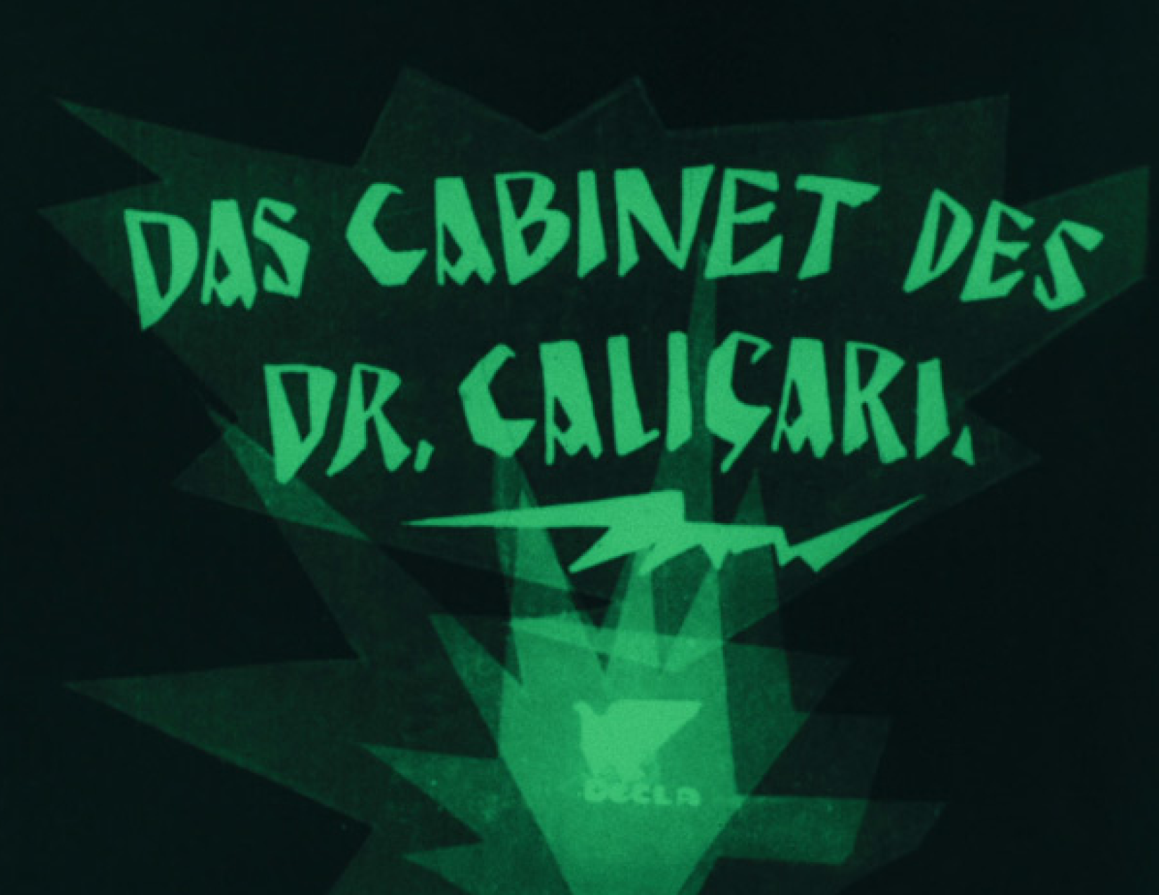
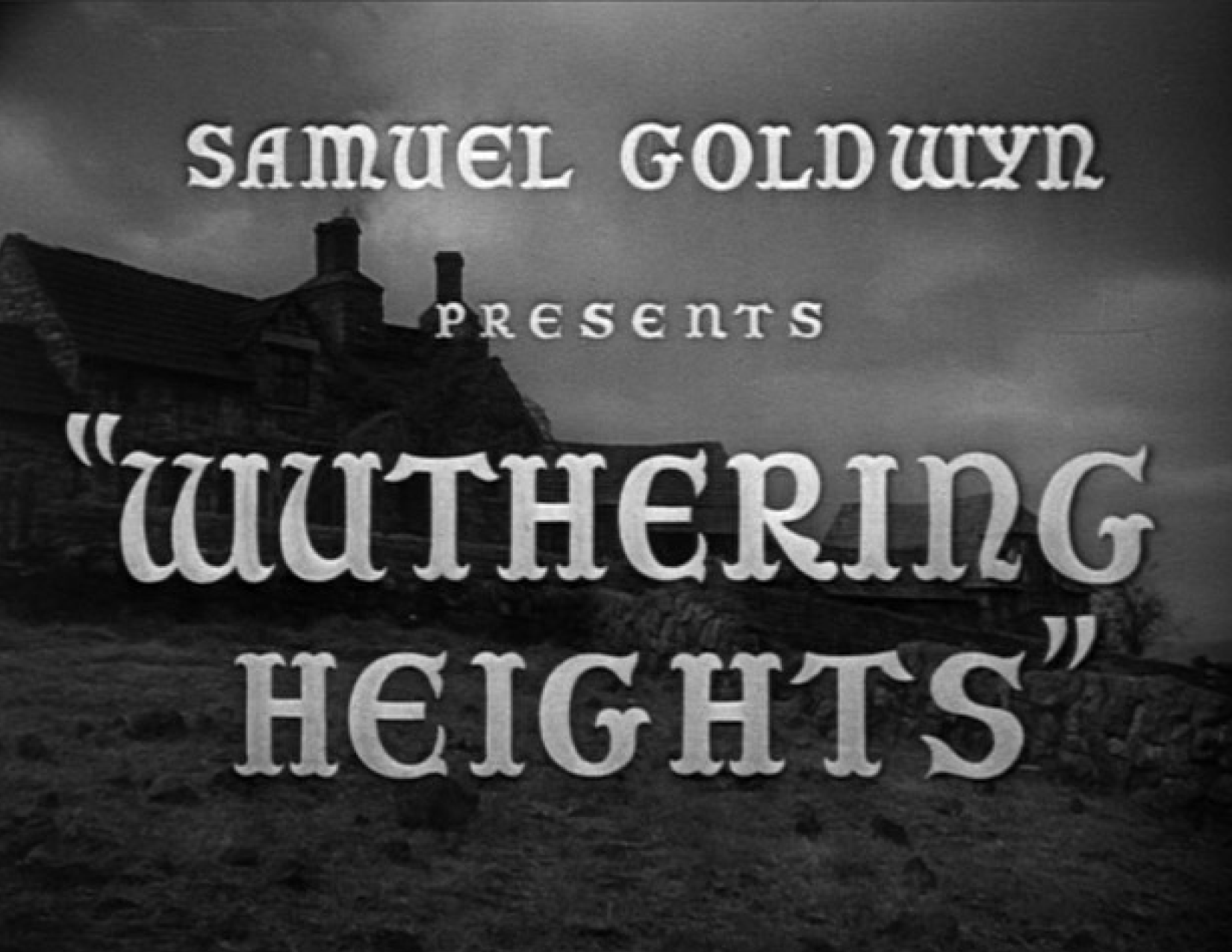
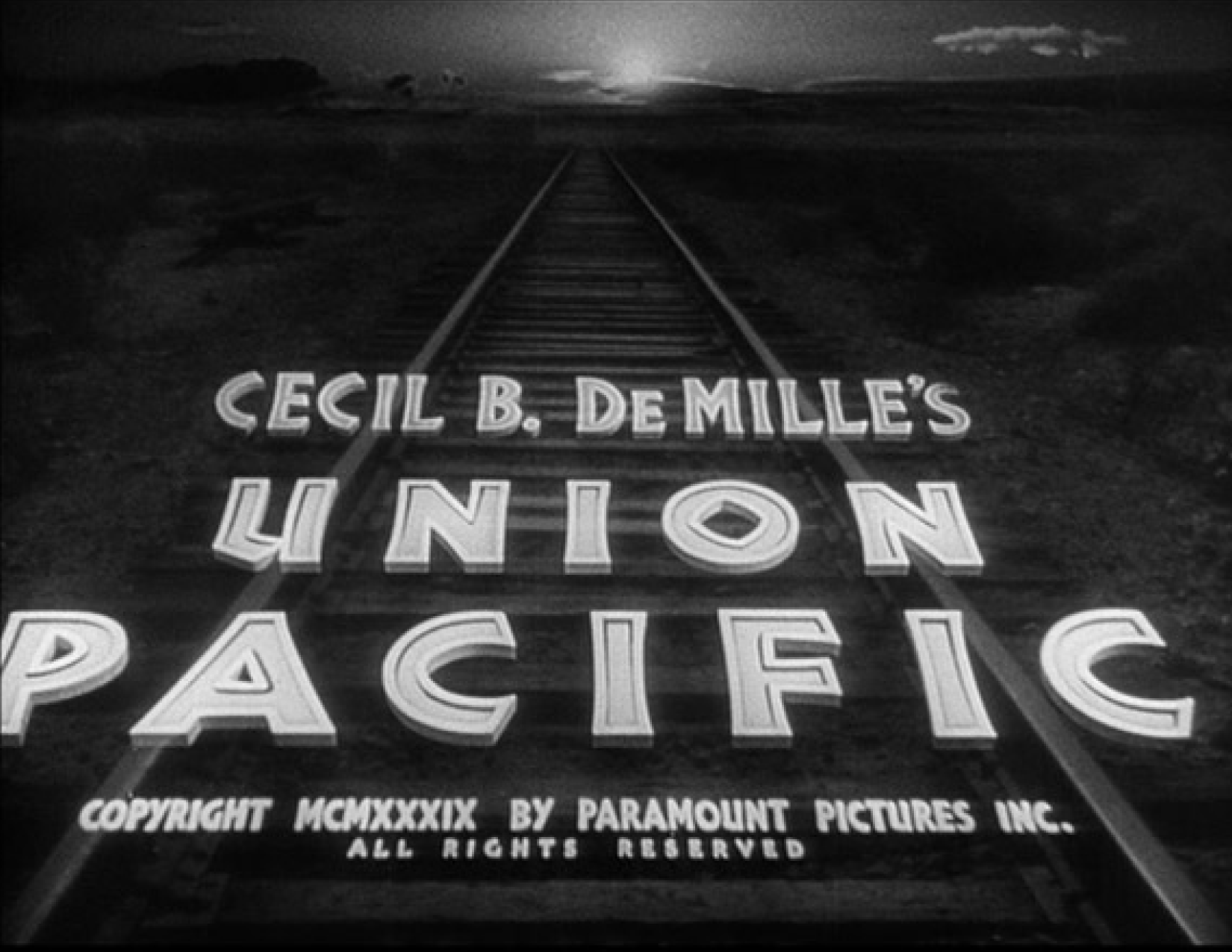
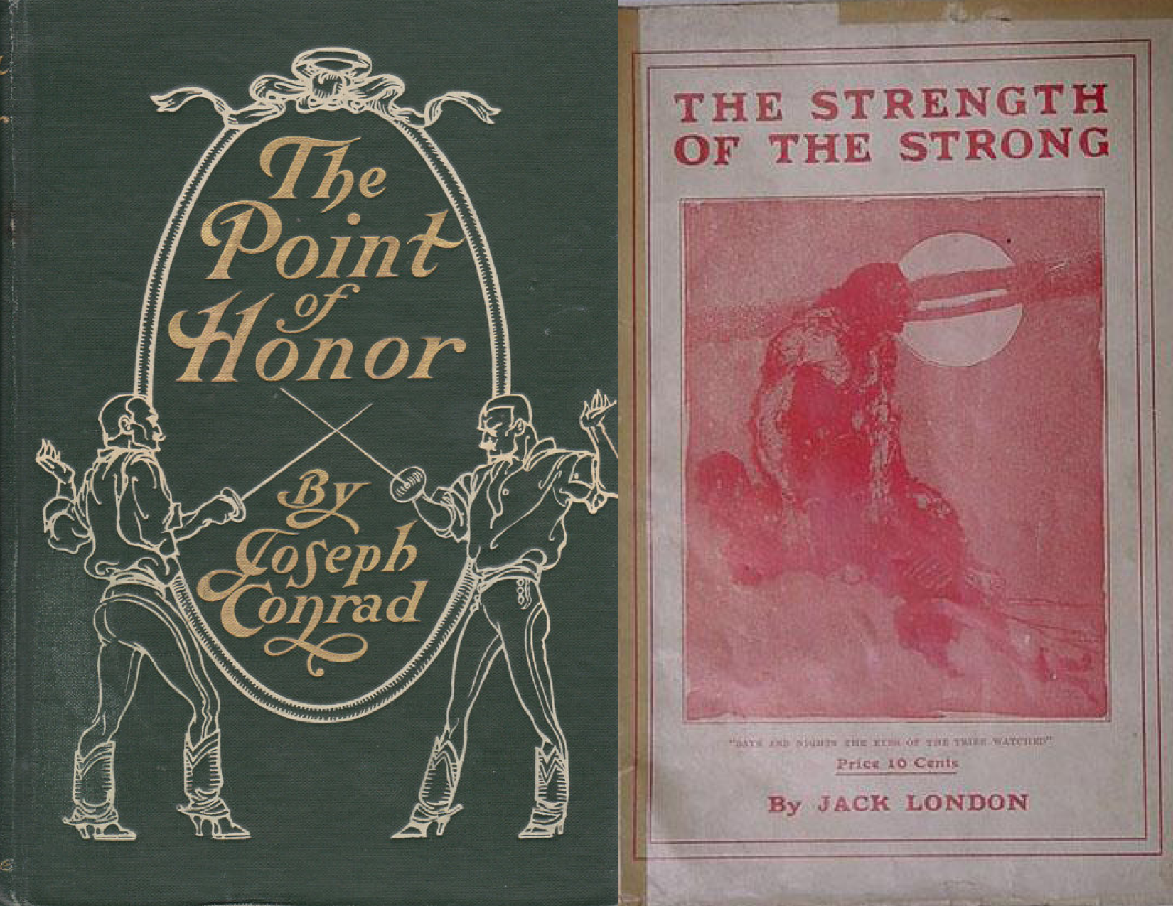
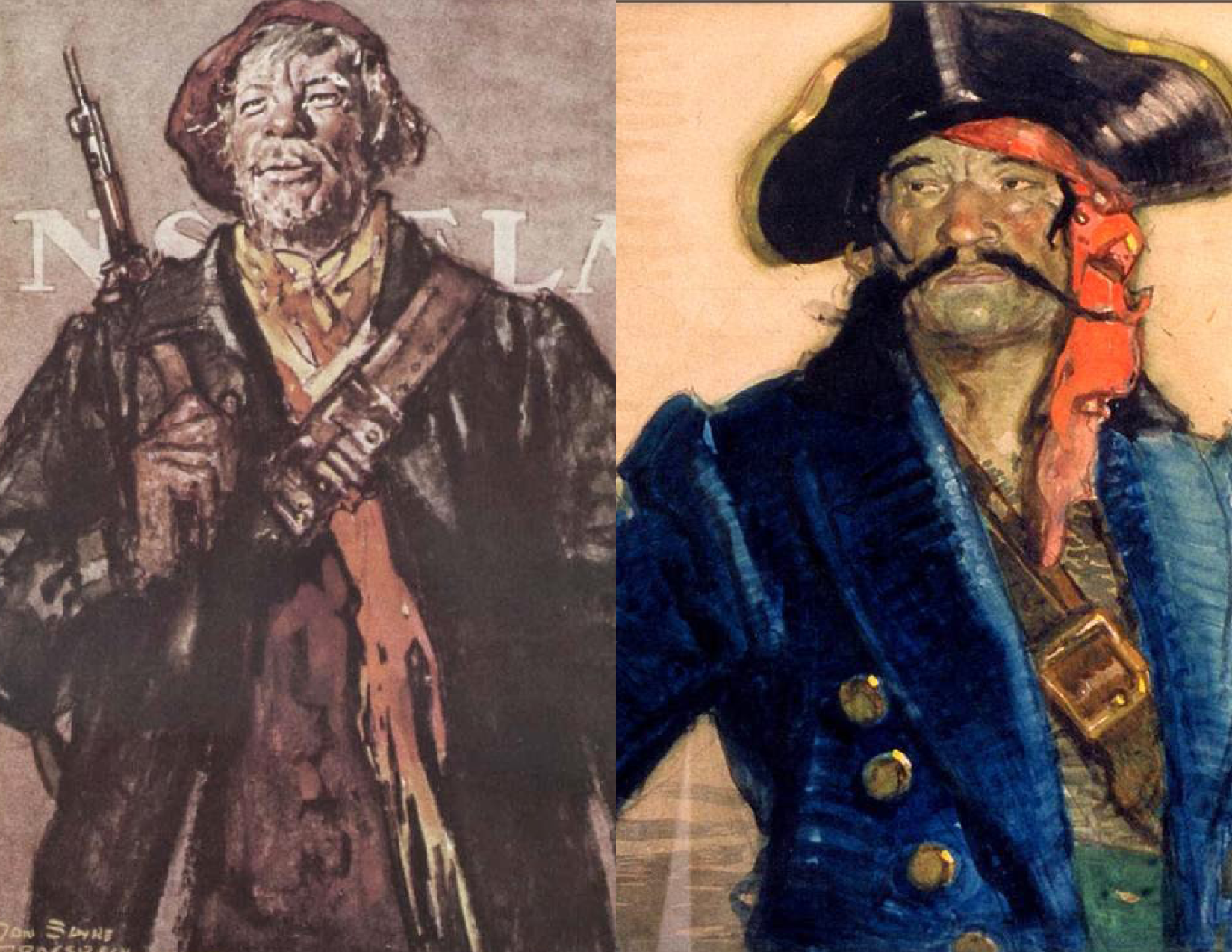
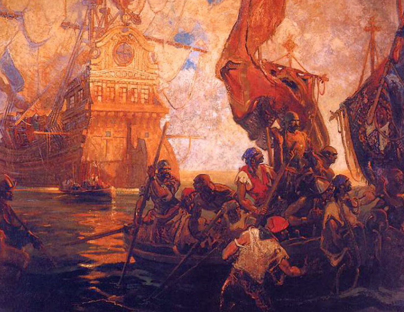
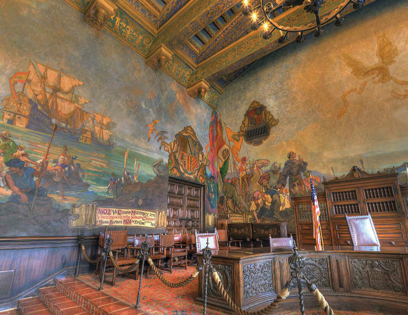
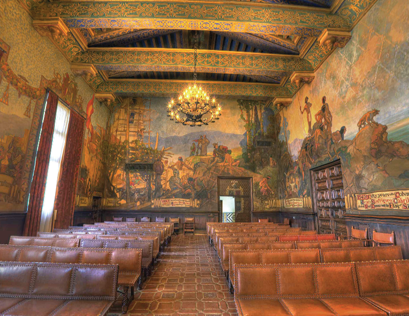
One of these Californian artisans was an enigma named Daniel Sayre Groesbeck (1879-1950) who actually worked on that last film. His life is actually not very well recorded and so we don't have a ton of specifics, but in 1905 he moved from California to Chicago to pursue illustration. Supposedly he even worked on book designs for Joseph Conrad & Jack London. He was then deployed to Russian in 1919 to help end the Civil War there. He served as a gunner and also took part in a number of theatrical productions put on by the troops, fittingly designing scenery and costumes. So, it makes sense that later that year, Groesbeck returned from service and begun, among other artistic endeavors, working for the film maker Cecil B. DeMille as a studio artist {Dominique from the Buccaneer}. It seems, by the look of the detailed sketches and drawings while working on some epic films, he had a special talent for ‘visualizing’ a dramatic scene and capturing his ideas. He even included a bit of lettering on some of his paintings and sketches as well! By 1926 DeMille & Groesbeck had a good working partnership and were casting some bigger stars as well. This artistic collaboration is reflected in the great romantic, Biblical, and historical films made by DeMille over the next 20 years – King of Kings, The Buccaneer, Union Pacific, Reap the Wild Wind, Unconquered, Samson and Delilah. During this prolific period in the ‘20s, he settled in Santa Barbara. Because of this experience and his unique artistic skill-set, he was soon getting work in the area. The local County National Bank hired him to paint a large mural of explorer Juan Rodríguez Cabrillo’s 1542 California expedition for its new building on State Street, and he was paid quite well to execute the 9-by-12-foot work. “The Landing of Cabrillo” brought Groesbeck national recognition as a muralist. This mural now hangs outside the Mural Room at the Santa Barbara County Courthouse and undoubtedly helped Groesbeck secure the courtroom commission, which is, coincidentally, our main focus today: This giant mural , covering each of the four walls in the very large courtroom and measuring 6,400 sq/ft, is considered by most Grosebeck’s masterpiece. It depicts important historical scenes from the communities past, and is really something to behold in person. The reason why this is such an important piece, to not only Groesbeck, but to Santa Barbara in general, is because it contains some very early examples of the Spanish Colonial-influenced blackletter and Lombardic lettering that we now see beautifully painted on the side of these government buildings.
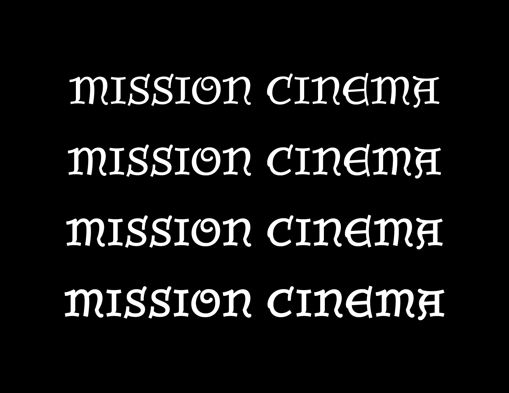
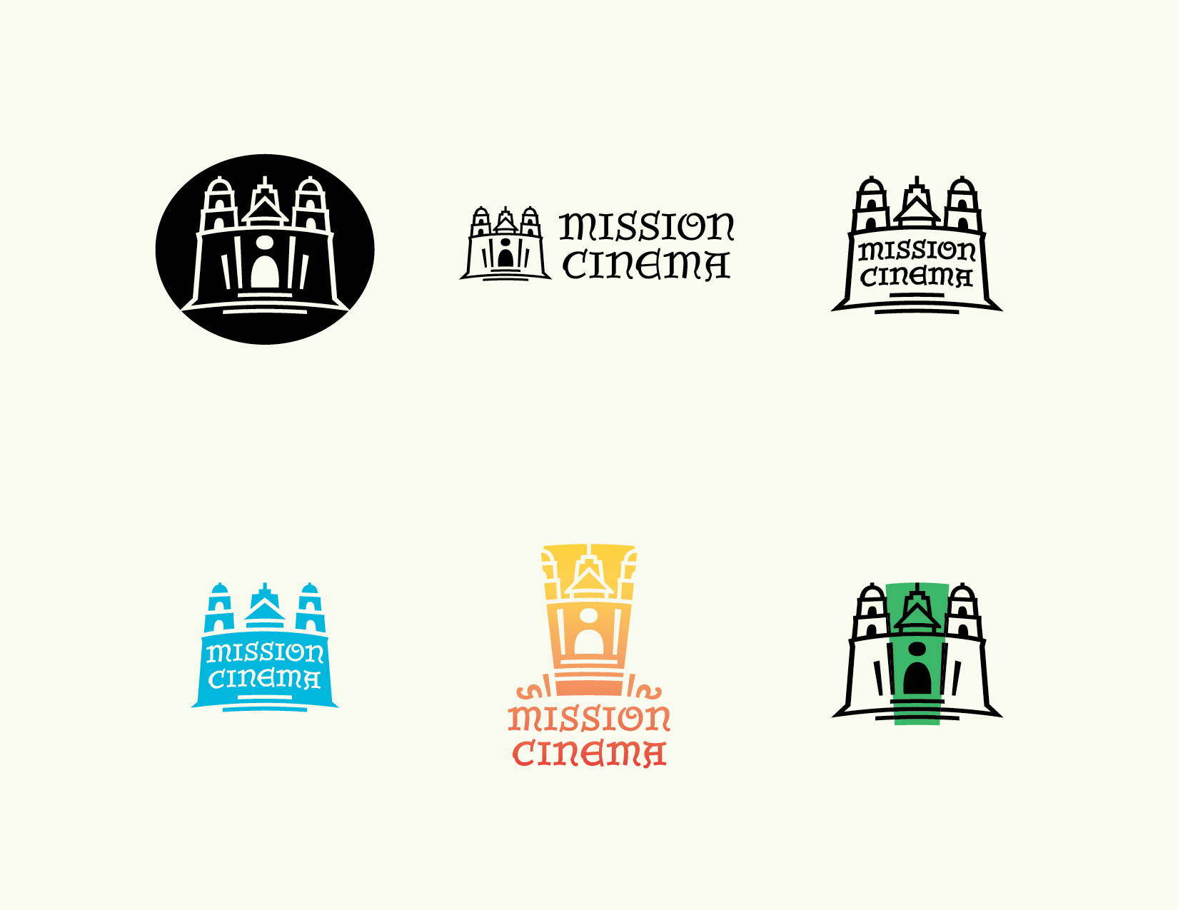
So, why am I going on and on about some crazy Californian artist and his murals? Well, After reading the articles sent to me on Spanish Colonial influence on Architecture in Cali, Grosebeck, Santa Barbara, the Courthouse Mural Room, and the beautiful painted lettering found within, I was enthused and just had to talk to this guy that helped me out. Dirk was pretty surprised some kid from Texas was so interested in this subject, but I guess he doesn’t generally talk to obsessive type designers. Thankfully though, he had a common interest in this subject as well – After decades of producing films in the US & Europe, he decided to start his own film and production company in his home town of Santa Barbara. Oddly like Groesbeck... He was looking for an identity designer to create the branding for this new company, Mission Cinema. Ideas were already spinning. I was all in to say the least.
Practical Aspect
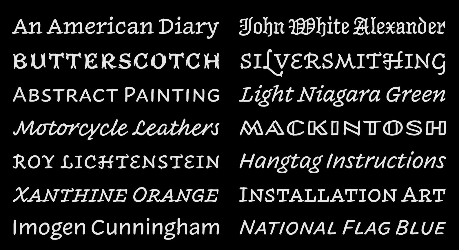
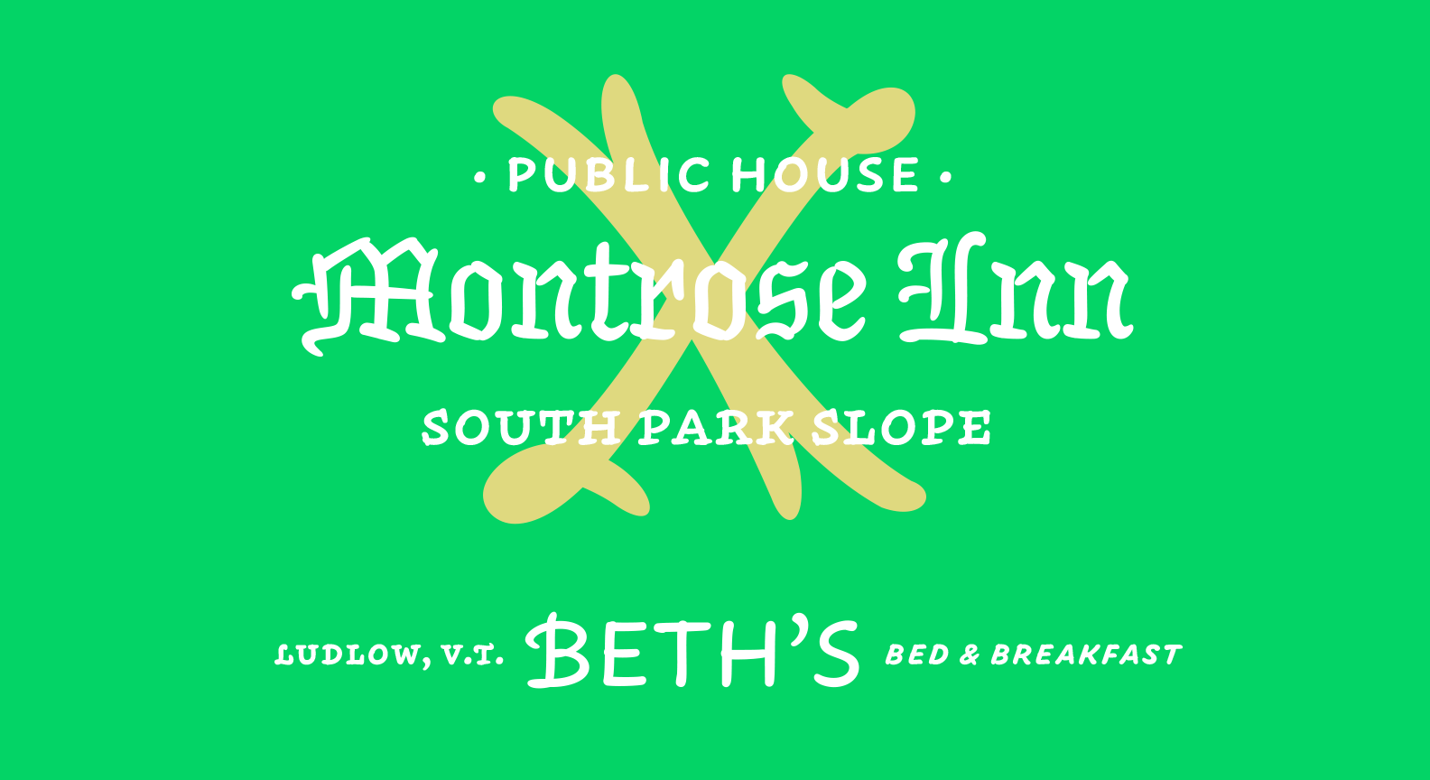
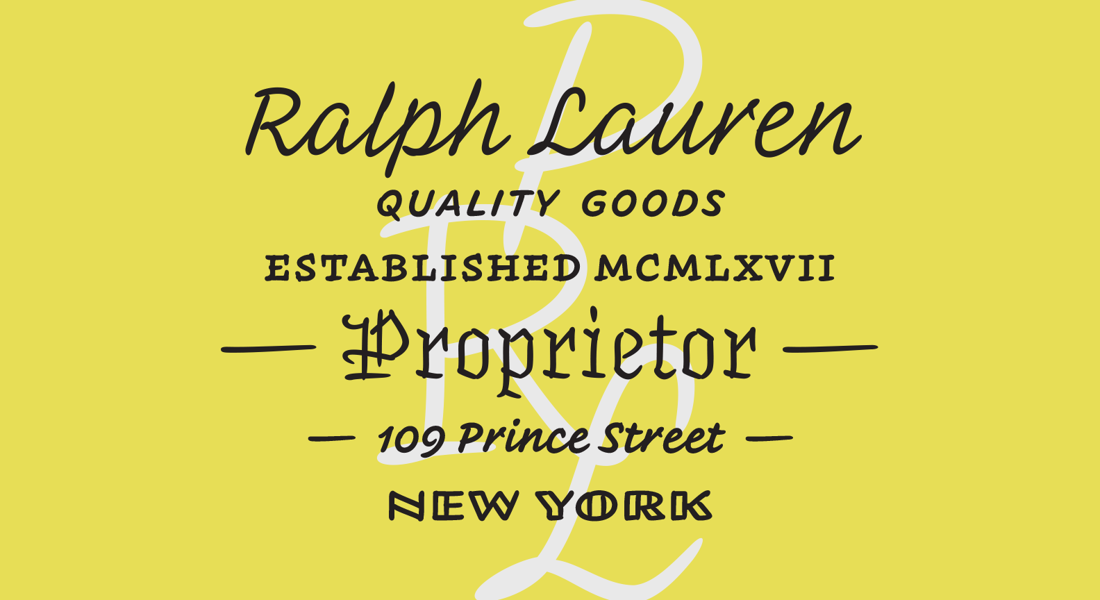
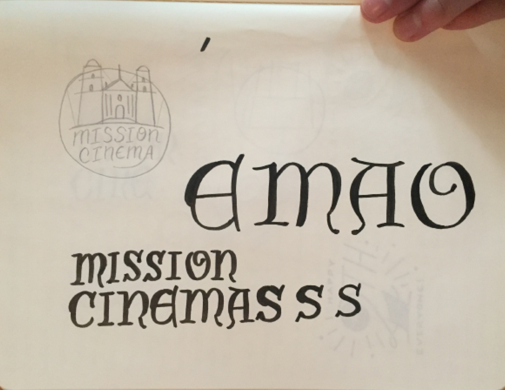
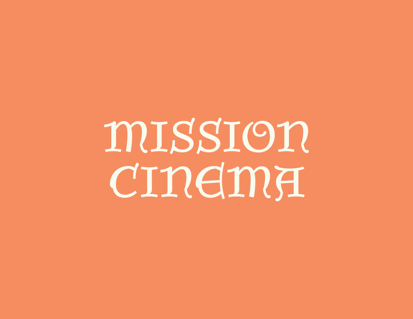
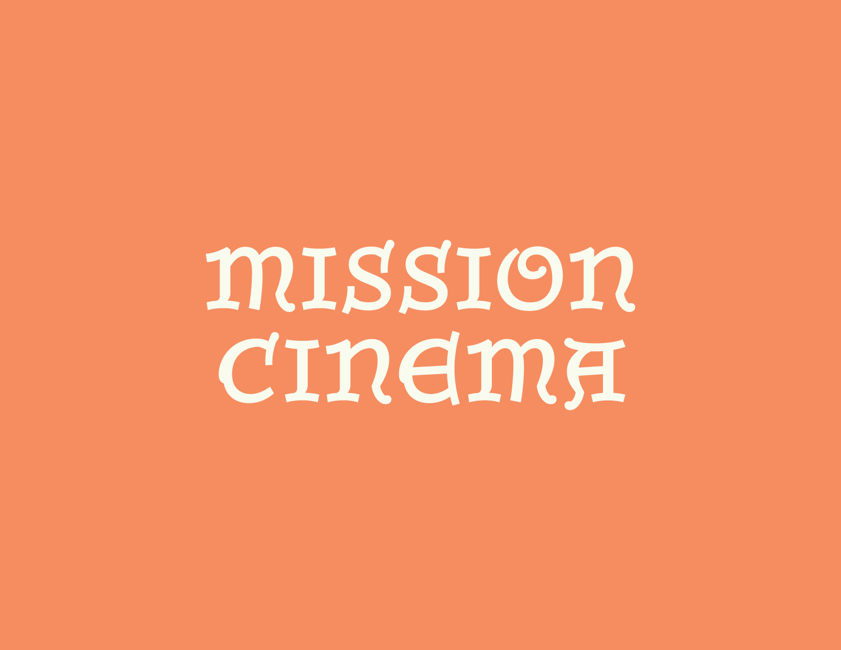
This story also directly relates on a very practical level with the workshop I led in Philadelphia: Taking a bit of historical, found lettering and expanding upon its design – whether that means new styles, weights, widths, or character sets, it doesn’t matter. What matters is the context of the project. Once the context is established and understood, any of these style extensions may be appropriate for the specified project. For Dirk and Mission Cinema , it meant creating an identity for a local film company that will be seen in huge ranges of sizes and mediums – from a few feet tall on the silver screen to a couple millimeters high on a business card, the identity had to be flexible, practical, and most importantly, driven by the local aesthetic and history. So, I drew two related styles based off the same Lombardic skeleton , and interpolated, or mathematically blended, to make grades, or intermediate steps, so that the client can use the lettering at many different sizes and the design wont look disparate, lightweight, or out of place when paired with the various different icons on many different mediums. Creating a flexible identity is a very contemporary issue that is being addressed in many different design projects and businesses today, along with some of our past projects at H&Co. I was very happy to be able to combine a historical subject (the Mission) with a local lettering style, to create a range of adaptable designs for an amazing client. It really is all about the client though, isn’t it? I was lucky enough to be able to work with a supremely cool dude that truly cared about the context and history of his design. This is very important and I think we can all use a bit more thought and care when we attempt to appropriate something historical for a modern cause. There are beautiful things all around us. Let’s find beautiful ways to use them today.
– From "Vernacular Lettering and Santa Barbara’s Unique Voice"
Philadelphia, March 2016
